Atelier Caracas
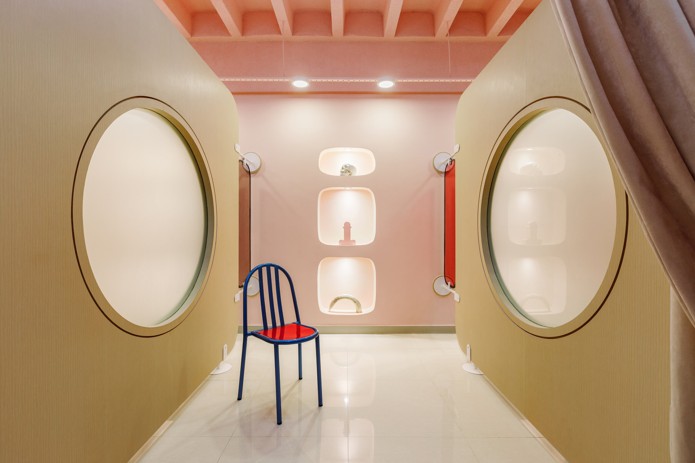
“we consider it an exercise in design and investigation to see what can happen when you decontextualize architecture’s components”
Founded in 2015 by Julio Kowalenko and Rodrigo Amas, the Venezuela-based architecture studio Atelier Caracas explores a range of formal, aesthetic and cultural attitudes across the realms of architecture, furniture and fashion. The studio claims strong influences from found objects and pop culture and utilises them to craft captivating spaces that are charged with the energy of the city of Caracas.
Submerging their visitors in other-worldly and carefully stylised spaces, Atelier Caracas works with a unique vision, emboldened with colour and personality that speaks to the passion and creative vision of the studio.
NR speaks with Julio Kowalenko to learn more about the studio’s innovative projects 2020: A Spa Odyssey and Fun Maze.
You mention that Atelier Caracas operates as a platform that spans across furniture and fashion – how much do these elements inform your architecture?
We like to think of architecture as a medium through which we communicate our ideas towards contemporary problems. These problems could be related to anything, not necessarily just architecture. Although we’re both architects, we’ve always shared an affinity for fashion design and furniture – it’s an important source of inspiration for Atelier’s design process.
There is a sense of freedom behind fashion design and furniture that we envy (in a good way). This freedom trespasses the boundaries and formalities of the architectural practice and focuses on expressing ideas about social, political and cultural issues – we try to channel this in each one of our projects.
Jan Kaplický once said “We don’t want to be fashionable architects, but we are interested in the idea of fashion”. That’s exactly how we feel.
What would you say are the main influences from pop culture on your creative practice?
We embrace pop culture in a very Venturi/Scott Brown kind of way, in that we have a fixation with ordinary things. We like to state that our architecture doesn’t always come from architecture itself, but rather emanates from ordinary or simple things. Every time we approach a new design, whether it is a piece of furniture, a building or even a garment, we always have mood boards that are a compilation of images, sometimes very incoherent, but once forced to coexist on the same canvas something starts to appear – a new language, a new construction detail, a new possibility that might have once been thought as a flaw or failure.
80s Punk flyers, NBA logos, Mid-Century Venezuelan Architecture, Shiro Kuramata (among other design heroes); these are all things that for us, in terms of hierarchy, have the same weight as references when it comes to conceiving architecture. We like to think that things carry a DNA – whether that be a texture, a chromatic palette, or a certain detail of a building – that we like to extract and construct into our own universe.
“It’s a sort of clinical dissection of popular imagery as a design strategy.”
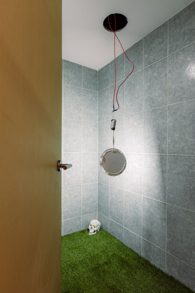
One of my favourite projects of yours is the 2020: A Spa Odyssey. What attracted you to Stanley Kubrick’s film or science fiction in general, and were there any other conceptual inspirations?
When we were asked to design the spa, we were told explicitly to “make something out-of-this-world”, we took that very seriously.
Immediately we started searching for and filing images related to outer space exploration and science fiction. NASA, Isaac Asimov, Akira and related cinematography became constant reference sources in our studio during the design process. It wasn’t long before we knew that 2001: A Space Odyssey would be the definitive reference pool for inspiring us during the development of the project.
The dissection of the film became a fundamental part of our design process, even to the point that the Spa’s name is a play on words. Studying Kubrick transcended into something greater, and we understood the project to be a succession of scenes that use colour, light and symmetry to engage with certain sensations and things the filmmaker applied in many of his works. Ever since we did 2020: A Spa Odyssey, we utilise this in all our designs.
What was the process like when creating the furniture for the spa?
A tight budget and “outer space” artifacts didn’t seem to be synonymous at all. This led us to the idea of conceiving furniture made from ready-mades.
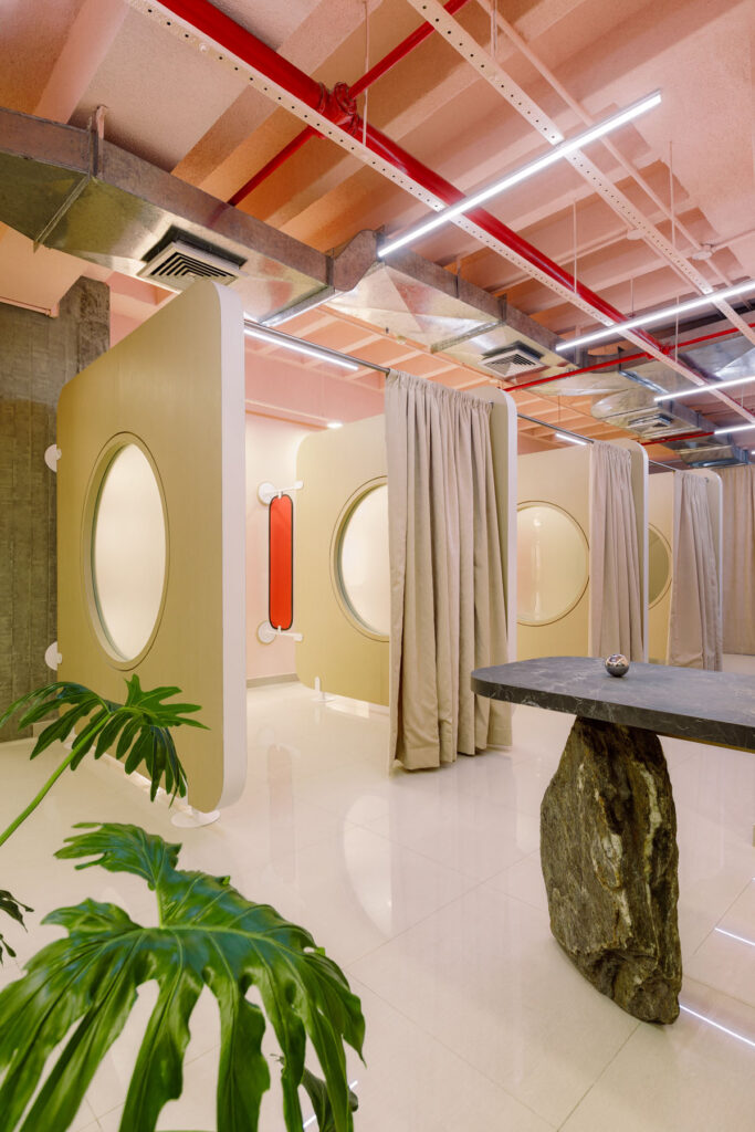
With the ‘other worldly’ theme we wanted the furniture to underscore and exalt the project’s narrative potential. Thus came about the idea of a ‘meteorite’ floating in space for the reception desk. Something heavy like a rock lightly posed and acting as a fulcrum disturbs the notion of gravity in space and throws the viewer off balance and out of the immediate environment, which is a very busy area of Caracas.
Our approach is particularly scenographic when it comes to designing space and furnishings. This project, with its obvious cinematic reference, was the perfect opportunity to test all our ideas about generating a narrative through design.
Are there any subtleties of the design of the spa that you’re particularly proud of?
Something that pleasantly surprised us was the visual and spatial effect of the translucent plexiglass panelling. It gives off an indefinite boundary and a ‘spacey’ vibe to the massage cubicles.
Also, considering that the Spa is located in a particularly busy area of the city, we’re very happy that the project acts as a pleasant hermetic bubble, an airtight space isolated from the noise of the city and where the often-polluted environment seems to simply disappear.
How much does the Venezuelan landscape impact your work?
Very much, in every single way. For us, Venezuela and above all, Caracas is an ever-present muse. Born in the 90s and growing up in the 2000s we’ve been through a lot of political and social turmoil. We consider this to be a formative and educational phase in our lives.
Living in Venezuela has taught us that good design has no limits when it comes to budget and scarcity of means.
Understanding landscape as something that can transcend into a cultural concept, we’re very proud of our artistic and cultural legacy, and we seek to express that in our work. The presence of small gimmicks and intentional references within our projects (what we like to call architectural quoting) serve as small respectful homages to the masters of Venezuelan architecture. More than a ‘copy-paste’ kind of architecture, we consider it an exercise in design and investigation to see what can happen when you decontextualize architecture’s components.
“We never did our post graduate studies, so this is also our way continuing to study architecture.”
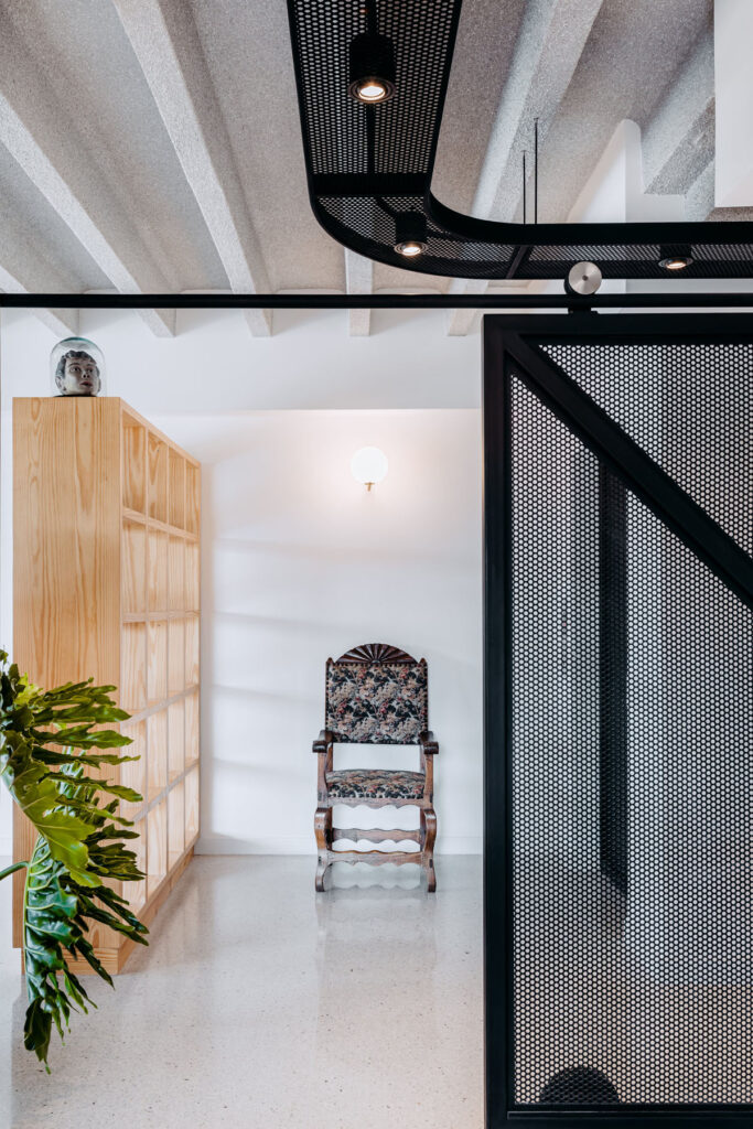
Another design of yours that stood out to me was the Fun Maze. What were your aims and inspirations for the project?
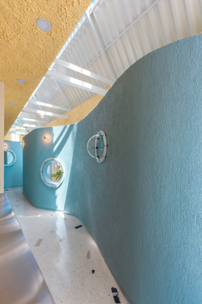
Fun Maze is a motor therapy and rehabilitation centre for children with mental disabilities, so our main goal was to humanize the doctor’s consultation office, to eradicate the cubicle and use it as a way of promoting alternative ways of socialising amongst visitors.
The idea was to create an infrastructure that transforms therapy spaces into lineal parks where parents, therapists, pets and children can reimagine how their bodies can relate to and interact with scale, light and space.
In terms of inspiration, this project has two main references. First, we intentionally evoked the universe and code of forms in John Hejduk’s architecture, especially his exercises and explorations in Diamond House C, where a series of biomorphic volumes have a dialogue with an orthogonal space system, creating residual spaces for phenomenological narratives. And secondly, creating a covered boundary space with the dimensions of a long corridor immediately recalled the architectural work of our deceased professor and mentor Joel Sanz, especially his exercise on “El Techo de Sol/Techo de la Lluvia” (“Roof of The Sun/Roof of The Rain”), and his seminal project “Casa de mi Madre” (“My Mother´s House”).
How important was shape and colour when designing this space?
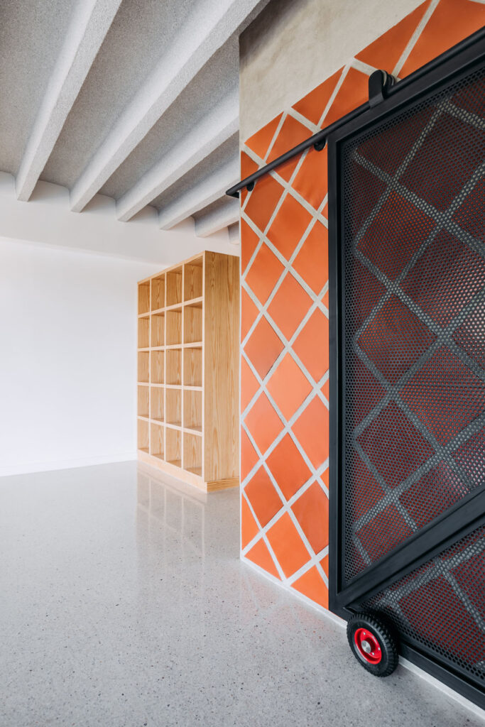
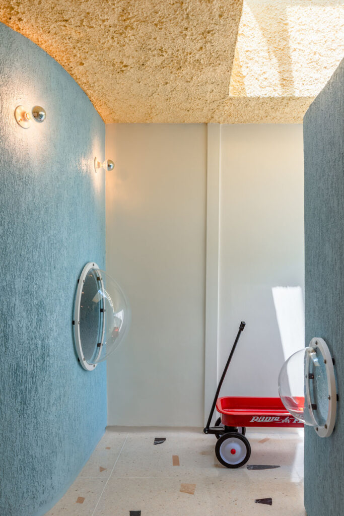
For us, colour and form held a key role in the design process. Having a space with no windows forced us to be precise about how we utilized natural light. The roof, the coloured biomorphic volumes and the terrazzo flooring were crucial in how sunlight enters the building and can then be reflected through the different therapy modules.
Since we were on a tight budget, we started experimenting with textures with similar materials. The whole project derives from variations of cement stuccos that take on different textures at different times of day under natural light. The sunlight hitting the interior walls generate a range of chromatic and sensorial experiences.
The pastel colour palette was also used for both psychological and functional reasons. Through our research we found that bright colours boost creativity, productivity and self-awareness, and as a functional aspect, it helped to reflect sunlight and generate a fresh environment inside.
What’s next for Atelier Caracas?
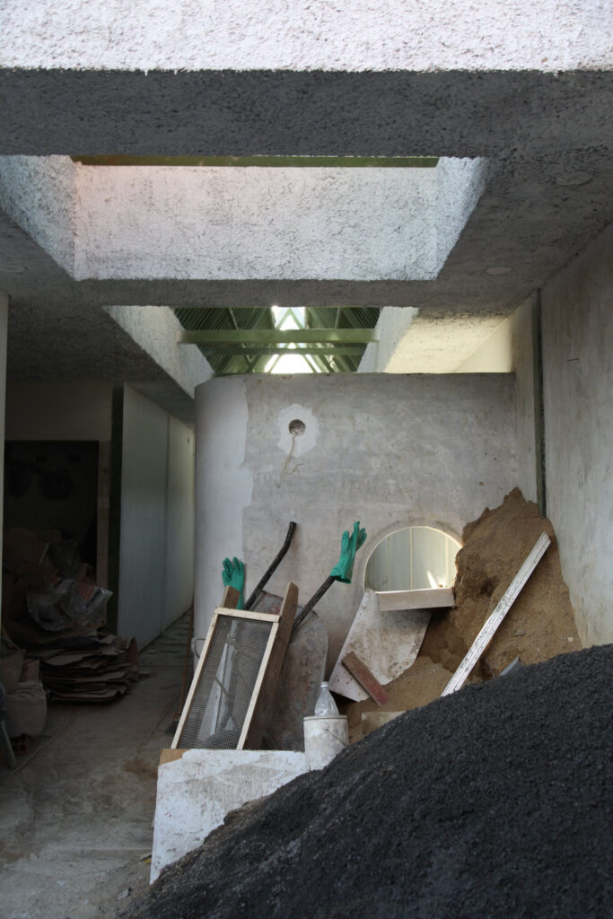
We’re currently finishing a lot of projects that we’ve had under construction, so hopefully this year we’ll be publishing some of them on several digital and printed platforms.
We’re also planning to launch our second furniture collection with design gallery Studio Boheme by the end of this year. We can’t reveal anything yet, but as a teaser all we can say is that it is called VENUS.
Credits
Atelier Caracas was nominated for the Royal Academy Dorfman award in 2019. Their work has been featured internationally in Domus, Architectural Digest, Dezeen, Frame, Divisare, Vogue and more.
Images · ATELIER CARACAS
https://ateliercaracas.com/