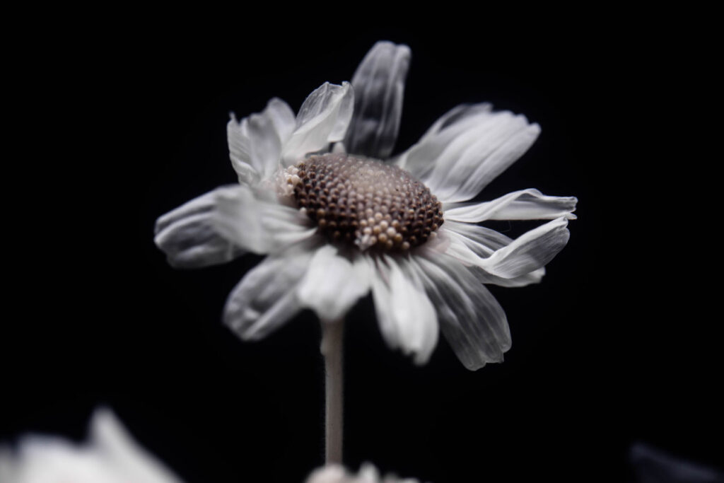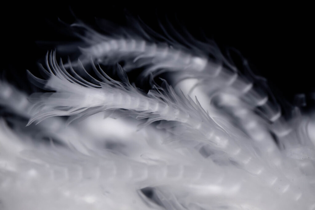
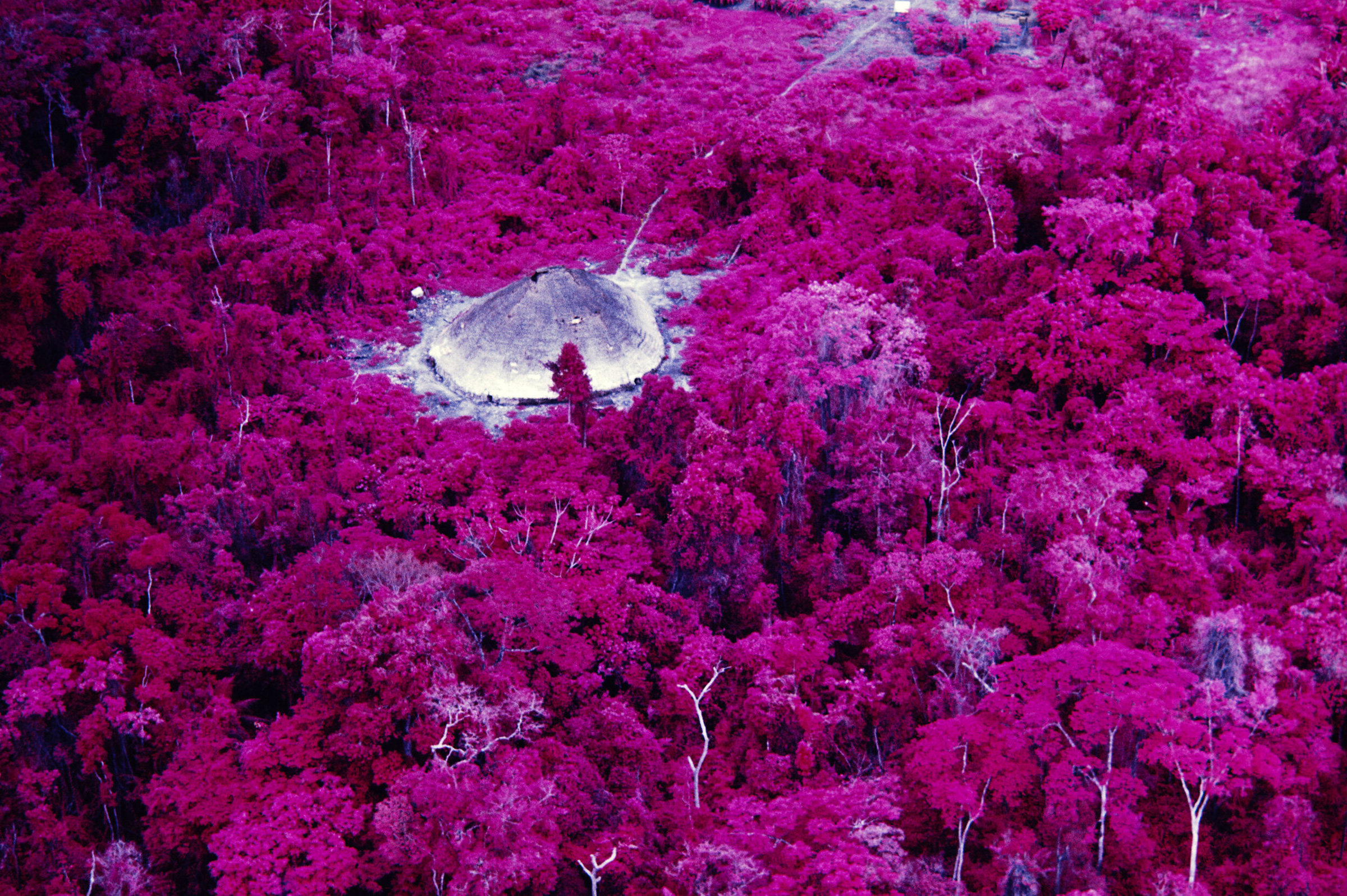
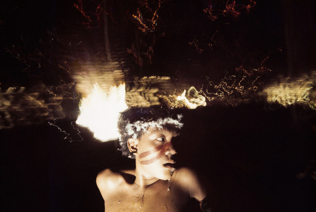
Andujar often applied Vaseline to her camera lens, used flash devices, infrared film, and oil lamps to create visual distortions
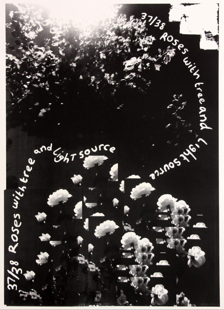
The Barbican’s latest exhibition explores the work of Claudia Andujar, a Swiss-born Brazilian photographer and activist who has spent her life documenting and defending the Yanomami, one of Brazil’s largest indigenous peoples. Through a collection of over 200 photographs, an audio-visual installation, and a series of drawings by the Yanomami, the exhibition explores Andujar’s relationship with the Yanomami that spanned five decades, and details periods of direct activism amongst the indigenous communities.
The exhibition is housed in The Curve, featuring powerful photographs from Andujar’s first six years living with the Yanomami and explores how the photographer used her camera as a tool to drive political change. At a time when the Yanomami’s territory and way of life is being threatened from continued illegal mining and the spread of Covid-19, the exhibition holds particular significance: it shows how Andujar dealt with visually interpreting a complex culture, and how her art serves to amplify the voices and struggles of the Yanomami.
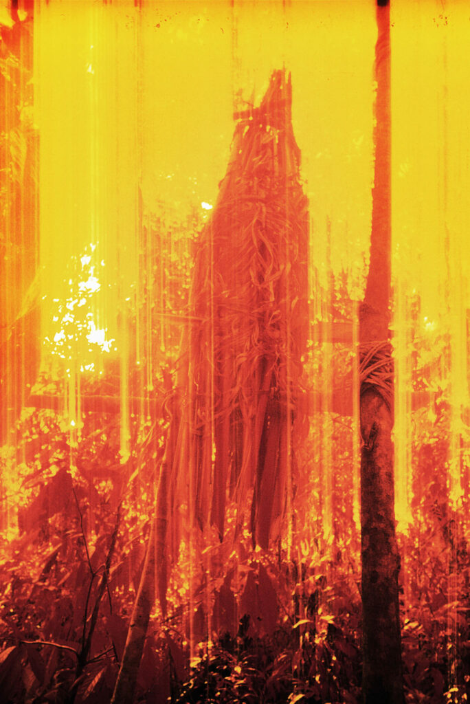
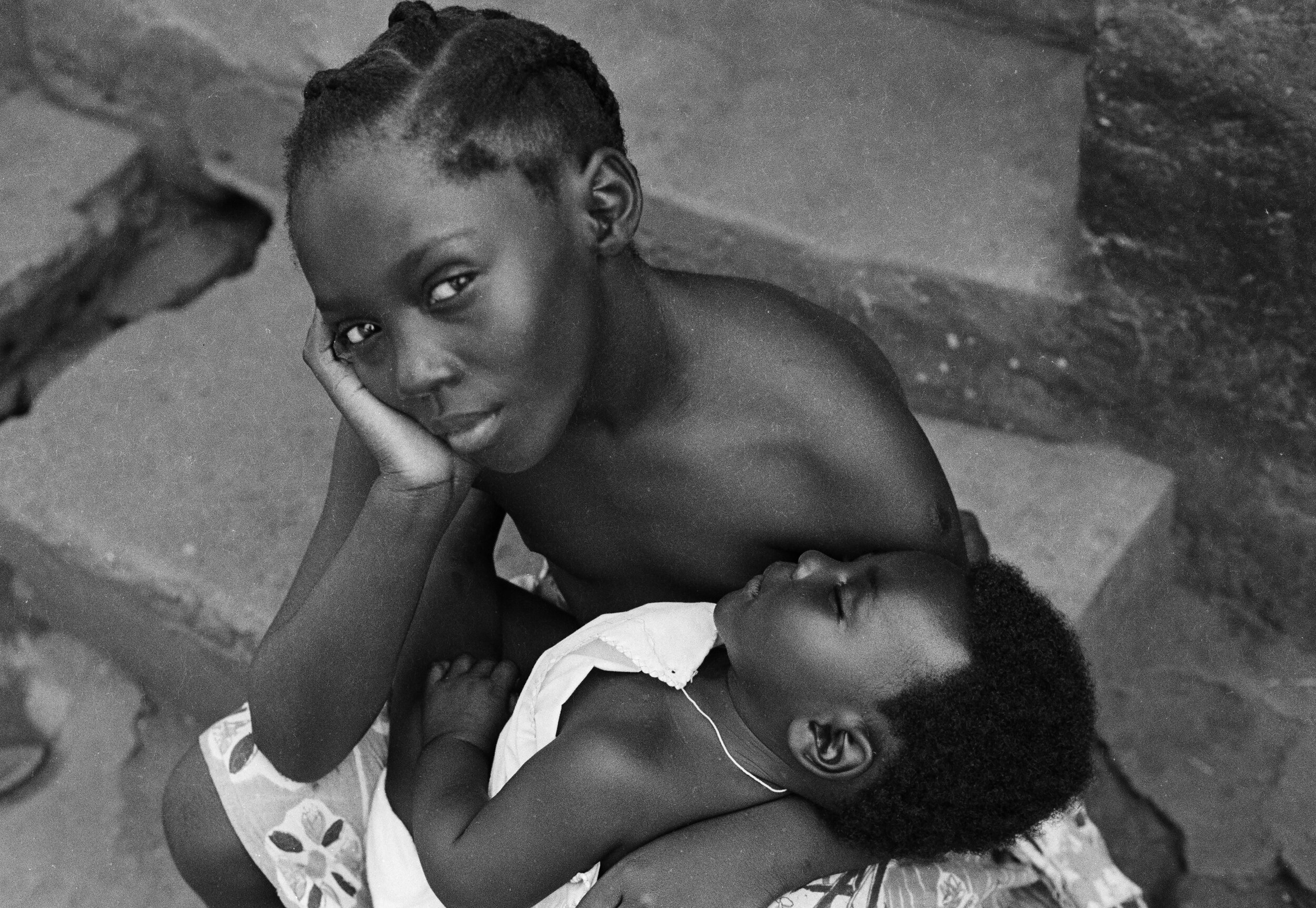
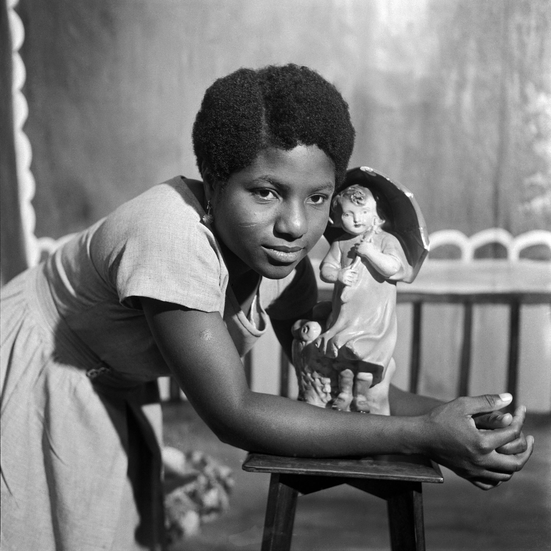
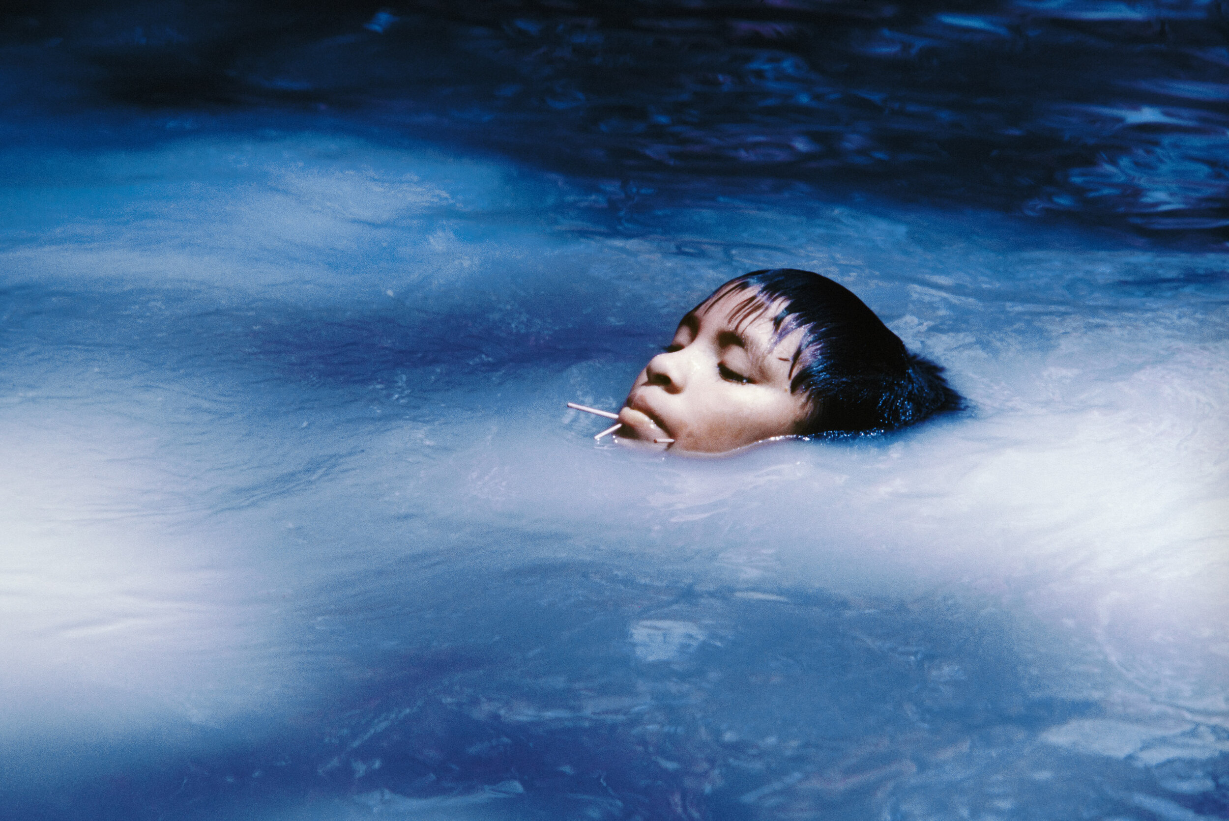
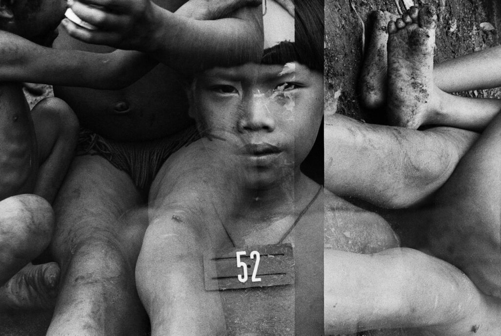
From the start of her career documenting the Yanomami in the 1970s, Andujar’s photographic approach differed greatly from the traditional documentary style of her contemporaries. The photographs she took during this period experiment with a range of techniques to visually translate the shamanic and ritualistic culture of the Yanomami. Andujar often applied Vaseline to her camera lens, used flash devices, infrared film, and oil lamps to create visual distortions of light streaks and saturated colours that imbue her work with an ethereal quality. The exhibition also features a series of more sober black-and-white portraits of the Yanomami that focus closely on their faces and bodies, using an intense chiaroscuro to create a strong sense of intimacy.
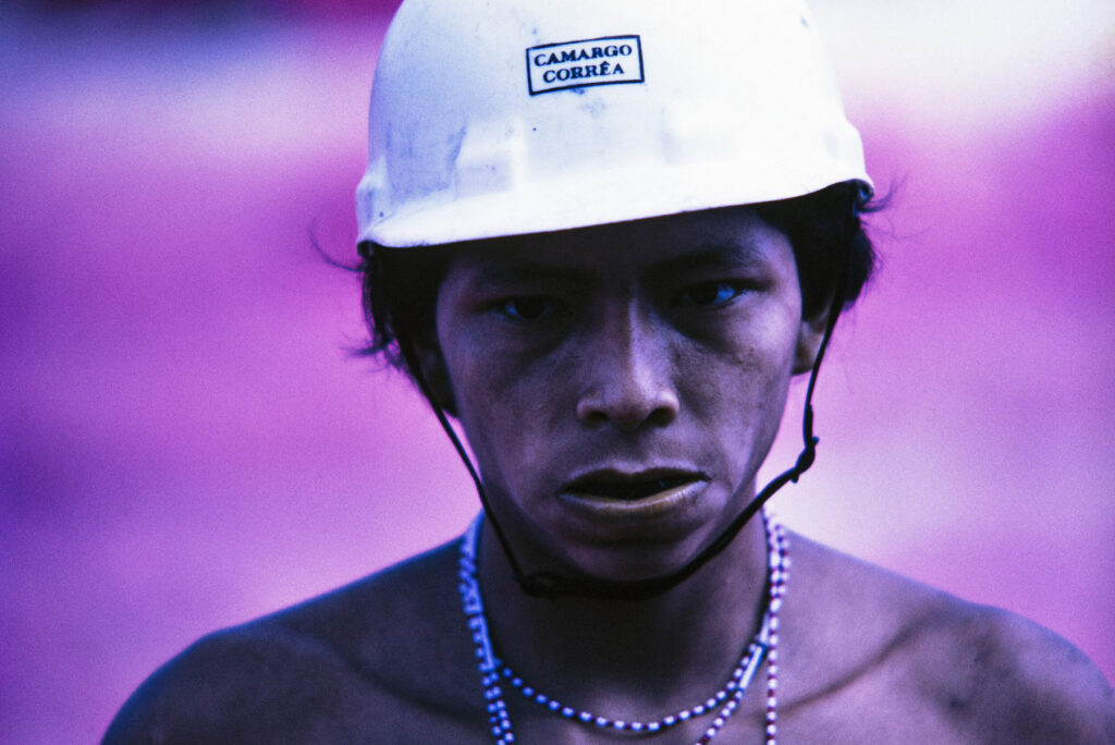
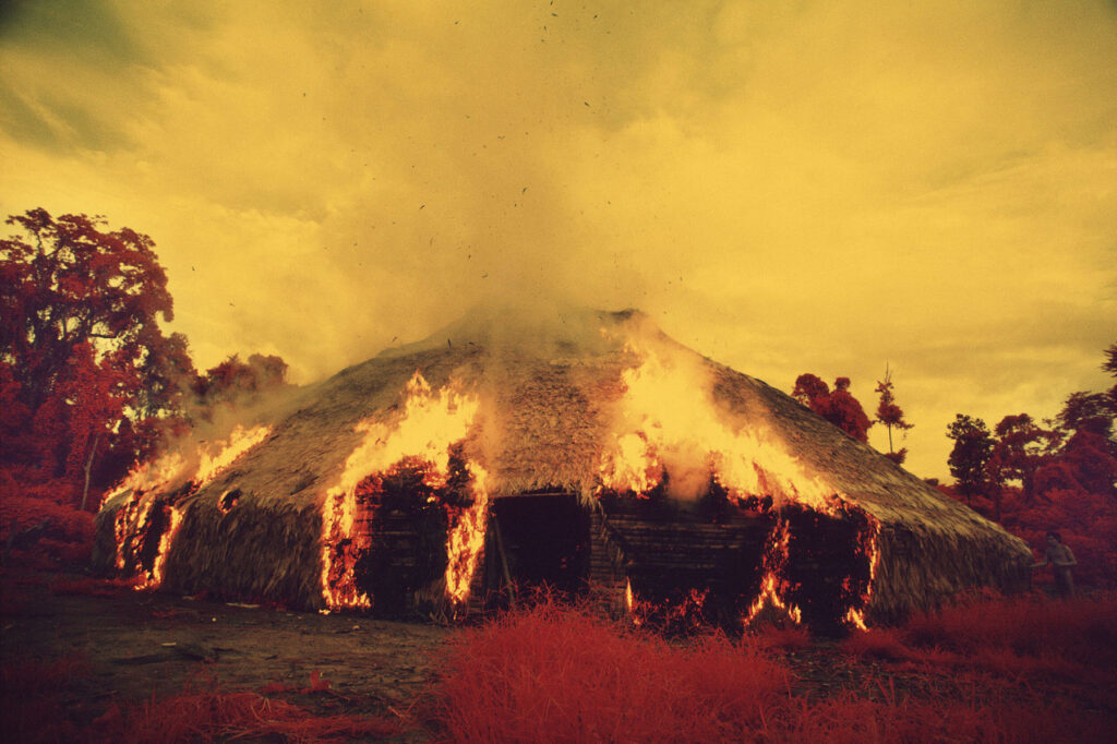
By the late 1970s, Andujar had reached a pivotal point in her career. With the Amazon region opened to deforestation and invasive agricultural programs, entire Yanomami communities were destroyed. Andujar deepened her commitment to the Yanomami struggle, and in 1978 she helped found the ‘Commissão Pro-Yanomani’ and began a campaign to protect their homeland. Andujar’s artistic career at this point was abandoned in favour of using photography solely to raise awareness for the cause.

As a photojournalist and a European, Andujar’s project is still a complex one: it cannot be wholly separated from the history of the colonial gaze on indigenous people. Yet it is clear that she has been welcomed by the Yanomami – films, drawings and texts by the community leader Davi Kopenawa throughout the exhibition demonstrate. It is without a doubt that Andujar’s work powerfully captures the struggles of the indigenous peoples and delivers both a unique peek into the lives and worldview of the Yanomami and a potent condemnation of the violence enacted on them.
‘Claudia Andujar: The Yanomami Struggle’ is on at the Barbican Centre until 29th August. Discover more here barbican.org.uk