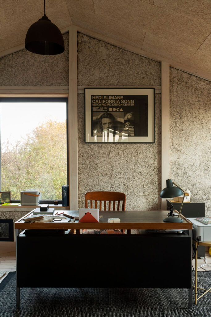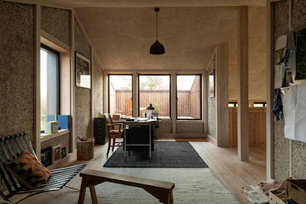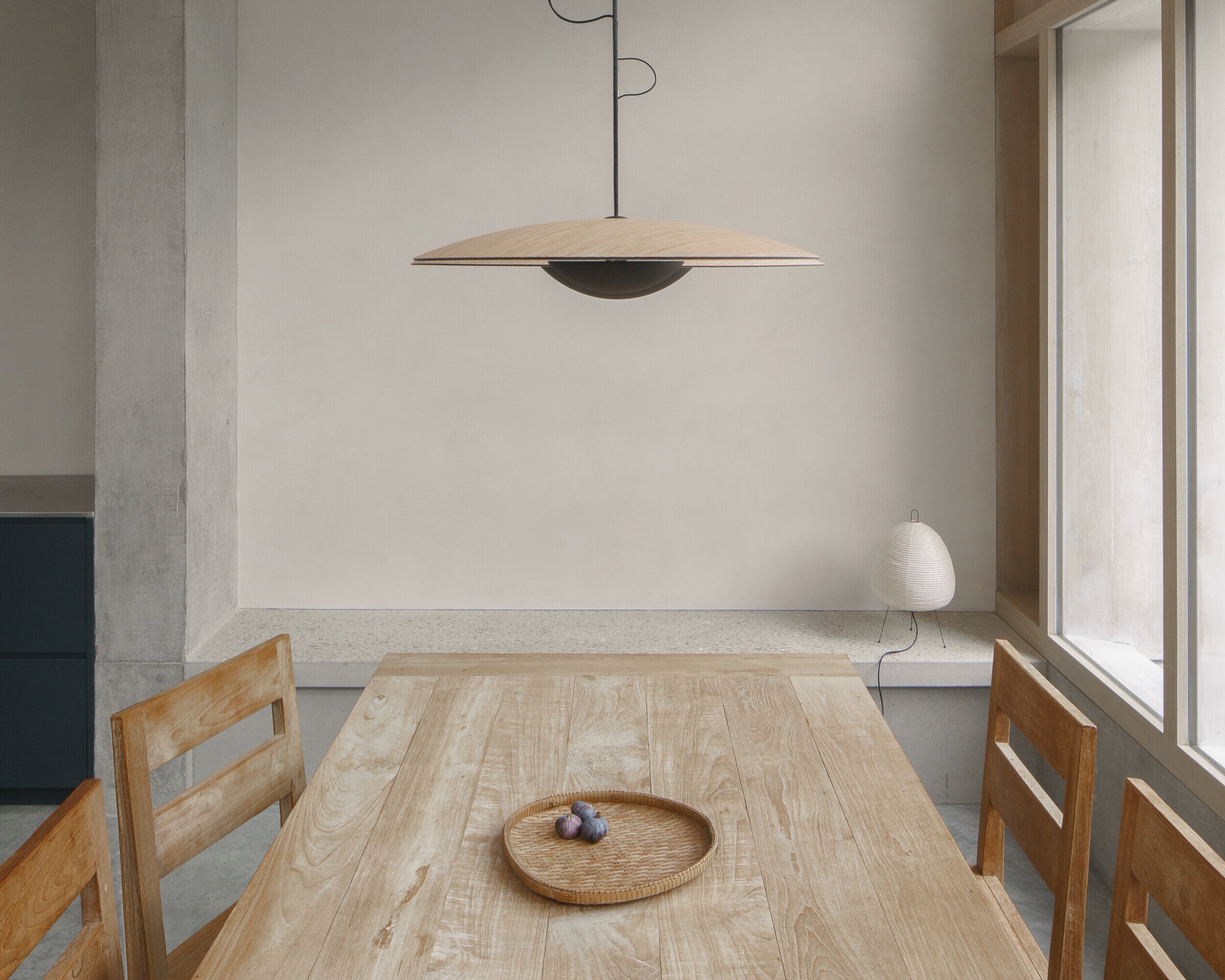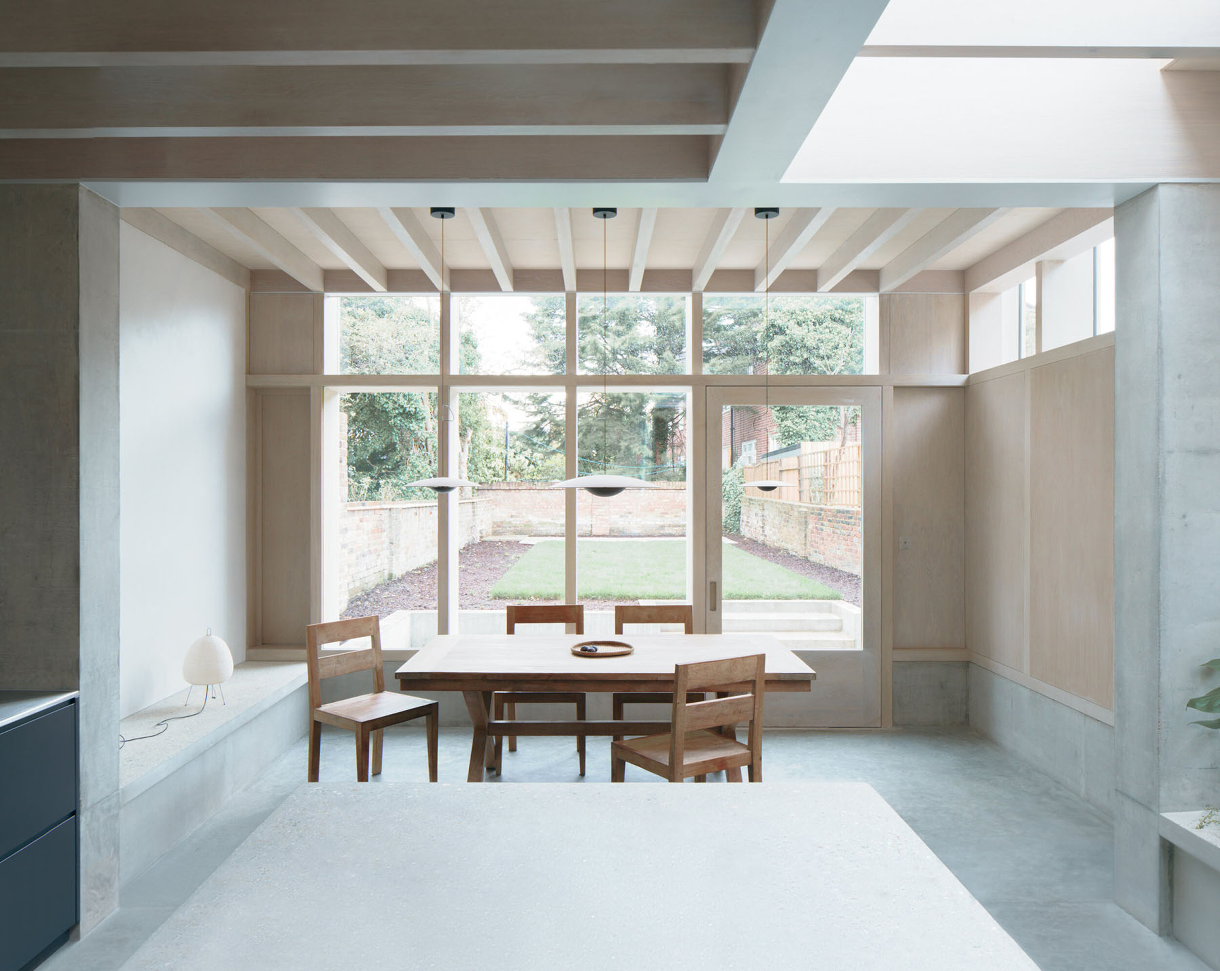
Ben Kelly

“Keep going, don’t stop”

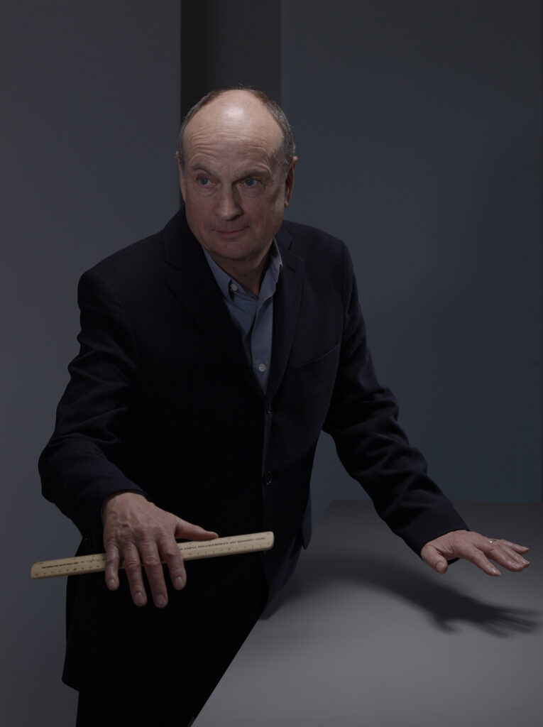
One of the UK’s most influential designers Ben Kelly is perhaps best known for designing the interior of the famous Manchester nightclub, the Haçienda which was infamous in Manchester’s post-punk house and rave scene. Of course, this is only a tiny part of his extensive and varied career. Kelly has worked with big names such as The Sex Pistols, Virgil Abloh, Factory Records, Vivienne Westwood and Malcolm McLaren. However, speaking to him one is reminded of their favourite university lecturer, sternly indulgent and ultimately kind to anyone who falls under the umbrella of the ‘young creative’.  He has the interview questions before him, he’s made notes and he asks questions. “What does NR stand for?” “How did you research me?” “What university did you go to and what did you study?”. It’s certainly a novel experience for the interviewer to find themselves becoming the interviewed, and that is only the start as NR Magazines joins Ben Kelly in conversation.
You originally wanted to be an artist before you went into design. If you had stuck to that initial career path what do you think your art practice would look like today? 

Well, that’s a simple yet complex question. Who knows what the answer is without having a crystal ball. But when I was applying for my postgraduate at the Royal College I was asked why did I want three more years of further education in the interior design department. My answer was I wanted to discover whether it was possible to mix together art and interior design to produce what I called art interiors. I had equal interests in those two subjects. When you’re a student doing interior design it’s frustrating because you never get to see an end product, it only ever exists as drawings and models. But I was lucky enough to have the opportunity to work with another student to redesign the student bar at the Royal College. I named the student bar the Art Bar and we had a neon sign made saying art bar which is still there today. That’s one of my proudest things that’s been left behind. We went about that project as designers and artists because we had carte blanche because we didn’t really have a client.

Fast forward, I ultimately felt that some years back I had achieved my goal of this combination of references to the art world within the discipline of interior design. Ultimately in the last three or four years, I have produced a number of art installations in 180 The Strand. So I have kind of achieved my goal in a roundabout way. Along that way maybe I was using clients to experiment with this notion of producing what I called art interiors. When we had a looser brief I took that opportunity to investigate those possibilities. I also now operate as an artist in the art world, all be it slightly obliquely, and produce interiors so that’s my answer.

You stated that you are inspired by Marcel Duchamp and that he has “pretty much inspired everyone in the creative world, some way or another.” How exactly do you think he has inspired everyone? 

Well, I scribbled down by default. That’s a complicated question but I guess my answer would be that it is an accepted fact, stated by Duchamp himself, that he either intended to or did change the way we look and think about art. If you move that on into the world of design and the broader world it’s unquestionably influenced by the thoughts, approach and activities of Duchamp. I think it’s bled into design and architecture sometimes in subtle, sometimes in obvious ways. It can be almost subliminal. So it’s there under the surface, not necessarily clear or obvious but I believe life had changed generally thanks that one man being on the planet and doing what he did. Without Duchamp, our lives would be different in a quieter way. It would be a poorer world. The thinking behind everything would be different and it would look different. It would lack subtlety and humour.

“Duchamp opened a new toolbox of thought processes and an application of ideas, a new language.”

So historically you go from Duchamp to Richard Hamilton, the artist who reproduced The Large Glass of Duchamp. Hamilton taught at Newcastle School of Art in the late 60s where Bryan Ferry of Roxy Music was a student. Ferry was under the spell of Hamilton who was under the spell of Duchamp. Ferry was equally influenced by Duchamp and the lyrics of his songs related back to him. When I designed the Haçienda I struggled to find a background colour for it because there were acres and acres of walls. I had an idea of that colour but I couldn’t grasp what it was. I eventually found it on an album cover by Bryan Ferry called The Bride Stripped Bare which is a title from a Duchamp artwork. So I enjoyed that connection. I told Ferry about that anecdote and his answer was “I’m glad I could be of help,” and off he trotted.

How has he inspired everyone? By default. By a subtle undertone of influences that other people, other designers, other artists, other thinkers who have drawn inspiration from Duchamp, and that seeps through the cracks.

How would you describe your identity in design? 

I don’t and I won’t and I can’t. I like to have an independent identity and not be associated directly with a given description, but I’m interested in the broader description of popular culture. I operate under that umbrella to a degree, but not all the time.

There are two quotes by journalists, which doesn’t answer your question but it sort of does. One is certainly my all-time favourite. In 1982, the same year I did the Haçienda, I did a hairdressing salon on the King’s Road called Smile. Smile was a really fashionable hairdressing salon they started in Knightsbridge and lots of fashion and music people went there. They took this property on the King’s Road one door away from Malcolm McLaren and Vivienne Westwood’s shop. My brief to myself was to design a hairdressing salon that looked the least like a hairdressing salon as possible.  In other words,  it wasn’t a typical hairdressing salon. So each styling position was different to the next one, they were all different and I used the colour orange. This journalist said, “Ben Kelly rescued the colour orange from the scrapheap of style”. It doesn’t get any better than that as far as I’m concerned.

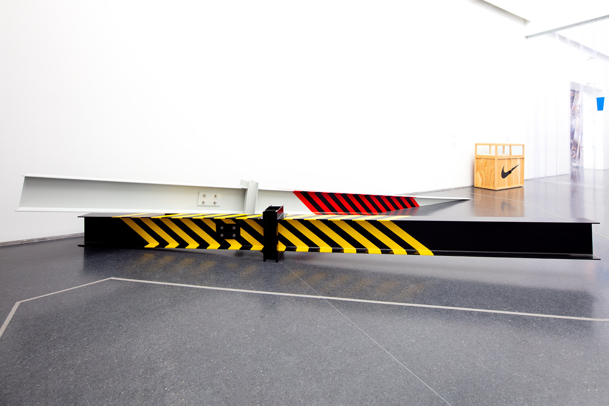
The other one was about the Haçienda. A journalist referred to it as “the motorway aesthetic”, simply because I used cats eyes and roadside bollards in the scheme. So I leave what my identity in design is for other people to decide. That the job for other people it’s not mine. I just like to be independent and keep pushing boundaries. Going back to Duchamp, I like taking one thing from one world and another thing from another world and putting those two things together that have never coexisted before and suddenly something new happens.

You have stated before that you have been quite angry with people ‘sampling’ your work, but do you think that anyone can create anything truly original in this day and age? 

Well, your research has lead you to quotes where I’ve said I’ve been angry or pissed off or whatever and quite a lot of those things I’ve said tongue in cheek. I think I know what specific example is being referred to here. It’s very flattering if people copy your work. However, going back to the Haçienda, (or it might have been the Dry Bar, I can’t remember which one), but within weeks, not that far away, another place opened and it was almost identical to the piece of work we’d done and that pissed me off! It was incredibly opportunist of whoever that was.

Fast forward. I painted stripes on the columns in the Haçienda, merely as a method of making them clear as hazards as they were on the dance floor. So I took the language of factories and workplaces where hazards are marked as per British standard. But that simple gesture I made somehow found its way into popular culture and it’s kinda gone global, you see it everywhere. One person in particular had seen it, someone who became a friend and a collaborator.

“A man called Virgil Abloh put stripes onto garments for a label called Off-White.”

I didn’t know anything about Virgil or Off-White when it was brought to my attention. It seemed pretty obvious where the inspiration for that had come from. It took me by surprise at the time and I was kind of shocked.
It must have been quite frustrating to see that after spending so much time and effort coming up with the ideas.

Well it was just work, and I never thought it would go further than that. Yeah maybe I got pissed off but it took me a while to think about it and understand that it was absolutely no different to what happens with music and the whole idea of sampling. As I’ve said I don’t own copyright on stripes, that would be ridiculous to even think about, but ideas and copyright are so difficult to define. You end up being philosophical because,

“Virgil sampling something I did has paid dividends beyond what I could even imagine.”

It lead on to him and I collaborating, and becoming friends, and opening doors, and making other things possible. Now he’s probably one of the most famous men in the world and that’s not a bad thing to be associated with. It’s a funny old world.

Do you think the idea of copyright and people copying work has gotten more complex with the rise of the internet? 

This might sound contradictory I think it had become both more complex and more simple. Because I think we all now understand the idea of sampling. However, copying is a different thing and I will give you a couple of examples. There is a film called 24 Hour Party People which was all about Factory Records, the Haçienda and the whole factory scene in Manchester. It was directed by a man called Michael Winterbottom who I mostly think is a great filmmaker, a man with integrity, but they copied my design of the Haçienda. They had to rebuild it for the film and they approached me for help but as soon as I suggested a fee might be charged they disappeared. The film came out and they did an amazing job but they copied me. That design is my copyright and that’s all designers have. You only have copyright to protect your work so if it’s copied to the millimetre without your permission there’s something wrong there. I spent several years fighting it legally. I wanted to make a big thing about that and take it to the press to make a noise about how important the issue of copyright is but I was so exhausted by the time the distributors of the film settled out of court, I just wanted to let it go.

More recently Manchester City football club have done their version of Haçienda strips on their T-shirts and that really made me very angry. Nobody spoke to me about it and I thought they did a very poor job, I didn’t enjoy what they had done. Of course, they are one of the richest football clubs that there is, so how could I do battle with them? I have to be philosophical and say a bit of a poor show on their part.

So that’s the way it goes with copyright and sometimes it’s relevant and sometimes it isn’t. You have to be careful and young designers do get their work copied, particularly in the fashion industry. I don’t think that young people are sufficiently aware of how to protect their work. I always wanted to make a noise about it but I was exhausted and wanted to move on. However, I make reference to it where I can, like now, to bring awareness.

How has designing the Haçienda influenced your design journey and ethos? 

That’s a huge question for me. The Haçienda opened in 1982. Next year it will be the 40th anniversary of the opening.

“My quote is the ‘Haçienda never dies’, and it doesn’t.”

Its influence and story, it’s embedded in popular culture. It’s been acknowledged as one of the most important nightclubs for a whole host of different reasons. However, for me at first, it became the monkey on my back. It wouldn’t go away and people would only talk to me about having designed the Haçienda. Of course, I’ve designed many things, many different types of interiors, and many other things outside of interior design, and that kind of annoyed me. Then I stopped being annoyed and realised that it was a massive asset to me.

My interpretation of your question is, having designed the Haçienda, the slipstream that followed on from it has massively influenced, and lead on to, the majority of work  I’ve done ever since. I could say possibly 99% of what I’ve done since, in one way or another, there have been references to the Haçienda, or it happened as a result of Haçienda, or some intersection of those. Something to do with the  Haçienda has been a part of nearly every project I’ve done since. That might not be visible or legible or understandable but I know it’s embedded in there somewhere. So that’s fed into work I’ve done in many other disciplines, it’s been a big part of what I’ve done.

You worked on the set design for the PTB19 runway show. How do you see interior design and fashion working together in the future? 

Again with that project they came to me because the collection they showed had been partly inspired by the design of the Haçienda. For the set, there are subtle references to the design of the Haçienda which are
mostly some black and yellow stripes. I’d like to think it was done in a poetic and subtle way. It was great I really enjoyed doing that show.

But to answer your question, I have no idea, I can’t predict the future. Well, going back to Virgil, his last Off-White show was done virtually because of the pandemic. My observation was that he’d taken his inspiration for the set from a combination of two interiors. One was was The Barcelona Pavilion by Mies van der Rohe. The other was a set from 2001: A Space Odyssey by Stanley Kubrick. So obviously you get this really heavy mix of references which is a kind of Duchampian. I know that Virgil, is as obsessed with Duchamp as I am, it’s something we share. So fashion and interiors, there’s no limit to that collaboration. I expect to see really rich pieces of work coming out of that combination of design disciplines and industries. People like Virgil are in the luxurious position of leading the way because they have big budgets and can work with the best people in the world.

But if you put all that to one side and bring it back to young people, who’ve left college and are trying to find a way of being creative, that’s where my interest lies. The future belongs to them and it’s the hardest environment to be operating in right now, my sympathies lie hugely with young people. But finding a space, finding backers, finding a budget, being able to just go to a nightclub, is almost unaffordable.

“To buy a drink in a bar is almost unaffordable so new ways have to be found. They have to be super creative, and sidestep the mainstream and find another way.”

That’s why punk was so great, it was two fingers to authority and invent your own ways of doing things. It didn’t last that long but the spirit and the ethos of it is still there. I’m looking forward to the revolution.

Has Covid affected how you approach your art practice, and if so how? 

Well yeah, that was interesting when covid hit and the lockdowns and the poor handling of it by our government. I’m very lucky because I’m sat here talking to you from my studio in London, but I have another, bigger, studio on the south coast. So I went and isolated down there and the phone stopped ringing, well it’s emails and texts these days, but that all stopped and went quiet.

I had been asked to design a piece of artwork as a print, but the pandemic put a stop to the exhibition happening. So I’m sat there in my studio and I thought “I won’t make it as a print, I’ll make it as a painting”. It was to do with the language of the Haçienda, and I thought “Oh I could do another one” so then I did another one and another one, and I did maybe fifteen or sixteen of these paintings over the first and the second lockdown period. It was fantastic, it was like therapy, it was another form of expression. I’m hoping that some paintings I’ll be able to show in an exhibition. So the pandemic physically affected my art practice in that it made me sit down and make some paintings which I enjoyed. It will lead on to me doing more of that kind of work. Something that I independently drive forward, there isn’t a client or a brief, it’s just me. So I have the pandemic to thank for that.

What advice do you have for young creatives looking to work in design? 

Be independent, is my advice. Keep going, don’t stop. Mistakes will be made but you learn from those mistakes. You will fail at things, but failure teaches you an awful lot. When I started it was so much easier, because my first projects were done for people who were friends or like-minded people. Now it’s much more complicated because everything costs more money, there’s less money around and the internet changed everything. We need to find a way for young people to operate. For young creative people in the art world to find space to do what they do and add richness to our lives.

“Richness is being removed, the oxygen is being sucked out, and we need to fix that.”

Are you working on any projects at the moment and what plans do you have for the future? 

Well, two things. I have done a collaborative project with a photographer called Eugene Schlumberger. Using Kickstarter we have funded a book called Haçienda Landscapes. The story there is I stumbled upon his work on Instagram. I kept seeing these photographs that I thought were really beautiful and really just compositionally well thought out and I realised that they were referencing the Haçienda. This guy was finding the language of the design of the Haçienda out in the post-industrial landscape in the North-East of England, with all the ruined factories and machinery with hazard stripes. I messaged him, we started talking to each other and eventually met up in London. I said we need to do a project together and it should be a book called Haçienda Landscapes. I’ve also been taking photographs over the years of things that kind of reference the language of the Haçienda but mine were more snapshots. His are quite thought out, carefully composed and it makes a really nice kind of contrast with these two different sets of photographs. We’ve been very successful so I hope we are going to produce a thing of great beauty. The other is an exhibition at 180 The Strand which has turned into the most amazing alternative art space. The owner of the building is someone I’ve known for a very long time and they’ve commissioned me to do a couple of installations there. It’s going to be called ‘Columns, Revolving Mirrors and International Orange’.

Credits

Images · BEN KELLY

The Ranch Mine

“Our identity is the fuel behind the best design and architecture”

Architectural studio The Ranch Mine draw inspiration from the rich history of the pioneers who settled in their local state of Arizona in search of a better life. “We chose our name to honour those that have come before us, the humble ranchers and miners, who have paved the way for our opportunities for prosperity today, and to serve as inspiration to design spaces that afford us the opportunity to imagine what’s beyond what we see in the present so we can strive for new experiences.”

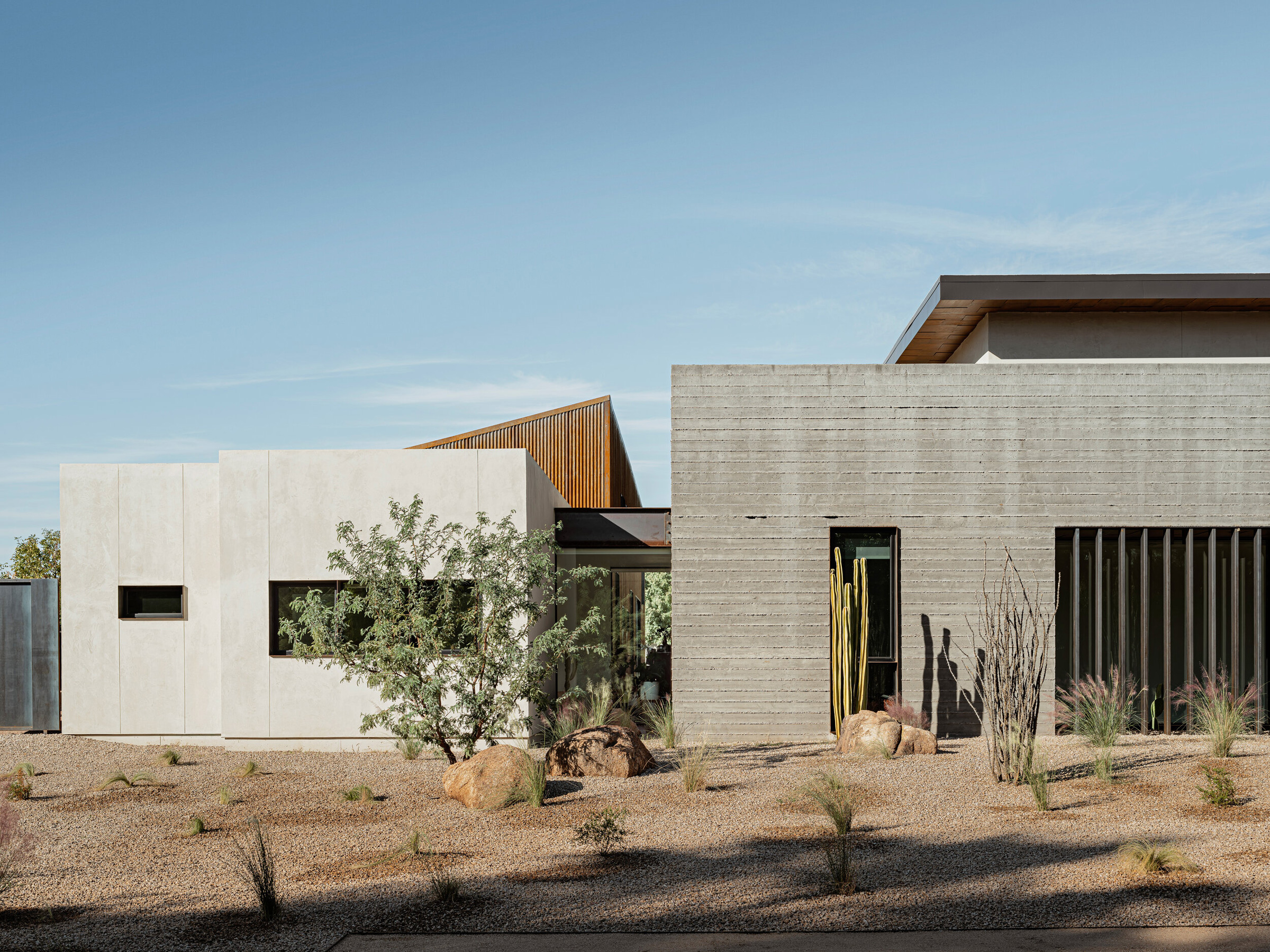
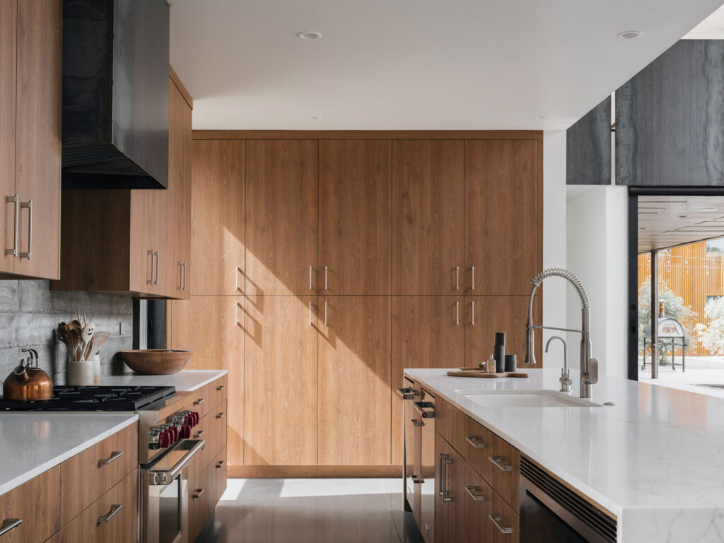
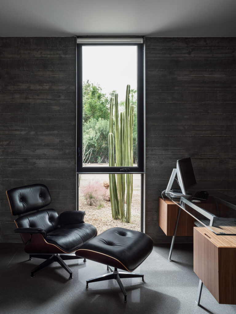
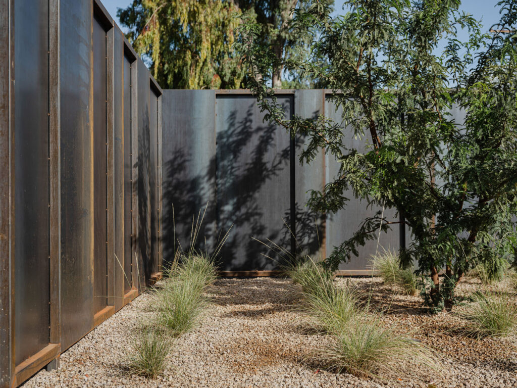
In 2018 The Ranch Mine was approached by a family who owned a large plot of land in Phoenix, Arizona to create a home “in which their family could grow and create.” One member of the family is a ceramic artist and The Ranch Mine drew inspiration from the ancient art of pottery when designing the property. The name Foo House is derived from the Chinese character ‘Fu’, which means good fortune and luck, as a nod to the client’s Chinese heritage.

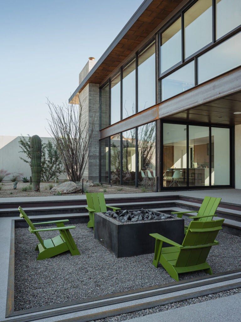
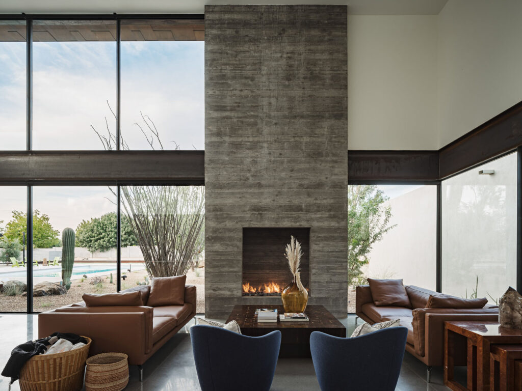
Phoenix is located in the northeastern reaches of the Sonoran desert and is known as The Valley of the Sun. With dusty-grey board marked concrete, orange weathering steel, and shades of olive and cream Foo House embodies the spirit of the desert with a sprawling and airy design. NR Magazine joins The Ranch Mine in conversation.

How do you think identity informs design and architecture?

We believe that identity is both the reason for design and architecture and the result of design and architecture. Our identity is the fuel behind the best design and architecture. Architecture is a reflection of who we are, our time, our place, and our culture. Who we are and how we live shapes the form and function of the spaces we create. What is really fascinating to us is that who we are is inextricable from where we have been and where we are. We shape the built environment, and it, in turn, shapes us. This is why it is critical to continue to infuse the identity of people into spaces, and design for opportunities to grow beyond who we are and what we see today.

Foo House is influenced by the ancient art of pottery. How did this factor into the design specifically?

We are fascinated with history and love how pottery has played a critical role in most societies in human history as well as our modern-day understanding of those societies. So we broke down what makes pottery interesting to us, and how could we take those principles to inform a new piece of architecture. The design emerged as a home that is rigid in structure while malleable in use, precise in form while imperfect in texture, and varied in volume while limited in materials.

Are there any new technologies in architecture that you are particularly excited about?

One of the most exciting things about architecture is the development of building science, and how we can use new materials to improve tried and true ancient ways of living. The newest technology that we are excited about is a company based here in Phoenix called Source that has created a hydropanel that is the first renewable drinking water system. It creates drinking water from the air through the use of solar energy. Living in a desert where water is a precious resource, this is very exciting to us.

Given the issues of rising temperatures around the globe and the location of Foo House was this something you had to consider when conceptualising the architectural design of the property?

Phoenix is definitely at the forefront of dealing with extremely high temperatures and has been for a while. Studying the sun, the most powerful element here is where all our designs begin. Foo was designed as a large courtyard house that follows the sun’s day arc, shielding the interior from times of extreme heat. Courtyard houses have been effective ways of living in the desert dating back 5000 years to Kahun in Egypt and possibly earlier. They are self-shading, providing a space to either embrace or escape the sun at all times of day throughout the year.

Other than the ancient art of pottery were there was there any other influences or inspirations that you drew on when working on this project?

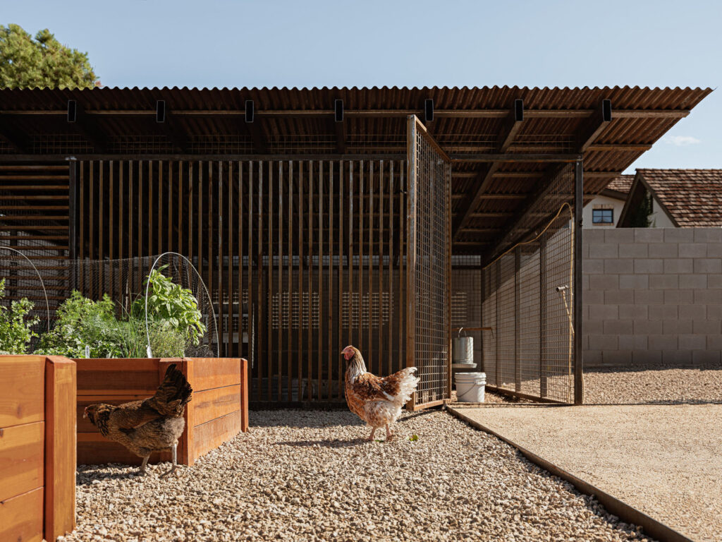
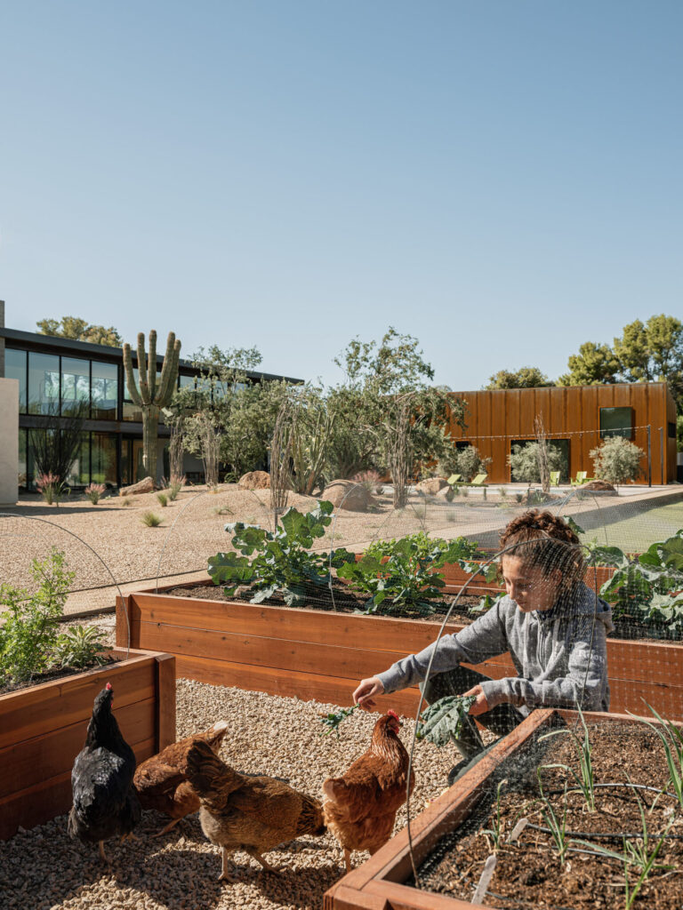
We always draw inspiration from our clients, who in this case were a very “hands-on” family, starting with their professions but leading to their kids playing musical instruments, gardening and raising chickens, and making robots. We wanted to go beyond just making a pottery studio and maker space to satisfy the “what” of the scope. We wanted to build on the essence of these items and make an entire home that reflected their family values. So the design uses a combination of the hand made and materials meant to patina and change over time, in an aesthetic some might consider wabi-sabi, that embraces the journey, the imperfections of hand made, and the transitory nature of our world. The other major inspiration in every project is the site, and its location in this world. We are fortunate to have incredible weather for the majority of the year in Phoenix. While the headlines talk about the high heat which can be intense, about 7-8 months a year you can basically live outside.

We wanted to create a home that everywhere you are in the house has a direct relationship with the exterior, and we wanted to create a lot of different types of connections, not just one big opening. The main living space has double-height glazing that faces north towards the courtyard. It has sliding glass doors that open it out onto the covered patio towards the outdoor kitchen, fire pit, and pool beyond. It also has a lofted area that provides skyline views to the south and views of the Phoenix mountain preserve to the north. It provides a different perspective of the landscape. We also created glass connectors between the volumes of the house, so the landscape sort of tucks in around the house, and you are constantly aware of it as you walk from one area of the house to the next. The bedroom wing has smaller openings that frame the olive grove or high windows that look towards the sky. Using exposed aggregate concrete blurred the transition as you step outside and areas where the glass is fixed, the new desert landscape comes right up to it.

What were some of the challenges you faced when working on Foo House and how did you overcome them?

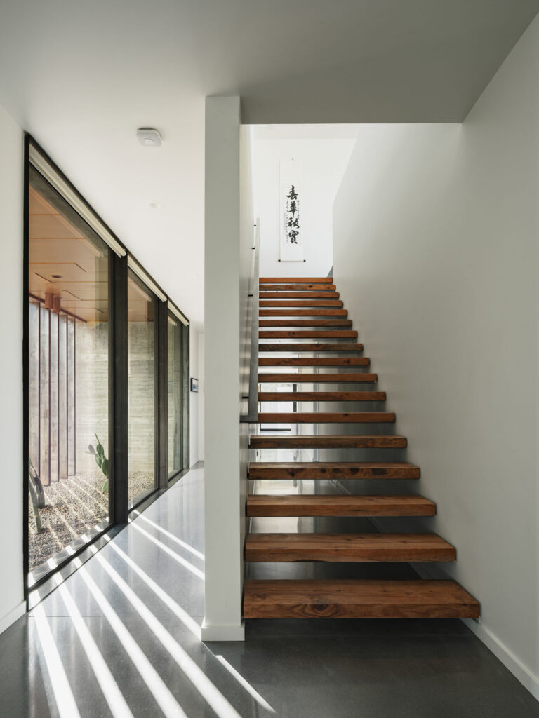
The first challenge is that the house is located in a pretty busy urban area, less than a half-mile from 10+ story towers. To create an oasis-like refuge, we shaped the building to create a large central courtyard, using the building to shield the areas that faced the busy part of the city. The second challenge was overcoming the fact that buildings are generally by their nature static. We wanted to find a way to activate the house to meet the dynamism of the family and their passions. Our approach to doing this was two-pronged. The first was to design the building to be noticeably affected by time. We did this by using materials that would patina like the rusting siding or soften the board-formed concrete joints as well as using vertical floor to ceiling windows that face due south that act like sundials throughout the day. This is most noticeable where we shifted the hallway around the stairwell and added a steel brise soleil to highlight the solar pattern in the hallway. The second way we did this was by creating a campus-like plan, where you walk through communal spaces, outside and inside to get to more specific places. This creates casual exchanges.

When creating a family home like Foo House what are some important aspects to bear in mind?

When creating a family home, the first thing people often think of designing for is durability. While this is of course important, it is not the main driving factor for us. When designing family homes we focus on flexibility over time, spaces that inspire creativity, and a variety of spaces in which you can connect with each other, with extended family and with friends, as well as opportunities to disconnect.

The site contains a chicken coop, a citrus grove, a stone fruit grove, and raised planting beds for growing herbs and vegetables. Are there any other methods of sustainability used on the property?

The house is designed to primarily use stack ventilation in the bedrooms and main living area to use the diurnal temperature swings to help passively cool the house. The house opens up primarily to the north for indirect natural light and uses the height of the volumes to shade exterior spaces for outdoor living. The U-shaped form of the house creates a large courtyard, creating a bit of a microclimate. The roofing is a combination of white-coloured foam or corrugated metal to reflect the radiant heat from the sun. The property used to be almost entirely grass and we changed it to primarily desert and native vegetation on drip irrigation, heavily reducing the water consumption on the property in combination with low flow water fixtures throughout.

What advice do you have for young creatives looking to work in architecture?

Find out who you are first. Then put that out into the world. Once you do it will attract people you want to work with. You are uniquely you. Your identity is your gift to the world, it is the one thing you do better than everyone else. Share it.

Are you working on any projects at the moment and what are your plans for the future?

We have about 30 residential projects in the works currently. We are excited that about 1/3 of those projects have taken us into new climates, new states, and outside of the country. Each new location continues to hone our research practices and understanding of place.

Our plans for the future are focused on continuing to grow our residential practice, designing homes that expand people’s creative potential and liberate them from the confines of convention. We look forward to more projects locally as well as projects that take us to new places, new people, and introduce new challenges.

Ludwig Godefroy

“the relationship with the emotions you will feel in a space is the very essence of a project”

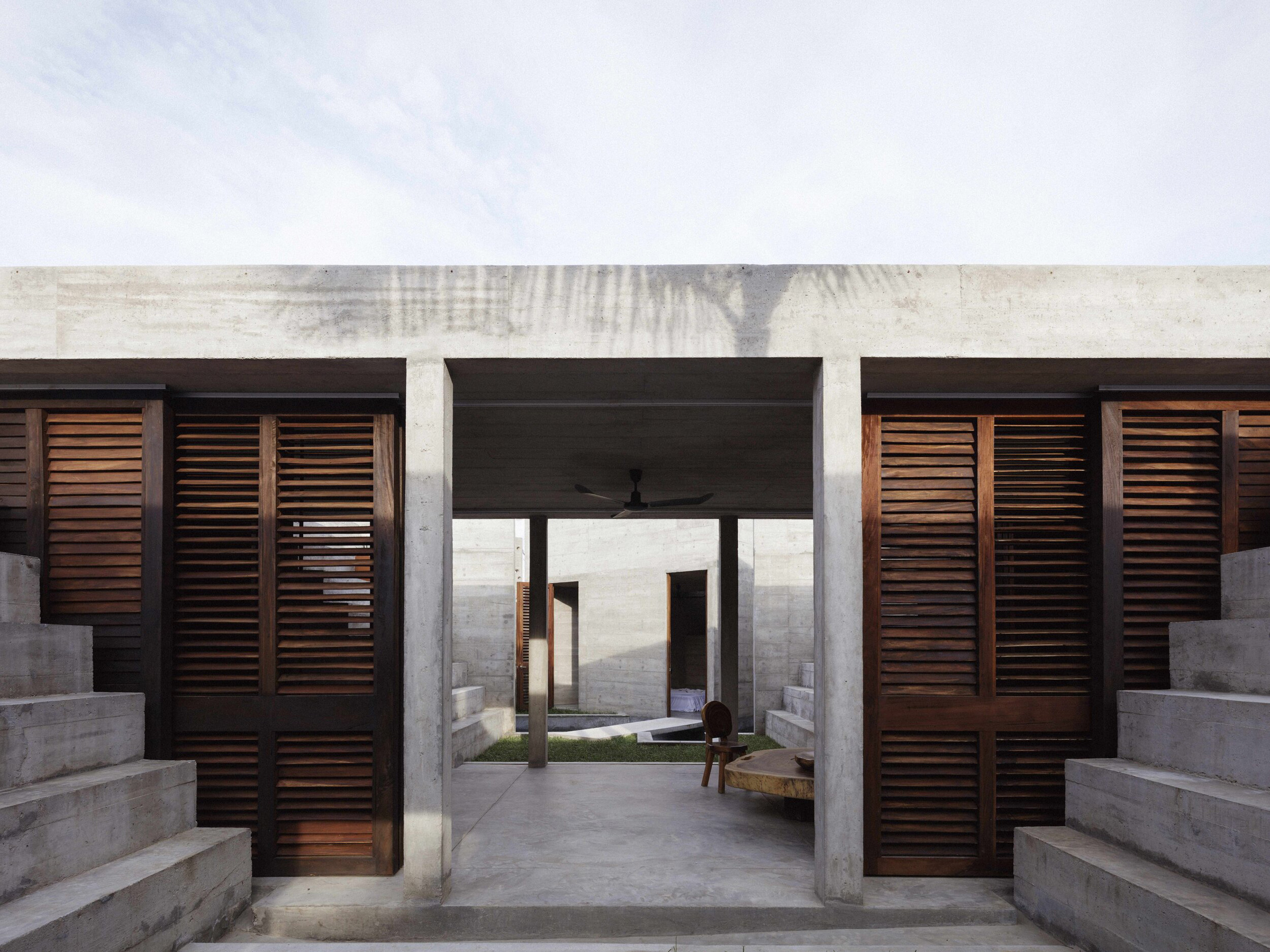
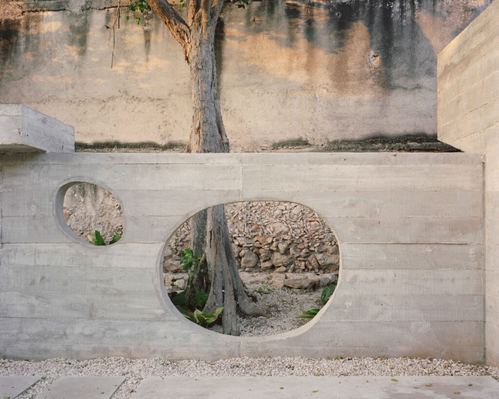
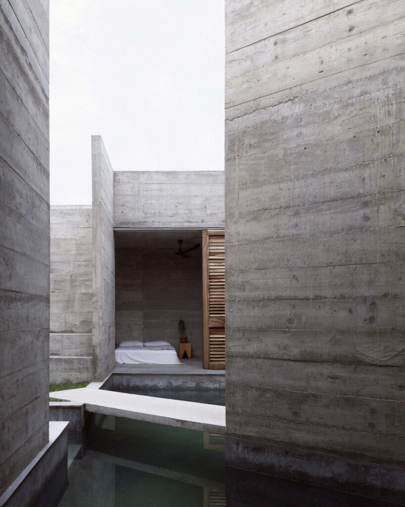
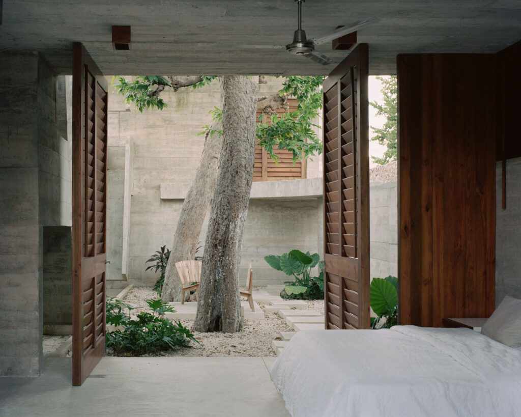
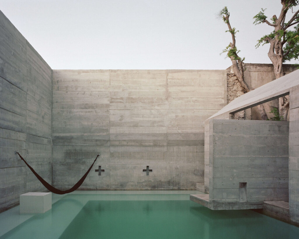
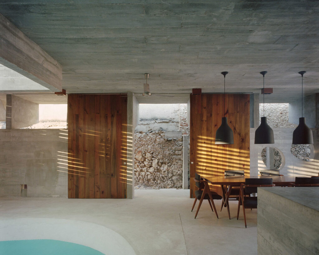
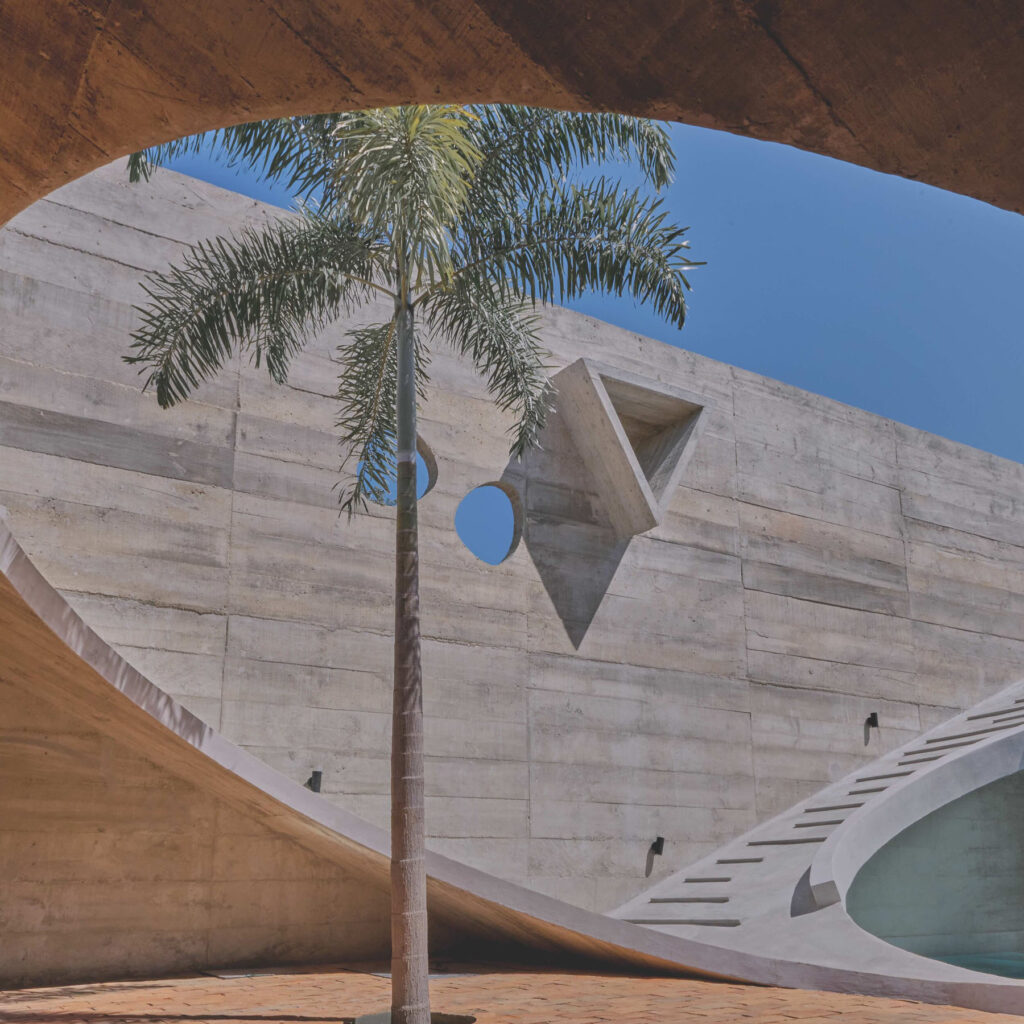
Raw concrete, old brick and pale gravel glow under the golden light of the sun in Mérida, the capital city of Mexico’s Yucatán state, which is considered as the centre of indigenous Mayan civilisation. When designing Casa Mérida, architect Ludwig Godefroy asked the question “How is it possible to build architecture that reflects and considers the Yucatán identity, to make this house belong to its territory? In other words, how could this house be Mayan?” Inside the decor is as simple as the outside, with wood, stone, and pops of blue which mirrors the turquoise swimming pool at the back of the property.

The site itself has rather odd proportions for a house, it’s only eight meters wide and eighty meters long, resembling a road or pathway more than a traditional plot of land than a home. However, Godefroy has turned this to his advantage, inserting open patios between the buildings to create traditional airflow cooling concepts in a city which is known for its extreme climate and high temperatures. He also references a Sacbé, which is the name for the ancient Mayan road system which would connect the indigenous people’s of the land. “Those straight lines used to connect all together the different elements, temples, plazas, pyramids and cenotes of a Mayan city; sacred ways which could even go from one site to another along a few hundred kilometres.” NR Magazine joins the artist in conversation.

How do you think cultural identity influences design and architecture?

Definitely, it does according to my way of thinking. I always look around me and since I arrived in Mexico, it’s been now 14 years, my architecture changed, became heavier, made out of concrete, stone and tropical wood. Mexico changed my way of designing, I started to look at prehispanic architecture and mixed it with my personal taste, the bunkers from Normandy (where I was born), my European education and background working with OMA and Enric Miralles / Benedetta Tagliabue.

But now, I definitely consider myself a Mexican architect and not a French or European architect anymore. Mexico is the country where I live, it’s my inspiration, and it’s made out of Mexican references and Mexican moments of life. The way I’m building right now is also Mexican, more handcrafted and less industrialised, always integrating locals knowledge and details coming from Mexican vernacular architecture and ways of building it.

My architecture became a bunker from Normandy on the outside, protecting my personal Mexican pyramid on the inside, both connected by the use of vernacular simplicity; vernacular simplicity from my fisherman village in Normandy being, in a way very, close to the vernacular simplicity of the Mexican countryside where I build.

Do you think there is much to learn about sustainability from indigenous’s cultures like the Mayans and which of these methods were used when building Casa Mérida?

It’s a very complicated question, the context of our lives radically changed, and the globalisation as well. But definitely, our relation with nature is the one that suffered the most. I don’t think we have to feel ashamed of building, I mean I’m an architect and it’s my job, but probably what I’ve learned from indigenous cultures and, in my case, more specifically from pre-hispanic civilisation legacy is: what do we want to feel inside of our buildings, how can the atmosphere of my architecture can remain sacred and sensitive?

According to my thinking, the relationship with the emotions you will feel in a space is the very essence of a project, which means once you created emotions in architecture, you don’t need much more. You can naturally step back to more simple architectural elements, made out of simple but massive materials, with the ability to get old instead of getting damaged by time. I want to run away from the “everything throwaway mentality” of our modern society, getting rid of the unnecessary, creating timeless spaces which will slowly change under the action of time, ageing being part of the architecture, an architecture which will get covered by a new coat of materiality: “the patina of time”.

Are there any new technologies in architecture that you are particularly excited about?

Not at all. I really love technology, I need the internet non-stop, computers and smartphones but I still remain a peasant. I was born in Normandy, in a fisherman’s village and I still like what’s most simple in life. I still like to push and pull a switch to turn on and off the light, I don’t need my fridge to tell me what to buy, and I still like to open the curtains myself in the morning. I like the wind, I like the light, I like the heat, I don’t need much technology around me, only music. I enjoy waking up in the morning to prepare a nice black expresso coffee and go to my garden to observe the plants, the trees, the birds and the lizards; it’s my process to start working on my projects every day, contemplation.

Rising temperatures are becoming an increasingly huge issue and you designed Casa Mérida specifically to combat high temperatures without having to use AC. Do you think housing around the world will begin to implement techniques like these in the future or will the majority continue to rely on AC?

No, I don’t think so!  I also understand there are parts of the world where it’s almost impossible to survive without AC, and Mérida, Yucatán is one of those. Casa Mérida is a house designed for pleasure, it’s a vacation house, it’s easier than a main residence, or an office space. I made a project based on natural crossed ventilation to avoid the use of AC, thinking if you offer the option to live in a well-ventilated space, maybe you’ll help people change their minds.

My vision of architecture focuses on changing people habits, rather than looking for technological improvements, towards a more simple way of living with fewer necessities, to minimise our impact on the ecology of our planet. It’s basically what vernacular architecture does and always has done, I’m not inventing anything, but just trying to go back to basics.

You kept elements of the old house including the front facade and the old buildings ‘bones’. Do you think this kind of perseveration is vital when modernising homes like this one?

Yes, I love it. I always think you belong to a permanent work in progress. There were people before you on the construction site you’re working on, and there will be people after you. I see architecture as a palimpsest, when you clean up the lamb parchment, the previous story will never vanish 100%. There is always something remaining from the past story in the back of the new story you are writing on top of your palimpsest.

You have stated that Casa Mérida reflects Yucatán identity, in what specific ways does it do so?

I always design my architecture as a peasant would. I always draw short structures, using short beams, between 4 to 5 meters long; dimensions I know any mason in the world is able to build without any specialised skills. I know this way everything will be local, starting with the workers. A house in Yucatán has to be built by people from Yucatán, It´s for me the first step to start belonging. I want my architecture to respond to local techniques, the stone, the wood I use will always change according to the region where I am building. As I said before, my architecture is always playing with temples and pyramids references. In the case of Casa Mérida, the house is organised along a Sacbé ”white way”, the Mayan roads that used to connect temples and pyramids together, ending in the swimming pool which looks like a concrete cenote.

Blue textiles have been used to mirror the house’s swimming pool which is inspired by cenotes. This reminded me of David Hockey’s swimming pool series, is there any connection or inspiration there?

To be honest no, but I really like the idea! Hockney’s work is beautiful, and I like the way it’s simple, almost naive sometimes, it matches with my architecture I guess.

What challenges did you face whilst working on this project and how did you overcome them?

I would say the concrete. Mérida is not a place where people are used to rough concrete. Rough concrete is something more common in Oaxaca state or Mexico City. So we had to learn together with the constructor in charge, explaining to the workers what we wanted to reach. For a mason rough concrete is unfinished, they don’t catch the beauty of it at the beginning. We had to explain it to them.

But definitely, our concrete is not perfect, This is part of something I totally accept, having un-perfect concrete, trying to get better and better during the process of building. Accident is part of my aesthetic, I always tell my clients to stop looking at Tadao Ando, we won’t make a Japanese concrete, we will make a Mexican concrete, rougher than the Japanese one, A perfectly un-perfect concrete.

What advice would you give to young creatives who are interested in architecture?

Don’t buy books and magazines on contemporary architecture. Only buy books and magazines that were published up until the 80s. This way, with those references, you won’t be tempted to literally copy them, you will have to reinterpret them, so this way you will make them yours.

Are you working on any projects at the moment and do you have any plans for the future?

Yes, right now I’m finishing three houses, one outside Mexico City, one in Puerto Escondido Oaxaca and another one in Mérida Yucatán. I have also one hotel under construction in Puerto Escondido Oaxaca. I’m about to break ground for a new house in Mérida Yucatán, a house/Airbnb hotel close to Huatulco Oaxaca, and another house/Airbnb hotel in Roca Blanca Oaxaca. Meanwhile, we are working on three new projects in the conceptual phase in the office.

Sophie Hicks

“Architecture appears to be moving towards helping human beings live, work and experience their lives better. And if that means the building looks like shit, then so be it!”

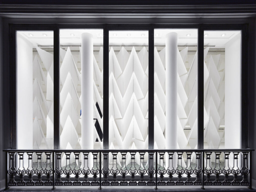
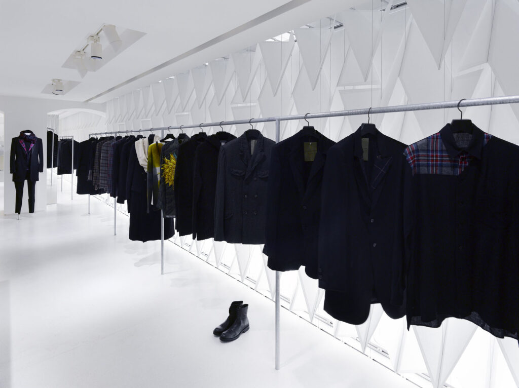
While still a student at the Architectural Association, Sophie Hicks founded her London-based architecture firm in 1990. The practice started out designing private housing, and by leveraging her insider insight, it is safe to say that Sophie Hicks has become one of fashion’s favourite architects, with her firm designing stores for the likes of Acne Studios, Chloé, Yohji Yamamoto and more.

Hicks became a chartered architect in 1994, prior to which she worked as a fashion editor for Vogue and for the iconic designer, Azzedine Alaïa. Hicks’s relentless efficiency has allowed her to lead her practice with extensive experience in the fashion world. Particularly strong on design, her approach is both conceptual and practical, and is highly attuned to the zeitgeist.

Outside of her fashion clients, Hicks’s residential projects embody the spirit of their surroundings, and champion honesty and boldness of materials. Subtle yet meticulously considered details are typical of Hicks’s architecture, which is best characterised by her discreet, restrained and durable ways of working.

NR Magazine speaks with Hicks about the ins and outs of her career, and to learn more about what distinguishes her identity as an architect.

What inspired you to change career path from fashion to architecture? 

I think it two things, really. I was very excited about being in the fashion world. From the age of about 17, when I entered it, it was very exciting. I enjoyed being a stylist and identifying new trends and fashions, creating pictures, and putting teams together, but I got to a point where I saw the fashion cycle coming full circle with the types of images and models coming out, and I was only about 26. I felt that it was too soon for me to be getting stuck into a cycle. I didn’t want to be part of a world that was going around in circles.

What I really wanted to do was to be creative and to create something myself. With photography and styling photographs, you are in effect, being creative but you’re putting together teams like a director. You’re grabbing clothes, putting together teams of photographers, models, hair, makeup and inventing a story, but you’re not actually taking the photograph or designing the clothes. I’d always been interested in architecture ever since I was a teenager, and I just decided to completely change paths and see if I could be an architect and create things myself that would affect how people experience the world.

Was that scary? The fashion world is such a dynamic and intimidating place to work in. Was it a shock moving into the world of architecture? 

Yes. I quite like having new and different experiences, and I quite like taking risks. Towards the end of my fashion career, I was working for Azzedine Alaïa doing a set of photographs with him of his previous collections from the start until that point in the mid-80s. We were recording all his collections for a book that he eventually bought out. So I was dressed top to toe in Alaïa – the tailored pieces, not the slinky ones, but I was pretty sharply dressed. I’ve never been so smart since.  I swanned up to the Architectural Association for an interview looking like something they’d never really seen before.

They asked to see my portfolio, and I told them I didn’t have one, only my fashion sketches. In those days at fashion shows, you weren’t allowed to photograph the clothes because they were kept embargoed until they actually got into the shops, so if you were an editor, you sat there sketching in your notebooks. You had to sketch extremely quickly because the models would come by quite fast. I showed them these books, and I was sitting there in a black tailored double-breasted suit – I think they just thought I was mad. I heard afterwards that they really didn’t think I would stick it, but they didn’t realise that if I decide to do something, I do it.

But they offered me a place, and on day one, I knew I shouldn’t walk in there all dressed up, so I decided to go completely under the radar and became unnoticeable. You had to absorb yourself and become a chameleon. It was about the second term, when someone turned to me and asked, ‘You’re not that Sophie Hicks who used to be the fashion editor at Vogue, are you?’ and I said, ‘well, yes, I am actually.’ and she said, ‘why do you look like that then?’ it was all quite amusing. I just really enjoyed drawing and making things. We did a lot of work in the workshops – we would weld, cut, saw, and make models. I loved all of that. We did a lot of expressive drawings, which were pre-computer, and I’m not a good drawer by hand, so I’d make a lot with clay, plaster, carving, printing, and etching etc.

We would talk a lot about our ideas. And the Architectural Association is brilliant at teaching design, and brilliant at teaching you how to think. I’m an external examiner there now, which I’ve been doing for the last four years, and it’s amazing how they get their students to think – to a level that I don’t think you get in other schools.

It’s a bit like if you were thinking about conceptual art, I suppose. Thinking about what the concept is, what the meaning behind it is and why you’re doing it. Absolutely everything needs an explanation when you design, and it’s got nothing to do with aesthetics until you know why you’re doing it, then the aesthetics happen naturally. Of course, some people do their aesthetics better than others – some people have an elegance, and some people don’t. But if there isn’t a reason behind why you’re doing something, then I don’t think it’s very meaningful.

I’ve always thought that film directors have a very interesting job, with the way they approach a project and how they set up a team and choosing all the people who are going to gel as unit. It was Grace Coddington who taught me how to set up a team when you’re doing a fashion shoot. The psychology of a group is incredibly important. I took that kind of thinking with me to the world of architecture: thinking broadly, out of the box and about how to set up an architectural project in a way that is more likely to be successful.

What inspiration do you draw from other engineers and architects – particularly with Félix Candela and Paulo Mendes da Rocha? 

They worked brilliantly with concrete. Recently, I’ve used quite a bit of concrete in buildings I’ve made. I think Félix Candela was probably the most brilliant user of concrete who has ever lived. He mathematically worked out how to create very thin, reinforced concrete shells that were very elegant and incredibly clever. And if you can do something very clever, why wouldn’t you? He also did this because he was designing quite simple structures like bus shelters and churches for communities in Mexico. The budgets were very tight, and I believe he even designed some churches without windows. Because of this low budget, he used less concrete, so the building was less expensive. Because of that, he designed these extraordinary floating canopies and canopy rooves, where the geometry is really his invention. His brilliance as an engineer allowed him to do that. There are some wonderful photographs of this, one in particular which has workman standing on top of this mushroom-like roof. It’s about 10 or 15 metres high and incredibly thin. It’s just a brilliant demonstration of history.

Paulo Mendes da Rocha’s buildings in and around Sao Paolo have an incredible force to them. They’re raw and feel very dynamic, as they have so much embodied energy, in that they are incredibly still. The thing about him which I find very interesting, and which I feel reassured by, is when when I hear about architects of his stature that did what I do, which is having an office of one. An architect of his stature, you would expect to have an office of quite a lot of people, but he maintained a very small office. I’ve never had a big office – I’ve had an office of about 10 people perhaps, and I found that I wasn’t properly designing myself. I was spending too much time looking after other people and checking their work.

Everything froze with the crash in 2008, and I felt like I really needed to get back to basics. What I really wanted to do was design buildings, and what I really wanted to do was actually be the one doing the designing, not passing it down. I’ve got the most brilliant kind of situation now, where I work very closely with my colleague Tom Hopes, and we work very well together. He’s very strong on construction, and I’m very strong on design. He’s teaching me construction and I’m teaching him design – we do both and understand both sides. My aspiration would be to continue to work in this way, and to continue to work in the way that Mendes da Rocha worked. That involved only bringing in other team members for a project when you need to, so you don’t have everyone in the office all the time.

The most recent building I did was a house in Northamptonshire, and it was a reasonably big team. We did all the drawings here, with about 10 or so people, but it worked very well because the quality of the design and the detail was that bit higher. We work very closely as a team and get much better results, I feel. But it’s an unusual way to work, so I’m always encouraged when I read that someone like him created really interesting buildings with that same process.

What do you value most about a living space?

That it’s really comfortable, and not just literally. It’s important that you feel relaxed, calm, and able to be yourself in and around it. The word ‘comfortable’ might have the wrong connotations because it makes you think about sitting on squishy chairs, but it’s not that. It’s a kind of feeling – feeling yourself.

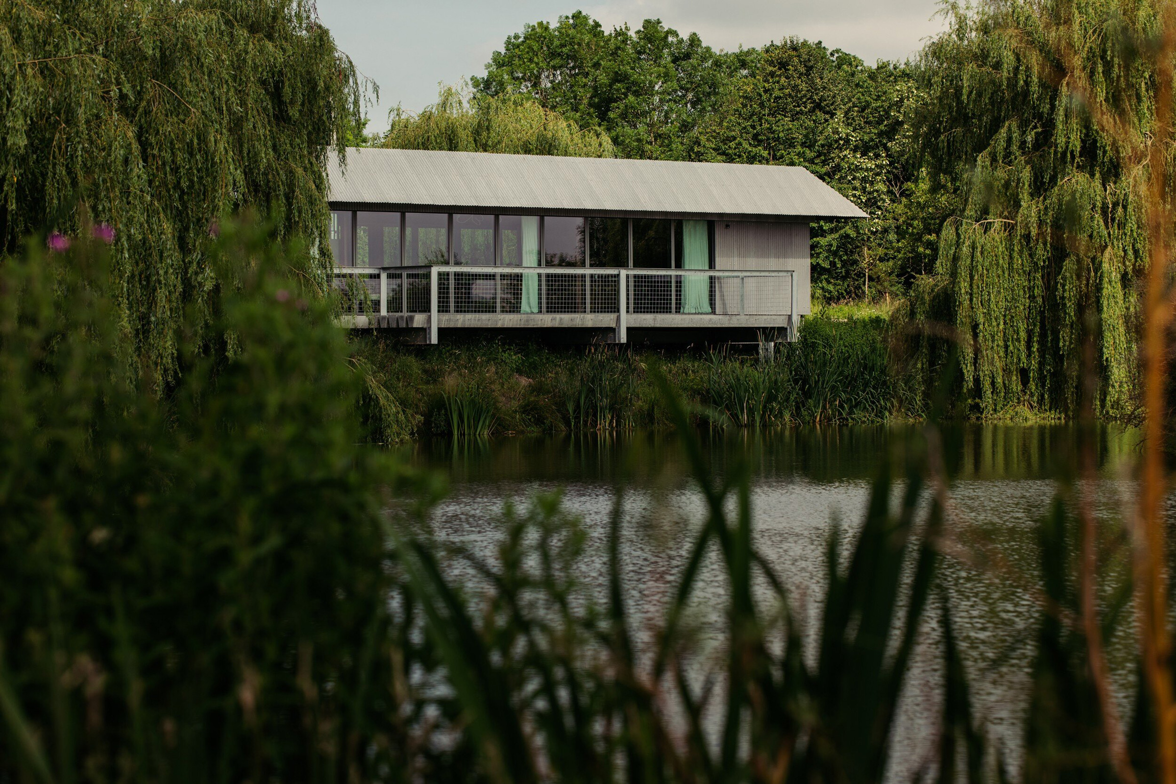
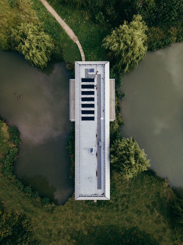
When I design for other people, I want to find out what makes them feel right. If I’m designing a house for somebody, I want to know everything about how they live, how they behave, what makes them feel comfortable, and what kind of impression they want that building to embody. With the house that I designed for my daughter recently, which is called House Between Two Lakes, it was really important to her that it wasn’t a show-off-y house. She didn’t want a flashy house. She didn’t want a house that was obtrusive. She wanted something that was the opposite of a designed house, which is why we made something that sat very gently in the landscape, and that is very streamlined.

As the theme of this issue is identity, I thought it would be interesting to know if you’ve ever had kind of ‘identity crisis’ with a project?   

That’s a difficult one, because architectural projects are very long and very complicated, and they involve an awful lot of solving problems. These problems might be thrown up by the environment or by the building problems that crop up during construction. If you’re working on a project where you’re solving problems, an identity crisis is less common.

There’s initial design that you tend not to go forward with until you’ve got the concept sorted out. Projects don’t go ahead if you can’t get that right. It’s a difficult question for me to answer. I know it sounds as if I’m not admitting to self-doubt, but that’s not it. As an architect, you’re a servant of the client, so you need to understand what they’re all about. If you don’t understand what they’re all about, the project tends not to go forward. If you are trying to understand what they’re all about, you carry on until you reach a point of agreement, and during that process, there are often moments where you doubt if you’re ever going to get there. There are multiple points in time where I would be searching for the solution that would embody the character or the ethos of a brand, or the character of the person or thing that they want to embody in the building. It might be some sort of feelings or atmosphere, and I might be struggling to understand what they really mean. And even when I do understand, I have to then find a way of translating that into a built form.

There is a kind of lightbulb moment when you get it right. It happened with the Chloé shop early on for Phoebe Philo. I was struggling with what to do for this luxurious brand, and for its new, young, dynamic designer. She’s got great ideas and a contemporary way of looking at things. At the end of the day, it’s a Paris luxury house, and had stores on fancy shopping streets. I thought about what we could do to bring the spirit of that young designer into the shop environment in a way that would feel how I think she feels about her designs. I really thought we weren’t going to get there. I really didn’t know what I was going to be able to suggest, and then suddenly, we had riots in Bond Street. There were some demonstrations, and the shop fronts were boarded up, and that was my lightbulb moment. We used railing and raw plywood like you would use to protect your front window. We put that inside the shop and used it as the finish for the walls. There’s a real beauty to basic plywood. Not fancy plywood and beautiful veneer, just the bog-standard shuttering with lots of faults in it. I wanted to bring that into this luxury space and offset it with the pink marble and gold-plated metal fittings that Phoebe was working on. We gave it a kind of spin that would tell the kinds of rich women who are going to come into shop, that there’s something else going on here. The spirit of the place is just a bit more rooted in reality.

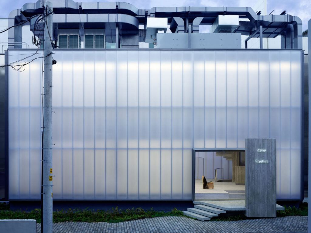
Your Acne Studios flagship store has a very forceful and distinct presence, reflecting the studio’s designs and aversion to conventional Swedish design. What were the other influences behind this project?

When working with a fashion client or a brand, they have very distinct characteristics and their brand identity is important to them, so it’s about finding an architecture that will embody that character and ethos. When I have a new client, I go and study that person, or that group of designers.

I’d never been to Sweden before Acne Studios contacted me, so I spent a long time shadowing Jonny Johansson during design meetings, hearing how he spoke to other people and absorbing how he works and how he makes his choices. I also spent quite a lot of time travelling around Sweden and going to the islands to gather information in my mind about Swedish light.

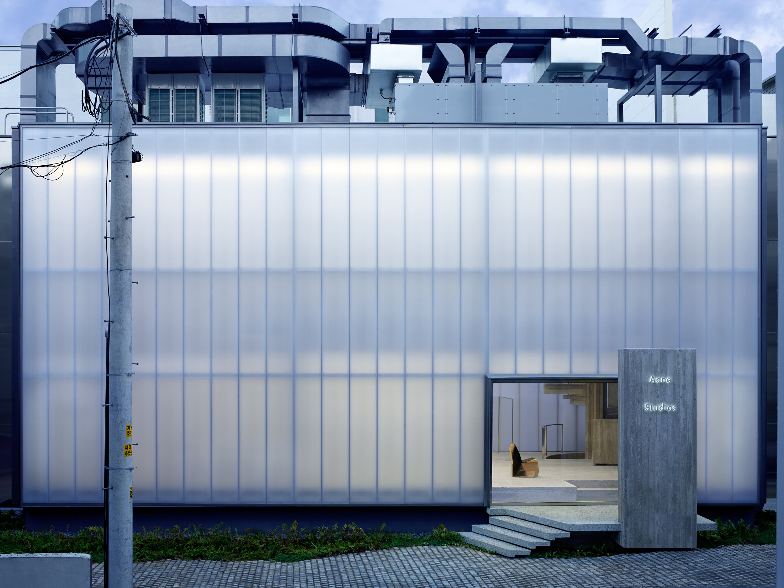
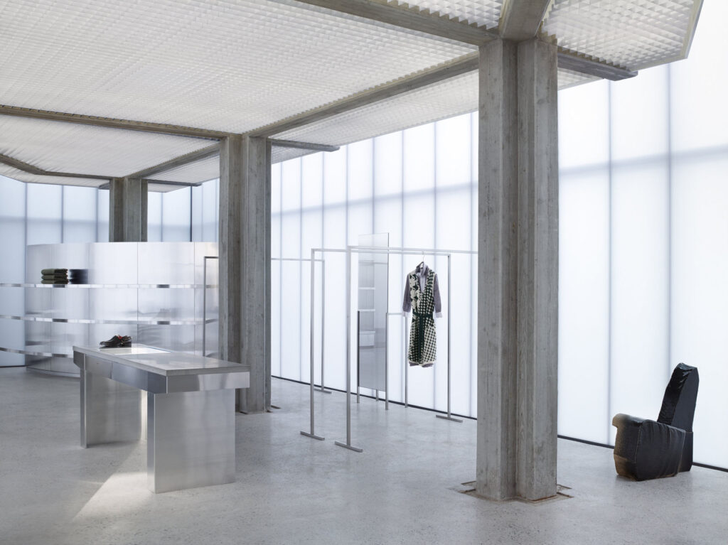
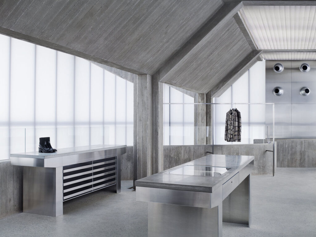
One of the most important things for that Seoul flagship store was the kind of light you get in Sweden. In the summer, you get a very strong and completely engulfing flat light. Light is very important in Sweden, because for many months of the year they don’t have a lot of it, and then they have a lot of it all at once in the summer. Something I noticed from studying Jonny and the other Swedes in the office, is that they were very private and keep their cards quite close to their chest. Seoul is a very dynamic, outgoing place in comparison. I thought if I were going to make a building in this very dynamic city for a brand whose culture is much more reticent, then I would like to make the building sit as a quiet, almost brooding monster. Monster isn’t quite the right word, I know, but there’s something very still about the concrete frame within that building. It’s very grounded and permanent, but then it’s held inside this misty white box. With this misty white box, you get no hint of what’s going on inside until you enter. I also had no idea that the light was going to be as good as it was until we built it. I thought it would be nice, but it really is extraordinary. All the daylight comes through this white polycarbonate material, and it makes you feel as if you’re in a white cloud. It’s quite odd and does strange things to your perception. I think that aspect of it is the Swedish part – this sense of unreality and dreaminess that is present in Sweden, particularly in the islands, that are so silent. It embodies that quietness of the Swedish character.

So it’s kind of in opposition to Seoul, but then all the air conditioning and all the services, we had piled up on the roof. All the rooftops in Seoul are a mess of air conditioning units, so we did that as a nod to Korea, but in a very neat and tidy way. This also allowed us to keep the space inside the building free, without any dropped ceilings or internal surfaces hiding anything. I don’t like finishes and I don’t like hiding things, so I don’t like having to build internal walls to hide services. I like the internal finish to express the structure of the building.

How did you go about combining both Japanese and Parisian aesthetics and design principles with your Yohji Yamamoto store?

I knew Yohji anyway, as I’d seen his first shows in Paris when I was working at Vogue, so I knew how he was when he landed in Paris. He landed with this extraordinary new vision that was completely different from anything that had come before. I knew how he’d been incredibly shocking to the Parisians and the world of fashion entirely. I also knew how he’d become comfortable over the years in Paris and opened one of his design studios. He had a big office in Paris and worked quite a few months of the year there, so I knew he’d become much more embedded in Paris than say Rei had – she was much more Japan-based.

When I was working on his project, I basically shadowed him. But with him, he didn’t like anyone close, so I’d be observing and studying from a distance. He’s a very private person, and Japanese shopping culture is very sophisticated. They don’t like to show off. It feels very wrong to put a mannequin in a window for a Japanese client.

I decided to include glimpses, and he was open enough to be able to show glimpses into the store from the windows, so we used a kind of Shoji screen. We played with the idea of things on axes, like in formal French gardens. You get glimpses through the screen, and as you get closer, you can see into the shop. We included without heads, so basically had all the dresses floating in the space. And when you entered, you’d have a series of glimpses that would start from a kind of corridor of wooden folded screens. As you move down this corridor, the view suddenly opens up, and that’s when you can tell a story about menswear and womenswear. It was all to do with opening up really, which I think is a very French thing, and then through showing his clothes in a progression – that’s how I tried to make the link between him and Paris.

What qualities of materials do you think lend the most atmosphere to a space? And what do you enjoy working with the most?

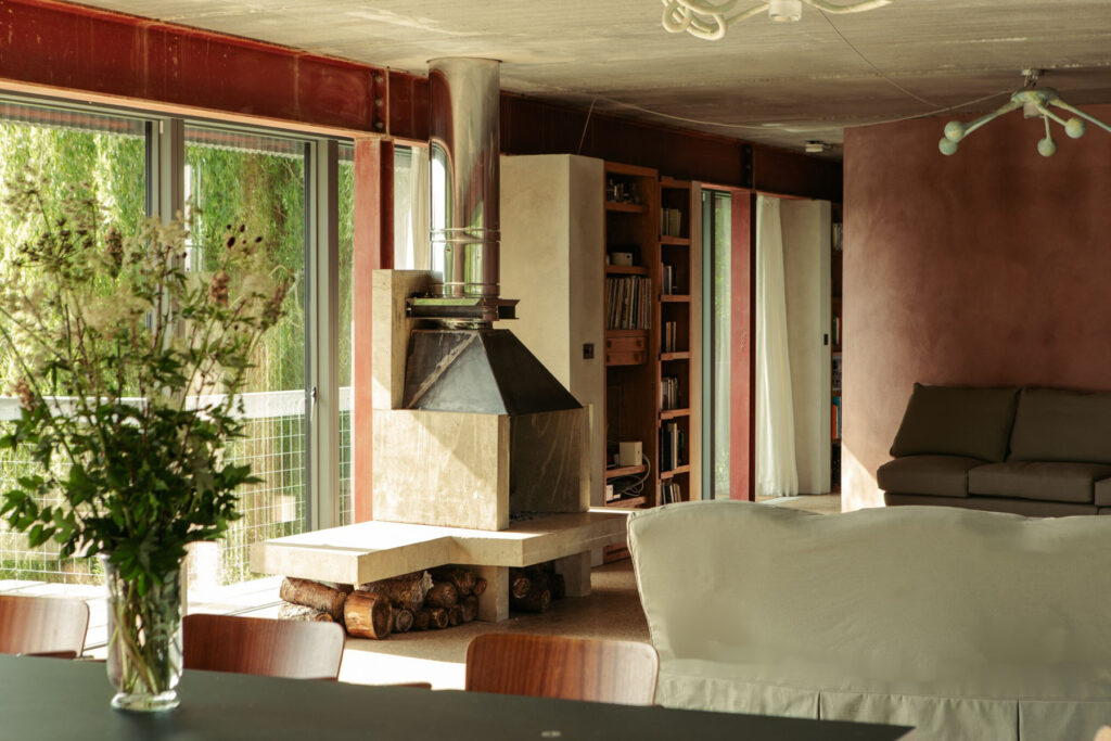
For an interior space, I like the structure of the building to be expressed internally. I want to be able to see what the structure is, and it’s the expression of those structural materials that I think gives character and atmosphere to the space. That’s one reason why I don’t like decoration. With House Between Two Lakes, we had one or two internal walls, as we had to divide the space somewhat, and it needed a surface finish. I hate decoration so I didn’t know what to do.

Because the roof is made from precast concrete planks and the floor is cast in situ concrete, decided to do something related to those two materials. We used render with some pigments to give it a more interesting colour, and it was very important to me that the sand and cement render was done by the plasterer. I would have hated it if someone else came to do a clever finish. We wanted to keep any expressive movements. We chose the colour to relate to the earth. That piece of land was a brick quarry at one point, so we chose this brick red colour. This was the only way I could find to do a finish that would be as far away from decoration as possible.

I’m also slightly allergic to tiling in bathrooms, so we put a waterproofing agent into the mixture, and put it in all the bathrooms. I’ve done tiling in other projects, I’ve done lovely marble bathrooms and stone-clad bathrooms, but for the House Between Two Lakes, it is a house in the mud. It’s unbelievably wet there. The house is supported on pairs of steel piles, that go something like 16 or 18 metres down into the ground to anchor it into the mud. You basically want to smear the mud on the walls. Fancy things wouldn’t make sense – it just doesn’t read visually.

Is there anything you consider to be an architectural faux pas?   

I don’t know about faux pas, but over the past decade I’ve noticed a tendency for architecture to be sculptural, or a tendency for a piece of architecture to be a bold statement about form and glamour. That is something I don’t feel comfortable with, so I’ve been biding my time hoping this moment will pass, and I think it has.

This year’s architecture biennale in Venice was very much on a different track. Architecture appears to be moving towards helping human beings live, work and experience their lives better. And if that means the building looks like shit, then so be it! I much prefer that. Of course, they never do, because if you make a building that really functions beautifully for human beings, then by definition, it’s going to work and be a wonderful piece of architecture. I think it’s a great moment for architecture to get re-grounded and not be concerned with making a flash statement.

Some of the South American projects are fantastic. They’re more left wing and democratic. They have a history, that is not so far buried, of making buildings to serve the people. I’ve been sucked into this world of clients who aren’t really serving the people. I know that most of the projects I’ve been commissioned to do are projects that may be wonderful, and I may be pleased with them, but they are projects that aren’t necessarily needed. You don’t need a fancy store. I happen to enjoy designing a store, because there’s an intellectual exercise of trying to identify what the ethos of that brand is.

I think brands are moving more towards the social and cultural changes that we’ve experienced in the last two or three years. They are recognising them, reacting to them, and bringing something of them into their shopping experiences. I watch with interest to see if any of the big luxury brands react to this, but at the moment, I haven’t really seen anything that makes me think that they’re willing to break the mould and allow people to shop in a different way. I have various theories about it, and I’ve had a couple of potential clients in the last year who might have gone for it but didn’t in the end.

How important is sustainability to you? 

It’s very important. I’m very ‘waste not want not’, so it is in my nature not to throw things away – I like to reuse, and I like things that are very durable. What I’ve realised is that I’ve been creating buildings in the last 4,5,6 years, that are going to be incredibly hard to demolish. They have these big concrete frames that express a kind of solidity which I love to use in contrast to a lightness. I like the solidity and I like the delicacy as well.

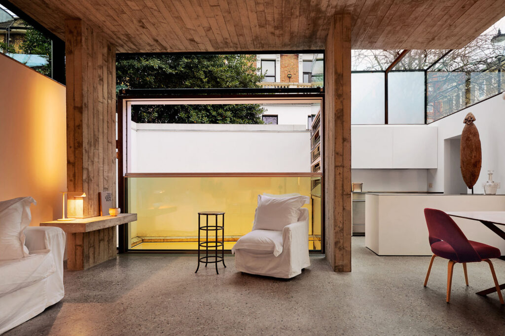
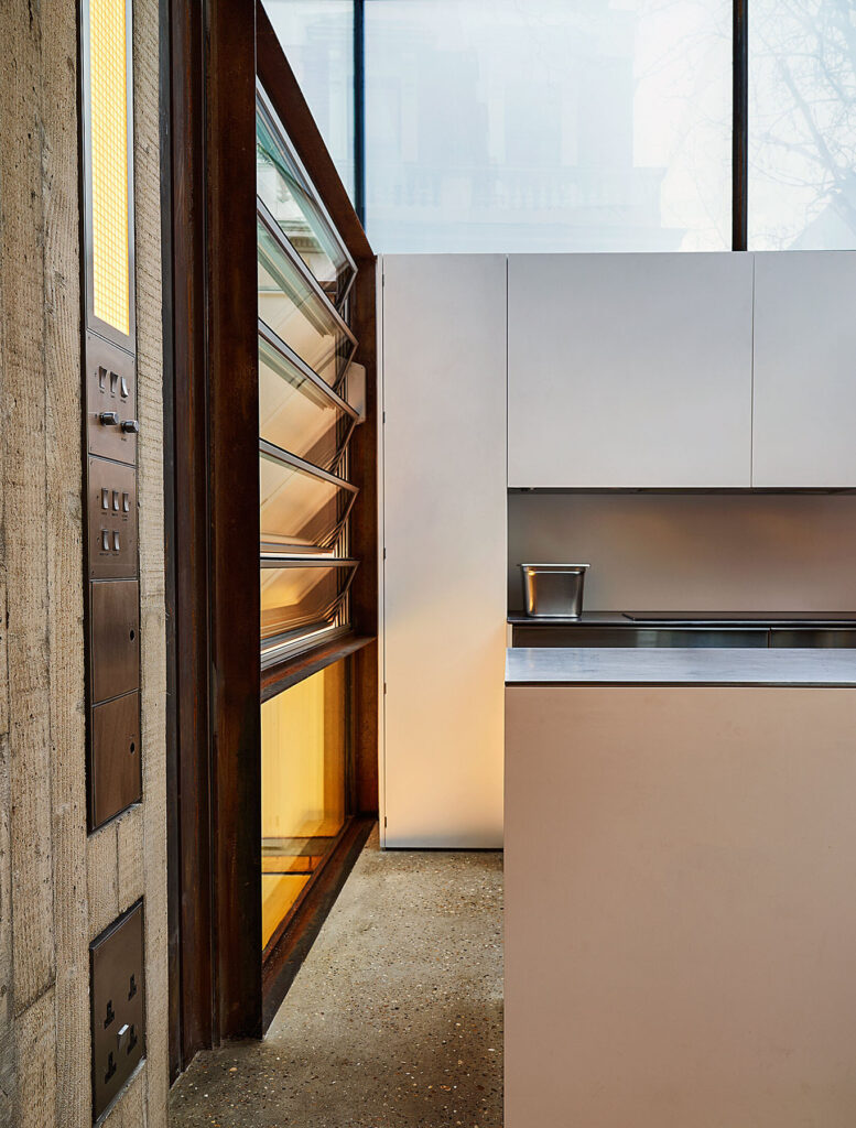
The Earls Court House that I built for myself, has a basement which must be, by definition, constructed out of concrete. So, I decided to bring the concrete up to grow out of the ground and combine it with the delicacy of the glass. Mass concrete is incredibly comfortable to live in. It very slowly and gently absorbs heat or the cold, which means that you have a very constant temperature, so you can avoid using lots of electricity for heating. It’s very sustainable for electricity usage, because what you don’t do is use a lot of electricity for heating.

When you manufacture concrete, you use a lot of energy and you disturb the land because of the quarrying, so it is disruptive, but if you if you use concrete, and you don’t intend to demolish your building, it quite quickly becomes sustainable. I think there’s a balance. I think until a building has lasted a certain number of years, it’s not sustainable, but once it’s been in for a certain time, and you factor in the reduced energy usage, then I think it’s reasonably sustainable.

With the House Between Two Lakes, I reused joinery and doors from previous buildings that had been demolished and stored. The bronze front door for example – I think it’s quite rare for architects to reuse old parts in new buildings like that.

I think in the future, what I would really like to do is make a building where we use materials that are available very close to the site, whatever that might be.

What do you anticipate for the future of your work? 

I’d love to do housing development, rather than one-off housing. I would love to be approached by a developer who wants to design some sort of group of houses that is particularly suited to life now – perhaps family life.

Discover more here sophiehicks.com

Practice Architecture

“It’s this kind of interdisciplinary weaving together that is going to make change happen”

Founded in 2009, Practice Architecture is a London based firm adept at delivering various acclaimed cultural, community and residential projects. The firm has established itself as one that creates exceptional structures with a strong sense of place, and has a hands-on approach, getting involved from a design’s inception through to a structure’s completion, and help to curate both space and the activity it houses.

For their innovative Flat House project, the firm worked alongside hemp farmers and with sustainable methods of construction to construct a zero-carbon home in Cambridgeshire from prefabricated panels, all in just two days.

Their smaller scale Polyvalent Studio project was created within the parameters of the caravan act, meaning in most contexts it does not require planning permission. It was designed by students from London Metropolitan University and constructed within just 12 days, exemplifying the possibilities of low embodied energy design and the benefits of a collaborative working process in the industry.

Practice Architecture is currently working with food growing workers cooperative OrganicLea in developing a 10-year plan for the expansion of the infrastructure at their main site Hawkwood. The project will deliver substantial new educational buildings and volunteer spaces alongside a large community hall and kitchen, and the project will be built from natural materials as a self-build, working with the volunteers on site.

NR Magazine speaks with Practice Architecture to learn more about these projects, how they incorporate sustainable methods into their practice, and their ethos as a firm.

What inspired you to start working with cultural and community projects?

We started making things in London in a very informal way. We worked a lot with our peers and what we were doing was really part of a broader DIY culture within our community. In the absence of institutions that spoke to us, we made our own spaces in which to explore our own culture. This kind of work was only possible under the provision of it being temporary, but serendipitously, almost all the places we built in this era are still here.
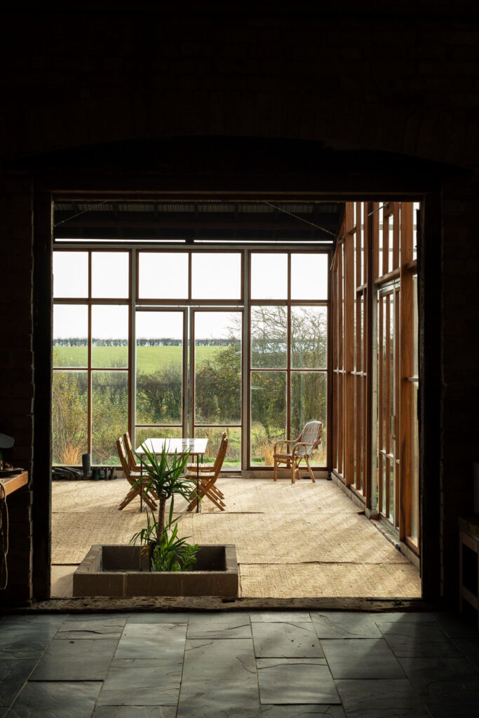
We made our buildings in a very hands-on way, going on site ourselves, with friends and volunteers to build a project and used very basic tools and equipment to do so. This experience continues to feed into the work we do now, our understanding of materials and the way we design with others.

More designers are using hempcrete at the moment, and I’m familiar with artists using it on a small scale with pottery and sculpture, but nothing like on your Flat House project. What was the process like when building with this material on a larger scale?

The process began with the drilling of the seeds in the 30 acres of field that surround the house.  This was overseen by Joe Meghan, a hemp farmer who had supported Steve Baron the client and founder of Margent Farm in getting a licence and specifying the appropriate subspecies of plant.

Hemp is a very resilient crop, with long tap roots that help to rehabilitate and condition soils that have been degraded through industrial farming practices. It has a short growing season of 3-4 months, after which we were able to harvest the seed and stem and process it into usable oil, fibre and shiv (the woody core of the stem).

The project makes use of each element of the plant, with the oil being used by Margent Farm in health and body treatments, the fibre being made into a cladding and the shiv into the hempcrete insulation. Each element of the plant went through a different process, with the fibre being felted and blended with a sugar resin and the shiv being chopped and mixed with a lime binder.

We designed a cassette-based construction system using structural timber with hempcrete to form an insulated panel, refining the construction details with Oscar Cooper from Lignin Builds. The panels were constructed in a factory and dried before being brought to site and lifted into place over two days. The cladding was made a few miles down the road with the impregnated hemp fibre matt pressed to form corrugations. The cladding is very easy to work with as it’s light and can be cut using a simple hand saw. We were lucky that with so many elements of experimentation, everything went very smoothly, and the building came together as anticipated.

Aside from sustainability, what were the other aims and inspirations behind your Flat House project?

We wanted to demonstrate how, what are often thought of as traditional materials, can be applied in a very contemporary way using the latest construction technology. The project celebrates the simplicity of its construction and how few materials went into making it. The key thing with Flat House was not just to develop a building, but to develop a whole system that could be replicated at scale across the country.

The project has led to the establishment of Material Cultures, a research organisation that explores natural materials in the context of offsite construction. Could you talk a bit more about that?

Yes, Material Cultures is now doing the work of scaling up these ideas and applying them to large scale housing and commercial projects. We are working with a variety of clients and housing developers – people who are interested in doing things differently. Alongside this, we carry out research projects with a number of universities, developing full scale mock-ups and looking at the broader cultural context of the work we do.

Material Cultures is exploring how regional specificity and a relationship to regenerative agriculture might shape the evolution of new housing typologies. The low carbon construction industry is still relatively embryonic, which means working across many fields and disciplines simultaneously to make things happen. That’s why we are really excited to be working with Yorkshire and the North East and ARUP to develop a regional strategy for a transition to a bio-based construction economy.

It’s this kind of interdisciplinary weaving together that is going to make change happen.

What does collaboration mean to you as an architecture firm?

For us architecture has always been as much about process as it is about built form. The design is material and construction led, which means really understanding how something is put together. 

“Each project is an opportunity to connect with different disciplines and expertise, to learn and test something.”

We have been really lucky to have amazing long-term collaborators such as Henry Stringer – one of the most inventive makers of things – and Will Stanwix who has over 20 years’ experience of working intuitively with natural materials.

We generally make places directly with the people that use them, whether that be through getting everyone on site during the build or developing genuinely engaged co-design processes.

How do you go about balancing space and intimacy with a project?

We are really interested in spatial qualities and the different ways in which we are acted upon or made to feel by a building. We look to create balance, often pairing close and intimate spaces with more open ones. Material plays a large role in this. Arriving at the Straw Auditorium project in Bold Tendencies you move from the harsh open floor plates of the concrete carpark into an intimate womb like space, enveloped by the tactile warmth and smell of an organic material.

What inspired you to work with cellulose-based materials for the Polyvalent Studio project?

The Polyvalent Studio project was developed with David Grandorge and students at the London Metropolitan School of Architecture. The project was a continuation of Practice Architecture’s work exploring natural construction at Margent Farm and shares a lot of the material technology developed with Flat House.

The building is designed within the caravan act meaning it can be moved in two independent modules and that it could be built without planning permission. It touches very lightly on the ground with timber footings that penetrate the soil line. These are made from Accoya, an acetylated timber product that can far outperform other timbers and represents exciting opportunities for the substitution of traditionally high carbon materials in exposed areas.

The studio was designed and built by students at London Metropolitan School of Architecture. What was it like working with students and completing the project in such a short space of time?

Building the studio together with the students was a really amazing experience. They brought so much energy, passion, and commitment. It is mournfully rare for architecture students to get an opportunity to use their hands and build things at scale.

“Building things is one of the most direct ways to learn how to design things, and the lack of genuine understanding of construction by architects is what leads to many tensions between professions.”

This project was established within the context of your research into natural materials and low carbon construction techniques like with Flat House. What other kinds of innovative solutions to sustainable construction are you hoping to work with?

We are always looking to learn about new materials. Currently this means exploring innovative straw and mycelium construction and looking at the role of chalk within structural and civil engineering projects.

With the theme of this issue being Identity, I’d love to know how you feel the firm incorporates sustainability and education into its identity.

For a long time, sustainability was something we did by default, but we didn’t really talk about it or have a way of articulating what we were doing. We saw our work as predominantly socially driven and about process – and the architecture and materiality as a means to an end.

It’s been interesting over the last few years to begin redressing and articulating an underlying intentionality behind our approach to how things are made. Underlying the design is a deep concern for how the things we make fit within a broader cycle and ecology of things. Where do the components come from and where do they end up? How can we be resourceful and responsible? It’s been great to begin to articulate these things and situate what we have been doing within other conversations around things like regenerative agriculture and the logic of global supply chains.

How important is adaptability to you?

We want to make buildings that can respond to their users. This means they need to be able to adapt and evolve. You can design in a way that either makes this very difficult or enables it. By keeping structure exposed and close to the surface and making the construction legible, it empowers residents and users to add, change and adapt.

Working with a food growing cooperative, your Hawkwood Plant Nursery project also champions natural materials and community collaboration. Could you talk a bit more about the aims for this ten-year plan?

It’s really exciting to be working on a number of large-scale food growing projects in London. These kinds of spaces are so important and so different from other types of green spaces such as parks.  They offer the opportunity for a genuine connection to soil and to land – one that is mutually nourishing and that brings you into contact with most important natural processes that we all depend on like the water cycle, photosynthesis, composting and soil formation.

Hawkwood and the other Market Garden City project Wolves Lane are leading the way in setting a precedent for socially and community focussed food spaces. We are looking to embed genuinely circular principles in the project, working with the resources available on site and integrating locally sourced natural materials wherever possible. The principal being that anything we are bringing onto the site can ultimately return to those natural cycles itself, in the form of mulch and compost.

Credits

Images · PRACTICE ARCHITECTURE
www.practicearchitecture.co.uk

DGN Studio

“Light is always the starting point for all our projects”

Founded in 2016 by Daniel Goodacre and Geraldine Ng, DGN Studio crafts customized objects and spaces informed by utility and the context of their surroundings – an approach to design that is instilled with a deep sense of care and attention to detail. The architecture studio aims to enhance the everyday living experience of their clients, and advocates for a carefully considered use of materials. 

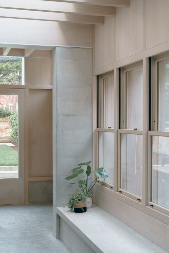
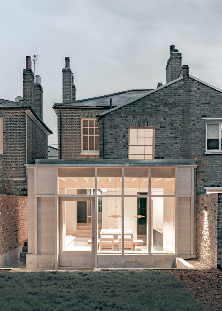
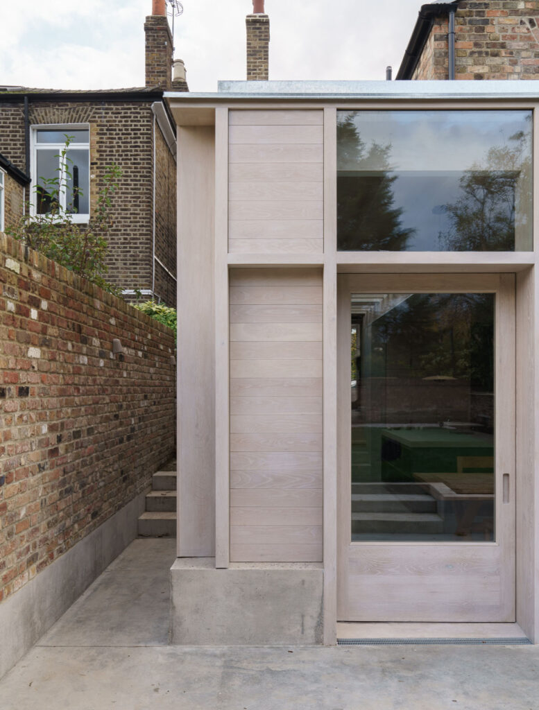
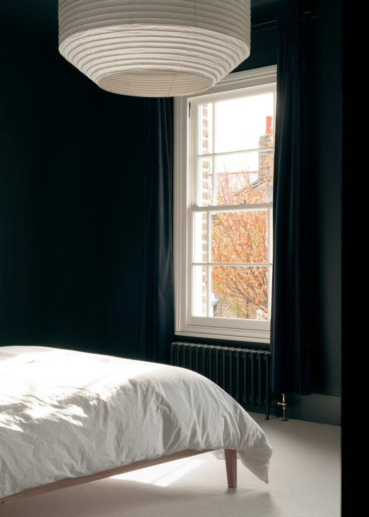
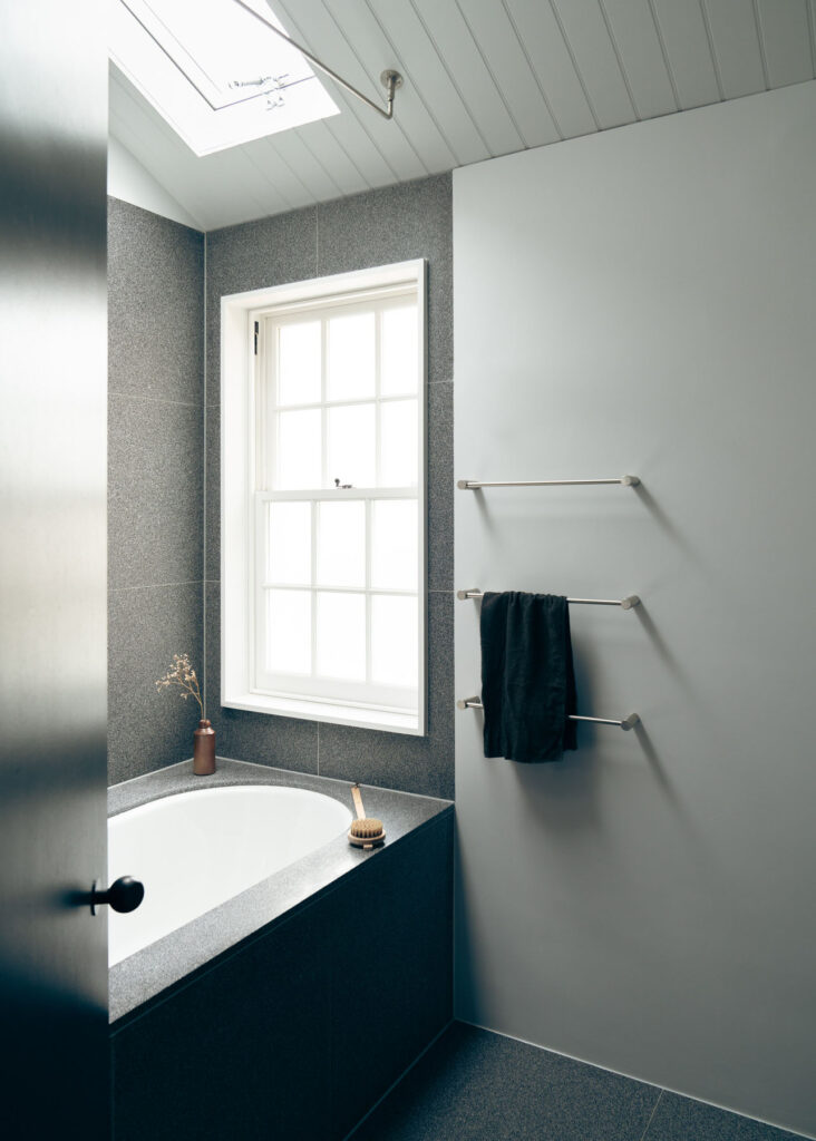
The studio’s 2020 Concrete Plinth House project is located in the London borough of Hackney, where a dark Victorian semi-detached house has been transfigured into a sleek and leisurely brutalist-inspired home. The terrace is grounded on a dense concrete base, yet feels light and serene, featuring clean, minimalist surfaces. Commissioned by a young couple to transform the house into a modern family home, the project extended and opened the property to include lighter-touch renovations that show off the beauty of the materials used, such as concrete benches and wooden beams, all working in a simple aesthetic and functional harmony.

NR Magazine speaks with DGN Studio to get a deeper insight into their design values and to discuss the details of the project.

For this project you were tasked to create a versatile and leisurely space – what initially sprung to mind when you began to conceptualise the house? 

Making a space that could accommodate gatherings of different sizes seemed to require a degree of flexibility. We had conflicting thoughts at the outset. We wanted to make a space that could be used in different configurations, but also a desire to create something with weight and mass that felt very firmly grounded in the site. 

In the end the flexibility was achieved not by moving things around, but from being able to occupy the edges of the space – the steps, perimeter walls and benches which provide lots of options for how they might be used. This allowed us to really explore the feeling of permanence created by these various concrete surfaces and plinths. 

We also had an early idea about the timber frame as a kind of screen or filter between the interior and exterior spaces which in this instance seemed a more helpful concept than that of placing windows in a wall. 

What was your approach to working with the original features of the house? 

We wanted the new addition to resonate with the existing house in a subtle way, such that it could have a definite character of its own. 

The best rooms in the existing house had a tall proportion and we liked these spaces as distinct rooms that suggested specific purposes or activities. We wanted the new spaces and layout to maintain this feeling of a series of rooms while also opening up long views throughout the house, pulling light further in and creating a better flow through the spaces. The level changes in the floor and ceiling help distinguish the different ‘rooms’ of the new space. 

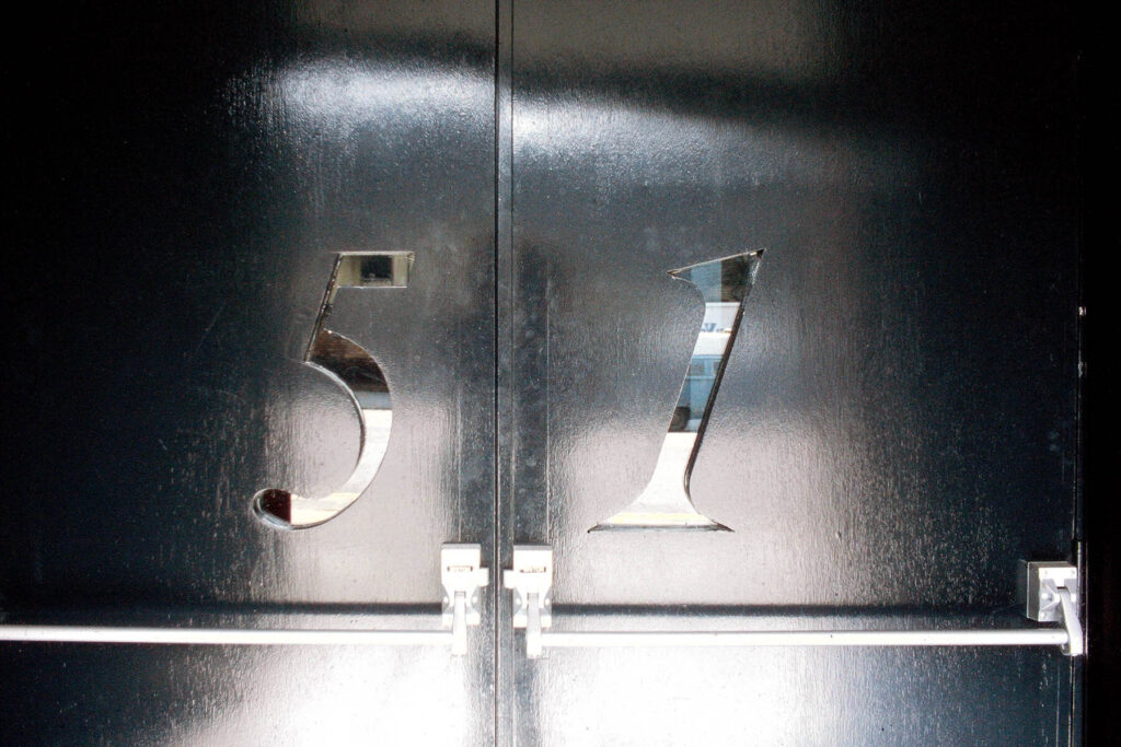
We paid attention to the details of the house such as door handles, window furniture, and curtain rails and commissioned Dean Edmonds to design bespoke pieces that sat comfortably in both the new and existing parts of the house. 

The sash windows running along the side elevation are a nod to the original glazing and add to the resonance between new and old. 

Were there any influences for the project? 

There is no overarching reference point – there are loads of influences that come in at different points of the project for specific reasons. Mostly it is about identifying a particular atmosphere that is right for the space. 

Developing the project is about navigating a course through the different parameters that emerge at each stage – starting from conversations with the client about their lives and desires, to their budget, planning restrictions, and then developing the details of how the building is put together with the skilled craftspeople who actually make it. All this time we are trying to hold onto that desired atmosphere and make sure that this still emerges at the end of a very long process.

You can really sense a harmony and a celebration of materials with the project- was this something that was particularly important for you? 

Absolutely – the material palette is really the stuff that the building is made from (predominantly oak and concrete). We were keen to keep the number of finishes relatively limited, and for the different materials to contribute to the serene atmosphere of the new space. 

We generally favour a relatively subtle material palette not because we don’t love colour, but because we tend to find that colour comes best from all the life that takes place inside the space rather than from what we have designed. The building is not the main event! 

How did you go about prioritising light and space with the project, especially in an older building and a tight urban site? 

Light is always the starting point for all our projects. How the sun moves around the site and how to choreograph spaces in relation to this. 

Extending a house can create problems with light due to the resulting depth of the plan so it’s really important to consider how the existing spaces will be affected. As a result, we have opened up views through the house so that you can see the garden from a number of locations and pull in as much light in as possible. There is also a considered contrast between light and dark spaces passing through the dark snug that sits between the living room at the front and the kitchen/dining room at the rear enhances.

We were also very conscious of not overexposing the interior, and the positioning of the glazed panels in the extension was carefully considered to get the balance of lighting right and to prevent the feeling of being in a goldfish bowl.

Were there any existing structures or materials that influenced the design? 

There’s a whole library of projects floating around in our heads – the ones that rise to the surface will depend on the client, the brief and the site. We also try to resist becoming diverted by all the things we’re looking at and trust our intuitions which are of course built on all the things we’ve seen and appreciated. 

How do you get inspired when starting a new project? 

There’s so much to draw from in any new project, no matter how small it may be – every site has its own history, and every client has their own unique story – trying to get under the surface of how the clients live (or would like to live) is really important and provides lots of starting points. 

We’re also really inspired by the city we live in and how it has developed over the centuries – just a bus ride through it is enough to generate a whole raft of ideas. Of course, inspiration often comes in more oblique ways through art objects, music, books, landscapes…

What’s your usual process in developing a design concept? 

It always starts with a plan and lots of sketching to try and explore the intuitions that we have about the project. From there we like to try and get as quickly into making models as we can – often digitally first, but we always like to make physical models as well. So much is discovered and can be tested in the making of them, and they always resonate well in describing ideas to clients. 

Throughout the process we also like to have workshops with clients – sitting together around a table and discussing the ideas – the project is always a collaboration, and this is fundamental to the way projects develop.

DGN Studio is currently working on a number of residential projects across London, as well as designing and making furniture and interiors.

Credits

Images · DGN STUDIO
www.dgnstudio.co.uk 
Photography · NICK DEARDEN FROM BUILDING NARRATIVES

Subscribe to our
Newsletter