Archive page:


Nanometer Architecture

“It is important to have a feeling of love”

Architectural duo Yuki Mitani and Atsumi Nonaka are known for their minimalist architectural work under the moniker Nanometer Architecture. Taking inspiration from traditional Japanese design the pair focus on the smaller details when working on a project. “We believe that building an architecture is like a supplement for the ultimate goal, providing a place, proposing an event, and then inducing it to create an atmosphere.” NR Magazine joined them in conversation about their practice.

Nanometer is an interesting name, is there some kind of story or meaning behind it and how does it relate to your work?

The first letters of “n” (Nonaka) and “m” (Mitani) are connected to form “nm,” which is the symbol for nanometer. In the nano-world, the world is very different from the micro-world. Because it is so small and the specific surface area (volume/surface area) is so large, it becomes highly reactive, and the properties of the same substance can be changed if it is reduced to the nano level. The same material can change its properties if it is reduced to nano size. In other words, it is possible to manipulate a single electron.

Focusing on nanomaterials, we can move from top-down construction, where materials are scraped out of matter, to bottom-up construction, where atoms and molecules are assembled. They will be able to self-assemble like living organisms, without the waste materials that are scraped out. It will be a complete opposite approach to the way we have been producing things.

As I was researching this, I began to think that nanometers are close to our philosophy.

“We believe that the creation of buildings is like a supplement to the final goal and that the essence of providing a place, proposing an event, and inviting people to come afterwards is to create an atmosphere.”

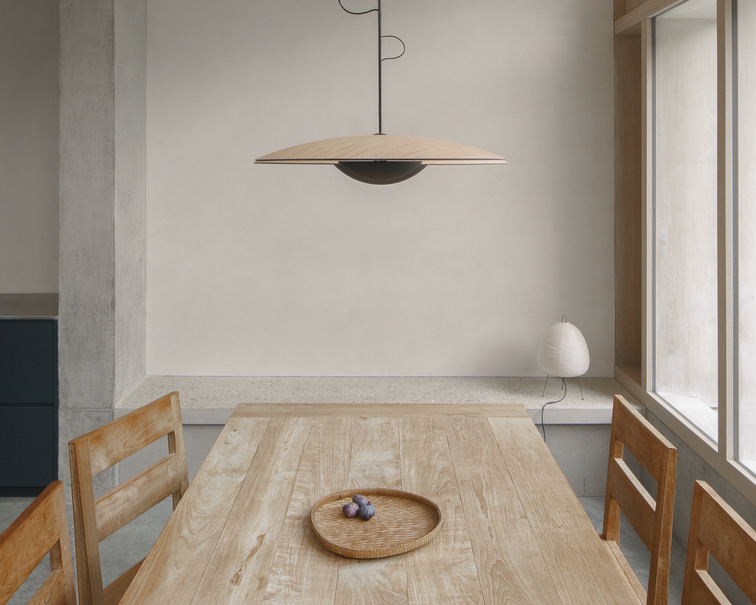
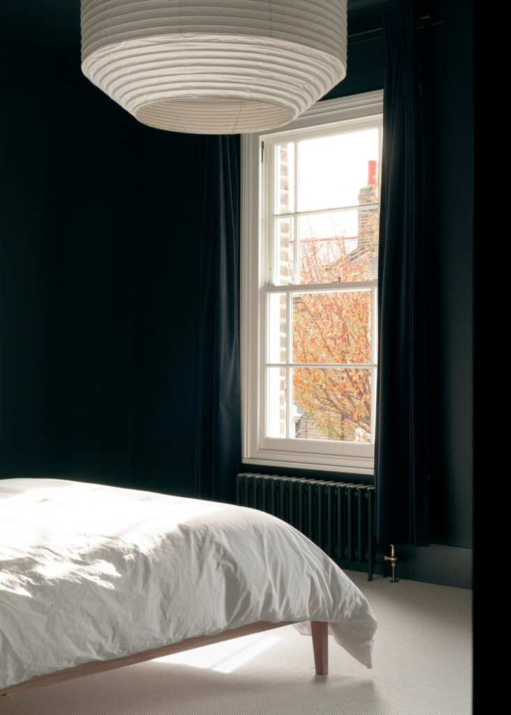
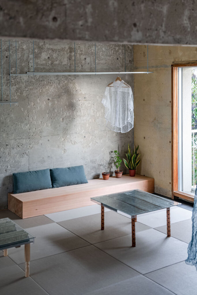
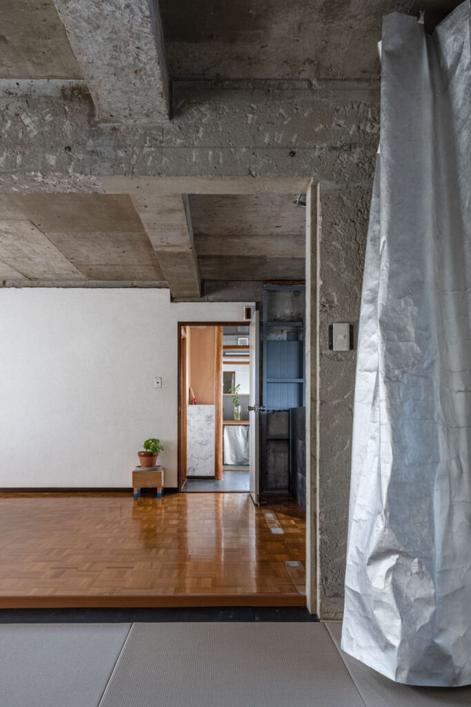
With Nagoya flat, I imagine all the exposed concrete makes it quite a cool space to be in summer, but how did you tackle issues of insulation and heating for when it gets cold? 

I try to prevent cold air from entering through the gaps in the windows, I have gas heaters, and I put down carpets. We don’t have many cold days where it snows, so the heater is all we need.

The room was bare from the time we rented it in the first place. I didn’t want to spend that much money on a rental apartment, so I didn’t go as far as insulating the apartment for long-term living.

With Seaside Villa you had to take into account the effect of sea breezes on the property did you also have to consider issues of rising sea levels and how they might affect the property in years to come? 

We did not take into account the sea level rise. When the tide goes out, the beach will appear and the scenery will change, and people can play there. This site will not be rebuilt in the future because the ordinance has been changed to a place where new buildings cannot be built, so this architecture cannot be rebuilt either.

Where do you draw your inspiration from when working on a project? 

A lot of it comes from everyday experiences. It can be something you notice while casually walking around the city, an exhibition, a movie, a book, or a conversation with someone.

With PALETTE you particularly had to consider accessibility for those with disabilities is this something you also consider when working on other projects and has PALETTE changed how you approach issues like these in your work? 

In Japan, depending on the scale and use of the building, there are some things that are essential to consider. The degree of this depends on the project, but I think it is important to make it easy to use for all kinds of people.

House in Shima has a very open and welcoming design, considering how closely it’s located to a national park is this an intentional way to integrate its man-made structure with the surrounding nature.

It does not face a national park but is located in a national park. It is under the control of the Ministry of the Environment and had to be built with consideration for the landscape. For example, the colour of the exterior walls and roof, and the slope of the roof. In this way, the materials and colours naturally became closer to nature. The open design is more in accordance with the client’s request rather than in the park. The desire to live in nature with the windows open at all times and to have a barbecue all year round led to this open appearance.

What was the most challenging project you worked on and why? How did you overcome those challenges?

There are always difficulties in every project, so it is impossible to rank them.

Are there any new technologies within this industry that you are particularly excited about and how do you think they will change how to approach future projects?

3D scanning. If we can easily read the land and the inside of the building, the design will be more accurate.

What advice would you give young creatives looking to get started in this field?

Our efforts will always come back to us in some way. In any project, we face society and aim to improve the atmosphere of the world, even if only little by little. Many young people become frustrated because they think that they are not suited for this kind of work, but you cannot decide what you are not suited for.

“It is important to have a feeling of love and wanting to do something.”

Are you working on any projects currently and what plans do you have for the future? 

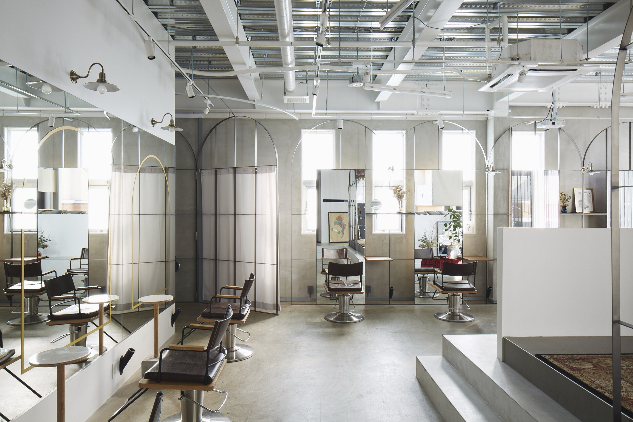
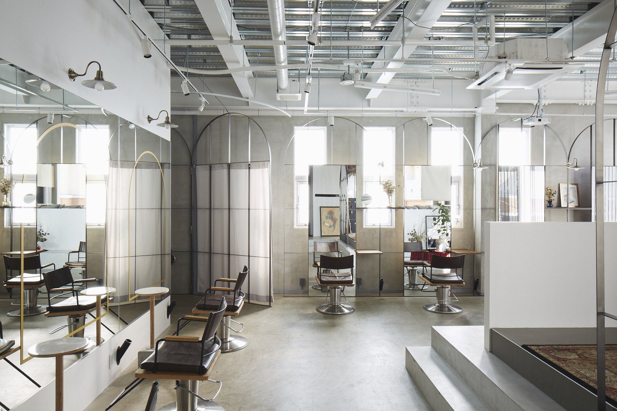
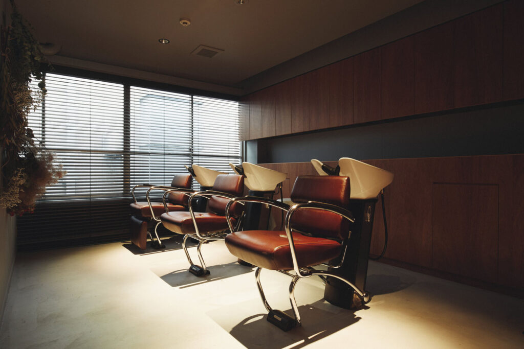
We are working on exchanges, housing complexes, detached houses, clinics, relaxation salons, etc. Since we moved our office to Sakae in the centre of Nagoya in February 2021, we would like to work on cafes, salons, apparel, bars, offices, etc. around the town where we work.

Credits

Images · Nanometer Architecture
https://nm-9.com/

Judy Watson

“In making the work I make I am lifting up my ancestors and their stories and learning more from them every day”

Judy Watson is an Australian artist whose practice is based on her exploration of her matrilineal Waanyi Aboriginal heritage and the experiences of Aboriginal people since British colonisation. Exploring Waanyi culture through the lens of collective memory, she then incorporates these histories into her artworks, often drawing on archival research and documents.

Watson’s work a preponderance of aboriginal blood uses copies of documents from the Queensland State Archives which are then layered with ‘blood-like pools of red paint, symbolising the pain and deaths of Aboriginal people.’ The documents in question are evidence of the discrimination Aboriginal Australians faced, including voting rights.’Full blooded’ Aboriginal people were not allowed to vote but ‘half caste’ Aboriginal people were. The artwork highlights the awful treatment of Aboriginal peoples in Queensland as a reflection of the ongoing effects of British colonisation.

This artwork will be part of A Year in Art: Australia 1992, a free exhibition at Tate Modern. The exhibition brings together a selection of over 25 works, many on show for the first time in the UK. The exhibition explores how artists have acknowledged the continuing relationship Aboriginal and Torres Strait Islander peoples have with their lands, as well as the ongoing impact of colonisation and the complexities of representation in Australian society today. The exhibition is available to view from June 8th 2021 until Spring 2022.

When it comes to ideas of social change you have described your work as subtlety discreet with a strong message that insinuates itself into the viewer’s consciousness, do you think that aesthetically pleasing and subtle artworks can be used as an effective form of activism?

Yes, I think the power of aesthetics and subtlety can embed themselves into people’s memory and slowly leak their contents into their consciousness before they can put up resistance. Sound and smell can be a strong activation as well.

Do you think this exhibition, and your artwork specifically, will make British people more aware of the issues of British colonialism and how that affected/affects Aboriginal and Torres Strait Islanders? 

Yes, if people look into the work, they will get a sense of the oppression of Aboriginal people under the ‘Act’.

You talk about collaborating with family members on your artworks. Did they have any specific input/influence on a preponderance of aboriginal blood, and if so in what way?

I spoke to my mother, Joyce Watson about this work. She is also trained in printmaking, in fact, I was one of her first art teachers at Art School in Townsville. After making this work I took Mum and Dad into the Queensland State Archives with me. I showed them the files held on my grandmother, Grace Isaacson (Camp) and her mother Mabel Daly, among other members of my matrilineal Aboriginal family. I made a second artist book: ‘under the act’ based on these files. My mother is very supportive of me using this material in order to show the public what it was like for our people to live their lives under this institutionalised brutality and bureaucracy. My grandmother, Grace Isaacson gave permission for us to access her files.

You speak about collective memories as an inspiration for your work, have you found that a lot of personal histories and information have been lost due to a fear of discrimination from British colonialism? And if so did you find that loss of personal histories frustrating when researching during your process?

Many people have helped me to uncover documents and history about my Aboriginal family. I did interviews with my grandmother Grace, my mother Joyce and other family members from Mt Isa over the years. I’ve also undertaken a lot of research as have others about these untold stories of colonisation in Australia. It was hard at first to find these stories but we achieved it with persistence and hard work. There is more to be unearthed in the future.

Can you tell me about your creative process for a preponderance of aboriginal blood? How did you come up with the idea and how did you go about the physical process of making the artwork? 

I went to a talk by Loris Williams (an Aboriginal archivist) and Margaret Reid at the University of Queensland about Indigenous people and the right to vote in Queensland. They showed amazing documents on their PowerPoint and this is where I first heard the terms: half-blood and a preponderance of Aboriginal blood. Immediately I knew that this is what I wanted to make work about. I had been asked to make an artist book for the commemoration of Queensland women and the right to vote. I knew I wanted to focus on Aboriginal women in particular. I asked permission to use the images from Loris Williams’s talk and it went from there.

I’ve discussed the making of the work in previous texts that you can access from the description in ‘a preponderance of aboriginal blood’.

In previous works you have united your Aboriginal heritage with your English, Scottish and Irish ancestry such as standing stone, kangaroo grass, red and yellow ochre, is this also the case with a preponderance of aboriginal blood? How else do you navigate the contrast of these ancestries within your work?

My work ‘burnt shield’ which is in the collection of the Queensland Art Gallery could be the shape of a European family shield. It could also be the female shape of the pubic area, or the waterhole at Duwadari waterhole, Lawn Hill Gorge, Boodjamulla National Park in NW Queensland. Sometimes I have referenced my skin colour, derogatory names and imagery associated with flayed skins. These are earlier works, both in prints and works on canvas.

You stated that shared experiences are an important part of your work. How do you feel to be a part of this group exhibition and is there any other artists artwork that particularly resonates with or stands out to you?

There are many amazing artists whose works resonate with me.

Sometimes I know them and sometimes I don’t but their work goes beyond the knowing.

You describe discovering how your Aboriginal ancestors were treated as a ‘heavy burden’, do you consider your artistic work/process as a way to work through, express and deal with that ancestral trauma?

In making the work I make I am lifting up my ancestors and their stories and learning more from them every day. I want to pass that knowledge onto my children and to others in the wider community.

What other media (i.e. books, films, documentaries)  would you personally recommend to people who are looking to learn about Aboriginal and Torres Strait Islander histories and cultures and the effects of British colonialism? 

Tony Roberts ‘Frontier Justice’, Timothy Bottoms ‘Conspiracy of Silence’, Bruce Elder ‘Blood on the wattle’, Rachel Perkins ‘First Australians’. So many books, videos, resources…

What artworks are you currently working on and which topics do you plan on exploring in the future?

I am currently making two bodies of work for different projects and venues that I can’t reveal yet.

One project is looking at climate change. The other is looking at a big issue affecting Aboriginal and Torres Strait Islander people in custody. I am also working with more research around the Aboriginal women in my family, the stations they worked on, the maps of the country. Other imagery will appear as I go through the process of making the work.

My public artwork ‘bara’ will be installed soon at the Botanical Gardens in Sydney, looking down at the Opera House. It is a large work in marble that represents the bara / fish hooks made from shell. These were predominantly used by Aboriginal women in Warrane / Sydney when they were fishing in their Nawi / bark canoes in the waters around Sydney, catching fish for their families in Gadigal Country.

Credits

DGN Studio

“Light is always the starting point for all our projects”

Founded in 2016 by Daniel Goodacre and Geraldine Ng, DGN Studio crafts customized objects and spaces informed by utility and the context of their surroundings – an approach to design that is instilled with a deep sense of care and attention to detail. The architecture studio aims to enhance the everyday living experience of their clients, and advocates for a carefully considered use of materials. 

The studio’s 2020 Concrete Plinth House project is located in the London borough of Hackney, where a dark Victorian semi-detached house has been transfigured into a sleek and leisurely brutalist-inspired home. The terrace is grounded on a dense concrete base, yet feels light and serene, featuring clean, minimalist surfaces. Commissioned by a young couple to transform the house into a modern family home, the project extended and opened the property to include lighter-touch renovations that show off the beauty of the materials used, such as concrete benches and wooden beams, all working in a simple aesthetic and functional harmony.

NR Magazine speaks with DGN Studio to get a deeper insight into their design values and to discuss the details of the project.

For this project you were tasked to create a versatile and leisurely space – what initially sprung to mind when you began to conceptualise the house? 

Making a space that could accommodate gatherings of different sizes seemed to require a degree of flexibility. We had conflicting thoughts at the outset. We wanted to make a space that could be used in different configurations, but also a desire to create something with weight and mass that felt very firmly grounded in the site. 

In the end the flexibility was achieved not by moving things around, but from being able to occupy the edges of the space – the steps, perimeter walls and benches which provide lots of options for how they might be used. This allowed us to really explore the feeling of permanence created by these various concrete surfaces and plinths. 

We also had an early idea about the timber frame as a kind of screen or filter between the interior and exterior spaces which in this instance seemed a more helpful concept than that of placing windows in a wall. 

What was your approach to working with the original features of the house? 

We wanted the new addition to resonate with the existing house in a subtle way, such that it could have a definite character of its own. 

The best rooms in the existing house had a tall proportion and we liked these spaces as distinct rooms that suggested specific purposes or activities. We wanted the new spaces and layout to maintain this feeling of a series of rooms while also opening up long views throughout the house, pulling light further in and creating a better flow through the spaces. The level changes in the floor and ceiling help distinguish the different ‘rooms’ of the new space. 

We paid attention to the details of the house such as door handles, window furniture, and curtain rails and commissioned Dean Edmonds to design bespoke pieces that sat comfortably in both the new and existing parts of the house. 

The sash windows running along the side elevation are a nod to the original glazing and add to the resonance between new and old. 

Were there any influences for the project? 

There is no overarching reference point – there are loads of influences that come in at different points of the project for specific reasons. Mostly it is about identifying a particular atmosphere that is right for the space. 

Developing the project is about navigating a course through the different parameters that emerge at each stage – starting from conversations with the client about their lives and desires, to their budget, planning restrictions, and then developing the details of how the building is put together with the skilled craftspeople who actually make it. All this time we are trying to hold onto that desired atmosphere and make sure that this still emerges at the end of a very long process.

You can really sense a harmony and a celebration of materials with the project- was this something that was particularly important for you? 

Absolutely – the material palette is really the stuff that the building is made from (predominantly oak and concrete). We were keen to keep the number of finishes relatively limited, and for the different materials to contribute to the serene atmosphere of the new space. 

We generally favour a relatively subtle material palette not because we don’t love colour, but because we tend to find that colour comes best from all the life that takes place inside the space rather than from what we have designed. The building is not the main event! 

How did you go about prioritising light and space with the project, especially in an older building and a tight urban site? 

Light is always the starting point for all our projects. How the sun moves around the site and how to choreograph spaces in relation to this. 

Extending a house can create problems with light due to the resulting depth of the plan so it’s really important to consider how the existing spaces will be affected. As a result, we have opened up views through the house so that you can see the garden from a number of locations and pull in as much light in as possible. There is also a considered contrast between light and dark spaces passing through the dark snug that sits between the living room at the front and the kitchen/dining room at the rear enhances.

We were also very conscious of not overexposing the interior, and the positioning of the glazed panels in the extension was carefully considered to get the balance of lighting right and to prevent the feeling of being in a goldfish bowl.

Were there any existing structures or materials that influenced the design? 

There’s a whole library of projects floating around in our heads – the ones that rise to the surface will depend on the client, the brief and the site. We also try to resist becoming diverted by all the things we’re looking at and trust our intuitions which are of course built on all the things we’ve seen and appreciated. 

How do you get inspired when starting a new project? 

There’s so much to draw from in any new project, no matter how small it may be – every site has its own history, and every client has their own unique story – trying to get under the surface of how the clients live (or would like to live) is really important and provides lots of starting points. 

We’re also really inspired by the city we live in and how it has developed over the centuries – just a bus ride through it is enough to generate a whole raft of ideas. Of course, inspiration often comes in more oblique ways through art objects, music, books, landscapes…

What’s your usual process in developing a design concept? 

It always starts with a plan and lots of sketching to try and explore the intuitions that we have about the project. From there we like to try and get as quickly into making models as we can – often digitally first, but we always like to make physical models as well. So much is discovered and can be tested in the making of them, and they always resonate well in describing ideas to clients. 

Throughout the process we also like to have workshops with clients – sitting together around a table and discussing the ideas – the project is always a collaboration, and this is fundamental to the way projects develop.

DGN Studio is currently working on a number of residential projects across London, as well as designing and making furniture and interiors.

Credits

Images · DGN STUDIO
www.dgnstudio.co.uk 
Photography · NICK DEARDEN FROM BUILDING NARRATIVES

Joe Mortell

“When working on a new scene, I always aim to have at least one unique element in it”

Joe Mortell is a 3D designer based in London, whose work combines the efforts of creative direction, animation and illustration to construct elegantly rendered interiors and landscapes. Often merging into one another, Mortell’s interiors and exteriors integrate to form a unique and surreal aesthetic, crafted with a high level of detail.

Mortell’s 3D rendered environments have a comfortingly familiar, dreamlike quality to them. With their carefully stylised compositions and polished imagery, it is as though we’ve been given a glimpse into a digital utopia. With ambient lighting, inventive furnishings and alluring textures, Mortell’s work transfigures the digital realm into something almost tangible.

Initially moving to London to study graphic design before specialising in 3D work, Mortell has built a vibrant and impressive career, working internationally with the likes of The New York Times, Wallpaper*, Selfridges, Louis Vuitton, Moët Hennessy, Youth to the People and more. NR Magazine speaks with Joe to learn more about the details of his 3D designs, pop culture influences and creative process.

What attracted you to start working with 3D design?

I love the amount of freedom 3D can give you as a designer! There are so many different areas within it to explore, learn and experiment with. When I first started, I was trying out almost anything that came to mind. Animating things like wind moving through plants, light beams passing through windows and light refracting through rippling glass. You never know what new effect might come out when you experiment within 3D. Even today, around 5 years after I started, I have a huge list of things I want to learn and experiment with.

What do you enjoy most about working with digital and surreal landscapes?

I really enjoy merging the outside world with interior spaces. They have a really nice mix of feeling unusual and surreal but also inviting. You can imagine yourself walking into them, relaxing and even exploring past the edges of the frame.

I feel that up until now it’s been very difficult and expensive to imagine spaces like these without a large movie budget. Within 3D it’s not only really quick to create things like this but it also gives you the freedom to experiment quickly and stumble across happy accidents.

The past year has been such a struggle for the arts and for creatives – how have you managed to stay motivated?

As with a lot of other people, this past year gave me a lot of free time that I wasn’t expecting to have. Personally, this enabled me to spend a lot of time experimenting and refining my 3D work. I enjoy doing it so much that it feels like a hobby when I’m learning something new or trying out a new idea for a scene. I feel as if the last year has allowed me to see what I want to achieve in my work a lot more clearly. I realise this really isn’t the case for everyone. My advice to anyone that is struggling is to try and find a completely new creative area that interests them and experiment with it. If you can find a creative area that you really love, the motivation will come on its own.

When do you feel like a work is ‘complete’?

I tend to focus on the composition of a scene first so I can settle on a direction and will then have a good base to work from. After that’s in a good place I start to add natural elements and furniture until the pairings feel right together.

The last 50% of the work that I put into a scene will be all about the smaller details and that’s where I feel the scene starts to really feel complete. These will be details in the materials and textures to make them feel natural along with small objects to make the scene feel lived in. An ideal scene will have small areas that catch the eye and really hold your interest.

What are the most important things you consider when designing your 3D landscapes?

When working on a new scene, I always aim to have at least one unique element in it. This could be the shape of the architecture, the natural landscape, the lighting, the colour palette or maybe even something simple like a unique piece of furniture. Using this method has helped me to find entirely new approaches to making scenes. Some things that I’ve tried out as an experiment before have become the core foundations in what I create today.

What spaces and landscapes inspire you and your practice?

The spaces that inspire me the most are almost anything retro and futuristic. I love the unique shapes in the architecture and the super bold and stylish furniture within them. I’m always aiming to find the right balance between vintage and futurism in my work.

I’ve also started to become very inspired by renaissance landscape paintings. They manage to achieve a feeling of amazing depth within them by using clever areas of shadowing and lighting to break down the scenery into something more readable. The lighting and scenery in these paintings always have a brilliant powerful feeling to them that would be amazing to try and capture in a 3D scene.

What aspects of your own life influence your creative vision?

I’m a huge movie fan so this has played a big part in how I imagine new scenes. I especially enjoy anything surreal, or anything dream based. Studio Ghibli movies stand out as some of my favourites along with movies such as Eternal Sunshine of the Spotless Mind with its incredible surreal scenes. I’m also a fan of Nintendo, so the worlds in Zelda and Super Mario have always really inspired me.

What have been your favourite projects to work on?

I have so many favourites it’s difficult to pick! I find that working in 3D allows you to work on such a wide variety of different projects. I find that I either particularly like working on something I haven’t tried before that allows me to experiment a bit, or on the other end, a project that allows me to really focus on refining the realistic details.

A few projects that do come to mind are modelling and animating birds for AllBirds shoes and NYT that allowed me to try something new. I also recently worked on a project for Wallpaper* with Charlotte Taylor where we mixed furniture with outdoor spaces. Another would be creating six unique surreal animations for Youth to the People.

Are you working on anything at the moment?

Right now I’m working on some really exciting projects. Some of which are collaborations with other 3D artists where we will be creating spaces together. Combining different skill areas that we have to make some really unique ideas. Also, as I’ve been solely focusing on still images the past few months, I’m working on bringing motion back into my work and creating a series of surreal animations.

Discover more here joemortell.com

Brent Chua

Stem

Credits

Photography · BRENT CHUA
Fashion · JUNGLE LIN
Grooming · TAKANORI SHIMURA using MAC COSMETICS
Models · CANNON MICHAEL and LUKE LENSKI at IMG

Designers

  1. Full Look SAINT LAURENT with GUCCI Shoes
  2. Full Look BOTTEGA VENETA
  3. Full Look KYLE’ LYK
  4. Full Look GUCCI 
  5. Coat VERSACE Top ERMENEGILDO ZEGNA XXX
  6. Full Look LRS NYC with DRIES VAN NOTEN Shoes
  7. Bag ERMENEGILDO ZEGNA XXXTrousers and Shoes EMPORIO ARMANI
  8. Back Turtleneck GUCCI Trousers BOTTEGA VENETA Shoes LOUIS VUITTON   Front Trousers KYLE’ LYK
  9. Full Look LOUIS VUITTON
  10. Left Shirt DRIES VAN NOTEN Trousers ERMENEGILDO ZEGNA XXX Shoes EMPORIO ARMANIRight Shirt and Shorts VERSACE Shoes SAINT LAURENT

Jean Dubuffet

Chaotic yet vibrant visual tumult, mirroring the hectic pace of life in the last quarter of the century

Barbican Art gallery presents ‘Jean Dubuffet: Brutal Beauty’, the first major UK exhibition in over 50 years celebrating the career of Art Brut pioneer Jean Dubuffet. The exhibition explores Dubuffet’s rejection of conventional notions of beauty in favour of more subversive forms and presents the artist as a multifaceted innovator of the immediate post-war period, adept at translating his creative vision through a vast range of artistic mediums, creating works out of mud, glass and cement.

Walking through the exhibition, visitors can track the course of Dubuffet’s career, as his practice and inspiration evolves and progresses. Abundantly inventive and playful, Dubuffet’s oeuvre includes assemblies of butterfly wings, scrawled illustrations, viscous and visceral painted landscapes and female nudes – monstrous and captivating – that all come together as a chaotic yet vibrant visual tumult, mirroring the hectic pace of life in the last quarter of the century. 

A defining feature of the exhibition is Dubuffet’s variety of technique and materiality. His work prompts a unique kind of introspection and contemplation, as he captures the sombre essence of the post-war period. Dubuffet’s scenes and caricatures rail against traditional ideas of beauty and capture the beauty of the mundane and something in a gritty and poetic way.

The exhibition is on at the Barbican until the 22nd August.  For more information visit Barbican

Paolo di Paolo

Milano. Fotografie 1956 – 1962

As I enter an entryway clothed in a mass of tendrils and leaves, a restaurant heralds the space with diners enclaved among the green shrubbery. I follow the walkway until I find myself at the footsteps of a staircase, leading towards the gallery. Fondazione Sozzani presents the exhibition Milano. Fotografie 1956 – 1962 of Paolo di Paolo, curated by Silvia di Paolo in collaboration with Bvlgari. The series of photographs displays di Paolo’s adoration and admiration to the city of Milan, which meant a sense of traveling to a foreign country for the photographer. The exhibit showcases di Paolo’s conception of Milan, an unprecedented and untouched look before globalization. Mist hovers, residents and pigeons flock the city center, and the romance of typography and companionship croons the metropolis: the photographs lull the visitors back into the ripening state of Milan.

Humid air permeates the quaint space of the exhibit, stirring up warmth against the twenty-five-degree weather outside. The sliding door remains opened, stuck in its machinery, but whirs whenever a guest walks into the area. As I make my way inside, the glint of the seventeen overhead warm lamps, dangling over the square-shaped metal railing, reflects on the glossy purple floor. It adds illumination into the space as if the two closed windows on the left side are not enough to spill the sunlight inside. Positioned in the middle, a DNA-shaped metal seat waits for three tired guests, but there are only two visitors at the time, myself included.

Strolling to the left side by the entrance, di Paolo’s reverence for Milan springs up. The photographer captures four open windows in an architecture for La natura resiste. From afar, a person holds onto the railing of a window as they dust off the beam they crouch on, but the attention suddenly diverts to the sawed trunk and branches attached to the remains of the tree with a rope. The classic human versus nature tale leaps off the frame, a lost narrative from the two images of Fiera di Milano that position beside it. In these two photographs, captured in 1962, a crowd inspects the thermal circuit breakers with its cresting gray thin wires inserted into an unwieldy-looking box where the name KLIXON remains embossed on the side. The business men’s observant and analytical gaze at the device outlasts their time so much that they have forgotten to notice the two nuns in their habit uniforms that observe with them, who are enthralled by how the device functions. As di Paolo walks further in the 1962 technology fair, he captures three men and a woman peeking through the viewfinders of the cameras nestled into the walls which promise 3D images during the decade.

The year 1960, two years before the fiera, means di Paolo goes to Bar Jamaica and weaves through the bustle of Milan’s folks, photographing their humane interaction by giving each imagery his definition of grandeur in the city life. An orator raises his hands as he looks at the ceiling, swooned by his own declarations and dismissing the puzzled looks of the man behind him. A man sits beside a woman and courts her, bending his head sideways to usher humor into his punchlines, while she directs her eyes far from his presence. A woman looks behind her to find a man in his pensive expression as he raises his small cup, snugged between his forefinger and thumb, just below his lips. On the other side of the room, a group of men gambles in a room clothed with bathroom tiles. Here, the primary subject wears an unperturbed expression while a lit cigarette snuggles between his teeth, oblivious to the curious onlooker behind him who stands too close to the player and desires to offer advice on which card to throw on the table.

Magnolia on the radar, the celestial flow of luxury in the 1960s: di Paolo walks into the Aretusa Night Club, his camera in tow. Inside, an overhead lamp casts shadows across the space, illuminating romance and haze to wrap with the nostalgia of the evening. A man hooks his arm around a woman’s hips and tugs her to his body. They sway to the soft hum of the music and pay no attention to the patrons that surround them as they gaze into each other’s eyes, falling and ruminating. Such a sight differs in Sala da ballo as patrons dance to the sound of the live band, a mix of piano and guitar tunes over the saxophone lullabies.

Di Paolo commands his camera to record the political discussion in Duomo, the heart of Milan, when the year pivots back to 1958. The frantic pigeons flap their wings aggressively as they flock the city center, masking over the photograph. As one sees beyond the birds, residents crowd beside the monument of Vittorio Emanuele II to participate in political exchanges in their heavy winter coats, handheld purses and attache cases, tipped hats, and cigarette stubs between the lips. In the background, the forgotten era of typography in a myriad of designs and styles pepper the antique and historic architecture of Milan, a slow ascent towards modernization and minimalism.

The photographer’s storytelling on Milan endures as he captures a lone man walking on the roof of the cathedral with his phone on his ear, his scrunched eyebrows signal distressed against the lush and resplendent of the church. In Sul tetto del Duomo, – on the roof of Duomo – di Paolo hovers his camera to carpet the shot with the cathedral’s poignance, a registered vaporous memory to last and test time. As di Paolo walks down the cathedral and into the streets of Milan, he bumps into a couple, innamorati a Milano, lazing in the angle of a street – the man in trench coat looks afar as contentment flashed across his face and lets the woman beside him rest her cheek and hands on his left shoulder. Milan serenades the couple in the shelter of its romantic arms, enshrining their affair with a state of zen and mirage for years to come.

Dusk turns into nighttime, and the city center glows with Christmas string lights and street lamps. Di Paolo shoots four photographs for le luci di Natale as the exhibit forwards in 1962 and demonstrates the solemn celebration far from the Western upbringing. A policeman wears his cap and stands alone in the corner of a street, watching the pedestrians cross as the rattle of the tram passes by. Cars honk as they jam the street and appear slower than the crowd who germinate the sidewalks on foot. A policeman – his back facing the lens – stands outside Galleria Vittorio Emanuele II in Duomo, watching the residents stoll around the space and away from the frenzy Milan encounters today. The last photograph, the one that sits on top of the three frames, shows street lamps decorated with sticks of light to emulate fireworks in a starless sky. Here, a sense of finale has dawned in defiance.

I step back from the four photographs of le luci di Natale and turn around to find myself alone in the room. The afternoon sun creeps into its peak, and the rays pass through the window panes and bounce on the floor, attempting to replicate the reminiscence of Milan between the 1950s and 1960s. The longer I remain in the four walls of Fondazione Sozzani in Via Corso Como, 10 with Milano. Fotografie 1956 – 1962 of Paolo di Paolo, the more I realize that the beauty, divinity, and fertility of the bygone years persist.

Credits

Images · FONDAZIONE SOZZANI
For more information visit
Fondazione Sozzani
Corso Como 10, 20154 Milano
tel. +39 02.653531
galleria@fondazionesozzani.org

Auroboros

“Agender and body inclusive, the clothing line is establishing a community evolving around the limitless nature of digital”

What could questionably be the most important aspect of contemporary fashion, if not its attempt in shaping the light of tomorrow, or, as others would say, the future?

In light of the countless issues and social discrepancies, the role of fashion cannot detract itself from accountability any longer. Being the second most polluting industry worldwide, and probably one of the most disregarded powers in promoting cultural, political and ethical change, nowadays fashion has landed onto a battlefield that requires much more than it used to. Producing clothes, projecting a vision: time requires engagement, it expects creative voices to speak, and bring light to what more than ever should matter now, change. So here I am, hoping for a brighter tomorrow that I ask myself, what is the ethics of the future? Where should fashion be standing within such instances?

The correlation to luxury not only became to represent a myth, it has rather bonded itself to an idea of culture which cannot survive within time. What we are experiencing is a crisis of values, where the reward of luxury is nothing, but individualistic. Looking back at the etymology of luxury, it is clear that its original meaning of ‘abundance’ cannot fit within the contemporary scenario anymore. The act of consumption of the rarefied can no longer withstand, rather, one should question what it could eventually mean today. With the advent and unprecedented development of technology and digital platforms, how can luxury fit within the cyber realm and culture? Digital currency, digital art, the world of NFTs is slowly redefining the meaning of luxury. People are investing in it, they are questioning the principles of its value, making implications that could dismantle our preconception of worth.

Striking attention this spring is nonetheless the digital creator AUROBOROS. Member of The Sarabande Foundation by Lee Alexander Mcqueen, the uprising high-tech brand is deconstructing the boundaries of fashion, placing itself under the spotlight as the first-ever digital fashion house.

The founders Paula Sello and Alissa Aulbekova, respectively digital designer, and director of visual communication, have been merging forces in bringing to life the first brand blending physical haute couture to digital-only ready-to-wear design. With innovation at the core of their project, the designers are morphing their sci-fi and nature inspiration, to project the wearer into another world, into other realities: to take the physical experience onto unexplored territories.

Two are the lines the brand is currently covering: physical couture and digital RTW. The first, focused on innovative science, employs never-used-before materials in correlation to temporality. Designing pieces that grow over a longer period of time, the brand’s couture creations project patterns from nature onto the wearer’s bodies, transcending the evolution of the materials from the very first stages of their conception, to their growth and final disintegration. On the other hand, AUROBOROS’ RTW line is instead debuting on a full-digital basis: capping material wait to 0, and addressing luxury to a much wider audience. Agender and body inclusive, the clothing line is establishing a community evolving around the limitless nature of digital: a domain where body diversity and disabilities can be fully represented, bringing self-expression to an innovative brand new stage.

AUROBOROS allows the wearer to encapsulate the garment onto any visual source. it allows materials exchangeability, including fire, jellyfish, metal: in other words, a limitless asset of opportunities. Not only is RTW being deprived of its infamous idea of luxury, the brand is also actively opening it to a wider dialogue, demonstrating the power of technology in generating utopia rather than dystopia.

As pointed out by the designers, digital fashion should not dictate, it should rather push us to explore identity, and reconnect to nature. Imagine a world where anything could be worn: with creativity being the only limit, it is within such instances that luxury is pushed to an idea of experiencing something that you would have never thought of before.

With this in mind, how could consumerism accept the digitalisation of fashion to become the ultimate luxury?

Dropping their debut collection this June during London Fashion Week in official tech partnership with the Institute of Digital Fashion, the brand’s hopes fall within the understanding of their creative process as an effort in creating a new world, rather than a mere digitalisation of a tangible experience. What this seems to be all about, is to suit fashion to the customer, erasing its impersonal contemporary status. AUROBOROS has successfully demonstrated the necessity for accessibility, but, most importantly, has opened up a discussion that has been required for a long time. How we engage with technology is what will define our future.

Credits

Images · AUTOBOROS

Di Petsa

“There is a  censorship of our bodily waters: the fact that we are wet, the fact that we come from water is something to be hidden.”

When thinking of contemporary design and consumerism, the idea of social engagement is probably one of the most important factors in distinguishing the greatness of a creative mind. Dimitra Petsa, Athens based designer, and founder of the namesake brand DI PETSA, is a clear example of it.

Following her graduation from MA Fashion Womenswear at Central Saint Martins, the designer set back to her city of origin to establish her own label, a creative platform that pursues cultural support to women. “My long term aim is to be able to provide jobs for these women, to facilitate the training of younger people, in order to preserve crafts in the future.” admits the designer.

This past week, Dimitra Petsa sat down with NR magazine to look back at her roots, inspiration and ideals. Advocating against cultural taboos of wetness, the designer explained her intent and ambitions for her label: community based projects, performances, workshops and a publication too. Blending together performance art, writing and ancient design techniques, the brand is fighting against shame, promoting an empowering vision of femininity and WETNESS. 

For those who may still not know you, would you like to tell us a bit more about the brand and how you started your career as a fashion designer?

I grew up in Greece, around my grandmother who ran her own tailoring school, and this is where I learnt to sew and construct a dress from a very young age. I think this experience has influenced the way I see fashion in general, from the point of view as a seamstress who works with her personal clients, rather than its normative context. I admired her deep connection with her clients. While the fabric was pinned to the body there were secrets, tears, laughter… I craved this deep intimacy between the designer and wearer, which I first got to experience while developing my final collection at Central Saint Martins. My models would run around the studio naked, share personal stories, and discuss philosophy to help with the design development. One moment we were laughing, the next one crying: I fell in love with that process of design, an exercise based on personal experience and interaction.

How has your brand developed since your graduation at Central Saint Martins back in 2018?

The ethos of our brand is centred around the ‘Wetness Theory’. It has remained the same, and continues to be a focal point of our design inspiration. Each collection explores this through new viewpoints: looking at the evolution of the journey of a woman, her relationship with water, and how she is becoming more accepting of her bodily waters.

For the SS21 collection, titled Self-Birth, water is examined as a vital force of life, and re-birth, that allows introspection, and ultimately self-reconnaissance. With a focus on Maternal waters, and the journey to self-healing, the film displays the vision of a woman floating on water, representing the act of transcending – an ecstatic self-birth.

Our AW21 collection, titled “I am my own Mother”, is inspired by the devotion of self-mothering. To love one-self unconditionally, embracing the strength that comes with self-acceptance of our Bodily Fluids: Water filtered through our bodies, Bodily Water. Holy Water, Sea Water. After last season’s collection centered on ecstatic birth, we now look to a transformative future, harnessing the power of self-love for unashamed self-expression, with the aim of strengthening the connection to our physical and immaterial self, water.

How do your origins inform your work?

To me, the sea has played an essential role in growing up. My hometown in Greece is next to a harbor, meaning I could always hear boats leaving the docks from my bedroom. I find sea healing: to me it feels like home, it has played a big part in my research and creative practice with the DI PETSA brand.

In terms of cultural influence, I am very interested in exploring antiquity, how it coexists in contemporary culture, and how we communicate our relationship with the past in general. Greek mythology and practice inform my designs. For SS21, we developed a golden prayer corset that’s entirely hand-embroidered with materials traditionally used in Greek orthodox priest-wear.

Lastly, craftsmanship, sustainability and textile innovation are very important to me. I am very moved by the dying art of traditional greek craftsmanship. I would love to find a way to preserve it, to interact with it in my designs. For our latest AW21 Collection we have been working with a local group of women in Athens – the Lyceum Club of Greek Women, an organisation founded in 1911 – who work towards preserving traditional arts, including embroidery and lace making. For our latest season, we created our first collaboration together. My long term aim is to be able to provide jobs for these women, to facilitate the training of younger people, in order to preserve such crafts in the future.

I see Di Petsa, I think WET DRESS. Can you tell us about the inspiration behind it?

The Wetness theory behind the brand evolved during my time at CSM. I was conducting eco-feminist research, investigating the relationship between Women and water, Women and their bodily fluids. The idea was to create a vision of a totally wet woman, fully accepting she is coming from water, and of her wetness. Our goal in fashion is to allow people to be unashamedly wet. To create beautiful work that can inspire others to consider nature as something of our own. Our bodily fluids. Water filtered through our bodies, bodily Water, holy Water.

The Wetlook comes after an original technique that took 6 months to develop during my master’s years at Central Saint Martins. Its conceptualization started from a series of performances I was doing for my BA years studying performance, design and practice. I had a woman dressed in water walk across Athens and that was the idea I wanted to crystallize: somebody wearing their own Wetlook could be part of this water performance without actually having to be wet.

Where does your work stand in relation to Feminism? 

The brands Wetness theory seeks to subvert the idea of shame of natural bodily fluids. By re-narrating their physical and philosophical context – a notion that is unapologetically on display through our Wet Script Mesh collections, with poetic scripts, such as “Cries in Public”, “Holy Water, Sea Water”, “Wetness”, digitally printed onto the surface of the mesh garments – our mission aims to inspire the wearer and act as subtle reminders in the performance of their everyday life to embrace their wet self.

Through our work we aim to create a new narrative around bodily fluids and the female body, a subject that often remains taboo in mainstream media. We want to make women feel comfortable and empowered in their natural self, something which we are conditioned and told through the media to change and mould into what society views as the “ideal” vision of a woman. It feels very sanitized and stirpped back, “if you cry in public, you must hide it, if you breastfeed in public, you must hide it”.. There is a  censorship of our bodily waters: the fact that we are wet, the fact that we come from water is something to be hidden. Shame is a self-inflicting punishment. This research, which has resonated with a lot of other people, is to this day a personal healing journey.

Your work also penetrates the realm of performance, how does such practice enable you to spread your voice?

I knew I loved fashion, but I was also very interested in performance art, theater and film, and I wanted to acquire skilIs that would develop my artistic practice and bring new viewpoints and inspiration to my fashion education. I did my first degree in Performance Design and Practice at Central Saint Martins. When I graduated I continued onto the Masters in Fashion Design Womenswear, and that was where I really combined all my skills and interests into one practice: couture fashion practices, textile development with performance, sustainability and film.

Both performance and art are so important to my work and creative practice. I am very involved in my work: it is something very personal to me. The relationship between model, designer and viewer is very interconnected, that’s why I always take part amongst the performers in my shows, exploring my vulnerability and body expression, alongside their exploration. Through these intimate moments, and the overcoming of shame, I can really tap into my creative side, and create work that comes from a deeper place. Work that is authentic to me and my experience. For us, a garment worn with intention and connection to a deeper emotional message, is one that will resonate and last with the consumer.

At DI PETSA, we are working on many different creative projects aside from the RTW collections. We recently launched a book, titled WETNESS: A Script of bodily Fluids, which I wrote and also illustrated. The book consists of 7 chapters exploring 7 bodily fluids: Saliva, Tears, Breast Milk, Vaginal Fluids and Semen, Sweat, Blood, and Urine. The writing is a merge of scripts for a filmed performance and poetic text which aims to create an alternative narrative for bodily fluids.The book includes direction notes, rehearsal exercises, diary logs, and fashion illustrations offering a behind the scenes eye to the Wetness concept and the performance work at DI PETSA.

We also run monthly Wetness Workshops that allow our audience to deepen their connection to water at large, and the connection to our bodily waters.

What is the highlight of your SS21 Collection?

The highlight piece from the DI PETSA SS21 collection for me was the Gold Embroidered Breastfeeding Corset and Wrap Skirt. The embroidery technique was inspired by an ancient greek ritual dress often used to decorate Greek Orthodox Priest wear – traditionally worn by males – but created, and passed through the hands of women. I liked the idea of subverting this by applying the technique to a womenswear garment.

What do you hope your audience to perceive from your work?

I hope the work at DI PETSA inspires our audience to embrace their Wet Self. To find intimacy in becoming comfortable with their natural self and their fluid expressions of wetness. The Wet Script garments are a very useful performance tool for when you get out of centre, or when you want to dedicate your day to Wetness and to coming back to the home self – the sea. It can be very beautiful to just look down your chest, and read excerpts of a script that re-aligns you to your own self. It puts you back into the performance you choose to create, and not be so affected by what is around you. A wearer-performer, that’s the way that I perceive it. Someone who puts an intention forward when they wear a Wet Script garment, and chooses to connect with it on a deeper level.

What are the next steps you would like your brand to follow?

Craftsmanship and sustainable design is important to our brand, and something we want to continue to evolve within our design process in the future. We have recently started to work with a local group of Women in Athens for a special Ancient Greek embroideries series. We want to continue investing in community driven projects like this. As the scale of our production grows, we hope to employ more women. In the future, we would like to run teaching classes within our studio, to ensure the embroidery skills continue to be passed down to younger generations. We want to develop collections that are consciously designed, with investment in sustainable materials and innovative ways of designing, looking at methods of upcycling and repurposing

James Barnor

Exploring the nuances and societal transitions in the 1950s and 1960s, as London was blossoming into a multicultural capital

London’s Serpentine Gallery presents an overview of the career of British-Ghanaian photographer James Barnor. Working over two continents and over six decades as a studio portraitist, photojournalist and Black lifestyle photographer, Barnor’s career covers a multitude of photographic genres and offers a wider social commentary, documenting major socio-political changes in London and Accra.

On the cusp of Ghana’s Independence in the early 1950s, Barnor set up his famous Ever Young studio in Accra. Arriving in London towards the end of the decade, he began working with the South African magazine Drum, capturing the experiences of the African diaspora and the style and creative spirit of the period. Barnor returned to Ghana in the 1970s, where he continued his work with portraiture, established himself in the music scene and created the country’s first colour processing lab.

Barnor’s street photography explores the nuances and societal transitions in the 1950s and 1960s, as London was blossoming into a multicultural capital. Returning to the city 1994, Barnor’s work focussed on documenting the Black communities that had settled in London – something that had previously been documented by mostly white, European photographers. His portraits of the African diaspora in London focus on the members of the Black Power Movement, while also capturing different fashion trends present in Britain’s Black community during the 1960s.

Barnor’s body of work spans six decades and possesses a clarity of vision and a sense of community and sensitivity that he both extends towards and brings out in his subjects. The Serpentine’s exhibition displays Barnor’s work from 1950-80 and draws from his archive of around 32,000 images, all mapping the flourishing cultures of two cities and reflecting Barnor’s ceaseless uplifting and creative energy.

‘James Barnor: Accra/London’ runs until 22nd October at the Serpentine North Gallery.

Subscribe to our
Newsletter