“All things come from nothing and their presence in the present is a miracle of creation”
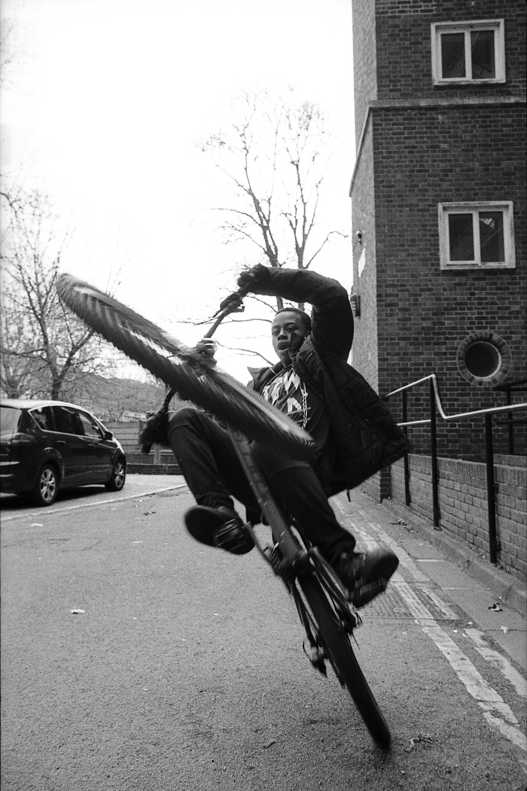
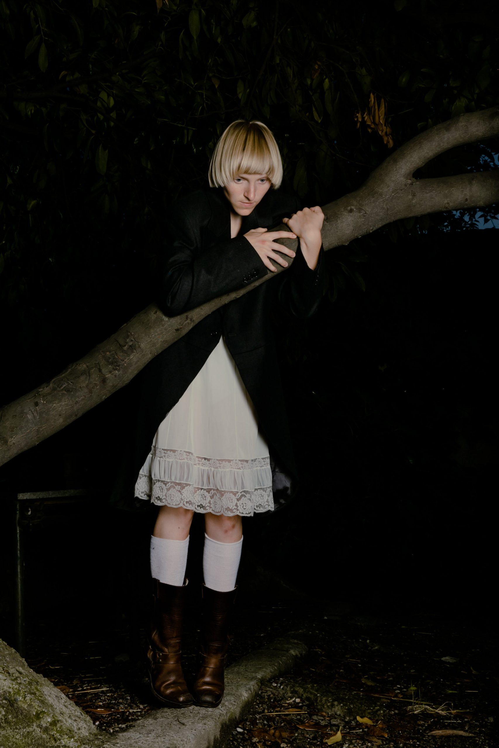
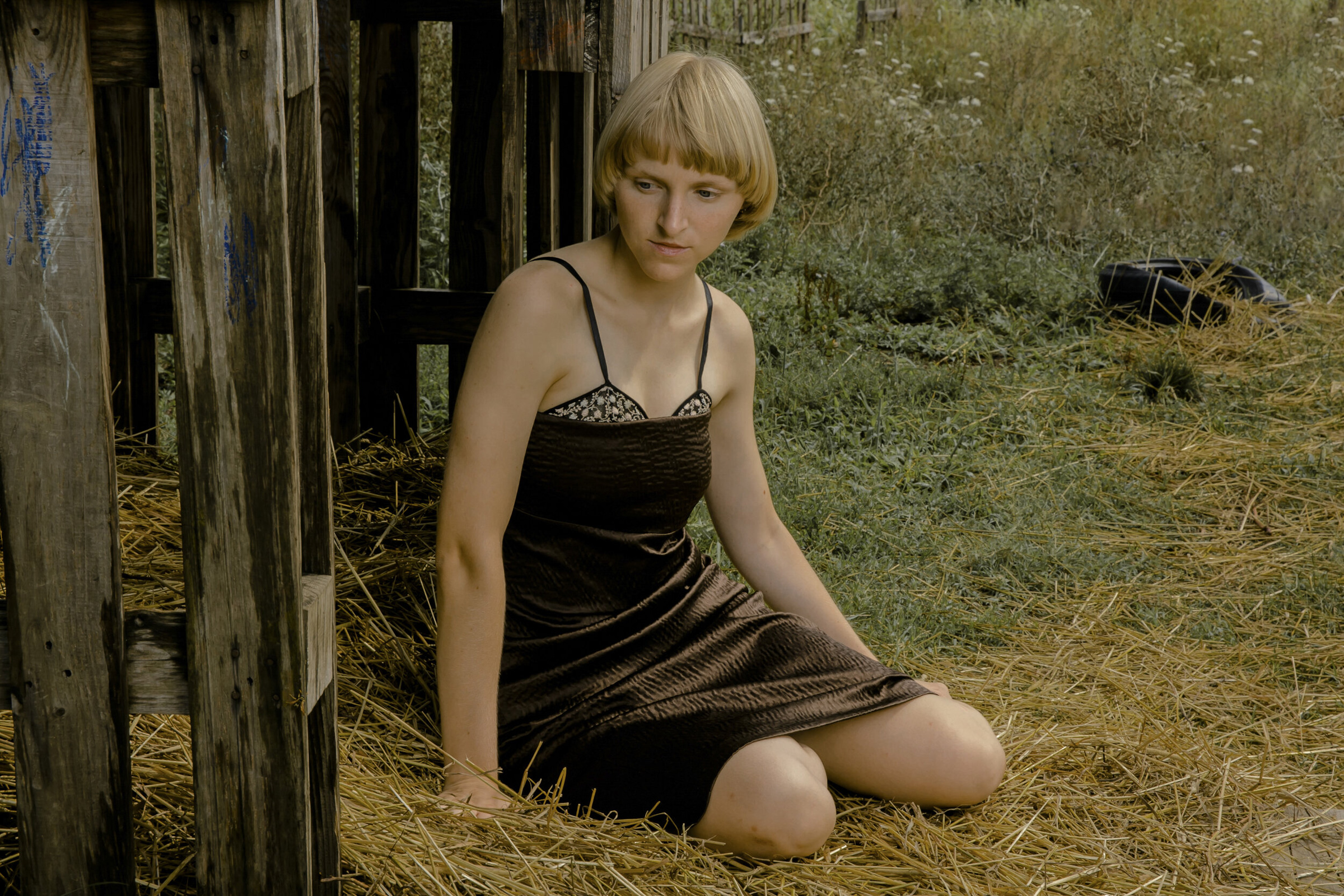
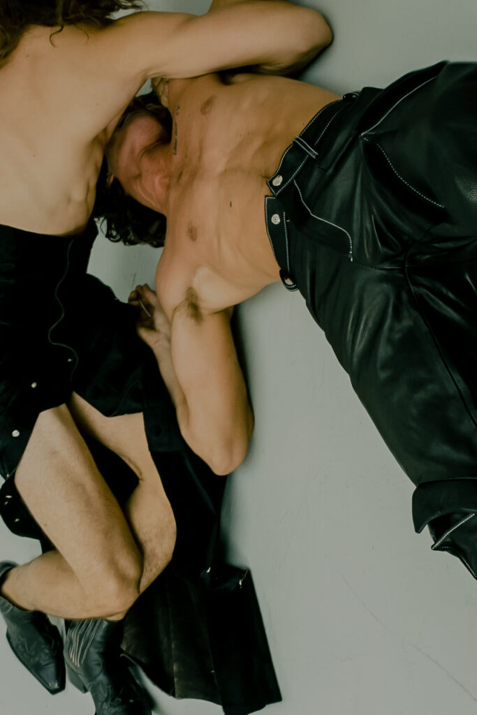
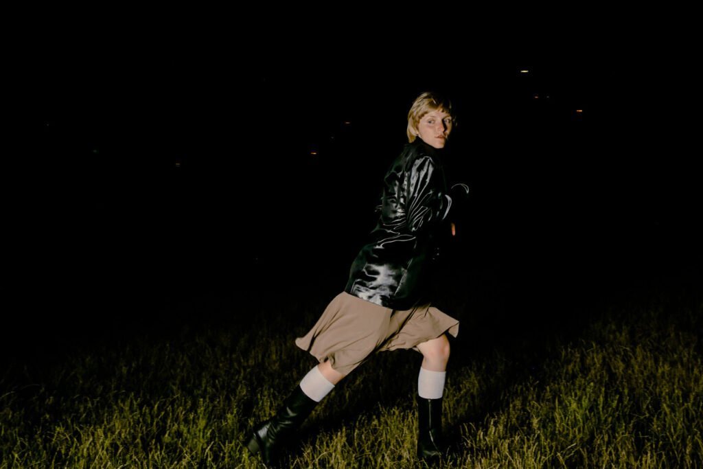
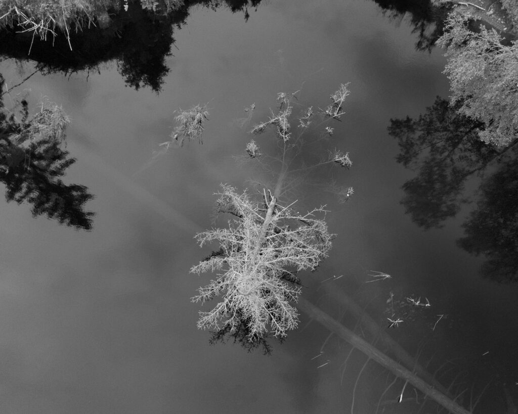
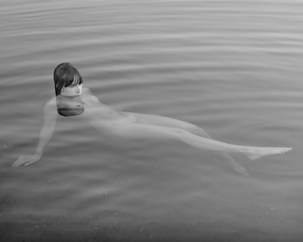
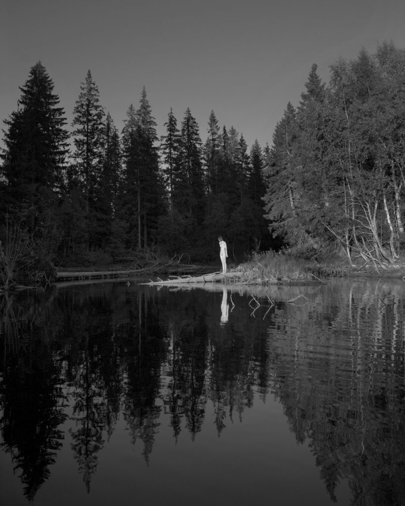
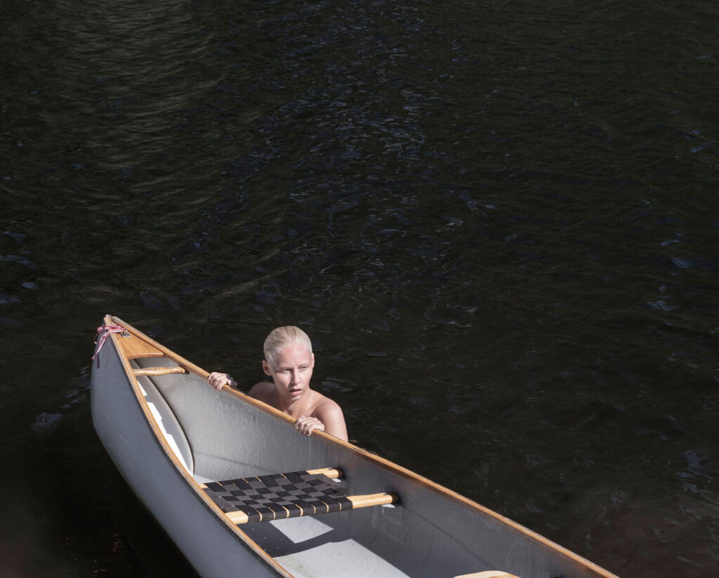
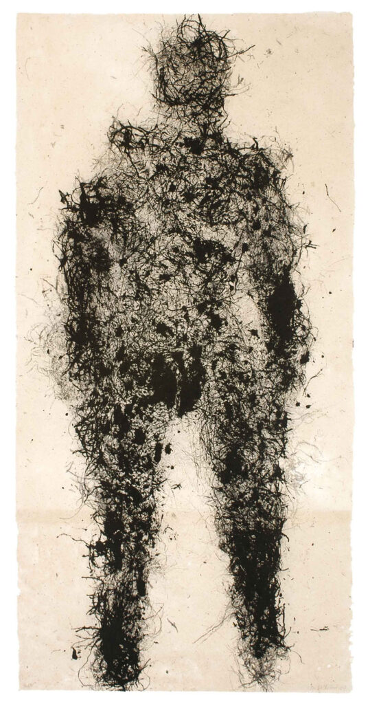
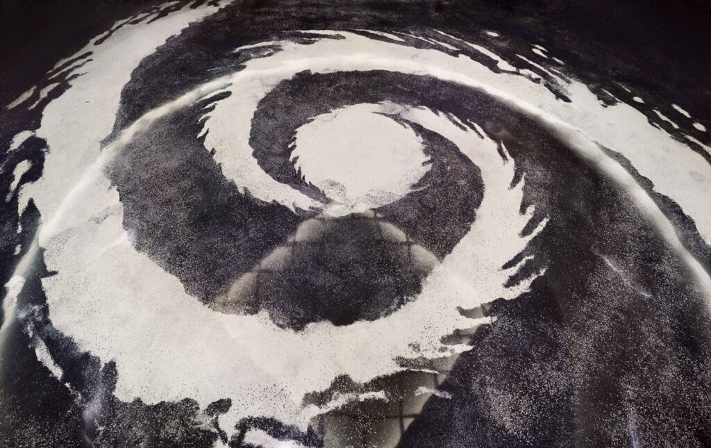
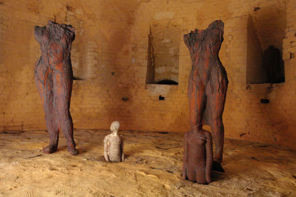
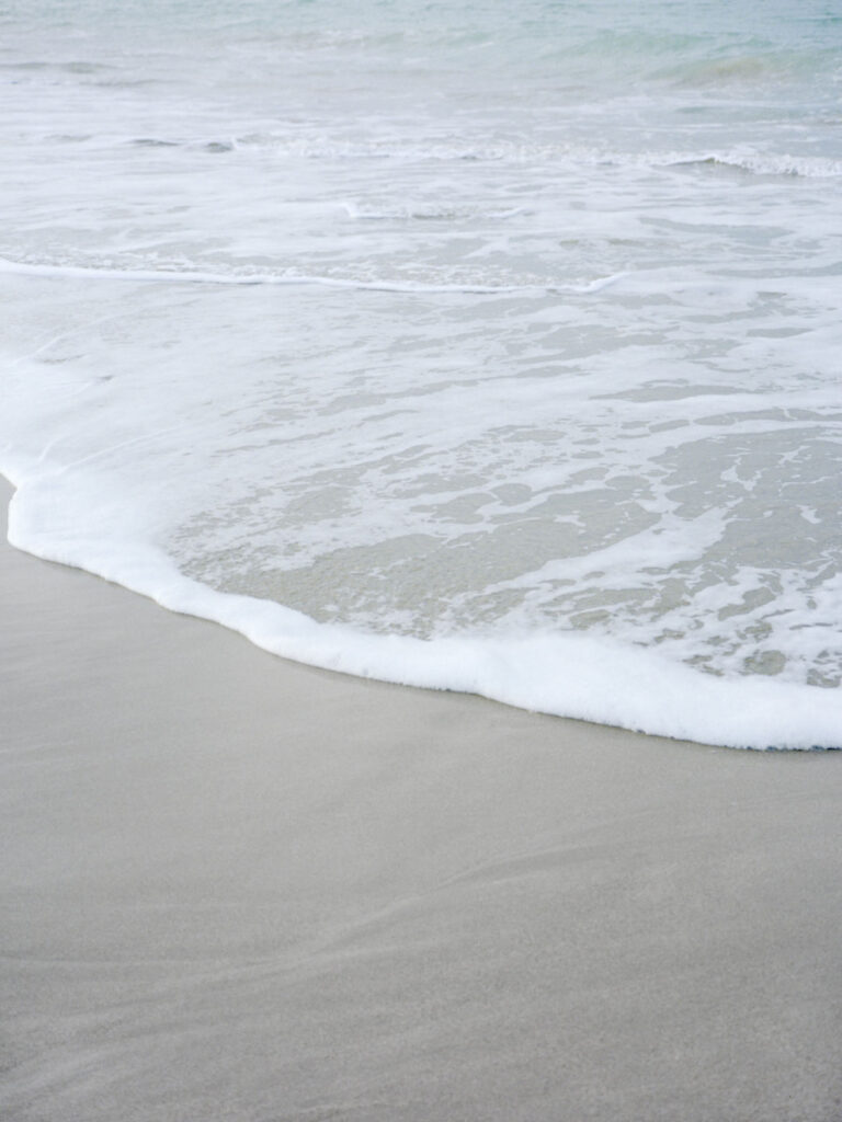
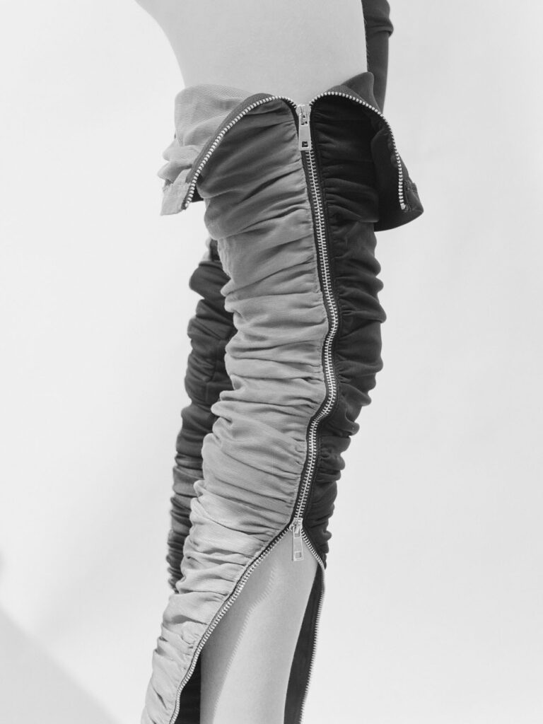
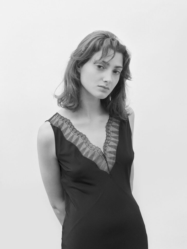
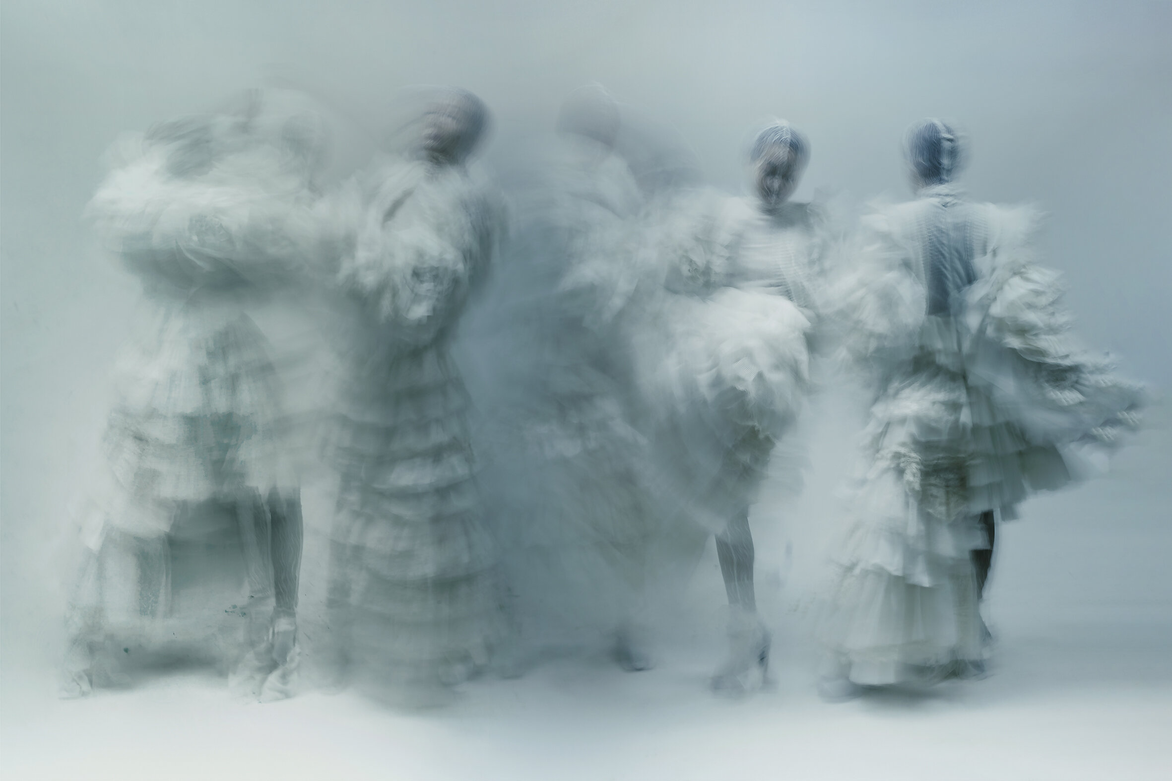
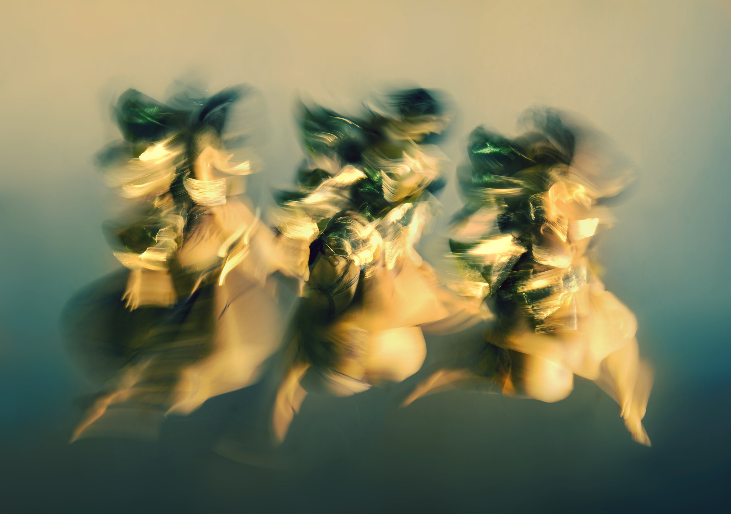
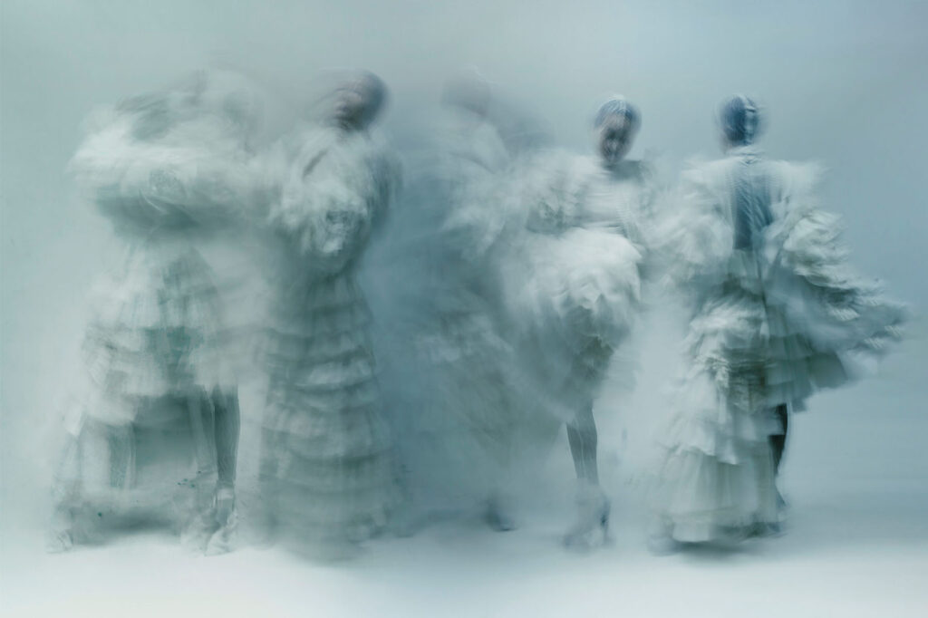
Magnetism towards nature, bodies, materials, and phenomena from their ancestry to their hazy, visual forms. When Vietnamese photographer and artist Chiron Duong narrates his artistry and where it springs from, he touches on the spiritualism and benevolence he finds in photography, fashion, and art, fusing the three to concoct a visual vision associated with the law of life. All images blurred, his model dances in a butterfly costume, his flowers tremble sideways, his water sloshes from gentle to rapid rapids, and his concepts of garments over bodies mean to flow, sway, and never settle.
The mantra from nothing to create a magical existence nestles within him for his fingers to capture through photography, his eyes to scrutinize via fashion, and his lips to speak of his art. As he points his lenses to his subject, whether it is a human body or nuance of nature, Chiron Duong communicates with his audience to convey stories that penetrate beyond the mere forms of objects, a display of the relationship between these tangible materials and the phenomena of nature and the universe that recalls science and magic.
Before diving deep into your practice, how did you end up in photography? What were your studies and sets of training before this?
Before practicing photography, I was a student of landscape architecture and urban planning in Vietnam. It was because I had practiced these two fields together that I sought to apply them to my study of photography and vice-versa. Landscape architecture and urban planning have helped me form my own perspective and find the direction that I will develop in the future towards photography.
Currently, I am focusing heavily on photography, but this is not my end goal. I hope my works can educate children and young generations about love and the natural environment through programs and visuals that combine arts and education.
There’s a sense of fashion and art in your photography. Would you say that you are combining photography with fashion and art, and why? How would you describe the relationship of these three, and why?
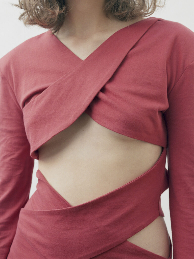
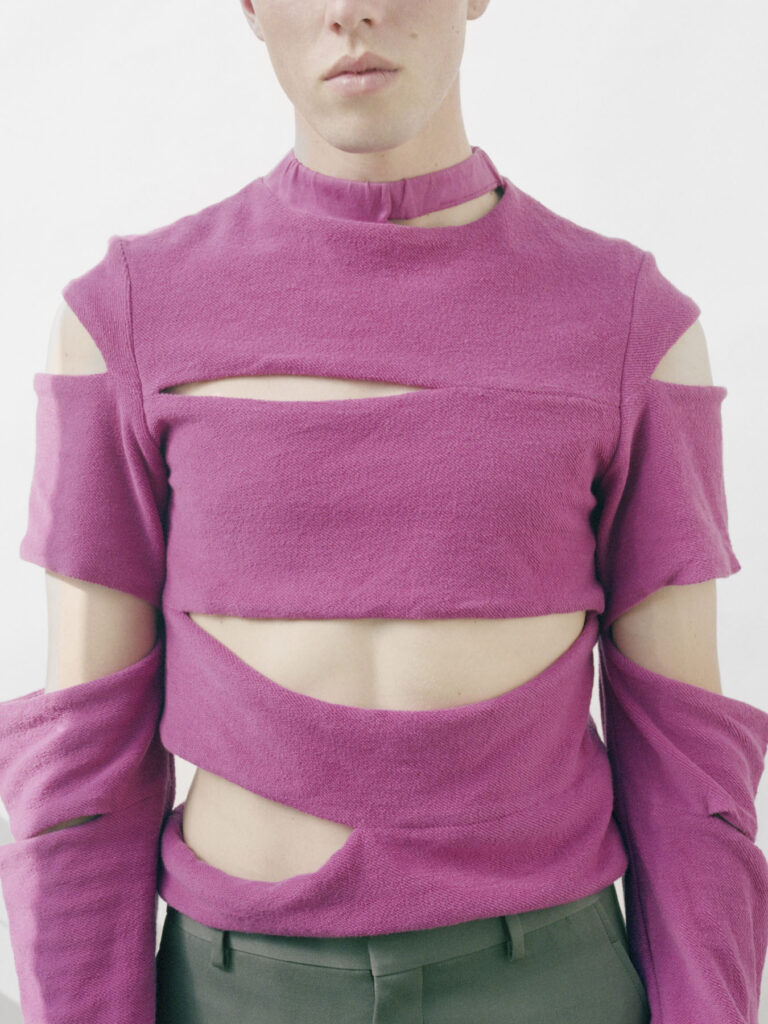
Photography, fashion, and art are my three favorite elements, and they have a clear relationship with each other. I have always wondered how I could turn my camera into a paintbrush and use fashion as palettes in my photographs. This is why I think about blurred boundaries when capturing the motions of the models. This will create the effect of a painting. Color also plays an important role along with the material of fashion designs as each material creates a different effect when I take pictures. Besides the three elements here, I am also experimenting with the educational elements as part of my mission to convey stories through my works.
In an interview, you mentioned that your mantra is “Chân không diệu hữu,”– “from nothing to create a magical existence.” What did you mean by this? How can you create magic from nothing?
“Chân không diệu hữu,”– “from nothing to create a magical existence.” This is a saying in Buddhism. It carries the meaning of the creation of all things. The good and the bad that are present before our eyes can be an illusion and a challenge to our minds. All things come from nothing and their presence in the present is a miracle of creation and from the universe. I have applied this saying to my works.
“I want to tell stories that go beyond the mere form of an object, thereby showing the relation of that object to a phenomenon in nature and to the universe that recalls miracles and magic.”
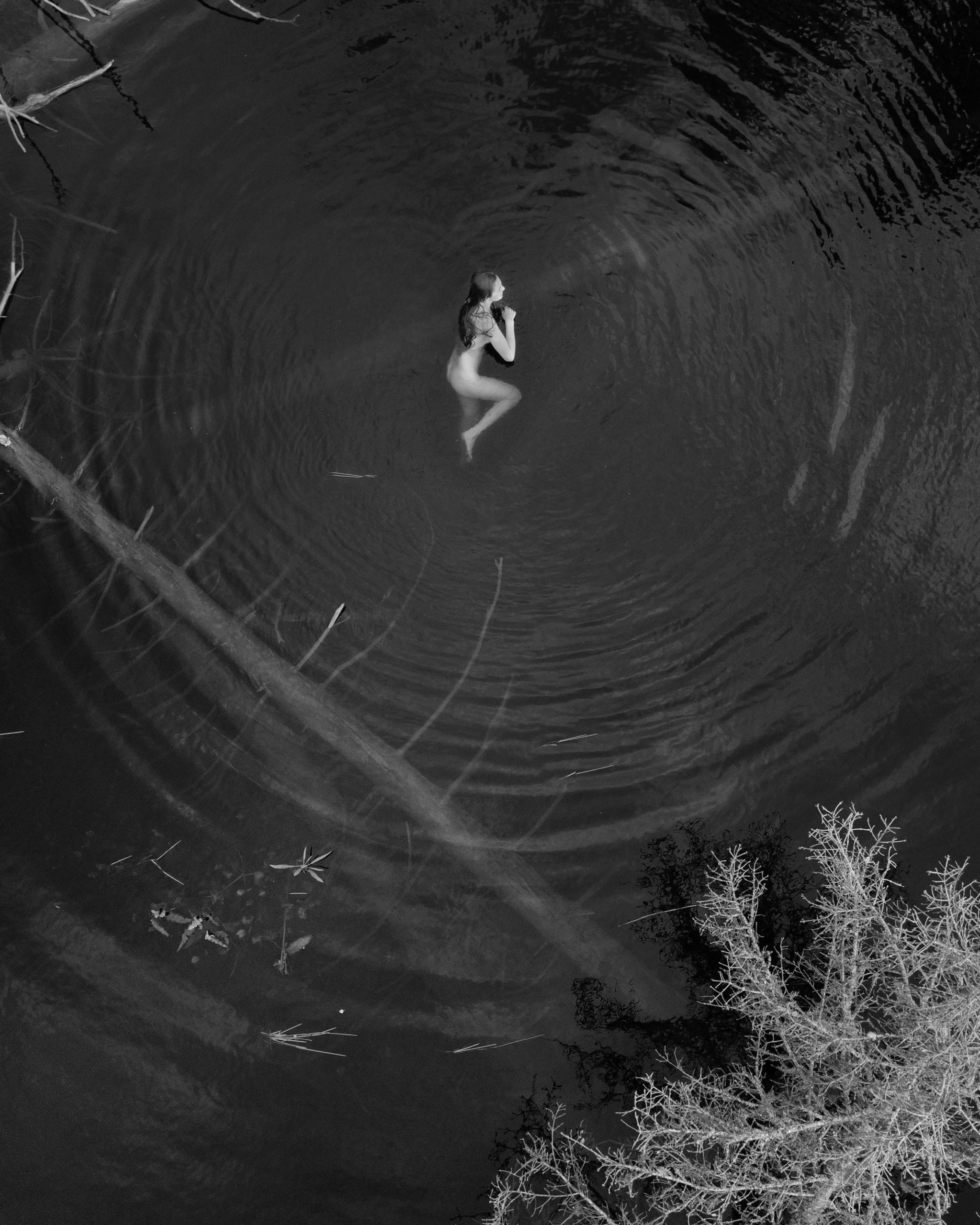
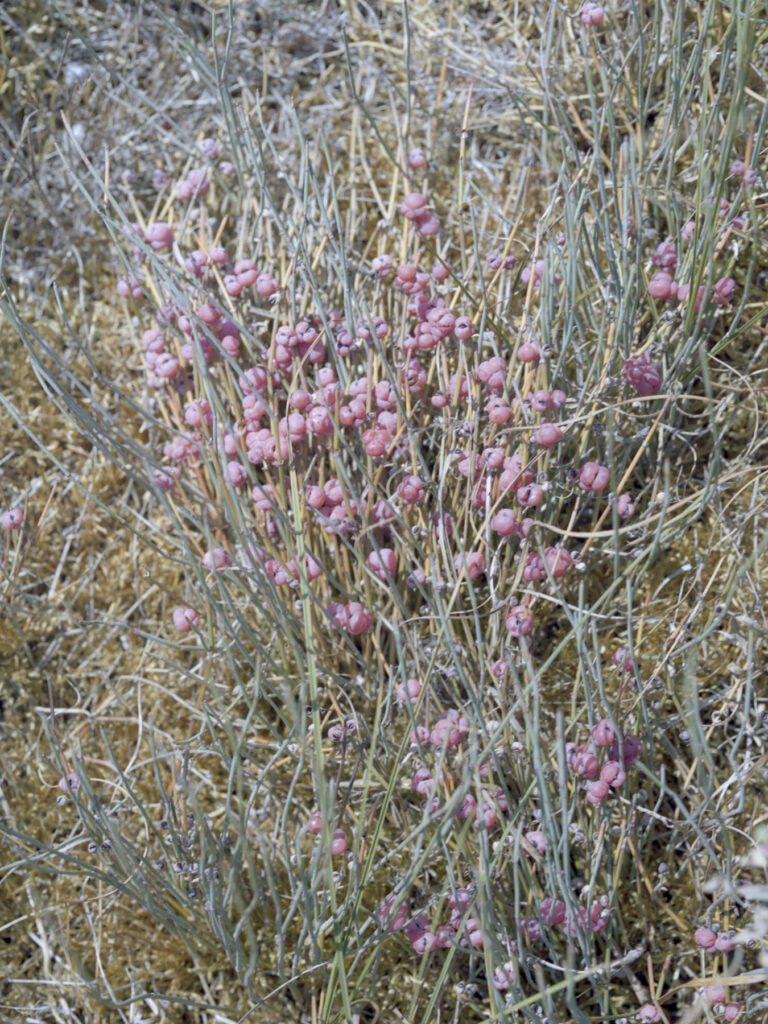
My Reply I, II photos see the fantastical stories the plants tell us about their former existence.
Speaking of magic, your photographs are just ethereal and whimsical. What’s your creative process? How do you achieve these blurred images?
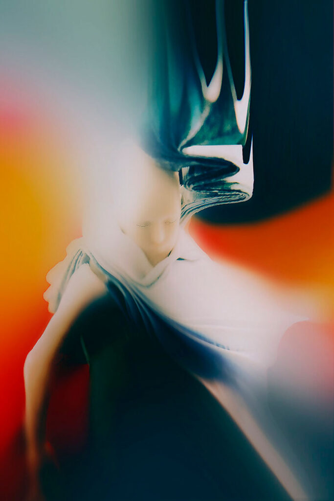
The process of doing these works as a way of meditation is that I observe things and find out their characteristic properties in terms of shape, color, inside and out, thereby looking for the connection between these objects and natural phenomena, people, animals, and society. From there, the objects in my photo will have stories out of their basic shape. This is a miracle.
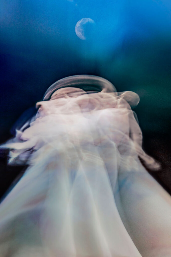
Sometimes, I will use a low-speed shutter to capture movement, but sometimes I use light effects to create a sense of flight. I also apply special effects such as shooting in different environments like water and fire. This means the imagery is not limited to the form of expression but is important to the sense of magic my works create.
There’s a sense of soft power and fluidity in your photographs. What would you say your themes are in photography, and why? Do you have any advocacy that you would love to showcase through images?
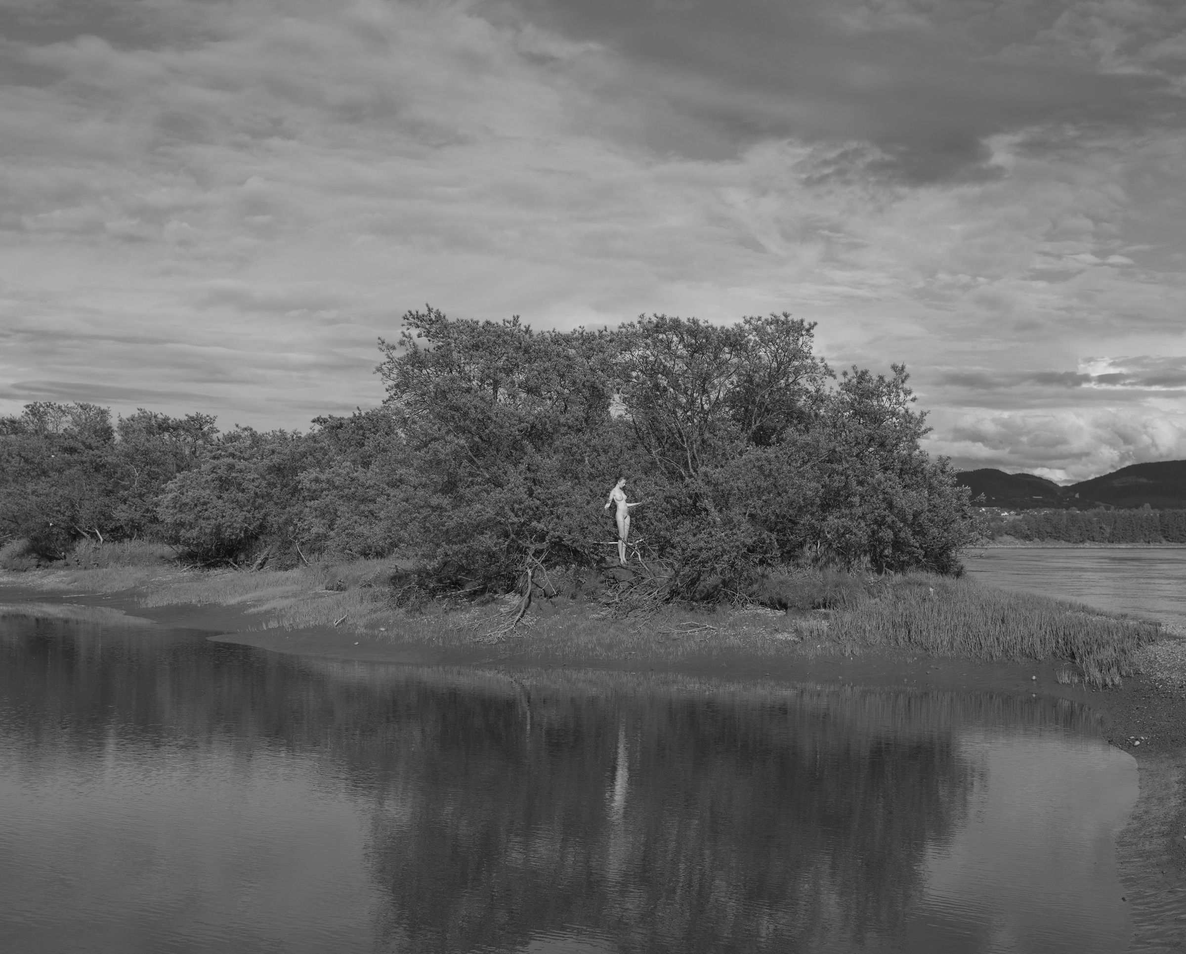
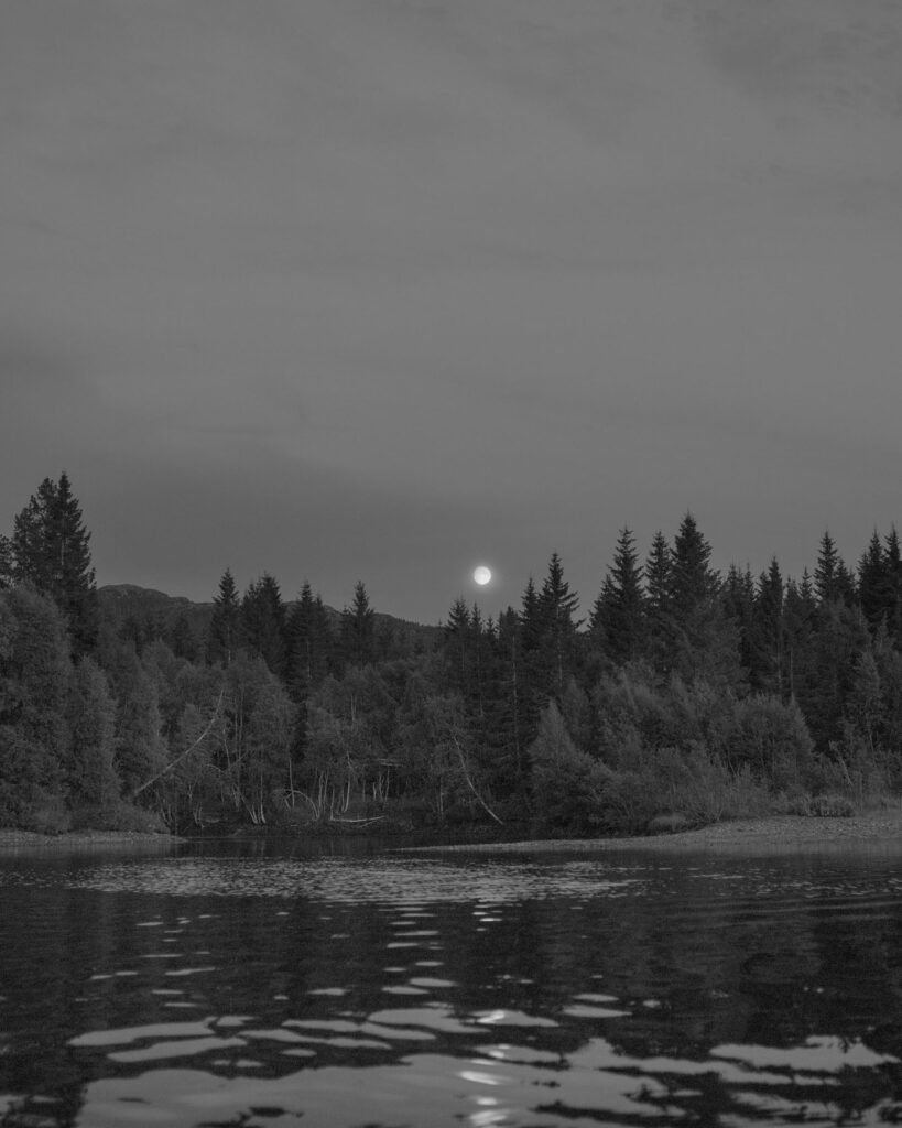
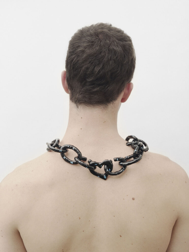
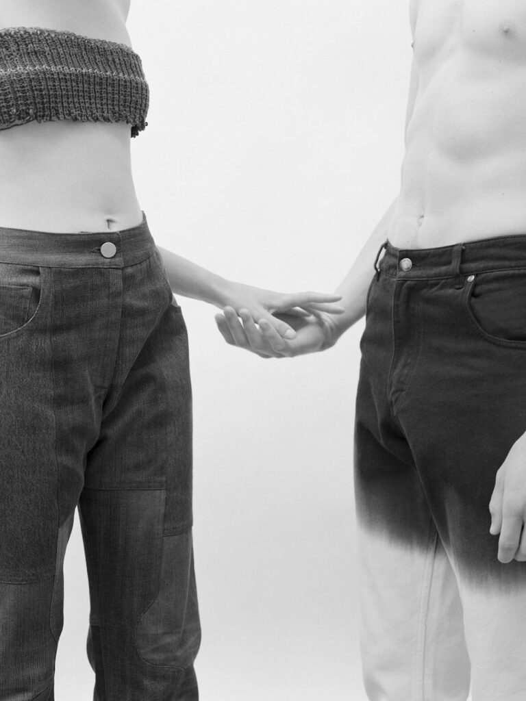
The two big themes in my works are Flaming Asian and The Connections. Flaming Asian to me has many meanings not only in color but also in cultural, spiritual, dreamy, and soft aspects. These are the themes to show the origin of my love for fashion, photography, and painting. On the other hand, The Connection is a big topic in both still-life and fine art photography. In this topic, I seek to connect objects with nature on environmental and social issues, while infusing morality in their messages.
Talking about the blurriness in the images, there must be some movement for this to happen. What’s your opinion about movement? How essential is it for you?
I always consider the blur in the photos to ensure a balance between emotion and technique when I photograph. I do not want this blur effect to be just a visual effect that impresses the viewer without conveying the message of the photo. With movement, it becomes more effective when combined with the color and texture of the garment. Most importantly, I want to create a special space to tell my personal story through my works.
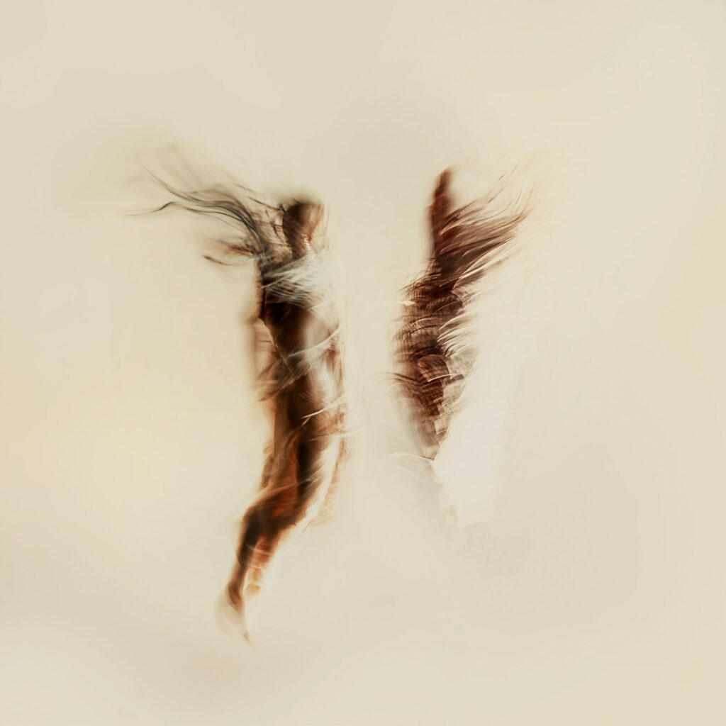
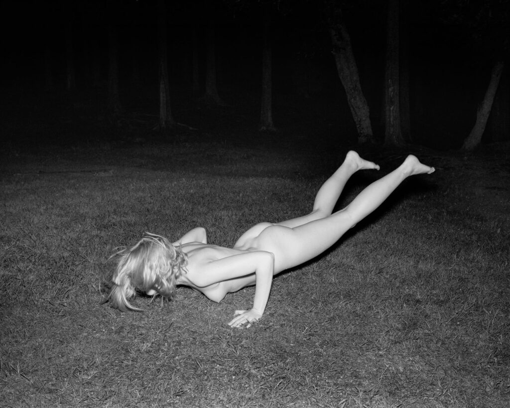
In an interview, you mentioned that you “intend to show the energy that comes from within our bodies, the mystical spirit.” Could you elaborate on this?
It is a form, a state beyond the present shape of the object.
“When I desire to express a feeling of energy from within myself, thoughts, conflicts, and movement, forms take place within the mind and body that we cannot see with our eyes.”
I want to recall those feelings as I feel the energy within me move. Usually, I will use motion capture techniques with appropriate props or photographs to create a shift in the viewer’s point of view and evoke the content I want to show.

In terms of personal philosophy, what are the beliefs that you practice that influence your photography? Could you share how these started?
I think personal perspective and direction are very important, which can affect your photography style. In my case, I have had time to try out many different types of photography including commercial, architecture, still life, and street. I find my favorite features from these genres and include them in my photography. Most importantly, I am exposed to different fields to understand what issues I care about, and how I want to present my perspective. For example, I often ask myself what I love, and what I want for society and my community. I often look back on my own origins and development to understand why I care about those issues in photography. For me, your culture and community from childhood to adulthood and your social background will greatly influence your thinking in choosing the path you want to take and creating your identity in photography.
Credits
Images · CHIRON DUONG
https://www.instagram.com/chironduong/