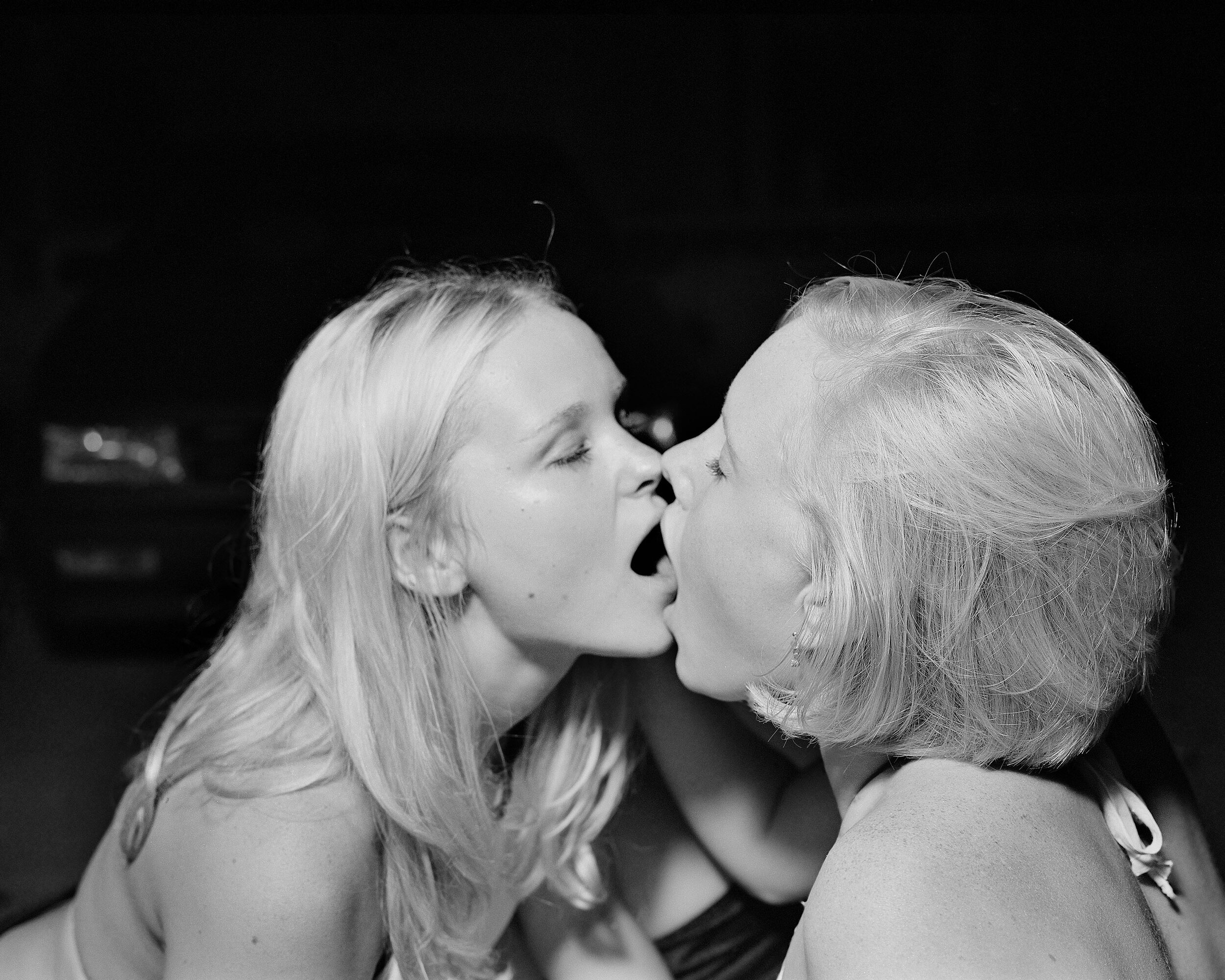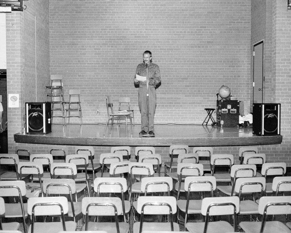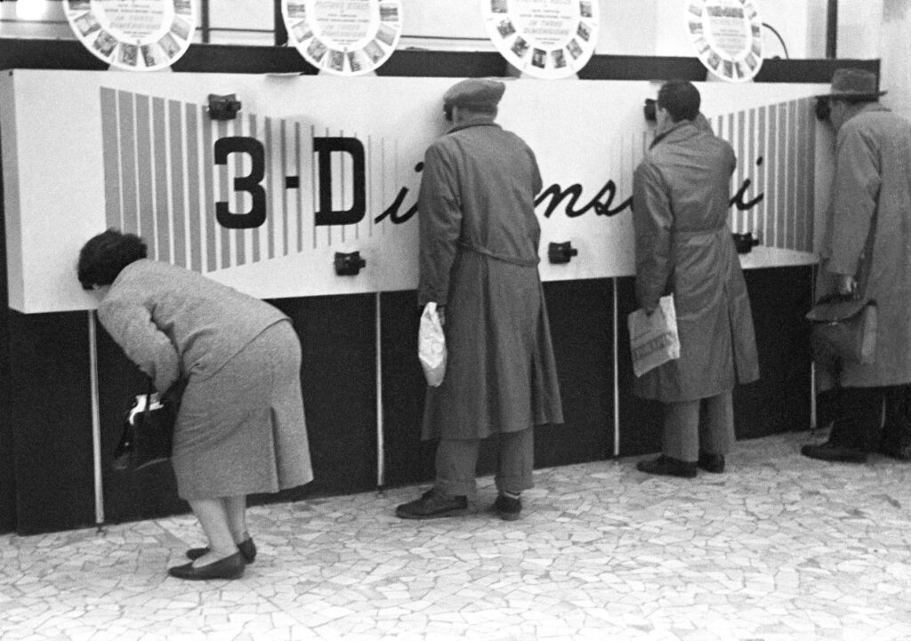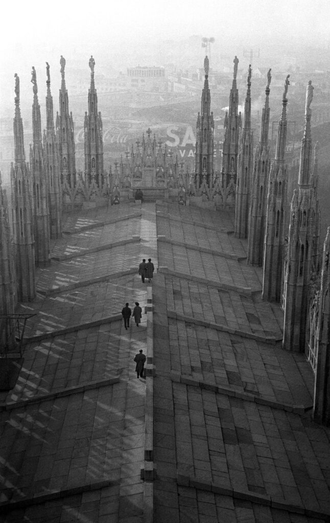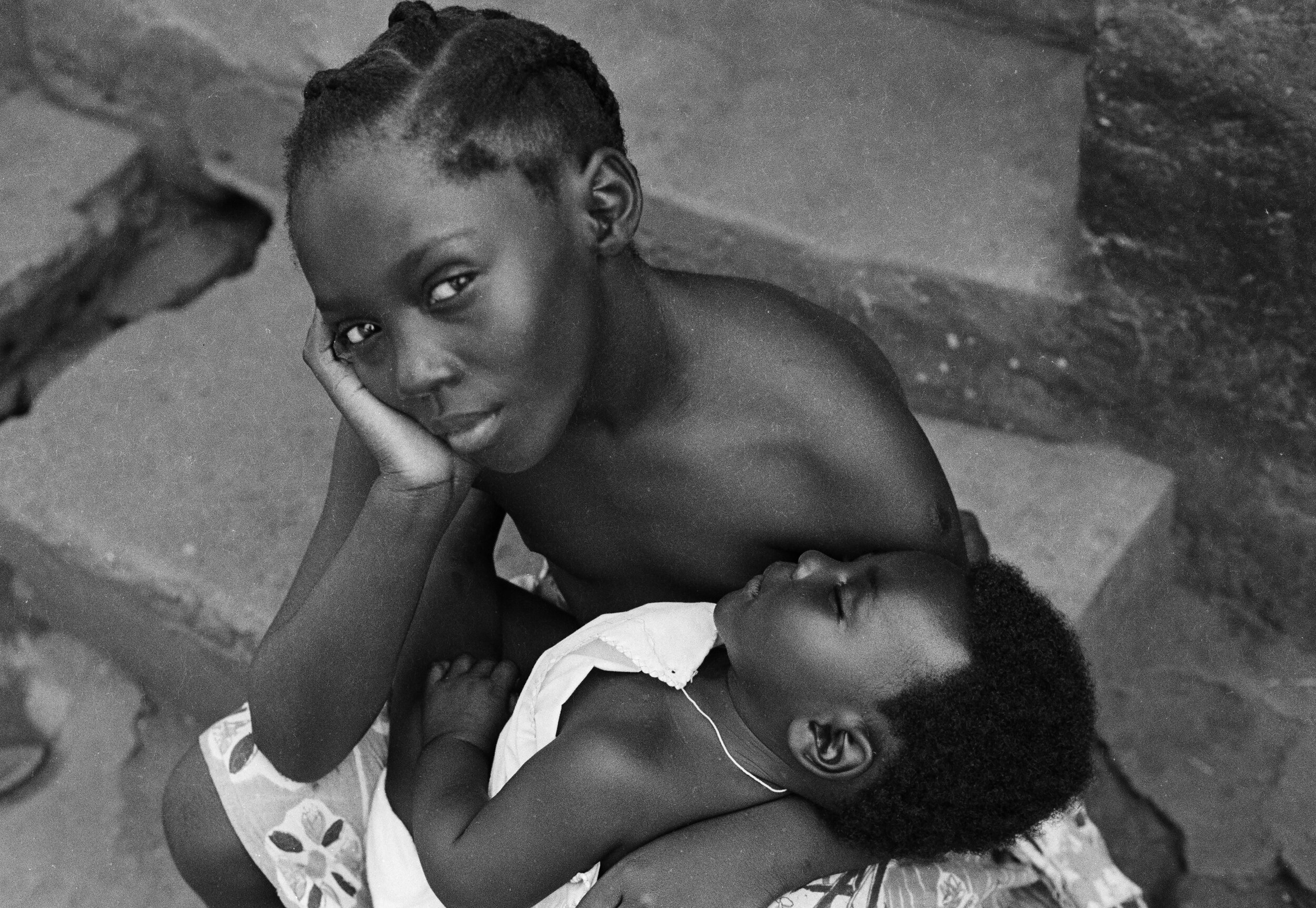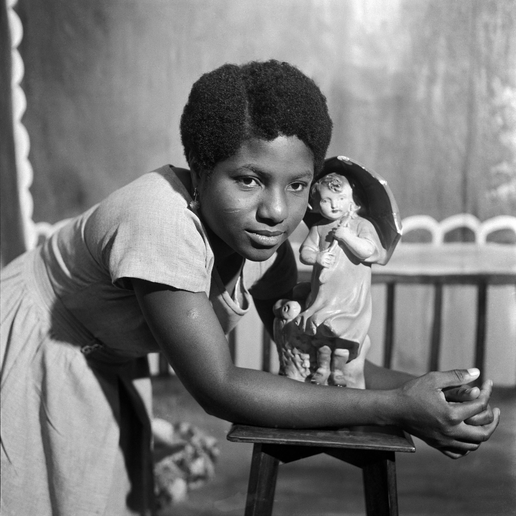

“It has to feel right, otherwise it’ll drive me crazy”
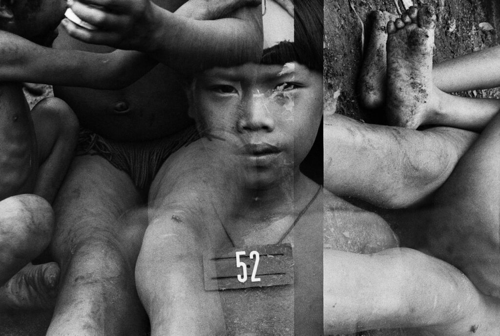
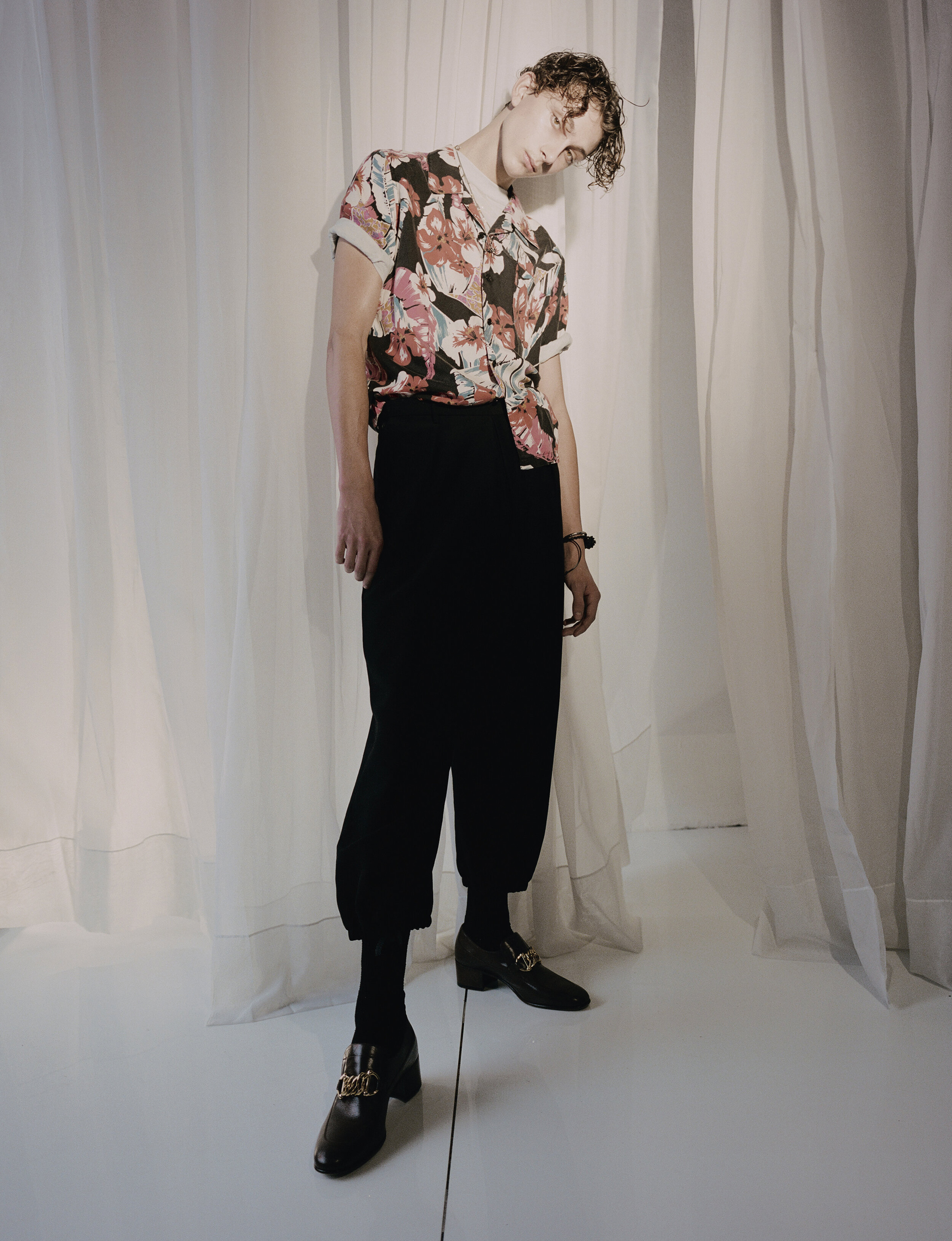
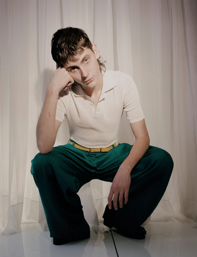
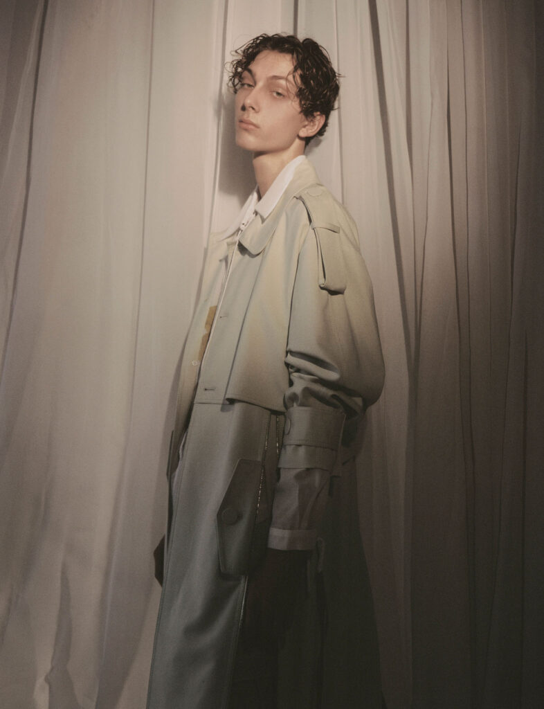
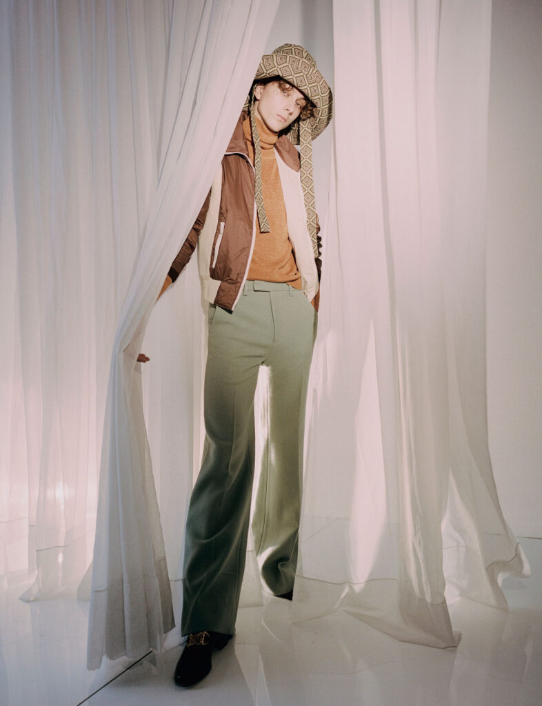
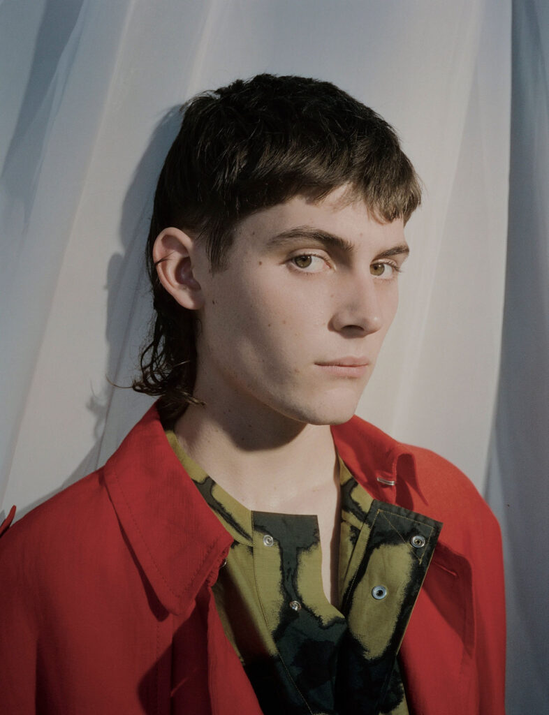
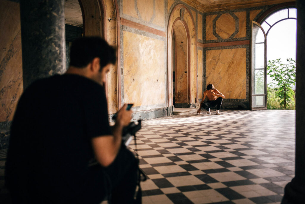
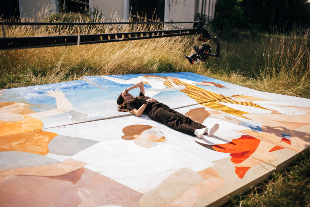
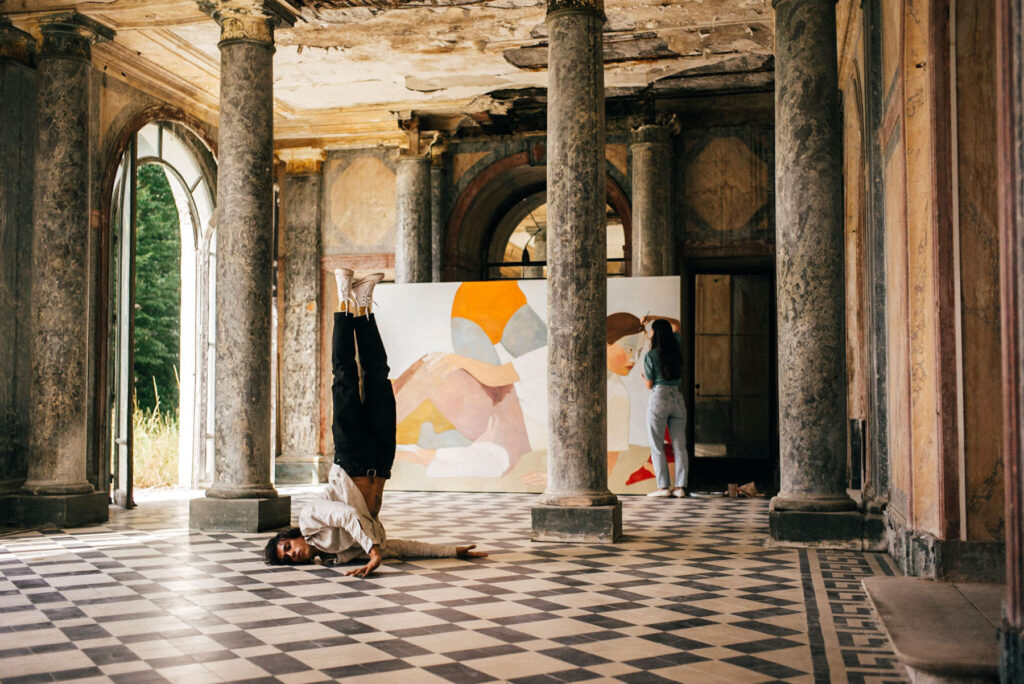
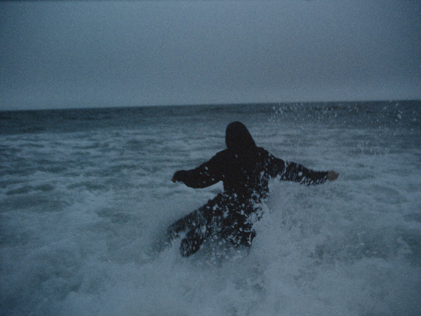
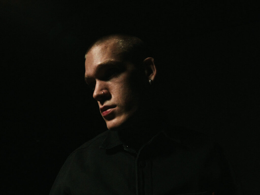
Logan Rice is a photographer, filmmaker and cinematographer based in Los Angeles, California. The young artist has established himself in the creative industry as one to watch, with an impressive body of work that includes cinematic and light-hearted collaborations with high profile clients, alongside more impassioned and personal projects.
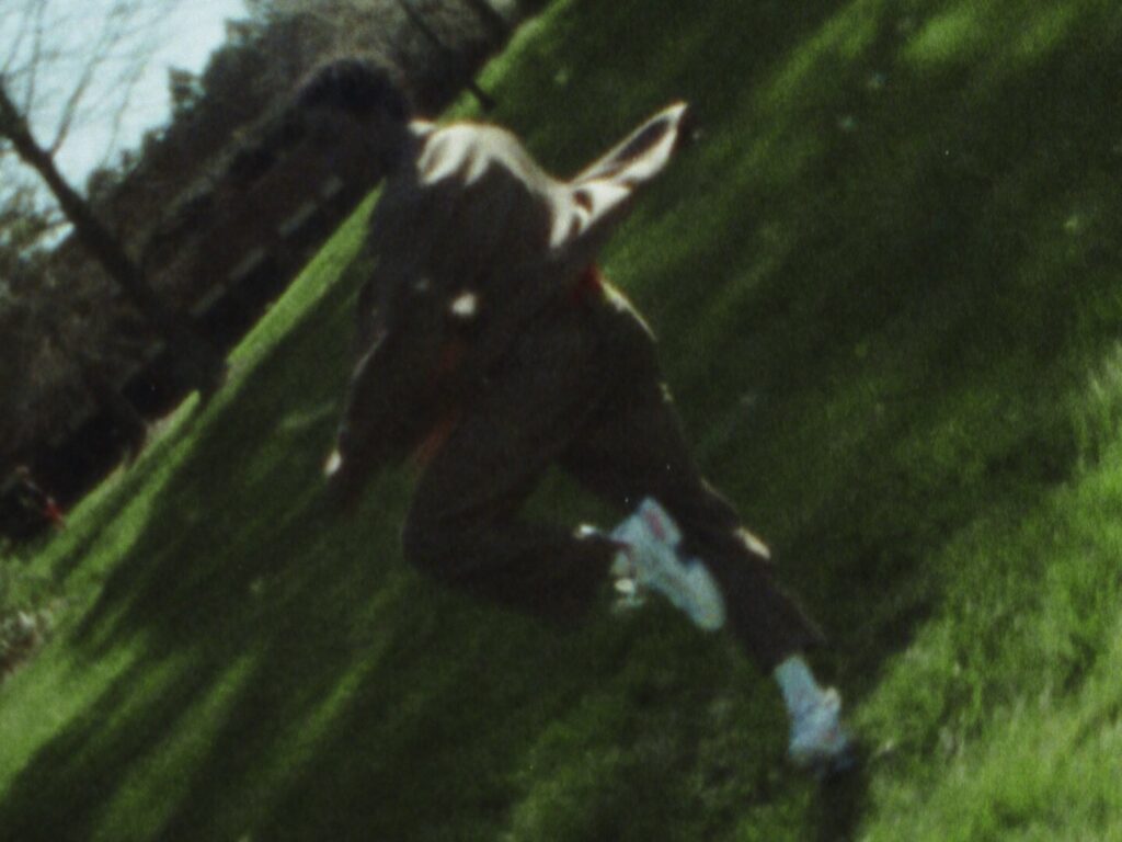
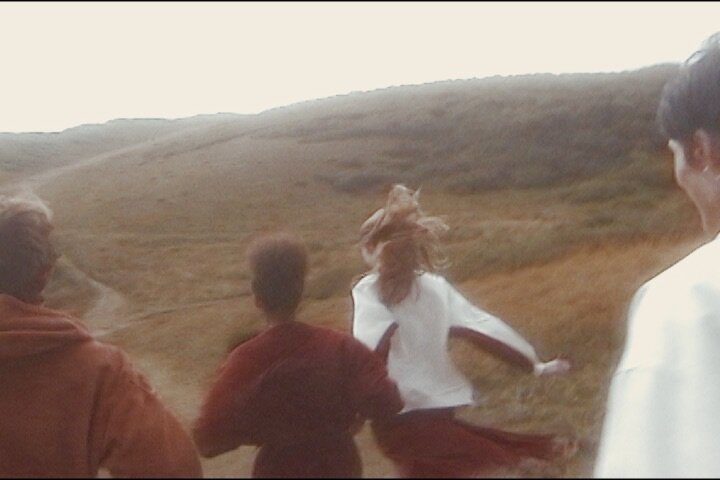
Growing up filming skateboarding, it is only natural that the artist would make the move to Los Angeles, where his inspiration from day-to-day culture, music and fashion has now come to inform his eclectic and ever-growing practice.
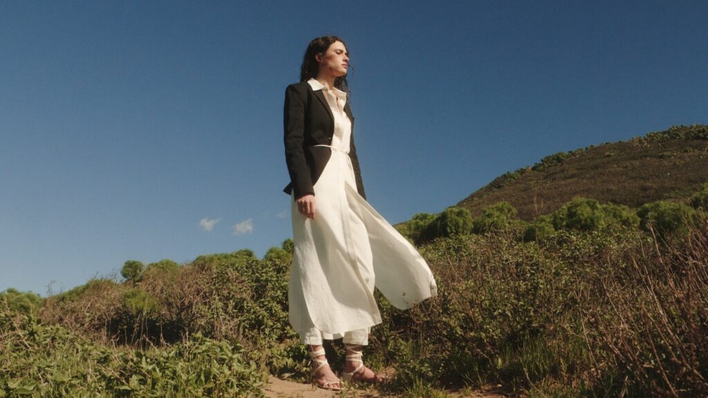
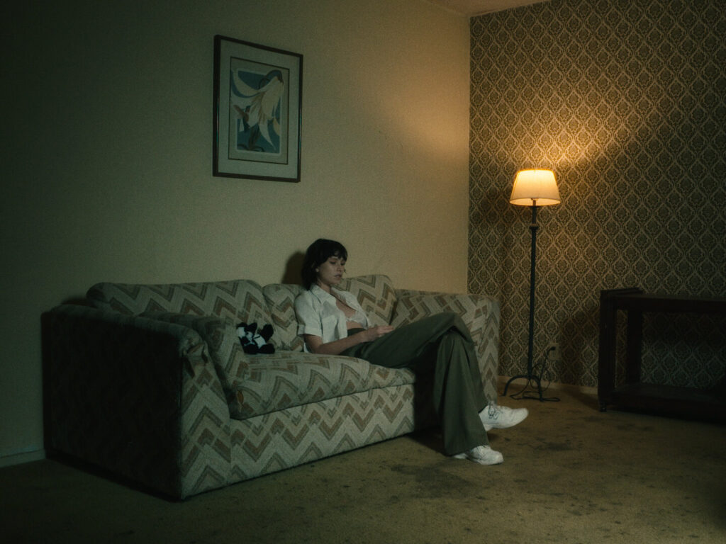
Largely focused on fashion campaigns and editorials, Logan has also worked on a variety of music videos, documentaries, and exclusive content for the likes of Nordstrom, Pull&Bear, Fender, Columbia Records, L’Officiel, Adidas, Flaunt Magazine and more, as well as filming artists including Grimes, Lykke Li, Alice Glass and many others.
NR Magazine speaks with Logan to discuss the versatility of his work and how he has come to develop his style over the years.
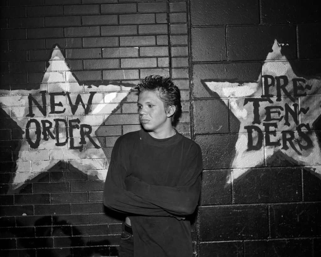
A lot of your personal work channels feelings of nostalgia in your depictions of youth culture – is this something you consciously aim to create or is it something that just comes through naturally as part of your creative process?
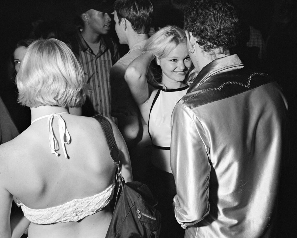
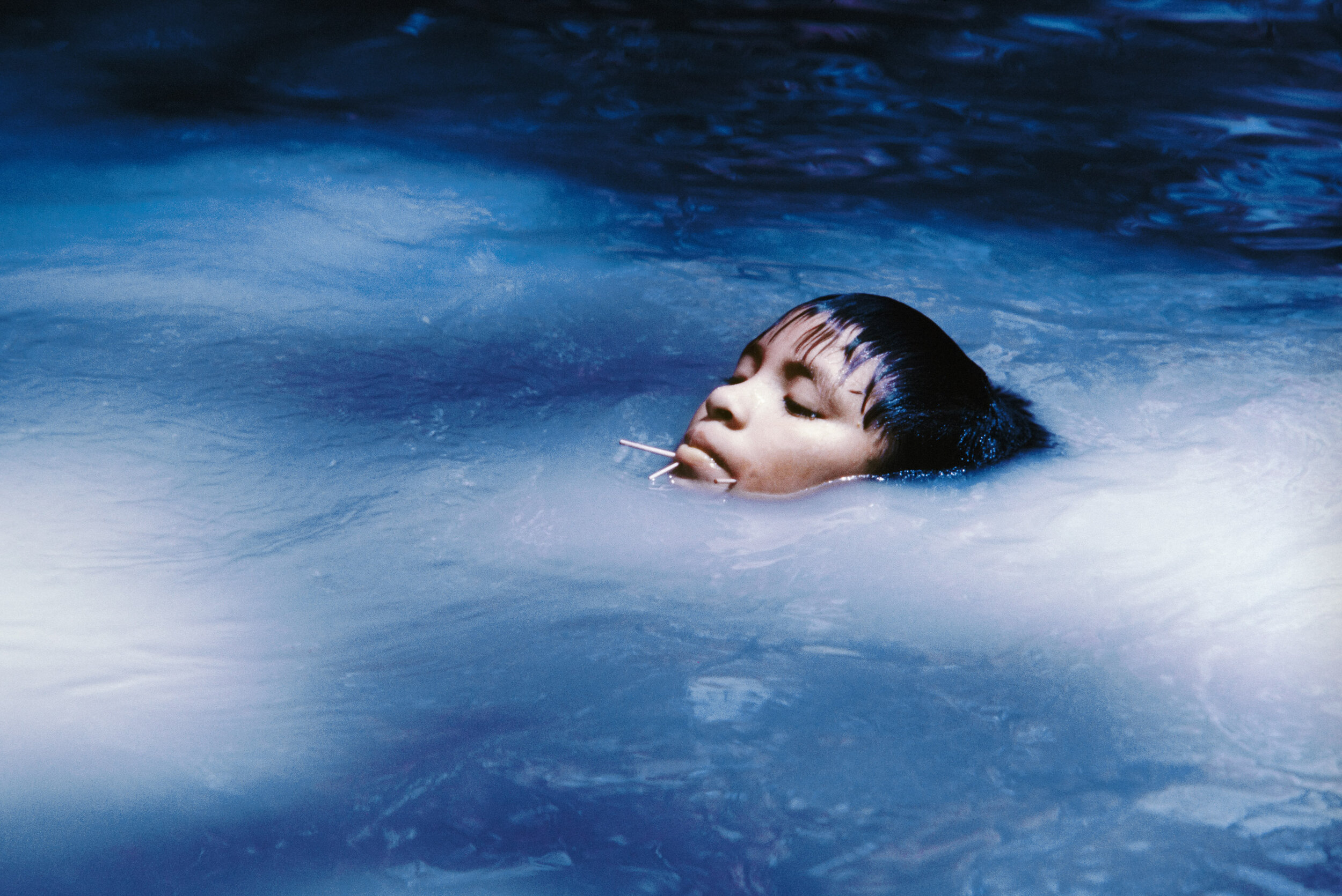
That’s definitely something people have mentioned to me before. I would say that it comes naturally. I aim to capture moments that just are and that feel real. The nostalgia element isn’t something I intentionally seek out, it just kind of happens that way.
How have you come to develop your style?
I grew up filming skateboarding and I think that style of shooting and editing transitioned over heavily when I started creating a lot of content in the music world and eventually into all the fashion projects I’ve done over the past few years. I never noticed until fairly recently when people would point it out and be like, “You used to film skateboarding right? I can see it in your work.”
I definitely use some of the same shooting techniques that I used as a 14/15-year-old filming skateboarding. It has obviously improved over the years but it’s the same method. The same goes for editing – I’ve always edited skate videos to the mood and beat of the song and I let that dictate how a project comes together. I never understood how people could make a rough edit with no music behind it. The music dictates the entire flow and feeling of the project, and I just let the feeling take over rather than looking at something for what technically makes sense. It has to feel right, otherwise it’ll drive me crazy.
How do you juggle your more commercial work alongside personal projects? Do the two influence each other at all or do you have clear separations between your personal and commissioned pieces?
It gets hard to balance both, honestly, but commercial work always comes first. That’s the work that allows me to be a freelance artist living in Los Angeles and it funds my personal projects and editorials.
Personal work is very important, so whenever I get an idea or have free time, I definitely try to push myself to do something that’s meaningful to me. Those projects take a long time to complete though. I always overthink it or get busy with something else but eventually they’ll all get done.
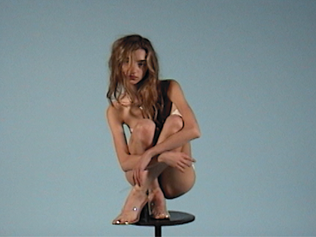
The personal projects I’ve done are still some of my favourite things I’ve created. Even if they are 2, 3, 4, 5 years old, they still hold up in my opinion. Whenever I watch them now, I’m like, “Yeah, this is it. This is the kind of work that really keeps me going.”
Commercial work shows me what I’m capable of with a bigger team, budget, and resources and pushes me on a production scale. But with that being said, personal work shows me I don’t need a huge team or budget to make something that I really love or that I think is great.
What’s important for you when directing? What sort of things inspire a narrative and help you tell a story?
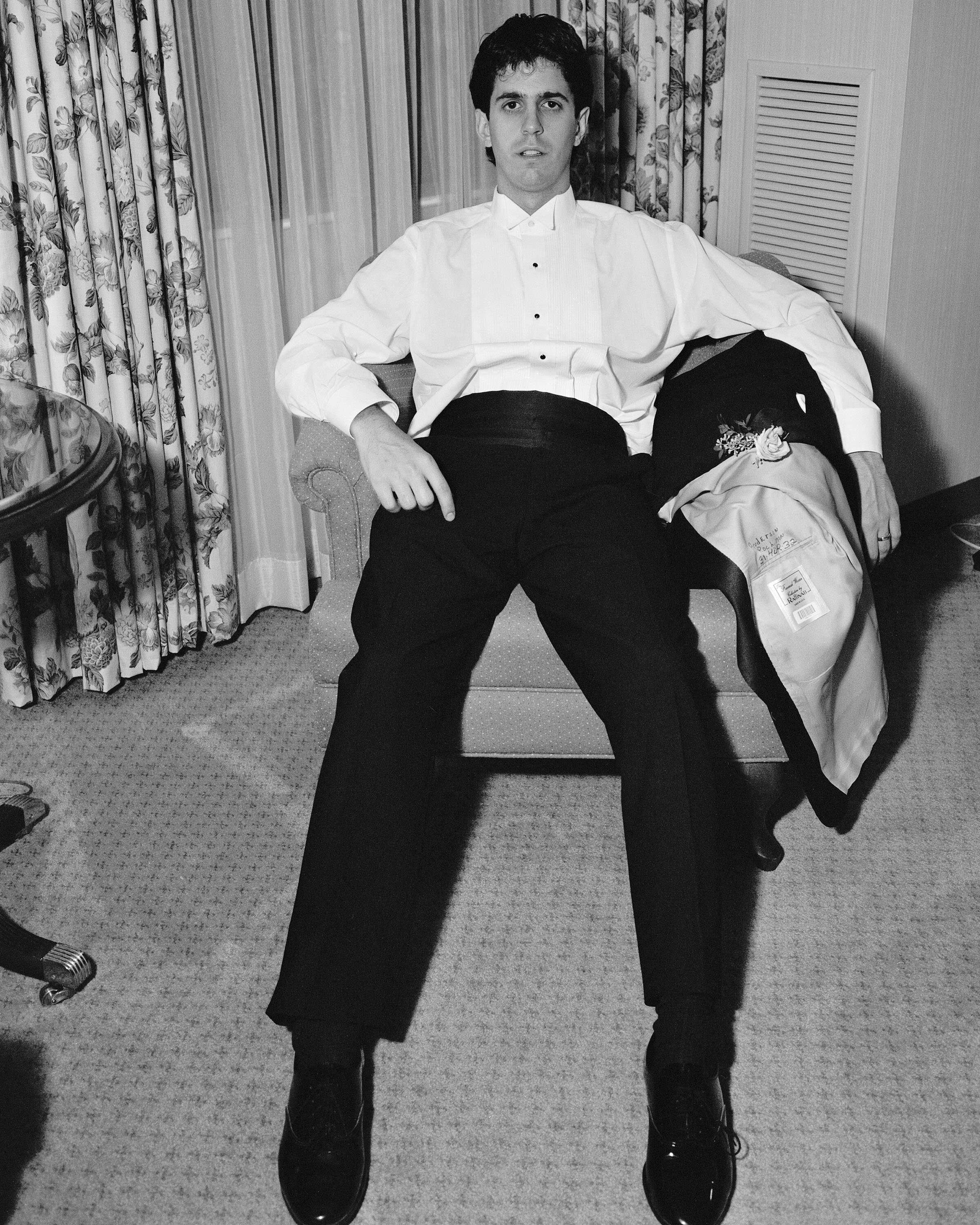
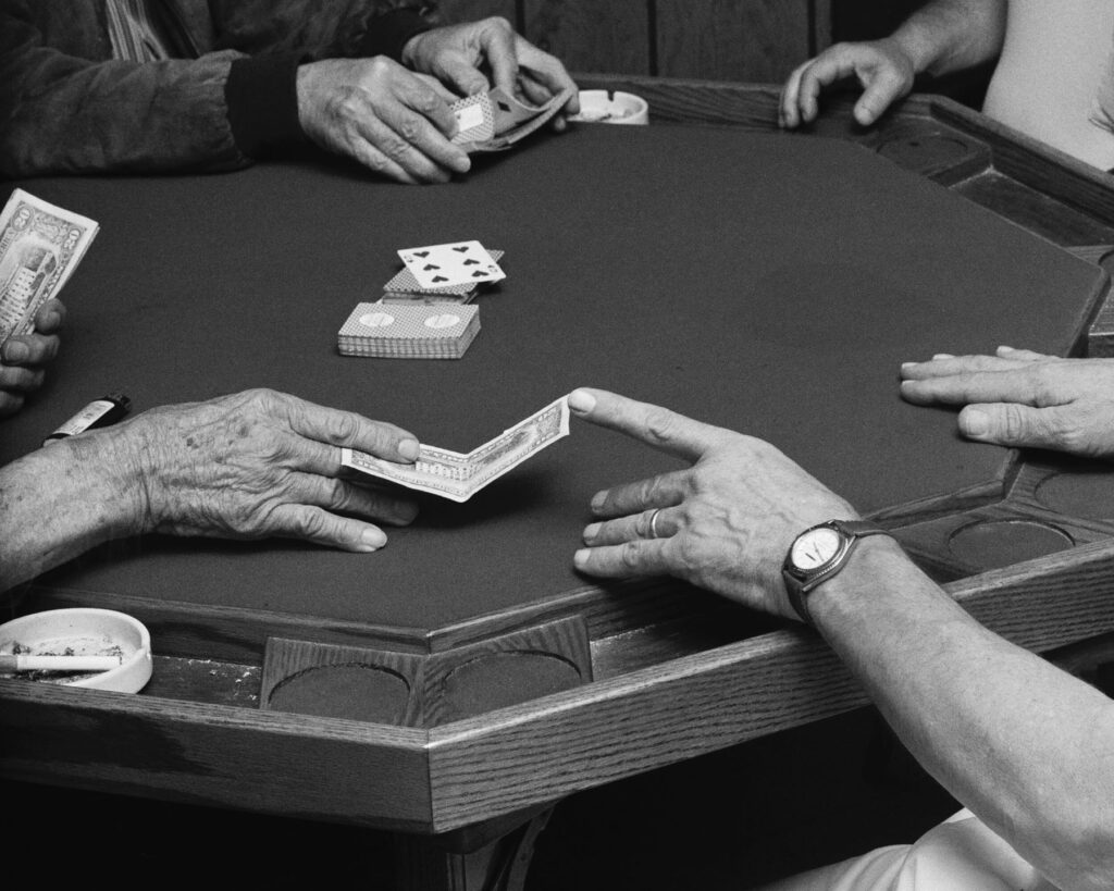
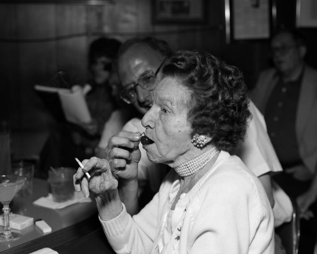
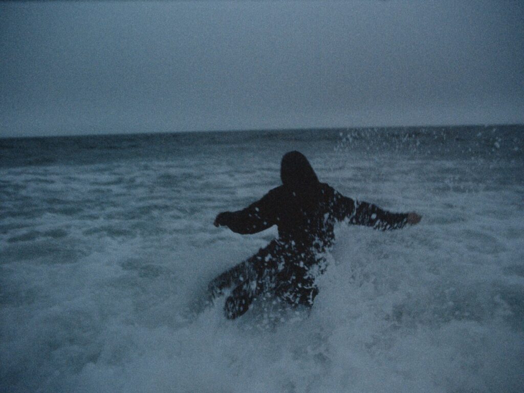
The most important thing to me is capturing moments that are real and that feel real. Pre-visualized shots are great, and you always need to have a game plan, but I think I’ve always created the best content from just trying random things to see what works. Also, a lot of the time I roll a bit before and after the main take and those little off moments can sometimes be the most beautiful and unique.
“Storytelling is much less important to me than having a project that makes you feel a certain way.”
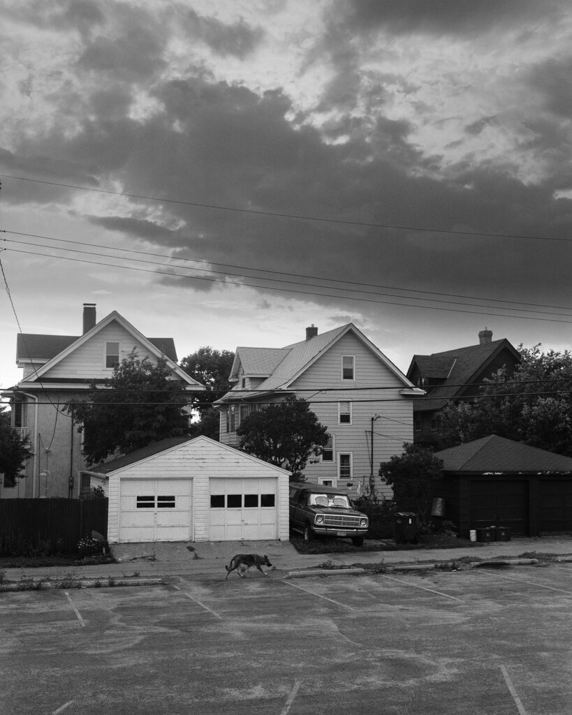
What aspects of your own life influence your work?
I think just living in the moment and going with the flow of things. I really try not to overthink and not do anything that doesn’t feel right. That’s how I’ve always been as a person and it’s how I tend to approach projects. I just have to trust my instincts and usually the outcome is better than anything I try to force.
How have you managed creatively during the pandemic?
The first few months were absolutely brutal, but over time I started doing shoots for brands my friends owned or worked at and I started doing music videos a lot because it seemed like the majority of the fashion industry was on hold. That kept me busy for a while until everything came back full swing August 2020, and it’s been pretty steady since then. Some months are slower than others, but I always have different things to work on.
I do wish I had picked up new creative hobbies during my time off but to be honest with you,
“I just ate pasta, drank wine, played a lot of video games, and binged a ridiculous amount of TV shows… and I’m ok with that.”
Are you working on any projects at the moment?
I’m in post-production on about 3 or 4 projects right now and I just did a shoot over the weekend that I’m really excited about. I have a few really cool editorial projects coming out in July and I’m always making content with my really good friend and artist Hudi, so we’ve got some music videos and other things in the works.
Credits
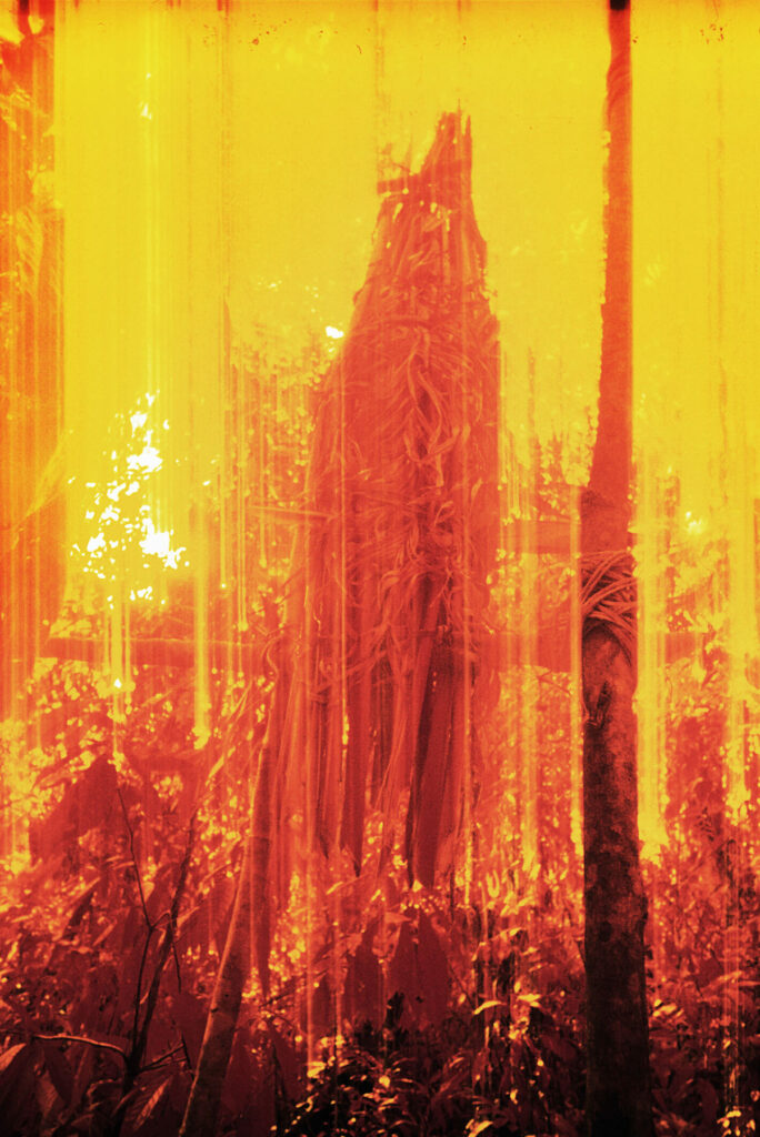
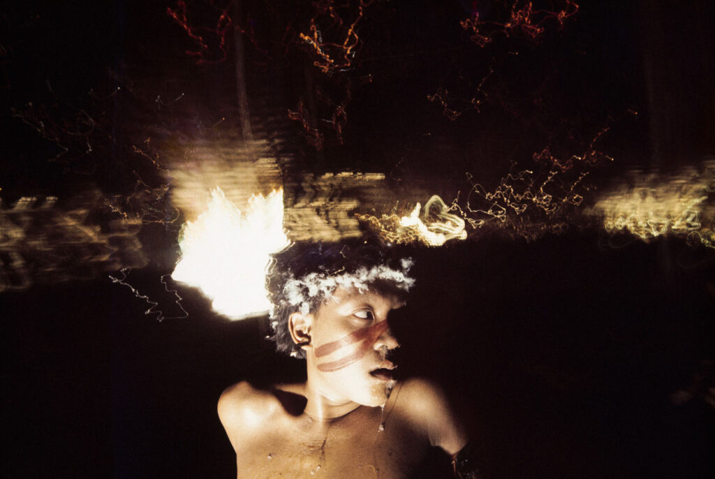
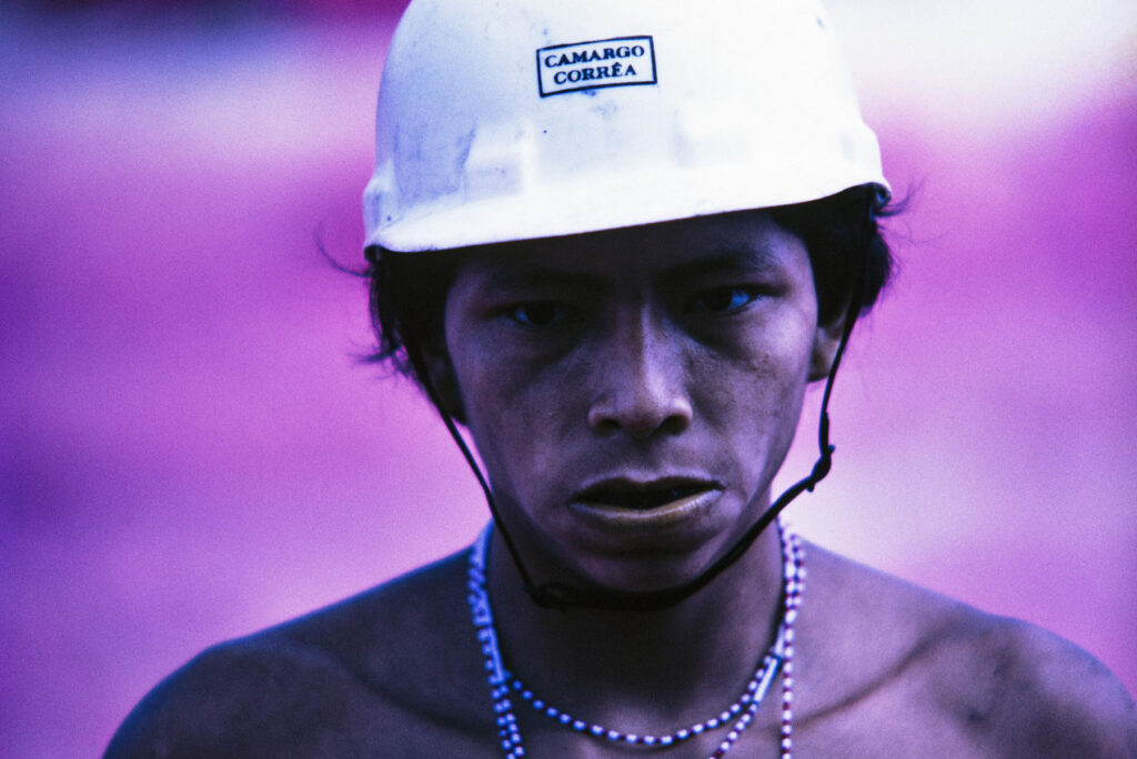
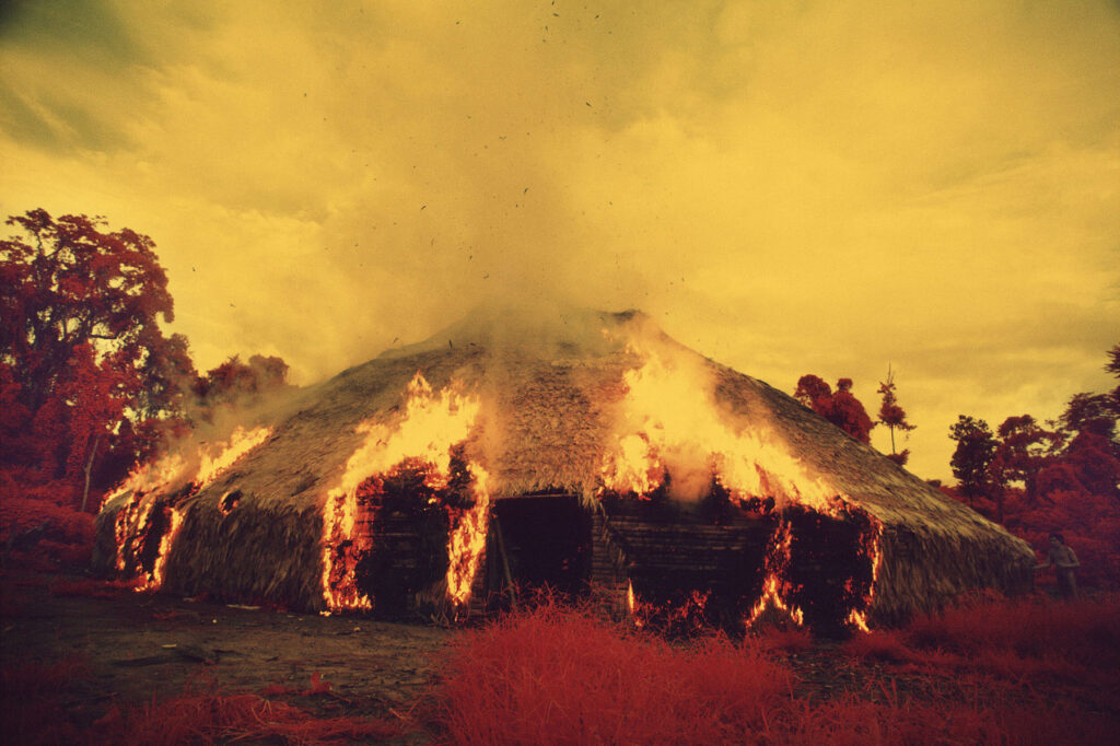
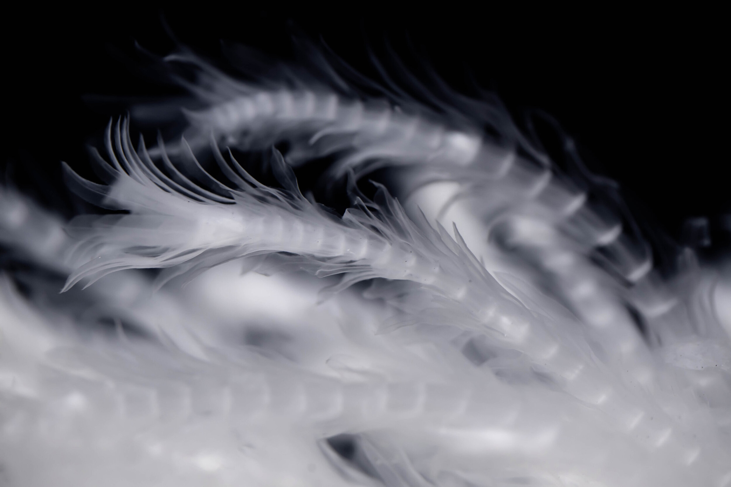
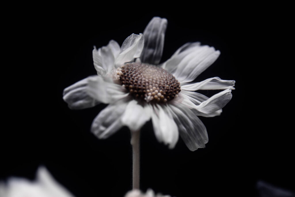
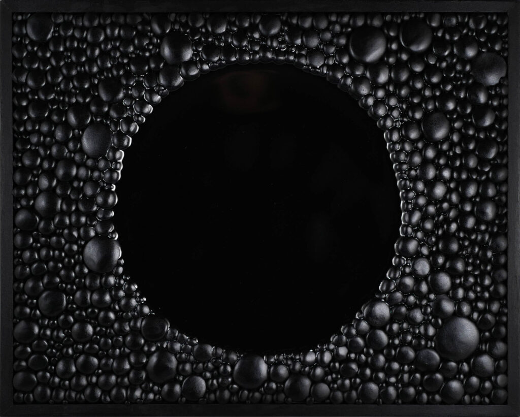
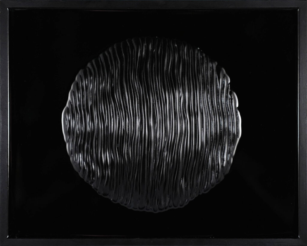
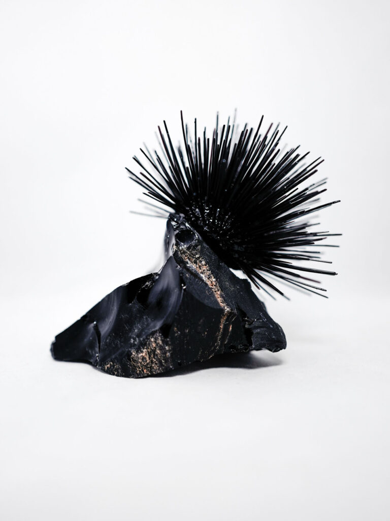
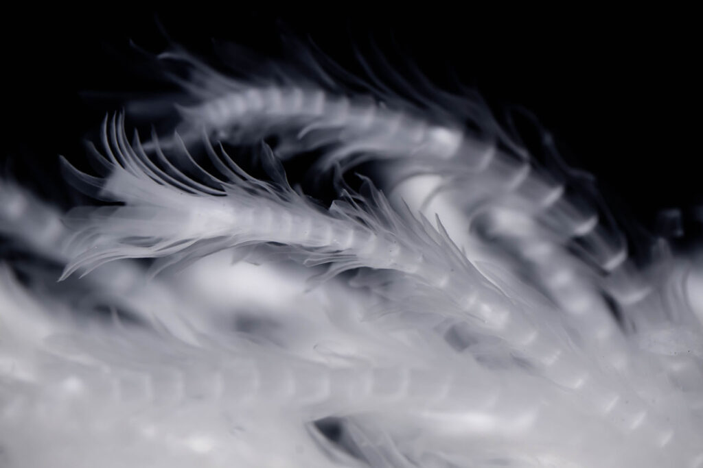
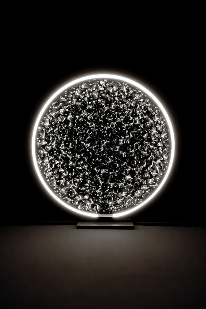
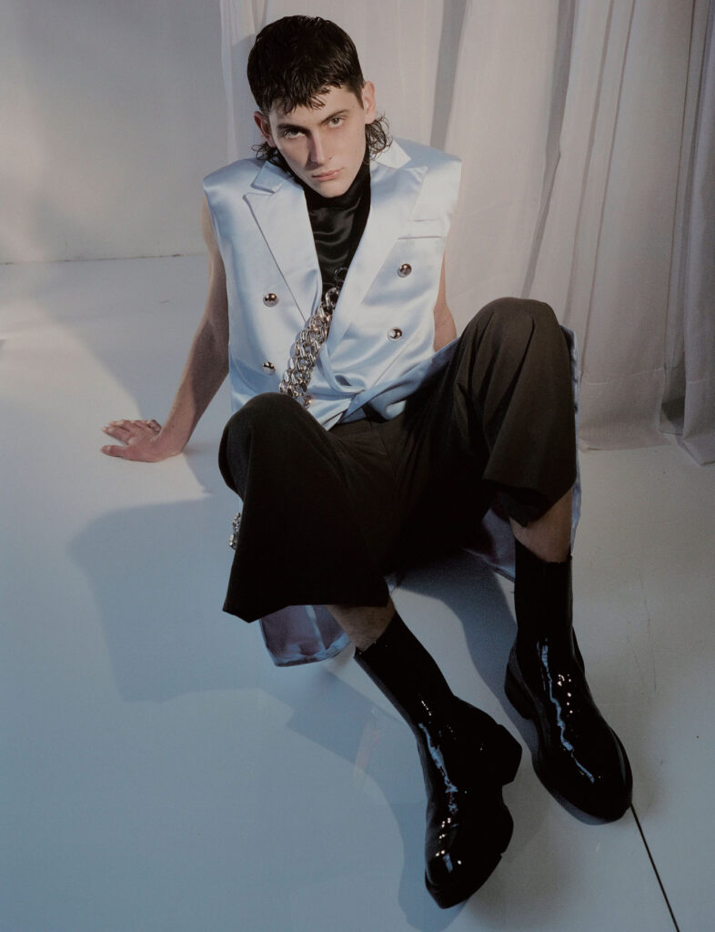
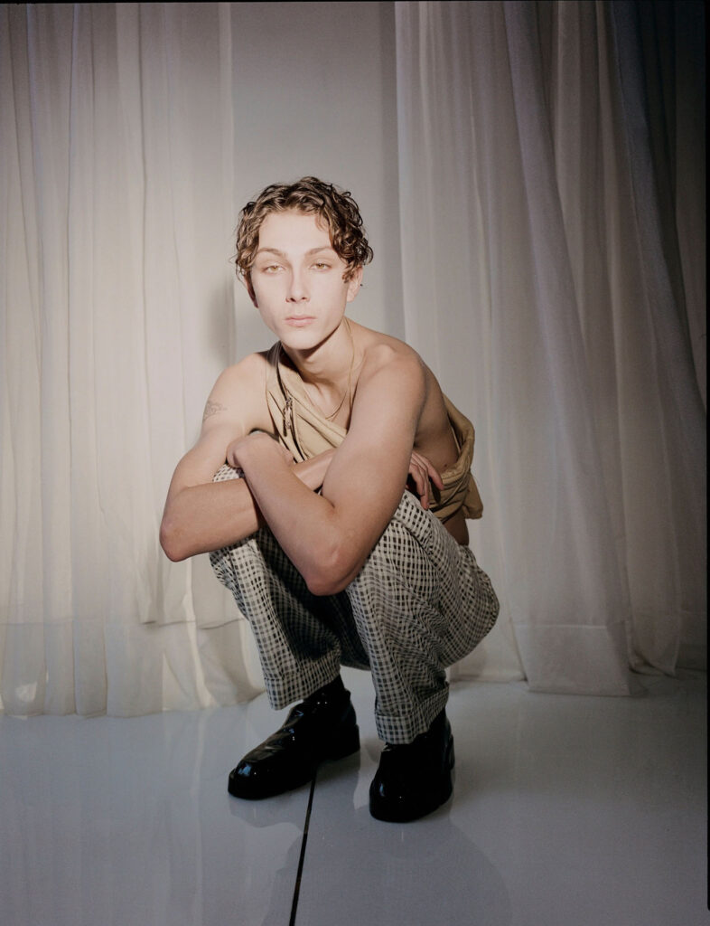
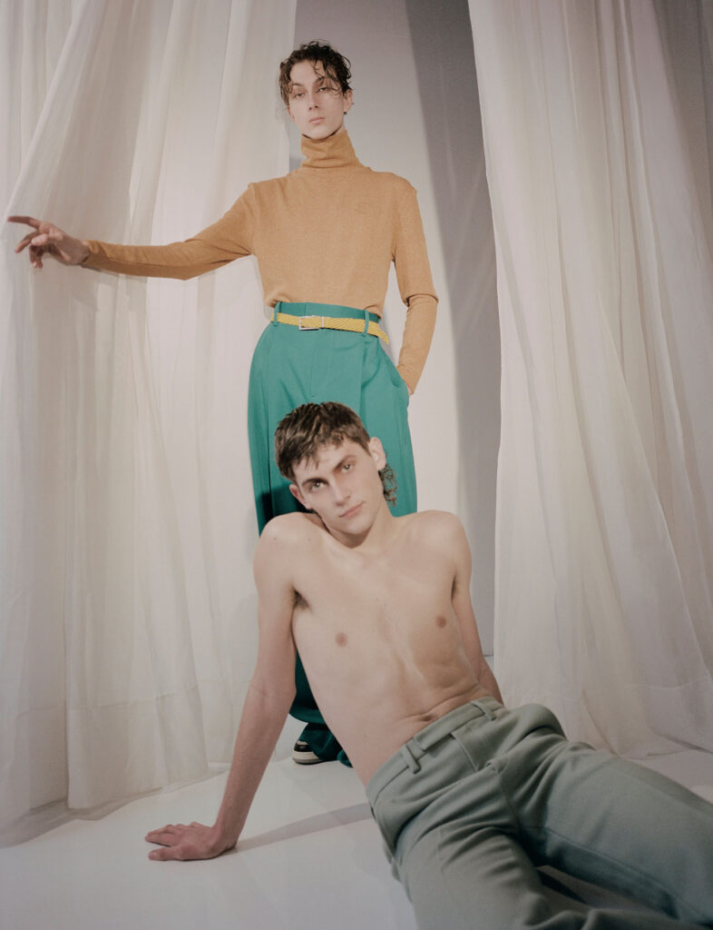
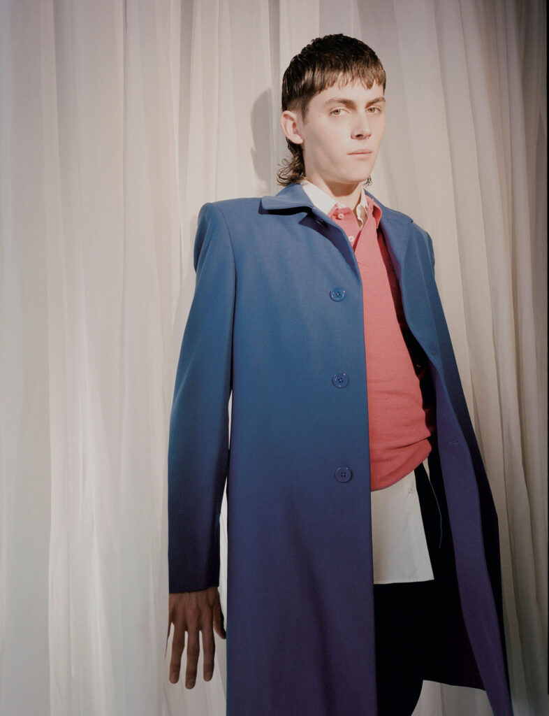
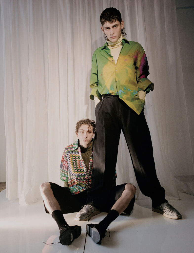
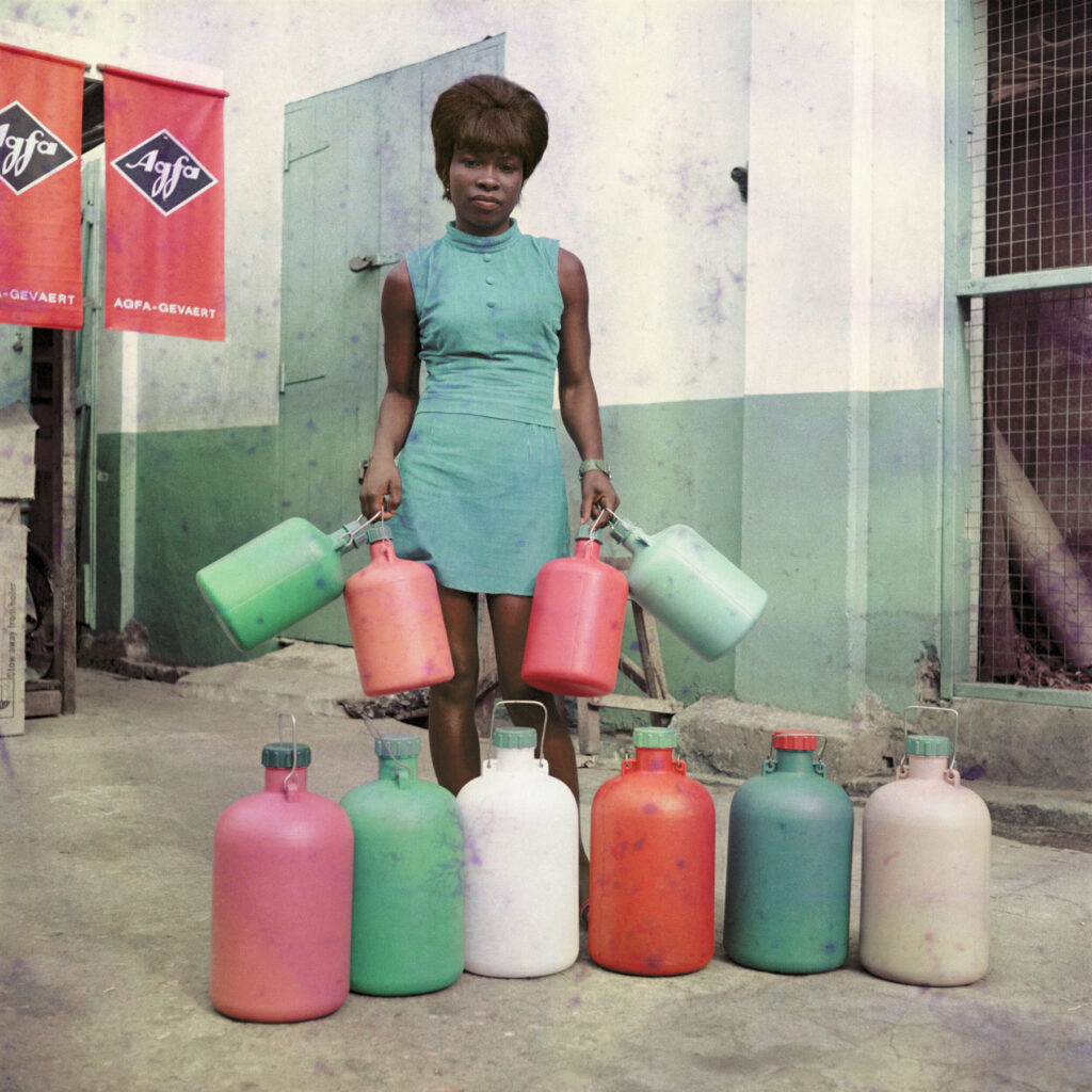
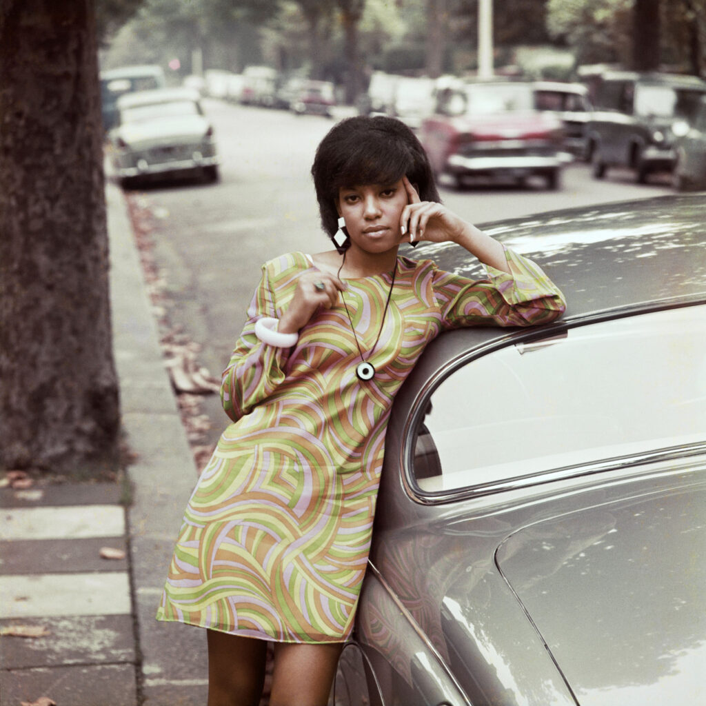
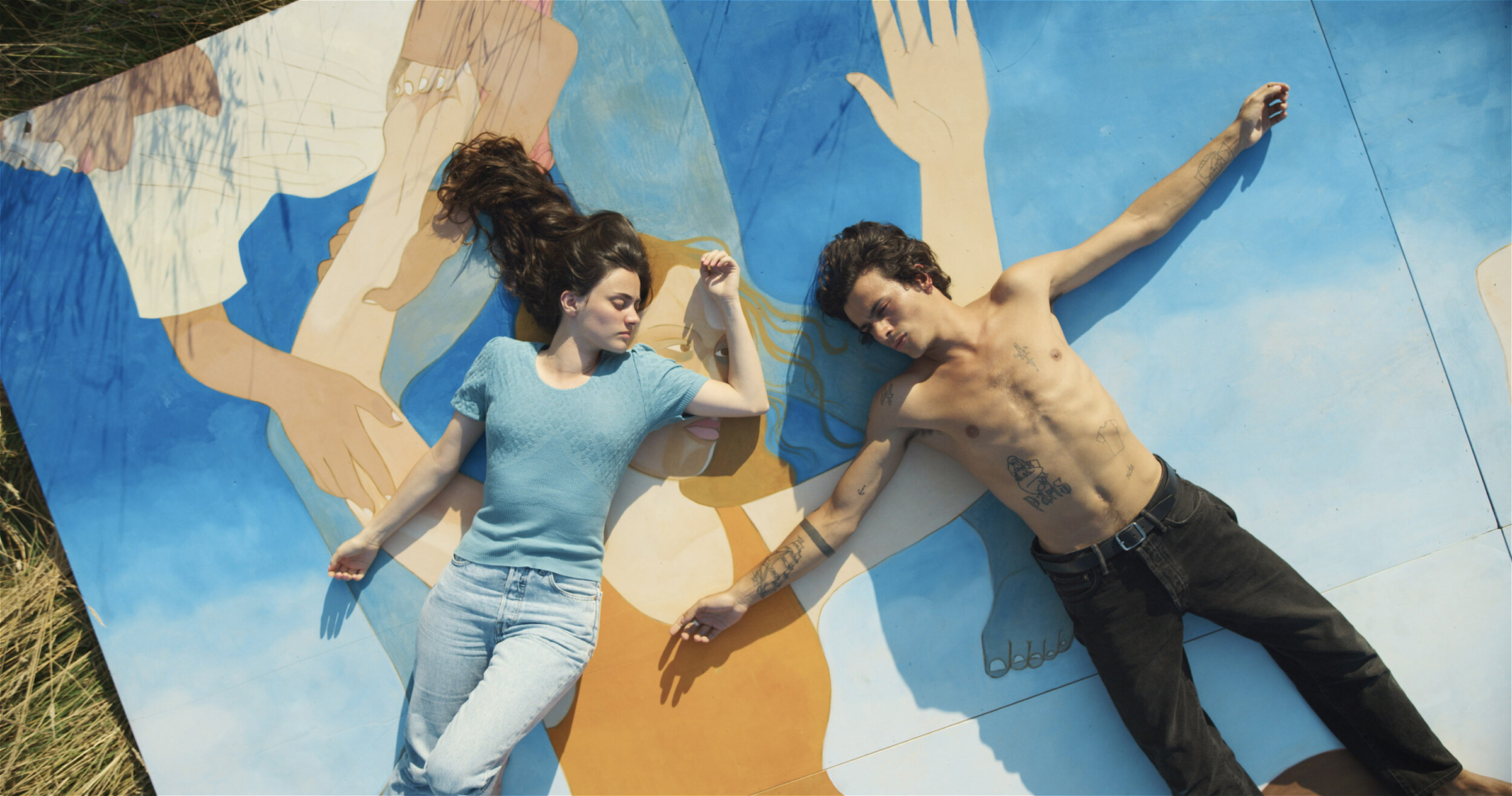
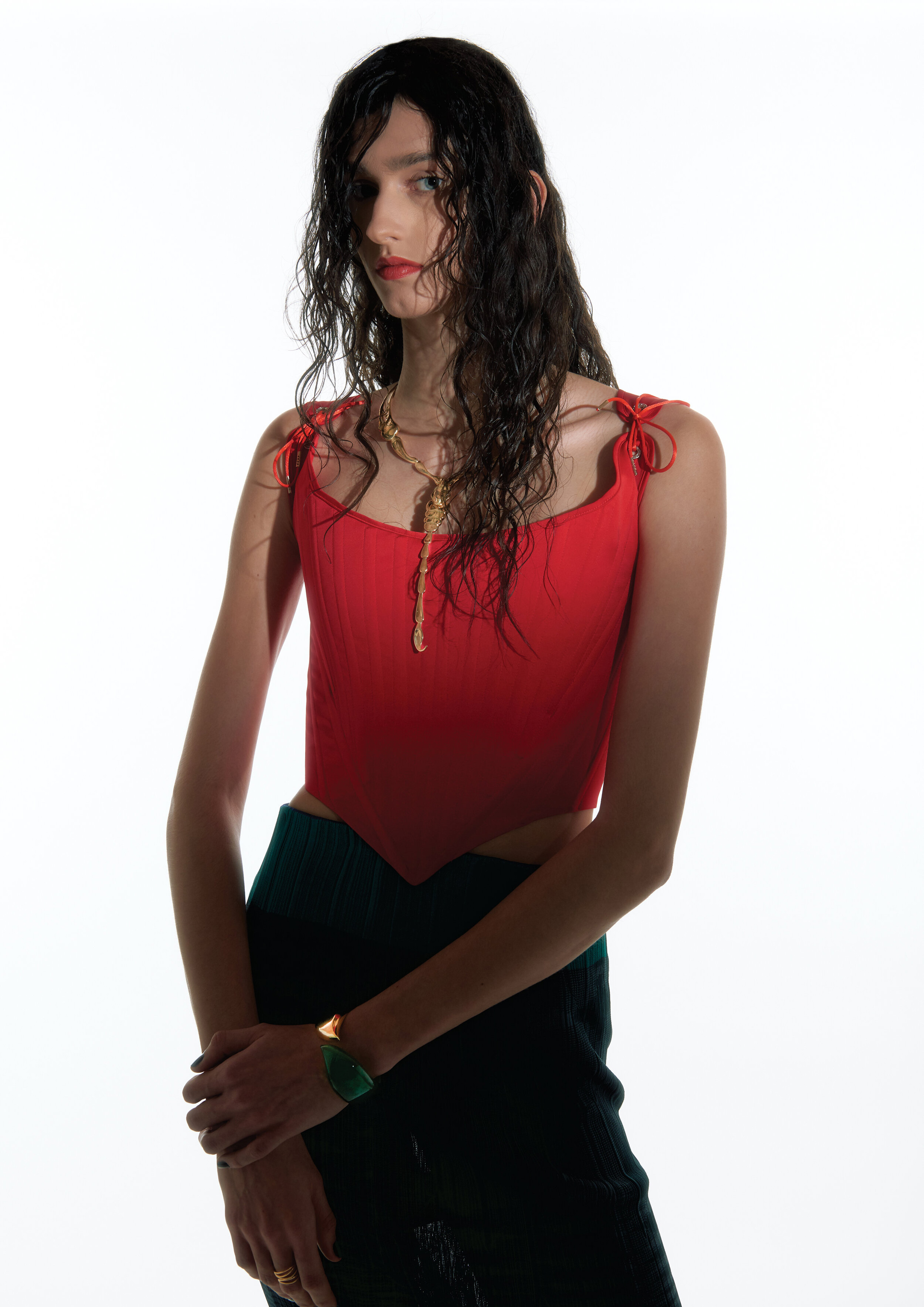
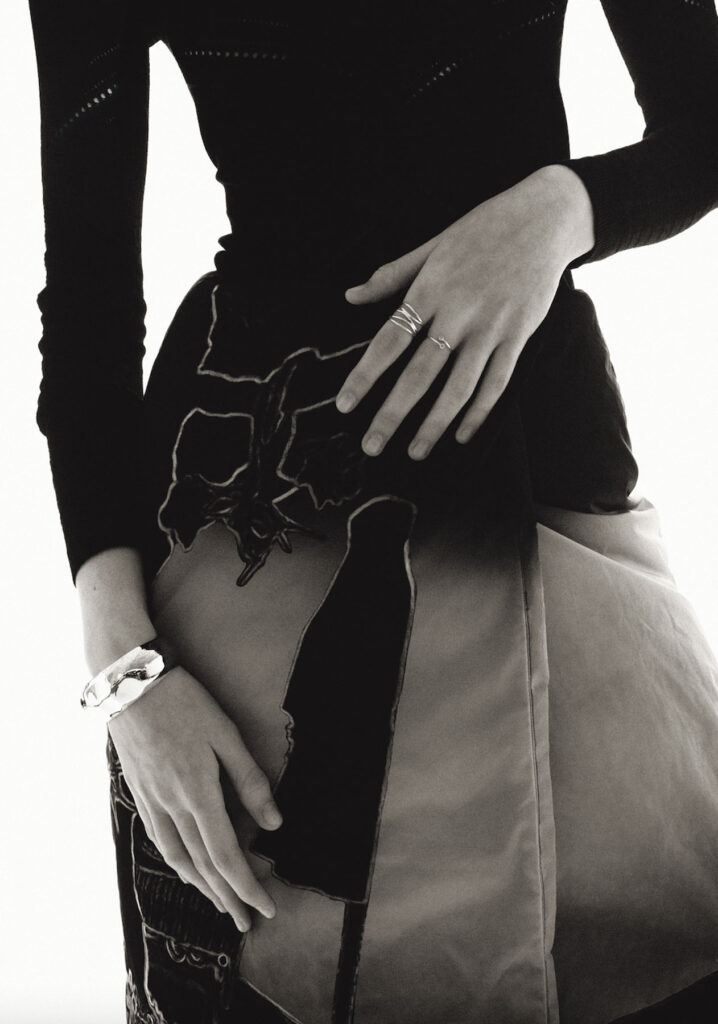
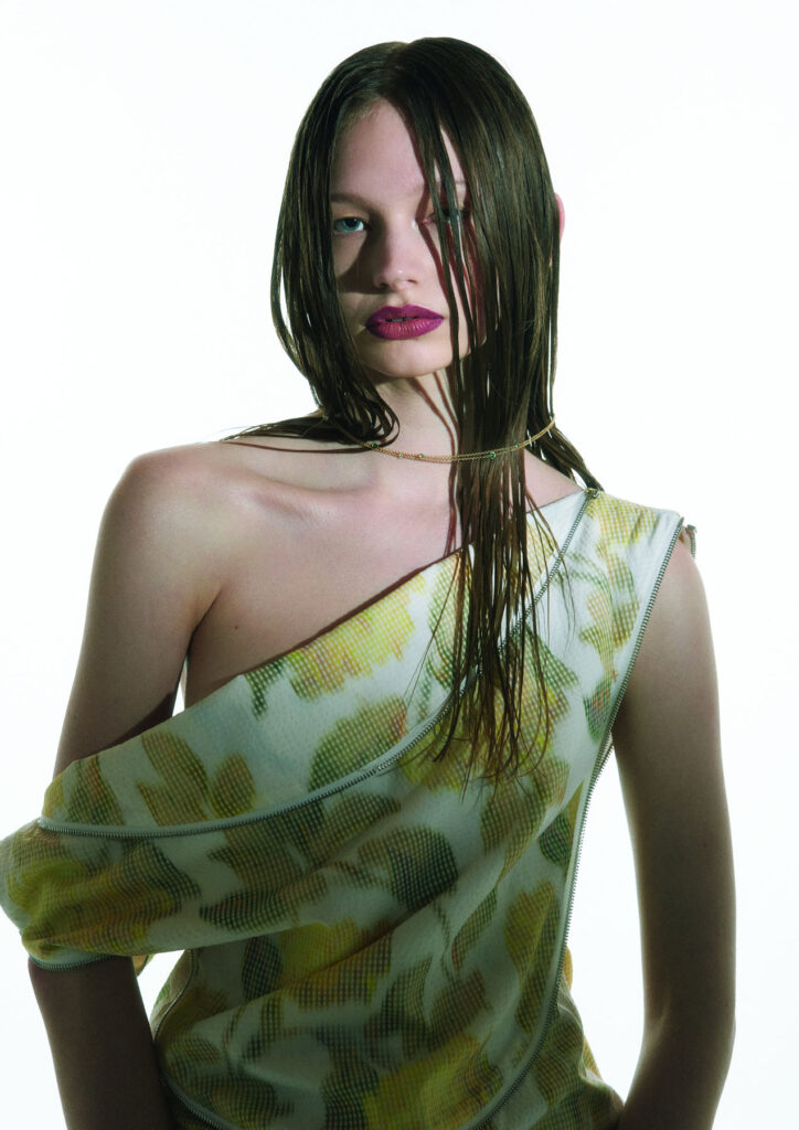
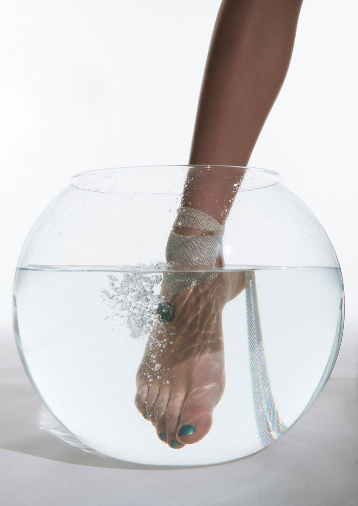
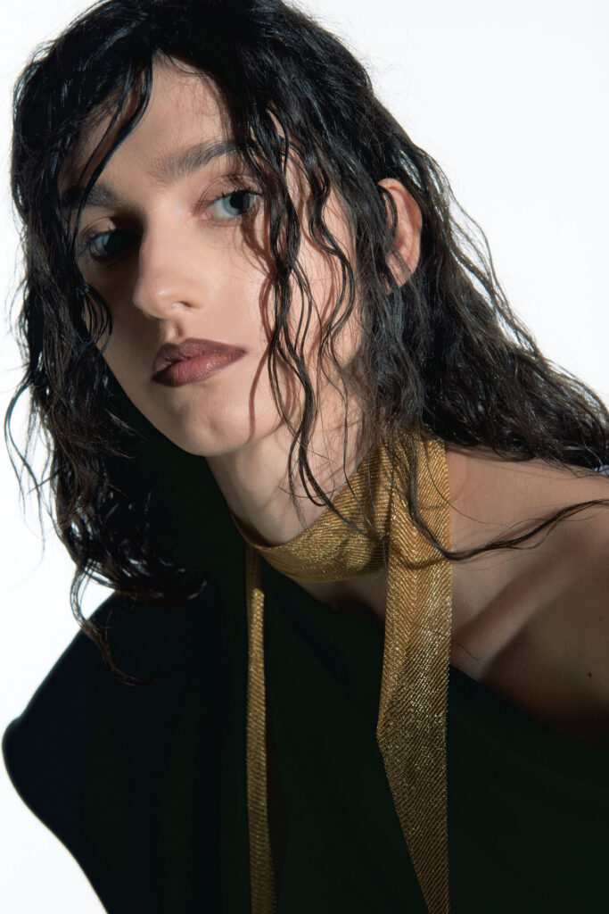
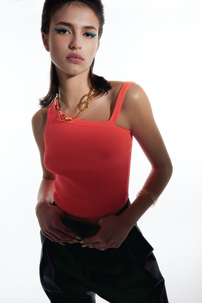
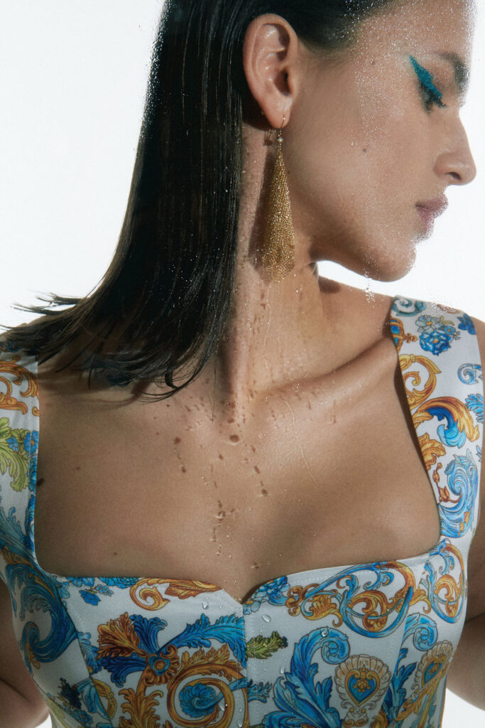
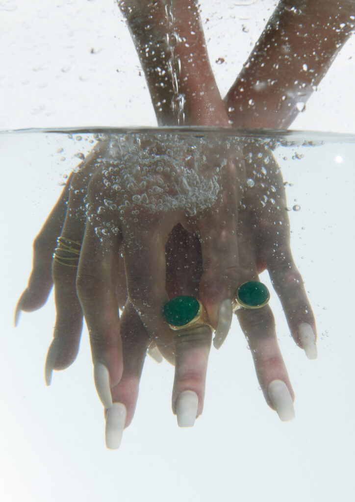
Images · LOGAN RICE
www.logan-rice.com