Archive page:


Alessandra Sanguinetti

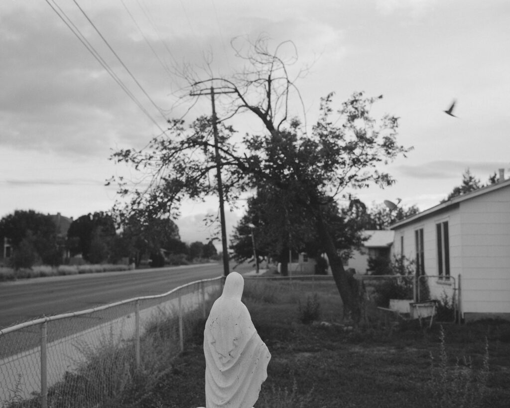
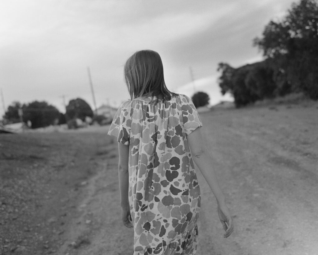
New-York based photographer Alessandra Sanguinetti often explores through her work, changes, experiences and feelings in society. Sanguinetti’s photography is infused with a certain serenity and a beautiful melancholia showing a certain level of trust between her and her subjects.

Her decade long project The Adventures of Guille and Belinda captures two cousins growing up together in the rural province of Buenos Aires, in Argentina. It is a testimony of family, a study of love, tracing the girls’ lives between every day and imagination from the ages of 14 to 24 and their passage from girlhood to young womanhood. The series which began in 1998 is the subject of two booksThe Adventures of Guille and Belinda and the Enigmatic Meaning of Their Dreams (Nazraeli) and ten years later,The Adventures of Guille and Belinda and the Illusion of an Everlasting Summer(Mack).

Recently, Alessandra Sanguinetti shot a cover for Vogue Italia for their January 2021 Animal issue which aimed at bringing awareness to the urgency of the environmental problem.

When I was nine years old a book I began to get curious about the books on our living room coffee table. Amongst books about nature and old ‘masters’ (Caravaggio etc) there was a Lartigue, a Chim (David Seymour), Dorothea Lange book , and Wisconsin Death Trip, by Michael Lesy. It was the latter that made me beg for a camera. I had a gut reaction to that book – it was the first time I saw, or paid attention to, images of people long gone, and it was the first realization that I was going to die and disappear as well. I panicked and had immediately associated photography with death, life, and memory.

I did receive a camera for Christmas and set out to memorialize everything in my life.

That’s the way it’s been since.

As far as my practice, it was in my twenties that I consciously realized photography was a way to relate to the world and a way to make a living. I’d never thought of myself as an artist or anything in that neighborhood, until then.

Credits

Images · ALESSANDRA SANGUINETTI
https://www.instagram.com/alessandra_sanguinetti/

Designers

  1. Cecilia
  2. Christen
  3. Hadil, 2003
  4. Mayelin
  5. Jessica
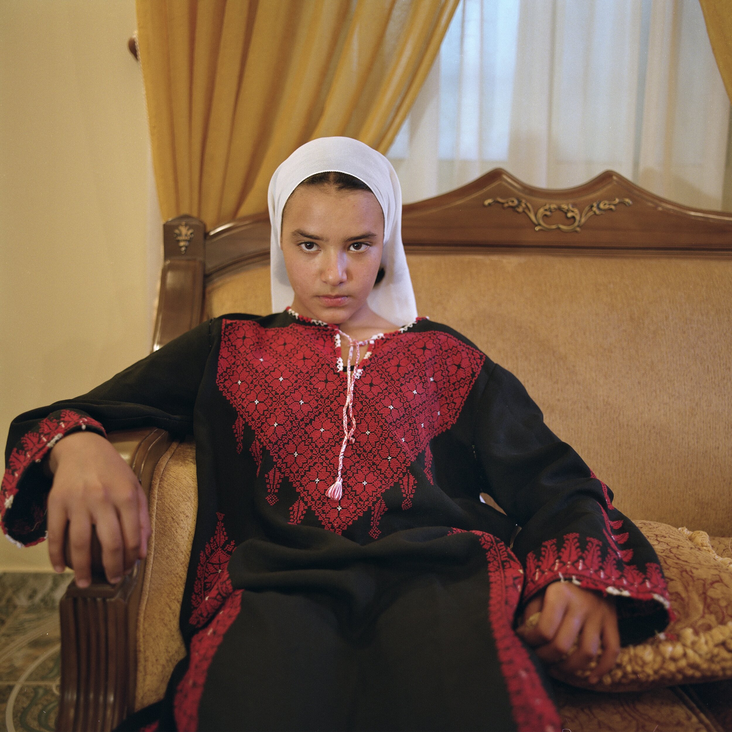
  6. Miriam. Aida Refugee Camp, West Bank, Palestine, 2004
  7. Sarita
  8. The Couple
  9. Mothers, 1999
  10. Untitled, 2009
  11. The Blue Dress, 2000
  12. Untitled, 2009

Pelle Cass

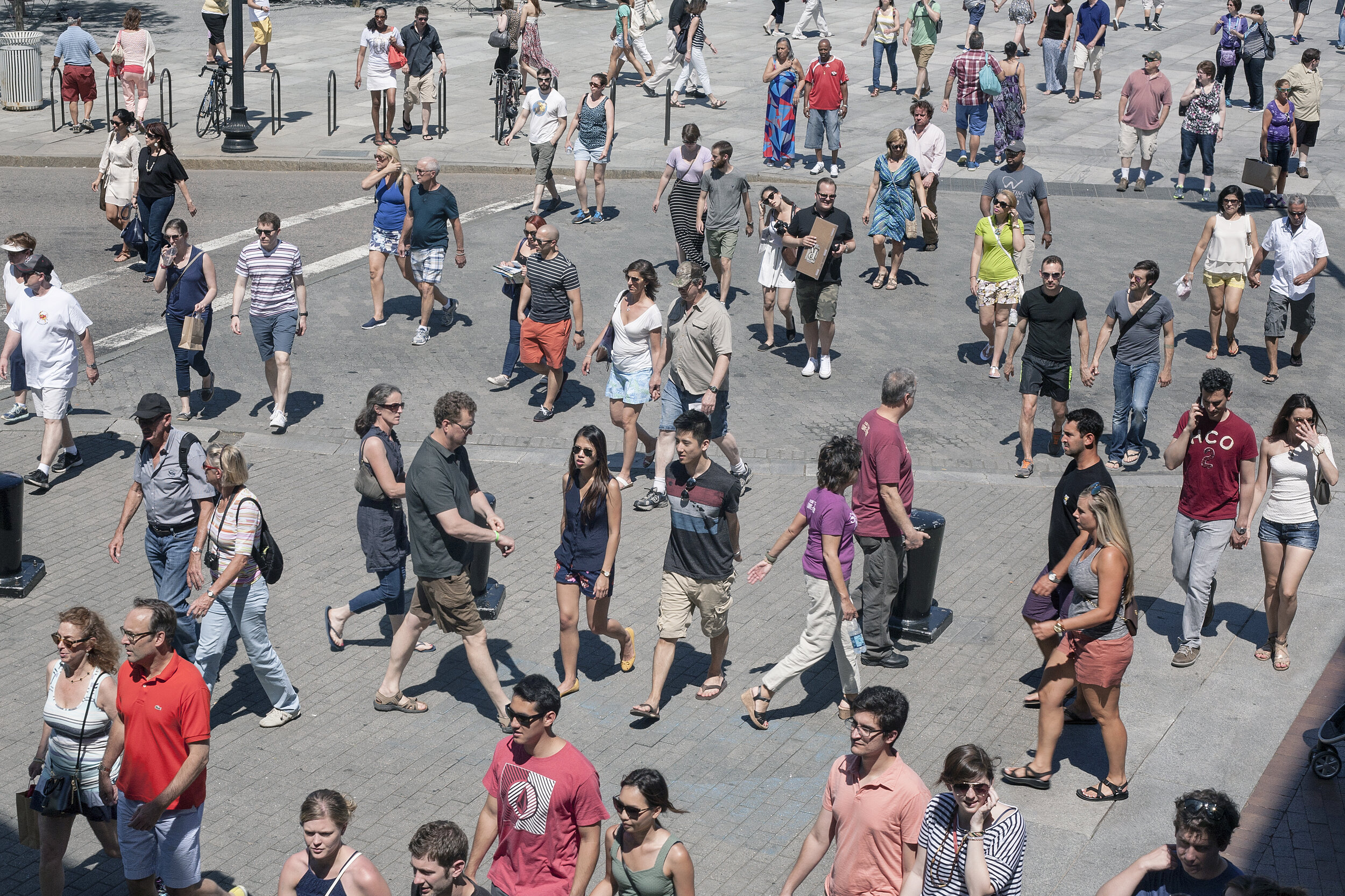
Selected People

Credits

Images · PELLE CASS
https://pellecass.com/

Rick Schatzberg

“conversations helped to create the atmosphere I needed to portray vulnerability”

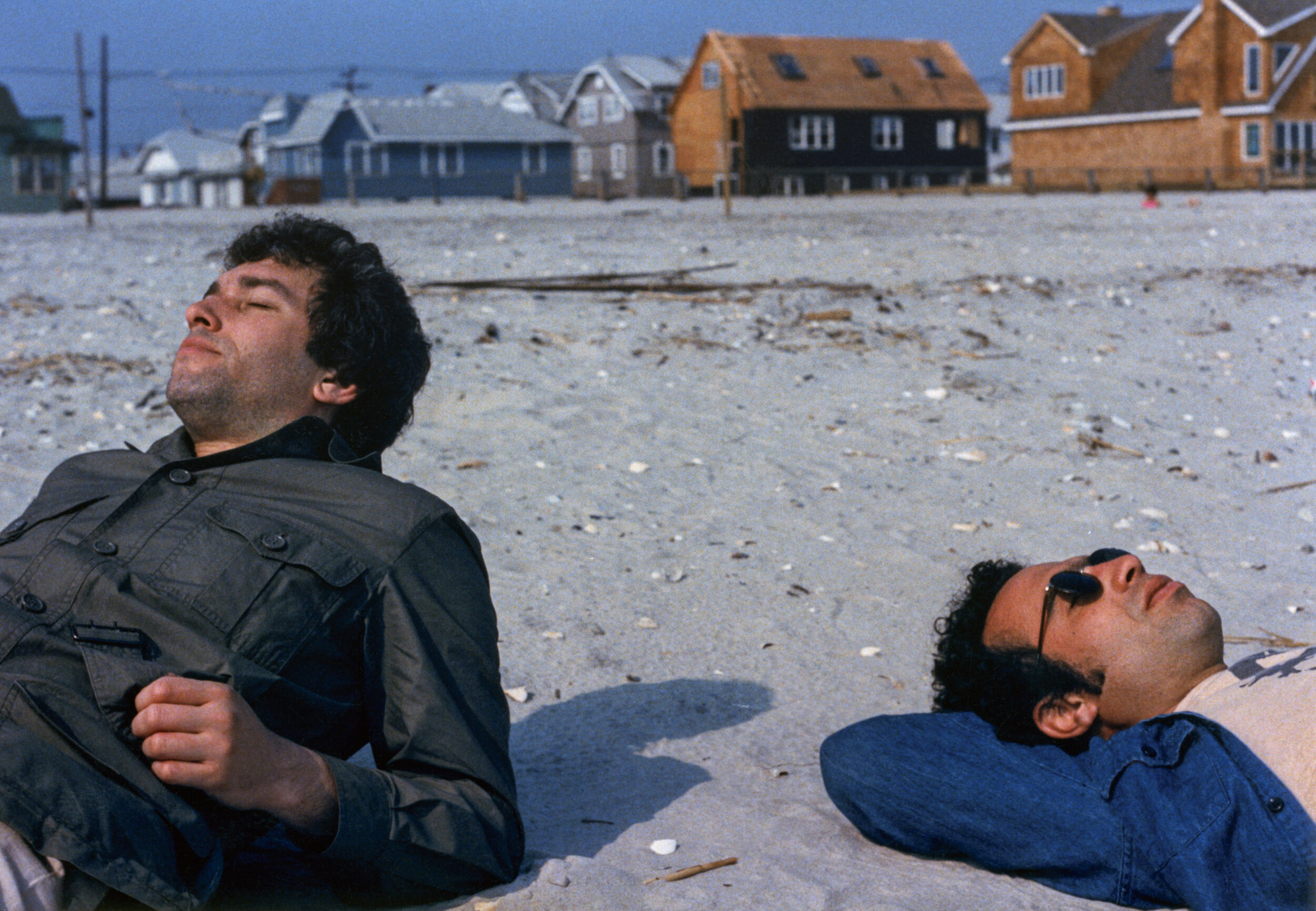
Rick Schatzberg grew up in a suburb of Long Island in the 1950s – a place constructed out of nothing but a post-war optimism for prosperity and abundance. A place that, by Rick’s own admission, was in reality, characterised by its monotony and it’s ‘nowhereness’. Surrounded by the comfort of middle class living, Rick and his friends discovered the world by hanging out in one another’s bedrooms, the local mall or a wooded area not far from their suburban enclave. As teenagers, the boys (as they came to be known amongst themselves) would experiment with alcohol and drugs, and hang out with girls; an upbringing unremarkable to anyone who wasn’t there at the time. As they grew older, the boys took on different careers. Rick moved to New York and became an entrepreneur, the others would become teachers, taxi drivers, salesmen, realtors and healthcare workers But they remained what Rick calls a ‘cohesive entity,’ eternally bound together by their childhood moniker.

The Boys, the second photobook by Rick Schatzberg, is the result of both his pivot into photography and the unexpected death of two of his friends in close succession. Confronted with the fragility of life, Rick began in earnest to take photographs of the remaining boys. Using a large format camera, the images of himself and his friends, now in their mid-60s, are a stark reminder of the passage of time. In and of themselves, Rick’s photographs are tender portraits capturing the toll of time and age on the human body. But in the book, these images are interspersed with snapshots and photographs from the boys’ youth. Aged bodies become youthful, smiling faces – hanging out, experimenting with weed. Though Rick is quick to outline that The Boys isn’t nostalgic, there’s something poignant in flicking through the book’s pages and recognising the quirks and characteristics of each of the boys as time passes by. Addressing the responses he’s had so far about the book, Rick sums this feeling up well in our interview below: ‘anemoia: nostalgia for a time or place you’ve never known’. Many of the old photographs included in the book are snapshots that had been forgotten about – forgotten in the almost immediate aftermath that they were taken. They raise questions of memory; can the boys even recall the time and place that the photograph puts them in?

Alongside the images, old and now, are twelve short texts. One is an email exchange between Rick and two of the boys trying to piece together the facts of a fight that happened at a wedding. Their recollections of what actually occurred differ; evidence of the unreliability of memory. To celebrate the release of the book, Rick spoke in conversation with the photography writer and curator, David Campany in early 2021. As well as discussing the subject matter of The Boys, something that came up as crucial to the book’s release is its design. As part of the book launch, Rick shared a video of himself going through the book to demonstrate that the large format photographs of his friends feature as fold out pages (something, he tells the audience via Zoom, his mentors and peers from his photography course advised against). But something that also stands out in the structure of the book is that the 12 texts Rick includes in The Boys read like snapshots themselves.

An accompanying essay to the book by the writer, Rick Moody, raises this point, writing about the ‘relationship between a still image and the kind of expressive power that we associate with narrative activity.’ In the context of The Boys, as a photobook, this takes on historical significance. Writing about the 1920s, a time of the proliferation of the photobook and the photo essay, the academic Andreas Huyssen describes how a new form of literature appeared.

The “modernist miniature”, popularised by novelists like Franz Kafka and critical thinkers like Walter Benjamin, sought to capture modern life with photographic precision through words. In that way, then, Rick’s book is much more than a selection of photographs of his peers – young and now old – it’s a reckoning with how we navigate time, memory and our existence through the lens of modern life.

How did your experience of studying photography influence The Boys?

My work on The Boys was influenced by my art school education in several ways. To begin with, the photography MFA program I was enrolled in at Hartford University, Connecticut, is heavily focused on photobooks, and I went knowing I’d be making one. I thought I already knew a fair amount about photobooks, but the breadth of what I was exposed to by teachers, guest artists, and student colleagues was eye-opening. I had to examine my motivations to make any work and to think about how I would make a book that wasn’t just a collection of interesting pictures, but something with substance and depth.

In grad school, one of the challenges of making work that you hope to eventually present to the world is interpreting and deciding what to do with the near constant feedback you receive. You go to art school to not be limited by your inclinations. But there’s also the danger of gearing your work for approval of teachers and fellow students. In the end, I had to absorb what was helpful and discard what wasn’t; making that distinction was sometimes a confusing struggle. 

At the virtual launch, you emphasised that this book had to be universal, and not nostalgic. What feedback have you had from people about The Boys? Does it differ from the boys themselves, those who come from the same place/time, and those with no real connection to the American suburb?

For me, the work is not really nostalgic; I feel that the almost forensic nature of the large format portraits grounds the work in the present. But I may have overstated my case against nostalgia a bit. The feedback has been consistent in that the work evokes an emotional response, which I find very gratifying. But judging from what people have written or told me, the way into the work has really varied. For some, the immediate connection is nostalgia for their youth or that time or place. For others, typically younger readers and often European, it may be anemoia: nostalgia for a time or place you’ve never known. (Like films and novels, photography is good at evoking this.) I’ve heard from people for whom the portrayal of enduring friendship was the hook, and after reading the book they either felt the urge to reach out to friends they have not been so attentive to or lamented that they didn’t have friendships that lasted into adulthood.

Obviously, this work is radically specific: a very particular group of white guys of a particular generation, raised in a very particular American suburban community.

“From the outset though, my feeling was that if this work isn’t felt to be universal then it’s a failure. Mortality, after all, is the bedrock of our biology.”

You mentioned the importance of collaboration in making the book – did this collaboration extend to your friends? Or did they feature just as subjects? Why did you use a large format camera for the portraits? 

I discussed the deeper underlying themes of the project – aging, loss, memory, mortality, friendship – with my friends during our photo sessions. Though my directions for posing were minimal, these conversations helped to create the atmosphere I needed to portray vulnerability. I also explained that I planned to use the work as the basis of my master’s thesis so they understood that there would be a critical audience for the work beyond our circle. Their attitudes went from gracious acceptance to genuine interest. It was as though they became partners with a stake in the outcome.

“It was clear that I would be making unheroic portraits that might not be flattering, and they understood there was good reason for doing so.”

The word that often came to mind in these photo sessions was ceremonial. Using a 4×5 film camera, with all its fussy rituals and storied traditions, felt performative and serious. The slow, cumbersome, and mysterious (to my subjects) process helped amplify the psychological intensity surrounding the project. In the face of our brothers’ deaths, together we were creating a formal certificate of presence (to use Roland Barthe’s expression), using traditional tools.

That said, it is was not a true collaboration because the power to select specific portraits for use in the book was mine alone. My friends did not even see the images I was choosing between, nor did they know how I would ultimately deploy the portraits in the book. They trusted me. It was important to assert my authorial voice, but without entirely drowning out the voices of my friends, which they asserted through the written word, their snapshots, and their gestures in the portraits.

We’re faced with the processes of ageing, time and mortality in The Boys – when returning to your childhood home and neighbourhood for the book, had the nowhere place you came from aged too?

In the winter, with the trees bare, the neighborhood looks very much like it did 50 years ago. In the warmer months the trees, mature and leafy, give the neighborhood a homier, more established feel. The automobiles in front of many of the homes are now more numerous and luxurious, probably more a sign of growing consumer credit and a shift in values than of greater wealth.

The short texts in The Boys read like snapshots, how and why did you choose the texts you include?

I was interested in constructing narratives to loosely link text and images that would stand as discrete memories – not stories as such but fragments that help tell the larger story. I chose to write short texts that could function in different ways: sometimes straight narrative; sometimes like vague, recovered memories; sometimes as meditations; and sometimes more as dream than narrative. The one outlier is the story about my father. I didn’t initially think to include this in the book. I was having a conversation with my editor and I related the story to her.

“She told me to write it down and as soon as I did, I knew it belonged in the book.”

In his essay, Rick Moody refers to a good photograph as one left in a drawer for 30 years. Did the archives of photographs of yourself and the Boys ever come to light in the intervening years leading up to the making of this book? If so, in what circumstances?

Several of the snapshots have been circulating for ten years or so on social media. Others, which I found loosely strewn in boxes stored away for years, may have been passed around shortly after they were taken but were mostly forgotten. Time conferred poignancy as Rick Moody describes, but curating enlarged full-bleed versions astride pictures of old men and stories of death, makes new meaning. Even the more familiar old snapshots felt like new discoveries.

Credits

Images · RICK SCHATZBERG
https://rickschatzberg.com/

Lyndon French

The Mysteries of the Secrets

Credits

Images · LYNDON FRENCH
https://lyndonfrench.com/

Thomas Demand

“I think the use of models is a highly influential and underexposed cultural technique, we can only absorb the complexity of the world around us by filtering end remodeling it.”

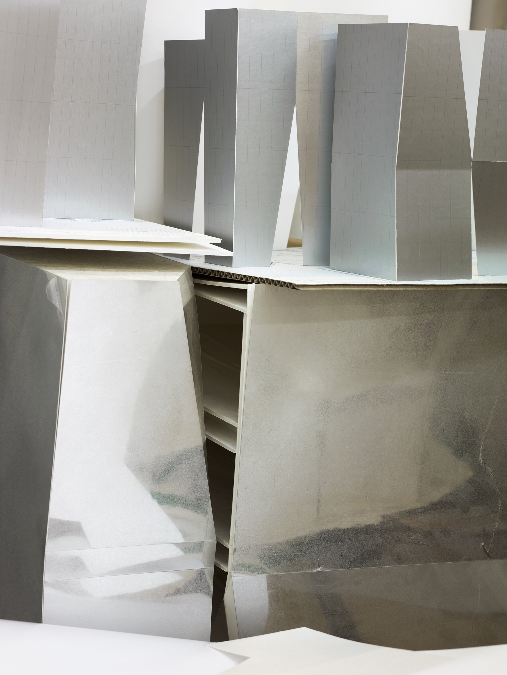
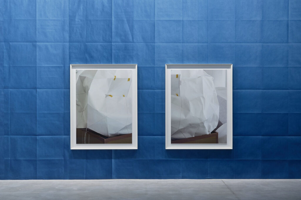
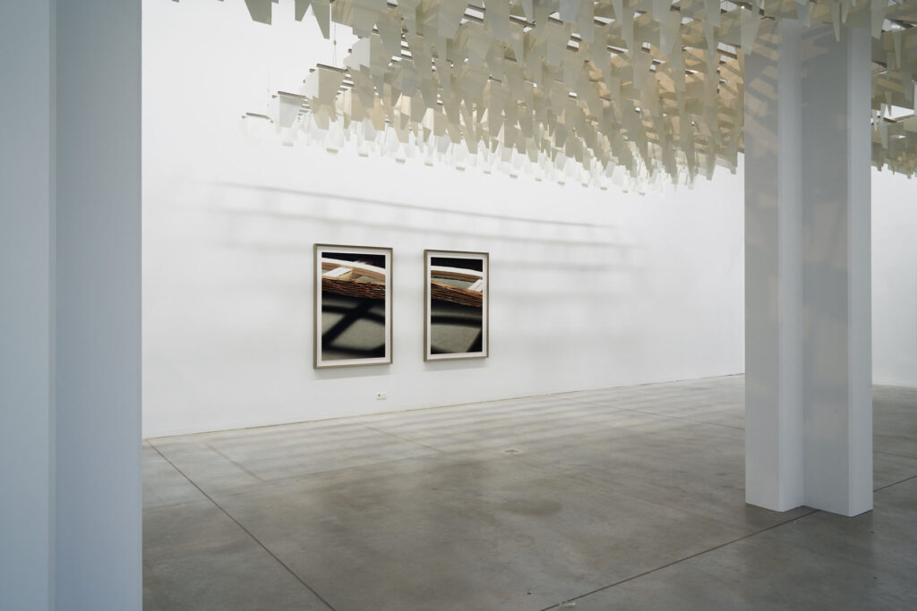
German sculptor Thomas Demand lives and works between Berlin and Los Angeles. One of the most innovative artists of his generation, Demand has specialized in handcrafting facsimiles of architectural spaces and natural environments. Through his use of paper and cardboard, Demand meticulously reconstructs images and scenes, embedding those in society’s collective memory with mural-scale photographs. The ephemeral and illusionistic characters of Demand’s work have pushed the medium of photography further than ever before and are part of his investigation of the livelihood of images.

NR looks into Thomas Demand’s development as an artist, from sculptor to photographer and how he found a balance between the two practices using excellent craftsmanship and imagination, blurring the line between reproduction and original whether it be in architecture or fashion.

Thomas Demand, it is such a pleasure to be interviewing you. How are you?

Very well, thank you.

You have had a fascinating career spanning across various fields such as sculpture, photography, art, film. As the theme of this issue is Growth, I thought it would be interesting to let you talk to us about how you found a balance between all those practices, using excellent craftsmanship and imagination.
You initially trained as a sculptor, how did you find yourself in the place where you are today and how did you initiate that merge between sculpture, photography and architecture?

I grew up in an environment which naturally connected these fields like family: my father and mother were painters, my uncle and grandfather architects, my grandmother a concert pianist (still working to find my way in that field) and my best friend at school was the son of one of the most important and visionary art collectors in Germany. So I have no Schwellenangst, even if I do have greatest respect for the disciplines and their differences.

You have studied in Düsseldorf, Munich, Amsterdam, Paris and London. You have been moving quite a lot. What are some of the places that have inspired you the most?

Japan, USA and northern Italy. But I also noted over the years that there are cities which are good for making art and some to look at art, but rarely is both the case.

Your starting point is often photography as a “constructed reality” and from there, you design life-size paper models with colored paper and cardboard. You create inventive images of life- size architectural paper models that look exactly like the final product. Your constructions are ephemeral as you always discard them once you’ve photographed them. Why is that?

I don’t think it is exactly like the starting point, but even if, it would be a valid artistic concept, I believe. But my version is a version of reality which might have more relations to how we see the world, not how it might be. How we remember it, how we are manipulated, how our ideas influence what we recognize and so forth. Like a writer, he might write truthfully about the world, but it will not be taken as the reality itself. I consider this worth exploring in the medium of photography, where this distinction is easily obfuscated by the mechanistic understanding of documentation the apparatus delivers.

Your work often serves as testimonies for other artists’ thought processes and create a place in time for them. Where did that interest come from?

We all stand on someone else’s shoulders, and I find it an easy way not to isolate my vision in the ghetto of photography. Photography as a technique or discipline never interested me enough.

In an interview for the Louisiana Museum you say that “many things first become visible to us via the images we see of them.” and that we live in a world of models. Could you elaborate on that? Do you think you are creating a new version of reality or giving new perspectives or is this more about bridging the gap between what we see and what is represented and almost building a realm between fiction and reality?

I think the use of models is a highly influential and underexposed cultural technique, we can only absorb the complexity of the world around us by filtering end remodeling it. The ancient Greek philosophy was already fully aware of that and things didn’t get less complex since then. The weather forecast, retirement plans, demographics, elections, psychology ect, all is using models to find a direction through data. People often think of architects and children’s toys if they refer to models, but it is much more fundamental. It is amazing how little literature and research there is about that.
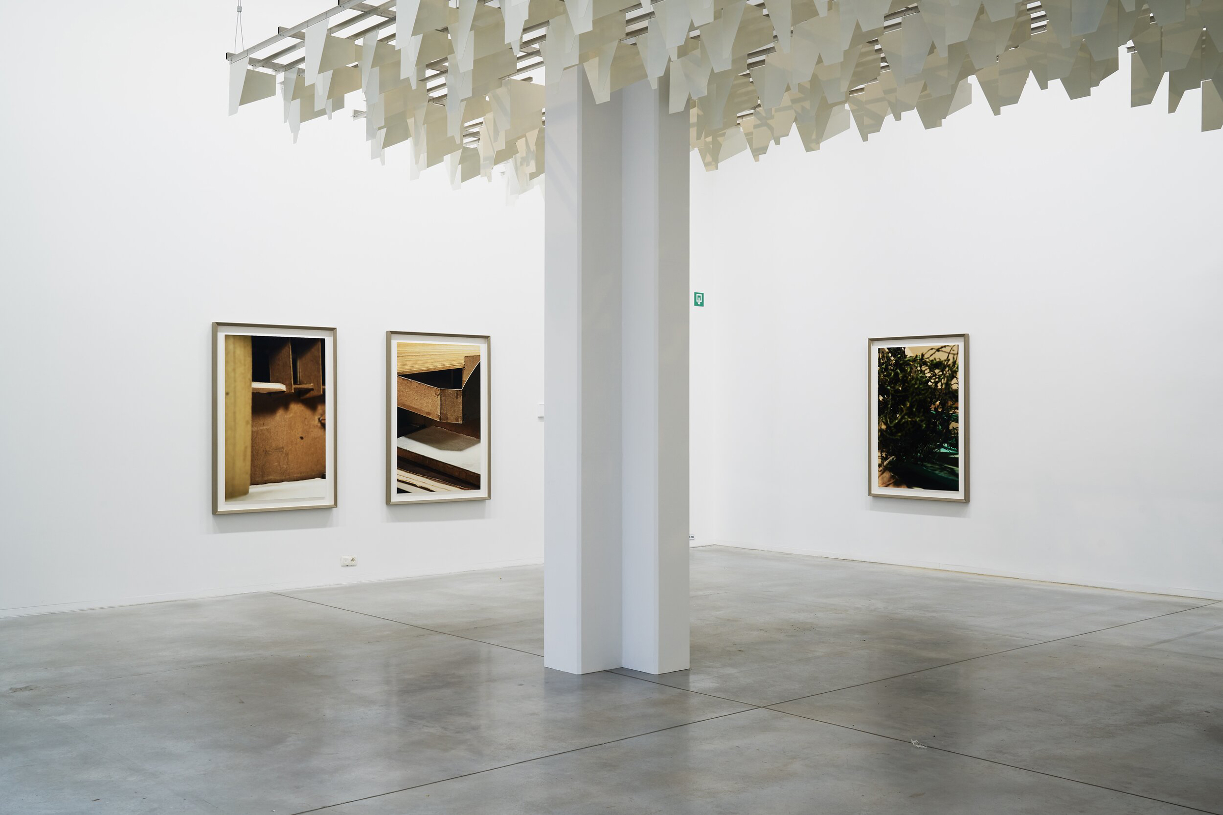
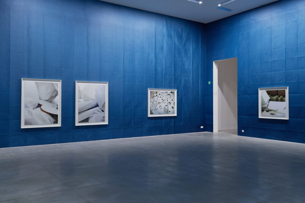
Your major solo exhibition ‘House of Card’ is on view until April 2021 at M Leuven museum in Belgium. It coincides with the release of your book House of Card with Mack, which focuses on your relationship to architecture and the collaborations you have done with architects. Your series Model Studies which also serves as an introductory point in House of Card, was honoring through photographs taken during your visit at the Getty Museum in Los Angeles, 13 unreleased projects and discarded structures made by well-known architect John Lautner. This was also the first time for you not to photograph models of your own.

HoC is the show and the book, which works as a standalone, but it is the book to the show.

Could you delve into your engagement with architecture over the last decade?

I noted over the years that architecture developed a specific interest and response towards my work, I heard of competitions which were won with my images as examples, architectural schools did seminars about it and architectural biennales invited me many times to contribute. I also worked since my first exhibitions with display features, exhibition architecture and embraced challenging spaces to show the work without compromising neither the architecture nor the pictures. All that established long-termed collaborations with a number of architects. I think that prepared the situation in which I started thinking about architecture as a promising claim for my thinking and obviously there are a number of approaches imaginable for me: looking at it, using it and now also doing it myself. That’s what the show is about, plus collaborative aspects which come along, as architecture is always a team effort.

How does your work resonate with architecture? In your opinion, how do abstraction and architecture correlate?

Architecture, not unlike photography are figurative. The process might be very abstract, but what is built is concrete. But there are stages in the design process which are open and not about doors, faucets and fire regulations, and those interest me, as they shadow a bit what I enjoy in my work, when ideas become form and forms become figures. I consider my Model Studies series as my most photographic work to date but also my most abstract. In the end the source is becoming irrelevant, you won’t recognize a Lautner building nor a dress by Alaïa on my images.

You have spent time recently in Tokyo in the offices of the architects Kazuyo Sejima and Ryue Nishizawa, also known as SANAA. Your 2015 show Latent Forms at Sprüth Magers in London displayed the close-up images you took of their paper and cardboard architectural models during your visits at SANAA offices. Those images part of Model Studies II, became abstracts and fragments of ideas of buildings that may not come to realization. Why were you interested in working with SANAA?

Besides the fact that they are amongst the most astonishing and original firms in the field of architecture, I was approached by them to contribute to their Venice architecture biennale exhibition in 2010. I visited them in Tokyo and found the most amazing and confusing office they worked in, which just fascinated me. So, when I moved to L.A. I decided to fly every few months over there to see how that place changes. Their design process is highly influenced by the use of very low-key simple paper models, which they make in a minute to communicate ideas. Once such idea is used or abandoned for one project it might have an afterlife in another project because it just sits there amongst what looked like a 1 million other models. So, it felt familiar for me as a studio situation, but also it was used for completely different purposes.

Could you tell us about Model Studies IV and the inspiration you had from the late fashion designer Azzedine Alaïa’s pieces?

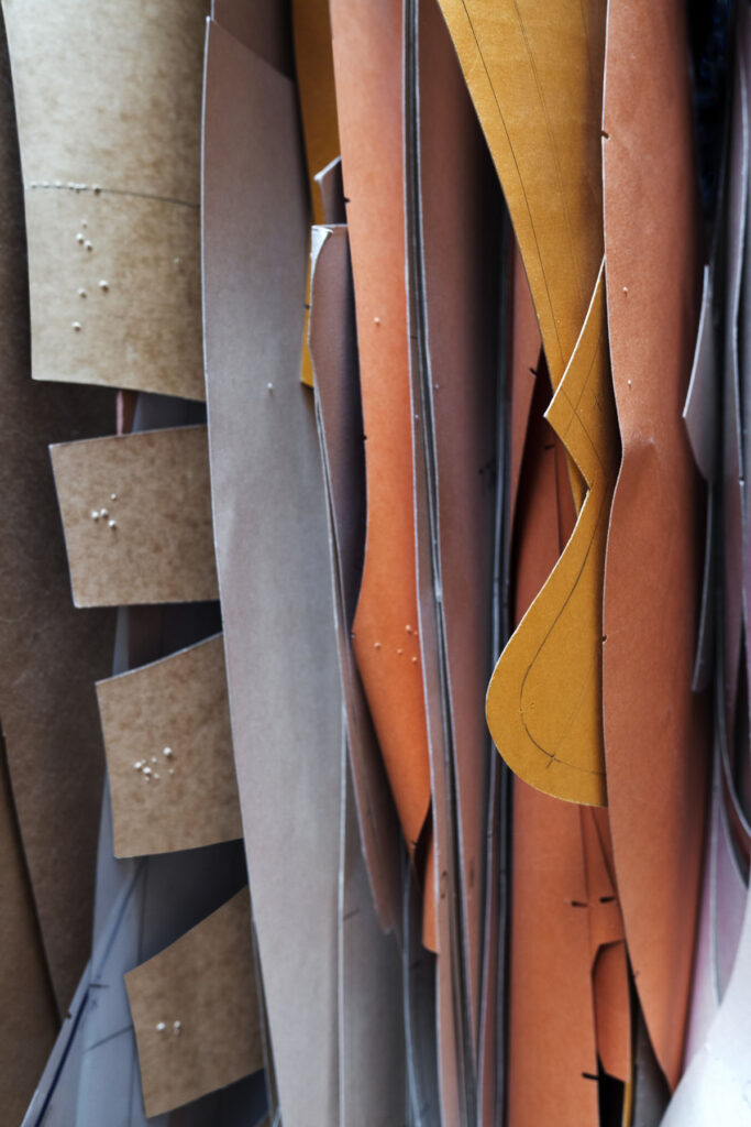
I had the pleasure to have lunch with him once or twice in his atelier, and at the same time I had planned to work with the patterns which are used in clothes making for many years. Although I never found the right picture, I kept searching. It reminded me of the discarded leftovers on Matisse’s floor in his studio in Nice, where he did the cut outs in colored paper. Again, it felt familiar but wasn’t an artist’s studio. Important in all cases is for me also that these people think with their hands, which is really important in a time when the digitalization is taking over any aspect of our life.

Last year you realized your first collaboration with a fashion brand, for Prada and you’ve decided to create anonymously a series of images titled Hanami (meaning cherry blossoms, a symbol of youth and love) created for each window of every Prada stores across the world. This was also a first for Prada to officially collaborate with an artist. You have had a close relationship with Miuccia Prada and Fondazione Prada for the last decade. How did that collaboration unfold? Why also the desire for anonymity? Could you tell us more about the narrative behind the series and what was the inspiration behind it?

Over the last 15 years I did nine different projects in all different shapes and ambitions with the Fondazione Prada. I saw it developing into an amazing organization, which never used the art for marketing reasons, very unlike most other efforts in that field. The trust in the artist and the generosity when it comes to making things possible is the connection to the core of the company and in the end their idea of luxury. So when MP asked me if I would consider to give permission to use my work in a seasonal campaign worldwide – it was spring 2020 – I considered the cooperation with company a chance to try out my work on a global audience without making it a marketing move on my part. I mean every Prada shop in the world, all of them in prime locations, and most of the windows were designed specifically. What a roll out!

It seems that artists and fashion brands are collaborating more and more. You have mentioned before that fashion is time and identity related and I think we can find those elements in your work too. What are some other fashion houses that you would want to collaborate with?

I find it a relatively confusing message to have a shop window with handbags and then having an artist name on top of that, possibly even with a social mission. I think the handbag should convince in itself and the shop window should do the best to create attention and context, full stop. But as I said, contemporary art is a niche and fashion is an industry, I think there can be very interesting combinations, as long as they respect the autonomy and maybe auratic character of an artwork. Also, the series ‘Blossom’ was existing, we aligned and composed it anew for the purpose, but it was not a commission in the sense of the word. But I really admire what Prada has built over the years, that’s why I was open to the request, not because I wanted to combine my ‘brand’ with theirs or any other strategic consideration.

Coming back to architecture, your most recent project currently under construction, is very very exciting. It is a Pavilion at the Headquarters of design-innnovation leader Kvadrat, a contemporary textiles and textile related products for architects and designers, company in Denmark. Could you tell us about this collaboration?

Again, that grew over the years into a long ongoing and trustful relation. Anders Byriel, the CEO, is very interested in contemporary Art and approached me decades ago when I had a show in the Museum Louisiana, and was just trying find his way around in the arts. It wasn’t really about commercial interests on both sides. We became friends since, did a few projects which were all great fun and showed convincing results, and so when he decided to build some kind of meeting place next to the company headquarters, he asked me if I have ideas or if I want to do it. And I said yes, instantly. You need to understand, very rarely an artist has the chance to build an entire house or in this case three of them. And I am trying to make it in some kind of Gesamtkunstwerk, where I am doing everything you touch and consider everything in it’s visual appearance and all follows the logic of paper. As it is my first, of course I needed help and asked CarusoStJohn to facilitate my ideas, I have also done a number of projects with them in the past, so it is a constructive and sensitive dialogue.

Are there other projects that you are working on at the moment?

I am working on a film about which I can’t say much right now, we will open a show in London next week, I am developing a large show for Garage in Moscow, which will include a direct collaboration between me and SANAA, as well as a contribution by Alexander Kluge and a show at the Fundacion Botin in Santander, called Mundo del Papel, with a very ambitious exhibition architecture in their wonderful Renzo Piano Building. Let’s hope the world is back on track by autumn, when it all will be realized.

Rina Yang

“the pandemic happened, and I think the drama world struggled more than commercials”

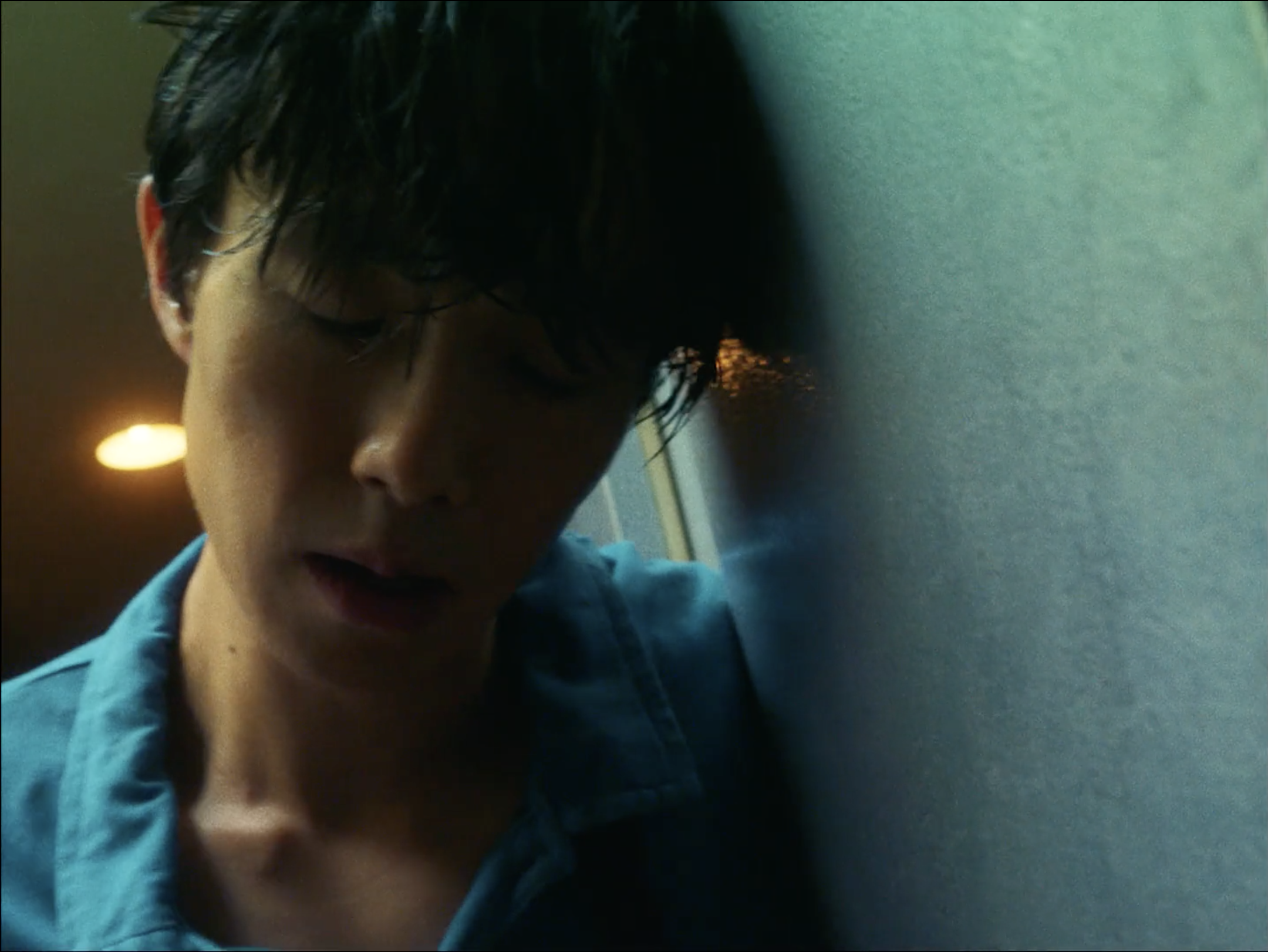
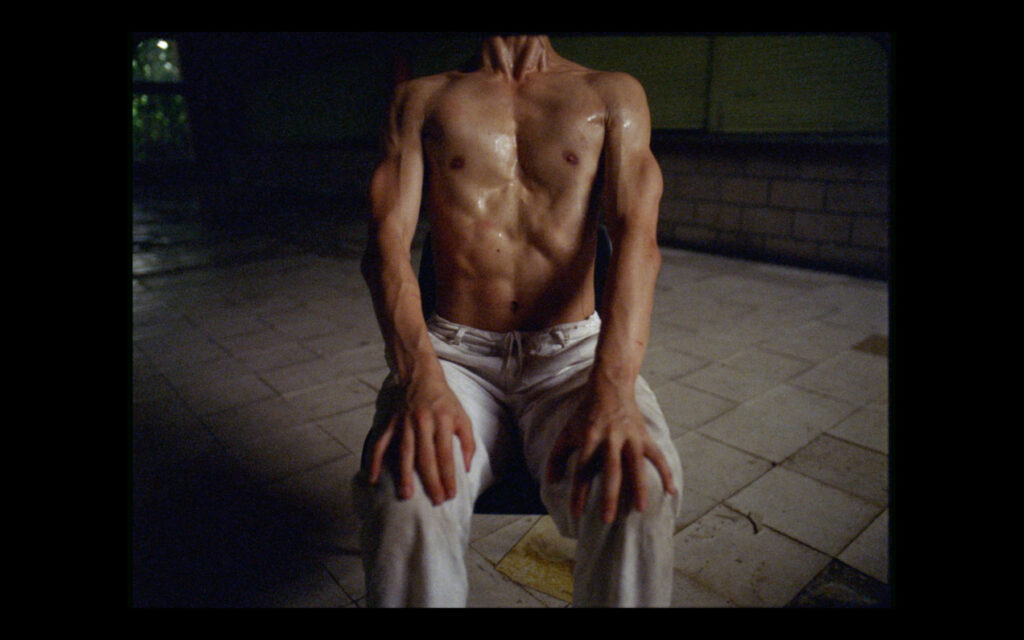
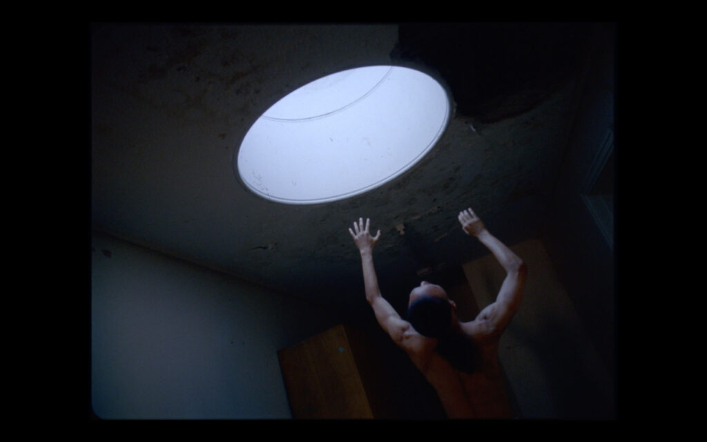
When she was younger, Rina Yang would keep in contact with her best friend in London by making, editing and sending ‘video letters’ from her hometown in Japan. Rina later moved to London to study and while there, saw an ad for a film school. The course was mostly theory with very little practical work, she told Lecture in Progress in 2017, but nonetheless gave her a reason to remain in the UK. Rina’s first roles in the industry involved working as a camera assistant on short projects. ‘I only did it properly for a couple of years,’ because as she tells me over the phone, it was a stressful role. But she did find common ground talking to directors during breaks about the creative processes behind the work. ‘I was better at that, than looking after the camera.’ And so, she pivoted – cutting her teeth in music video and short films jobs that her friends would ask her to work on. ‘One thing led to another,’ Rina adds – and she was able to carve out a space for herself as a director of photography (DP), a notoriously difficult role to break into and succeed in.

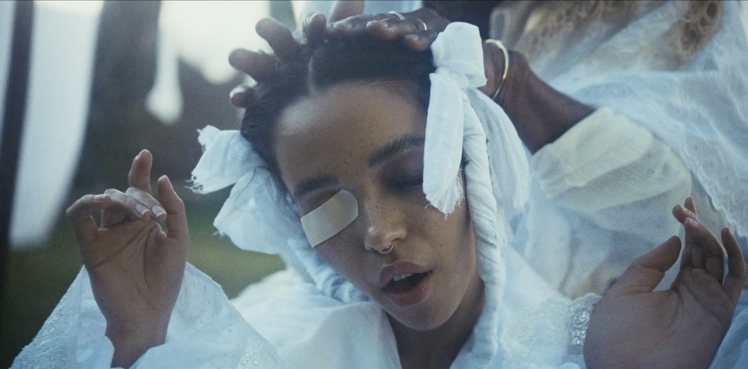
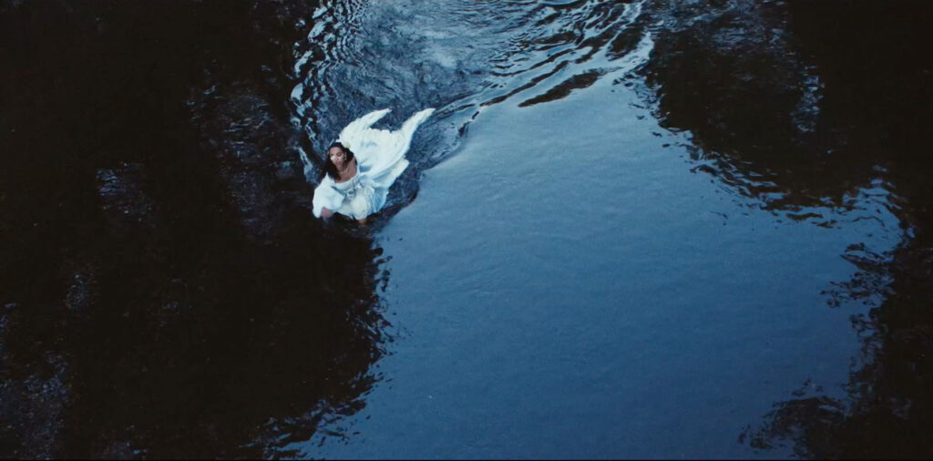
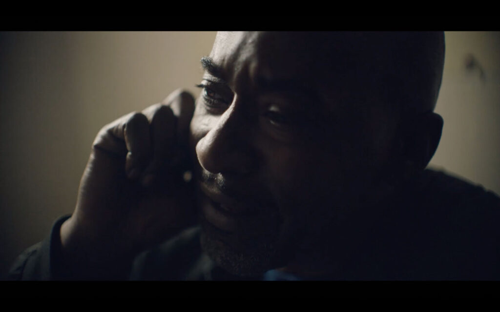
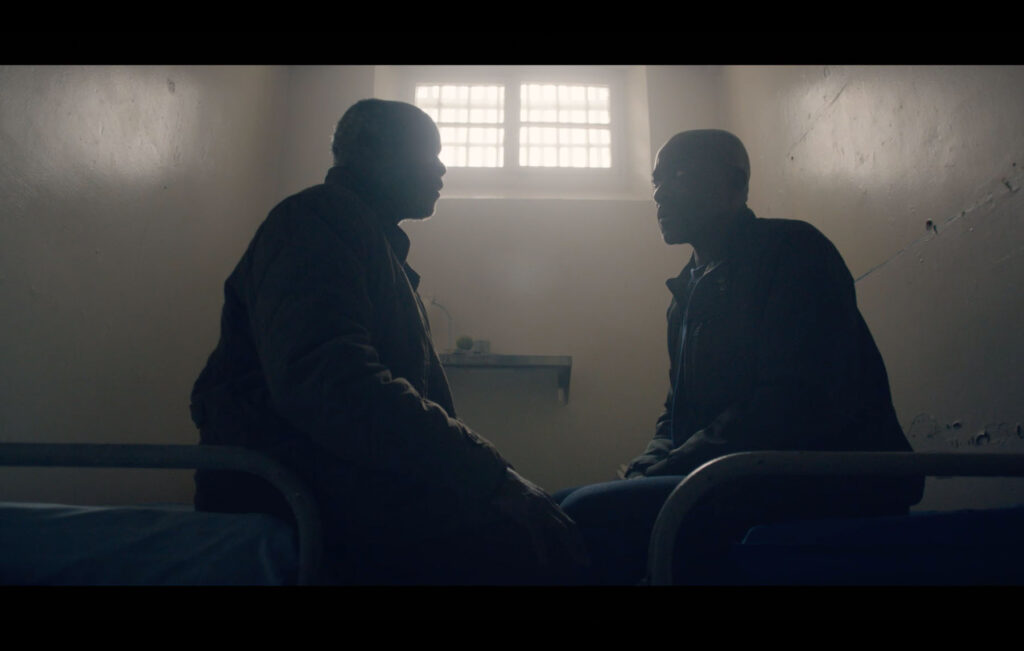
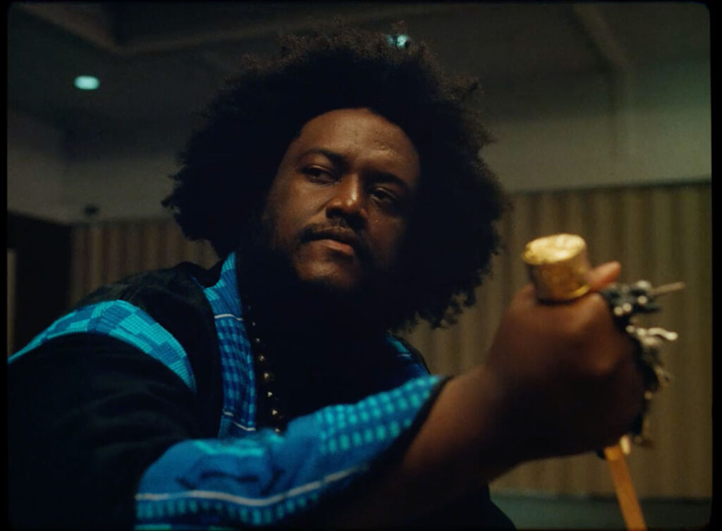
As a DP, Rina has worked on music videos for artists including Kamasi Washington, Vince Staples, Björk and FKA twigs (including the “controversial” and “risqué” ‘do you believe in more’ advertisement that twigs directed and soundtracked for Nike in 2017). Rina regularly balances projects across music videos, commercials and narrative work, a crossover she tells me is quite uncommon. And though her approach may differ depending on the project, her work consistently demonstrates an aptitude and eye for capturing the people and characters in front of the camera. A scene from the BBC’s Windrush drama, Sitting in Limbo, from last year, or the third series of Top Boy (for which Rina shot a number of episodes) are as beautiful and captivating as, say, a Rimowa commercial with Adwoa Aboah or her work for Sephora. 

Rina’s talent and vision as a DP have made her a sought after name in the industry – even at such an early point in her career. She was named by British Vogue as one of the 14 rising stars in the creative industries back in February, described as a “New Wave of boundary-breaking visionaries bringing fresh, exciting perspectives to the creative industries”. Her portrait to accompany the piece was shot by Campbell Addy who, like Rina, is part of a new vanguard of young talent. Last year, Rina was also included in the BAFTA Breakthrough list for 2020. Being recognised by organisations like BAFTA is great, Rina tells me, but it’s not something she’s had much time to think about, ‘I haven’t properly got my head around it.’ But, she adds, she definitely feels as though she’s at an interesting point in her career. That said, having faired the storm caused by the pandemic, Rina is now remarkably well-placed to continue to grow and nurture her skill. 

You’ve done a lot of commercial work with the likes of Nike, Rimowa and many others, and TV work for shows like Sitting in Limbo and Top Boy. How do you balance the different projects you work on? Is there something specific that draws you in?

I think the selection of the projects really comes down to your personal taste and what you find interesting. When I do commercials, I’m less selective because it is a very short commitment, and it’s a good opportunity to meet new directors and new collaborators. So I’m less picky and I’ll take the risk to work with new people. When it comes to narrative, it’s a whole different conversation. There’s a lot more boxes to tick to see if it’s the right project to do. It’s a different process, but I do like doing both. With my narrative work, you get paid less but I think it’s more of a romantic thing.

With that said, I love that your commercial work don’t just feel like adverts. They’re like short stories in their own way.

The directors and all the creatives I’m drawn to tend to have that kind of style. I don’t find the very straight up advertising that interesting. I mean, to be honest, sometimes we just do very boring commercials. You just don’t shout about it. But I think the ones that I get to shoot, they tend to be creative ads with slight narrative threads. And I’m grateful that I’ve been able to shoot some of them. You kind of flex your narrative muscle a little bit, but it’s a very different working environment in commercial compared to narrative. 

You’ve got a very distinctive use of colour, texture and lighting. How did you develop that style? 

When I started out my style was a bit more documentary because it’s hard to afford to do a big lighting setup. But even with documentary style, I don’t want it to look like what it looks like with the naked eye. So I try to heighten what you see, by using different lenses, or how you expose the sensor or the film – to add your take on the reality you see. 

As I progressed in my career, I could afford to have a good crew with me and all these big lights. And I guess that’s when I started using a bit more colour. I did go through a period of using a lot of colours because I kept getting asked to do that. I think with any artist or DP, we’re versatile so it’s nice not to get pigeonholed into one look. In general, I like to heighten the reality of a scene, and I think, “what if I did this” – I talk about a lot of what ifs, and still do some colourful lighting here and there.

So as a DP, how do you tell a story and create narrative?

How would I tell a good story? First of all, there has to be a good script, and there has to be a good director to execute that. I can only advise how I think we could shoot things, or collaborate with the director. In the beginning when I started out, it was quite hard to find directors on that level. One the hardest things in the beginning is to find a director who can execute the narrative in the way you see it, or better than how you imagined it. So I think I really collaborate with my directors, talk about how we see it. 

I guess it’s such a collaborative process; you’ve got to be able to work together well.

Yeah, definitely. The level of collaboration is different in music videos, commercials and narrative. With commercial, they tend to come with already established ideas –  with exactly how they want it to look because they’ve gone through a lot of chats with the clients and agency, and they tend to have have every exact visual references that I will need to execute. So there’s no huge room for us to create the look from scratch. And then music videos, you can be a little bit more funky with it. And with narrative, if it’s a TV show and you’re the first block DP, you can create the look with your director and showrunner. If you’re coming into the TV show in the middle of it, then you have to replicate what’s been established. And then if it’s a movie, there’s a lot more room to experiment. That’s why a lot of DPs prefer to do movies and the first block of TV shows. 
Has the pandemic changed your work process and schedule much over the past year?

Before the pandemic, I was going to shoot TV shows or films in 2020. I was shooting a lot of commercials early in the year because I was going to work hard on commercials until the spring, so I could afford to do a film or TV show that I like. But then the pandemic happened, and I think the drama world struggled more than commercials, so they’ve been on pause for a lot longer than advertising. Now, I’m reading scripts and trying to decide what narrative projects I should do next. This past year has been an interesting switch I think, because I was going to shoot a drama this year, and after doing commercial for a year, I’m really ready to shoot another long project, TV show or movie. 

Does it help having the balance of both commercial and narrative work, and being able to fall back on one or the other?

For sure – I take influence from both commercial and narrative. But, you know, I do switch my brain; if I’m pitching for a film, I’ll switch my brain to a narrative aesthetic and approach. My visual references would be quite different from what I would put in for commercial work because I think the commercial world is more like eye candy. It has to be catchy because we only have a minute or so to tell something. You have to say something in a very short amount of time. But when it comes to narrative, there’s a lot more room to grow and develop.

Credits

Images · RINA YANG

Ishiuchi Miyako

“Photography is the work of evoking time using light”

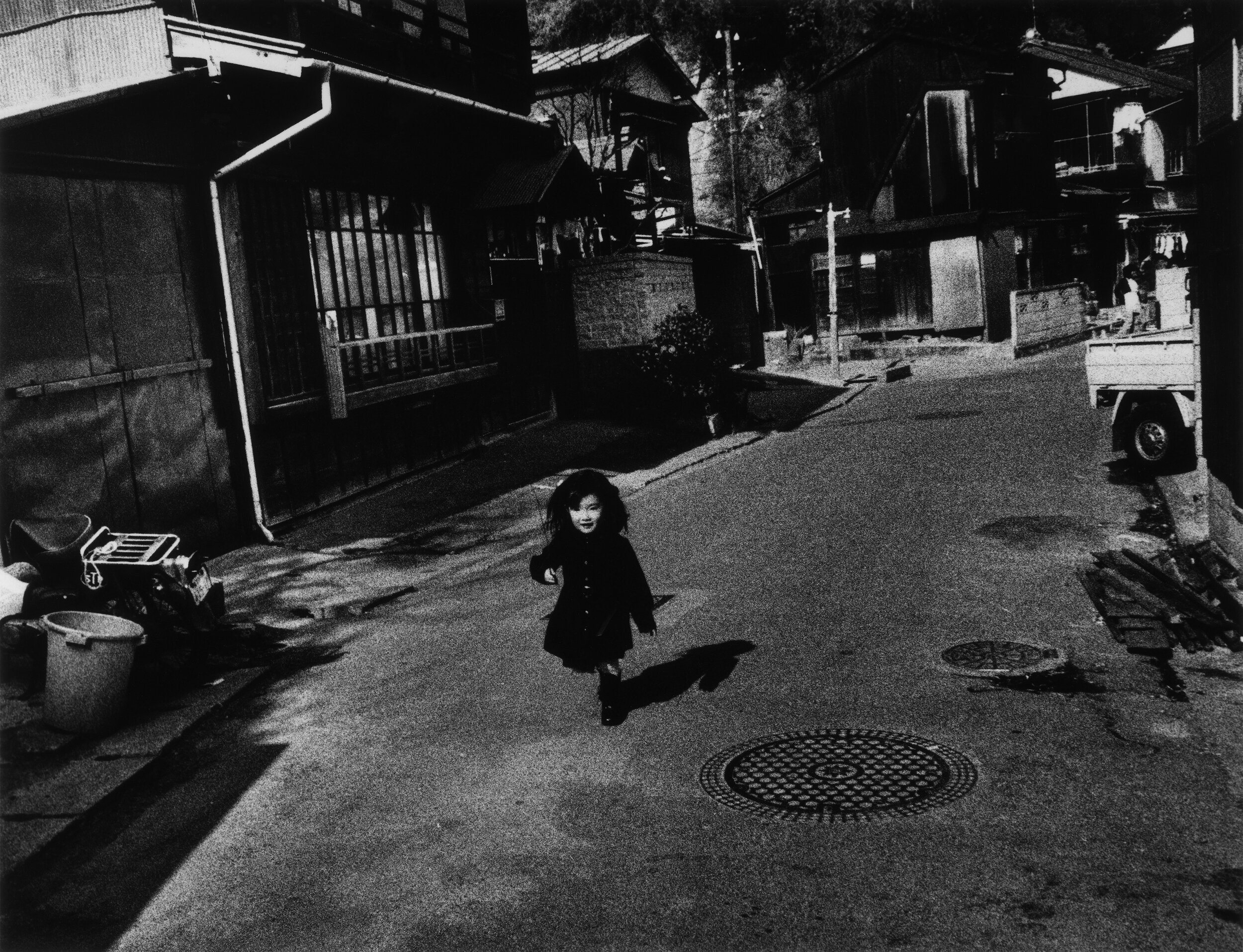
The photographer, Ishiuchi Miyako, grew up in the Japanese port city of Yokosuka in the aftermath of the World War II. Yokosuka is one of the largest overseas US Naval base, and it was against this backdrop that Ishiuchi Miyako grew up. She went on to study textiles and weaving in Tokyo in the late 1960s, and whilst there, discover a passion for photography. Ishiuchi Miyako returned to Yokosuka in the 1970s to confront the place that brought joy (in the form of American exports like jeans and pop music), fear and anger, as a city overrun by the – sometimes sinister –  pleasures of the military occupation. Once there, Ishiuchi Miyako began documenting the city in grainy black and white images that capture a place shrouded in confusion surrounding its identity. Her images are scenes of a Japanese urbanscape, that much is clear, but the lingering presence of Americanisms here and there in oftentimes deserted scenes feels alienating and menacing. Ishiuchi Miyako titled this body of work Yokosuka Story after a hit Japanese pop song, and its release as a book in 1979 launched her career in a male-dominated field. 

Ishiuchi Miyako would later create a series of work around the time of her 40th birthday, in which she contacted women of the same age to photograph their hands, feet and bodies up close. The work, 1∙9∙4∙7, captures imperfections, wrinkles, and scars as evidence of the life’s impression on the human form, not quite young but not old either. What is striking about Ishiuchi Miyako’s photography is that many of her projects seem to inform the next body of work. After the book publication of 1∙9∙4∙7 in 1990, Ishiuchi Miyako turned her attention to another series, Scars – a tender exploration of scarred bodies. One particularly striking image, Scars #13 (Accident 1976), shows a woman’s torso in soft focus; a lengthy scar etched into the natural dip of her stomach. ‘While a person hopes to remain unblemished through life, we must all sustain and live with wounds, visible and invisible,’ the photographer explains in the afterword of the 2005 book, Scars; ‘It is an imprint of the past, welded onto a part of the body.’ 

In 2000, when Ishiuchi Miyako had been working on the Scars series for almost a decade, she persuaded her mother to take part – hoping to document scars from a cooking accident that left their mark on a large part of her body. Unbeknownst to both Ishiuchi Miyako and her mother however, the latter would be diagnosed with liver cancer not long after the photographs were taken and died within a short space of time. Left with her deceased mother’s belongings, Ishiuchi Miyako began working on her next series, Mother’s. In attempting to grapple with the grief she was experiencing, coupled with a complicated relationship with her parent, Ishiuchi Miyako turned to photographing the shoes, underwear, dentures and make up left behind. A hairbrush is captured with strands of her mother’s hair still entangled in its spokes. In one image, Ishiuchi Miyako photographs a snapshot of her mother from the 1940s stood in front of a vehicle. Her mother drove an ammunition truck during the war; another reminder of Japan’s fraught history.

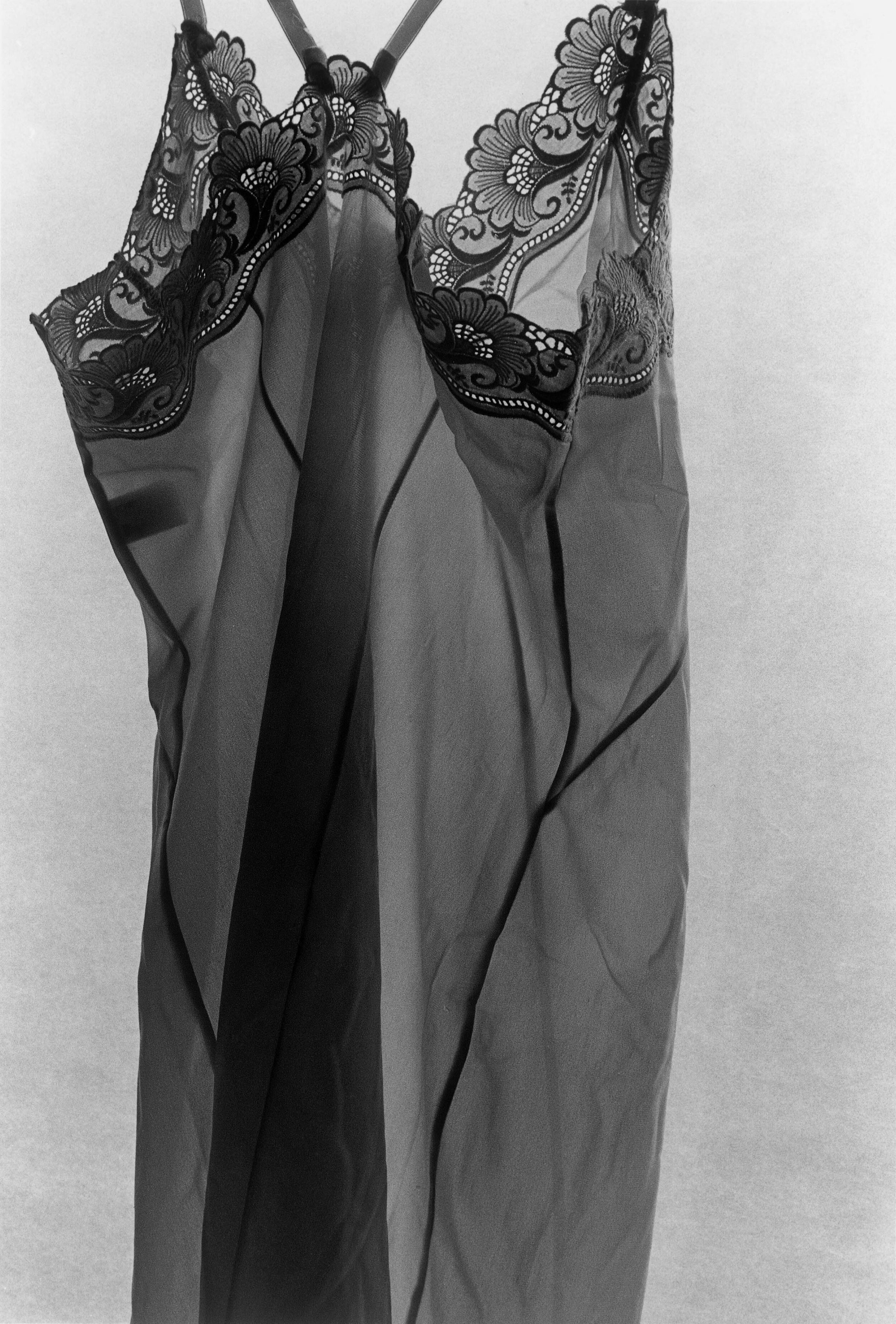
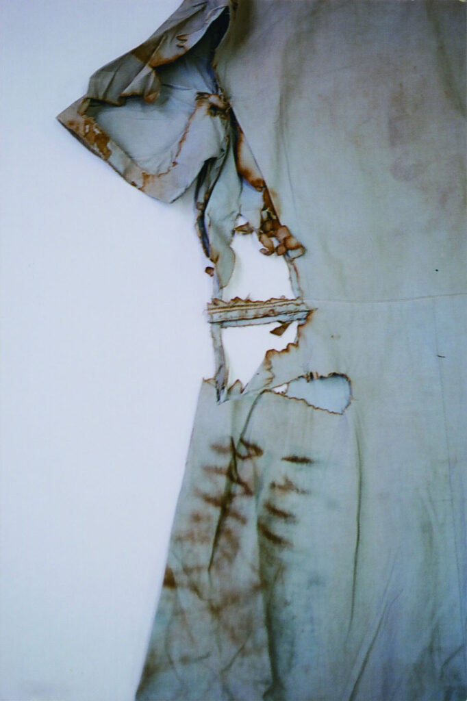
Mother’s was shown in the Japanese pavilion at the 2005 Venice Biennale; it was after that that the photographer was approached by the Hiroshima Peace Memorial Museum to photograph clothing and accessories belonging to the victims of the atomic bomb. Without the familial connection to the belongings of a parent, in hiroshima, Ishiuchi Miyako forges a relationship with the objects themselves. For the series, the photographer carefully positioned each item of clothing – sometimes talking to them, the curator of the museum told Getty in 2015. The images are beautiful, affording an almost anthropomorphic feeling to a dress or a blouse. But these images are hard to look at too; after noticing the detail of a collar, intricate needlework or the vividness of a print, the eye turns to the tears and charring in the fabric. As Makeda Best, Curator of Photography at Harvard Art Museums, wrote in 2015, ‘These “scars” on the fabric serve as metaphors for the bodies of bomb victims and of a nation.’

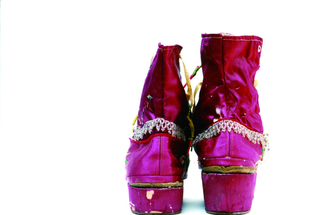
Following hiroshima, Ishiuchi was commissioned by the Museo Frida Kahlo in 2013 to photograph 300 of the artist’s belongings, sealed in the bathroom of her home in Mexico until 2004. The result is a body of work that both forms a bond with the clothing of someone the photographer never knew, and begins to build an impression of a woman’s life. Over the course of her career, Ishiuchi Miyako’s photography has worked to leverage an intimate portrayal of women and womanhood, of time, suffering, loss and memory, into a world of brutality and hardship. 

Has your outlook as a photographer changed over time? 

Photography has always been a product of its time, and has always changed with the times. My photographs may change in superficial terms, but what I am basically expressing and my mentality remain unchanged.

You mention that it was photographing your mother’s lipstick that led you to take colour photography. What difference is there between shooting in B&W and colour, and what impact does this have on the final image? 

I can do every step by myself when I’m working in black and white. My ideal here has been to take full responsibility for every stage: shooting, developing, printing. When I’m working in colour, I just take the photographs and have the rest of the work done at a lab. When I started doing this, it was very refreshing to have the works be out of my hands and be able to look at them more objectively.

With black and white, I felt like I was clinging to the photographs throughout the entire process. When I started working in colour, I felt in a way as if I had been liberated from photography. Black and white is a world of artistic creation, while colour is the world of everyday life. At the same time, both black and white and colour are just approaches, and it doesn’t matter which you use.

The photographs of Yokosuka are commended for their grainy texture. What are the attributes that make a powerful image? 

The Yokosuka photographs are not intended to have a powerful impact. When I printed my first photograph, I realized that a photograph is a collection of ink grains on paper. I wanted to print those particles properly, so I developed the film at a high temperature. Grains are like units of time, and I tried to make prints as if I were counting them one by one.

I like the analogy between your background in weaving and the process of photographic development.

Do you think there’s something similar with the photographs themselves; weaving moments of time into history? 

Photography and textiles are very similar – they are both water works. It was a revelation to me that the colour-fixing liquid used for dyeing yarn and the stopping liquid used for photography are the same thing. Making textiles is very labour-intensive work. Photography is the work of evoking time using light. Both of them are jobs done by hand.

A lot of your work involves photographs of objects and possessions. Do you see photographs as being objects and possessions too? 

“A photograph is a narrative that documents and renders memory visible in two dimensions, transcending objects and possessions.”

Photographed subjects are given new value and meaning, and by becoming part of a photograph they become almost eternal.

Did you take a different approach photographing the possessions of your mother and Frida Kahlo, compared with the clothing of Hiroshima victims (whose identity we might not know)? 

/hiroshima, Mother’s, and Frida all share the same intent in that they focus on what has been left behind. I took the same approach to photographing these three subjects, but Mother’s began as my own personal project, then after being shown at the Venice Biennale it became a photographic work that transcends my own personal concerns, expanding from the private to the public. This later shaped the specific development of /hiroshima and Frida.

I find it interesting that you don’t attach messages or captions to your photographs. How does that relate to the objects (clothing/possessions) that you photograph? Do you try to interpret the meaning that their original owner gave them? 

I consider my photographs to be creative rather than documentary, and I take them from my own point of view and with my own values. I believe that adding a message or caption to my photos would take away the viewer’s freedom of thought. I want people to be free to see my photos from their own perspectives, and to attach their own words to them. 

I cannot photograph the past. My work is based on encounters with things left over from the past, but which are in front of me, in the same space and time, in the reality through which I am living in now. In particular, the bombed artefacts of Hiroshima cannot become part of the past.

/hiroshima is very different to Yokosuka Story – how do they capture the aftermath of the war in Japan and the country’s relationship with America? 

I made my debut with Yokosuka Story, a series that is kind of a personal sentimental journey.

“I was born in the post-war era and spent my adolescence in a community with an American military base, and I enlarged these prints to exorcise emotions like scars I felt I had received from the Occupied Japan city of Yokosuka.”

There is a connection between Yokosuka and the history of the atomic bomb dropped on Hiroshima, which played a huge role in ending the war, and which I documented about 30 years later. Yokosuka still serves as the home port for Asia’s largest nuclear-powered aircraft carrier. The post-war period is not yet over, and the reality is that Japan is still under US control. My photographic work, which started in Yokosuka, inevitably turned toward Hiroshima, and /hiroshima is still an ongoing project.

Credits

Images · ISHIUCHI MIYAKO
Special Thanks · THE THIRD GALLERY AYA

Alexandra Leese

Me + Mine

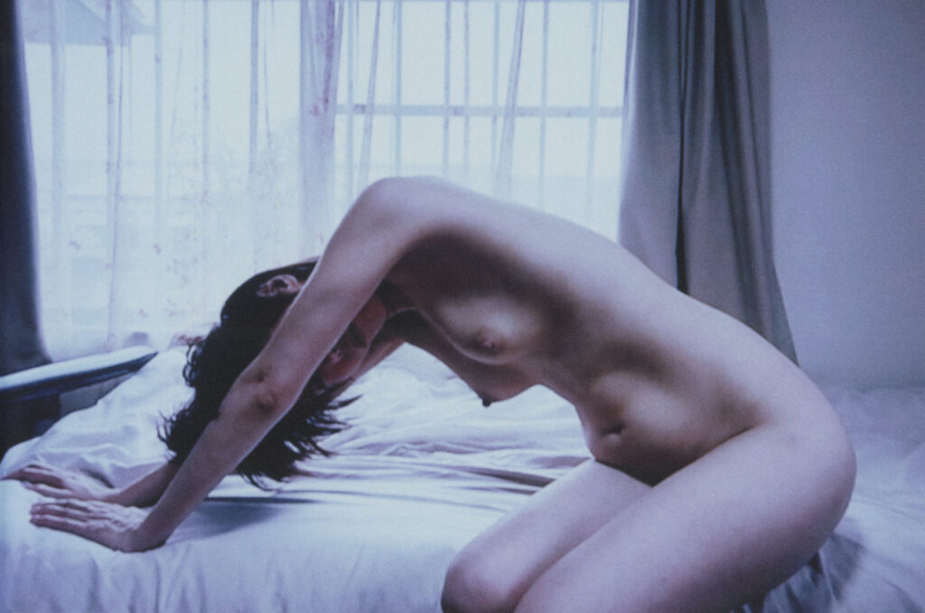
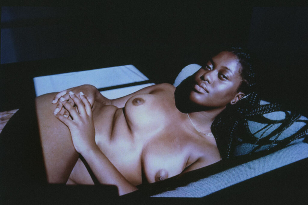
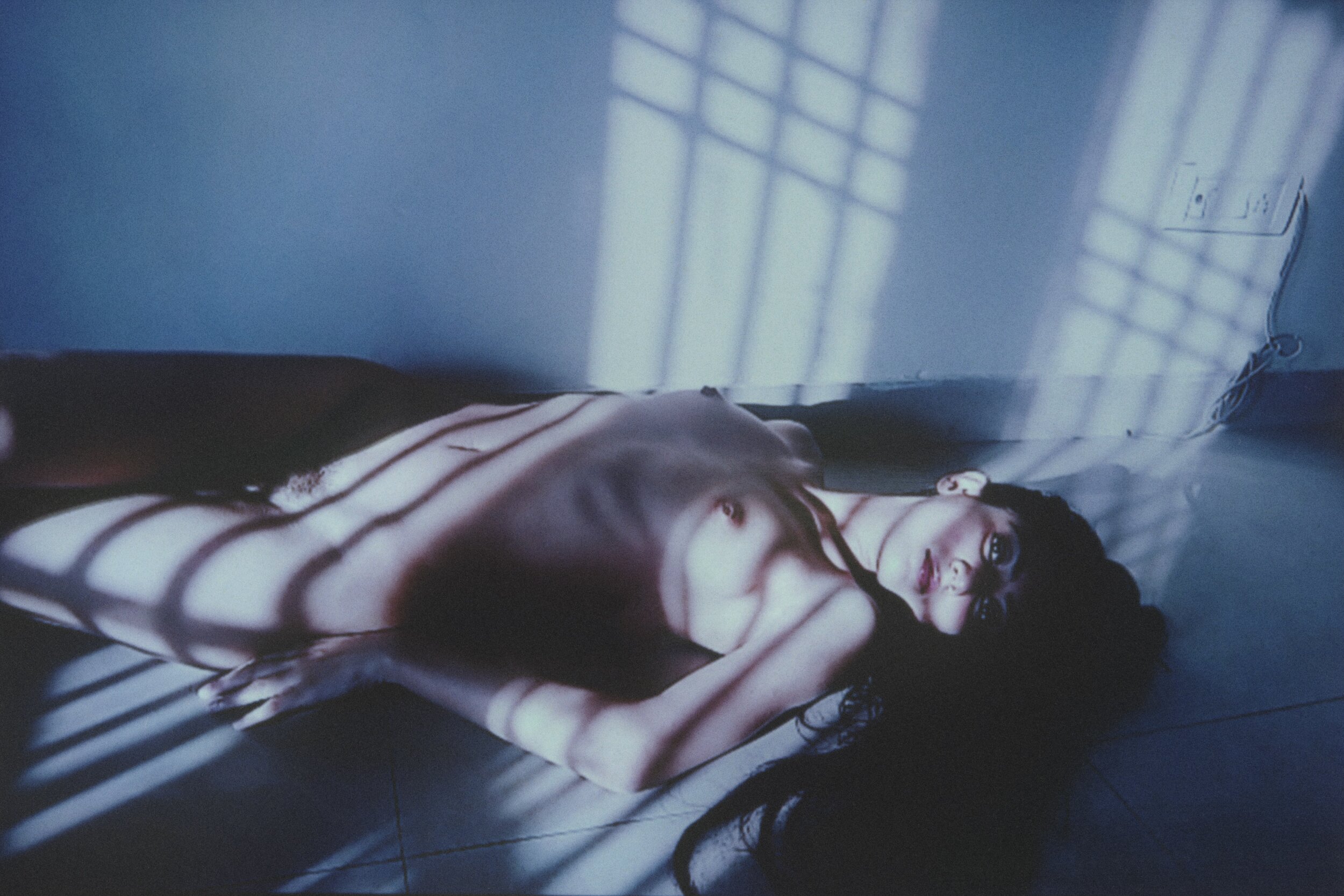
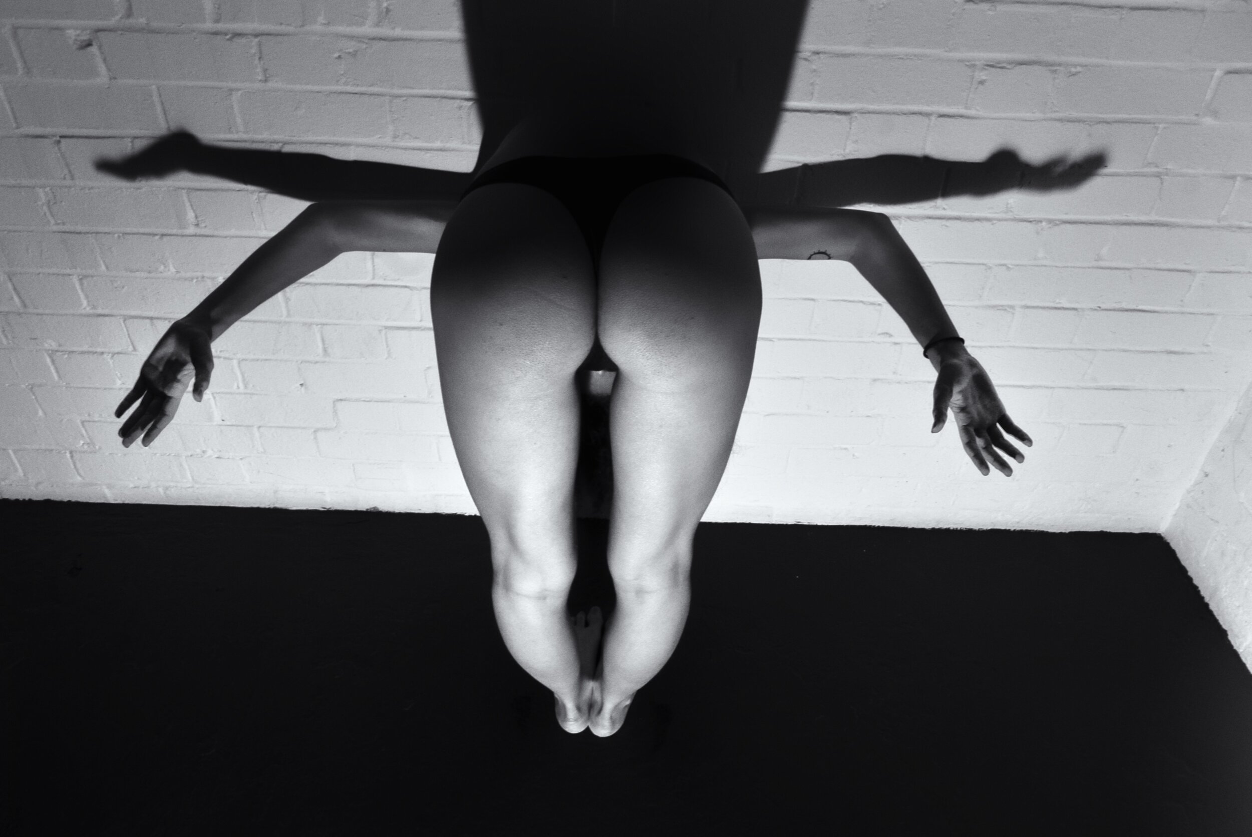
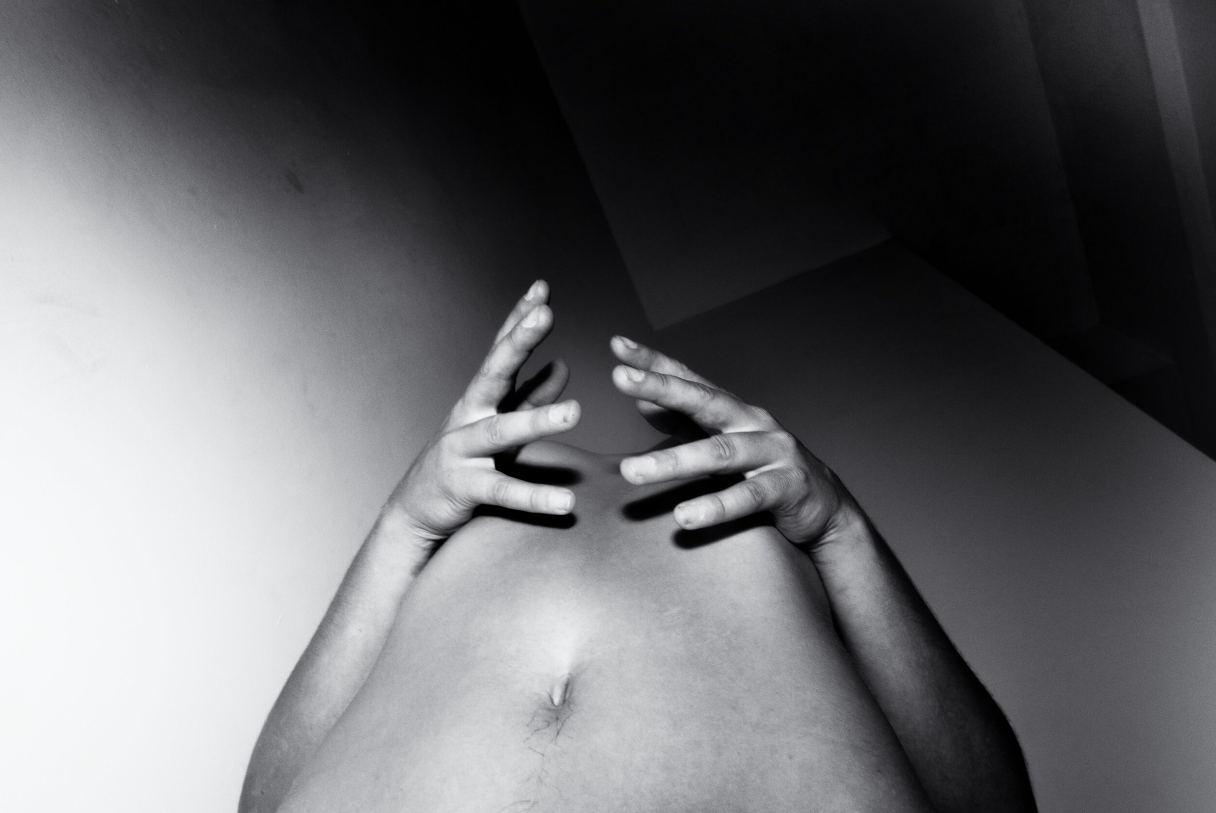
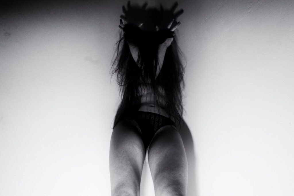
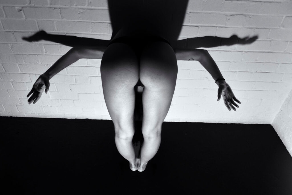
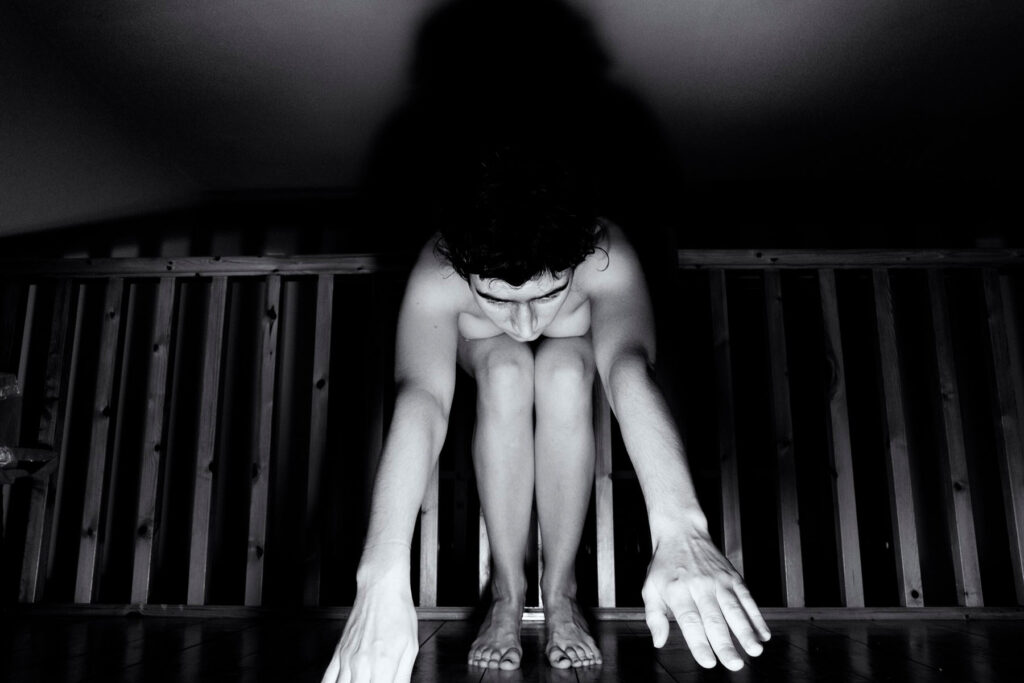
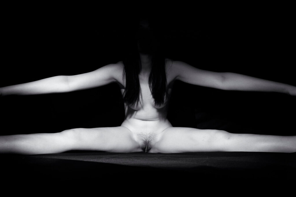
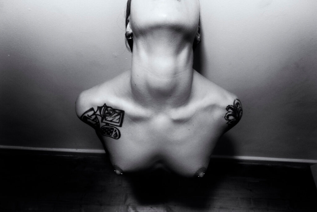
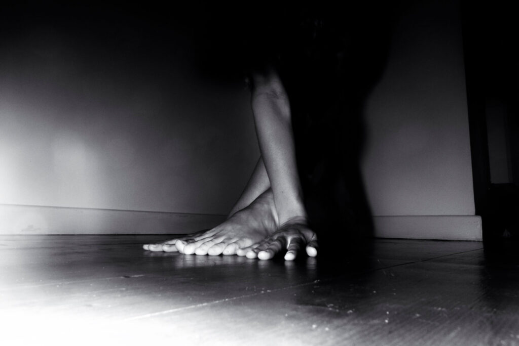
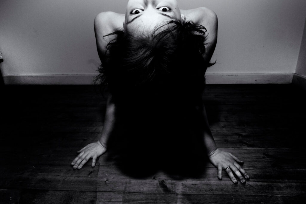
My body. My limbs. My hair. My nose. My skin. My heart. My lungs. My breath.

Much of what we are taught about ourselves as women is that our bodies are not ours. As if we are someone else’s to keep, to define, to use, take pleasure in, and to hurt.

Loving our bodies is not as simple as it sounds when we are still finding a home within us. When we’re alone in nothing but our skin.

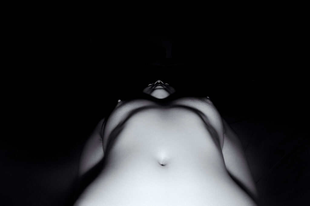
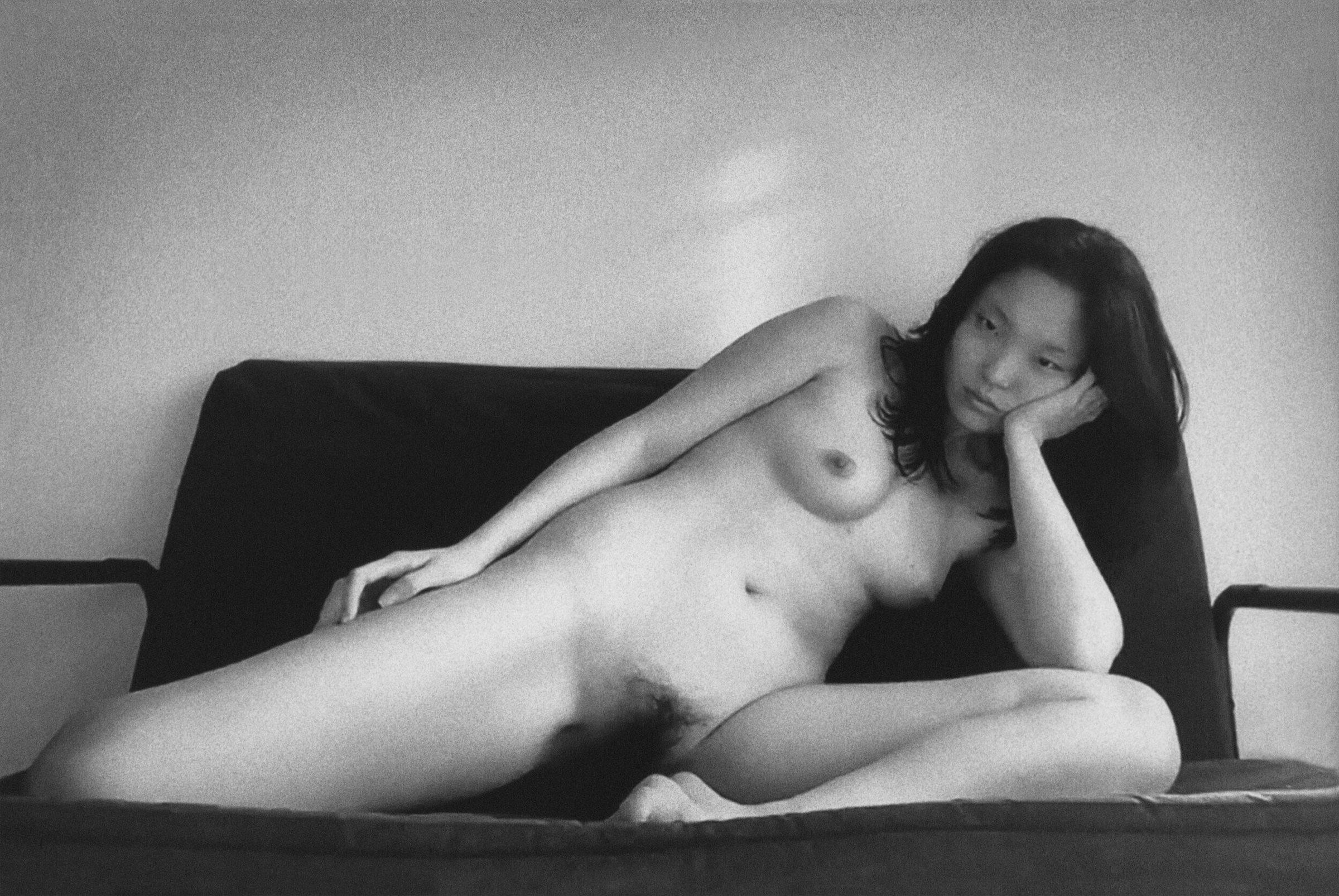
While nudes have traditionally been used to display our bodies for the pleasure of the male viewer, these portraits of us are distinct in that they evoke the safety we feel when no one is looking. We do not produce images for the gaze of patriarchy or to compete with other women. We don’t seek to empower people — we know empowerment happens when we take control for ourselves.

Across many regions and cultures, though it doesn’t represent every kind of body and beauty out there, this project is us sending nudes to ourselves — not to be consumed but to be revered. Each woman has a unique, evolving relationship with her body. What we have in common is being alongside one another on the path to loving our bodies how we choose, despite the battles we may face.

So we dream along our journeys. We touch each hair, each fold, each wrinkle, and each scar, remembering that we belong to ourselves.


Credits

Words · Alexandra Leese and Xoài Pham
Me + Mine is available for purchase via antennebooks.com
Proceeds of Me + Mine will be donated to the organisations Black Trans Femmes in the Arts, Trans Law Centre and Rape and Sexual Abuse Support Centre.

Yis Kid

Spiders and Religious Mysticism

Credits

Photography · Yis Kid
https://yiskid.com/

Bruno Sialelli

“Being at home, not being able to live a ‘normal’ life, does not mean that you cannot dream, have fantasies, expectations for yourself”

When Bruno Sialelli’s recent collection as Lanvin’s creative director was unveiled back in February, it was rich in a kind of French bourgeois opulence; perfectly coiffed hair, glossy lips, impeccable tailoring and strut with the air of je ne sais quoi. Stylistically, the collection finds its inspiration somewhere between the 1920s with sheer, ankle-gazing cocktail dresses and feathers – and the 1960s; flapper-esque headbands that verge on space age, bouffant femme fatale waves and dramatic eyes. But within barely weeks of show, the glamour and sultriness that Sialelli envisioned for this season were already overshadowed by a wave of another kind. 

There’s little need to dwell on the fact that sales of athleisure and loungewear have soared for the best part of a year now, especially as many parts of the world enter a second lockdown of some kind, as pandemic infections rise and restrictions follow. That doesn’t so much concern Sialelli, however. For one, the AW20 collection took inspiration from the brand’s namesake, Jeanne Lanvin, who crawled out of poverty, the eldest of 11 children, starting as a milliner’s apprentice at age 13, before going on to found the fashion house in 1889.

And of course, Sialelli’s collection could not pre-empt what this year would entail, but pandering to a current demand for soft, comfortable clothing is not on the cards for Lanvin. Has the house had to adapt to a potential shift in customers wanting more casual attire? No, as the creative director explains over email, ‘I do not think this is a mission for a house like Lanvin. Being a couture house – the oldest still in activity today – brings responsibilities.’ Responsibilities, that is, to both ‘the legacy and to the clients.’ 

Since Sialelli took the helm at Lanvin in January 2019, he’s been quick to outline that he intends to elevate the brand’s heritage and Jeanne Lanvin’s legacy. By making his loyal commitment to the Lanvin legacy and client clear, however, Sialelli demonstrates that he truly means business as the brand’s creative director – pandemic, or no pandemic. ‘Being at home, not being able to live a “normal” life, does not mean that you cannot dream, have fantasies, expectations for yourself,’ he explains,

“being dressed up, being elegant, being fabulous remains essential to our lives – even more today, and mandatory tomorrow!”

‘To me, Lanvin is here for those reasons.’ There’s always been a demand and desire for the glitz that Lanvin affords. During the interwar period, when fashions veered towards a rejection of the constraints that lingered from the nineteenth century and loose-fitting dresses reigned supreme, that era at Lanvin is rememberable for the robe de style. It was a look that referenced the romanticism and elegance of the eighteenth century, with full skirts and ornate beading. Not quite 100 years later, that mentality returns to the fore under Sialelli: the SS21 collection was envisioned and created under the first lockdown and is ‘all about elegance, optimism, and joie de vivre, the ingredients of today’s world.’  

That ethos of grace and hope is so deeply woven into the fabric of the Lanvin image that it cannot be compromised. Especially so considering, as Sialelli explains, Jeanne Lanvin’s vision during the interwar years remains synonymous with the “French look” of that time. ‘Still today, when you refer to this period, only Lanvin silhouettes come to mind.’ Jeanne’s eponymous brand ‘brought a very unique style that remains a reference today,’ and Sialelli sees it as being part of his mission as creative director to reimagine that for a contemporary audience and client. For the SS21 collection, staged in Shanghai, the opening look made a resounding reference to Jeanne’s heyday; a bejewelled black robe de style coalescing French and Chinese culture and style. 

After a tumultuous few years at Lanvin, following the departure of the house’s much-respected creative director, Alber Elbaz, in 2015, much pressure lay on Sialelli’s shoulders. He was the fourth designer to head the house in as many years; relatively unknown and only 31 years old, he wasn’t the kind of superstar appointment that has been made at other houses in recent years. This, as it turns out, has landed in Sialelli’s favour. Though he’s keen to emphasise the importance of continuing the legacy that Lanvin has left on the fashion world, the appointment has also enabled him to carve out his own legacy.

With almost three years in the role, how does he perceive the mark that he’s made on Lanvin? Objectively speaking, it is, he says, ‘very difficult for me to answer that!’ But it would be the ‘deep and constant dialogue I initiated with Jeanne Lanvin. Understanding who she was, as a woman, as a fashion genius and as an entrepreneur.’ But also, ‘why she did what she did – the genesis of her story, and what still exists today,’ he explains:  

“I guess I place myself as a filter through which I digest, project, and establish Lanvin today.”

Sialelli’s approach to creating a new look for Lanvin is apparent in the ways he re-uses the brand’s heritage now. For the most recent collection, the brand collaborated with the estate of the French-Swiss art deco artist, Jean Dunand (a friend of Jeanne’s), whose prints perfectly encapsulate that early-twentieth-century fascination and cross-cultural fusion of styles between the west and China. Sialelli’s inspiration for each season comes ‘from everywhere, on purpose,’ from people he sees on the streets, to stand-out iconography. 

Lanvin under its current creative director is the perfect blend of classic, French style and a savvy for knowing what a heritage fashion house should be today. Sialelli has definitely tapped into the power that an iconic look can hold in the twenty-first century (his Instagram is brimming with beautiful close-ups of the Lanvin collections and images that clearly serve as personal inspiration). Whilst the house has had to rethink and adapt to the changes this year has brought, evaluating and reaffirming the Lanvin vision, Sialelli has been using his time differently – doing what he previously couldn’t find time for;

“Looking, reading, listening to things that I would not have managed to prior to these lockdowns.”

And though Sialelli is, like the rest of us, uncertain as to how deeply the pandemic will affect the fashion industry – he is hopeful for Lanvin’s future. ‘My responsibility is to (not for now and, I hope, not in a very long time) hand over the reins to another creative director one day who will come to continue the story we are drafting.’ Despite a few hiccups, Lanvin finds itself as the oldest French fashion house – a feat coupled by the accomplishment of never having lost its distinct charm and elegance.

Team

Photography · TERESA CIOCIA
Fashion · MARCO DRAMMIS
Interview · Ellie Brown
Creative Direction · NIMA HABIBZADEH and JADE REMOVILLE
Casting · Isadora Banaudi
Make-Up · ANDREA SAILIS  
Hair · YU NAGATOMO
Photo Assistant · GIUSTINIANO MODARELLI 
Fashion Assistant · FEDERICA MUSELLA Make-Up Assistant · DANILO MASALA
Hair Assistant · MARTINA PORCELI
Models · SONYA MALTCEVA and JULIANY MORAES at FABBRICA MILANO, THORLEIF ENDSJO and MASSAER SECK at D’MEN and MARIA BAZA at ELITE

Subscribe to our
Newsletter