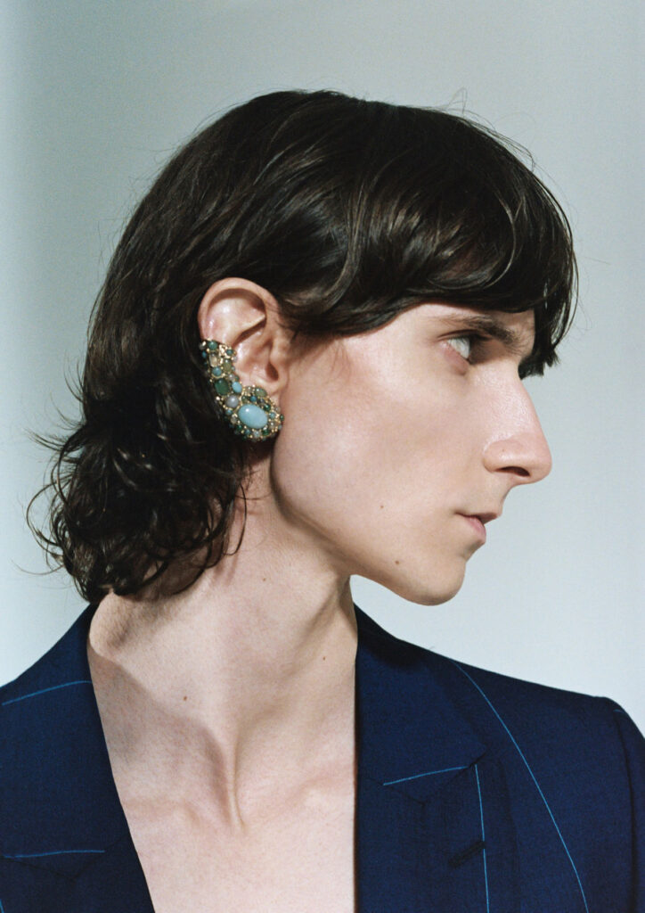

«conversations helped to create the atmosphere I needed to portray vulnerability»
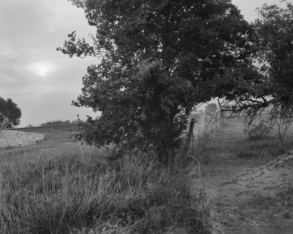
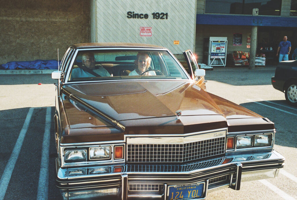
Rick Schatzberg grew up in a suburb of Long Island in the 1950s – a place constructed out of nothing but a post-war optimism for prosperity and abundance. A place that, by Rick’s own admission, was in reality, characterised by its monotony and it’s ‘nowhereness’. Surrounded by the comfort of middle class living, Rick and his friends discovered the world by hanging out in one another’s bedrooms, the local mall or a wooded area not far from their suburban enclave. As teenagers, the boys (as they came to be known amongst themselves) would experiment with alcohol and drugs, and hang out with girls; an upbringing unremarkable to anyone who wasn’t there at the time. As they grew older, the boys took on different careers. Rick moved to New York and became an entrepreneur, the others would become teachers, taxi drivers, salesmen, realtors and healthcare workers But they remained what Rick calls a ‘cohesive entity,’ eternally bound together by their childhood moniker.
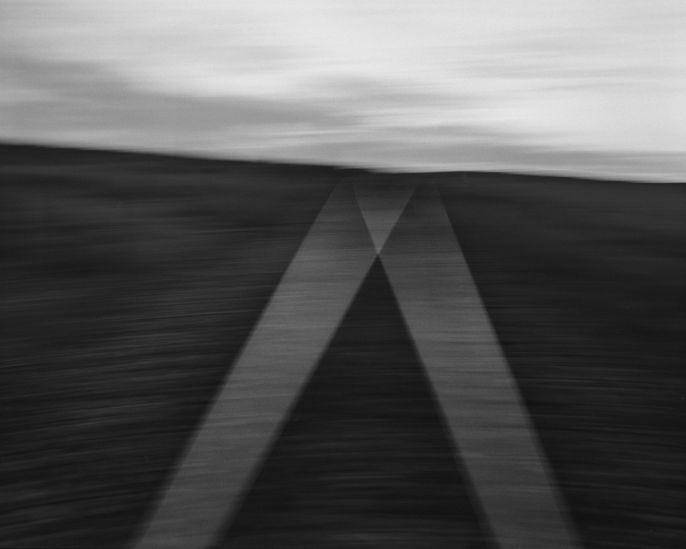
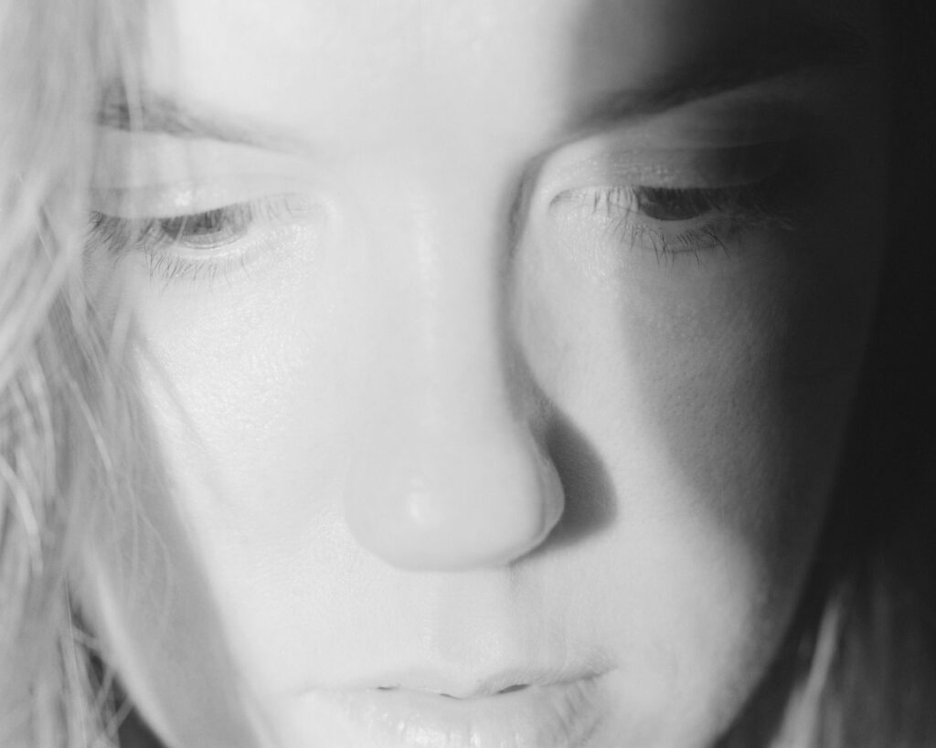
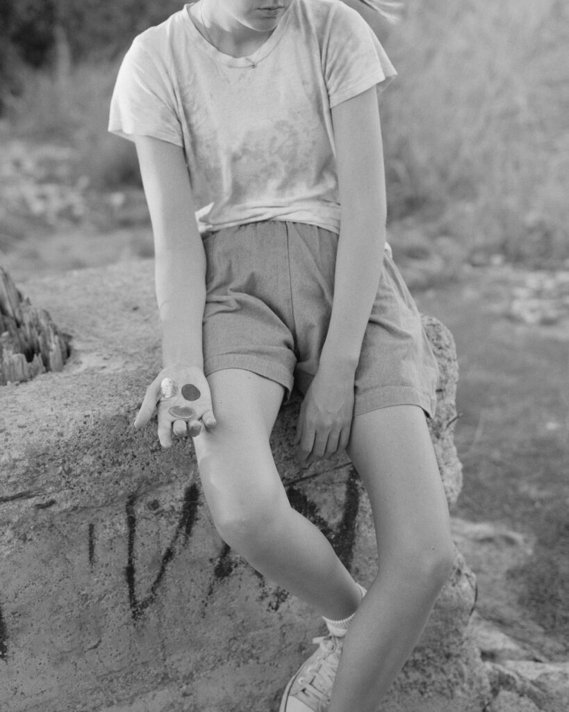
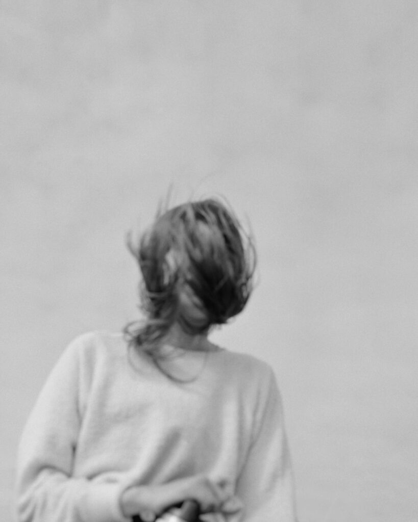
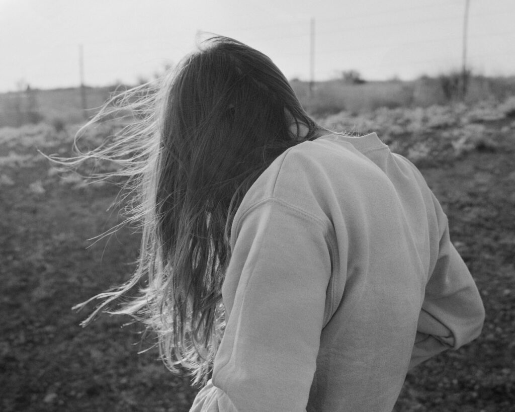
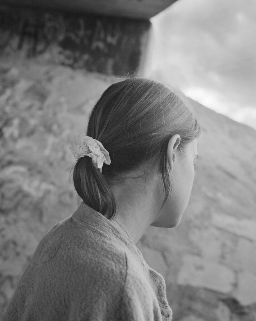
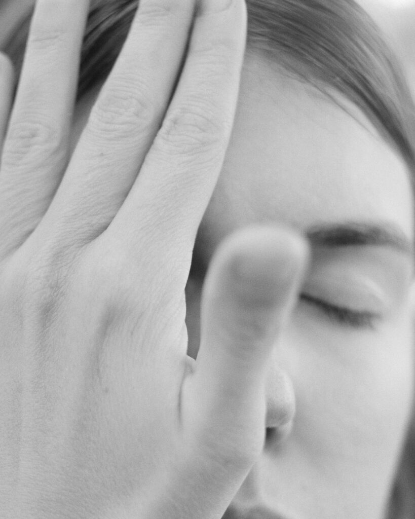
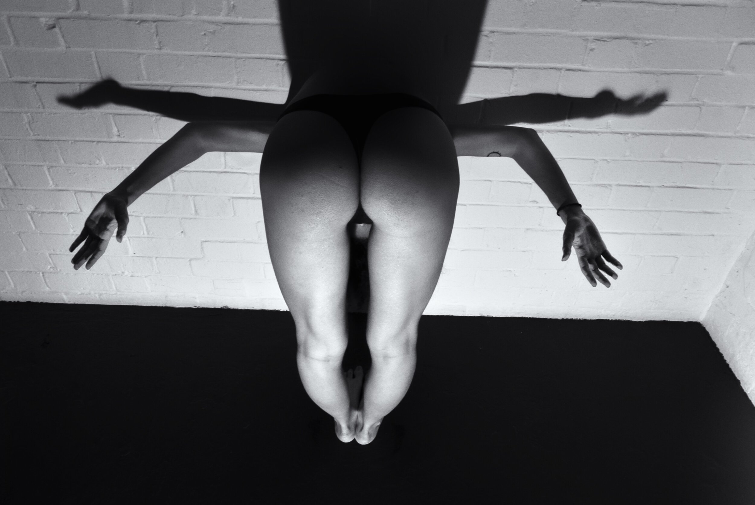
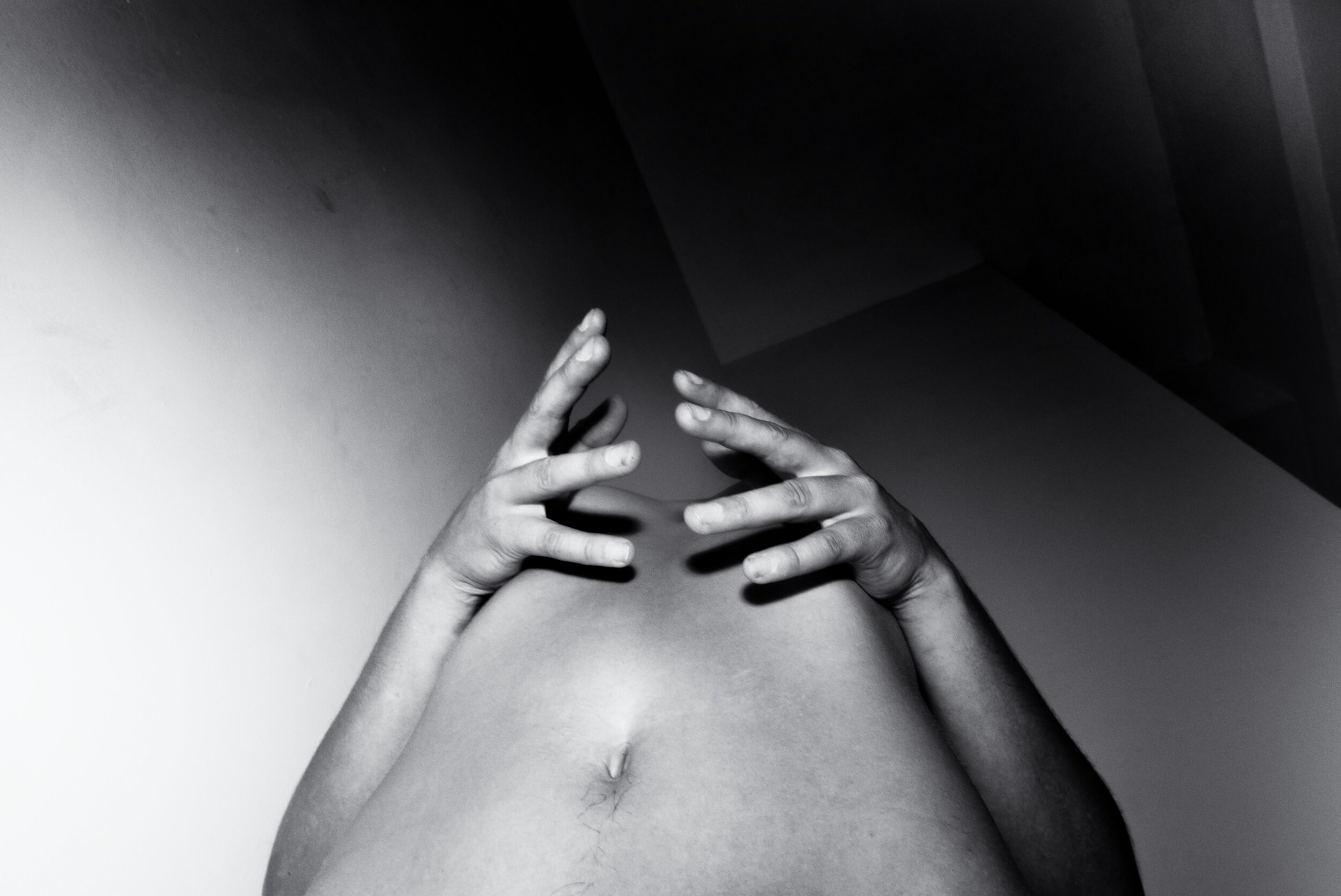
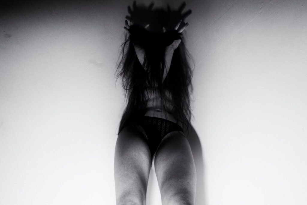
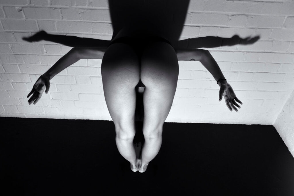
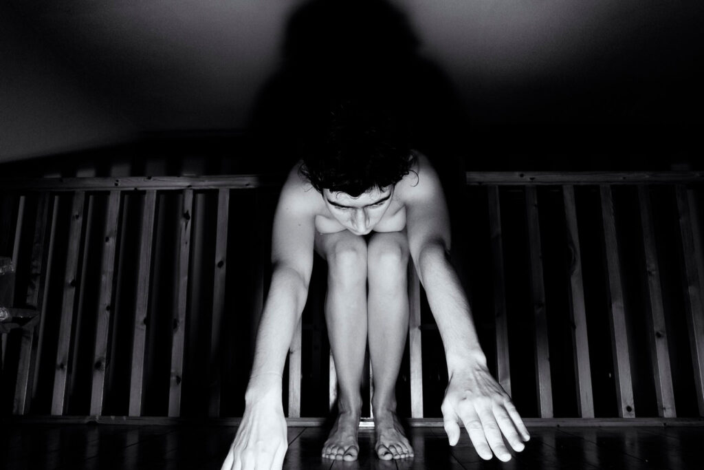
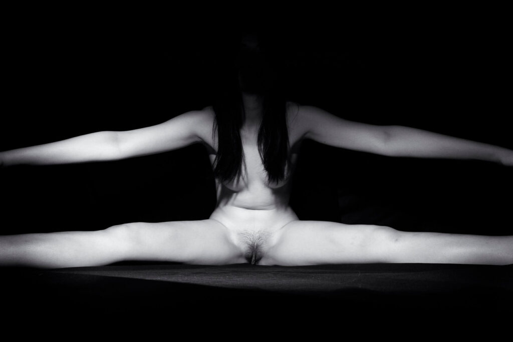
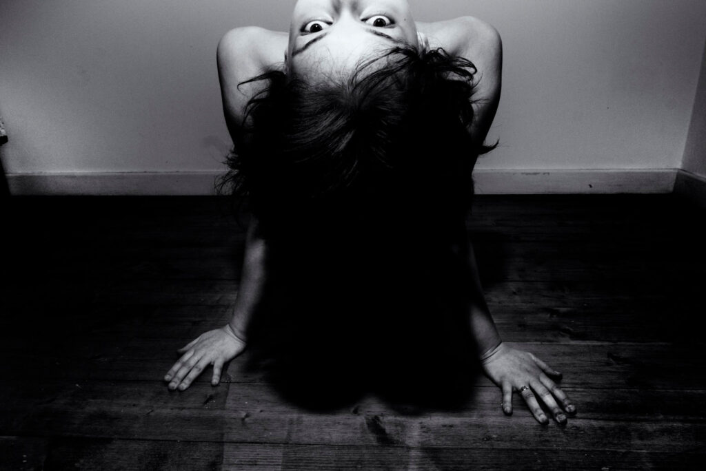
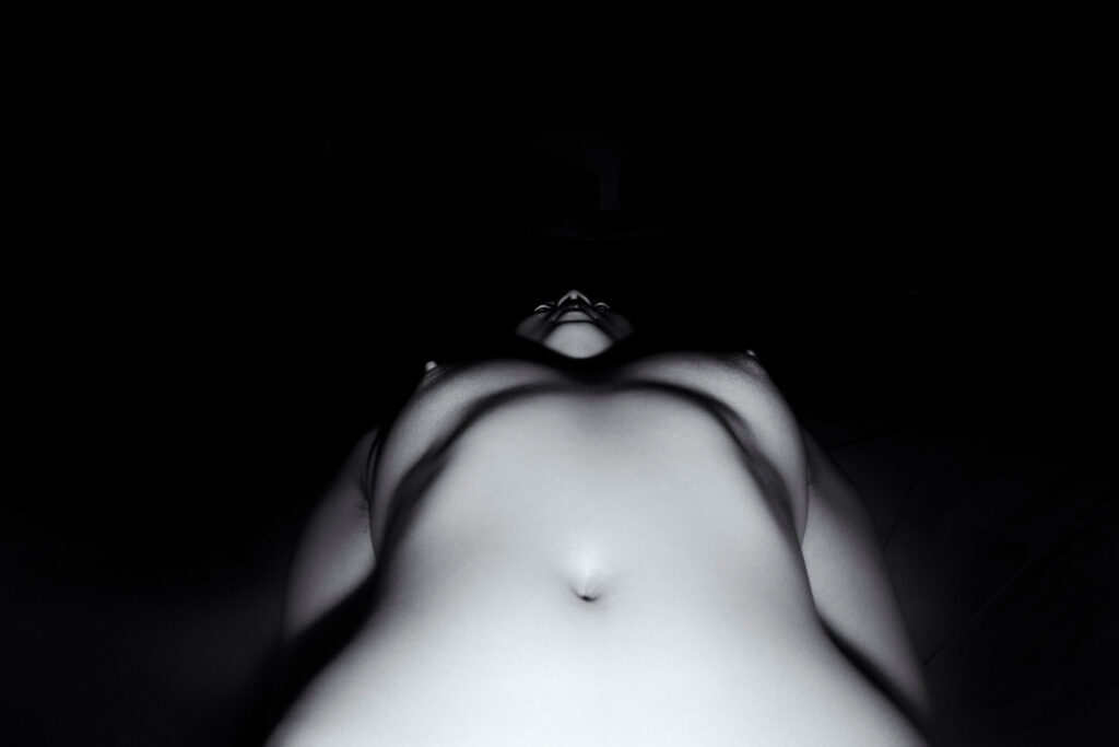
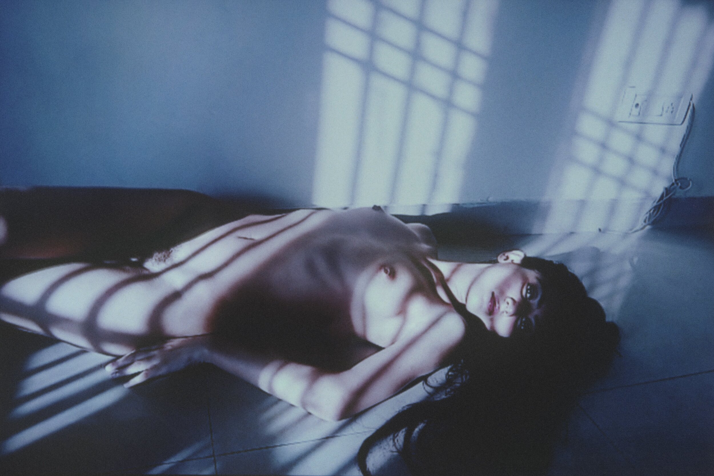
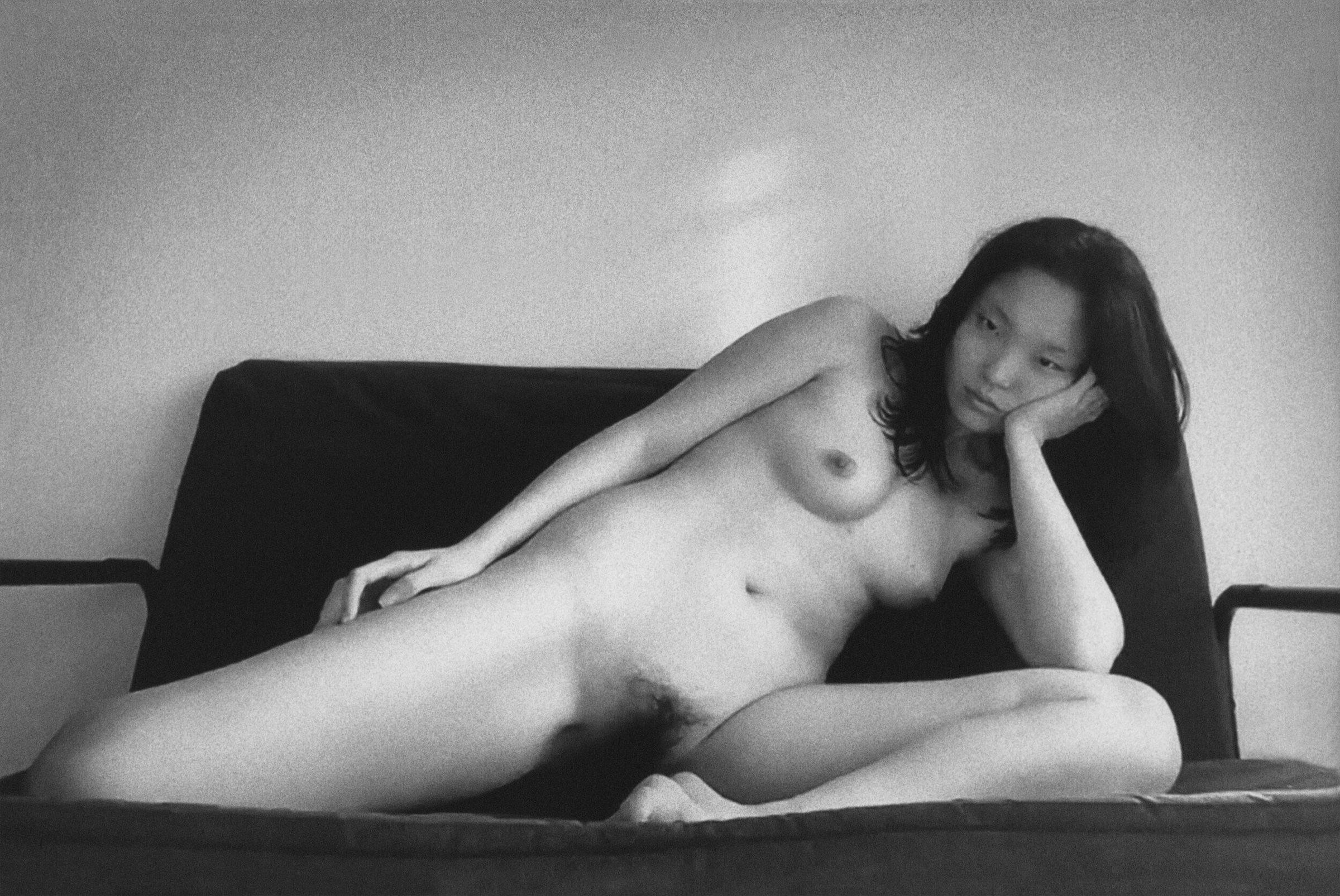
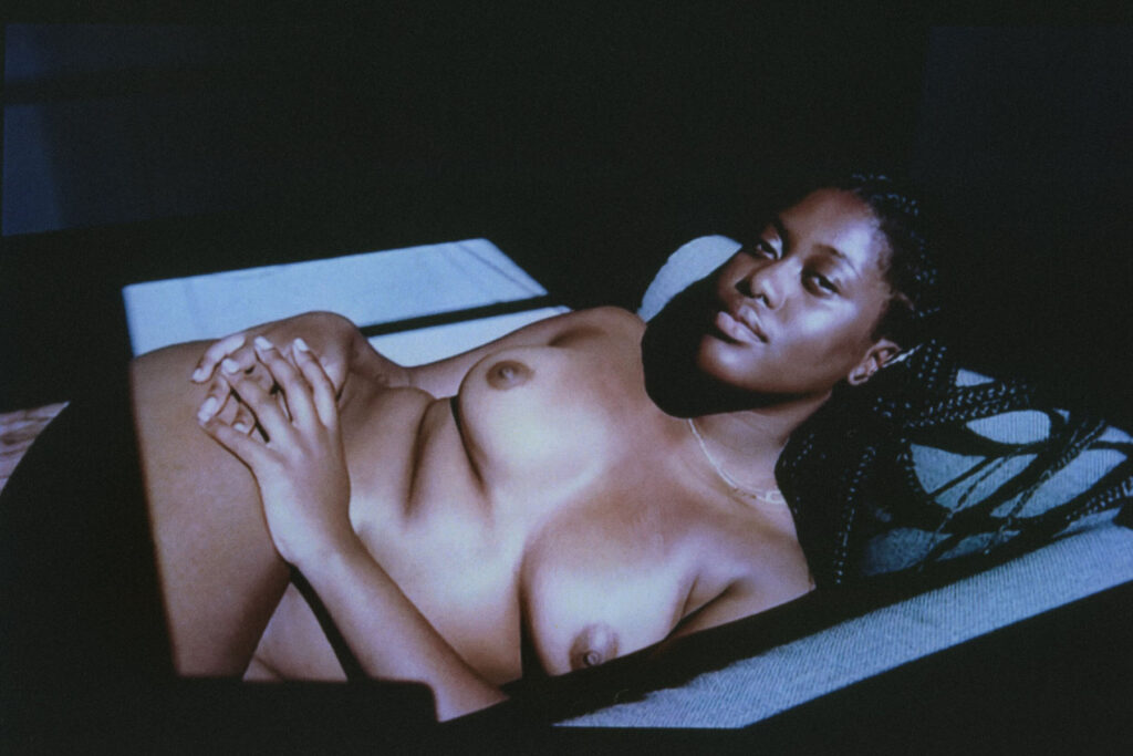
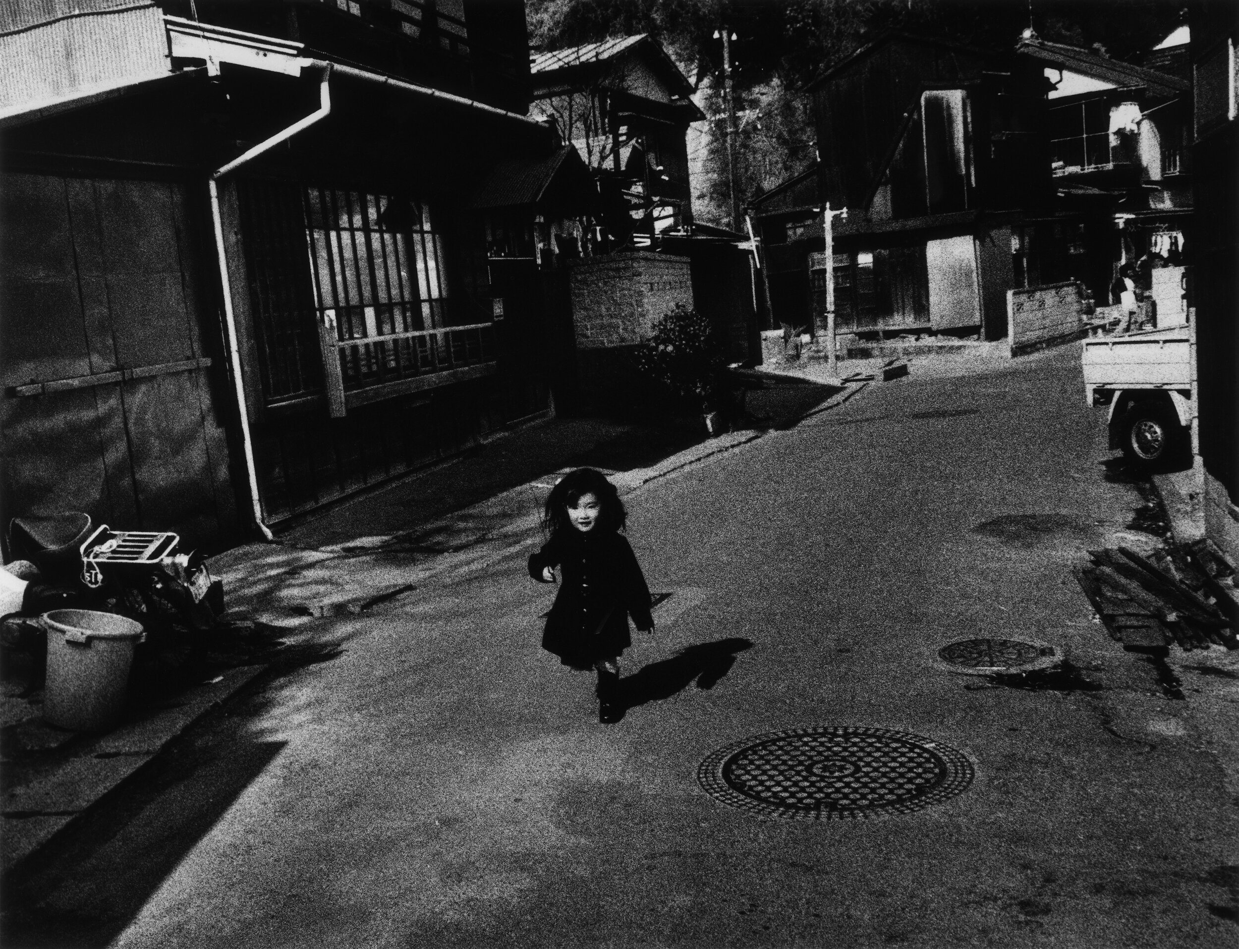
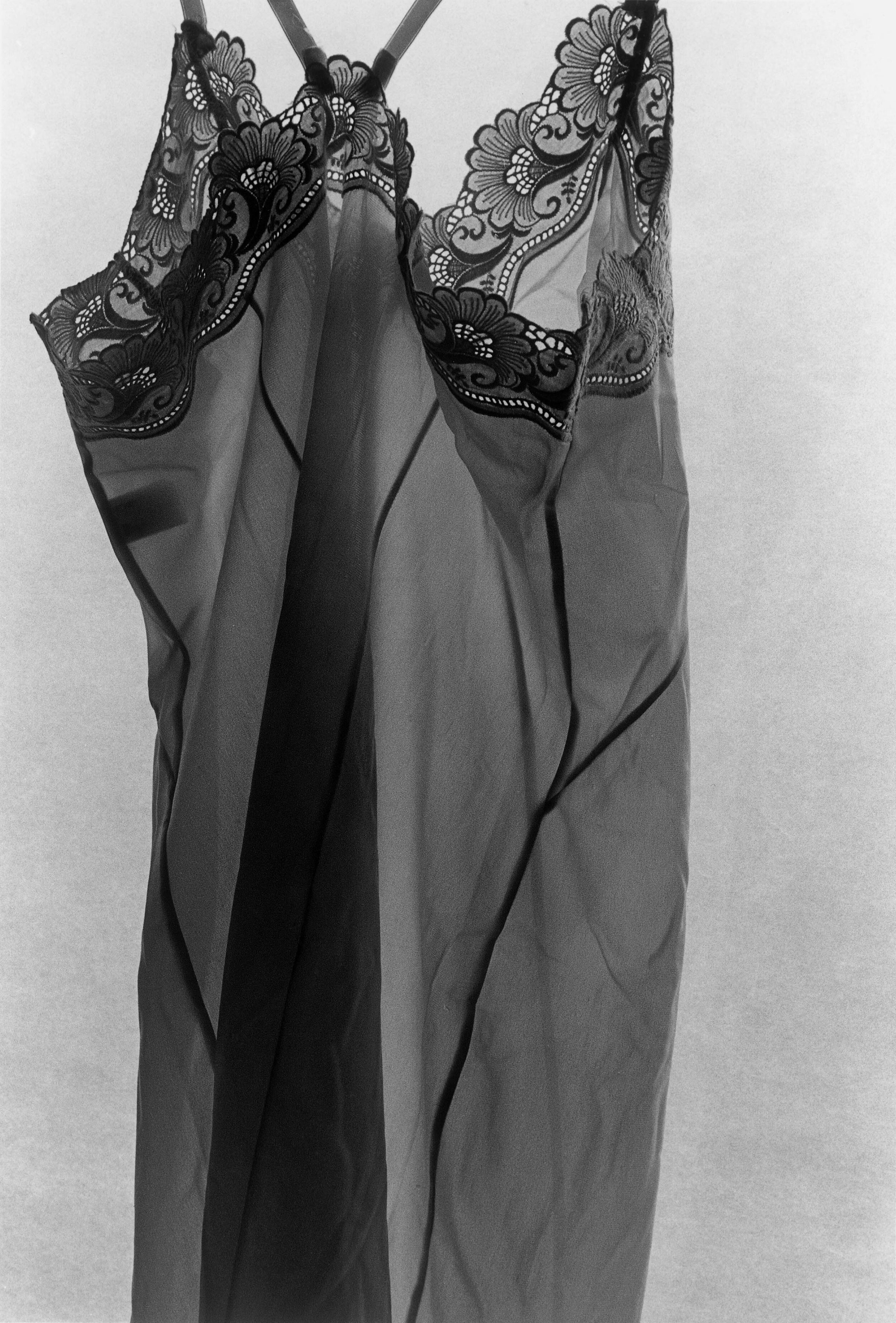
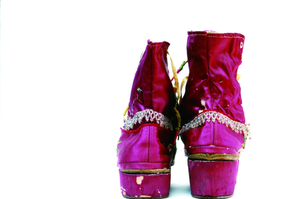
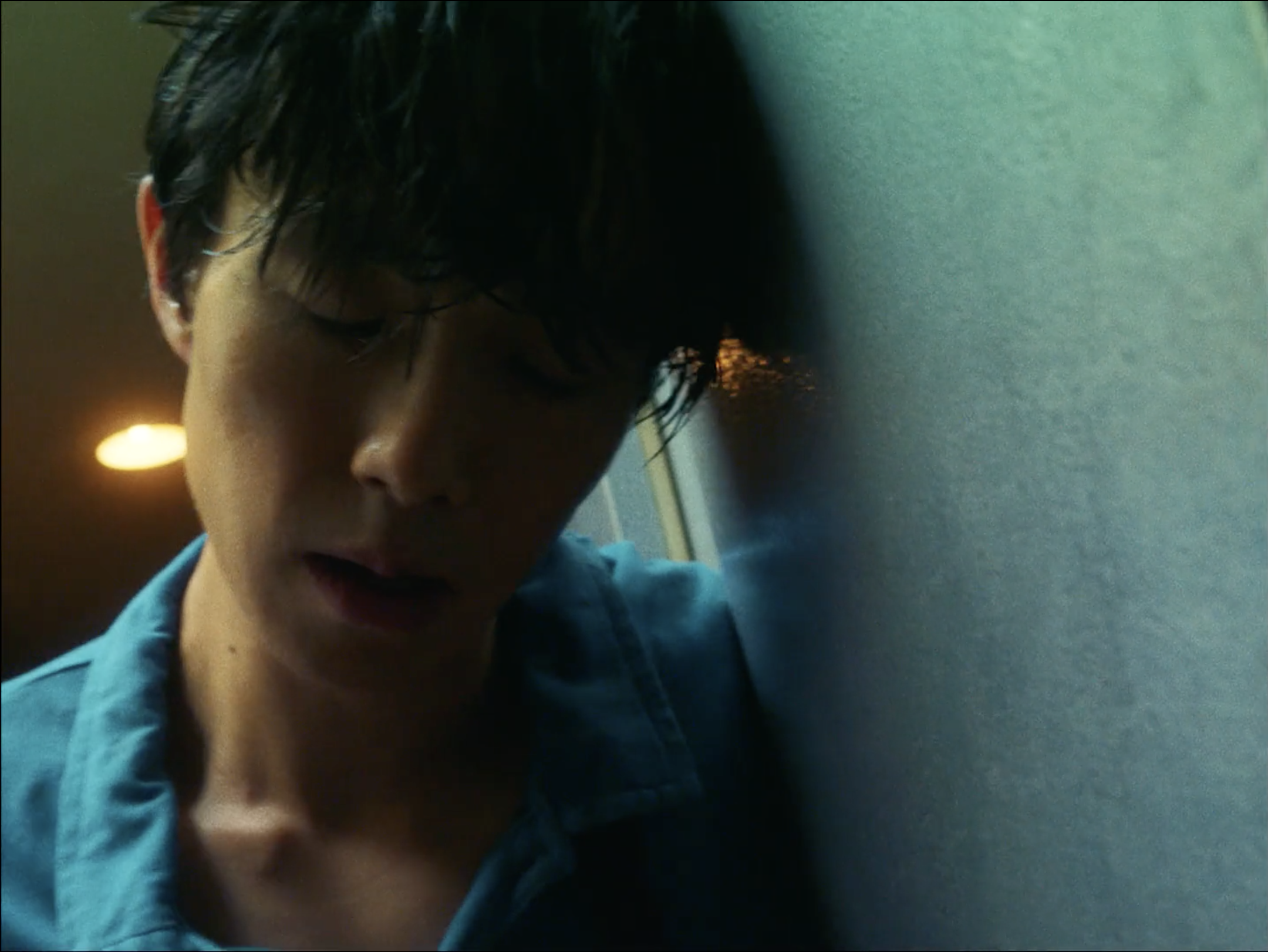
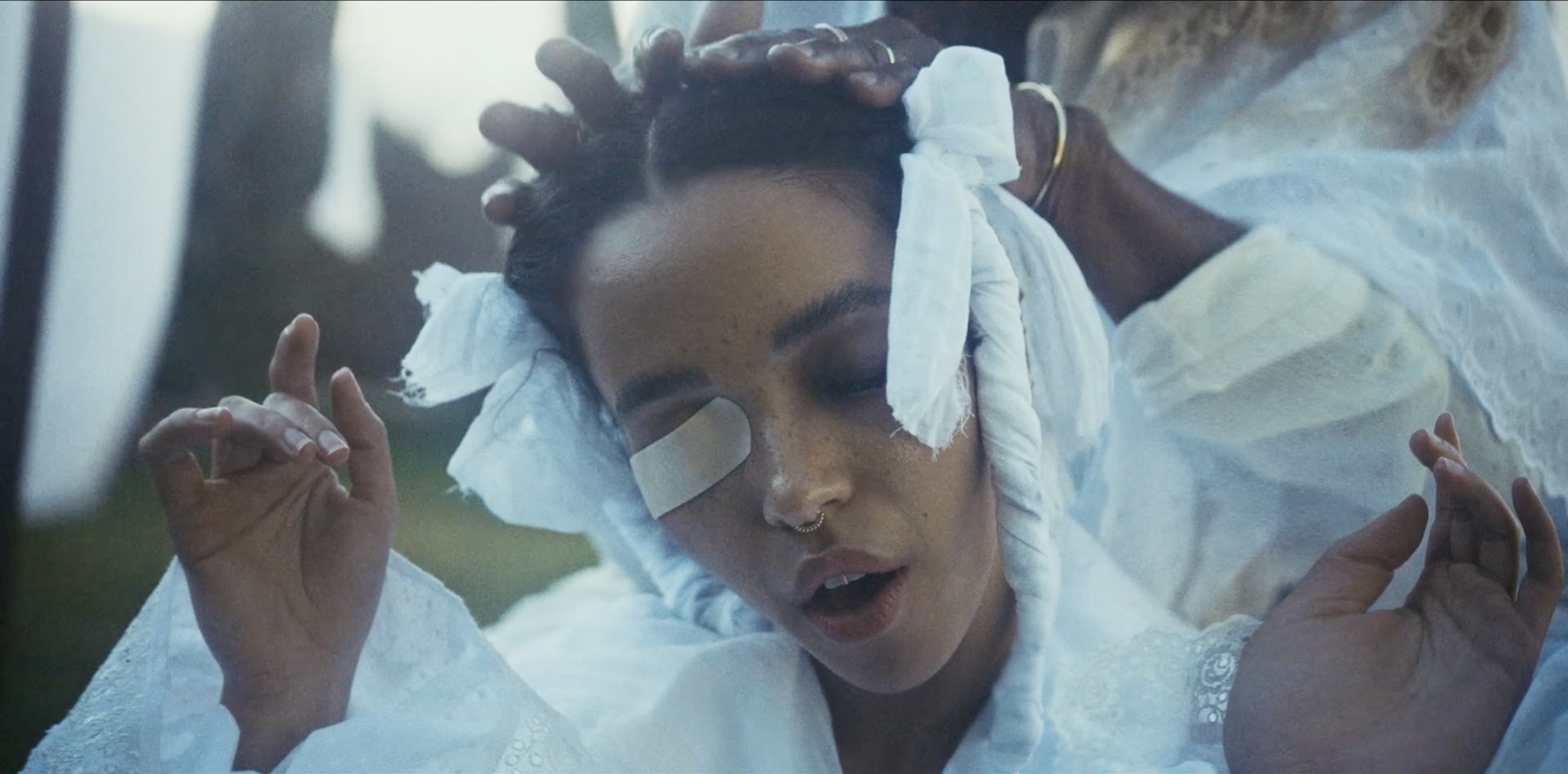
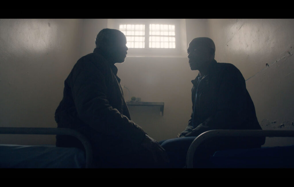
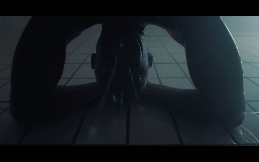
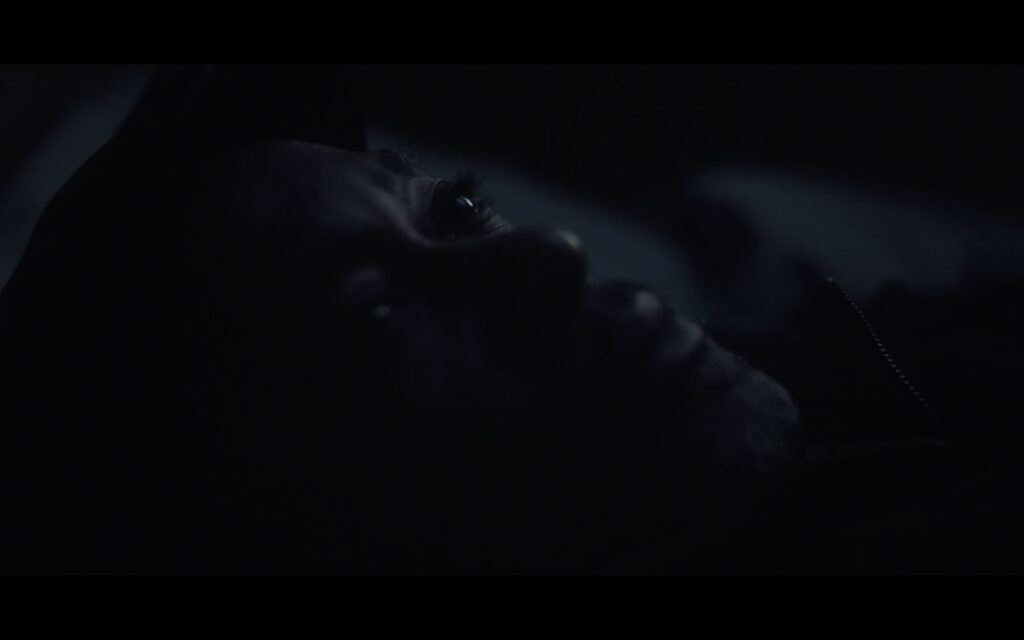
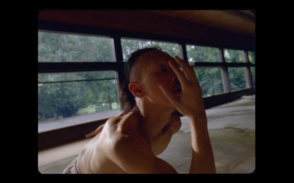
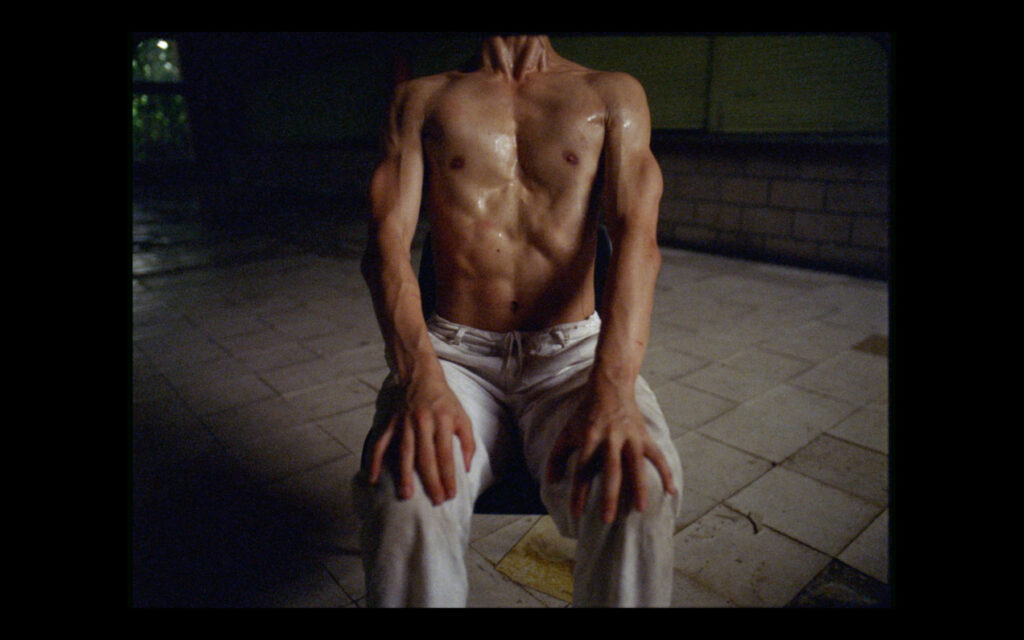
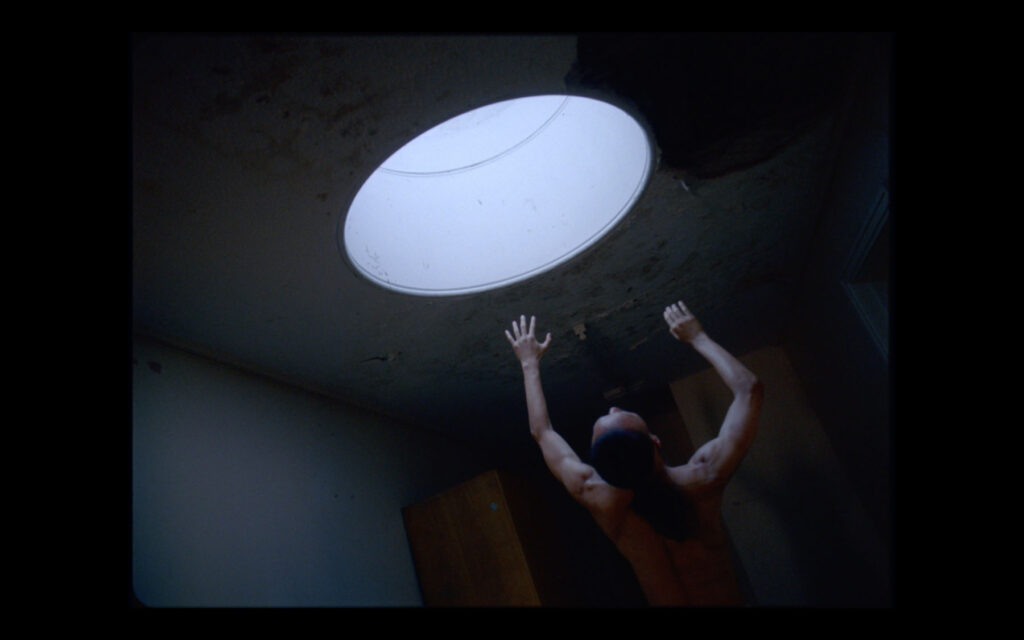
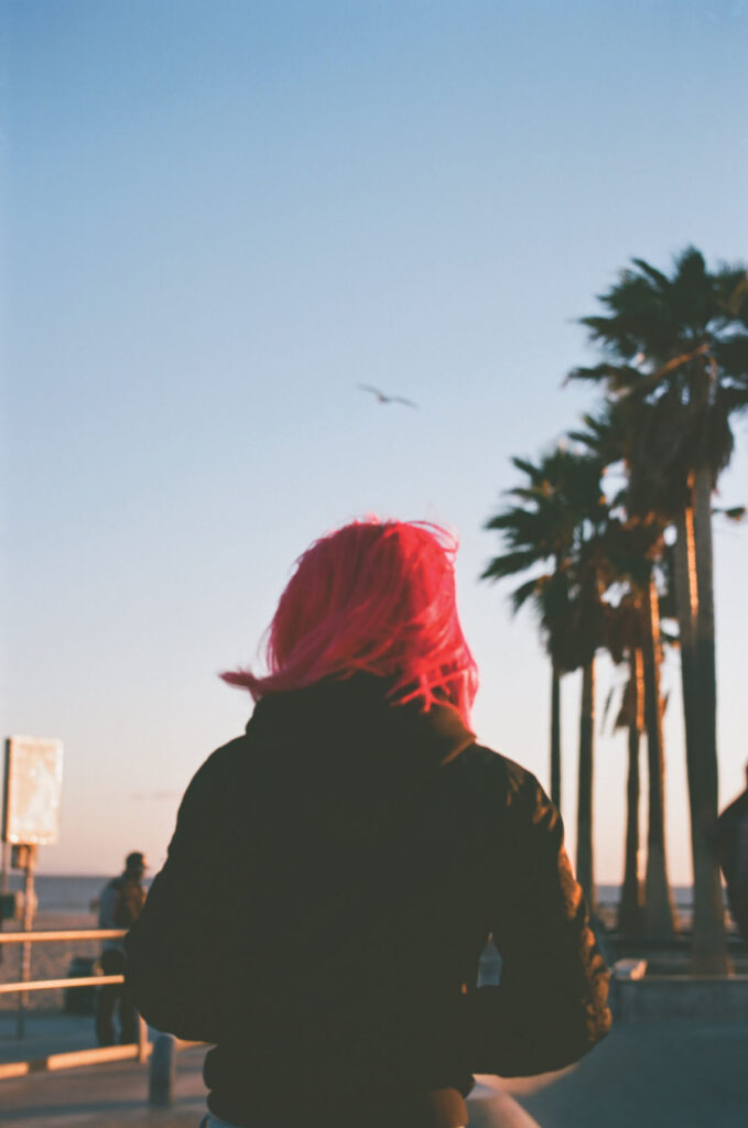
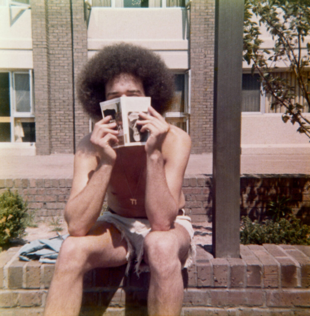
The Boys, the second photobook by Rick Schatzberg, is the result of both his pivot into photography and the unexpected death of two of his friends in close succession. Confronted with the fragility of life, Rick began in earnest to take photographs of the remaining boys. Using a large format camera, the images of himself and his friends, now in their mid-60s, are a stark reminder of the passage of time. In and of themselves, Rick’s photographs are tender portraits capturing the toll of time and age on the human body. But in the book, these images are interspersed with snapshots and photographs from the boys’ youth. Aged bodies become youthful, smiling faces – hanging out, experimenting with weed. Though Rick is quick to outline that The Boys isn’t nostalgic, there’s something poignant in flicking through the book’s pages and recognising the quirks and characteristics of each of the boys as time passes by. Addressing the responses he’s had so far about the book, Rick sums this feeling up well in our interview below: ‘anemoia: nostalgia for a time or place you’ve never known’. Many of the old photographs included in the book are snapshots that had been forgotten about – forgotten in the almost immediate aftermath that they were taken. They raise questions of memory; can the boys even recall the time and place that the photograph puts them in?
Alongside the images, old and now, are twelve short texts. One is an email exchange between Rick and two of the boys trying to piece together the facts of a fight that happened at a wedding. Their recollections of what actually occurred differ; evidence of the unreliability of memory. To celebrate the release of the book, Rick spoke in conversation with the photography writer and curator, David Campany in early 2021. As well as discussing the subject matter of The Boys, something that came up as crucial to the book’s release is its design. As part of the book launch, Rick shared a video of himself going through the book to demonstrate that the large format photographs of his friends feature as fold out pages (something, he tells the audience via Zoom, his mentors and peers from his photography course advised against). But something that also stands out in the structure of the book is that the 12 texts Rick includes in The Boys read like snapshots themselves.
An accompanying essay to the book by the writer, Rick Moody, raises this point, writing about the ‘relationship between a still image and the kind of expressive power that we associate with narrative activity.’ In the context of The Boys, as a photobook, this takes on historical significance. Writing about the 1920s, a time of the proliferation of the photobook and the photo essay, the academic Andreas Huyssen describes how a new form of literature appeared.
The “modernist miniature”, popularised by novelists like Franz Kafka and critical thinkers like Walter Benjamin, sought to capture modern life with photographic precision through words. In that way, then, Rick’s book is much more than a selection of photographs of his peers – young and now old – it’s a reckoning with how we navigate time, memory and our existence through the lens of modern life.


How did your experience of studying photography influence The Boys?
My work on The Boys was influenced by my art school education in several ways. To begin with, the photography MFA program I was enrolled in at Hartford University, Connecticut, is heavily focused on photobooks, and I went knowing I’d be making one. I thought I already knew a fair amount about photobooks, but the breadth of what I was exposed to by teachers, guest artists, and student colleagues was eye-opening. I had to examine my motivations to make any work and to think about how I would make a book that wasn’t just a collection of interesting pictures, but something with substance and depth.
In grad school, one of the challenges of making work that you hope to eventually present to the world is interpreting and deciding what to do with the near constant feedback you receive. You go to art school to not be limited by your inclinations. But there’s also the danger of gearing your work for approval of teachers and fellow students. In the end, I had to absorb what was helpful and discard what wasn’t; making that distinction was sometimes a confusing struggle.
At the virtual launch, you emphasised that this book had to be universal, and not nostalgic. What feedback have you had from people about The Boys? Does it differ from the boys themselves, those who come from the same place/time, and those with no real connection to the American suburb?
For me, the work is not really nostalgic; I feel that the almost forensic nature of the large format portraits grounds the work in the present. But I may have overstated my case against nostalgia a bit. The feedback has been consistent in that the work evokes an emotional response, which I find very gratifying. But judging from what people have written or told me, the way into the work has really varied. For some, the immediate connection is nostalgia for their youth or that time or place. For others, typically younger readers and often European, it may be anemoia: nostalgia for a time or place you’ve never known. (Like films and novels, photography is good at evoking this.) I’ve heard from people for whom the portrayal of enduring friendship was the hook, and after reading the book they either felt the urge to reach out to friends they have not been so attentive to or lamented that they didn’t have friendships that lasted into adulthood.
Obviously, this work is radically specific: a very particular group of white guys of a particular generation, raised in a very particular American suburban community.
«From the outset though, my feeling was that if this work isn’t felt to be universal then it’s a failure. Mortality, after all, is the bedrock of our biology.»


You mentioned the importance of collaboration in making the book – did this collaboration extend to your friends? Or did they feature just as subjects? Why did you use a large format camera for the portraits?
I discussed the deeper underlying themes of the project – aging, loss, memory, mortality, friendship – with my friends during our photo sessions. Though my directions for posing were minimal, these conversations helped to create the atmosphere I needed to portray vulnerability. I also explained that I planned to use the work as the basis of my master’s thesis so they understood that there would be a critical audience for the work beyond our circle. Their attitudes went from gracious acceptance to genuine interest. It was as though they became partners with a stake in the outcome.
«It was clear that I would be making unheroic portraits that might not be flattering, and they understood there was good reason for doing so.»
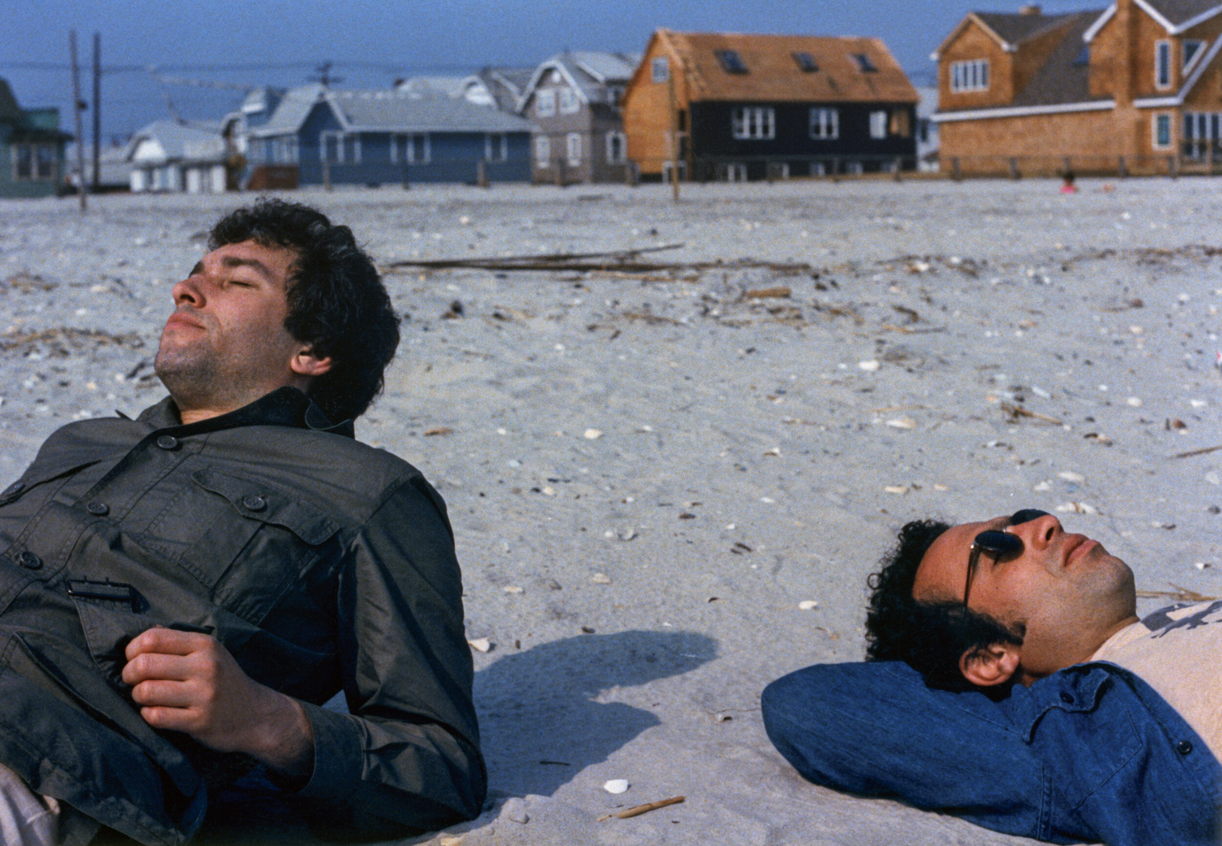
The word that often came to mind in these photo sessions was ceremonial. Using a 4×5 film camera, with all its fussy rituals and storied traditions, felt performative and serious. The slow, cumbersome, and mysterious (to my subjects) process helped amplify the psychological intensity surrounding the project. In the face of our brothers’ deaths, together we were creating a formal certificate of presence (to use Roland Barthe’s expression), using traditional tools.
That said, it is was not a true collaboration because the power to select specific portraits for use in the book was mine alone. My friends did not even see the images I was choosing between, nor did they know how I would ultimately deploy the portraits in the book. They trusted me. It was important to assert my authorial voice, but without entirely drowning out the voices of my friends, which they asserted through the written word, their snapshots, and their gestures in the portraits.
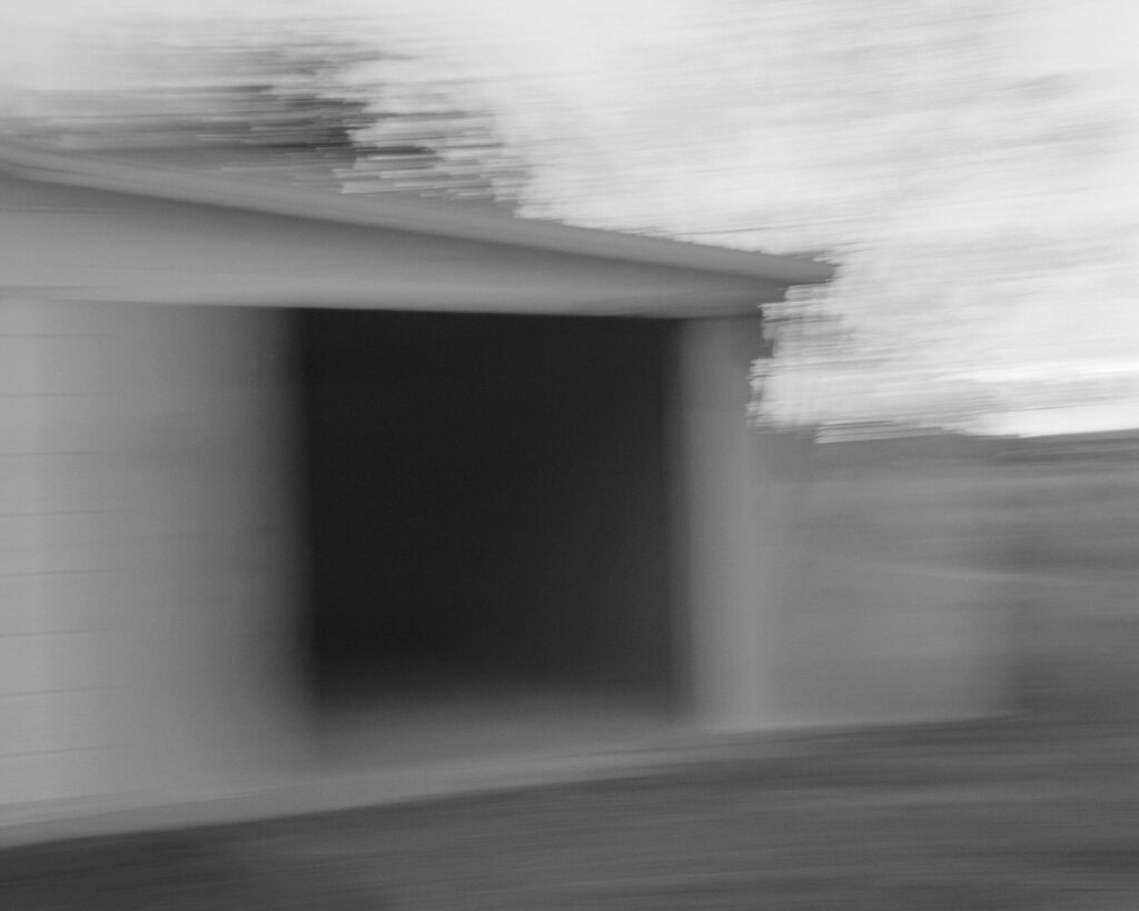
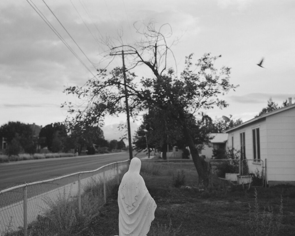
We’re faced with the processes of ageing, time and mortality in The Boys – when returning to your childhood home and neighbourhood for the book, had the nowhere place you came from aged too?
In the winter, with the trees bare, the neighborhood looks very much like it did 50 years ago. In the warmer months the trees, mature and leafy, give the neighborhood a homier, more established feel. The automobiles in front of many of the homes are now more numerous and luxurious, probably more a sign of growing consumer credit and a shift in values than of greater wealth.
The short texts in The Boys read like snapshots, how and why did you choose the texts you include?
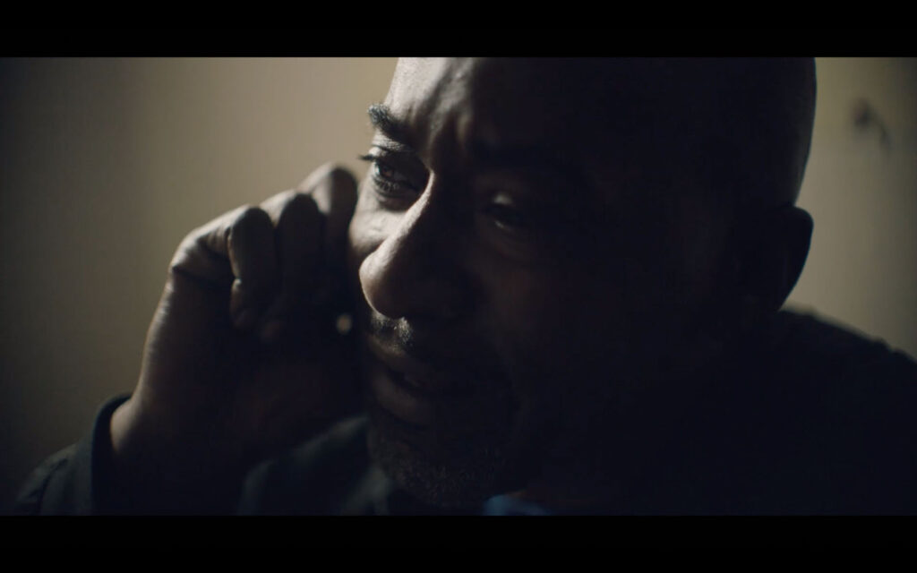
I was interested in constructing narratives to loosely link text and images that would stand as discrete memories – not stories as such but fragments that help tell the larger story. I chose to write short texts that could function in different ways: sometimes straight narrative; sometimes like vague, recovered memories; sometimes as meditations; and sometimes more as dream than narrative. The one outlier is the story about my father. I didn’t initially think to include this in the book. I was having a conversation with my editor and I related the story to her.
«She told me to write it down and as soon as I did, I knew it belonged in the book.»

In his essay, Rick Moody refers to a good photograph as one left in a drawer for 30 years. Did the archives of photographs of yourself and the Boys ever come to light in the intervening years leading up to the making of this book? If so, in what circumstances?
Several of the snapshots have been circulating for ten years or so on social media. Others, which I found loosely strewn in boxes stored away for years, may have been passed around shortly after they were taken but were mostly forgotten. Time conferred poignancy as Rick Moody describes, but curating enlarged full-bleed versions astride pictures of old men and stories of death, makes new meaning. Even the more familiar old snapshots felt like new discoveries.
Credits
Images · RICK SCHATZBERG
https://rickschatzberg.com/