Thomas Demand, it is such a pleasure to be interviewing you. How are you?
Very well, thank you.
You have had a fascinating career spanning across various fields such as sculpture, photography, art, film. As the theme of this issue is Growth, I thought it would be interesting to let you talk to us about how you found a balance between all those practices, using excellent craftsmanship and imagination.
You initially trained as a sculptor, how did you find yourself in the place where you are today and how did you initiate that merge between sculpture, photography and architecture?
I grew up in an environment which naturally connected these fields like family: my father and mother were painters, my uncle and grandfather architects, my grandmother a concert pianist (still working to find my way in that field) and my best friend at school was the son of one of the most important and visionary art collectors in Germany. So I have no Schwellenangst, even if I do have greatest respect for the disciplines and their differences.
You have studied in Düsseldorf, Munich, Amsterdam, Paris and London. You have been moving quite a lot. What are some of the places that have inspired you the most?
Japan, USA and northern Italy. But I also noted over the years that there are cities which are good for making art and some to look at art, but rarely is both the case.
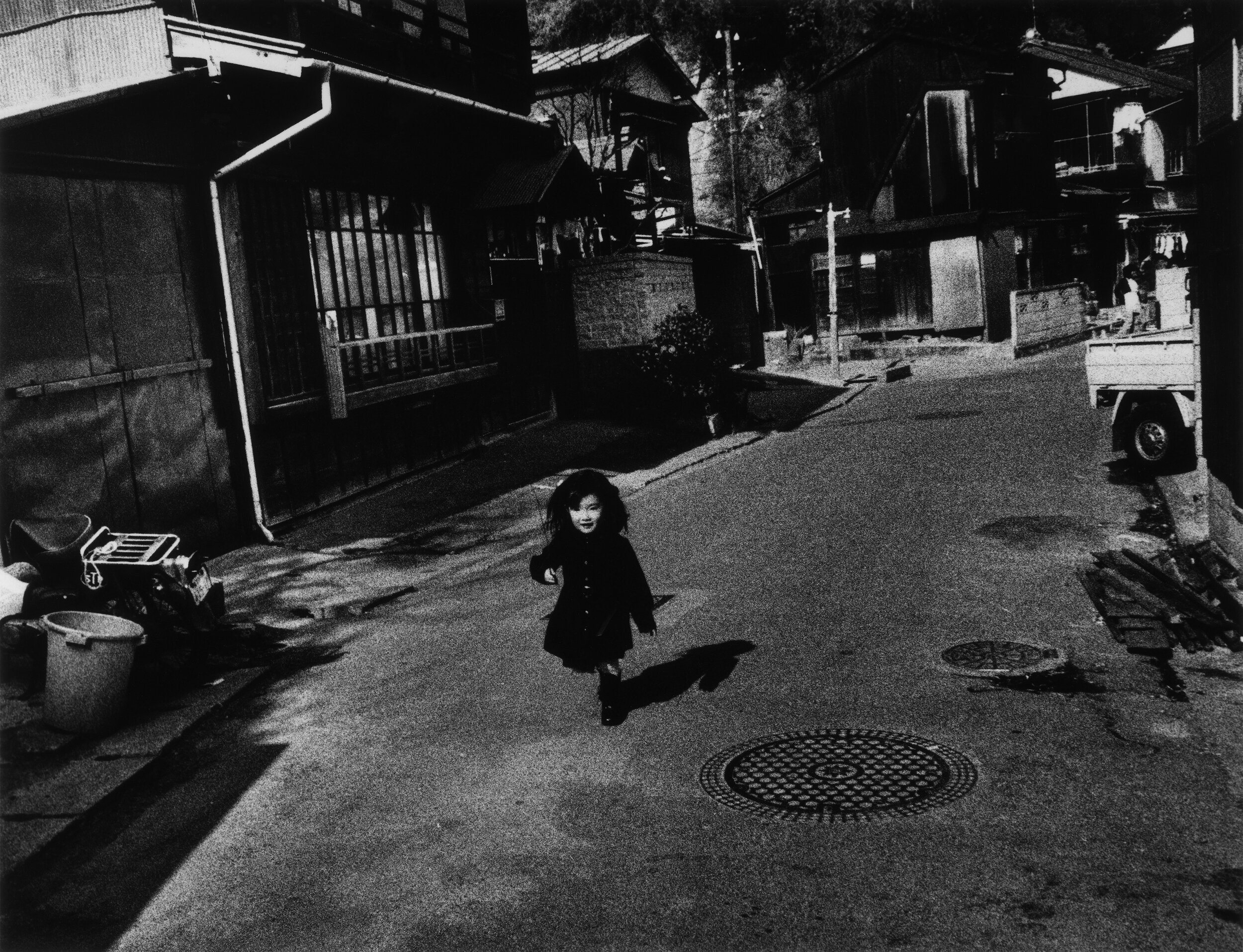
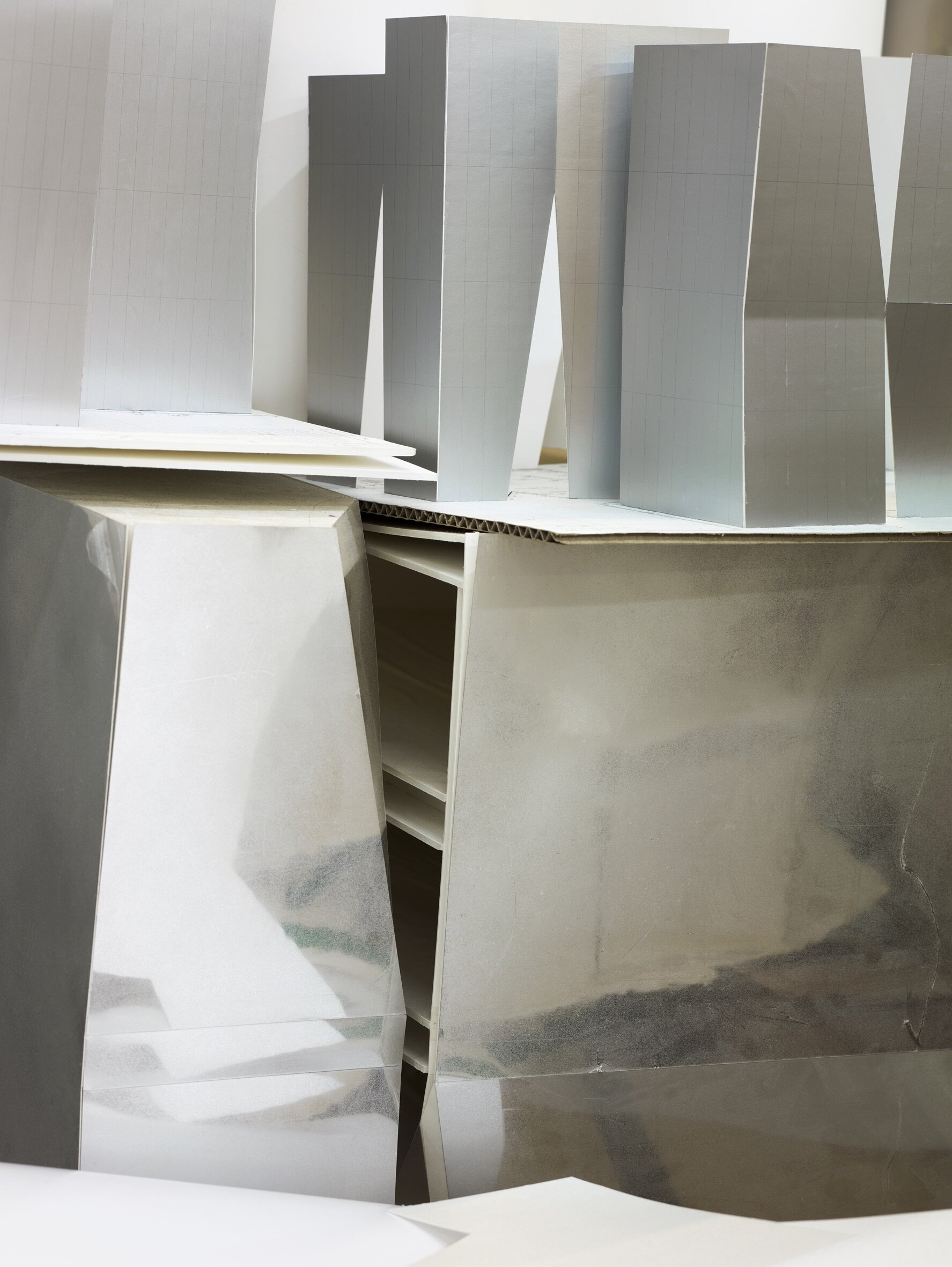
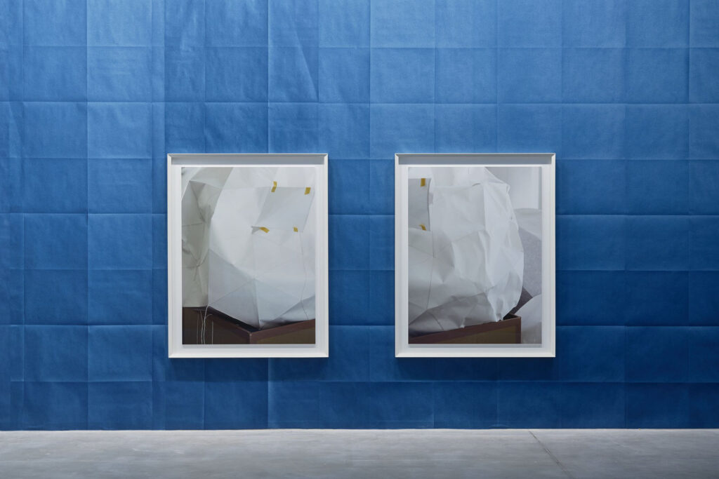
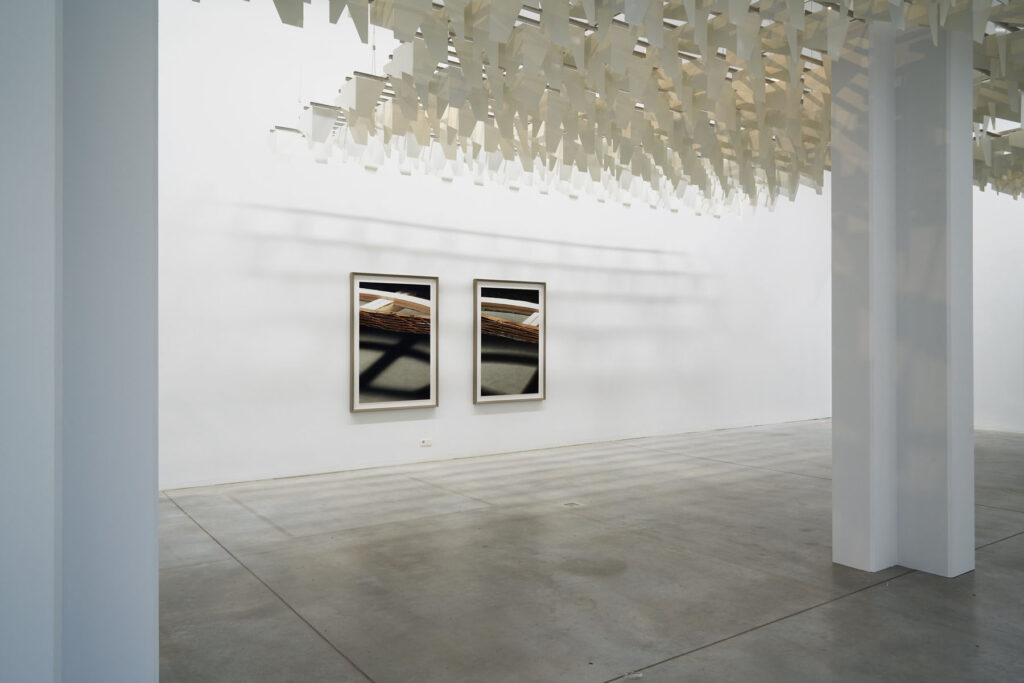
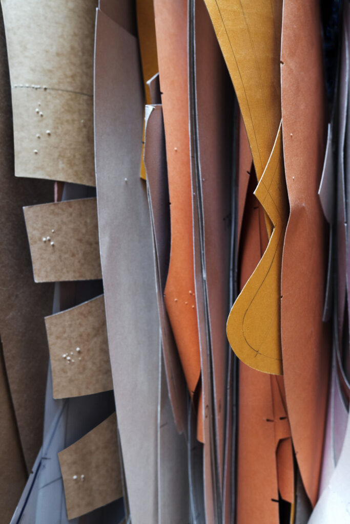
Your starting point is often photography as a “constructed reality” and from there, you design life-size paper models with colored paper and cardboard. You create inventive images of life- size architectural paper models that look exactly like the final product. Your constructions are ephemeral as you always discard them once you’ve photographed them. Why is that?
I don’t think it is exactly like the starting point, but even if, it would be a valid artistic concept, I believe. But my version is a version of reality which might have more relations to how we see the world, not how it might be. How we remember it, how we are manipulated, how our ideas influence what we recognize and so forth. Like a writer, he might write truthfully about the world, but it will not be taken as the reality itself. I consider this worth exploring in the medium of photography, where this distinction is easily obfuscated by the mechanistic understanding of documentation the apparatus delivers.
Your work often serves as testimonies for other artists’ thought processes and create a place in time for them. Where did that interest come from?
We all stand on someone else’s shoulders, and I find it an easy way not to isolate my vision in the ghetto of photography. Photography as a technique or discipline never interested me enough.
In an interview for the Louisiana Museum you say that “many things first become visible to us via the images we see of them.” and that we live in a world of models. Could you elaborate on that? Do you think you are creating a new version of reality or giving new perspectives or is this more about bridging the gap between what we see and what is represented and almost building a realm between fiction and reality?
I think the use of models is a highly influential and underexposed cultural technique, we can only absorb the complexity of the world around us by filtering end remodeling it. The ancient Greek philosophy was already fully aware of that and things didn’t get less complex since then. The weather forecast, retirement plans, demographics, elections, psychology ect, all is using models to find a direction through data. People often think of architects and children’s toys if they refer to models, but it is much more fundamental. It is amazing how little literature and research there is about that.