The Climate Clock

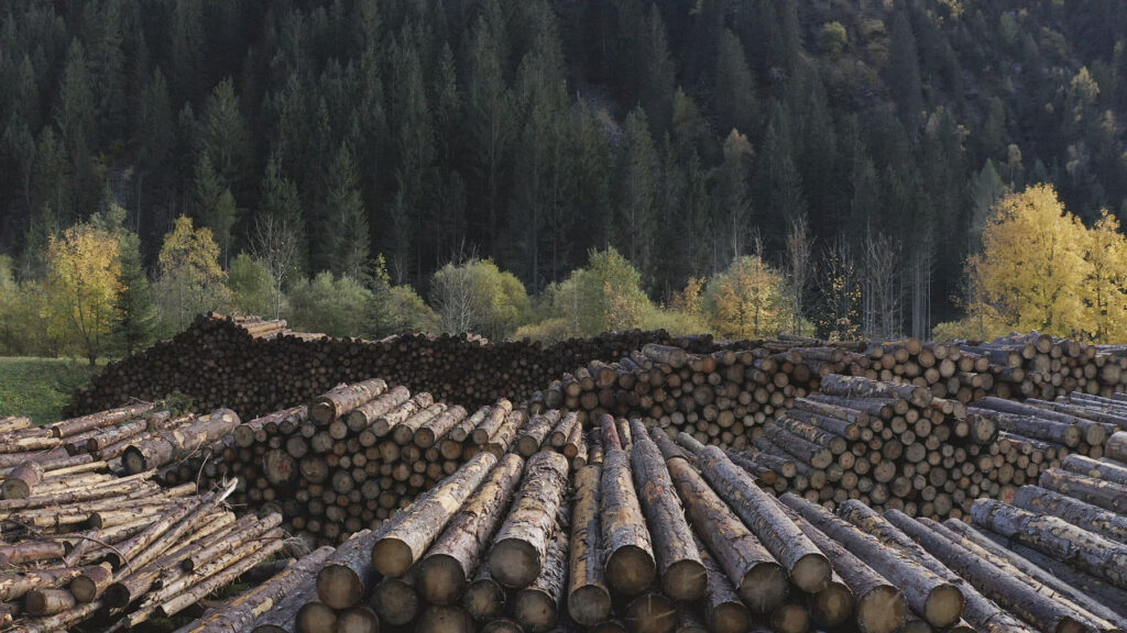
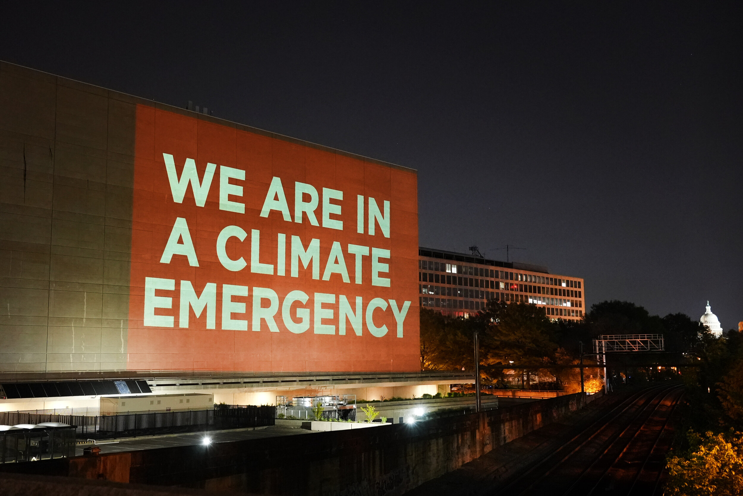
“A slow-motion carbon time-bomb we are dropping on ourselves and all of Nature”

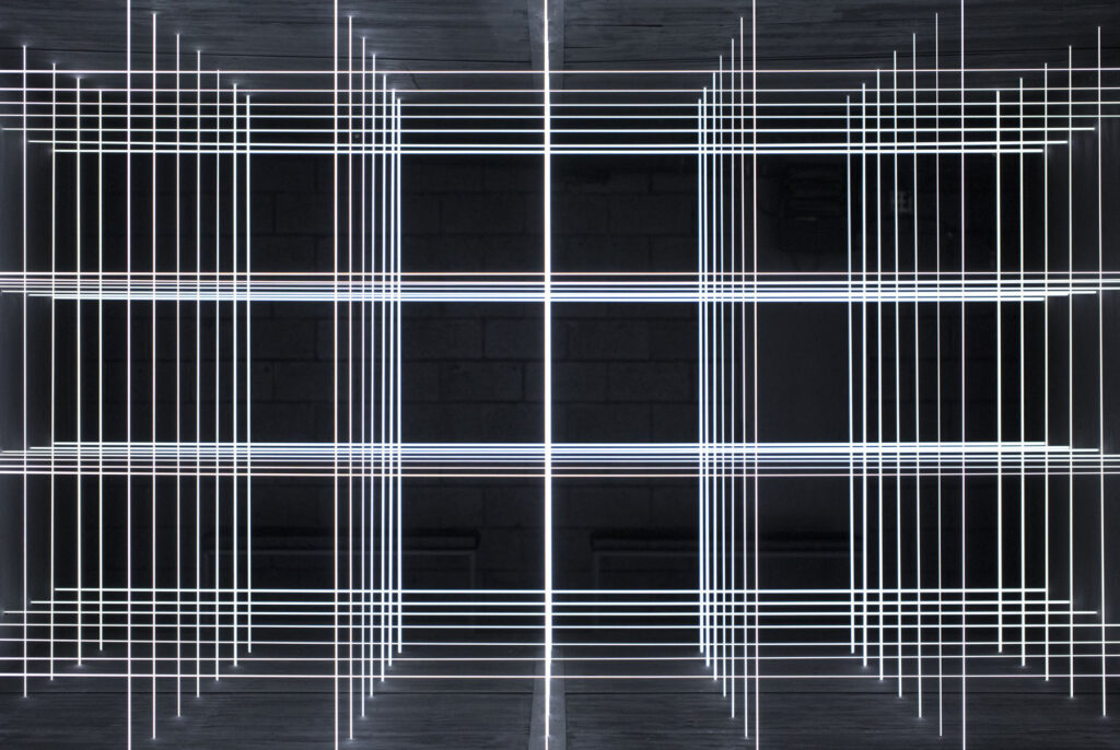
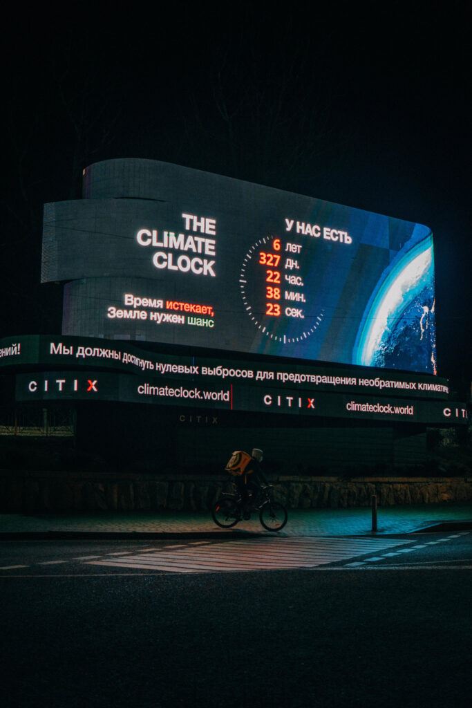
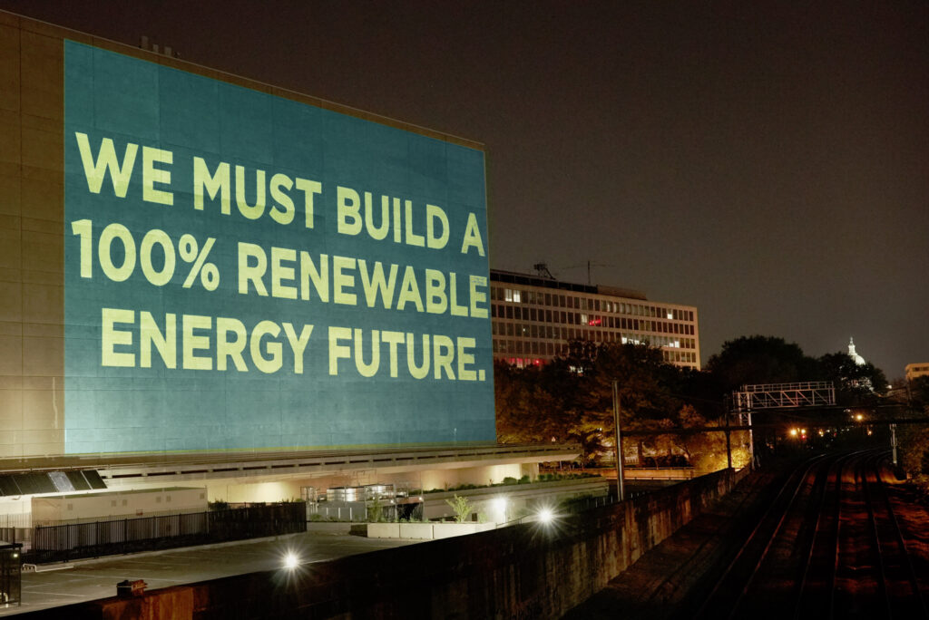
At the time of writing, there is six years, 267 days, 16 hours, 25 minutes and 57 seconds to stop the clock, so to speak, before the environment faces catastrophic events. Of course, by the time this goes to print, that number will be less. And in September 2020, when two artists, Gan Golan and Andrew Boyd, unveiled their ‘Climate Clock’ in New York, there were seven years remaining. The clock, plastered on the side of a building in New York’s Union Square, shows two figures. The first, in red, shows the time remaining to reach the 1.5 degree target, set by the Mercator Research Institute on Global Commons and Climate Change, which would provoke devastating environmental disasters around the world. The second, in green, shows the percentage of energy produced using renewable energy; our lifeline, as it were. 

The clock replaces Metronome, an LED public art installation unveiled in 1999 by the artists, Kristin Jones and Andrew Ginzel, that shows the length of time to, and from, midnight in a 24 hour cycle. As it happened, the artists behind the original public artwork had been looking to address the climate crisis through this work. Utilising the existing technology, the display was temporarily reprogrammed for the duration of Climate Week, ending on 27th September. For now, the Climate Clock remains in situ – that is, of course, unless it reaches zero.

Following the birth of his daughter (igniting a sense of urgency around the climate crisis) Gan Golan approached Andrew Boyd, to collaborate on the project. They had previously made a Climate Clock before, but on a much smaller scale. Nine days before the activist, Greta Thunberg, appeared at the UN Climate Action Summit in 2019, the pair were approached by email. “Greta wants a clock,” it read. They were able to band together enough coders, designers, artists and the like to make the clock in time for the summit, which was ultimately barred from being brought into the event by UN security. As the affair is summarised on Climate Clock’s website: “Oh, come on! It’s just a block with LED digits furiously counting down. Does that really look so much like a bomb?! Oh. Right. Well, that’s probably because it is a bomb! Or at least the symbol of a bomb. A slow-motion carbon time-bomb we are dropping on ourselves and all of Nature.”

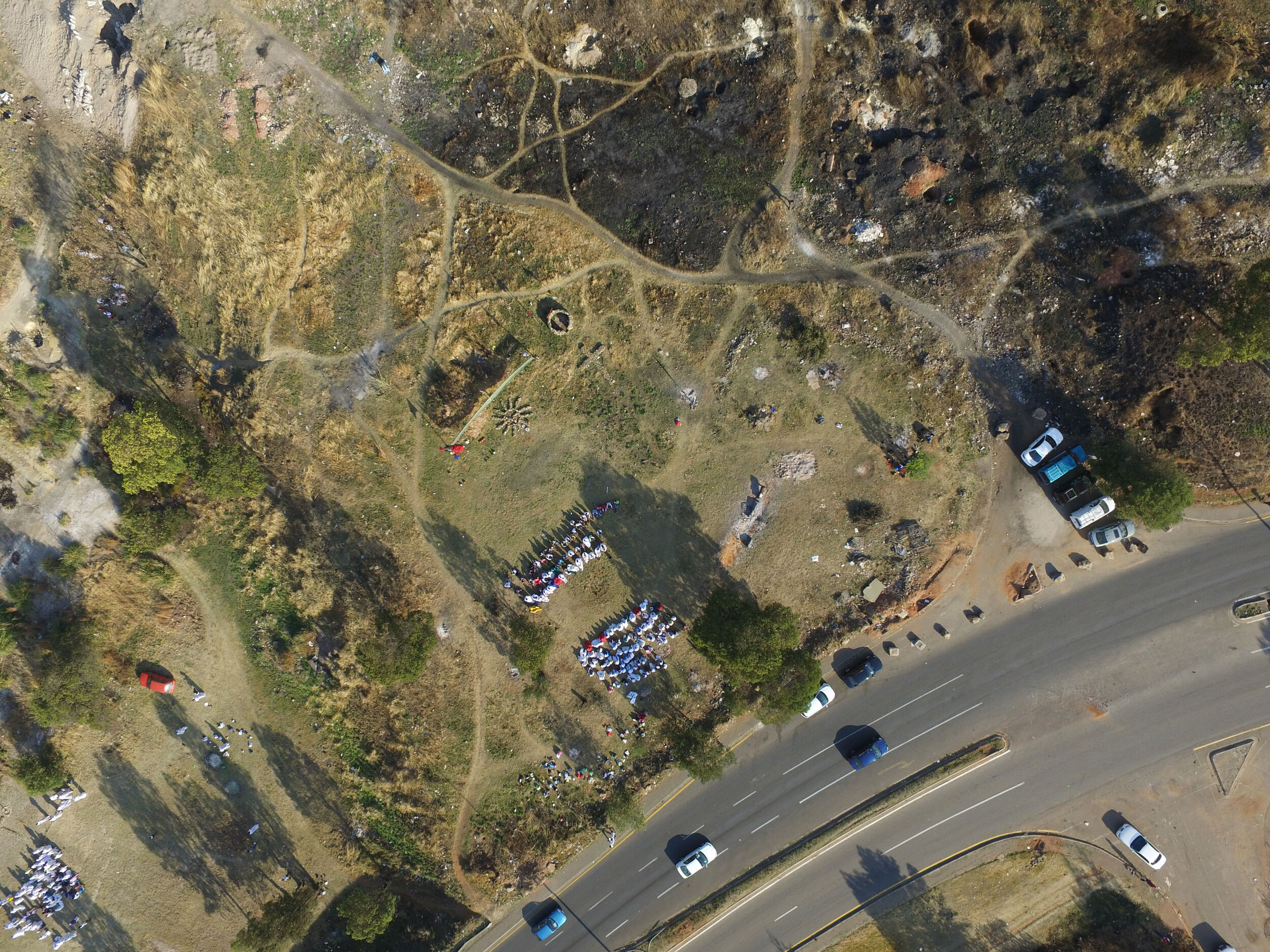
The launch of the Climate Clock in New York chimed with the world in a much bigger way than Gan and Andrew had perhaps anticipated. And in the six or so months since its unveiling, smaller Climate Clock initiatives have launched across the globe. The first clock in Kazakhstan was turned on in January, another is planned in Glasgow to coincide with the United Nations Climate Change Conference (COP26) in November, and there are plans for one in the Bay Area – to name just three. Climate activism is not a recent phenomenon, but the past few years have undoubtedly seen an acceleration in their coverage, influence and engagement. 

The first Earth Day was marked on 22nd April 1970, during which 20 million Americans mobilised to voice their concerns for the direction in which the climate was headed. Every year since, Earth Day has taken place on the same day. The origins of Earth Day date back further, however, arguably to the publication of Silent Spring in 1962. The books author, Rachel Carson, rang the alarm bells that the twentieth-century way of life was having a devastating impact on the environment. Petrol guzzling engines; the acceleration of mass-production; the use of pesticides. Up until that moment, the world was somewhat unaware of the consequences of their behaviour on the environment, the eco system and on their own health.

Ahead of Earth Day 2021, NR Magazine partnered with Gan, Andrew and the Climate Clock team to highlight the urgency of addressing the climate crisis. We spoke with representatives from three of the satellite projects, in Kazakhstan, Glasgow and the Bay Area, to learn more about what drew them to the Climate Clock, and how their involvement is creating change within their local environments. The full video discussion, which took place over Zoom, will be unveiled on 22nd April, but below is a condensed and edited summary of the issues covered.

The three representatives, Meruyert from Almaty, Kazakhstan, James from Guildford, UK, and Kim from San Francisco, US, are all at different stages of their Climate Clock journey. ‘I saw the clock that they’d set up in New York over social media […] and it caught my attention,’ James explains. He recognised its huge potential to raise awareness about the upcoming COP26 summit throughout the country ‘because,

“not many people in the UK actually know it’s happening or what it is, which is not a good sign because that means that people around the world probably don’t know it’s happening either.”

For Meruyert and Kim, seeing the New York clock on social media helped sow the seed amongst their teams, too.

‘One of the team members, Galiya, found out that we could also put a Climate Clock in our city – in our country,’ Meruyert says. They began as a team of four, working to put up the ‘third biggest Climate Clock’ and the first in Asia. ‘It was crazy, it was huge […] And now, we’re doing new movements [and] projects in our community and getting into the eco activist life.’ Not long before the Zoom call, the Kazakhstan team welcomed their sixth team member. For Kim in the Bay Area, though, it’s currently just her and her friend, Hannah, involved. They’re still early on in the process, but are committed to doing something about the Bay Area’s lack of any ‘[real] substantial symbol of action towards the climate crisis’. 

Though the ultimate goal of Climate Clock is to “flatten the climate curve” it’s interesting to hear the immediate concerns of the respective teams. The shadow cast by Silicon Valley over the Bay Area is one that needs to be addressed, quickly, for the local environment, as well as the world. ‘[These areas] have a such a large sphere of influence. There’s so many corporations and companies that can work towards a more sustainable future.’ Kim hopes a ‘butterfly effect’ will occur, and so her goal is to put pressure on those companies. 

For both Meruyert and James, their action is aimed more at politicians. As James explains, the hopes for the Glasgow Climate Clock around the time of COP26 is that it will address the ‘huge disparity between current levels of political ambition and what needs to happen.’ The idea being that the clock will help mobilise the public, and put pressure on politicians to draft up seriously-considered strategies and policies; words that have actions behind them.

“We have a big problem, in the UK at least, with politicians talking the talk and saying things at these international summits, but then actually, domestically, not really living up to that.”

That’s a sentiment Meruyert shares, and it was the empty words of political leaders in Kazakhstan that energised the team to get to work. ‘The interesting thing is the people in political power say that they need to take action, but they want us – the younger generation – to save the world, to save the country. But they’re the decision-makers.’ This disconnect spurred Meruyert and team on; ‘that was the urgency. And after researching all the information we were like, “We must get it. We need to do it.” So, we did it.’  

Another issue that all three teams have had to address is criticism that, if real change depends on political power, the Climate Clock only scares and intimates the public. ‘We’ve definitely had some tough questions and concerns raised,’ Kim recalls, adding that a community college she contacted about adding the Climate Clock’s widget to their website were worried it was ‘too similar to a Doomsday Clock and would actually push people away.’

After the installation of the clock in Almaty, Meruyert’s team approached officials in Nur-Sultan, the capital of Kazakhstan, about installing a clock there. The response was that they didn’t want ‘negative energy in big public places.’ But as all three point out, what’s more terrifying is the fact that the 1.5 degrees threshold could be crossed due to global inaction. ‘I feel that the climate issue [is at] a point where such an urgent symbol is needed,’ notes Kim. ‘We don’t have forever to fix the issue, and I think that the Climate Clock is meant to be intimidating because it’s supposed to pressure people to take action.’ 

Collaboration comes before fear-mongering, within the Climate Clock community and beyond. The teams meet virtually every Wednesday with Gan and Andrew and have access to training and mentoring to help them get their local campaigns off the ground. Kim mentions that herself and Hannah, for example, received advice from the Kazakhstan team on how to reach out to local partners. Unlike Kim and Meruyert, James has been a climate campaigner since the age of 13, and the team in Glasgow have also had discussions with other climate activist groups in the city and beyond, including Fridays For Future and YOUNGO, the UN’s youth climate constituency.

Acknowledging his relative experience as a climate campaigner, James asks Kim and Meruyert whether they’ll continue to be involved in similar work after Climate Clock. Both agree that, in one way or another they will – because the issue isn’t just going to disappear. But as we approach Earth Day 2021, what do the three team members hope to have achieved by Earth Day 2022? 

‘I hope we’ll have managed to successfully use [the Climate Clock] to mobilise young people in the UK ahead of COP26, and managed to push for ambitious enough action – and start to have that filter through into policy around the world. But hopefully, we can still use it to continue to generate momentum around the country and the world to hold politicians accountable to the decisions they’ve made at that summit, and make sure that actually translates into physical action rather than just words that were spoken that once, in November in Glasgow.’ – James

‘To change people’s minds at the local level. All around the world, people want to change the climate crisis. But a year from now, I guess, first of all, on a local level, we want as many people as we can to join our movement; to know and to educate themselves and to realise that it’s real. And second, is to get our team bigger and bigger. One year from now, I hope our movement will grow to a bigger movement, to bigger projects and to stop climate change.’ – Meruyert 

‘I really hope to grow the Bay Area team too. Right now, it’s just a team of two people, so having that help would be great. But, on a local level I think there needs to be more education, especially for the younger generation. Our goal with the Climate Clock on a local level is to educate those people and bring awareness to these issues. In a larger sense, the corporations and companies that I talked about earlier, just helping them, pushing them, towards a more sustainable future is […] one of our main priorities.’ – Kim 

Credits

Images · THE CLIMATE CLOCK
https://climateclock.world/

David Caon

“equally useful, simple and beautiful”

CAON is a multi-disciplinary design studio based in Sydney, Australia and founded in 2009 by David Caon, a graduate of Industrial Design at the University of South Australia. Specialised in industrial, transportation, aviation, product, graphic and interior design, CAON provides innovative solutions. From aircraft interiors, tableware to furnishings for the workplace and home, Creative Director David Caon has mastered the art of applying design thinking to industrial design across different disciplines. The CAON philosophy is simple: precision analysis and bespoke response lead to unique outcomes appropriate to each individual case. Collectively, they believe that in the right hands design has the power to heighten human experience and enhance quality of life.

NR delves into the studio’s projects and partnerships with the likes of Qantas airlines on multiple occasions (whether it has been or the airline’s tableware or its fleet’s interiors), the studio’s take on sustainability as well as their plans for the future.

CAON is a multi-disciplinary design studio specialising in industrial, transportation, aviation, product, graphic and interior design. Did you study anything related to any of these fields? Did you study product design, architecture or interior design?

I studied Industrial Design (product design) and commenced a masters of transport design which I left after about 3 weeks in.

Caon studio seems to be very focused on industrial design. What led you to create your own practice? What is it that you are exploring or tackling with your work?

My ambition in the early days of my career working for designers was always to one day have my own studio. I spent my initial years working in Europe. Once I returned to Australia, I decided to realise my goal after working for a large multinational architectural practice. I realised that I liked being part of a smaller, more familiar unit. My focus is to create designs that are equally useful, simple and beautiful. I’m trying to create things that avoid trend and thereby stand a chance of being timeless. You can’t create something that’s timeless, you stumble upon it by chance, which I kind of like. But you can try for it.

This is not the first time that CAON is doing projects for Qantas Airlines (for instance the Qantas Airlines Economy Seatings and the interior of Qantas A380). How did the collaboration come about? As a designer, do you enjoy doing collaborative works?

I’ve worked with the airline in some form since about 2003. My first introduction was whilst working in the studio of Marc Newson. Once I started my own studio, they were almost my first client. So there has been a wonderful consistency and evolution in the relationship. As a designer, having a long term collaboration with a client is a wonderful thing, and in some ways a bit old school. When it comes to new projects, it means that we are already on the same page, speaking the same language. The brand also means a lot to me, it’s been such a big part of my career for so long. I want them to do well out of every collaboration. 

The colour palette and material palette both feel very relaxing and wellness focused. Was this something you wanted to make a point of? Travelling does take a toll on the body but well- designed spaces can heighten human experience and enhance quality of daily life and it feels that the Qantas First Class Lounge Interior in Singapore has achieved that. How did the collaboration with Akin Atelier unfold?

I try to limit the interior design projects I take on because I’m very detail-focused which isn’t necessarily efficient when designing spaces. My general design approach is guided by industrial design practice, so I’m quite aware that I’m biased towards smaller scales. I know its best if I collaborate with designers that are able to take a broader view. The collaboration with Akin was born out of my friendship with Kelvin Ho, who is the director of Akin Atelier. These projects are important to Qantas and I want to make sure they are as good as possible and as enjoyable as possible, so bringing Akin into the project ensured that and also meant that I had a sounding board. The feeling we have tried to create was a conscious decision to make the space feel more like a sophisticated lounge room, part Sydney, part Singapore. Functionally, space is very food oriented as well because lay over times tend to be short and we wanted to give the passengers as much opportunity to refresh and reinvigorate before the next leg.

What have been some of the responses to your projects? Is there a particular project you have worked on that was particularly well received and did this inform your future projects? As your method of design seems to rely or be influenced by the relationship between people and their surroundings, how does the way people react to work affect the way you create? You have also designed tableware products such as bottle openers and furnishings for the workplace and the home, which is a nice way to connect people to the things they use in their daily lives.

The Premium Economy seat for Qantas was really well received but it didn’t mean that we didn’t think it could be evolved when we came to update it for the A380. It’s funny, as a designer, people are a bit reticent to tell you anything that might be wrong with your design, but I’m keenly focused on progressing our process and honestly evaluating our work. I’m wary of praise and I try not to rely on it as a measure of whether a design has been successful. So I guess I’m saying that no, reaction to one project hasn’t driven the direction of another project. I try to involve my colleagues, from across a range of disciplines, in my design process, as a way of stress-testing ideas. And when I’m designing I tend to think of my friends and family, people that I know well, and imagine how they might use the objects or what they might think.

Do you have a particular effective method to approach projects as they seem to be quite bespoke and tailored projects?

The basic structure of our methodology is quite a traditional one. Research, ideation, prototyping and development. Given that we are often heading into unknown territory, we try to learn as much as possible about the type of product or object or space that we’re working on. With a lot of our projects, especially the more specialised transportation projects, design is a cog within a system, so we are working within a framework. Critically, I think our role is push beyond that framework somewhat so that we can introduce new ideas and find space for innovation. Depending on the structure of the project and our role, we will adopt our process.

How has been in Australia influenced your design method?

It doesn’t so much influence our method as it does the reality of our business. Design studios in Australia do not necessarily have the immediate connection to the broader world of clients, whether they be furniture houses, big iconic brands like Nike or the tech giants like Apple. We’re in a funny time zone and quite remote. And its a shame really because due to those limitations, studios here tend to be quite inventive. We have to manufacture a lot of our own work in order to have an output. I think this approach could bring a lot to the bigger clients out there.

Sustainability has been very much on a lot of companies’ radars in various fields whether it be fashion or design and architecture. As you are dealing in a few of your projects with an airplane company and air transport, which is one of the most polluting means of transport and thus has a consequential environmental impact, what are your thoughts on incorporating a more sustainable approach?

I’m 100% for it. Air transport is a challenging arena for innovation because of how careful manufacturers and suppliers need to be around safety. So innovation happens slowly within the bounds of certification and the like. Introducing new materials is a complex process, something I have tried on a number of occasions with limited success. That said, there is a desire to be more sustainable across the board which is palpable. We are making things as light as we can in order to be more and more efficient, burning less and less fossil fuels. I think the industry really does need a couple of technological step changes to really begin to contribute to reducing pollution.

What are some of the projects that you are working on for 2021?

There are a few things. CAON operates two brands in-house at the moment and we’re busy developing new products for those. Additionally we’ve established a brand in partnership with my friend Henry Wilson called Laker. Laker has been in the works for a number of years but we officially launched at the end of 2020. We’re also doing a new restaurant for Neil Perry in a beautiful part of Sydney called Double Bay. We’re doing that in collaboration with our friends ACME. Finally we’re continuing our explorations into the future of transport with a couple of research projects. 

Credits

Images · CAON STUDIO
https://www.caonstudio.com/

Rick Schatzberg

“conversations helped to create the atmosphere I needed to portray vulnerability”

Rick Schatzberg grew up in a suburb of Long Island in the 1950s – a place constructed out of nothing but a post-war optimism for prosperity and abundance. A place that, by Rick’s own admission, was in reality, characterised by its monotony and it’s ‘nowhereness’. Surrounded by the comfort of middle class living, Rick and his friends discovered the world by hanging out in one another’s bedrooms, the local mall or a wooded area not far from their suburban enclave. As teenagers, the boys (as they came to be known amongst themselves) would experiment with alcohol and drugs, and hang out with girls; an upbringing unremarkable to anyone who wasn’t there at the time. As they grew older, the boys took on different careers. Rick moved to New York and became an entrepreneur, the others would become teachers, taxi drivers, salesmen, realtors and healthcare workers But they remained what Rick calls a ‘cohesive entity,’ eternally bound together by their childhood moniker.

The Boys, the second photobook by Rick Schatzberg, is the result of both his pivot into photography and the unexpected death of two of his friends in close succession. Confronted with the fragility of life, Rick began in earnest to take photographs of the remaining boys. Using a large format camera, the images of himself and his friends, now in their mid-60s, are a stark reminder of the passage of time. In and of themselves, Rick’s photographs are tender portraits capturing the toll of time and age on the human body. But in the book, these images are interspersed with snapshots and photographs from the boys’ youth. Aged bodies become youthful, smiling faces – hanging out, experimenting with weed. Though Rick is quick to outline that The Boys isn’t nostalgic, there’s something poignant in flicking through the book’s pages and recognising the quirks and characteristics of each of the boys as time passes by. Addressing the responses he’s had so far about the book, Rick sums this feeling up well in our interview below: ‘anemoia: nostalgia for a time or place you’ve never known’. Many of the old photographs included in the book are snapshots that had been forgotten about – forgotten in the almost immediate aftermath that they were taken. They raise questions of memory; can the boys even recall the time and place that the photograph puts them in?

Alongside the images, old and now, are twelve short texts. One is an email exchange between Rick and two of the boys trying to piece together the facts of a fight that happened at a wedding. Their recollections of what actually occurred differ; evidence of the unreliability of memory. To celebrate the release of the book, Rick spoke in conversation with the photography writer and curator, David Campany in early 2021. As well as discussing the subject matter of The Boys, something that came up as crucial to the book’s release is its design. As part of the book launch, Rick shared a video of himself going through the book to demonstrate that the large format photographs of his friends feature as fold out pages (something, he tells the audience via Zoom, his mentors and peers from his photography course advised against). But something that also stands out in the structure of the book is that the 12 texts Rick includes in The Boys read like snapshots themselves.

An accompanying essay to the book by the writer, Rick Moody, raises this point, writing about the ‘relationship between a still image and the kind of expressive power that we associate with narrative activity.’ In the context of The Boys, as a photobook, this takes on historical significance. Writing about the 1920s, a time of the proliferation of the photobook and the photo essay, the academic Andreas Huyssen describes how a new form of literature appeared.

The “modernist miniature”, popularised by novelists like Franz Kafka and critical thinkers like Walter Benjamin, sought to capture modern life with photographic precision through words. In that way, then, Rick’s book is much more than a selection of photographs of his peers – young and now old – it’s a reckoning with how we navigate time, memory and our existence through the lens of modern life.

How did your experience of studying photography influence The Boys?

My work on The Boys was influenced by my art school education in several ways. To begin with, the photography MFA program I was enrolled in at Hartford University, Connecticut, is heavily focused on photobooks, and I went knowing I’d be making one. I thought I already knew a fair amount about photobooks, but the breadth of what I was exposed to by teachers, guest artists, and student colleagues was eye-opening. I had to examine my motivations to make any work and to think about how I would make a book that wasn’t just a collection of interesting pictures, but something with substance and depth.

In grad school, one of the challenges of making work that you hope to eventually present to the world is interpreting and deciding what to do with the near constant feedback you receive. You go to art school to not be limited by your inclinations. But there’s also the danger of gearing your work for approval of teachers and fellow students. In the end, I had to absorb what was helpful and discard what wasn’t; making that distinction was sometimes a confusing struggle. 

At the virtual launch, you emphasised that this book had to be universal, and not nostalgic. What feedback have you had from people about The Boys? Does it differ from the boys themselves, those who come from the same place/time, and those with no real connection to the American suburb?

For me, the work is not really nostalgic; I feel that the almost forensic nature of the large format portraits grounds the work in the present. But I may have overstated my case against nostalgia a bit. The feedback has been consistent in that the work evokes an emotional response, which I find very gratifying. But judging from what people have written or told me, the way into the work has really varied. For some, the immediate connection is nostalgia for their youth or that time or place. For others, typically younger readers and often European, it may be anemoia: nostalgia for a time or place you’ve never known. (Like films and novels, photography is good at evoking this.) I’ve heard from people for whom the portrayal of enduring friendship was the hook, and after reading the book they either felt the urge to reach out to friends they have not been so attentive to or lamented that they didn’t have friendships that lasted into adulthood.

Obviously, this work is radically specific: a very particular group of white guys of a particular generation, raised in a very particular American suburban community.

“From the outset though, my feeling was that if this work isn’t felt to be universal then it’s a failure. Mortality, after all, is the bedrock of our biology.”

You mentioned the importance of collaboration in making the book – did this collaboration extend to your friends? Or did they feature just as subjects? Why did you use a large format camera for the portraits? 

I discussed the deeper underlying themes of the project – aging, loss, memory, mortality, friendship – with my friends during our photo sessions. Though my directions for posing were minimal, these conversations helped to create the atmosphere I needed to portray vulnerability. I also explained that I planned to use the work as the basis of my master’s thesis so they understood that there would be a critical audience for the work beyond our circle. Their attitudes went from gracious acceptance to genuine interest. It was as though they became partners with a stake in the outcome.

“It was clear that I would be making unheroic portraits that might not be flattering, and they understood there was good reason for doing so.”

The word that often came to mind in these photo sessions was ceremonial. Using a 4×5 film camera, with all its fussy rituals and storied traditions, felt performative and serious. The slow, cumbersome, and mysterious (to my subjects) process helped amplify the psychological intensity surrounding the project. In the face of our brothers’ deaths, together we were creating a formal certificate of presence (to use Roland Barthe’s expression), using traditional tools.

That said, it is was not a true collaboration because the power to select specific portraits for use in the book was mine alone. My friends did not even see the images I was choosing between, nor did they know how I would ultimately deploy the portraits in the book. They trusted me. It was important to assert my authorial voice, but without entirely drowning out the voices of my friends, which they asserted through the written word, their snapshots, and their gestures in the portraits.

We’re faced with the processes of ageing, time and mortality in The Boys – when returning to your childhood home and neighbourhood for the book, had the nowhere place you came from aged too?

In the winter, with the trees bare, the neighborhood looks very much like it did 50 years ago. In the warmer months the trees, mature and leafy, give the neighborhood a homier, more established feel. The automobiles in front of many of the homes are now more numerous and luxurious, probably more a sign of growing consumer credit and a shift in values than of greater wealth.

The short texts in The Boys read like snapshots, how and why did you choose the texts you include?

I was interested in constructing narratives to loosely link text and images that would stand as discrete memories – not stories as such but fragments that help tell the larger story. I chose to write short texts that could function in different ways: sometimes straight narrative; sometimes like vague, recovered memories; sometimes as meditations; and sometimes more as dream than narrative. The one outlier is the story about my father. I didn’t initially think to include this in the book. I was having a conversation with my editor and I related the story to her.

“She told me to write it down and as soon as I did, I knew it belonged in the book.”

In his essay, Rick Moody refers to a good photograph as one left in a drawer for 30 years. Did the archives of photographs of yourself and the Boys ever come to light in the intervening years leading up to the making of this book? If so, in what circumstances?

Several of the snapshots have been circulating for ten years or so on social media. Others, which I found loosely strewn in boxes stored away for years, may have been passed around shortly after they were taken but were mostly forgotten. Time conferred poignancy as Rick Moody describes, but curating enlarged full-bleed versions astride pictures of old men and stories of death, makes new meaning. Even the more familiar old snapshots felt like new discoveries.

Credits

Images · RICK SCHATZBERG
https://rickschatzberg.com/

Pelle Cass

Selected People

Credits

Images · PELLE CASS
https://pellecass.com/

Alessandra Sanguinetti

New-York based photographer Alessandra Sanguinetti often explores through her work, changes, experiences and feelings in society. Sanguinetti’s photography is infused with a certain serenity and a beautiful melancholia showing a certain level of trust between her and her subjects.

Her decade long project The Adventures of Guille and Belinda captures two cousins growing up together in the rural province of Buenos Aires, in Argentina. It is a testimony of family, a study of love, tracing the girls’ lives between every day and imagination from the ages of 14 to 24 and their passage from girlhood to young womanhood. The series which began in 1998 is the subject of two booksThe Adventures of Guille and Belinda and the Enigmatic Meaning of Their Dreams (Nazraeli) and ten years later,The Adventures of Guille and Belinda and the Illusion of an Everlasting Summer(Mack).

Recently, Alessandra Sanguinetti shot a cover for Vogue Italia for their January 2021 Animal issue which aimed at bringing awareness to the urgency of the environmental problem.

When I was nine years old a book I began to get curious about the books on our living room coffee table. Amongst books about nature and old ‘masters’ (Caravaggio etc) there was a Lartigue, a Chim (David Seymour), Dorothea Lange book , and Wisconsin Death Trip, by Michael Lesy. It was the latter that made me beg for a camera. I had a gut reaction to that book – it was the first time I saw, or paid attention to, images of people long gone, and it was the first realization that I was going to die and disappear as well. I panicked and had immediately associated photography with death, life, and memory.

I did receive a camera for Christmas and set out to memorialize everything in my life.

That’s the way it’s been since.

As far as my practice, it was in my twenties that I consciously realized photography was a way to relate to the world and a way to make a living. I’d never thought of myself as an artist or anything in that neighborhood, until then.

Credits

Images · ALESSANDRA SANGUINETTI
https://www.instagram.com/alessandra_sanguinetti/

Designers

  1. Cecilia
  2. Christen
  3. Hadil, 2003
  4. Mayelin
  5. Jessica
  6. Miriam. Aida Refugee Camp, West Bank, Palestine, 2004
  7. Sarita
  8. The Couple
  9. Mothers, 1999
  10. Untitled, 2009
  11. The Blue Dress, 2000
  12. Untitled, 2009

Matthew Genitempo

Mother of Dogs

Mother of Dogs is a project that I began and completed at the beginning and middle of quarantine. Life had been tossed in the air once the pandemic hit, so my partner and I began taking daily walks by the train tracks next to our house in order to introduce some stability. That project could be related to growth considering our development towards balance and steadiness.”

Yis Kid

Spiders and Religious Mysticism

Credits

Photography · Yis Kid
https://yiskid.com/

John Pawson

“I have always thought that a house should be a collection of spaces in which to dream”

John Pawson CBE has spent over thirty years making rigorously simple architecture that speaks of the fundamentals but is also modest in character. His body of work spans a broad range of scales and typologies, from private houses, sacred commissions, galleries, museums, hotels, ballet sets, yacht interiors and a bridge across a lake. His method is to approach buildings and design commissions in precisely the same manner, on the basis that ‘it’s all architecture’, incorporating minimalism and rigorous simplicity mixed with function.

NR discusses with the renowned British architectural designer about his career, some of his key works, his most recent project Home Farm, a space in which family and friends can gather, as well as his future plans for 2021.

John Pawson, it is an absolute pleasure to be interviewing you. Thank you for taking the time to be a part of this issue. How are you doing in those strange times we are all living in?

My wife Catherine and I have spent most of the various lockdowns at Home Farm in Oxfordshire.  I am used to being pretty much constantly on the move and being still for so long has been a revelation.  At any one time, some or all of our three grown-up children have also been here. One of the few upsides of the current situation has been the opportunity to live alongside one another again for extended stretches as a family, when normally we are scattered.

You have always been revered for your taste for minimalism and rigorous simplicity mixed with function in your design approach. 30 years ago minimalism would not be used as much as it is now, by architects and designers. Although some like Louis Khan do talk about ‘a society of spaces’ and about how the rooms not solely accommodate specific uses and functions but they create spaces and places encouraging chance encounters and unplanned meetings. This is something we can find to some extent in your work as it shows that a building is intrinsically linked to the quality of life within it and enriches experience. Do you think about that a lot when you start working on a project? About enriching or bettering the visitor’s or the inhabitant’s interior experience and engaging all of our senses, almost like a tactile reality?

When I start working on a new project, my thoughts are focused on the place – the immediate site and its surroundings – and on the people that will use the spaces I am designing.  A huge amount of thought goes into refining the function and the choreography,  but in the end it’s about making atmosphere and about ensuring a quality of sensory engagement.

Minimalism has now become a life style which is something we can all thank you for as you have helped coined this new phenomena. In your body of work can also be found a certain inclination for idealism and purism rather than materialism. 

When and where did you find your attraction for simplicity and how did your search for it, began?

I think that my interest in simplicity was always there, even as a child. My parents’ values and the treeless landscapes of the Yorkshire Moors where I grew up helped reinforce these innate preferences.

Who or what inspired you to start creating and designing?

What are some architects’ works or designers’ works that you really like?

It had been at the back of my mind for a long time, but the person who gave me the final impetus to pursue a career in architecture when I was in my late twenties was the Japanese architect and designer, Shiro Kuramata.

Alongside Kuramata, the people whose work I have always admired include Mies van der Rohe, Donald Judd and Dan Flavin.

I studied Interior Design at the Royal College of Art in London and your name came up frequently during my research as I was very interested in spaces that have a positive influence on the spirit and mind, spaces in which one is able to daydream and contemplate without any distractions. I am sure you know of Poetics of Space by Gaston Bachelard. I find some similarities between your manifestos most specifically in relation to day dreaming, thinking, imagination and presenting the space we inhabit as a cosmos of its own. What are your views on Bachelard’s philosophy? 

Like Bachelard, I have always thought that a house should be a collection of spaces in which to dream. The potential for dreaming comes when the mind and body are at ease.

The Valextra store was not your first retail project. You had been commissioned before to design stores for Calvin Klein in previous years. Could you tell us a bit about your decade-long relationship? How do you feel the world of fashion collide with the one of architecture and interior design? If you could pick one contemporary fashion designer that you would want to work with, who would that be?

The first store I designed for Calvin Klein actually opened more than two and a half decades ago. I think that the relationship between fashion and architecture is a naturally resonant one, even though the creative timeframes are so very different – the cycles of fashion are measured in weeks and months, where a single building can take many years from conception to realisation.

For me, it’s ultimately very simple: I’ve always tried to make stores where the clothes look good and people feel comfortable. Since Calvin, I have designed stores for Christopher Kane and Jil Sander’s creative directors, Luke and Lucy Meier, with whom the architectural collaboration is ongoing.

Obviously I imagine that it would be quite difficult to provide a short answer to how you find ways to approach fundamental issues revolving around space, proportion, light and material. But could you give us an insight into how you achieve such balance between those elements? 

The balance between the defining elements of my work – light, space, proportion, surface and scale – is always the result of a long, slow process of paring away.

The St Moritz Church in Augsburg is a standout example of bringing out the inner beauty of a space, a sort of humble beauty. I have not visited it in person (not yet) but I can imagine from the photos that the visitor would feel sheltered and protected. Could you tell us about the process of refurbishing such place? 

With the St Moritz church we inherited a building that was already the product of many earlier interventions, over the centuries. My intention was to simplify things a little –  to achieve a clearer visual field, where the primary physical experience for people entering the building would be of light and space.

What places around the world have been particularly inspiring for you and your craft? You have cited Milan for example as one of the most influential cities in terms of craftsmanship, manufacturing and culture. What are some other places you have really enjoyed visiting and that have nurtured and influenced your work?

I am always energised by visits to quarries, to choose stone for a project. I’ve gone deep underground in marble quarries in Vermont and the north of Italy, where you find yourself entirely surrounded by a single material. For someone interested in the condition of seamlessness, it is utterly exhilarating.

You’ve mentioned in interviews before that you use photography as a tool alongside your sketches which to me highlight how architecture can be a multidisciplinary field. You have also released a photography book titled Spectrum through Phaidon a couple of years ago. Could you tell us what other mediums you have used before to complement your work process?

Photography is a critical design tool for me. I use my camera in the same way that other designers use a pencil and sketchbook. I also find physical models very helpful as a medium for exploring ideas – both in the early stages of a project and later on in the architectural narrative, when it’s more about understanding the impact of the details.

You must get a lot of different reactions to your work. Do you rely on how the exterior world perceives your work and if so how do those perceptions inform your future projects?

My work is never going to appeal to everyone. I have been fortunate that there have always been people for whom my architecture makes sense and that some of these people are in a position to commission me to make more of it.

The theme of this issue is Growth and your countryside retreat, Home Farm in Oxfordshire is a project I felt resonated with it as you have successfully created a space that enables peace and tranquillity. How did the idea come about? 

Do you spend a lot of time there?

It was really Catherine, my wife, who was originally keen to find a place in the countryside. Now, of course, I could not imagine life without Home Farm.  The idea was to make a home with space for the wider family and friends to gather through the year, but also somewhere Catherine and I could live in a slightly different way than is possible in the city. In normal circumstances we move back and forth between London and Oxfordshire, but over the past twelve months I’ve relished the chance to immerse myself in the place – in the architecture and in the surrounding landscape.

We have a number of architectural projects on the drawing board and on site, but one of my ambitions this year – fuelled by this immersive period at Home Farm – is also to develop the inventory of domestic objects.

Any book recommendations?

A book I never tire of is ‘Architecture of Truth’, Lucien Hervé’s black and white photographic essay of Le Thoronet, a twelfth century Cistercian abbey in the south of France.  Hervé captures the different spaces and surfaces of the architecture across the passage of a day, inspiring Le Corbusier to write at the beginning of his preface to the book, ‘Light and shade are the loudspeakers of this architecture of truth, tranquility and strength’.

What will you be working on this year?

We have a number of architectural projects on the drawing board and on site, but one of my ambitions this year – fuelled by this immersive period at Home Farm – is also to develop the inventory of domestic objects.

Any book recommendations?

A book I never tire of is ‘Architecture of Truth’, Lucien Hervé’s black and white photographic essay of Le Thoronet, a twelfth century Cistercian abbey in the south of France. Hervé captures the different spaces and surfaces of the architecture across the passage of a day, inspiring Le Corbusier to write at the beginning of his preface to the book, ‘Light and shade are the loudspeakers of this architecture of truth, tranquility and strength’.

Nonotak

“what drive us was the experience, the moment, to feel physically connected with a space”

NONOTAK was born from the collaboration between architect musican Takami Nakamoto and visual artist Noemi Schipfer back in late 2011. The duo embodies that merge of architecture, spatial design, music and sound. From creating dreamlike environments to performances using light and sound installations, NONOTAK present their own format of art to the world.  Combining Noemi Schipfer’s experience in kinetic visual and Takami Nakamato’s approach of space and sound, the studio creates ethereal environments immersing the viewer.

NR discusses with the duo about the creative process behind some of their works, how the Covid crisis impacted the arts and music industry but how also it gave the two artists time to reflect on themselves and on the meaning of creating art and ultimately the studio’s plans for 2023.

Noemi and Takami, you both come from different creative paths, respectively illustration, visual arts, architecture and music. It is always very interesting and inspiring to see how two worlds merge. How did you meet and what inspired you to start Nonotak Studio in 2011? 

Noemi Schipfer: We first met in highschool in Paris at the Japanese class ( Tak have both parents Japanese and I’m half Japanese half French so it was a way to have good marks at school. Then we lost sight for few years and we met back in Tokyo during summer holiday. Tak was studying Architecture at that time and I was already graduate from Art school. We spent time walking in Tokyo and it was really inspiring to listen to his approach on Architecture and Space.

Tak was also playing in a metal band and I had the chance to follow them on few shows to take tour footages. In the late 2011 Takami was working in an Architecture studio called Bigoni-Mortemard in Paris and they were looking for an illustrator to do a mural painting in the entrance hall of a new building in Paris. To work on this project was intense & fun and it give us the will to do more together and to create our own space. We wanted to merge our backgrounds all together : visuals, space and sound. The installations format came pretty naturally and the first idea was to develop an immaterial space were everything would be intangible and in motion.

Takami Nakamoto: As Noemi said, we have known each other for a long time and the purpose of collaborating together was mainly because we had the same vision on what format of art we wanted people to experience, and how we were going to merge our backgrounds in order to create a particular environment where light, space and sound collide all together.

ISOTOPES V2 is a light installation experience that was inspired from Fukushima’s nuclear disaster. Could you tell us more about the creative process behind creating a dematerialised space? I love the concept of making something tangible out of a feeling or something that disappeared and that no longer exists, making it almost part of something fictitious. It is also a way to sort of immortalise the individuals that had and have been affected by Fukushima and it adds a commemorative and contemplative feel to it. Is that something you consciously wanted to convey?

NS: Fukushima’s nuclear disaster is something that personally really touched me.  I was in Paris at this moment but I remember I was shocked and afraid about the news. Japan is my second country, it is a place that I used to go since I’m born and I have so many memories there and part of my family. When the nuclear central exploded I thought I would never be able to go back there again so it was heart breaking. At this moment I felt really strange how one part of your life could feel like it was almost just a fiction. Everything could change or even worth, just disappear.

Time is a notion that fascinated me a lot even when I was a student in art school. Memories are a notion that is so immaterial but so strong at the same time. When we develop our first installation ISOTOPES V2 we wanted to represented this different notion of immateriality by creating a space that is constantly changing and where the audience would be able to travel through.

TN: I think this project is special to us as long as it was our first piece being exhibited in an international exhibition like the Mapping Festival in Geneva. First time we were able to share the experience of our work to unknown public and it felt like a new chapter in our career. It also made us look at our work in its actual scale, as long as we have been working on small scale models to work on the composition. This really brought another dimension to the purpose of our hard work.

LEAP V.3 at Wave Of Tomorrow Festival 2019 in Jakarta, I loved this piece which I thought was such another great work of yours in terms of translating feelings or emotions into sounds and lights. Could you tell us a bit more about this piece? 

NS: The first time we developed our installation LEAP was in a festival called Electric Castle in Cluj Romania and the exhibition space was really specific and historic. It was in an old stable of a castle, so the space itself was really atypical and the celling had beautiful bricks arcade. It was important for us to keep this strong architecture so we decide to invest the ground as the canvas. We wanted to deploy the installation in the maximum surface of the space and the light to cover every corner of it. That’s how we design those custom panels where 4 indirect lights are hidden behind and pointing 4 different directions. Light is a very flexible medium that has a huge impact on it’s environment. By controlling lights it’s not only the source itself that is moving but the entire space gets affected and painted by the shadows it creates.

LEAP V3 in Jakarta is the biggest version we did of this installation. We wanted to keep the massive volume of the space and highlight the length of it with the speed of lights and sound.

TN: In fact it was important to actually stay and program the installation on site, considering this unique context in Jakarta we were immersed in. We like the fact each site specific installation is about experiencing it through the build of it, the space itself, the people who are helping us with construction with the same goal of looking at something special at the end.

Last spring you revealed a large-scale installation in Porto Alegre, Brazil, titled GIANTS. The audio visual light and sound installation was set inside the Farol Santander building which was reminiscent of Nonotak’s first commissioned project in the lobby of a public housing building in Paris. Exploration of sound and space is at the core of GIANTS. Was also being in Brazil informative as to how you wanted to conduct this piece? It feels like a lot of your pieces are connected to the spaces they inhabit and are quite site specific like LEAP V.3. The interactions from the visitors in some of your pieces such as PARALLELS with the lights and by walking through the space, adds a very important element to that connection.

NS: When we get commissioned for an art installation, the starting point that drive us is the space that will host the piece. When we got the floor-plans and pictures of Farol Santander building we were struck by the verticality of the space and the massive columns. We wanted to accentuate this characteristic by adding more columns with light. The space offer a 360° view so it was important for us to include this specific in our piece as well. The columns included lights in the 4 directions, like LEAP installation concept. This space was also really interesting because there was two floor levels. You were able to see it from the ground levels, but also from above at the second floor. The rhythm of GIANTS is really contrasted. You have the first part were the ambiance is really dreamy, light dots are floating like fireflies are dancing together and then suddenly the sound get more violent and solid lines appear and move in the entire building like an army.

TN: I think the way we named the installation also speaks by itself in a way. When we saw the spatial context of the exhibition space, we immediately thought about experimenting with verticality and create an experience where people would feel like these massive totems of lights are taking over the space like Giants. The scale of these totem gave us the possibility of affecting the space with light so much that we could both create a feeling where we felt both “compressed” by it. The fact they are deployed along the whole space made these totems feel like they were ruling it.

Your work revolves around making visible, moving objects, forms, large-scale AV installations and spatialized sound. For instance with Parallels at STRP Biennale, you have used the whole space as a canvas for light which must also be quite difficult technically. That must result in a lot of experimentations and research behind each piece. Could you both tell us a bit more about that process? 

NS: At the beginning of NONOTAK we were a lot exploring light through projections and semi-transparent screens.

The semi transparent screens allow us to catch the visuals but also letting passing through the light and create duplication of the same visuals into several layers. It was our way to materialise the light at this moment. We develop few installations and a performance using this concept and explore different set up to see how we can create illusions playing with the positions of the projectors etc.

When we get commissioned for STRP Biennale, the theme of the exhibition was “Outside the screen”. We were working on the concept of the piece we wanted to present and at some point of the night we just realise why not just take literally the theme of the exhibition and get outside of our screens. That’s how we develop a concept that would materialise the light through space itself by using haze and would only have the space as a limit of the installations.

The first time we were able to experiment on this new concept was during the few days we had to set it up before the opening of the exhbition. We had preparations and expectations in our mind before coming but the first day we were there we just realise the effect wasn’t working as planned. We had to change everything, move completely the position of the projectors inside the room and start from zero all the composition of the visuals at the last minute. It learns me how important it is to be in front of the piece when you program it and how dangerous it could be to work on something by simulation when it comes to something as sensitive than light.

TN: This is actually one of these projects that really drew a line on the approach and the personal relationship we have with the work we create.

We realized that imagining projects in small scale or simulating them was helpful to visualize projects but nothing felt more real than getting to our exhibition space, spend time with our new piece and work on the composition in relation to the space. Living within the project and make it an intense experience. That’s how we like to experience our installations, and we should never forget that the reason we started all of this was because of our love for materiality in light, and we do think this can’t be replicated virtually and we treat it as a material in itself.

Your 40 minute audio visual piece SHIRO was ranked by the New York Times as one of the top 15 performances at Sónar Electronic Music Festival in Barcelona in 2017. I could not find the whole performance online but watched various extracts from it. In contrast to your other works, you both are taking part on stage so to speak in the performance. How did that feel? Would you want to do more of those kind of perforrnances in which the public get to actually see you? 

You have performed this piece in different places over the years, was there any in particular that you keep a fond memory of and if so, why? 

NS: When we were working on our installation we also realise it was cool to see people silhouette passing through it. The relationship with the human body scale and the installation was interesting. Tak as a musician was interested to extand his background in electronic music. That’s how in summer 2013 we worked on our first performance called LATE SPECULATION. The concept was us performing inside a translucent structure with 2 projectors and use our silhouettes as part as the visual effect. One projector was placed from the front and the other one in rear. By alternate which projector was on, we were making a visual illusion of us appearing or disappearing. SHIRO is our second performance in continuity with LATE SPECULATION.

Installations and performances are really different experiences. The first big difference is the fact that we are sharing the same moment with the audience and have a direct reaction from them. The dynamic is really different. It’s really powerful to hear the audience during the show.

TN: In addition to Noemi’s answer, I think we simply like the fact to not really limit ourselves to installation artists but also performances where music takes another dimension and also the way we directly interact with the audience and experience something in real time with them.

Stage is a special and unique place to express yourself and we enjoy switching from installation projects to live performance projects.

The 2019 pandemic in which we are still in, has obviously impacted quite harshly the arts and performances industry. The past year has definitely been difficult and for some more than others but I feel like we have all in some sort and in different capacities being able to plant the seeds for the present year. It feels as though there has been a lot of self-reflection and introspective work done at an individual level which will then enable growth, which is the theme of this issue. How do you both feel with this? How does Growth resonate with you? 

NS: During 7 years we had the chance to be able to live for our art and been able to showcase it in so many extraordinary places. I would be for ever grateful for this. The rhythm of our travels, exhibitions, live shows was intense and we never really had breaks at all. When we had our first show cancelled and the first lockdown was announced I was a little bit puzzled but at the same time for the first time since years, I would have a break and time to step back about NONOTAK.

Now that it’s been a year we are in this situation and seeing how it evolves I’m more than sad and anxious about the future. With NONOTAK what drive us was the experience, the moment, to feel physically connected with a space, exchange emotions with an audience, share a stage with people. And when I see the art scene going more and more only online it deeply depress me.

TN: That “covid” crisis really affected the touring dynamic of our collaboration and it is pretty sad, but we know it is also reflecting in many other people’s lives. That crisis gave us the time to reflect on ourselves, the meaning of creating art especially in this type of context. But it also gave us the time to reflect on society and the power the government has over people’s lives and their freedom but more importantly, the way they are able to fragilise culture and normalize it out in the open.

Questioning the narrative became politically incorrect, aspiring for freedom makes you feel guilty and this is the society we allowed ourselves to live in. What kind of future does Art expression have in this “new normal” we are submitting to? I don’t really know about that.  But it seems to me that being a sovereign individual is the starting point of any form of expression and we feel like we are totally losing the value of what it means to be free. It is pretty scary to me and I guess it is for many other people.

I think growth is still possible in this context. being adaptive is key to finding a path you feel comfortable with in terms of creating and growing. Since “covid” started we got ourselves in projects that required lot of learning and we at least feel like we took advantage of this a little bit.  We don’t know when we would have stopped touring without any interruption if this did not happen as well.

We are doing this interview during the first few months of 2021 and the issue will be released this spring. Are there any projects you are looking forward to be taking on and that you could share with us? 

NS: We are working on permanent installations that will take place in 2023. It’s a different challenge than working for events or temporary exhibitions but really exciting about the idea that the piece will last for ever.

Alexandra Leese

Me + Mine

My body. My limbs. My hair. My nose. My skin. My heart. My lungs. My breath.

Much of what we are taught about ourselves as women is that our bodies are not ours. As if we are someone else’s to keep, to define, to use, take pleasure in, and to hurt.

Loving our bodies is not as simple as it sounds when we are still finding a home within us. When we’re alone in nothing but our skin.

While nudes have traditionally been used to display our bodies for the pleasure of the male viewer, these portraits of us are distinct in that they evoke the safety we feel when no one is looking. We do not produce images for the gaze of patriarchy or to compete with other women. We don’t seek to empower people — we know empowerment happens when we take control for ourselves.

Across many regions and cultures, though it doesn’t represent every kind of body and beauty out there, this project is us sending nudes to ourselves — not to be consumed but to be revered. Each woman has a unique, evolving relationship with her body. What we have in common is being alongside one another on the path to loving our bodies how we choose, despite the battles we may face.

So we dream along our journeys. We touch each hair, each fold, each wrinkle, and each scar, remembering that we belong to ourselves.


Credits

Words · Alexandra Leese and Xoài Pham
Me + Mine is available for purchase via antennebooks.com
Proceeds of Me + Mine will be donated to the organisations Black Trans Femmes in the Arts, Trans Law Centre and Rape and Sexual Abuse Support Centre.

Subscribe to our
Newsletter