The Climate Clock

“A slow-motion carbon time-bomb we are dropping on ourselves and all of Nature”

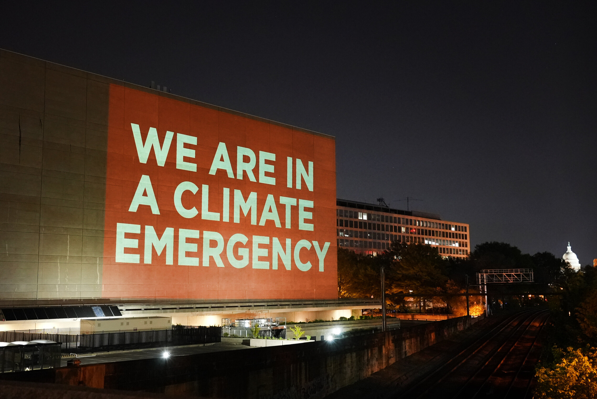
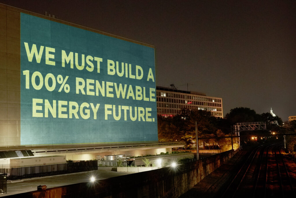
At the time of writing, there is six years, 267 days, 16 hours, 25 minutes and 57 seconds to stop the clock, so to speak, before the environment faces catastrophic events. Of course, by the time this goes to print, that number will be less. And in September 2020, when two artists, Gan Golan and Andrew Boyd, unveiled their ‘Climate Clock’ in New York, there were seven years remaining. The clock, plastered on the side of a building in New York’s Union Square, shows two figures. The first, in red, shows the time remaining to reach the 1.5 degree target, set by the Mercator Research Institute on Global Commons and Climate Change, which would provoke devastating environmental disasters around the world. The second, in green, shows the percentage of energy produced using renewable energy; our lifeline, as it were. 

The clock replaces Metronome, an LED public art installation unveiled in 1999 by the artists, Kristin Jones and Andrew Ginzel, that shows the length of time to, and from, midnight in a 24 hour cycle. As it happened, the artists behind the original public artwork had been looking to address the climate crisis through this work. Utilising the existing technology, the display was temporarily reprogrammed for the duration of Climate Week, ending on 27th September. For now, the Climate Clock remains in situ – that is, of course, unless it reaches zero.

Following the birth of his daughter (igniting a sense of urgency around the climate crisis) Gan Golan approached Andrew Boyd, to collaborate on the project. They had previously made a Climate Clock before, but on a much smaller scale. Nine days before the activist, Greta Thunberg, appeared at the UN Climate Action Summit in 2019, the pair were approached by email. “Greta wants a clock,” it read. They were able to band together enough coders, designers, artists and the like to make the clock in time for the summit, which was ultimately barred from being brought into the event by UN security. As the affair is summarised on Climate Clock’s website: “Oh, come on! It’s just a block with LED digits furiously counting down. Does that really look so much like a bomb?! Oh. Right. Well, that’s probably because it is a bomb! Or at least the symbol of a bomb. A slow-motion carbon time-bomb we are dropping on ourselves and all of Nature.”

The launch of the Climate Clock in New York chimed with the world in a much bigger way than Gan and Andrew had perhaps anticipated. And in the six or so months since its unveiling, smaller Climate Clock initiatives have launched across the globe. The first clock in Kazakhstan was turned on in January, another is planned in Glasgow to coincide with the United Nations Climate Change Conference (COP26) in November, and there are plans for one in the Bay Area – to name just three. Climate activism is not a recent phenomenon, but the past few years have undoubtedly seen an acceleration in their coverage, influence and engagement. 

The first Earth Day was marked on 22nd April 1970, during which 20 million Americans mobilised to voice their concerns for the direction in which the climate was headed. Every year since, Earth Day has taken place on the same day. The origins of Earth Day date back further, however, arguably to the publication of Silent Spring in 1962. The books author, Rachel Carson, rang the alarm bells that the twentieth-century way of life was having a devastating impact on the environment. Petrol guzzling engines; the acceleration of mass-production; the use of pesticides. Up until that moment, the world was somewhat unaware of the consequences of their behaviour on the environment, the eco system and on their own health.

Ahead of Earth Day 2021, NR Magazine partnered with Gan, Andrew and the Climate Clock team to highlight the urgency of addressing the climate crisis. We spoke with representatives from three of the satellite projects, in Kazakhstan, Glasgow and the Bay Area, to learn more about what drew them to the Climate Clock, and how their involvement is creating change within their local environments. The full video discussion, which took place over Zoom, will be unveiled on 22nd April, but below is a condensed and edited summary of the issues covered.

The three representatives, Meruyert from Almaty, Kazakhstan, James from Guildford, UK, and Kim from San Francisco, US, are all at different stages of their Climate Clock journey. ‘I saw the clock that they’d set up in New York over social media […] and it caught my attention,’ James explains. He recognised its huge potential to raise awareness about the upcoming COP26 summit throughout the country ‘because,

“not many people in the UK actually know it’s happening or what it is, which is not a good sign because that means that people around the world probably don’t know it’s happening either.”

For Meruyert and Kim, seeing the New York clock on social media helped sow the seed amongst their teams, too.
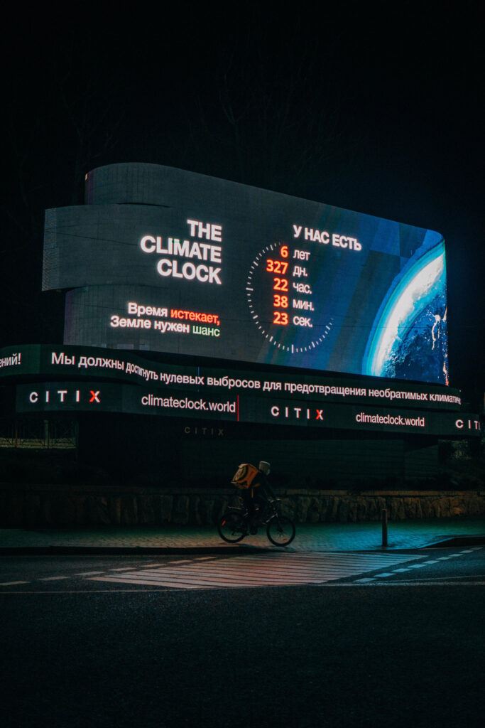
‘One of the team members, Galiya, found out that we could also put a Climate Clock in our city – in our country,’ Meruyert says. They began as a team of four, working to put up the ‘third biggest Climate Clock’ and the first in Asia. ‘It was crazy, it was huge […] And now, we’re doing new movements [and] projects in our community and getting into the eco activist life.’ Not long before the Zoom call, the Kazakhstan team welcomed their sixth team member. For Kim in the Bay Area, though, it’s currently just her and her friend, Hannah, involved. They’re still early on in the process, but are committed to doing something about the Bay Area’s lack of any ‘[real] substantial symbol of action towards the climate crisis’. 

Though the ultimate goal of Climate Clock is to “flatten the climate curve” it’s interesting to hear the immediate concerns of the respective teams. The shadow cast by Silicon Valley over the Bay Area is one that needs to be addressed, quickly, for the local environment, as well as the world. ‘[These areas] have a such a large sphere of influence. There’s so many corporations and companies that can work towards a more sustainable future.’ Kim hopes a ‘butterfly effect’ will occur, and so her goal is to put pressure on those companies. 

For both Meruyert and James, their action is aimed more at politicians. As James explains, the hopes for the Glasgow Climate Clock around the time of COP26 is that it will address the ‘huge disparity between current levels of political ambition and what needs to happen.’ The idea being that the clock will help mobilise the public, and put pressure on politicians to draft up seriously-considered strategies and policies; words that have actions behind them.

“We have a big problem, in the UK at least, with politicians talking the talk and saying things at these international summits, but then actually, domestically, not really living up to that.”

That’s a sentiment Meruyert shares, and it was the empty words of political leaders in Kazakhstan that energised the team to get to work. ‘The interesting thing is the people in political power say that they need to take action, but they want us – the younger generation – to save the world, to save the country. But they’re the decision-makers.’ This disconnect spurred Meruyert and team on; ‘that was the urgency. And after researching all the information we were like, “We must get it. We need to do it.” So, we did it.’  

Another issue that all three teams have had to address is criticism that, if real change depends on political power, the Climate Clock only scares and intimates the public. ‘We’ve definitely had some tough questions and concerns raised,’ Kim recalls, adding that a community college she contacted about adding the Climate Clock’s widget to their website were worried it was ‘too similar to a Doomsday Clock and would actually push people away.’

After the installation of the clock in Almaty, Meruyert’s team approached officials in Nur-Sultan, the capital of Kazakhstan, about installing a clock there. The response was that they didn’t want ‘negative energy in big public places.’ But as all three point out, what’s more terrifying is the fact that the 1.5 degrees threshold could be crossed due to global inaction. ‘I feel that the climate issue [is at] a point where such an urgent symbol is needed,’ notes Kim. ‘We don’t have forever to fix the issue, and I think that the Climate Clock is meant to be intimidating because it’s supposed to pressure people to take action.’ 

Collaboration comes before fear-mongering, within the Climate Clock community and beyond. The teams meet virtually every Wednesday with Gan and Andrew and have access to training and mentoring to help them get their local campaigns off the ground. Kim mentions that herself and Hannah, for example, received advice from the Kazakhstan team on how to reach out to local partners. Unlike Kim and Meruyert, James has been a climate campaigner since the age of 13, and the team in Glasgow have also had discussions with other climate activist groups in the city and beyond, including Fridays For Future and YOUNGO, the UN’s youth climate constituency.

Acknowledging his relative experience as a climate campaigner, James asks Kim and Meruyert whether they’ll continue to be involved in similar work after Climate Clock. Both agree that, in one way or another they will – because the issue isn’t just going to disappear. But as we approach Earth Day 2021, what do the three team members hope to have achieved by Earth Day 2022? 

‘I hope we’ll have managed to successfully use [the Climate Clock] to mobilise young people in the UK ahead of COP26, and managed to push for ambitious enough action – and start to have that filter through into policy around the world. But hopefully, we can still use it to continue to generate momentum around the country and the world to hold politicians accountable to the decisions they’ve made at that summit, and make sure that actually translates into physical action rather than just words that were spoken that once, in November in Glasgow.’ – James
‘To change people’s minds at the local level. All around the world, people want to change the climate crisis. But a year from now, I guess, first of all, on a local level, we want as many people as we can to join our movement; to know and to educate themselves and to realise that it’s real. And second, is to get our team bigger and bigger. One year from now, I hope our movement will grow to a bigger movement, to bigger projects and to stop climate change.’ – Meruyert 

‘I really hope to grow the Bay Area team too. Right now, it’s just a team of two people, so having that help would be great. But, on a local level I think there needs to be more education, especially for the younger generation. Our goal with the Climate Clock on a local level is to educate those people and bring awareness to these issues. In a larger sense, the corporations and companies that I talked about earlier, just helping them, pushing them, towards a more sustainable future is […] one of our main priorities.’ – Kim 

Credits

Images · THE CLIMATE CLOCK
https://climateclock.world/

Goya Gumbani

“it’s like breakfast or dinner”

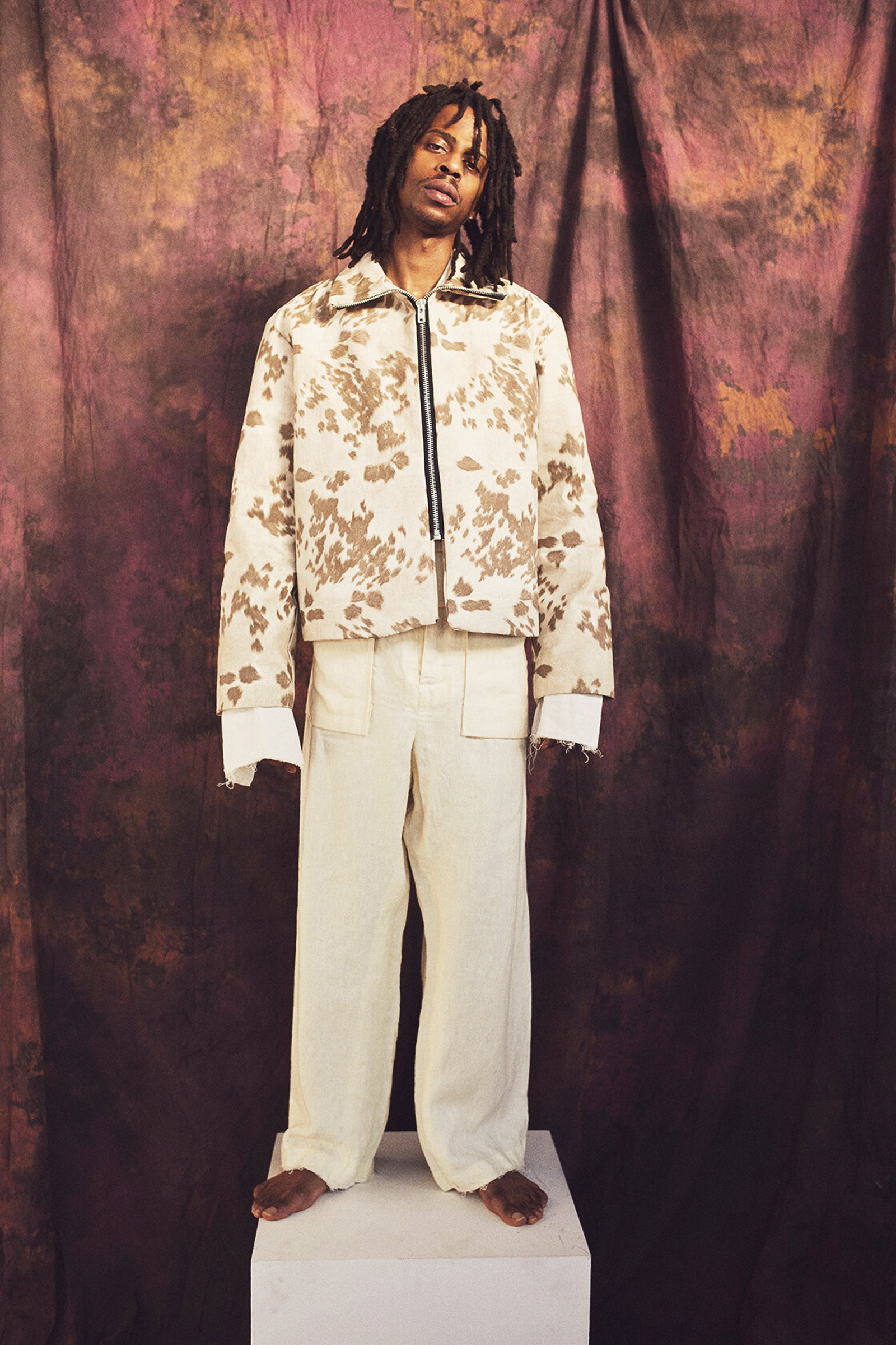
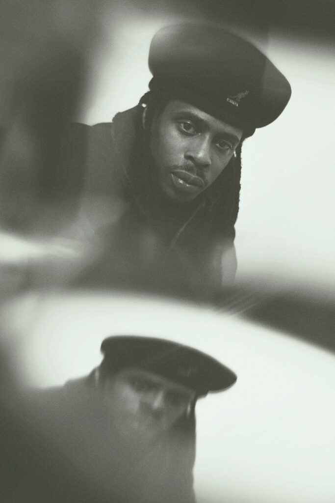
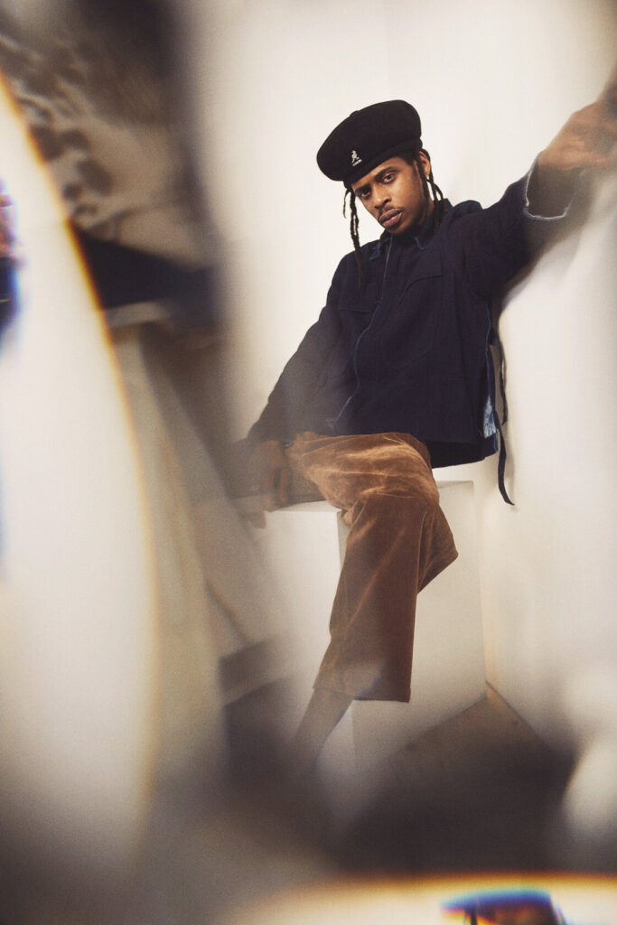
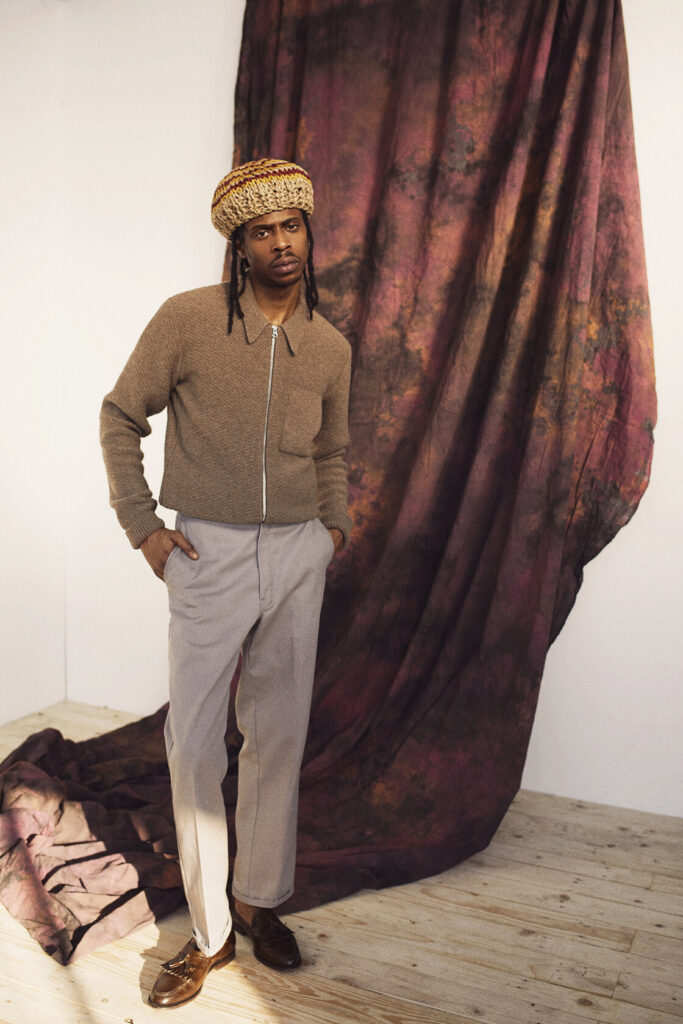
Born and raised in Brooklyn, rapper Goya Gumbani moved to London as a teenager. Landing a retail job at the London branch of Pharrell and Nigo’s streetwear label, Billionaire Boys Club, Goya joined a hub of fashion and music. The story goes that when the store closed, BBC would become a de facto studio – with industry heavyweights passing through its doors. Goya went on to pursue music, notably with the release of the 2018 EP, Morta & More Doves, but fashion has remained on his orbit. For one, he walked the Louis Vuitton AW presentation earlier this year – a far cry from ‘[modelling] in mad streetwear stores basements’ five years ago, as he shared on Twitter. Goya’s slick personal style is both an amalgamation of his inspirations (‘I like shit that looks 80s – pro Black, UK Reggae and Dub man from Brixton,’ he told BBC), and a visual embodiment of the London music scene that has come to influence his sound. Last year was a busy year for Goya, releasing five EPs with the likes of producer Oliver Palfreyman, on November’s six track EP Truth Be Sold, and with Bori on Steps Across the Pond from March (which got a limited edition vinyl pressing last month, a year after its release). Goya’s catalogue is consistent in its warmth. Often reflective and contemplative – and at times, existential – Goya’s vocals are perfectly matched to the soulful, hazy beats that are coming to define the artist’s sound. 

How do you set the pace of making music, and when do you know if something makes the cut for release?

I do this every day – at this point it’s like breakfast or dinner. I wake up and think about something music related. The making the cut process really just depends on where I’m at sonically or visually.

“Being from Brooklyn, living in London” is something of a tagline attached to your name. In terms of your sound, style and influence though, how do these elements come together?

They are both two great cities, they have both taught me different things from different perspectives. Both cities are in my DNA at this point, so they make me – if that makes sense.

I’d love to know if working at Billionaire Boys Club opened up your experience of London in different ways. How much of working there influenced your transition into music?

Yeah BBC was like a hub, everybody from every crack of the world used to pass through. So I met a lot of people in all fields, but most of the people I worked with there, also made music. I use to think I would just meet people to meet ‘em. But soon after, I realised you meet everyone for a reason. It’s not only to talk sweet nothings, but to build an grow to some degree.

At what point did you feel ready to share your music with people around you? 

Few years ago, I just had something I wanted to show, which kinda lead me to a place where I wasn’t fazed by my own self-doubt. 

I really love the EP covers/videos, and how they’re all quite different – is there any relationship between the music and the visuals you use? (If so, to what effect?)

The artwork and visuals are a lot. I feel like that’s gonna speak to you before you even hear anything. So it’s chosen with the intent to grab and leave wonder… Everything relates though; it’s all one big canvas of imagery that can speak on its own if needs be.

Besides appearing in the Louis Vuitton AW21 presentation, what defines ‘style’ and your style? 

Style is expression and personal touch to me. I worked in a couple menswear spots back in the day, so that gave me the knowledge into different eras and how style was a time stamp. But, my old boy Jack used to tell me: “if no one likes it, you going in the right direction”, Which I took as get dressed for yaself and you can’t go wrong. So that’s the motto.

What are you currently working on, and what can we expect from you this year?

I got a collab project coming out with [the producer] Subculture and a solo tape coming out this year I’m excited about. Few things with some familiar faces too… Oh and catch me on a few festival line ups!

Credits

Photography · DAVID REISS
Styling · SERGIO PEDRO
Creative Direction · NIMA HABIBZADEH AND JADE REMOVILLE
Interview · ELLIE BROWN

Rick Schatzberg

“conversations helped to create the atmosphere I needed to portray vulnerability”

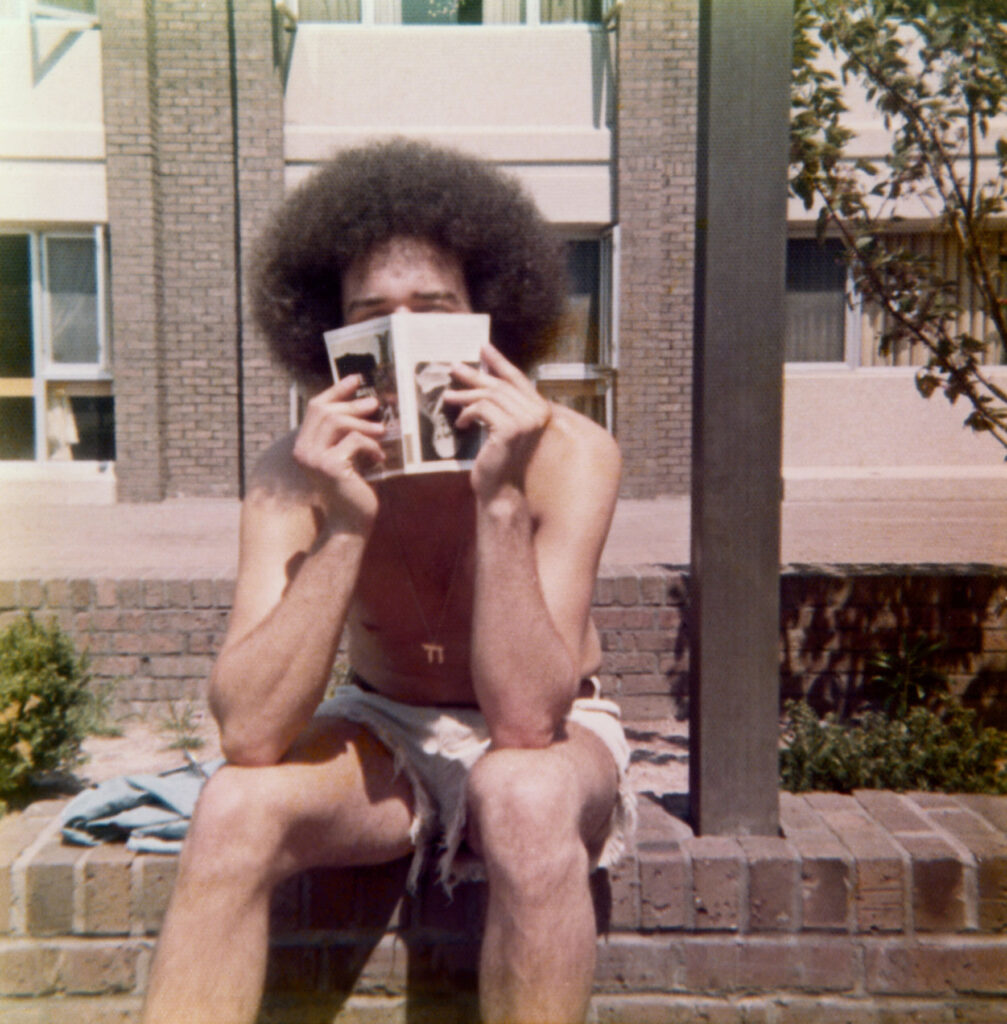
Rick Schatzberg grew up in a suburb of Long Island in the 1950s – a place constructed out of nothing but a post-war optimism for prosperity and abundance. A place that, by Rick’s own admission, was in reality, characterised by its monotony and it’s ‘nowhereness’. Surrounded by the comfort of middle class living, Rick and his friends discovered the world by hanging out in one another’s bedrooms, the local mall or a wooded area not far from their suburban enclave. As teenagers, the boys (as they came to be known amongst themselves) would experiment with alcohol and drugs, and hang out with girls; an upbringing unremarkable to anyone who wasn’t there at the time. As they grew older, the boys took on different careers. Rick moved to New York and became an entrepreneur, the others would become teachers, taxi drivers, salesmen, realtors and healthcare workers But they remained what Rick calls a ‘cohesive entity,’ eternally bound together by their childhood moniker.

The Boys, the second photobook by Rick Schatzberg, is the result of both his pivot into photography and the unexpected death of two of his friends in close succession. Confronted with the fragility of life, Rick began in earnest to take photographs of the remaining boys. Using a large format camera, the images of himself and his friends, now in their mid-60s, are a stark reminder of the passage of time. In and of themselves, Rick’s photographs are tender portraits capturing the toll of time and age on the human body. But in the book, these images are interspersed with snapshots and photographs from the boys’ youth. Aged bodies become youthful, smiling faces – hanging out, experimenting with weed. Though Rick is quick to outline that The Boys isn’t nostalgic, there’s something poignant in flicking through the book’s pages and recognising the quirks and characteristics of each of the boys as time passes by. Addressing the responses he’s had so far about the book, Rick sums this feeling up well in our interview below: ‘anemoia: nostalgia for a time or place you’ve never known’. Many of the old photographs included in the book are snapshots that had been forgotten about – forgotten in the almost immediate aftermath that they were taken. They raise questions of memory; can the boys even recall the time and place that the photograph puts them in?

Alongside the images, old and now, are twelve short texts. One is an email exchange between Rick and two of the boys trying to piece together the facts of a fight that happened at a wedding. Their recollections of what actually occurred differ; evidence of the unreliability of memory. To celebrate the release of the book, Rick spoke in conversation with the photography writer and curator, David Campany in early 2021. As well as discussing the subject matter of The Boys, something that came up as crucial to the book’s release is its design. As part of the book launch, Rick shared a video of himself going through the book to demonstrate that the large format photographs of his friends feature as fold out pages (something, he tells the audience via Zoom, his mentors and peers from his photography course advised against). But something that also stands out in the structure of the book is that the 12 texts Rick includes in The Boys read like snapshots themselves.

An accompanying essay to the book by the writer, Rick Moody, raises this point, writing about the ‘relationship between a still image and the kind of expressive power that we associate with narrative activity.’ In the context of The Boys, as a photobook, this takes on historical significance. Writing about the 1920s, a time of the proliferation of the photobook and the photo essay, the academic Andreas Huyssen describes how a new form of literature appeared.

The “modernist miniature”, popularised by novelists like Franz Kafka and critical thinkers like Walter Benjamin, sought to capture modern life with photographic precision through words. In that way, then, Rick’s book is much more than a selection of photographs of his peers – young and now old – it’s a reckoning with how we navigate time, memory and our existence through the lens of modern life.

How did your experience of studying photography influence The Boys?

My work on The Boys was influenced by my art school education in several ways. To begin with, the photography MFA program I was enrolled in at Hartford University, Connecticut, is heavily focused on photobooks, and I went knowing I’d be making one. I thought I already knew a fair amount about photobooks, but the breadth of what I was exposed to by teachers, guest artists, and student colleagues was eye-opening. I had to examine my motivations to make any work and to think about how I would make a book that wasn’t just a collection of interesting pictures, but something with substance and depth.

In grad school, one of the challenges of making work that you hope to eventually present to the world is interpreting and deciding what to do with the near constant feedback you receive. You go to art school to not be limited by your inclinations. But there’s also the danger of gearing your work for approval of teachers and fellow students. In the end, I had to absorb what was helpful and discard what wasn’t; making that distinction was sometimes a confusing struggle. 

At the virtual launch, you emphasised that this book had to be universal, and not nostalgic. What feedback have you had from people about The Boys? Does it differ from the boys themselves, those who come from the same place/time, and those with no real connection to the American suburb?

For me, the work is not really nostalgic; I feel that the almost forensic nature of the large format portraits grounds the work in the present. But I may have overstated my case against nostalgia a bit. The feedback has been consistent in that the work evokes an emotional response, which I find very gratifying. But judging from what people have written or told me, the way into the work has really varied. For some, the immediate connection is nostalgia for their youth or that time or place. For others, typically younger readers and often European, it may be anemoia: nostalgia for a time or place you’ve never known. (Like films and novels, photography is good at evoking this.) I’ve heard from people for whom the portrayal of enduring friendship was the hook, and after reading the book they either felt the urge to reach out to friends they have not been so attentive to or lamented that they didn’t have friendships that lasted into adulthood.

Obviously, this work is radically specific: a very particular group of white guys of a particular generation, raised in a very particular American suburban community.

“From the outset though, my feeling was that if this work isn’t felt to be universal then it’s a failure. Mortality, after all, is the bedrock of our biology.”

You mentioned the importance of collaboration in making the book – did this collaboration extend to your friends? Or did they feature just as subjects? Why did you use a large format camera for the portraits? 

I discussed the deeper underlying themes of the project – aging, loss, memory, mortality, friendship – with my friends during our photo sessions. Though my directions for posing were minimal, these conversations helped to create the atmosphere I needed to portray vulnerability. I also explained that I planned to use the work as the basis of my master’s thesis so they understood that there would be a critical audience for the work beyond our circle. Their attitudes went from gracious acceptance to genuine interest. It was as though they became partners with a stake in the outcome.

“It was clear that I would be making unheroic portraits that might not be flattering, and they understood there was good reason for doing so.”

The word that often came to mind in these photo sessions was ceremonial. Using a 4×5 film camera, with all its fussy rituals and storied traditions, felt performative and serious. The slow, cumbersome, and mysterious (to my subjects) process helped amplify the psychological intensity surrounding the project. In the face of our brothers’ deaths, together we were creating a formal certificate of presence (to use Roland Barthe’s expression), using traditional tools.

That said, it is was not a true collaboration because the power to select specific portraits for use in the book was mine alone. My friends did not even see the images I was choosing between, nor did they know how I would ultimately deploy the portraits in the book. They trusted me. It was important to assert my authorial voice, but without entirely drowning out the voices of my friends, which they asserted through the written word, their snapshots, and their gestures in the portraits.

We’re faced with the processes of ageing, time and mortality in The Boys – when returning to your childhood home and neighbourhood for the book, had the nowhere place you came from aged too?

In the winter, with the trees bare, the neighborhood looks very much like it did 50 years ago. In the warmer months the trees, mature and leafy, give the neighborhood a homier, more established feel. The automobiles in front of many of the homes are now more numerous and luxurious, probably more a sign of growing consumer credit and a shift in values than of greater wealth.

The short texts in The Boys read like snapshots, how and why did you choose the texts you include?

I was interested in constructing narratives to loosely link text and images that would stand as discrete memories – not stories as such but fragments that help tell the larger story. I chose to write short texts that could function in different ways: sometimes straight narrative; sometimes like vague, recovered memories; sometimes as meditations; and sometimes more as dream than narrative. The one outlier is the story about my father. I didn’t initially think to include this in the book. I was having a conversation with my editor and I related the story to her.

“She told me to write it down and as soon as I did, I knew it belonged in the book.”

In his essay, Rick Moody refers to a good photograph as one left in a drawer for 30 years. Did the archives of photographs of yourself and the Boys ever come to light in the intervening years leading up to the making of this book? If so, in what circumstances?

Several of the snapshots have been circulating for ten years or so on social media. Others, which I found loosely strewn in boxes stored away for years, may have been passed around shortly after they were taken but were mostly forgotten. Time conferred poignancy as Rick Moody describes, but curating enlarged full-bleed versions astride pictures of old men and stories of death, makes new meaning. Even the more familiar old snapshots felt like new discoveries.

Credits

Images · RICK SCHATZBERG
https://rickschatzberg.com/
Sumayya Vally

Sumayya Vally From The Johannesburg-Based Architectural Studio, Counterspace, On Amplifying The Lived Experiences Of Those Who Have Historically Been Overlooked

When Sumayya Vally founded the Johannesburg-based architectural studio Counterspace in 2015, it was against the backdrop of a deeply entrenched narrative of western hegemony. As an architectural student in South Africa, at the University of Pretoria and then the University of the Witwatersrand, Sumayya found the curriculum pivoted around a western worldview. And as the name implies, Counterspace seeks to redefine such a narrative, to amplify the lived experiences of those who have, historically, been overlooked. Earlier this year, Sumayya’s efforts to incorporate marginalised and underrepresented architectural ideas into an existing lexicon were internationally recognised when she was included as one of the TIME100’s most influential people.

Sumayya’s architectural perspective is one shaped by her experience growing up in a place less openly inclusive, though equally diverse. Now 30, Sumayya’s early life was spent in the final years of Apartheid-era Pretoria. And as child, she experienced first-hand the impact that architecture and design can have on people’s lives. As South Africa nears 30 years since Apartheid’s end, it’s a country that remains deeply segregated by race, class and wealth. Architecture and city planning is not an innocent bystander here and have been used throughout history as tools for control, subordination, and exclusion. Sumayya’s exposure to this complicated reality informs the interdisciplinary, and often imaginative, work that Counterspace does.

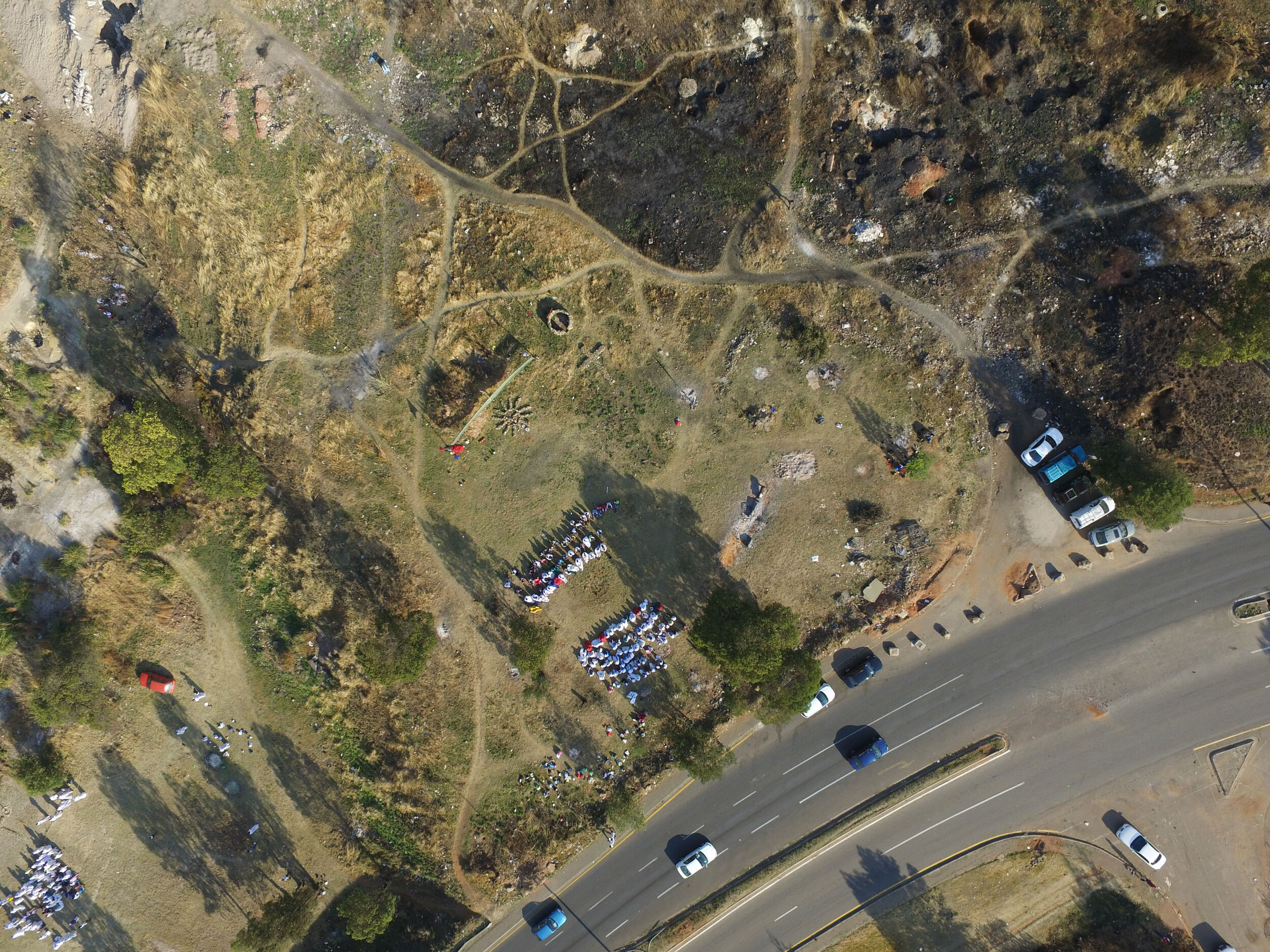
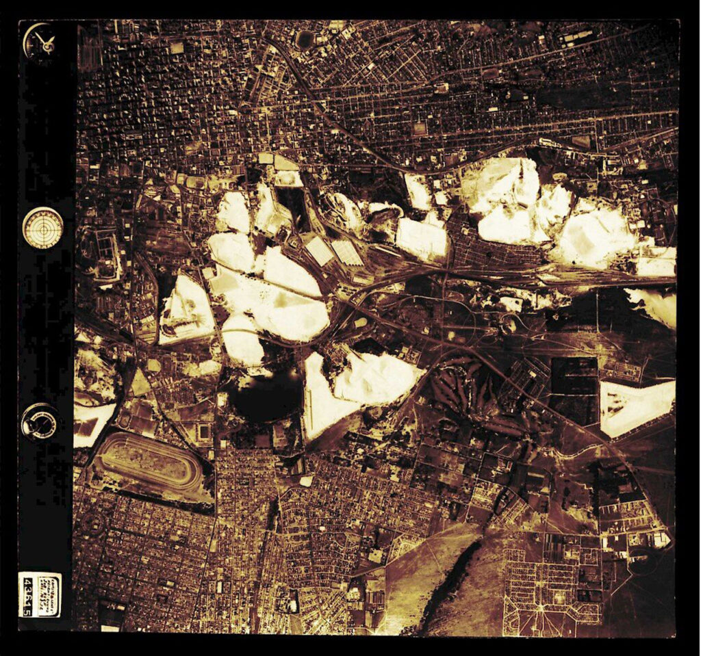
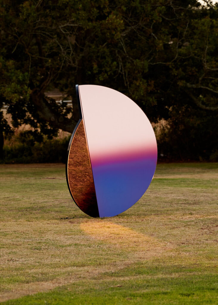
In 2019, the studio unveiled Folded Skies – a series of three sculptural structures made from interlocking tinted mirrors. The iridescent glow captured in the surfaces of the structures appears to represent the history of a city built on the vast gold deposits discovered in Johannesburg in the 1880s. While the legacy of this glittering past is reflected in the city’s colonial architecture, Folded Skies recalls instead the ecological aftermath of the gold rush. The city remains blighted by toxic pollution emanating from the equally vast number of waste dumps left behind from abandoned gold mines. The presence of these dumps is a reminder both of the aphorism that ‘everything that glitters is not gold’ and of the country’s history of segregation and suffering.

Johannesburg was a city divided right from the start, with mine-owners, wealthy from the gold rush, living separated, then segregated, lives from a black population who were eventually forced into townships in the city’s suburbs. The hangover of that gold discovery continues to wreak havoc. The large domineering heaps act as a physical barrier between rich and poor, black and white neighbourhoods; a reminder that segregation still exists. Toxic fumes from the dumps, which are themselves now being mined for the fragments of gold they may contain, are carried south by the wind, poisoning the black communities who live in their path – environmental racism in practise. Though human-made, the waste heaps demonstrate how materials can be used to control, to divide, to enslave people; as tools to construct a built environment, or as resources to build global trade.

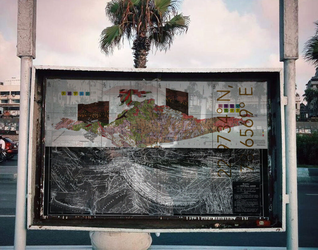
By engaging with Johannesburg’s complicated history, Sumayya and Counterspace’s practice is as much social history as it is about designing for a better future. Uhmlaba, a film made in collaboration with the Guggenheim Museum, will explore South Africa’s history of segregation using soil (as land) as both its catalyst and focus. The studio often uses film and photography (archival and contemporary) to animate their ideas; visual evidence to demonstrate the fluidity of life and people in an urban environment. And if Johannesburg exemplifies how the architecture is used to control and segregate, the architect’s plan cannot always anticipate the unpredictability of the lived city experience. Counterspace celebrates, and designs, with small acts of subversion in mind. And so, as Sumayya explains in our conversation below, a new approach to architecture and the way we look and engage with urban spaces begins with interweaving unheard and overlooked histories into the fabric of our built environments.

Would you be able to share some insight into the upcoming film Umhlaba?

Umhlaba translates to land in Zulu. The land in South Africa, like many places in the majority world has been implicated in our histories of movement, dispossession and displacement, empire and extraction. The film considers the depths, scales and layers of connection (and violences) in our relations to land – through the narration of recipes, stories and ingredients that become part of our cultures and constructions of belonging – to the violence of breathing toxic dust and the zoomed out segregation and separation of bodies from land in Apartheid city planning. The film is a collage of these various scales and entities, and weaves together connections and links between what was assumed unconnected and innocent.

How did you develop the approach that Counterspace takes through research, practice and pedagogy?

Johannesburg has served as a source of immense inspiration for the practice. Because so much of the city exists below the surface, so many ritual, economic and other practices have developed incredible resistances and are able to surface and exist, despite being excluded by our city’s histories and infrastructures. There is so much that lives beyond the limits of traditional planning, design and beyond the tools of the architectural plan, section and elevation. These ways of being invite us to imagine different ways to draw – to find tools to learn, absorb, understand, listen to and interpret our conditions. Many of them are aural, oral, atmospheric – which has given rise to drawing through film, performance, choreography, the digital, sonic and atmospheric field notes, temperature, colour, etc., to develop an expanded lexicon and ways of reading and seeing Johannesburg.

What informs your approach as an architect to incorporate performance, the medium of video/film, cultural histories into the practice?

Rituals, ways of being and the lives of people in my city – and this intent to draw, make visible, amplify and sharpen aspects of our histories and cultures that cannot be included in the traditional tools and ways of archiving that the discipline and the profession of architecture has inherited.

Counterspace’s work delves into materials like sand, soil, everyday detritus, so I’d love to know what you see as the cultural importance of “material”? 

I very much see materials as shifting earth and land; constantly being negotiated, reconstituted and reconfigured. Whether implicit or explicit, all projects stake a political claim in their approach to materials. I am very interested in the use of detritus, in traces and reconfigured leftovers, in how these give us a reading of our relationships to the earth. Materials are not neutral – everything, from cane and cotton, to concrete and gold – is a reading of our ties to each other and our histories (and consequential futures). I am also interested in blurring the binaries that we have drawn between ourselves and the world we are in, and a part of. Johannesburg has also given me an implicit desire to be resourceful and to piece together a lot with very little.

How do you navigate the kinds of architectural malpractices/Western authority that shaped the studio’s raison d’être?

I see my practice as an effort to realise design languages from places of difference – different ways of being and seeing, different histories and stories – and in that sense it has always existed tangentially to the dominant canon. I think things are changing now, but for a long time this meant that the work was quite invisible to the dominant canon. I very much see myself as part of a generation and a movement working to translate and embody our own positions of difference and bring a critical mass of them into the world. Any identity that is different to the dominant discourse is a lens with which to see the world from a different perspective – which is so needed, now more than ever.

It’s interesting to think of spaces where people gather as places that weren’t always envisioned as serving those very purposes. How did growing up around Johannesburg shape your understanding of this?

Our city, of course, has a history of clandestine meeting and organising – from pirate radio setups on kitchen tables to underground jazz during Apartheid. The city has such a divisive understanding of what public is and looks like. In many regards, we never had public spaces that are truly designed for everyone and that have truly drawn on our ways of being and our understandings and cultures of what ‘public’ is and looks like. But, in many other ways, the resilience of practices and gathering that exist outside of, and despite formal limitations, has been a revelation. Being able to see and read these, and learning from the atmospheres and spaces that are created by people and their practices of gathering and constructions of belonging – whether at a carwash, at a petrol station, for a lunchtime gathering, or church on a patch of leftover veld grass in the centre of the inner-city – has been deeply fundamental to my practice.


Ishiuchi Miyako

“Photography is the work of evoking time using light”

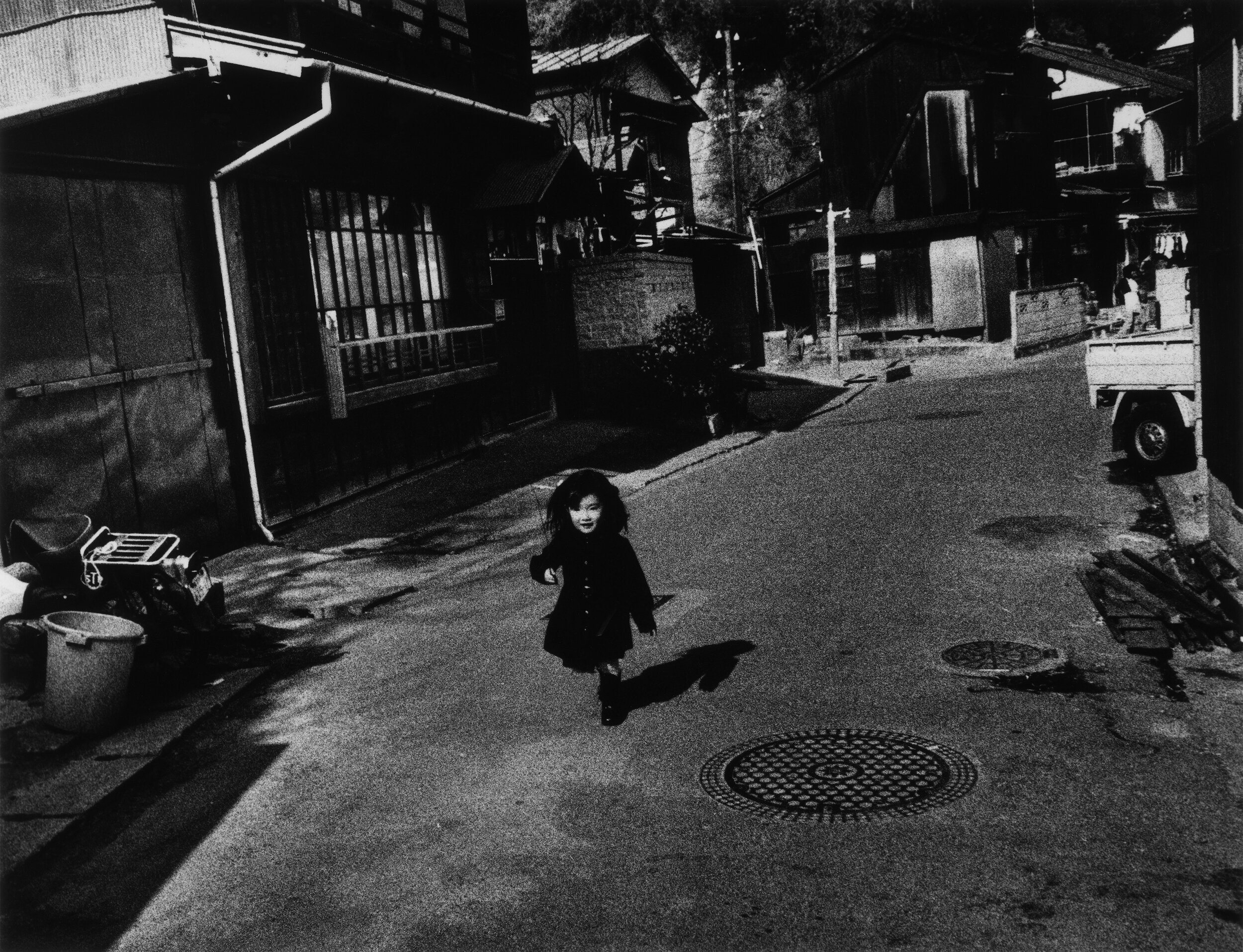
The photographer, Ishiuchi Miyako, grew up in the Japanese port city of Yokosuka in the aftermath of the World War II. Yokosuka is one of the largest overseas US Naval base, and it was against this backdrop that Ishiuchi Miyako grew up. She went on to study textiles and weaving in Tokyo in the late 1960s, and whilst there, discover a passion for photography. Ishiuchi Miyako returned to Yokosuka in the 1970s to confront the place that brought joy (in the form of American exports like jeans and pop music), fear and anger, as a city overrun by the – sometimes sinister –  pleasures of the military occupation. Once there, Ishiuchi Miyako began documenting the city in grainy black and white images that capture a place shrouded in confusion surrounding its identity. Her images are scenes of a Japanese urbanscape, that much is clear, but the lingering presence of Americanisms here and there in oftentimes deserted scenes feels alienating and menacing. Ishiuchi Miyako titled this body of work Yokosuka Story after a hit Japanese pop song, and its release as a book in 1979 launched her career in a male-dominated field. 

Ishiuchi Miyako would later create a series of work around the time of her 40th birthday, in which she contacted women of the same age to photograph their hands, feet and bodies up close. The work, 1∙9∙4∙7, captures imperfections, wrinkles, and scars as evidence of the life’s impression on the human form, not quite young but not old either. What is striking about Ishiuchi Miyako’s photography is that many of her projects seem to inform the next body of work. After the book publication of 1∙9∙4∙7 in 1990, Ishiuchi Miyako turned her attention to another series, Scars – a tender exploration of scarred bodies. One particularly striking image, Scars #13 (Accident 1976), shows a woman’s torso in soft focus; a lengthy scar etched into the natural dip of her stomach. ‘While a person hopes to remain unblemished through life, we must all sustain and live with wounds, visible and invisible,’ the photographer explains in the afterword of the 2005 book, Scars; ‘It is an imprint of the past, welded onto a part of the body.’ 

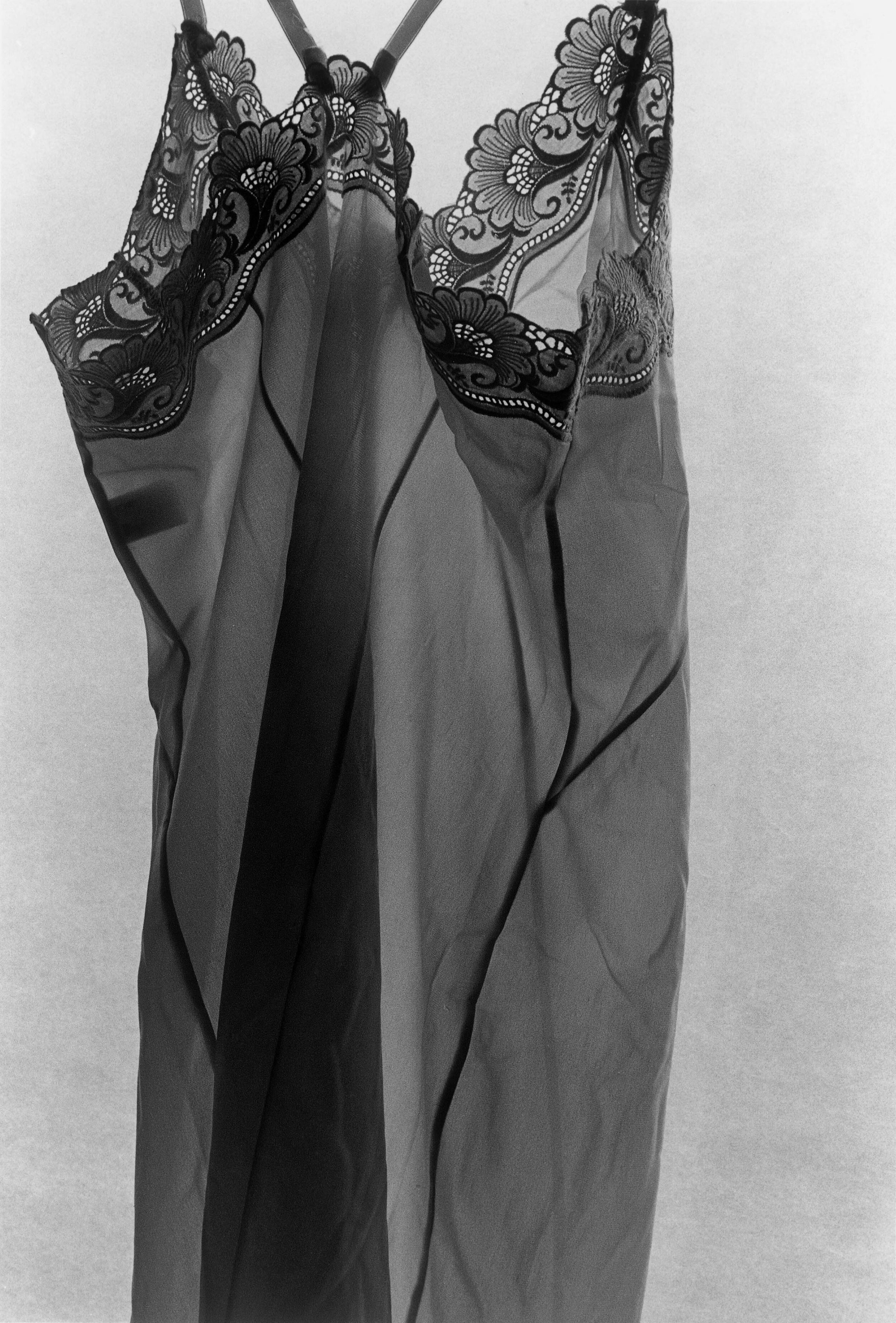
In 2000, when Ishiuchi Miyako had been working on the Scars series for almost a decade, she persuaded her mother to take part – hoping to document scars from a cooking accident that left their mark on a large part of her body. Unbeknownst to both Ishiuchi Miyako and her mother however, the latter would be diagnosed with liver cancer not long after the photographs were taken and died within a short space of time. Left with her deceased mother’s belongings, Ishiuchi Miyako began working on her next series, Mother’s. In attempting to grapple with the grief she was experiencing, coupled with a complicated relationship with her parent, Ishiuchi Miyako turned to photographing the shoes, underwear, dentures and make up left behind. A hairbrush is captured with strands of her mother’s hair still entangled in its spokes. In one image, Ishiuchi Miyako photographs a snapshot of her mother from the 1940s stood in front of a vehicle. Her mother drove an ammunition truck during the war; another reminder of Japan’s fraught history.

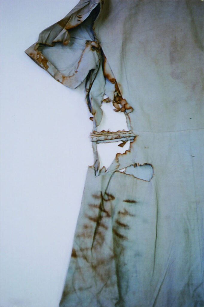
Mother’s was shown in the Japanese pavilion at the 2005 Venice Biennale; it was after that that the photographer was approached by the Hiroshima Peace Memorial Museum to photograph clothing and accessories belonging to the victims of the atomic bomb. Without the familial connection to the belongings of a parent, in hiroshima, Ishiuchi Miyako forges a relationship with the objects themselves. For the series, the photographer carefully positioned each item of clothing – sometimes talking to them, the curator of the museum told Getty in 2015. The images are beautiful, affording an almost anthropomorphic feeling to a dress or a blouse. But these images are hard to look at too; after noticing the detail of a collar, intricate needlework or the vividness of a print, the eye turns to the tears and charring in the fabric. As Makeda Best, Curator of Photography at Harvard Art Museums, wrote in 2015, ‘These “scars” on the fabric serve as metaphors for the bodies of bomb victims and of a nation.’

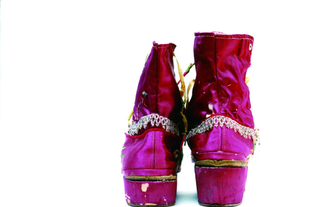
Following hiroshima, Ishiuchi was commissioned by the Museo Frida Kahlo in 2013 to photograph 300 of the artist’s belongings, sealed in the bathroom of her home in Mexico until 2004. The result is a body of work that both forms a bond with the clothing of someone the photographer never knew, and begins to build an impression of a woman’s life. Over the course of her career, Ishiuchi Miyako’s photography has worked to leverage an intimate portrayal of women and womanhood, of time, suffering, loss and memory, into a world of brutality and hardship. 

Has your outlook as a photographer changed over time? 

Photography has always been a product of its time, and has always changed with the times. My photographs may change in superficial terms, but what I am basically expressing and my mentality remain unchanged.

You mention that it was photographing your mother’s lipstick that led you to take colour photography. What difference is there between shooting in B&W and colour, and what impact does this have on the final image? 

I can do every step by myself when I’m working in black and white. My ideal here has been to take full responsibility for every stage: shooting, developing, printing. When I’m working in colour, I just take the photographs and have the rest of the work done at a lab. When I started doing this, it was very refreshing to have the works be out of my hands and be able to look at them more objectively.

With black and white, I felt like I was clinging to the photographs throughout the entire process. When I started working in colour, I felt in a way as if I had been liberated from photography. Black and white is a world of artistic creation, while colour is the world of everyday life. At the same time, both black and white and colour are just approaches, and it doesn’t matter which you use.

The photographs of Yokosuka are commended for their grainy texture. What are the attributes that make a powerful image? 

The Yokosuka photographs are not intended to have a powerful impact. When I printed my first photograph, I realized that a photograph is a collection of ink grains on paper. I wanted to print those particles properly, so I developed the film at a high temperature. Grains are like units of time, and I tried to make prints as if I were counting them one by one.

I like the analogy between your background in weaving and the process of photographic development.

Do you think there’s something similar with the photographs themselves; weaving moments of time into history? 

Photography and textiles are very similar – they are both water works. It was a revelation to me that the colour-fixing liquid used for dyeing yarn and the stopping liquid used for photography are the same thing. Making textiles is very labour-intensive work. Photography is the work of evoking time using light. Both of them are jobs done by hand.

A lot of your work involves photographs of objects and possessions. Do you see photographs as being objects and possessions too? 

“A photograph is a narrative that documents and renders memory visible in two dimensions, transcending objects and possessions.”

Photographed subjects are given new value and meaning, and by becoming part of a photograph they become almost eternal.

Did you take a different approach photographing the possessions of your mother and Frida Kahlo, compared with the clothing of Hiroshima victims (whose identity we might not know)? 

/hiroshima, Mother’s, and Frida all share the same intent in that they focus on what has been left behind. I took the same approach to photographing these three subjects, but Mother’s began as my own personal project, then after being shown at the Venice Biennale it became a photographic work that transcends my own personal concerns, expanding from the private to the public. This later shaped the specific development of /hiroshima and Frida.

I find it interesting that you don’t attach messages or captions to your photographs. How does that relate to the objects (clothing/possessions) that you photograph? Do you try to interpret the meaning that their original owner gave them? 

I consider my photographs to be creative rather than documentary, and I take them from my own point of view and with my own values. I believe that adding a message or caption to my photos would take away the viewer’s freedom of thought. I want people to be free to see my photos from their own perspectives, and to attach their own words to them. 

I cannot photograph the past. My work is based on encounters with things left over from the past, but which are in front of me, in the same space and time, in the reality through which I am living in now. In particular, the bombed artefacts of Hiroshima cannot become part of the past.

/hiroshima is very different to Yokosuka Story – how do they capture the aftermath of the war in Japan and the country’s relationship with America? 

I made my debut with Yokosuka Story, a series that is kind of a personal sentimental journey.

“I was born in the post-war era and spent my adolescence in a community with an American military base, and I enlarged these prints to exorcise emotions like scars I felt I had received from the Occupied Japan city of Yokosuka.”

There is a connection between Yokosuka and the history of the atomic bomb dropped on Hiroshima, which played a huge role in ending the war, and which I documented about 30 years later. Yokosuka still serves as the home port for Asia’s largest nuclear-powered aircraft carrier. The post-war period is not yet over, and the reality is that Japan is still under US control. My photographic work, which started in Yokosuka, inevitably turned toward Hiroshima, and /hiroshima is still an ongoing project.

Credits

Images · ISHIUCHI MIYAKO
Special Thanks · THE THIRD GALLERY AYA

Ewe Studio

“A horizontal approach of mutual learning, to promote and to translate a skill or knowledge into new meanings and possibilities”

Based in Mexico City, EWE is a design studio that celebrates the country’s rich history of artisanal practice. Tradition is interwoven with new ideas, combining innovation with heritage. The studio was started in 2017 by the Estonian curator, Age Salajõ, Mexican designer Héctor Esrawe, and Spanish industrial designer, Manu Bañó, whose varied backgrounds and expertise allow for their creative approach.

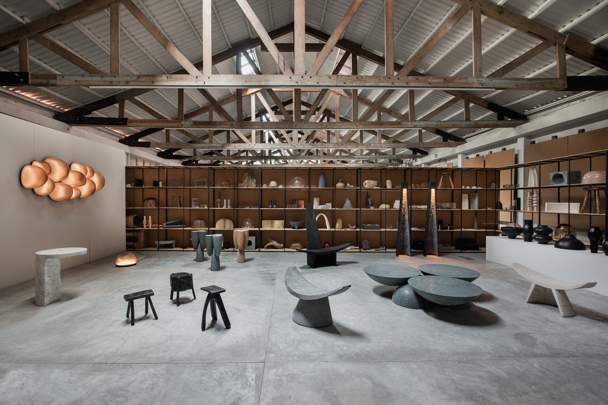
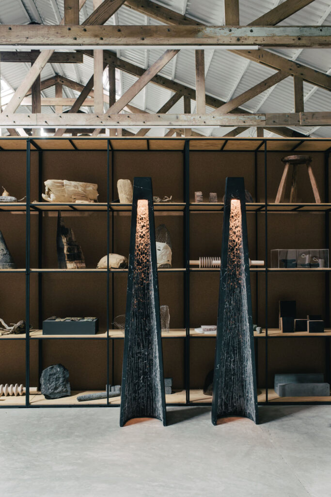
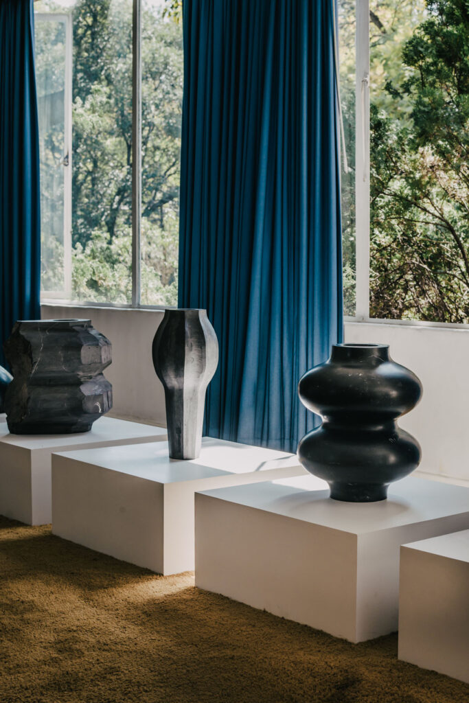
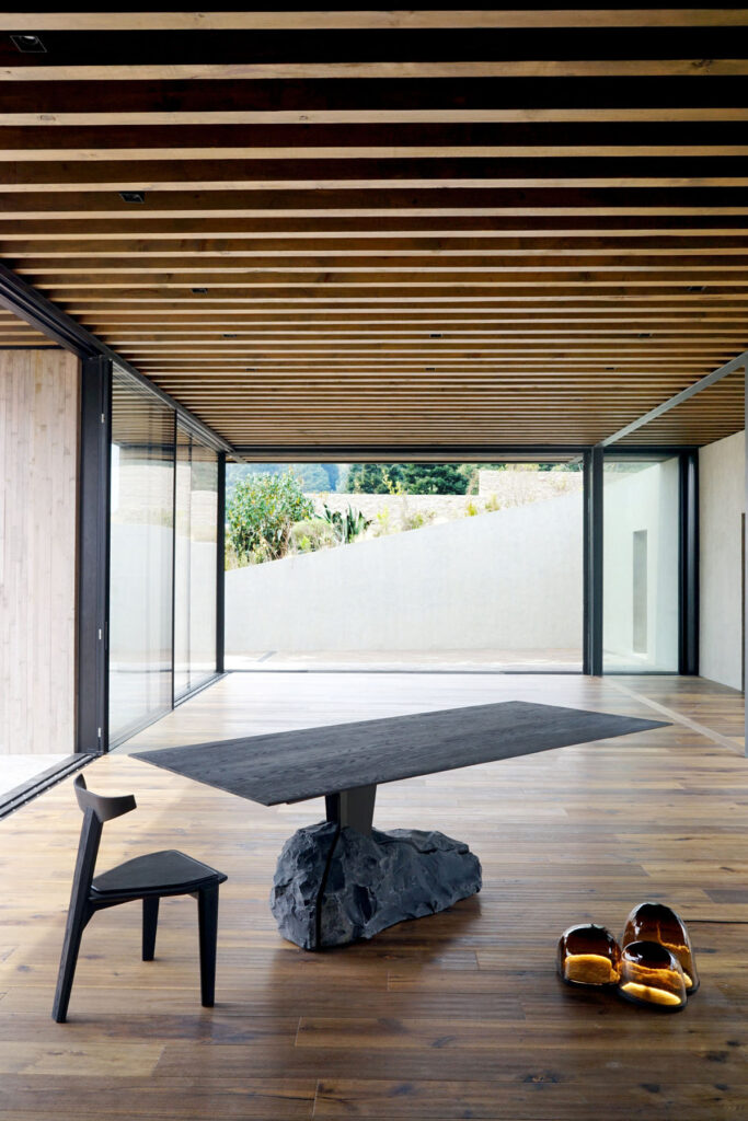
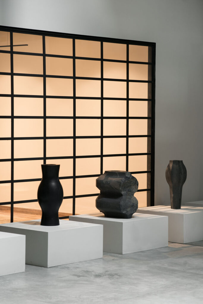
Their work falls somewhere between furniture and sculpture; beautifully-crafted objects that are also technically functional. By amplifying the skill of craftsmanship and the craftsman, their work is inherently collaborative – working with Mexican specialists to create ornate, yet organic, objects. The forms, shapes, colours and textures of their pieces recall the natural elements, something that is reflected in the studio’s approach to using four main processes – glass, stone, foundry work and wood.

EWE Studio’s limited-edition collections are part of a move in recent years to put Mexico on the world stage of design. Here, they explain how their process works and the inspirations that inform the studio’s approach to craft, heritage and their objects.

How do your different backgrounds and experiences influence the work of EWE Studio? 

What has made EWE a unique project is that combination; our origin, the skills, our individual knowledge and sensibilities. Our background and experiences are reflected in the way we approach everyday solutions, and through an open dialogue where those individual differences work towards a solution. 

How does collaboration tie into your work as a studio, and also with artisans in Mexico? 

Collaboration is an essential part of our philosophy, it is the axis of our project. A horizontal approach of mutual learning, to promote and to translate a skill or knowledge into new meanings and possibilities.

How do the four main processes you use (glass, stone, foundry, wood) individually and collectively represent the ethos of EWE Studio?

Those four have, so far, represented the expression of EWE, which by being a young company has created an aura focused on those materials. [That said] we are experimenting with many more materials.

What inspires the form and textures of your work at EWE Studio?

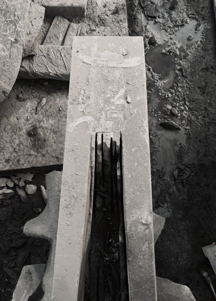
The forms and textures come from many angles; our heritage, the material itself, the sensibility to understand new possibilities out of a “found” moment or expression during visits to the workshops. We forge our inspiration from Mexican history and create new meanings and languages from that inspiration point. We love to mix raw and pristine textures and often keep parts of the stone surfaces as we found them. 

Since the studio began, have you adapted your processes for working together? How do you see the studio progressing and growing?

We have maintained the same creative process, with a deeper understanding of the soul of EWE. The studio has evolved, allowing us to integrate a small team in our everyday life besides design activities. We have assigned the efforts of production, administration, sales to each one of us. 

The three of us work very tightly together and with our team. We communicate throughout the day and are very much in the loop with different aspects of the studio. We regularly hold design meetings to create new work, but after that we all have different roles we play. EWE is a young studio but we have been fortunate to work with different galleries from around the world who are promoting and selling our work. 

Your pieces are a mix of sculpture and object – how do you see them being used?

They are pieces with an iconic and strong expression – pieces with character. Most of them are reinterpretations of an utilitarian background or a reminiscence of it. Many of our clients use them; some of them have them for contemplation. Even though we aim to create sculptural design, they are all functional. Even if the line between design and sculpture is blurry.

And how do you distinguish these pieces between art and design – does that matter?

From the start, EWE has been focused on promoting the skills of the artisans and create a dialogue with our heritage. Most of our inspirations comes from a utilitarian background, from elements that were used in ceremonies and/or worship.

Credits

Images · EWE STUDIO
https://ewe-studio.com/

Rina Yang

“the pandemic happened, and I think the drama world struggled more than commercials”

When she was younger, Rina Yang would keep in contact with her best friend in London by making, editing and sending ‘video letters’ from her hometown in Japan. Rina later moved to London to study and while there, saw an ad for a film school. The course was mostly theory with very little practical work, she told Lecture in Progress in 2017, but nonetheless gave her a reason to remain in the UK. Rina’s first roles in the industry involved working as a camera assistant on short projects. ‘I only did it properly for a couple of years,’ because as she tells me over the phone, it was a stressful role. But she did find common ground talking to directors during breaks about the creative processes behind the work. ‘I was better at that, than looking after the camera.’ And so, she pivoted – cutting her teeth in music video and short films jobs that her friends would ask her to work on. ‘One thing led to another,’ Rina adds – and she was able to carve out a space for herself as a director of photography (DP), a notoriously difficult role to break into and succeed in.

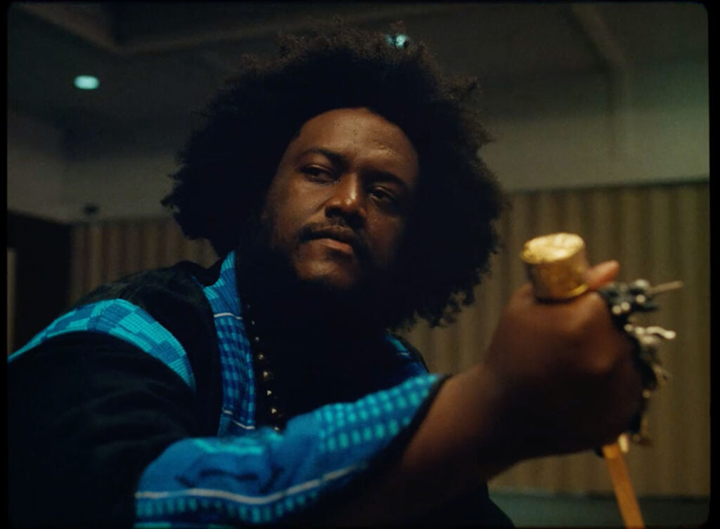
As a DP, Rina has worked on music videos for artists including Kamasi Washington, Vince Staples, Björk and FKA twigs (including the “controversial” and “risqué” ‘do you believe in more’ advertisement that twigs directed and soundtracked for Nike in 2017). Rina regularly balances projects across music videos, commercials and narrative work, a crossover she tells me is quite uncommon. And though her approach may differ depending on the project, her work consistently demonstrates an aptitude and eye for capturing the people and characters in front of the camera. A scene from the BBC’s Windrush drama, Sitting in Limbo, from last year, or the third series of Top Boy (for which Rina shot a number of episodes) are as beautiful and captivating as, say, a Rimowa commercial with Adwoa Aboah or her work for Sephora. 

Rina’s talent and vision as a DP have made her a sought after name in the industry – even at such an early point in her career. She was named by British Vogue as one of the 14 rising stars in the creative industries back in February, described as a “New Wave of boundary-breaking visionaries bringing fresh, exciting perspectives to the creative industries”. Her portrait to accompany the piece was shot by Campbell Addy who, like Rina, is part of a new vanguard of young talent. Last year, Rina was also included in the BAFTA Breakthrough list for 2020. Being recognised by organisations like BAFTA is great, Rina tells me, but it’s not something she’s had much time to think about, ‘I haven’t properly got my head around it.’ But, she adds, she definitely feels as though she’s at an interesting point in her career. That said, having faired the storm caused by the pandemic, Rina is now remarkably well-placed to continue to grow and nurture her skill. 

You’ve done a lot of commercial work with the likes of Nike, Rimowa and many others, and TV work for shows like Sitting in Limbo and Top Boy. How do you balance the different projects you work on? Is there something specific that draws you in?

I think the selection of the projects really comes down to your personal taste and what you find interesting. When I do commercials, I’m less selective because it is a very short commitment, and it’s a good opportunity to meet new directors and new collaborators. So I’m less picky and I’ll take the risk to work with new people. When it comes to narrative, it’s a whole different conversation. There’s a lot more boxes to tick to see if it’s the right project to do. It’s a different process, but I do like doing both. With my narrative work, you get paid less but I think it’s more of a romantic thing.

With that said, I love that your commercial work don’t just feel like adverts. They’re like short stories in their own way.

The directors and all the creatives I’m drawn to tend to have that kind of style. I don’t find the very straight up advertising that interesting. I mean, to be honest, sometimes we just do very boring commercials. You just don’t shout about it. But I think the ones that I get to shoot, they tend to be creative ads with slight narrative threads. And I’m grateful that I’ve been able to shoot some of them. You kind of flex your narrative muscle a little bit, but it’s a very different working environment in commercial compared to narrative. 

You’ve got a very distinctive use of colour, texture and lighting. How did you develop that style? 

When I started out my style was a bit more documentary because it’s hard to afford to do a big lighting setup. But even with documentary style, I don’t want it to look like what it looks like with the naked eye. So I try to heighten what you see, by using different lenses, or how you expose the sensor or the film – to add your take on the reality you see. 

As I progressed in my career, I could afford to have a good crew with me and all these big lights. And I guess that’s when I started using a bit more colour. I did go through a period of using a lot of colours because I kept getting asked to do that. I think with any artist or DP, we’re versatile so it’s nice not to get pigeonholed into one look. In general, I like to heighten the reality of a scene, and I think, “what if I did this” – I talk about a lot of what ifs, and still do some colourful lighting here and there.

So as a DP, how do you tell a story and create narrative?

How would I tell a good story? First of all, there has to be a good script, and there has to be a good director to execute that. I can only advise how I think we could shoot things, or collaborate with the director. In the beginning when I started out, it was quite hard to find directors on that level. One the hardest things in the beginning is to find a director who can execute the narrative in the way you see it, or better than how you imagined it. So I think I really collaborate with my directors, talk about how we see it. 

I guess it’s such a collaborative process; you’ve got to be able to work together well.

Yeah, definitely. The level of collaboration is different in music videos, commercials and narrative. With commercial, they tend to come with already established ideas –  with exactly how they want it to look because they’ve gone through a lot of chats with the clients and agency, and they tend to have have every exact visual references that I will need to execute. So there’s no huge room for us to create the look from scratch. And then music videos, you can be a little bit more funky with it. And with narrative, if it’s a TV show and you’re the first block DP, you can create the look with your director and showrunner. If you’re coming into the TV show in the middle of it, then you have to replicate what’s been established. And then if it’s a movie, there’s a lot more room to experiment. That’s why a lot of DPs prefer to do movies and the first block of TV shows. 

Has the pandemic changed your work process and schedule much over the past year?

Before the pandemic, I was going to shoot TV shows or films in 2020. I was shooting a lot of commercials early in the year because I was going to work hard on commercials until the spring, so I could afford to do a film or TV show that I like. But then the pandemic happened, and I think the drama world struggled more than commercials, so they’ve been on pause for a lot longer than advertising. Now, I’m reading scripts and trying to decide what narrative projects I should do next. This past year has been an interesting switch I think, because I was going to shoot a drama this year, and after doing commercial for a year, I’m really ready to shoot another long project, TV show or movie. 

Does it help having the balance of both commercial and narrative work, and being able to fall back on one or the other?

For sure – I take influence from both commercial and narrative. But, you know, I do switch my brain; if I’m pitching for a film, I’ll switch my brain to a narrative aesthetic and approach. My visual references would be quite different from what I would put in for commercial work because I think the commercial world is more like eye candy. It has to be catchy because we only have a minute or so to tell something. You have to say something in a very short amount of time. But when it comes to narrative, there’s a lot more room to grow and develop.

Credits

Images · RINA YANG

Anne Holtrop

“The driving force behind both temporary and permanent work is similar; it’s about the performance.”

Dutch architect Anne Holtrop started his eponymous studio in 2009. Anne designed the Bahrain pavilion for the World Expo in 2015, without having visited the country beforehand. Now, the architect divides his time between his hometown, Amsterdam, the Kingdom of Bahrain, where he is working to refurbish heritage sites, and as a Professor of Architecture at the ETH in Zürich, Switzerland. Anne’s work spans temporary installation to permanent structures, but it is his use of tactile and organic materials for which the studio is both recognised, and recognisable. Having started out as an assistant to Krijn de Koning, the Dutch artist known for his site specific installations, Anne’s first project was the Trail House in Almere. As part of an exhibition by the Museum De Paviljoens in 2010, the installation consists of a series of paths that make up the house’s structure – described as ‘A house that curls, bends and splits through the [vegetal] landscape’ surrounding it.

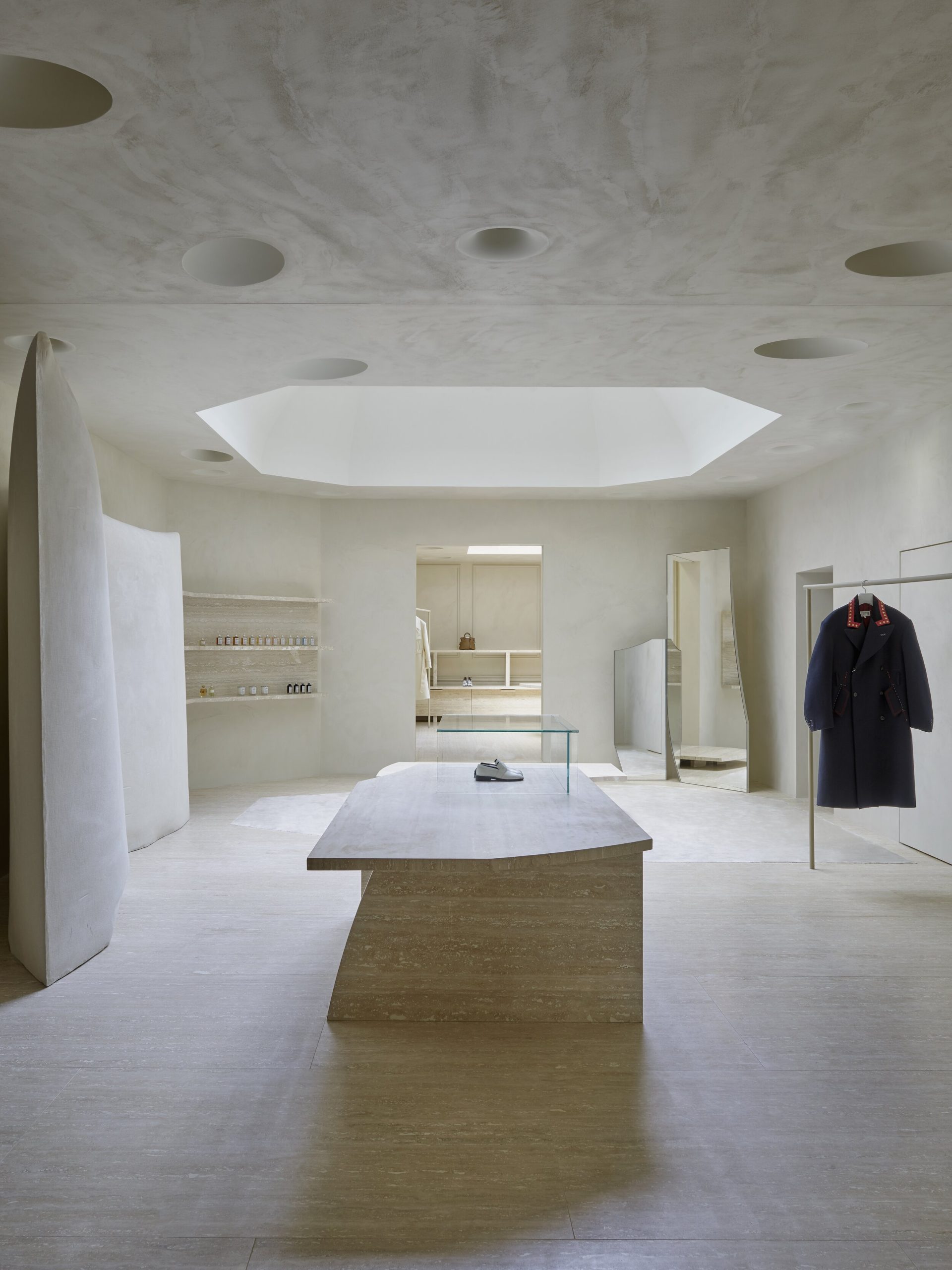
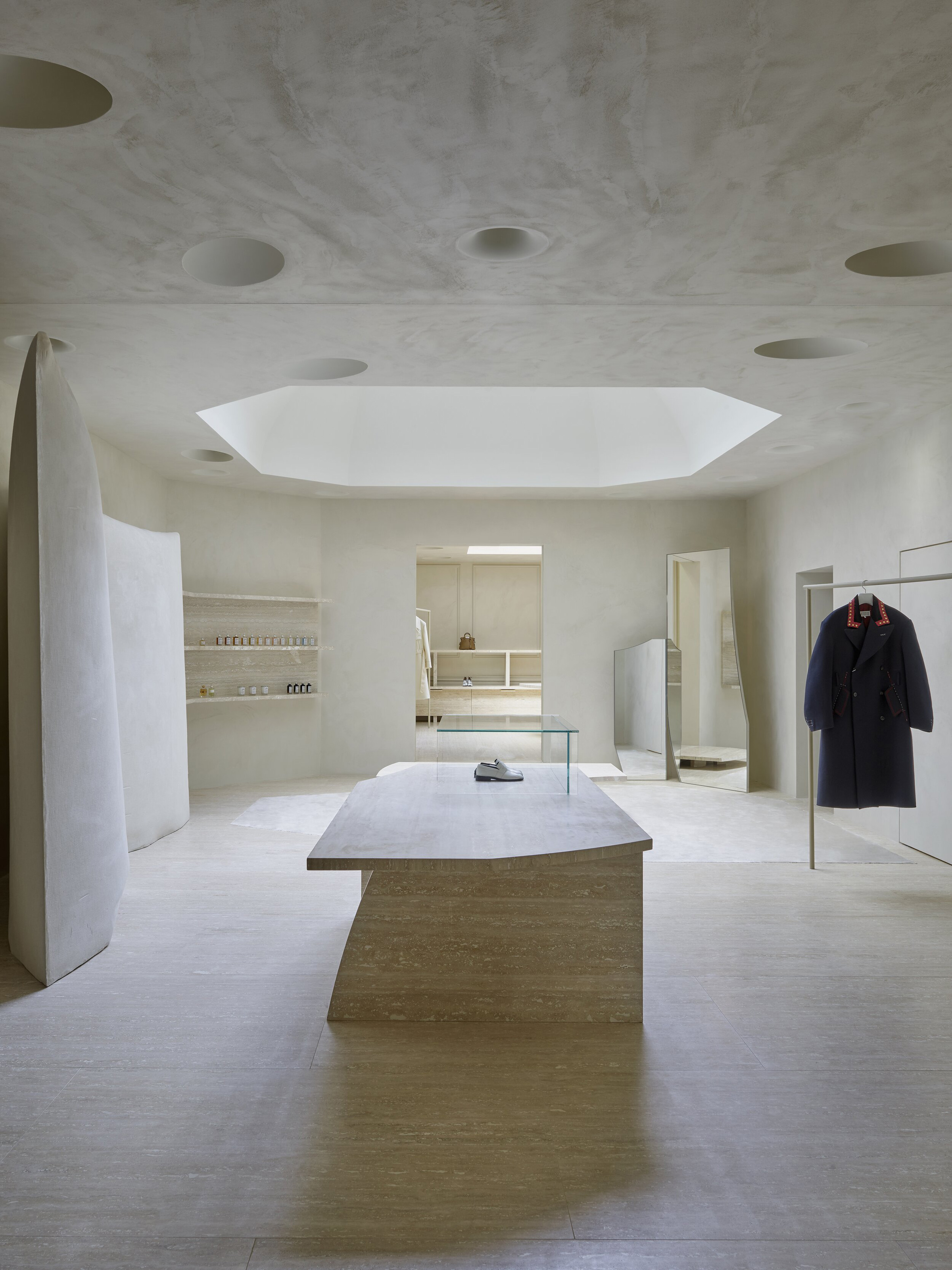
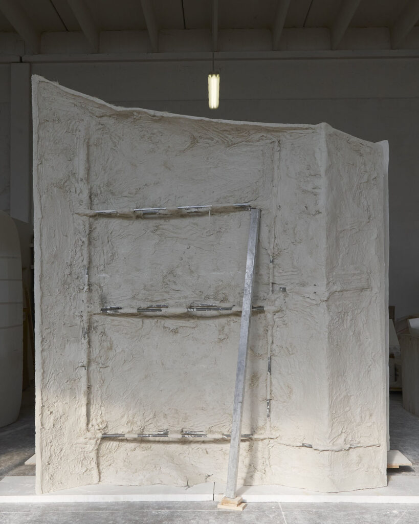
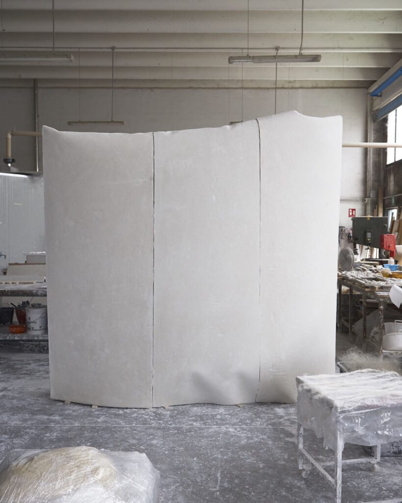
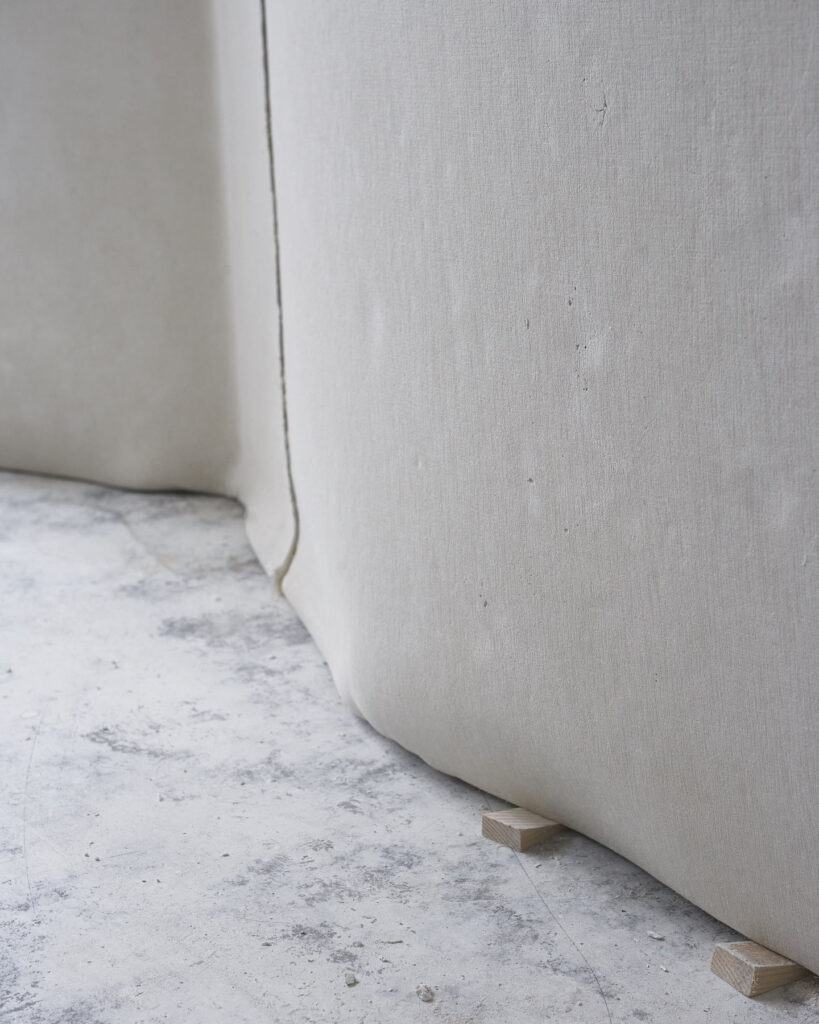
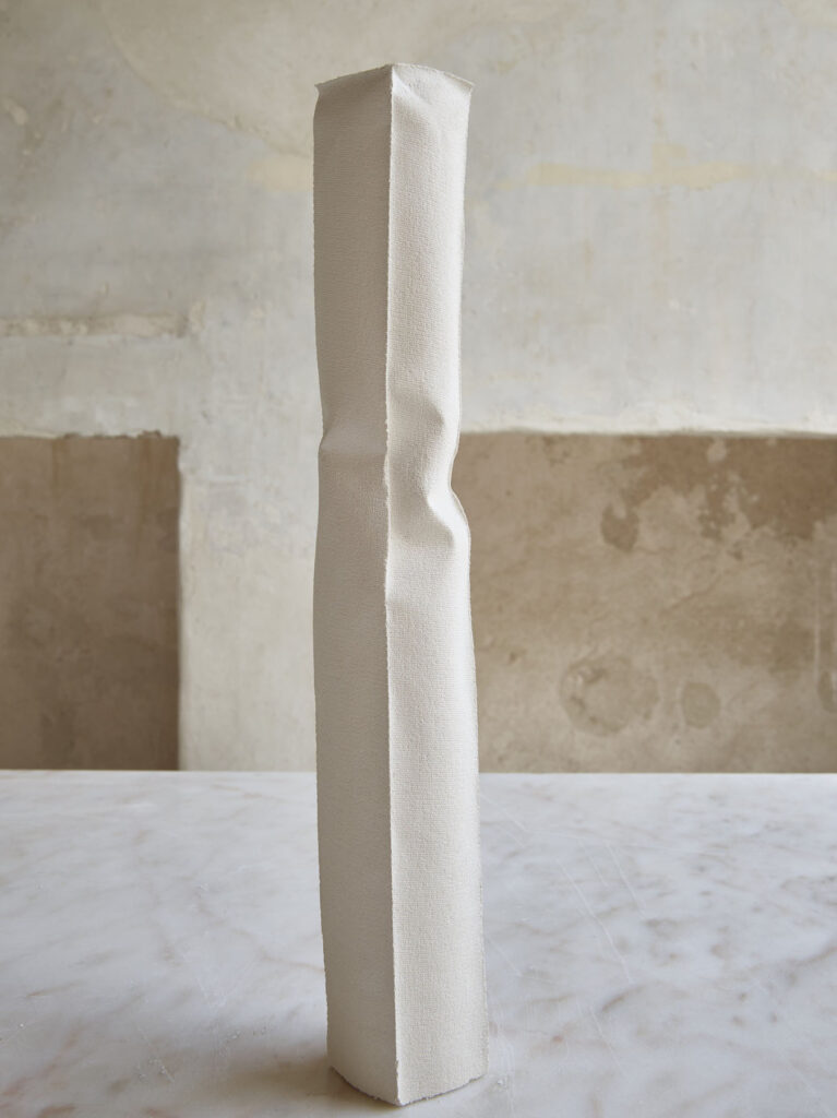
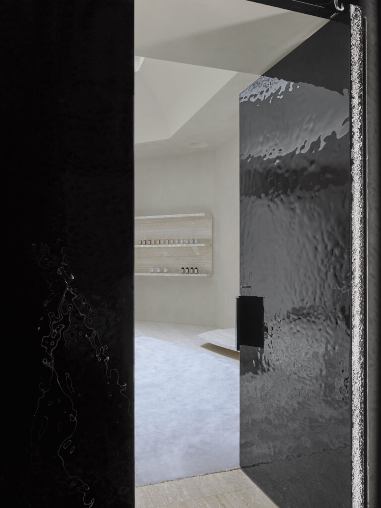
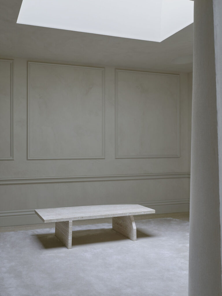
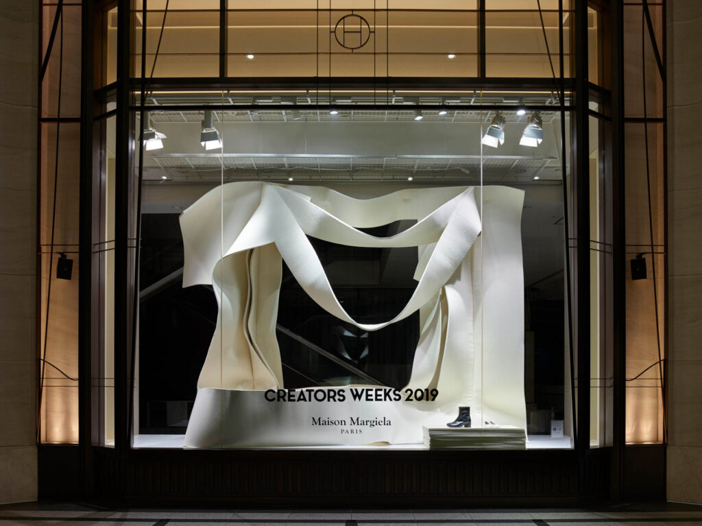
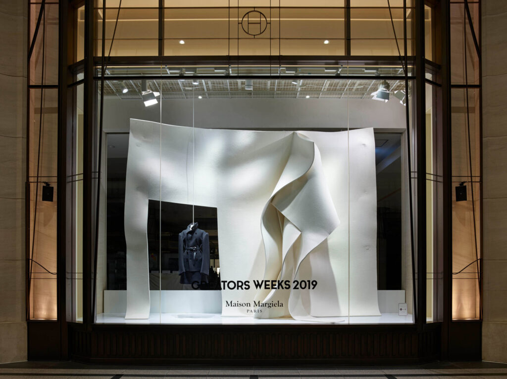
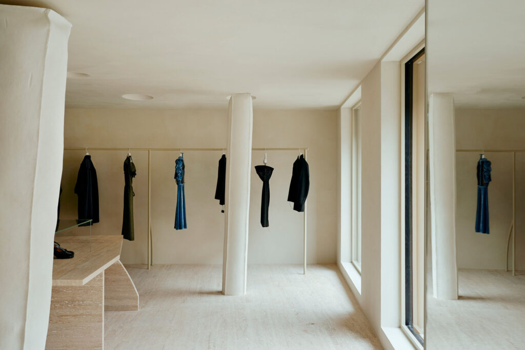
Alongside his work in Bahrain, Anne has worked with John Galliano since 2018 to redefine the brand identity of the Parisian fashion house, Maison Margiela – culminating with the remodelling of the label’s London store earlier this year. The curved gypsum walls and fabric-cast surfaces are evocative of both the studio’s signature feel, and of Margiela’s recent in-store presence. But, as Anne explained over Skype back in February, his work process is limited to neither the studio, nor Galliano’s vision for Margiela. Rather, he heralds the disappearing craftsmanship of specialists and family-led artisans. ‘For Margiela,’ he explains, ‘almost everything is produced in Italy. Around the time I started working in Bahrain, I started working a lot in Italy with small workshops that were specialists in the different materials I’m interested in.’

The gypsum casting that embodies Anne’s work with Margiela? It comes from a small company in Veneto; the profession almost died out, I’m told, because house molding is no longer en vogue. When Anne started working with the company, they had only two employees; they’ve since re-hired former collaborators. That’s not to say that irreparable damage hasn’t been done to artisanal craftsmanship though; despite enjoying something of a renaissance in recent years, Anne is quick to point out that ‘because of our lack of interest for a long time, these industries, which are often small family-based companies, have died out.’ The aluminium that features in the Green Corner building in Bahrain (2020), was cast at a foundry in the Netherlands, where their specialism allows for the experimental techniques that Studio Anne Holtrop employs.

Central to Anne’s design approach is an innate belief in the ‘gestures’ that define materials; the source of those very materials, and the ways in which they’re used to construct spaces and the architectural environment. And as our conversation below demonstrates, these are themes that inform Anne’s vision for the temporary, the interior and the exterior.

Does your practice take on different approaches depending on whether you’re creating something temporary versus a permanent?

With [Maison] Margiela, we did a catwalk show in 2018, shop windows in Osaka and a pop-up store in Tokyo. So these exist for one week, one day, a month – and in architecture, that’s a very short time. What I like about temporary work is it can be more radical in a way, because we have less to fulfil for a permanent use. So for instance, with Margiela, the [display] in the shop windows in Osaka, we made them out of very thick felt that we let hang. So it was a kind of architecture that’s literally soft; that has no rigidity. To make architecture that is literally soft is very difficult to maintain or to use. Although Margiela would love that idea, the practicality of it is just more difficult to manage. The driving force behind both temporary and permanent work is similar; it’s about the performance. You know, how can we form space and how can we also discover space?

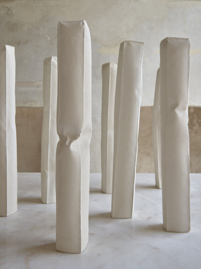
The Margiela store in Paris has crooked columns (textile-cast gypsum), which was a process of making, where we deliberately searched for an undefined outcome. It redefined the process of making, and the outcome is different every time you produce it. In that sense, we can discover and invent spatial conditions. John Galliano describes this kind of pyramid where everything starts with the artisanal collection, and then it trickles down. With architecture, we build maquettes of projects with the materials that we want to construct with. So that’s also a kind of temporary building – to scale, but it exists. It has a reality. Even if a project is permanent, that’s its temporary state.

I was looking at images from your work with the Charlotte Chesnais jewellery store in Paris from late last year; the acrylic sheets you use have these really organic shapes. I’d love to know a bit more about the kinds of materials you work with, and how you translate these into organic forms?

I have a liking for irregular forms like the Rorschach inkblots, the butterfly inkblot tests that are basically just ink on paper. But because of its form, you imagine things in it and for me, the irregular or organic forms of things have more possibility than a purely rectangular form. You can project more into it. That’s the way that we work because we have form that is not necessarily architectural. So, we can start to imagine how we’ll use something; how can we read the architecture? And for visitors, that happens [all over] again.

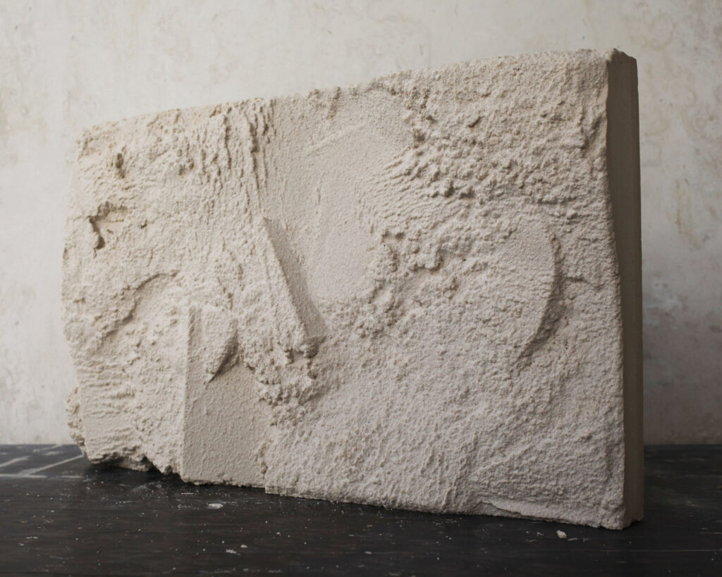
With the Charlotte Chesnais store, [the approach] came from a project before that, where we started casting materials directly in sand, using sand as a natural relief. So we cast another material in it and it takes the imprint of it in the material. We started doing that with gypsum, concrete and aluminium. For the store, we used acrylic but we didn’t cast it; we scanned a 3D relief of the sand. The irregular relief diffuses the light a lot more than it would a flat surface, which works more as a mirror.

[But] the irregular relief starts to diffuse the light so you cannot see through it anymore; the ceiling has this irregular form, and that diffuses light into the space and onto the display. Then we repeated the exact same thing with the display table, which works as a backdrop for the jewellery. So with the specific treatment of a material, we benefit from certain characteristics of it. By changing the relief, we have different characteristics that we can work with. So the material is the same, but the way it is formed and treated enhances, or brings forward, other properties. That is something I call material gesture; to work with the gestures that are intrinsically bound to a material, but also the gestures that, in the process of making things, are formed with the material.

And this is the same process you used for the Green Corner building in Bahrain?

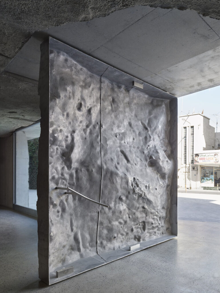
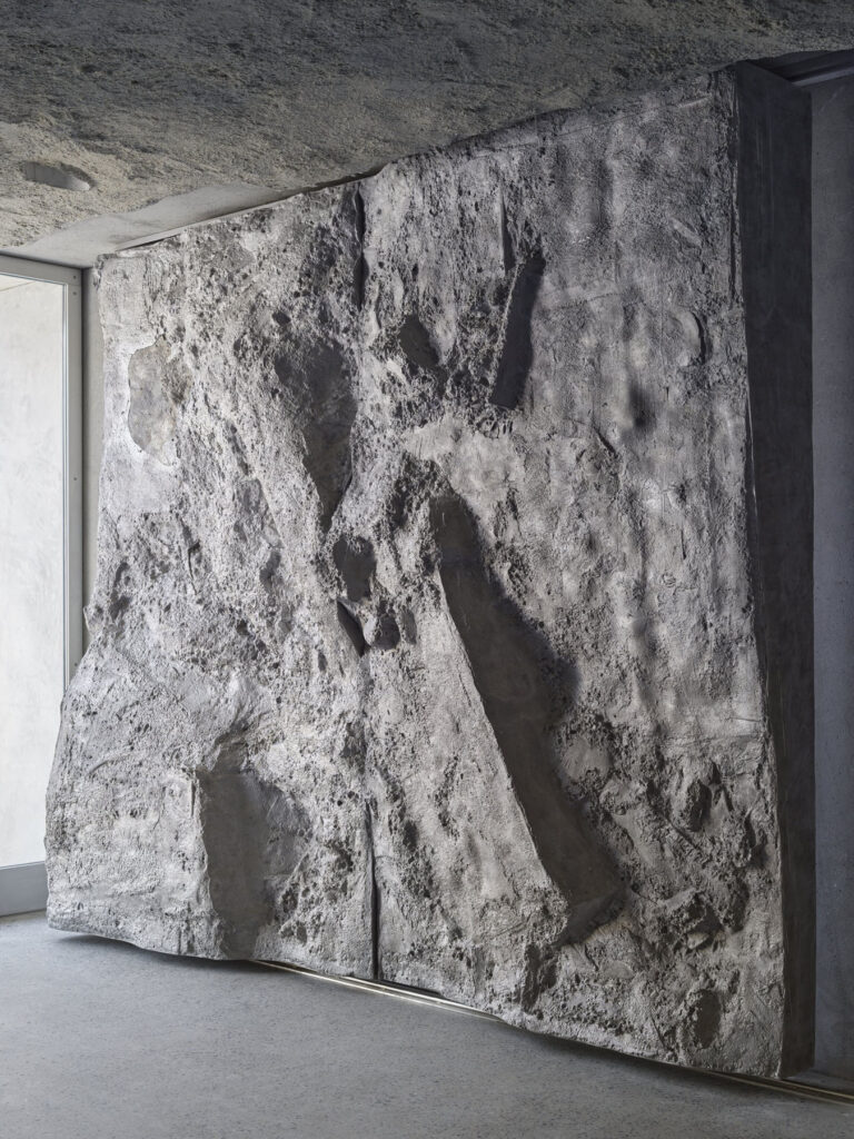
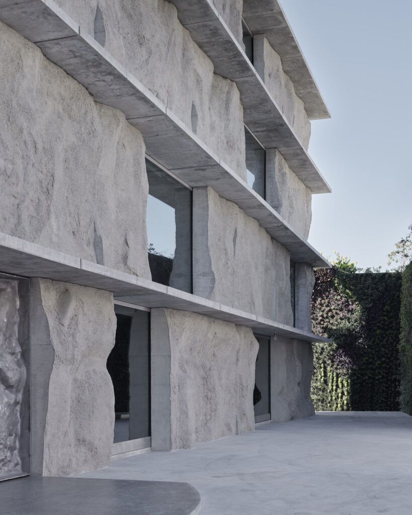
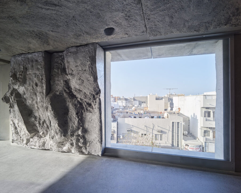
Yes – in the Green Corner building, all the concrete (so, the façades, the walls, the floors) are cast on land next to the building. So we cast it directly in the sand; every time the sand has been worked on by the workmen on the site, and so every time we had different reliefs in the concrete. It was also very efficient, so in that sense it contributes to an idea of sustainability because most of the form work is just in the sand, in the ground that is already there. We didn’t have to transport building materials, just the concrete. I think up to 50% of the energy [to build] is used in making form work, and the other 50% to cast it. So, by shortcutting that first 50% of formwork, we reduced the energy consumption used to make a building. But that’s not the only driving force.

The driving force is that we can building something that feels very local, and very [site specific]. The site itself produces the building, and leaves its mark on the building. With the façade, each one is a fragment of the landscape, but also a moment in time. One was done in March 2019, another in April. So you have this time recording in it as well. The building isn’t static; it becomes a time document and a process. With the Green Corner building, we also have aluminium doors and windows that are also sand casted, but we did that in a foundry. But with aluminium you can’t cast solids so, with the doors, the front side is an imprint of the sand and the back side is hollow.

By changing the material, you get something else. Suddenly you have the negative of the sand that you could never see in concrete. For that reason, we placed the doors and window shutters facing the other way. So when you see the sand cast concrete, you see the aluminium as a hollow version, so they are in a kind of juxtaposition with each other.

You’ve been living and working in Bahrain for seven years now – how has this time allowed you to use different techniques like, for example, the sand casting?

I mean, I was already doing that when I was [still] in Amsterdam. I was visiting Jordan, and going to Petra, a few years before I moved to Bahrain. So, for me there was definitely an interest in the type of landscape and conditions there. It’s very minimal – it’s rock and sand, and that it’s base. And I like that base because that’s also the base of building material; when I see a building standing in that landscape, I just see two versions of the same thing. And I was very excited to work in a place where I can research that kind of relationship.

So the Green Corner building is a very clear building for me in that way because it builds hat relationship between the soil in which it is built, the material, and the matter of it – the building itself and its construction.

The aluminium was also chosen because Bahrain has one of the largest aluminium smelters in the world. I saw it as being a local material, a vernacular material. When we look back in history, we say, you know, we built with clay, stones and things like that. But over the past 50 years, aluminium [has become] one of these materials. It’s a process [rather than a material], but nevertheless still part of it. And I like to build up that relationship. It’s all part of that investigation of material gesture; from the sourcing of material, the process, the craftsmanship of working with the material.

Subscribe to our
Newsletter