Archive page:


Judy Watson

“In making the work I make I am lifting up my ancestors and their stories and learning more from them every day”

Judy Watson is an Australian artist whose practice is based on her exploration of her matrilineal Waanyi Aboriginal heritage and the experiences of Aboriginal people since British colonisation. Exploring Waanyi culture through the lens of collective memory, she then incorporates these histories into her artworks, often drawing on archival research and documents.

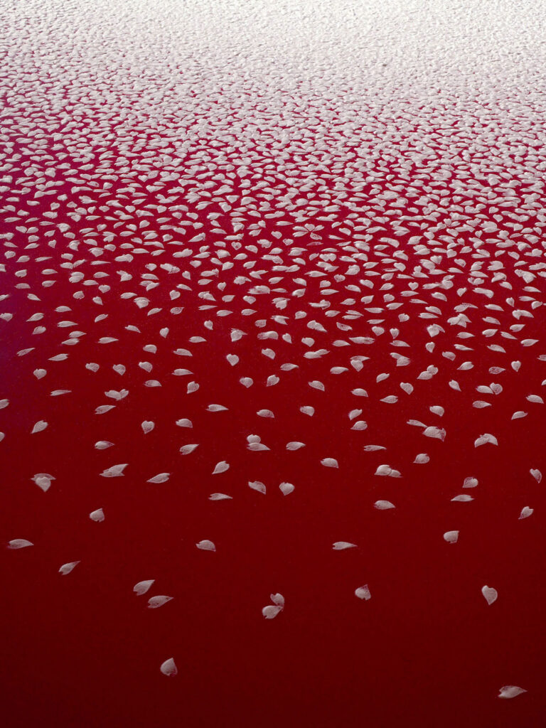
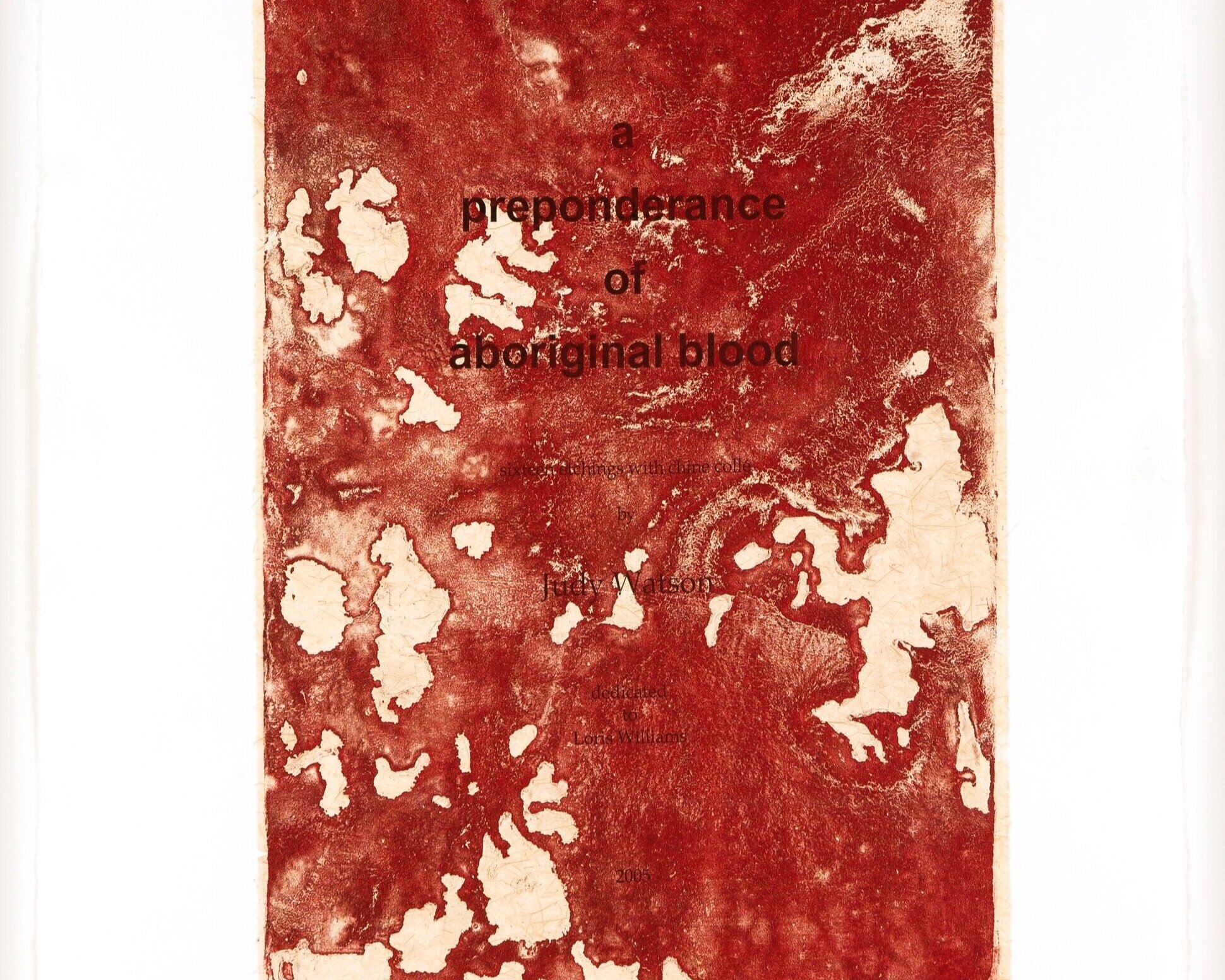
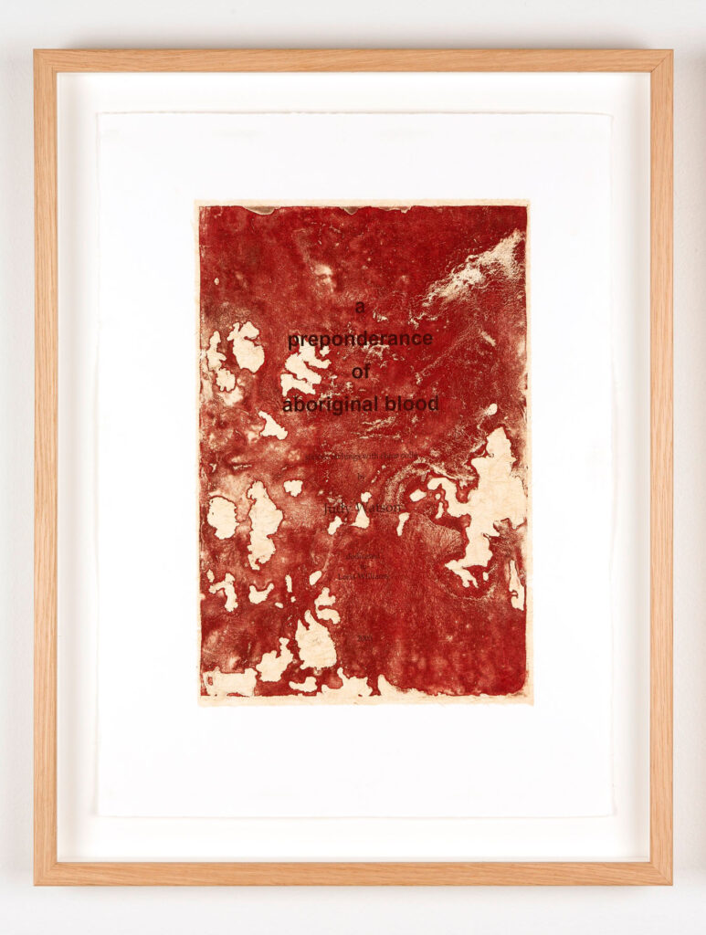
Watson’s work a preponderance of aboriginal blood uses copies of documents from the Queensland State Archives which are then layered with ‘blood-like pools of red paint, symbolising the pain and deaths of Aboriginal people.’ The documents in question are evidence of the discrimination Aboriginal Australians faced, including voting rights.’Full blooded’ Aboriginal people were not allowed to vote but ‘half caste’ Aboriginal people were. The artwork highlights the awful treatment of Aboriginal peoples in Queensland as a reflection of the ongoing effects of British colonisation.

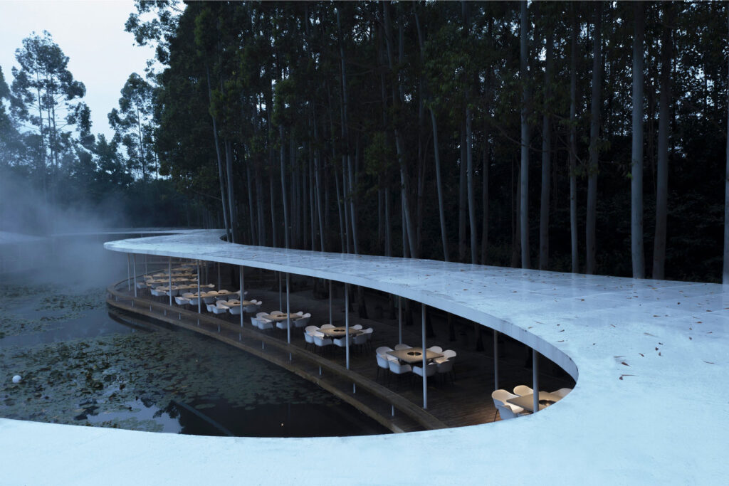
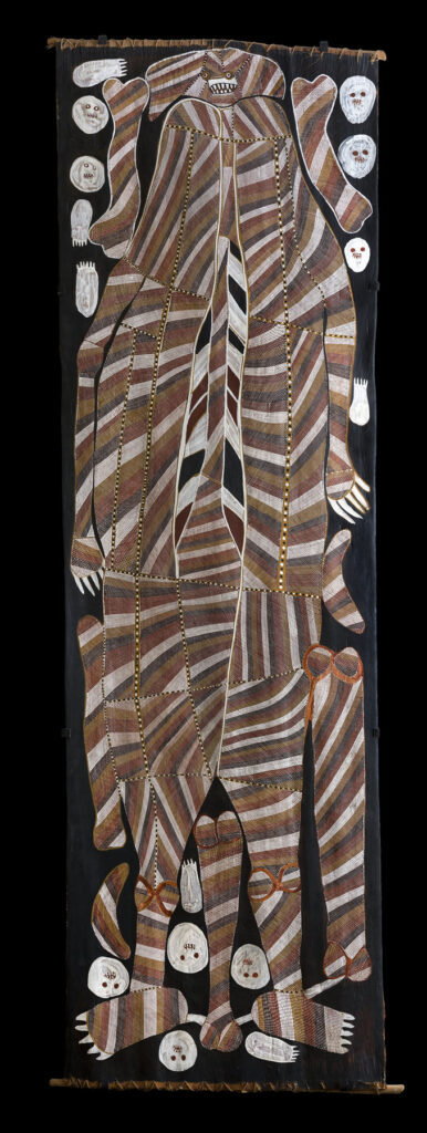
This artwork will be part of A Year in Art: Australia 1992, a free exhibition at Tate Modern. The exhibition brings together a selection of over 25 works, many on show for the first time in the UK. The exhibition explores how artists have acknowledged the continuing relationship Aboriginal and Torres Strait Islander peoples have with their lands, as well as the ongoing impact of colonisation and the complexities of representation in Australian society today. The exhibition is available to view from June 8th 2021 until Spring 2022.

When it comes to ideas of social change you have described your work as subtlety discreet with a strong message that insinuates itself into the viewer’s consciousness, do you think that aesthetically pleasing and subtle artworks can be used as an effective form of activism?

Yes, I think the power of aesthetics and subtlety can embed themselves into people’s memory and slowly leak their contents into their consciousness before they can put up resistance. Sound and smell can be a strong activation as well.

Do you think this exhibition, and your artwork specifically, will make British people more aware of the issues of British colonialism and how that affected/affects Aboriginal and Torres Strait Islanders? 

Yes, if people look into the work, they will get a sense of the oppression of Aboriginal people under the ‘Act’.

You talk about collaborating with family members on your artworks. Did they have any specific input/influence on a preponderance of aboriginal blood, and if so in what way?

I spoke to my mother, Joyce Watson about this work. She is also trained in printmaking, in fact, I was one of her first art teachers at Art School in Townsville. After making this work I took Mum and Dad into the Queensland State Archives with me. I showed them the files held on my grandmother, Grace Isaacson (Camp) and her mother Mabel Daly, among other members of my matrilineal Aboriginal family. I made a second artist book: ‘under the act’ based on these files. My mother is very supportive of me using this material in order to show the public what it was like for our people to live their lives under this institutionalised brutality and bureaucracy. My grandmother, Grace Isaacson gave permission for us to access her files.

You speak about collective memories as an inspiration for your work, have you found that a lot of personal histories and information have been lost due to a fear of discrimination from British colonialism? And if so did you find that loss of personal histories frustrating when researching during your process?

Many people have helped me to uncover documents and history about my Aboriginal family. I did interviews with my grandmother Grace, my mother Joyce and other family members from Mt Isa over the years. I’ve also undertaken a lot of research as have others about these untold stories of colonisation in Australia. It was hard at first to find these stories but we achieved it with persistence and hard work. There is more to be unearthed in the future.

Can you tell me about your creative process for a preponderance of aboriginal blood? How did you come up with the idea and how did you go about the physical process of making the artwork? 

I went to a talk by Loris Williams (an Aboriginal archivist) and Margaret Reid at the University of Queensland about Indigenous people and the right to vote in Queensland. They showed amazing documents on their PowerPoint and this is where I first heard the terms: half-blood and a preponderance of Aboriginal blood. Immediately I knew that this is what I wanted to make work about. I had been asked to make an artist book for the commemoration of Queensland women and the right to vote. I knew I wanted to focus on Aboriginal women in particular. I asked permission to use the images from Loris Williams’s talk and it went from there.

I’ve discussed the making of the work in previous texts that you can access from the description in ‘a preponderance of aboriginal blood’.

In previous works you have united your Aboriginal heritage with your English, Scottish and Irish ancestry such as standing stone, kangaroo grass, red and yellow ochre, is this also the case with a preponderance of aboriginal blood? How else do you navigate the contrast of these ancestries within your work?

My work ‘burnt shield’ which is in the collection of the Queensland Art Gallery could be the shape of a European family shield. It could also be the female shape of the pubic area, or the waterhole at Duwadari waterhole, Lawn Hill Gorge, Boodjamulla National Park in NW Queensland. Sometimes I have referenced my skin colour, derogatory names and imagery associated with flayed skins. These are earlier works, both in prints and works on canvas.

You stated that shared experiences are an important part of your work. How do you feel to be a part of this group exhibition and is there any other artists artwork that particularly resonates with or stands out to you?

There are many amazing artists whose works resonate with me.

Sometimes I know them and sometimes I don’t but their work goes beyond the knowing.

You describe discovering how your Aboriginal ancestors were treated as a ‘heavy burden’, do you consider your artistic work/process as a way to work through, express and deal with that ancestral trauma?

In making the work I make I am lifting up my ancestors and their stories and learning more from them every day. I want to pass that knowledge onto my children and to others in the wider community.

What other media (i.e. books, films, documentaries)  would you personally recommend to people who are looking to learn about Aboriginal and Torres Strait Islander histories and cultures and the effects of British colonialism? 

Tony Roberts ‘Frontier Justice’, Timothy Bottoms ‘Conspiracy of Silence’, Bruce Elder ‘Blood on the wattle’, Rachel Perkins ‘First Australians’. So many books, videos, resources…

What artworks are you currently working on and which topics do you plan on exploring in the future?

I am currently making two bodies of work for different projects and venues that I can’t reveal yet.

One project is looking at climate change. The other is looking at a big issue affecting Aboriginal and Torres Strait Islander people in custody. I am also working with more research around the Aboriginal women in my family, the stations they worked on, the maps of the country. Other imagery will appear as I go through the process of making the work.

My public artwork ‘bara’ will be installed soon at the Botanical Gardens in Sydney, looking down at the Opera House. It is a large work in marble that represents the bara / fish hooks made from shell. These were predominantly used by Aboriginal women in Warrane / Sydney when they were fishing in their Nawi / bark canoes in the waters around Sydney, catching fish for their families in Gadigal Country.

Credits

DGN Studio

“Light is always the starting point for all our projects”

Founded in 2016 by Daniel Goodacre and Geraldine Ng, DGN Studio crafts customized objects and spaces informed by utility and the context of their surroundings – an approach to design that is instilled with a deep sense of care and attention to detail. The architecture studio aims to enhance the everyday living experience of their clients, and advocates for a carefully considered use of materials. 

The studio’s 2020 Concrete Plinth House project is located in the London borough of Hackney, where a dark Victorian semi-detached house has been transfigured into a sleek and leisurely brutalist-inspired home. The terrace is grounded on a dense concrete base, yet feels light and serene, featuring clean, minimalist surfaces. Commissioned by a young couple to transform the house into a modern family home, the project extended and opened the property to include lighter-touch renovations that show off the beauty of the materials used, such as concrete benches and wooden beams, all working in a simple aesthetic and functional harmony.

NR Magazine speaks with DGN Studio to get a deeper insight into their design values and to discuss the details of the project.

For this project you were tasked to create a versatile and leisurely space – what initially sprung to mind when you began to conceptualise the house? 

Making a space that could accommodate gatherings of different sizes seemed to require a degree of flexibility. We had conflicting thoughts at the outset. We wanted to make a space that could be used in different configurations, but also a desire to create something with weight and mass that felt very firmly grounded in the site. 

In the end the flexibility was achieved not by moving things around, but from being able to occupy the edges of the space – the steps, perimeter walls and benches which provide lots of options for how they might be used. This allowed us to really explore the feeling of permanence created by these various concrete surfaces and plinths. 

We also had an early idea about the timber frame as a kind of screen or filter between the interior and exterior spaces which in this instance seemed a more helpful concept than that of placing windows in a wall. 

What was your approach to working with the original features of the house? 

We wanted the new addition to resonate with the existing house in a subtle way, such that it could have a definite character of its own. 

The best rooms in the existing house had a tall proportion and we liked these spaces as distinct rooms that suggested specific purposes or activities. We wanted the new spaces and layout to maintain this feeling of a series of rooms while also opening up long views throughout the house, pulling light further in and creating a better flow through the spaces. The level changes in the floor and ceiling help distinguish the different ‘rooms’ of the new space. 

We paid attention to the details of the house such as door handles, window furniture, and curtain rails and commissioned Dean Edmonds to design bespoke pieces that sat comfortably in both the new and existing parts of the house. 

The sash windows running along the side elevation are a nod to the original glazing and add to the resonance between new and old. 

Were there any influences for the project? 

There is no overarching reference point – there are loads of influences that come in at different points of the project for specific reasons. Mostly it is about identifying a particular atmosphere that is right for the space. 

Developing the project is about navigating a course through the different parameters that emerge at each stage – starting from conversations with the client about their lives and desires, to their budget, planning restrictions, and then developing the details of how the building is put together with the skilled craftspeople who actually make it. All this time we are trying to hold onto that desired atmosphere and make sure that this still emerges at the end of a very long process.

You can really sense a harmony and a celebration of materials with the project- was this something that was particularly important for you? 

Absolutely – the material palette is really the stuff that the building is made from (predominantly oak and concrete). We were keen to keep the number of finishes relatively limited, and for the different materials to contribute to the serene atmosphere of the new space. 

We generally favour a relatively subtle material palette not because we don’t love colour, but because we tend to find that colour comes best from all the life that takes place inside the space rather than from what we have designed. The building is not the main event! 

How did you go about prioritising light and space with the project, especially in an older building and a tight urban site? 

Light is always the starting point for all our projects. How the sun moves around the site and how to choreograph spaces in relation to this. 

Extending a house can create problems with light due to the resulting depth of the plan so it’s really important to consider how the existing spaces will be affected. As a result, we have opened up views through the house so that you can see the garden from a number of locations and pull in as much light in as possible. There is also a considered contrast between light and dark spaces passing through the dark snug that sits between the living room at the front and the kitchen/dining room at the rear enhances.

We were also very conscious of not overexposing the interior, and the positioning of the glazed panels in the extension was carefully considered to get the balance of lighting right and to prevent the feeling of being in a goldfish bowl.

Were there any existing structures or materials that influenced the design? 

There’s a whole library of projects floating around in our heads – the ones that rise to the surface will depend on the client, the brief and the site. We also try to resist becoming diverted by all the things we’re looking at and trust our intuitions which are of course built on all the things we’ve seen and appreciated. 

How do you get inspired when starting a new project? 

There’s so much to draw from in any new project, no matter how small it may be – every site has its own history, and every client has their own unique story – trying to get under the surface of how the clients live (or would like to live) is really important and provides lots of starting points. 

We’re also really inspired by the city we live in and how it has developed over the centuries – just a bus ride through it is enough to generate a whole raft of ideas. Of course, inspiration often comes in more oblique ways through art objects, music, books, landscapes…

What’s your usual process in developing a design concept? 

It always starts with a plan and lots of sketching to try and explore the intuitions that we have about the project. From there we like to try and get as quickly into making models as we can – often digitally first, but we always like to make physical models as well. So much is discovered and can be tested in the making of them, and they always resonate well in describing ideas to clients. 

Throughout the process we also like to have workshops with clients – sitting together around a table and discussing the ideas – the project is always a collaboration, and this is fundamental to the way projects develop.

DGN Studio is currently working on a number of residential projects across London, as well as designing and making furniture and interiors.

Credits

Images · DGN STUDIO
www.dgnstudio.co.uk 
Photography · NICK DEARDEN FROM BUILDING NARRATIVES

Joe Mortell

“When working on a new scene, I always aim to have at least one unique element in it”

Joe Mortell is a 3D designer based in London, whose work combines the efforts of creative direction, animation and illustration to construct elegantly rendered interiors and landscapes. Often merging into one another, Mortell’s interiors and exteriors integrate to form a unique and surreal aesthetic, crafted with a high level of detail.

Mortell’s 3D rendered environments have a comfortingly familiar, dreamlike quality to them. With their carefully stylised compositions and polished imagery, it is as though we’ve been given a glimpse into a digital utopia. With ambient lighting, inventive furnishings and alluring textures, Mortell’s work transfigures the digital realm into something almost tangible.

Initially moving to London to study graphic design before specialising in 3D work, Mortell has built a vibrant and impressive career, working internationally with the likes of The New York Times, Wallpaper*, Selfridges, Louis Vuitton, Moët Hennessy, Youth to the People and more. NR Magazine speaks with Joe to learn more about the details of his 3D designs, pop culture influences and creative process.

What attracted you to start working with 3D design?

I love the amount of freedom 3D can give you as a designer! There are so many different areas within it to explore, learn and experiment with. When I first started, I was trying out almost anything that came to mind. Animating things like wind moving through plants, light beams passing through windows and light refracting through rippling glass. You never know what new effect might come out when you experiment within 3D. Even today, around 5 years after I started, I have a huge list of things I want to learn and experiment with.

What do you enjoy most about working with digital and surreal landscapes?

I really enjoy merging the outside world with interior spaces. They have a really nice mix of feeling unusual and surreal but also inviting. You can imagine yourself walking into them, relaxing and even exploring past the edges of the frame.

I feel that up until now it’s been very difficult and expensive to imagine spaces like these without a large movie budget. Within 3D it’s not only really quick to create things like this but it also gives you the freedom to experiment quickly and stumble across happy accidents.

The past year has been such a struggle for the arts and for creatives – how have you managed to stay motivated?

As with a lot of other people, this past year gave me a lot of free time that I wasn’t expecting to have. Personally, this enabled me to spend a lot of time experimenting and refining my 3D work. I enjoy doing it so much that it feels like a hobby when I’m learning something new or trying out a new idea for a scene. I feel as if the last year has allowed me to see what I want to achieve in my work a lot more clearly. I realise this really isn’t the case for everyone. My advice to anyone that is struggling is to try and find a completely new creative area that interests them and experiment with it. If you can find a creative area that you really love, the motivation will come on its own.

When do you feel like a work is ‘complete’?

I tend to focus on the composition of a scene first so I can settle on a direction and will then have a good base to work from. After that’s in a good place I start to add natural elements and furniture until the pairings feel right together.

The last 50% of the work that I put into a scene will be all about the smaller details and that’s where I feel the scene starts to really feel complete. These will be details in the materials and textures to make them feel natural along with small objects to make the scene feel lived in. An ideal scene will have small areas that catch the eye and really hold your interest.

What are the most important things you consider when designing your 3D landscapes?

When working on a new scene, I always aim to have at least one unique element in it. This could be the shape of the architecture, the natural landscape, the lighting, the colour palette or maybe even something simple like a unique piece of furniture. Using this method has helped me to find entirely new approaches to making scenes. Some things that I’ve tried out as an experiment before have become the core foundations in what I create today.

What spaces and landscapes inspire you and your practice?

The spaces that inspire me the most are almost anything retro and futuristic. I love the unique shapes in the architecture and the super bold and stylish furniture within them. I’m always aiming to find the right balance between vintage and futurism in my work.

I’ve also started to become very inspired by renaissance landscape paintings. They manage to achieve a feeling of amazing depth within them by using clever areas of shadowing and lighting to break down the scenery into something more readable. The lighting and scenery in these paintings always have a brilliant powerful feeling to them that would be amazing to try and capture in a 3D scene.

What aspects of your own life influence your creative vision?

I’m a huge movie fan so this has played a big part in how I imagine new scenes. I especially enjoy anything surreal, or anything dream based. Studio Ghibli movies stand out as some of my favourites along with movies such as Eternal Sunshine of the Spotless Mind with its incredible surreal scenes. I’m also a fan of Nintendo, so the worlds in Zelda and Super Mario have always really inspired me.

What have been your favourite projects to work on?

I have so many favourites it’s difficult to pick! I find that working in 3D allows you to work on such a wide variety of different projects. I find that I either particularly like working on something I haven’t tried before that allows me to experiment a bit, or on the other end, a project that allows me to really focus on refining the realistic details.

A few projects that do come to mind are modelling and animating birds for AllBirds shoes and NYT that allowed me to try something new. I also recently worked on a project for Wallpaper* with Charlotte Taylor where we mixed furniture with outdoor spaces. Another would be creating six unique surreal animations for Youth to the People.

Are you working on anything at the moment?

Right now I’m working on some really exciting projects. Some of which are collaborations with other 3D artists where we will be creating spaces together. Combining different skill areas that we have to make some really unique ideas. Also, as I’ve been solely focusing on still images the past few months, I’m working on bringing motion back into my work and creating a series of surreal animations.

Discover more here joemortell.com

Jean Dubuffet

Chaotic yet vibrant visual tumult, mirroring the hectic pace of life in the last quarter of the century

Barbican Art gallery presents ‘Jean Dubuffet: Brutal Beauty’, the first major UK exhibition in over 50 years celebrating the career of Art Brut pioneer Jean Dubuffet. The exhibition explores Dubuffet’s rejection of conventional notions of beauty in favour of more subversive forms and presents the artist as a multifaceted innovator of the immediate post-war period, adept at translating his creative vision through a vast range of artistic mediums, creating works out of mud, glass and cement.

Walking through the exhibition, visitors can track the course of Dubuffet’s career, as his practice and inspiration evolves and progresses. Abundantly inventive and playful, Dubuffet’s oeuvre includes assemblies of butterfly wings, scrawled illustrations, viscous and visceral painted landscapes and female nudes – monstrous and captivating – that all come together as a chaotic yet vibrant visual tumult, mirroring the hectic pace of life in the last quarter of the century. 

A defining feature of the exhibition is Dubuffet’s variety of technique and materiality. His work prompts a unique kind of introspection and contemplation, as he captures the sombre essence of the post-war period. Dubuffet’s scenes and caricatures rail against traditional ideas of beauty and capture the beauty of the mundane and something in a gritty and poetic way.

The exhibition is on at the Barbican until the 22nd August.  For more information visit Barbican

Paolo di Paolo

Milano. Fotografie 1956 – 1962

As I enter an entryway clothed in a mass of tendrils and leaves, a restaurant heralds the space with diners enclaved among the green shrubbery. I follow the walkway until I find myself at the footsteps of a staircase, leading towards the gallery. Fondazione Sozzani presents the exhibition Milano. Fotografie 1956 – 1962 of Paolo di Paolo, curated by Silvia di Paolo in collaboration with Bvlgari. The series of photographs displays di Paolo’s adoration and admiration to the city of Milan, which meant a sense of traveling to a foreign country for the photographer. The exhibit showcases di Paolo’s conception of Milan, an unprecedented and untouched look before globalization. Mist hovers, residents and pigeons flock the city center, and the romance of typography and companionship croons the metropolis: the photographs lull the visitors back into the ripening state of Milan.

Humid air permeates the quaint space of the exhibit, stirring up warmth against the twenty-five-degree weather outside. The sliding door remains opened, stuck in its machinery, but whirs whenever a guest walks into the area. As I make my way inside, the glint of the seventeen overhead warm lamps, dangling over the square-shaped metal railing, reflects on the glossy purple floor. It adds illumination into the space as if the two closed windows on the left side are not enough to spill the sunlight inside. Positioned in the middle, a DNA-shaped metal seat waits for three tired guests, but there are only two visitors at the time, myself included.

Strolling to the left side by the entrance, di Paolo’s reverence for Milan springs up. The photographer captures four open windows in an architecture for La natura resiste. From afar, a person holds onto the railing of a window as they dust off the beam they crouch on, but the attention suddenly diverts to the sawed trunk and branches attached to the remains of the tree with a rope. The classic human versus nature tale leaps off the frame, a lost narrative from the two images of Fiera di Milano that position beside it. In these two photographs, captured in 1962, a crowd inspects the thermal circuit breakers with its cresting gray thin wires inserted into an unwieldy-looking box where the name KLIXON remains embossed on the side. The business men’s observant and analytical gaze at the device outlasts their time so much that they have forgotten to notice the two nuns in their habit uniforms that observe with them, who are enthralled by how the device functions. As di Paolo walks further in the 1962 technology fair, he captures three men and a woman peeking through the viewfinders of the cameras nestled into the walls which promise 3D images during the decade.

The year 1960, two years before the fiera, means di Paolo goes to Bar Jamaica and weaves through the bustle of Milan’s folks, photographing their humane interaction by giving each imagery his definition of grandeur in the city life. An orator raises his hands as he looks at the ceiling, swooned by his own declarations and dismissing the puzzled looks of the man behind him. A man sits beside a woman and courts her, bending his head sideways to usher humor into his punchlines, while she directs her eyes far from his presence. A woman looks behind her to find a man in his pensive expression as he raises his small cup, snugged between his forefinger and thumb, just below his lips. On the other side of the room, a group of men gambles in a room clothed with bathroom tiles. Here, the primary subject wears an unperturbed expression while a lit cigarette snuggles between his teeth, oblivious to the curious onlooker behind him who stands too close to the player and desires to offer advice on which card to throw on the table.

Magnolia on the radar, the celestial flow of luxury in the 1960s: di Paolo walks into the Aretusa Night Club, his camera in tow. Inside, an overhead lamp casts shadows across the space, illuminating romance and haze to wrap with the nostalgia of the evening. A man hooks his arm around a woman’s hips and tugs her to his body. They sway to the soft hum of the music and pay no attention to the patrons that surround them as they gaze into each other’s eyes, falling and ruminating. Such a sight differs in Sala da ballo as patrons dance to the sound of the live band, a mix of piano and guitar tunes over the saxophone lullabies.

Di Paolo commands his camera to record the political discussion in Duomo, the heart of Milan, when the year pivots back to 1958. The frantic pigeons flap their wings aggressively as they flock the city center, masking over the photograph. As one sees beyond the birds, residents crowd beside the monument of Vittorio Emanuele II to participate in political exchanges in their heavy winter coats, handheld purses and attache cases, tipped hats, and cigarette stubs between the lips. In the background, the forgotten era of typography in a myriad of designs and styles pepper the antique and historic architecture of Milan, a slow ascent towards modernization and minimalism.

The photographer’s storytelling on Milan endures as he captures a lone man walking on the roof of the cathedral with his phone on his ear, his scrunched eyebrows signal distressed against the lush and resplendent of the church. In Sul tetto del Duomo, – on the roof of Duomo – di Paolo hovers his camera to carpet the shot with the cathedral’s poignance, a registered vaporous memory to last and test time. As di Paolo walks down the cathedral and into the streets of Milan, he bumps into a couple, innamorati a Milano, lazing in the angle of a street – the man in trench coat looks afar as contentment flashed across his face and lets the woman beside him rest her cheek and hands on his left shoulder. Milan serenades the couple in the shelter of its romantic arms, enshrining their affair with a state of zen and mirage for years to come.

Dusk turns into nighttime, and the city center glows with Christmas string lights and street lamps. Di Paolo shoots four photographs for le luci di Natale as the exhibit forwards in 1962 and demonstrates the solemn celebration far from the Western upbringing. A policeman wears his cap and stands alone in the corner of a street, watching the pedestrians cross as the rattle of the tram passes by. Cars honk as they jam the street and appear slower than the crowd who germinate the sidewalks on foot. A policeman – his back facing the lens – stands outside Galleria Vittorio Emanuele II in Duomo, watching the residents stoll around the space and away from the frenzy Milan encounters today. The last photograph, the one that sits on top of the three frames, shows street lamps decorated with sticks of light to emulate fireworks in a starless sky. Here, a sense of finale has dawned in defiance.

I step back from the four photographs of le luci di Natale and turn around to find myself alone in the room. The afternoon sun creeps into its peak, and the rays pass through the window panes and bounce on the floor, attempting to replicate the reminiscence of Milan between the 1950s and 1960s. The longer I remain in the four walls of Fondazione Sozzani in Via Corso Como, 10 with Milano. Fotografie 1956 – 1962 of Paolo di Paolo, the more I realize that the beauty, divinity, and fertility of the bygone years persist.

Credits

Images · FONDAZIONE SOZZANI
For more information visit
Fondazione Sozzani
Corso Como 10, 20154 Milano
tel. +39 02.653531
galleria@fondazionesozzani.org

Auroboros

“Agender and body inclusive, the clothing line is establishing a community evolving around the limitless nature of digital”

What could questionably be the most important aspect of contemporary fashion, if not its attempt in shaping the light of tomorrow, or, as others would say, the future?

In light of the countless issues and social discrepancies, the role of fashion cannot detract itself from accountability any longer. Being the second most polluting industry worldwide, and probably one of the most disregarded powers in promoting cultural, political and ethical change, nowadays fashion has landed onto a battlefield that requires much more than it used to. Producing clothes, projecting a vision: time requires engagement, it expects creative voices to speak, and bring light to what more than ever should matter now, change. So here I am, hoping for a brighter tomorrow that I ask myself, what is the ethics of the future? Where should fashion be standing within such instances?

The correlation to luxury not only became to represent a myth, it has rather bonded itself to an idea of culture which cannot survive within time. What we are experiencing is a crisis of values, where the reward of luxury is nothing, but individualistic. Looking back at the etymology of luxury, it is clear that its original meaning of ‘abundance’ cannot fit within the contemporary scenario anymore. The act of consumption of the rarefied can no longer withstand, rather, one should question what it could eventually mean today. With the advent and unprecedented development of technology and digital platforms, how can luxury fit within the cyber realm and culture? Digital currency, digital art, the world of NFTs is slowly redefining the meaning of luxury. People are investing in it, they are questioning the principles of its value, making implications that could dismantle our preconception of worth.

Striking attention this spring is nonetheless the digital creator AUROBOROS. Member of The Sarabande Foundation by Lee Alexander Mcqueen, the uprising high-tech brand is deconstructing the boundaries of fashion, placing itself under the spotlight as the first-ever digital fashion house.

The founders Paula Sello and Alissa Aulbekova, respectively digital designer, and director of visual communication, have been merging forces in bringing to life the first brand blending physical haute couture to digital-only ready-to-wear design. With innovation at the core of their project, the designers are morphing their sci-fi and nature inspiration, to project the wearer into another world, into other realities: to take the physical experience onto unexplored territories.

Two are the lines the brand is currently covering: physical couture and digital RTW. The first, focused on innovative science, employs never-used-before materials in correlation to temporality. Designing pieces that grow over a longer period of time, the brand’s couture creations project patterns from nature onto the wearer’s bodies, transcending the evolution of the materials from the very first stages of their conception, to their growth and final disintegration. On the other hand, AUROBOROS’ RTW line is instead debuting on a full-digital basis: capping material wait to 0, and addressing luxury to a much wider audience. Agender and body inclusive, the clothing line is establishing a community evolving around the limitless nature of digital: a domain where body diversity and disabilities can be fully represented, bringing self-expression to an innovative brand new stage.

AUROBOROS allows the wearer to encapsulate the garment onto any visual source. it allows materials exchangeability, including fire, jellyfish, metal: in other words, a limitless asset of opportunities. Not only is RTW being deprived of its infamous idea of luxury, the brand is also actively opening it to a wider dialogue, demonstrating the power of technology in generating utopia rather than dystopia.

As pointed out by the designers, digital fashion should not dictate, it should rather push us to explore identity, and reconnect to nature. Imagine a world where anything could be worn: with creativity being the only limit, it is within such instances that luxury is pushed to an idea of experiencing something that you would have never thought of before.

With this in mind, how could consumerism accept the digitalisation of fashion to become the ultimate luxury?

Dropping their debut collection this June during London Fashion Week in official tech partnership with the Institute of Digital Fashion, the brand’s hopes fall within the understanding of their creative process as an effort in creating a new world, rather than a mere digitalisation of a tangible experience. What this seems to be all about, is to suit fashion to the customer, erasing its impersonal contemporary status. AUROBOROS has successfully demonstrated the necessity for accessibility, but, most importantly, has opened up a discussion that has been required for a long time. How we engage with technology is what will define our future.

Credits

Images · AUTOBOROS

Di Petsa

“There is a  censorship of our bodily waters: the fact that we are wet, the fact that we come from water is something to be hidden.”

When thinking of contemporary design and consumerism, the idea of social engagement is probably one of the most important factors in distinguishing the greatness of a creative mind. Dimitra Petsa, Athens based designer, and founder of the namesake brand DI PETSA, is a clear example of it.

Following her graduation from MA Fashion Womenswear at Central Saint Martins, the designer set back to her city of origin to establish her own label, a creative platform that pursues cultural support to women. “My long term aim is to be able to provide jobs for these women, to facilitate the training of younger people, in order to preserve crafts in the future.” admits the designer.

This past week, Dimitra Petsa sat down with NR magazine to look back at her roots, inspiration and ideals. Advocating against cultural taboos of wetness, the designer explained her intent and ambitions for her label: community based projects, performances, workshops and a publication too. Blending together performance art, writing and ancient design techniques, the brand is fighting against shame, promoting an empowering vision of femininity and WETNESS. 

For those who may still not know you, would you like to tell us a bit more about the brand and how you started your career as a fashion designer?

I grew up in Greece, around my grandmother who ran her own tailoring school, and this is where I learnt to sew and construct a dress from a very young age. I think this experience has influenced the way I see fashion in general, from the point of view as a seamstress who works with her personal clients, rather than its normative context. I admired her deep connection with her clients. While the fabric was pinned to the body there were secrets, tears, laughter… I craved this deep intimacy between the designer and wearer, which I first got to experience while developing my final collection at Central Saint Martins. My models would run around the studio naked, share personal stories, and discuss philosophy to help with the design development. One moment we were laughing, the next one crying: I fell in love with that process of design, an exercise based on personal experience and interaction.

How has your brand developed since your graduation at Central Saint Martins back in 2018?

The ethos of our brand is centred around the ‘Wetness Theory’. It has remained the same, and continues to be a focal point of our design inspiration. Each collection explores this through new viewpoints: looking at the evolution of the journey of a woman, her relationship with water, and how she is becoming more accepting of her bodily waters.

For the SS21 collection, titled Self-Birth, water is examined as a vital force of life, and re-birth, that allows introspection, and ultimately self-reconnaissance. With a focus on Maternal waters, and the journey to self-healing, the film displays the vision of a woman floating on water, representing the act of transcending – an ecstatic self-birth.

Our AW21 collection, titled “I am my own Mother”, is inspired by the devotion of self-mothering. To love one-self unconditionally, embracing the strength that comes with self-acceptance of our Bodily Fluids: Water filtered through our bodies, Bodily Water. Holy Water, Sea Water. After last season’s collection centered on ecstatic birth, we now look to a transformative future, harnessing the power of self-love for unashamed self-expression, with the aim of strengthening the connection to our physical and immaterial self, water.

How do your origins inform your work?

To me, the sea has played an essential role in growing up. My hometown in Greece is next to a harbor, meaning I could always hear boats leaving the docks from my bedroom. I find sea healing: to me it feels like home, it has played a big part in my research and creative practice with the DI PETSA brand.

In terms of cultural influence, I am very interested in exploring antiquity, how it coexists in contemporary culture, and how we communicate our relationship with the past in general. Greek mythology and practice inform my designs. For SS21, we developed a golden prayer corset that’s entirely hand-embroidered with materials traditionally used in Greek orthodox priest-wear.

Lastly, craftsmanship, sustainability and textile innovation are very important to me. I am very moved by the dying art of traditional greek craftsmanship. I would love to find a way to preserve it, to interact with it in my designs. For our latest AW21 Collection we have been working with a local group of women in Athens – the Lyceum Club of Greek Women, an organisation founded in 1911 – who work towards preserving traditional arts, including embroidery and lace making. For our latest season, we created our first collaboration together. My long term aim is to be able to provide jobs for these women, to facilitate the training of younger people, in order to preserve such crafts in the future.

I see Di Petsa, I think WET DRESS. Can you tell us about the inspiration behind it?

The Wetness theory behind the brand evolved during my time at CSM. I was conducting eco-feminist research, investigating the relationship between Women and water, Women and their bodily fluids. The idea was to create a vision of a totally wet woman, fully accepting she is coming from water, and of her wetness. Our goal in fashion is to allow people to be unashamedly wet. To create beautiful work that can inspire others to consider nature as something of our own. Our bodily fluids. Water filtered through our bodies, bodily Water, holy Water.

The Wetlook comes after an original technique that took 6 months to develop during my master’s years at Central Saint Martins. Its conceptualization started from a series of performances I was doing for my BA years studying performance, design and practice. I had a woman dressed in water walk across Athens and that was the idea I wanted to crystallize: somebody wearing their own Wetlook could be part of this water performance without actually having to be wet.

Where does your work stand in relation to Feminism? 

The brands Wetness theory seeks to subvert the idea of shame of natural bodily fluids. By re-narrating their physical and philosophical context – a notion that is unapologetically on display through our Wet Script Mesh collections, with poetic scripts, such as “Cries in Public”, “Holy Water, Sea Water”, “Wetness”, digitally printed onto the surface of the mesh garments – our mission aims to inspire the wearer and act as subtle reminders in the performance of their everyday life to embrace their wet self.

Through our work we aim to create a new narrative around bodily fluids and the female body, a subject that often remains taboo in mainstream media. We want to make women feel comfortable and empowered in their natural self, something which we are conditioned and told through the media to change and mould into what society views as the “ideal” vision of a woman. It feels very sanitized and stirpped back, “if you cry in public, you must hide it, if you breastfeed in public, you must hide it”.. There is a  censorship of our bodily waters: the fact that we are wet, the fact that we come from water is something to be hidden. Shame is a self-inflicting punishment. This research, which has resonated with a lot of other people, is to this day a personal healing journey.

Your work also penetrates the realm of performance, how does such practice enable you to spread your voice?

I knew I loved fashion, but I was also very interested in performance art, theater and film, and I wanted to acquire skilIs that would develop my artistic practice and bring new viewpoints and inspiration to my fashion education. I did my first degree in Performance Design and Practice at Central Saint Martins. When I graduated I continued onto the Masters in Fashion Design Womenswear, and that was where I really combined all my skills and interests into one practice: couture fashion practices, textile development with performance, sustainability and film.

Both performance and art are so important to my work and creative practice. I am very involved in my work: it is something very personal to me. The relationship between model, designer and viewer is very interconnected, that’s why I always take part amongst the performers in my shows, exploring my vulnerability and body expression, alongside their exploration. Through these intimate moments, and the overcoming of shame, I can really tap into my creative side, and create work that comes from a deeper place. Work that is authentic to me and my experience. For us, a garment worn with intention and connection to a deeper emotional message, is one that will resonate and last with the consumer.

At DI PETSA, we are working on many different creative projects aside from the RTW collections. We recently launched a book, titled WETNESS: A Script of bodily Fluids, which I wrote and also illustrated. The book consists of 7 chapters exploring 7 bodily fluids: Saliva, Tears, Breast Milk, Vaginal Fluids and Semen, Sweat, Blood, and Urine. The writing is a merge of scripts for a filmed performance and poetic text which aims to create an alternative narrative for bodily fluids.The book includes direction notes, rehearsal exercises, diary logs, and fashion illustrations offering a behind the scenes eye to the Wetness concept and the performance work at DI PETSA.

We also run monthly Wetness Workshops that allow our audience to deepen their connection to water at large, and the connection to our bodily waters.

What is the highlight of your SS21 Collection?

The highlight piece from the DI PETSA SS21 collection for me was the Gold Embroidered Breastfeeding Corset and Wrap Skirt. The embroidery technique was inspired by an ancient greek ritual dress often used to decorate Greek Orthodox Priest wear – traditionally worn by males – but created, and passed through the hands of women. I liked the idea of subverting this by applying the technique to a womenswear garment.

What do you hope your audience to perceive from your work?

I hope the work at DI PETSA inspires our audience to embrace their Wet Self. To find intimacy in becoming comfortable with their natural self and their fluid expressions of wetness. The Wet Script garments are a very useful performance tool for when you get out of centre, or when you want to dedicate your day to Wetness and to coming back to the home self – the sea. It can be very beautiful to just look down your chest, and read excerpts of a script that re-aligns you to your own self. It puts you back into the performance you choose to create, and not be so affected by what is around you. A wearer-performer, that’s the way that I perceive it. Someone who puts an intention forward when they wear a Wet Script garment, and chooses to connect with it on a deeper level.

What are the next steps you would like your brand to follow?

Craftsmanship and sustainable design is important to our brand, and something we want to continue to evolve within our design process in the future. We have recently started to work with a local group of Women in Athens for a special Ancient Greek embroideries series. We want to continue investing in community driven projects like this. As the scale of our production grows, we hope to employ more women. In the future, we would like to run teaching classes within our studio, to ensure the embroidery skills continue to be passed down to younger generations. We want to develop collections that are consciously designed, with investment in sustainable materials and innovative ways of designing, looking at methods of upcycling and repurposing

Muda Architects

“preserving and staying respectful to the natural environment”

Garden Hotpot Restaurant designed by MUDA Architects is located in the Sansheng Township in the suburb of Chengdu, China. Surrounded by a lotus pond and nestled in the midst of a eucalyptus forest, the building’s unique design reflects the beauty of the natural landscape and pays homage to the established traditions of hotpot culture – the area’s traditional cuisine where a simmering pot is served at the table.

Originally founded in Boston in 2015, MUDA Architects have set up offices in both Beijing and Chengdu. The studio’s aim for the Garden Hotpot Restaurant was to gently integrate the site with the surrounding environment, creating a leisurely and peaceful dining experience. The suburb’s warm climate makes its location ideal for visitors, and Chengdu’s unique natural features made it the perfect setting for the architects to generate an interactive space.

With no external or internal walls, MUDA decided to construct the restaurant out of a series of pillars and boards to blend the building in with the surrounding woodlands, allowing it to gently integrate with the site. The building’s canopy skirts the body of water, curving organically and seemingly in response to the landscape, replicating the shape of steam and smoke of hotpots diffusing into the air, further blurring the boundary between the building and nature.

The overall aim of the design was to minimise human intervention and enhance the interaction between the guests and nature. NR speaks with the architecture studio to learn more about their approach to sustainability and design.

The restaurant is located in the Sansheng Township – what were the advantages of working in such a suburban area?

The natural environment of the suburb is incredibly beautiful and peaceful. Its also very close to the city, so visitors can reach it easily.

How did you decide to integrate hotpot culture into the design of the restaurant?

“Hotpot” is the best representation of the leisurely spirit of life in Chengdu; so we thought it best for the design concept of the restaurant to echo this culture. We drew inspiration from the dense smoke rising from the boiling soup of the hot pot to create the free-flowing curves of the building.

How do you feel the project reflects and respects its surrounding environment?

When I first visited the site, I was deeply impressed by the breathtaking natural environment, with its tall eucalyptus trees and silhouettes of egrets skimming through the forest. To preserve the eucalyptus trees on the site, we mapped their locations so the building could curve to avoid the plants, preserving and staying respectful to the natural environment.

Did any other elements of the natural landscape inform or inspire the building’s design?

Inspired the trunks of the eucalyptus trees, we used white columns to support the roof, allowing the columns to integrate with the trees.

What was the process like when working with the natural environment – was it important for you to conserve some of the landscape?

Preserving the natural environment was a focus of ours. During the construction process, we shared with the contractor about the measures we were willing to take to help protect the natural environment of the site. We avoided large construction equipment and instead used manual operations.

Was bringing people closer to nature an important part of the project?

Absolutely. With the idea of paying the greatest respect to the natural environment, we decided to blur the architectural scale, leave out walls, and only use pillars and boards in order to let the building gently integrate with the site and to delineate the shape of the lake in a gentle way, so that visitors could experience the natural landscape close-up.

The features of your other project, the Xinglong Lake CITIC Bookstore, also interprets cultural traditions – is this something that you try to maintain within each of your designs?

The design concept of the Xinglong Lake CITIC Bookstore originates from the idea of “a book falling from the sky”, and the curved roof refers to the local traditional single-pitch roof. We aim to tap into each project’s locality and culture, and to incorporate that in a contemporary way into our design strategy.

What are some of the projects MUDA is currently working on?

The projects that are under construction right now are the M50 Art Hotel, Haikou Visitor Center and the TCM Museum of Pengzhou.

Credits

Images · MUDA ARCHITECTS
www.muda-architects.com

Motoi Yamamoto

“Our lives, that we live here now, it is always wrapped up in ephemerality”

Soft white piles of salt weave across the floor in delicate and intricate patterns that fill entire rooms. These transient installations are the result of hours of painstaking work from artist Motoi Yamamoto, for whom these creations are a way to remember his sister, who he lost in 1994 to a brain tumour, and his wife, who passed away in 2016 due to breast cancer.

Yamamoto states that he “keeps creating so that I will not forget memories of my family.” He considers the long hours he spends on each artwork as a way to help him to retain those memories. “I look for a convincing form of acceptance to come to terms with the parting of ways.”

On the last day of each exhibition, Yamamoto invites the public to help him destroy the artwork, gather up the piles of salt, and then return them to the sea. The cyclical nature of this act is inherently spiritual and references the cultural use of salt in Japanese traditions such as funerals. NR Magazine spoke to the artist about his practice.

I’ve noticed that you use a fine white seas salt to create your works, have you ever considered using other types of salt like pink rock salt which typically has larger crystals? 

I’ve only used it once in the past. In 2011, I used pink Himalayan rock salt in a large-scale solo exhibition in a museum. It was a work that looks like a Japanese rock garden. But one of the major reasons I use salt is its transparent whiteness and beauty as a crystal, so I think I will continue to use salt that looks white in the future.

Do you consider the process behind your work as a form of therapy that can help you work through and deal with the trauma of personal loss? 

The reason why I make art is to realise the farewell to the precious persons in a convincing way. I keep making art so that I don’t forget memories of those precious people.

“I see my work as ‘a mechanism to fight against the self-defence instinct of oblivion’.”

Salt has a particularly traditional and spiritual significance in Japanese culture, but also in many other cultures and practices around the world. What do you think it is about salt that makes it a globally significant and spiritual substance? 

Salt is a food necessary to support people’s lives. It is familiar but takes a considerable amount of time and effort to collect, which makes it both rare and essential. Another major advantage of salt is that food can be preserved and stored for a long time by salting. These are important functions of salt that support our life.

You have spoken about how you spend much of your time raising your daughter and that you want your work to look to the future. Do you involve your daughter in your art practice and does her view of the world offer you inspiration for your work? 

Basically, making art is a means to solve my own problems. But as she grew up, I sort of adopted changes in her will and mind and opened up opportunities to think about my work together with her. For example, one of the major reasons why I use blue as the underlying part of my work comes from the words my wife spoke before she died, but I asked my daughter about how bright and vivid the blue colour should be, and I decided to use the colour she chose for the work I am going to show this fall.

Both the process you use to create your works and then the returning of the salt to the sea when the installation is over, have an element of ritual to them. Do you think these acts could be considered a form of performance art? 

Certainly, there are performance elements in “public production” and “project to return to the sea”. However, it only looks like a performance as a result if you try to categorise it. It’s not my intention to establish it as a performance.

The patterns that make up your work are very organic in their form, is there a particular reason behind this? How do you plan out the designs?

The labyrinth-like complex shape was originally triggered by the winding form of the brain as my sister died of a brain tumour. And labyrinths have a meaning of rebirth. I began to draw the swirling works “Floating Garden” because the form of a vortex has a similar meaning to that of a labyrinth, mainly in East Asia.

What was the most challenging installation you worked on and why? How did you overcome these challenges? 

One of the most difficult works was a solo exhibition at a church in Cologne in 2010 in cooperation with MIKO SATO GALLERY. From 5:00 a.m. to 9:00 p.m., I worked more than 14 hours a day. Because I decided that the area originally planned was not enough to face the majestic space, it was necessary to take far more time than initially planned. With the help of the gallerist, the director, and many others, I managed to create a very satisfying work. The time I spent in Cologne is my treasure.

There is an ephemeral nature to both your completed artworks and the medium you use to create them. Do you think that nature is something that originally drew you to creating art in this way?

Since my sister and wife passed away at a young age, I always spend a finite time, permanently conscious of death. Even while I’m answering your question I am using my limited lifetime. There is no doubt that it is a very precious and limited time. Our lives, that we live here now, it is always wrapped up in ephemerality.

What advice would you give young creatives who want to create installations but perhaps don’t have the space or the resources to do so? 

After my wife died, I cancelled all my work to rebuild my life with my daughter. And I printed out hundreds of photos of my memories with my wife and put them on the wall of my room. That’s when I became suddenly aware that creating an installation and putting photos on the wall are equivalent to me.

My aim is to remember people who are precious to me, and I want to make sure that I never lose sight of the fact that creating installations with salt is just a means to get closer to that aim.

What projects are you working on at the moment and what plans do you have for the future? 

This year I am working on a new project. The Oku-Noto International Art Festival is a big challenge. Create huge installations in what was once a nursery. It is a plan to combine an area that uses a large amount of salt with an area drawn with paint. I’ll paint the walls, ceilings and floors of the nursery with the light blue colour that my daughter chose.

From next year onwards, I would like to realise exhibitions overseas again, for example in Germany, France and other countries.

Collectif Scale

“We don’t have the pretense to guide people younger than us, because we can also learn a lot from a new generation, born « connected »”

Rods of light twirl and twist, a line of hula hoops loop around each other in a mesmerisingly technical dance, a gallery space is transformed into a kinetic universe of projected images, all to hypnotic soundtracks of electronic and classical music. Collectif Scale is a group of artists and technicians based in Paris who pool their respective knowledge and experience to create cutting-edge augmented installations. Since their beginning, they have “questioned the links between music and the visual, light and architectural design, entertainment and contemporary art, nature and the future, man and machine.” They seek to provide the answers to these questions through their installations. NR Magazine spoke to the collective about their practice.

Your CODA installation has been described as ‘the ballets of robots’. How do you feel about this description and do you think it’s accurate. 

The starting point of CODA was to work around with the idea of a choreograph of lights and create a piece like a dance show or a ballet, where we would replace the body of dancers with robots and light. But even if many people see in CODA a reference to pop-culture, such as Star Wars or video games, our first idea was to produce a ballet of lights, more than a ballet of robots.

You state the collective does not individually define themselves as artists. What do you define yourself as?

Scale is just the pseudo of a visual designer and this designer happens to be a collective of friends.  As we produce different kinds of installations, from scenic scenography for live shows to pieces for art exhibitions, we don’t like to describe ourselves as artists but prefer to consider ourselves as creative technicians or just scenographers.

You have said that the current health crisis has complicated presenting to the public. Would you consider making outdoor installations? 

Since the crisis, most of the festivals or productions try to match with some new rules (outdoor exhibition, outdoor festival, etc…) In order to continue showing installations, we have just finished our first outdoor and waterproof installation. We also have decided that our future installations must be outdoor compatible in any case.

Do you draw inspiration from other artists or creatives when conceptualising your work? 

Not really. Most of the artists and collectives are connected, like us, to these social networks, so we can see what is produced all around the small world of new media art. When we are looking for a new idea, in general, as much as possible, we try to imagine something that has never been produced. In the end, we can say that the work of the others allow us to create new things because we don’t want to reproduce something existing.

What was the most difficult project you worked on, what are some of the challenges you faced and how did you overcome them? 

CODA was probably the most challenging project because it was our first project using motors. After 10 years of using video and LEDs, it was quite difficult to appropriate a new medium. Using motors, bots and mechanics involved a lot of physical constraints (torques, gravity, collisions, kinetic, etc..) We had to work and learn a lot to produce CODA and be able to control robotic arms in real-time and on stage. It reminded us of when we were in school. You open a book, you read, you learn, you try, you experiment, etc…

In the end, CODA is a perfect synthesis of the last 10 years of learning and experimenting. Even if we had the idea 3 years ago, we could never have produced it before, because of our lack of skill and the accessibility to those robotic technologies. We are happy because it really marks the end of a period and the start of something new and very exciting. CODA is maybe our best cocktail of poetry and technology.

You have said it is possible to live with technology but not nature. Are there particular patterns or structures in nature that you reference in your work? 

When you’re using robotic arms like CODA, it’s a reference to nature because a robotic arm is a bad copy of the human body’s mechanics. Beyond this idea, we think that nature is, in any case, very inspiring. From an artistic point of view, nature always produces the most beautiful things one can see: a dancer will always be more beautiful than a robot, an eclipse will always be more impressive than a projector.  From a technical point of view,  physics, mathematics and sciences are there to explain and decode to us how nature works, because nature is always more advanced than human knowledge. We feel it’s natural to draw inspiration from nature more than other artists, and also there’s no problem with copyright.

You mention the group’s love of video games and that there is a level of interactivity between your work and the public. Do you have any plans to create fully interactive, game-like works in the future? 

For many years, we’ve talked about the idea to produce an art piece that looks like a game, including levels, gameplay, etc… We still haven’t found the right idea but we’re working on it. More than video games, we are also very inspired by roller coasters and amusement parks. It would be a dream to customise a roller coaster, to make it interactive and for it to become an art installation.

What was the most exciting project you worked on as a collective and why? 

In the beginning, each new project seemed more exciting than the previous one haha. It’s only after several months that we realise if that one project was really exciting or not. The most exciting one was probably when La Gaité Lyrique, a famous place for digital art in Paris, asked for us to produce an entire exhibition, our first one, in 2014.

Do you have any advice for young creatives looking to create ‘augmented art’? 

We are still young ;). We don’t have the pretense to guide people younger than us, because we can also learn a lot from a new generation, born « connected ».

Are you working on any projects at the moment and do you have anything planned for the future? 

We have just finished a new installation the last week. The tours, festivals and exhibitions seem to be starting again in few weeks so we will probably be on the road once more, and will try to show something in real life.

Subscribe to our
Newsletter