“A horizontal approach of mutual learning, to promote and to translate a skill or knowledge into new meanings and possibilities”
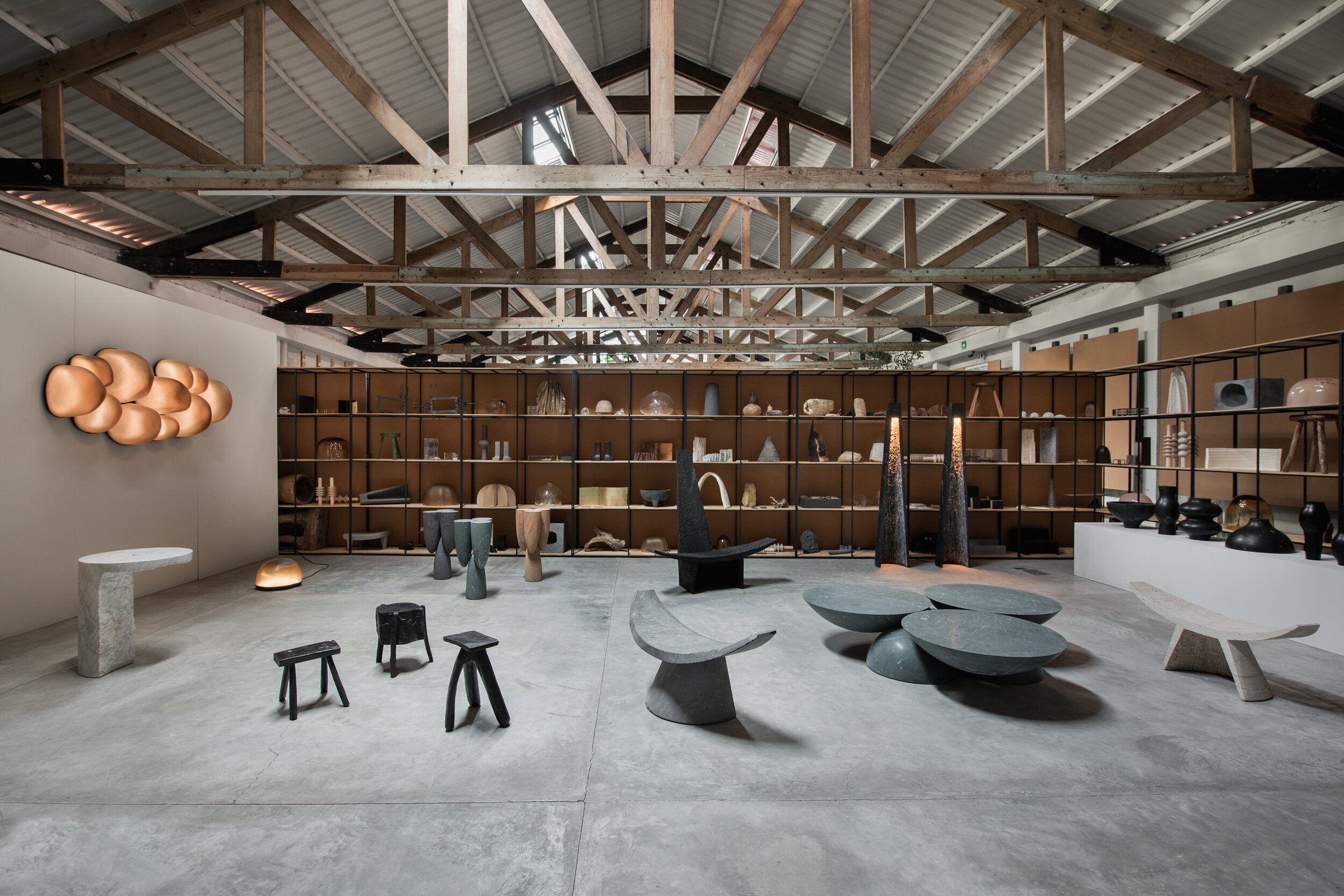
Based in Mexico City, EWE is a design studio that celebrates the country’s rich history of artisanal practice. Tradition is interwoven with new ideas, combining innovation with heritage. The studio was started in 2017 by the Estonian curator, Age Salajõ, Mexican designer Héctor Esrawe, and Spanish industrial designer, Manu Bañó, whose varied backgrounds and expertise allow for their creative approach.
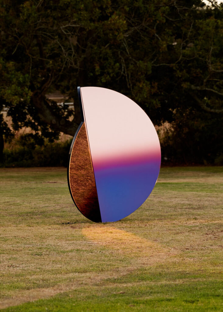
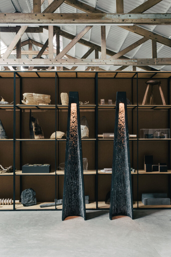
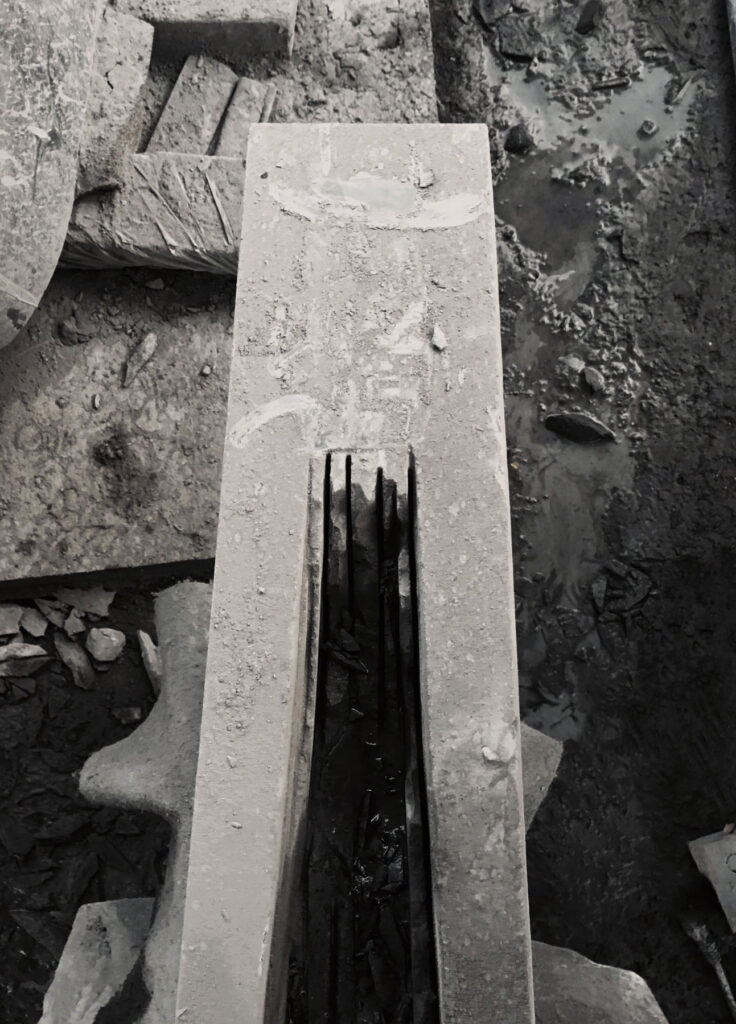
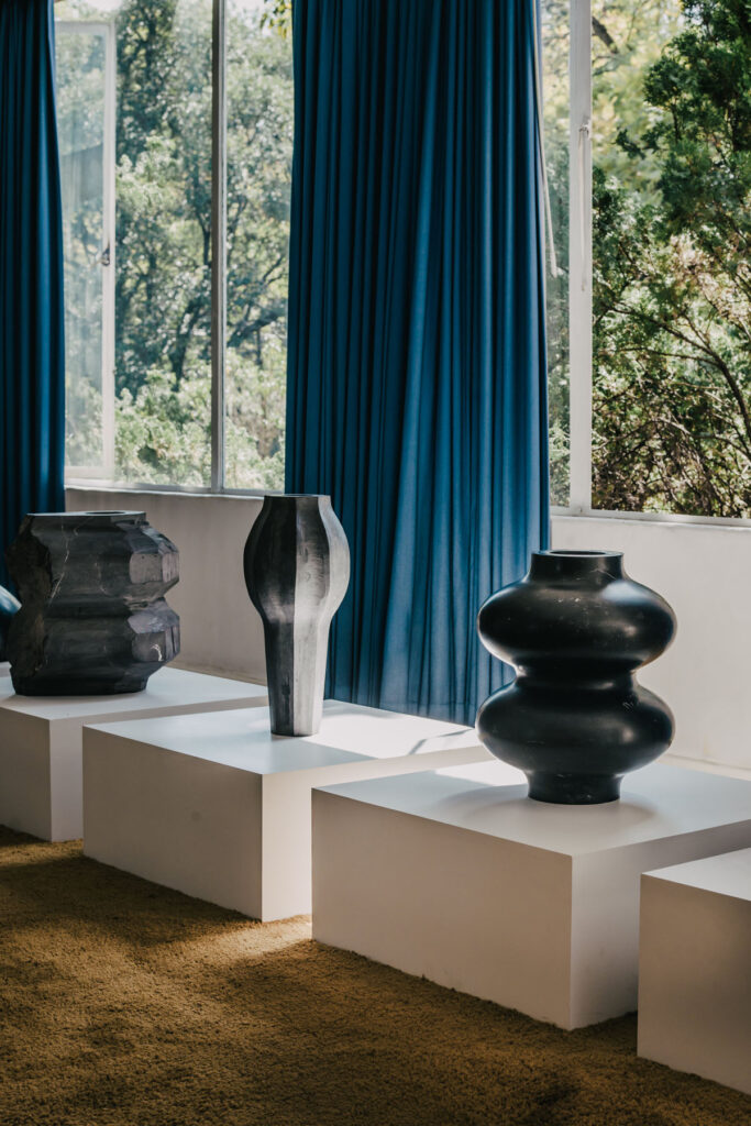
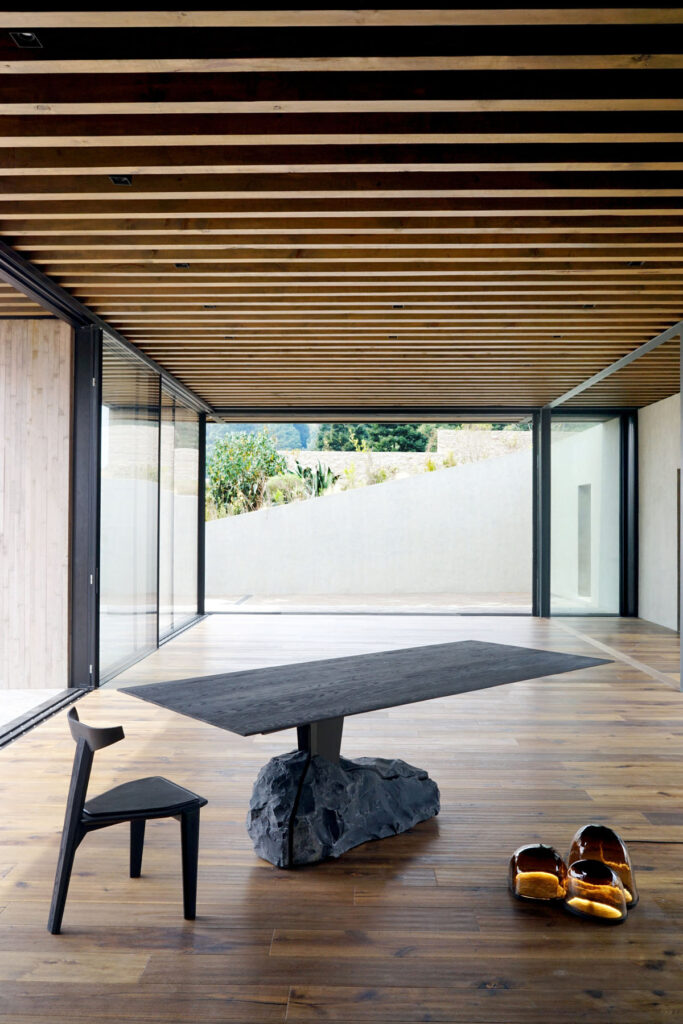
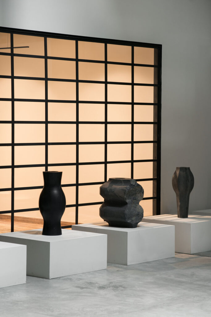
Their work falls somewhere between furniture and sculpture; beautifully-crafted objects that are also technically functional. By amplifying the skill of craftsmanship and the craftsman, their work is inherently collaborative – working with Mexican specialists to create ornate, yet organic, objects. The forms, shapes, colours and textures of their pieces recall the natural elements, something that is reflected in the studio’s approach to using four main processes – glass, stone, foundry work and wood.
EWE Studio’s limited-edition collections are part of a move in recent years to put Mexico on the world stage of design. Here, they explain how their process works and the inspirations that inform the studio’s approach to craft, heritage and their objects.
How do your different backgrounds and experiences influence the work of EWE Studio?
What has made EWE a unique project is that combination; our origin, the skills, our individual knowledge and sensibilities. Our background and experiences are reflected in the way we approach everyday solutions, and through an open dialogue where those individual differences work towards a solution.
How does collaboration tie into your work as a studio, and also with artisans in Mexico?
Collaboration is an essential part of our philosophy, it is the axis of our project. A horizontal approach of mutual learning, to promote and to translate a skill or knowledge into new meanings and possibilities.
How do the four main processes you use (glass, stone, foundry, wood) individually and collectively represent the ethos of EWE Studio?
Those four have, so far, represented the expression of EWE, which by being a young company has created an aura focused on those materials. [That said] we are experimenting with many more materials.
What inspires the form and textures of your work at EWE Studio?
The forms and textures come from many angles; our heritage, the material itself, the sensibility to understand new possibilities out of a “found” moment or expression during visits to the workshops. We forge our inspiration from Mexican history and create new meanings and languages from that inspiration point. We love to mix raw and pristine textures and often keep parts of the stone surfaces as we found them.
Since the studio began, have you adapted your processes for working together? How do you see the studio progressing and growing?
We have maintained the same creative process, with a deeper understanding of the soul of EWE. The studio has evolved, allowing us to integrate a small team in our everyday life besides design activities. We have assigned the efforts of production, administration, sales to each one of us.
The three of us work very tightly together and with our team. We communicate throughout the day and are very much in the loop with different aspects of the studio. We regularly hold design meetings to create new work, but after that we all have different roles we play. EWE is a young studio but we have been fortunate to work with different galleries from around the world who are promoting and selling our work.
Your pieces are a mix of sculpture and object – how do you see them being used?
They are pieces with an iconic and strong expression – pieces with character. Most of them are reinterpretations of an utilitarian background or a reminiscence of it. Many of our clients use them; some of them have them for contemplation. Even though we aim to create sculptural design, they are all functional. Even if the line between design and sculpture is blurry.
And how do you distinguish these pieces between art and design – does that matter?
From the start, EWE has been focused on promoting the skills of the artisans and create a dialogue with our heritage. Most of our inspirations comes from a utilitarian background, from elements that were used in ceremonies and/or worship.
Credits
Images · EWE STUDIO
https://ewe-studio.com/