“Architecture appears to be moving towards helping human beings live, work and experience their lives better. And if that means the building looks like shit, then so be it!”
While still a student at the Architectural Association, Sophie Hicks founded her London-based architecture firm in 1990. The practice started out designing private housing, and by leveraging her insider insight, it is safe to say that Sophie Hicks has become one of fashion’s favourite architects, with her firm designing stores for the likes of Acne Studios, Chloé, Yohji Yamamoto and more.
Hicks became a chartered architect in 1994, prior to which she worked as a fashion editor for Vogue and for the iconic designer, Azzedine Alaïa. Hicks’s relentless efficiency has allowed her to lead her practice with extensive experience in the fashion world. Particularly strong on design, her approach is both conceptual and practical, and is highly attuned to the zeitgeist.
Outside of her fashion clients, Hicks’s residential projects embody the spirit of their surroundings, and champion honesty and boldness of materials. Subtle yet meticulously considered details are typical of Hicks’s architecture, which is best characterised by her discreet, restrained and durable ways of working.
NR Magazine speaks with Hicks about the ins and outs of her career, and to learn more about what distinguishes her identity as an architect.
What inspired you to change career path from fashion to architecture?
I think it two things, really. I was very excited about being in the fashion world. From the age of about 17, when I entered it, it was very exciting. I enjoyed being a stylist and identifying new trends and fashions, creating pictures, and putting teams together, but I got to a point where I saw the fashion cycle coming full circle with the types of images and models coming out, and I was only about 26. I felt that it was too soon for me to be getting stuck into a cycle. I didn’t want to be part of a world that was going around in circles.
What I really wanted to do was to be creative and to create something myself. With photography and styling photographs, you are in effect, being creative but you’re putting together teams like a director. You’re grabbing clothes, putting together teams of photographers, models, hair, makeup and inventing a story, but you’re not actually taking the photograph or designing the clothes. I’d always been interested in architecture ever since I was a teenager, and I just decided to completely change paths and see if I could be an architect and create things myself that would affect how people experience the world.
Was that scary? The fashion world is such a dynamic and intimidating place to work in. Was it a shock moving into the world of architecture?
Yes. I quite like having new and different experiences, and I quite like taking risks. Towards the end of my fashion career, I was working for Azzedine Alaïa doing a set of photographs with him of his previous collections from the start until that point in the mid-80s. We were recording all his collections for a book that he eventually bought out. So I was dressed top to toe in Alaïa – the tailored pieces, not the slinky ones, but I was pretty sharply dressed. I’ve never been so smart since. I swanned up to the Architectural Association for an interview looking like something they’d never really seen before.
They asked to see my portfolio, and I told them I didn’t have one, only my fashion sketches. In those days at fashion shows, you weren’t allowed to photograph the clothes because they were kept embargoed until they actually got into the shops, so if you were an editor, you sat there sketching in your notebooks. You had to sketch extremely quickly because the models would come by quite fast. I showed them these books, and I was sitting there in a black tailored double-breasted suit – I think they just thought I was mad. I heard afterwards that they really didn’t think I would stick it, but they didn’t realise that if I decide to do something, I do it.
But they offered me a place, and on day one, I knew I shouldn’t walk in there all dressed up, so I decided to go completely under the radar and became unnoticeable. You had to absorb yourself and become a chameleon. It was about the second term, when someone turned to me and asked, ‘You’re not that Sophie Hicks who used to be the fashion editor at Vogue, are you?’ and I said, ‘well, yes, I am actually.’ and she said, ‘why do you look like that then?’ it was all quite amusing. I just really enjoyed drawing and making things. We did a lot of work in the workshops – we would weld, cut, saw, and make models. I loved all of that. We did a lot of expressive drawings, which were pre-computer, and I’m not a good drawer by hand, so I’d make a lot with clay, plaster, carving, printing, and etching etc.
We would talk a lot about our ideas. And the Architectural Association is brilliant at teaching design, and brilliant at teaching you how to think. I’m an external examiner there now, which I’ve been doing for the last four years, and it’s amazing how they get their students to think – to a level that I don’t think you get in other schools.
It’s a bit like if you were thinking about conceptual art, I suppose. Thinking about what the concept is, what the meaning behind it is and why you’re doing it. Absolutely everything needs an explanation when you design, and it’s got nothing to do with aesthetics until you know why you’re doing it, then the aesthetics happen naturally. Of course, some people do their aesthetics better than others – some people have an elegance, and some people don’t. But if there isn’t a reason behind why you’re doing something, then I don’t think it’s very meaningful.
I’ve always thought that film directors have a very interesting job, with the way they approach a project and how they set up a team and choosing all the people who are going to gel as unit. It was Grace Coddington who taught me how to set up a team when you’re doing a fashion shoot. The psychology of a group is incredibly important. I took that kind of thinking with me to the world of architecture: thinking broadly, out of the box and about how to set up an architectural project in a way that is more likely to be successful.
What inspiration do you draw from other engineers and architects – particularly with Félix Candela and Paulo Mendes da Rocha?
They worked brilliantly with concrete. Recently, I’ve used quite a bit of concrete in buildings I’ve made. I think Félix Candela was probably the most brilliant user of concrete who has ever lived. He mathematically worked out how to create very thin, reinforced concrete shells that were very elegant and incredibly clever. And if you can do something very clever, why wouldn’t you? He also did this because he was designing quite simple structures like bus shelters and churches for communities in Mexico. The budgets were very tight, and I believe he even designed some churches without windows. Because of this low budget, he used less concrete, so the building was less expensive. Because of that, he designed these extraordinary floating canopies and canopy rooves, where the geometry is really his invention. His brilliance as an engineer allowed him to do that. There are some wonderful photographs of this, one in particular which has workman standing on top of this mushroom-like roof. It’s about 10 or 15 metres high and incredibly thin. It’s just a brilliant demonstration of history.
Paulo Mendes da Rocha’s buildings in and around Sao Paolo have an incredible force to them. They’re raw and feel very dynamic, as they have so much embodied energy, in that they are incredibly still. The thing about him which I find very interesting, and which I feel reassured by, is when when I hear about architects of his stature that did what I do, which is having an office of one. An architect of his stature, you would expect to have an office of quite a lot of people, but he maintained a very small office. I’ve never had a big office – I’ve had an office of about 10 people perhaps, and I found that I wasn’t properly designing myself. I was spending too much time looking after other people and checking their work.
Everything froze with the crash in 2008, and I felt like I really needed to get back to basics. What I really wanted to do was design buildings, and what I really wanted to do was actually be the one doing the designing, not passing it down. I’ve got the most brilliant kind of situation now, where I work very closely with my colleague Tom Hopes, and we work very well together. He’s very strong on construction, and I’m very strong on design. He’s teaching me construction and I’m teaching him design – we do both and understand both sides. My aspiration would be to continue to work in this way, and to continue to work in the way that Mendes da Rocha worked. That involved only bringing in other team members for a project when you need to, so you don’t have everyone in the office all the time.
The most recent building I did was a house in Northamptonshire, and it was a reasonably big team. We did all the drawings here, with about 10 or so people, but it worked very well because the quality of the design and the detail was that bit higher. We work very closely as a team and get much better results, I feel. But it’s an unusual way to work, so I’m always encouraged when I read that someone like him created really interesting buildings with that same process.
What do you value most about a living space?
That it’s really comfortable, and not just literally. It’s important that you feel relaxed, calm, and able to be yourself in and around it. The word ‘comfortable’ might have the wrong connotations because it makes you think about sitting on squishy chairs, but it’s not that. It’s a kind of feeling – feeling yourself.
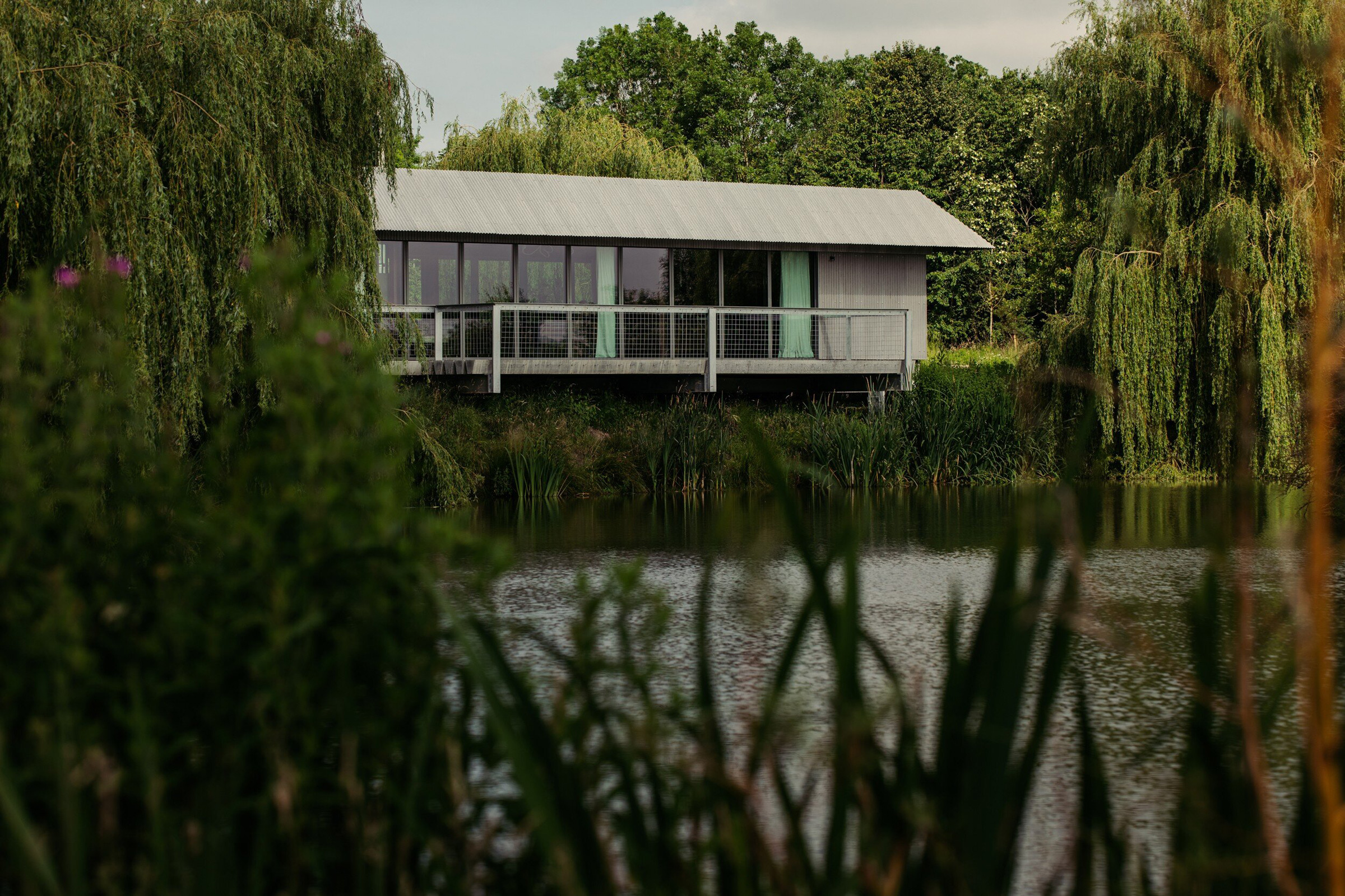
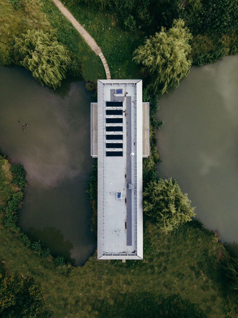
When I design for other people, I want to find out what makes them feel right. If I’m designing a house for somebody, I want to know everything about how they live, how they behave, what makes them feel comfortable, and what kind of impression they want that building to embody. With the house that I designed for my daughter recently, which is called House Between Two Lakes, it was really important to her that it wasn’t a show-off-y house. She didn’t want a flashy house. She didn’t want a house that was obtrusive. She wanted something that was the opposite of a designed house, which is why we made something that sat very gently in the landscape, and that is very streamlined.
As the theme of this issue is identity, I thought it would be interesting to know if you’ve ever had kind of ‘identity crisis’ with a project?
That’s a difficult one, because architectural projects are very long and very complicated, and they involve an awful lot of solving problems. These problems might be thrown up by the environment or by the building problems that crop up during construction. If you’re working on a project where you’re solving problems, an identity crisis is less common.
There’s initial design that you tend not to go forward with until you’ve got the concept sorted out. Projects don’t go ahead if you can’t get that right. It’s a difficult question for me to answer. I know it sounds as if I’m not admitting to self-doubt, but that’s not it. As an architect, you’re a servant of the client, so you need to understand what they’re all about. If you don’t understand what they’re all about, the project tends not to go forward. If you are trying to understand what they’re all about, you carry on until you reach a point of agreement, and during that process, there are often moments where you doubt if you’re ever going to get there. There are multiple points in time where I would be searching for the solution that would embody the character or the ethos of a brand, or the character of the person or thing that they want to embody in the building. It might be some sort of feelings or atmosphere, and I might be struggling to understand what they really mean. And even when I do understand, I have to then find a way of translating that into a built form.
There is a kind of lightbulb moment when you get it right. It happened with the Chloé shop early on for Phoebe Philo. I was struggling with what to do for this luxurious brand, and for its new, young, dynamic designer. She’s got great ideas and a contemporary way of looking at things. At the end of the day, it’s a Paris luxury house, and had stores on fancy shopping streets. I thought about what we could do to bring the spirit of that young designer into the shop environment in a way that would feel how I think she feels about her designs. I really thought we weren’t going to get there. I really didn’t know what I was going to be able to suggest, and then suddenly, we had riots in Bond Street. There were some demonstrations, and the shop fronts were boarded up, and that was my lightbulb moment. We used railing and raw plywood like you would use to protect your front window. We put that inside the shop and used it as the finish for the walls. There’s a real beauty to basic plywood. Not fancy plywood and beautiful veneer, just the bog-standard shuttering with lots of faults in it. I wanted to bring that into this luxury space and offset it with the pink marble and gold-plated metal fittings that Phoebe was working on. We gave it a kind of spin that would tell the kinds of rich women who are going to come into shop, that there’s something else going on here. The spirit of the place is just a bit more rooted in reality.
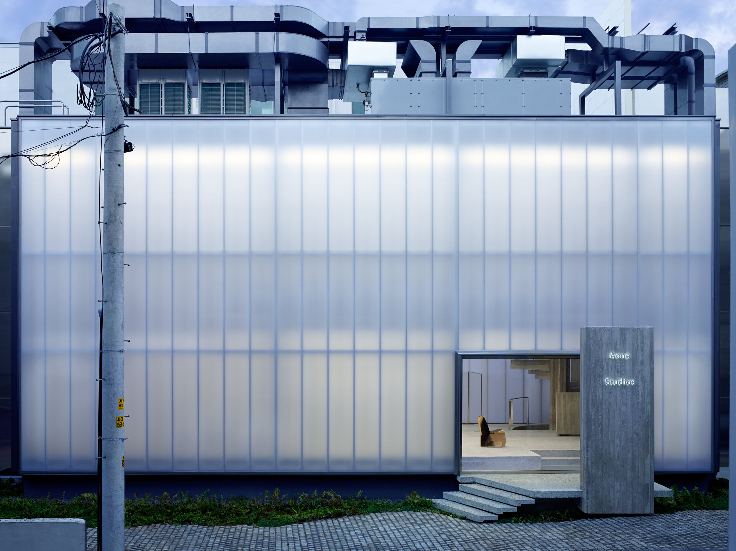
Your Acne Studios flagship store has a very forceful and distinct presence, reflecting the studio’s designs and aversion to conventional Swedish design. What were the other influences behind this project?
When working with a fashion client or a brand, they have very distinct characteristics and their brand identity is important to them, so it’s about finding an architecture that will embody that character and ethos. When I have a new client, I go and study that person, or that group of designers.
I’d never been to Sweden before Acne Studios contacted me, so I spent a long time shadowing Jonny Johansson during design meetings, hearing how he spoke to other people and absorbing how he works and how he makes his choices. I also spent quite a lot of time travelling around Sweden and going to the islands to gather information in my mind about Swedish light.
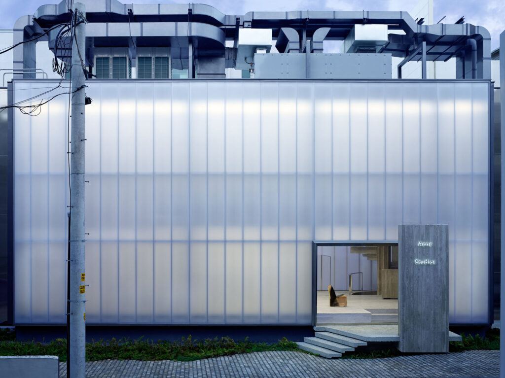
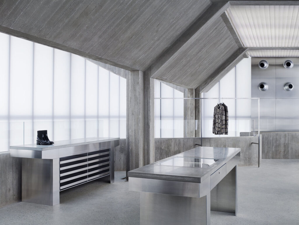
One of the most important things for that Seoul flagship store was the kind of light you get in Sweden. In the summer, you get a very strong and completely engulfing flat light. Light is very important in Sweden, because for many months of the year they don’t have a lot of it, and then they have a lot of it all at once in the summer. Something I noticed from studying Jonny and the other Swedes in the office, is that they were very private and keep their cards quite close to their chest. Seoul is a very dynamic, outgoing place in comparison. I thought if I were going to make a building in this very dynamic city for a brand whose culture is much more reticent, then I would like to make the building sit as a quiet, almost brooding monster. Monster isn’t quite the right word, I know, but there’s something very still about the concrete frame within that building. It’s very grounded and permanent, but then it’s held inside this misty white box. With this misty white box, you get no hint of what’s going on inside until you enter. I also had no idea that the light was going to be as good as it was until we built it. I thought it would be nice, but it really is extraordinary. All the daylight comes through this white polycarbonate material, and it makes you feel as if you’re in a white cloud. It’s quite odd and does strange things to your perception. I think that aspect of it is the Swedish part – this sense of unreality and dreaminess that is present in Sweden, particularly in the islands, that are so silent. It embodies that quietness of the Swedish character.
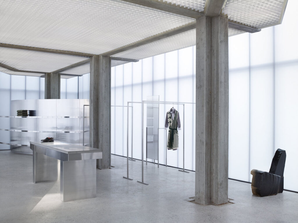
So it’s kind of in opposition to Seoul, but then all the air conditioning and all the services, we had piled up on the roof. All the rooftops in Seoul are a mess of air conditioning units, so we did that as a nod to Korea, but in a very neat and tidy way. This also allowed us to keep the space inside the building free, without any dropped ceilings or internal surfaces hiding anything. I don’t like finishes and I don’t like hiding things, so I don’t like having to build internal walls to hide services. I like the internal finish to express the structure of the building.
How did you go about combining both Japanese and Parisian aesthetics and design principles with your Yohji Yamamoto store?
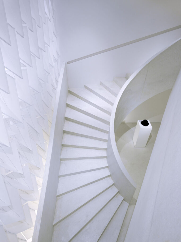
I knew Yohji anyway, as I’d seen his first shows in Paris when I was working at Vogue, so I knew how he was when he landed in Paris. He landed with this extraordinary new vision that was completely different from anything that had come before. I knew how he’d been incredibly shocking to the Parisians and the world of fashion entirely. I also knew how he’d become comfortable over the years in Paris and opened one of his design studios. He had a big office in Paris and worked quite a few months of the year there, so I knew he’d become much more embedded in Paris than say Rei had – she was much more Japan-based.
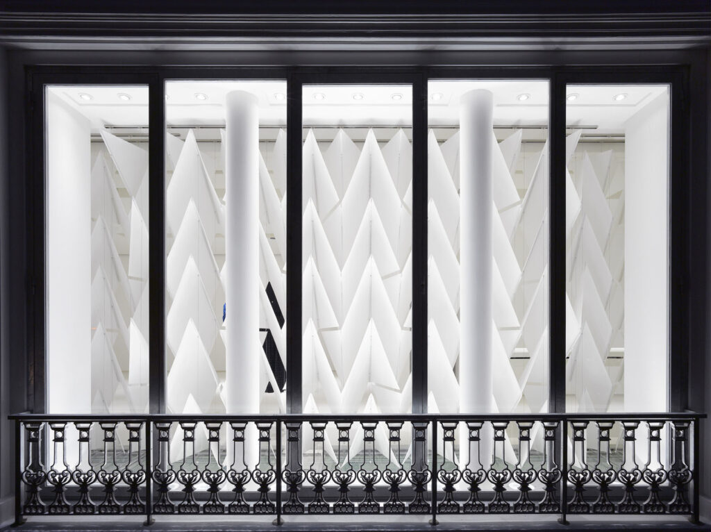
When I was working on his project, I basically shadowed him. But with him, he didn’t like anyone close, so I’d be observing and studying from a distance. He’s a very private person, and Japanese shopping culture is very sophisticated. They don’t like to show off. It feels very wrong to put a mannequin in a window for a Japanese client.
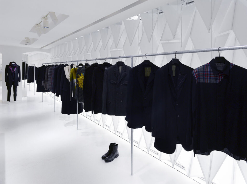
I decided to include glimpses, and he was open enough to be able to show glimpses into the store from the windows, so we used a kind of Shoji screen. We played with the idea of things on axes, like in formal French gardens. You get glimpses through the screen, and as you get closer, you can see into the shop. We included without heads, so basically had all the dresses floating in the space. And when you entered, you’d have a series of glimpses that would start from a kind of corridor of wooden folded screens. As you move down this corridor, the view suddenly opens up, and that’s when you can tell a story about menswear and womenswear. It was all to do with opening up really, which I think is a very French thing, and then through showing his clothes in a progression – that’s how I tried to make the link between him and Paris.
What qualities of materials do you think lend the most atmosphere to a space? And what do you enjoy working with the most?
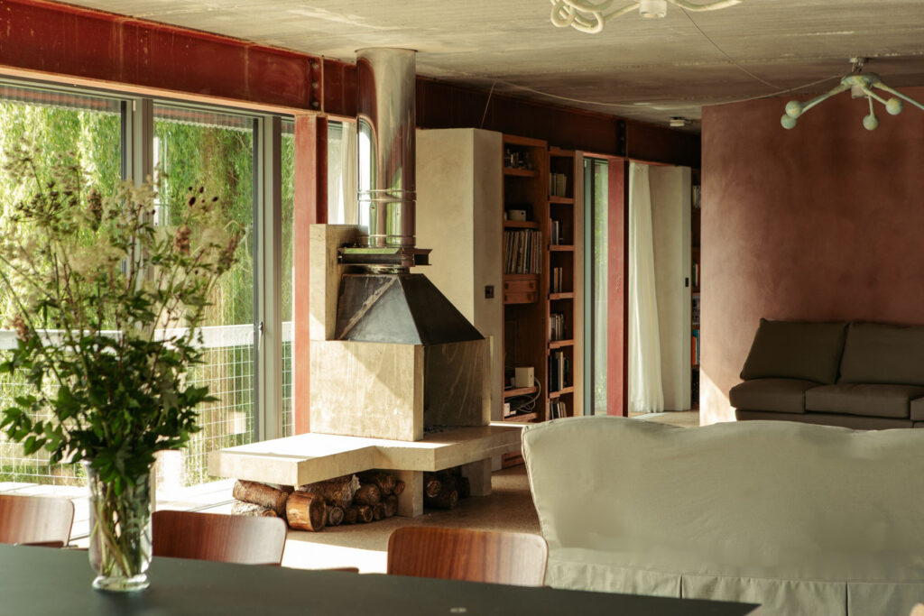
For an interior space, I like the structure of the building to be expressed internally. I want to be able to see what the structure is, and it’s the expression of those structural materials that I think gives character and atmosphere to the space. That’s one reason why I don’t like decoration. With House Between Two Lakes, we had one or two internal walls, as we had to divide the space somewhat, and it needed a surface finish. I hate decoration so I didn’t know what to do.
Because the roof is made from precast concrete planks and the floor is cast in situ concrete, decided to do something related to those two materials. We used render with some pigments to give it a more interesting colour, and it was very important to me that the sand and cement render was done by the plasterer. I would have hated it if someone else came to do a clever finish. We wanted to keep any expressive movements. We chose the colour to relate to the earth. That piece of land was a brick quarry at one point, so we chose this brick red colour. This was the only way I could find to do a finish that would be as far away from decoration as possible.
I’m also slightly allergic to tiling in bathrooms, so we put a waterproofing agent into the mixture, and put it in all the bathrooms. I’ve done tiling in other projects, I’ve done lovely marble bathrooms and stone-clad bathrooms, but for the House Between Two Lakes, it is a house in the mud. It’s unbelievably wet there. The house is supported on pairs of steel piles, that go something like 16 or 18 metres down into the ground to anchor it into the mud. You basically want to smear the mud on the walls. Fancy things wouldn’t make sense – it just doesn’t read visually.
Is there anything you consider to be an architectural faux pas?
I don’t know about faux pas, but over the past decade I’ve noticed a tendency for architecture to be sculptural, or a tendency for a piece of architecture to be a bold statement about form and glamour. That is something I don’t feel comfortable with, so I’ve been biding my time hoping this moment will pass, and I think it has.
This year’s architecture biennale in Venice was very much on a different track. Architecture appears to be moving towards helping human beings live, work and experience their lives better. And if that means the building looks like shit, then so be it! I much prefer that. Of course, they never do, because if you make a building that really functions beautifully for human beings, then by definition, it’s going to work and be a wonderful piece of architecture. I think it’s a great moment for architecture to get re-grounded and not be concerned with making a flash statement.
Some of the South American projects are fantastic. They’re more left wing and democratic. They have a history, that is not so far buried, of making buildings to serve the people. I’ve been sucked into this world of clients who aren’t really serving the people. I know that most of the projects I’ve been commissioned to do are projects that may be wonderful, and I may be pleased with them, but they are projects that aren’t necessarily needed. You don’t need a fancy store. I happen to enjoy designing a store, because there’s an intellectual exercise of trying to identify what the ethos of that brand is.
I think brands are moving more towards the social and cultural changes that we’ve experienced in the last two or three years. They are recognising them, reacting to them, and bringing something of them into their shopping experiences. I watch with interest to see if any of the big luxury brands react to this, but at the moment, I haven’t really seen anything that makes me think that they’re willing to break the mould and allow people to shop in a different way. I have various theories about it, and I’ve had a couple of potential clients in the last year who might have gone for it but didn’t in the end.
How important is sustainability to you?
It’s very important. I’m very ‘waste not want not’, so it is in my nature not to throw things away – I like to reuse, and I like things that are very durable. What I’ve realised is that I’ve been creating buildings in the last 4,5,6 years, that are going to be incredibly hard to demolish. They have these big concrete frames that express a kind of solidity which I love to use in contrast to a lightness. I like the solidity and I like the delicacy as well.
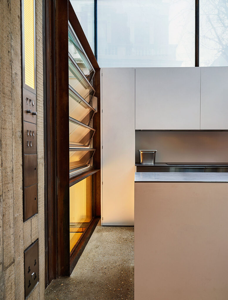

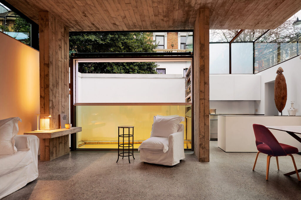
The Earls Court House that I built for myself, has a basement which must be, by definition, constructed out of concrete. So, I decided to bring the concrete up to grow out of the ground and combine it with the delicacy of the glass. Mass concrete is incredibly comfortable to live in. It very slowly and gently absorbs heat or the cold, which means that you have a very constant temperature, so you can avoid using lots of electricity for heating. It’s very sustainable for electricity usage, because what you don’t do is use a lot of electricity for heating.
When you manufacture concrete, you use a lot of energy and you disturb the land because of the quarrying, so it is disruptive, but if you if you use concrete, and you don’t intend to demolish your building, it quite quickly becomes sustainable. I think there’s a balance. I think until a building has lasted a certain number of years, it’s not sustainable, but once it’s been in for a certain time, and you factor in the reduced energy usage, then I think it’s reasonably sustainable.
With the House Between Two Lakes, I reused joinery and doors from previous buildings that had been demolished and stored. The bronze front door for example – I think it’s quite rare for architects to reuse old parts in new buildings like that.
I think in the future, what I would really like to do is make a building where we use materials that are available very close to the site, whatever that might be.
What do you anticipate for the future of your work?
I’d love to do housing development, rather than one-off housing. I would love to be approached by a developer who wants to design some sort of group of houses that is particularly suited to life now – perhaps family life.
Discover more here sophiehicks.com
