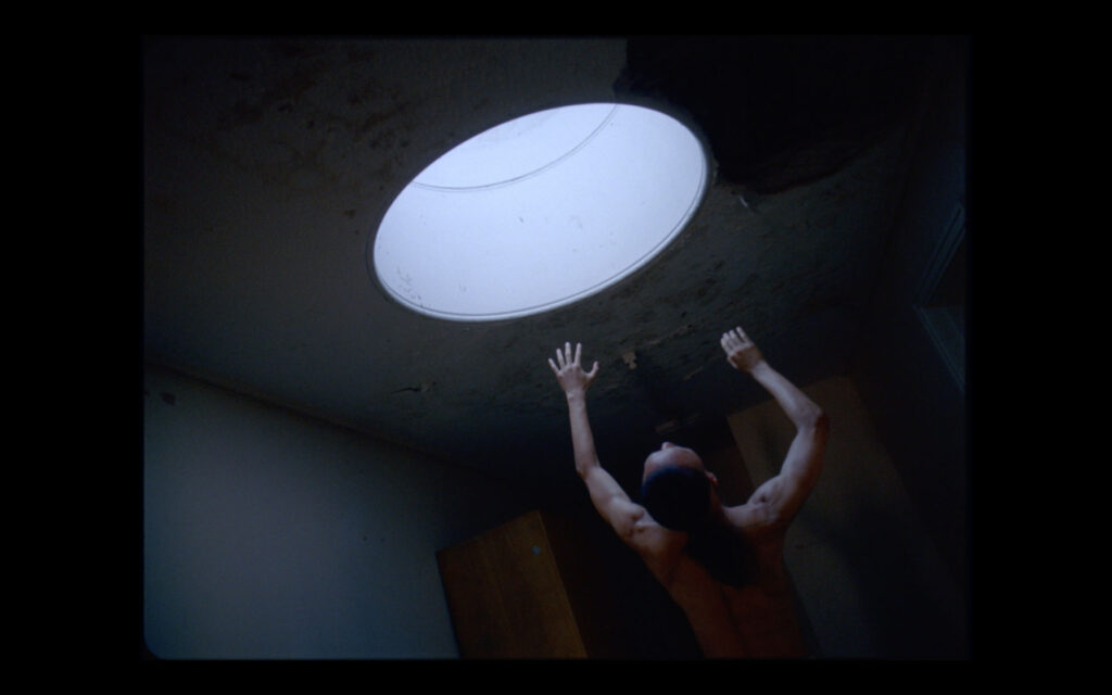
«what drive us was the experience, the moment, to feel physically connected with a space»
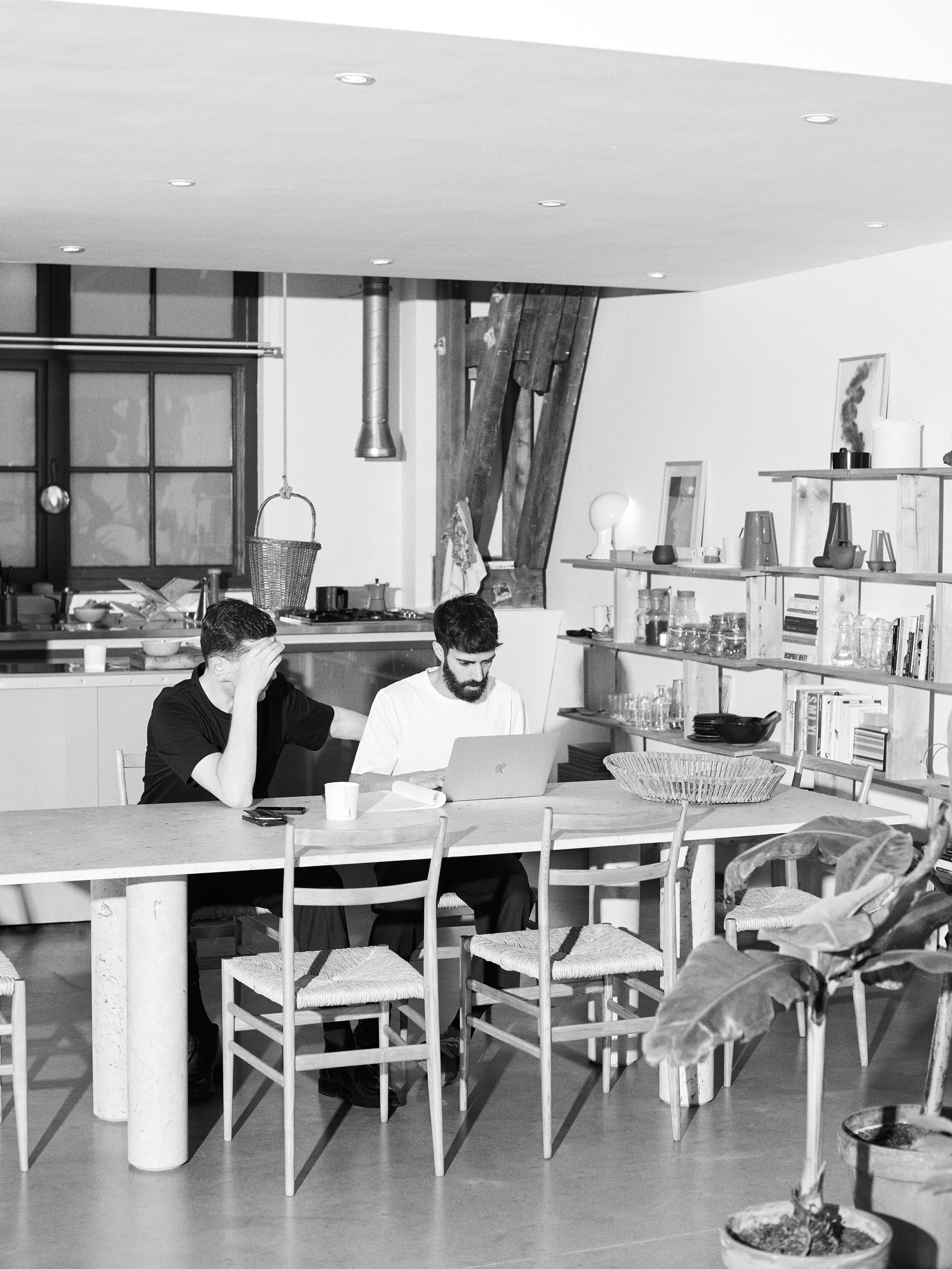
NONOTAK was born from the collaboration between architect musican Takami Nakamoto and visual artist Noemi Schipfer back in late 2011. The duo embodies that merge of architecture, spatial design, music and sound. From creating dreamlike environments to performances using light and sound installations, NONOTAK present their own format of art to the world. Combining Noemi Schipfer’s experience in kinetic visual and Takami Nakamato’s approach of space and sound, the studio creates ethereal environments immersing the viewer.
NR discusses with the duo about the creative process behind some of their works, how the Covid crisis impacted the arts and music industry but how also it gave the two artists time to reflect on themselves and on the meaning of creating art and ultimately the studio’s plans for 2023.
Noemi and Takami, you both come from different creative paths, respectively illustration, visual arts, architecture and music. It is always very interesting and inspiring to see how two worlds merge. How did you meet and what inspired you to start Nonotak Studio in 2011?
Noemi Schipfer: We first met in highschool in Paris at the Japanese class ( Tak have both parents Japanese and I’m half Japanese half French so it was a way to have good marks at school. Then we lost sight for few years and we met back in Tokyo during summer holiday. Tak was studying Architecture at that time and I was already graduate from Art school. We spent time walking in Tokyo and it was really inspiring to listen to his approach on Architecture and Space.
Tak was also playing in a metal band and I had the chance to follow them on few shows to take tour footages. In the late 2011 Takami was working in an Architecture studio called Bigoni-Mortemard in Paris and they were looking for an illustrator to do a mural painting in the entrance hall of a new building in Paris. To work on this project was intense & fun and it give us the will to do more together and to create our own space. We wanted to merge our backgrounds all together : visuals, space and sound. The installations format came pretty naturally and the first idea was to develop an immaterial space were everything would be intangible and in motion.
Takami Nakamoto: As Noemi said, we have known each other for a long time and the purpose of collaborating together was mainly because we had the same vision on what format of art we wanted people to experience, and how we were going to merge our backgrounds in order to create a particular environment where light, space and sound collide all together.
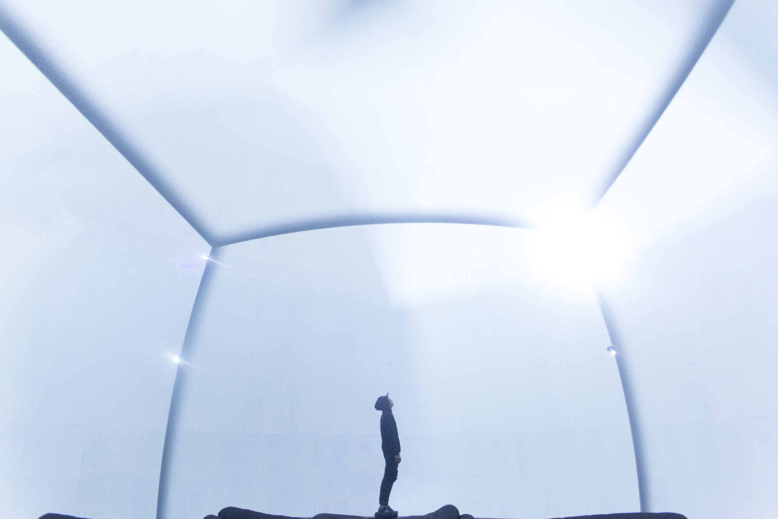
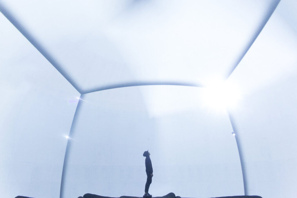
ISOTOPES V2 is a light installation experience that was inspired from Fukushima’s nuclear disaster. Could you tell us more about the creative process behind creating a dematerialised space? I love the concept of making something tangible out of a feeling or something that disappeared and that no longer exists, making it almost part of something fictitious. It is also a way to sort of immortalise the individuals that had and have been affected by Fukushima and it adds a commemorative and contemplative feel to it. Is that something you consciously wanted to convey?
NS: Fukushima’s nuclear disaster is something that personally really touched me. I was in Paris at this moment but I remember I was shocked and afraid about the news. Japan is my second country, it is a place that I used to go since I’m born and I have so many memories there and part of my family. When the nuclear central exploded I thought I would never be able to go back there again so it was heart breaking. At this moment I felt really strange how one part of your life could feel like it was almost just a fiction. Everything could change or even worth, just disappear.
Time is a notion that fascinated me a lot even when I was a student in art school. Memories are a notion that is so immaterial but so strong at the same time. When we develop our first installation ISOTOPES V2 we wanted to represented this different notion of immateriality by creating a space that is constantly changing and where the audience would be able to travel through.
TN: I think this project is special to us as long as it was our first piece being exhibited in an international exhibition like the Mapping Festival in Geneva. First time we were able to share the experience of our work to unknown public and it felt like a new chapter in our career. It also made us look at our work in its actual scale, as long as we have been working on small scale models to work on the composition. This really brought another dimension to the purpose of our hard work.
LEAP V.3 at Wave Of Tomorrow Festival 2019 in Jakarta, I loved this piece which I thought was such another great work of yours in terms of translating feelings or emotions into sounds and lights. Could you tell us a bit more about this piece?
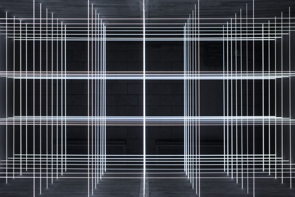
NS: The first time we developed our installation LEAP was in a festival called Electric Castle in Cluj Romania and the exhibition space was really specific and historic. It was in an old stable of a castle, so the space itself was really atypical and the celling had beautiful bricks arcade. It was important for us to keep this strong architecture so we decide to invest the ground as the canvas. We wanted to deploy the installation in the maximum surface of the space and the light to cover every corner of it. That’s how we design those custom panels where 4 indirect lights are hidden behind and pointing 4 different directions. Light is a very flexible medium that has a huge impact on it’s environment. By controlling lights it’s not only the source itself that is moving but the entire space gets affected and painted by the shadows it creates.
LEAP V3 in Jakarta is the biggest version we did of this installation. We wanted to keep the massive volume of the space and highlight the length of it with the speed of lights and sound.
TN: In fact it was important to actually stay and program the installation on site, considering this unique context in Jakarta we were immersed in. We like the fact each site specific installation is about experiencing it through the build of it, the space itself, the people who are helping us with construction with the same goal of looking at something special at the end.
Last spring you revealed a large-scale installation in Porto Alegre, Brazil, titled GIANTS. The audio visual light and sound installation was set inside the Farol Santander building which was reminiscent of Nonotak’s first commissioned project in the lobby of a public housing building in Paris. Exploration of sound and space is at the core of GIANTS. Was also being in Brazil informative as to how you wanted to conduct this piece? It feels like a lot of your pieces are connected to the spaces they inhabit and are quite site specific like LEAP V.3. The interactions from the visitors in some of your pieces such as PARALLELS with the lights and by walking through the space, adds a very important element to that connection.
NS: When we get commissioned for an art installation, the starting point that drive us is the space that will host the piece. When we got the floor-plans and pictures of Farol Santander building we were struck by the verticality of the space and the massive columns. We wanted to accentuate this characteristic by adding more columns with light. The space offer a 360° view so it was important for us to include this specific in our piece as well. The columns included lights in the 4 directions, like LEAP installation concept. This space was also really interesting because there was two floor levels. You were able to see it from the ground levels, but also from above at the second floor. The rhythm of GIANTS is really contrasted. You have the first part were the ambiance is really dreamy, light dots are floating like fireflies are dancing together and then suddenly the sound get more violent and solid lines appear and move in the entire building like an army.
TN: I think the way we named the installation also speaks by itself in a way. When we saw the spatial context of the exhibition space, we immediately thought about experimenting with verticality and create an experience where people would feel like these massive totems of lights are taking over the space like Giants. The scale of these totem gave us the possibility of affecting the space with light so much that we could both create a feeling where we felt both “compressed” by it. The fact they are deployed along the whole space made these totems feel like they were ruling it.
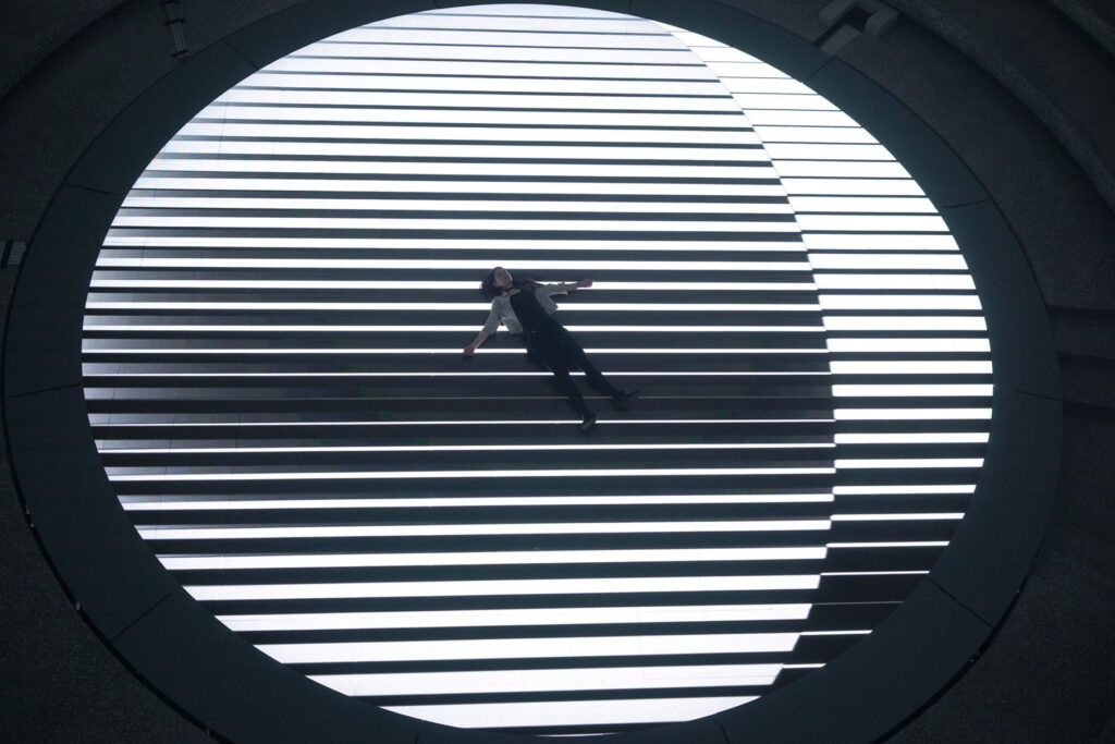
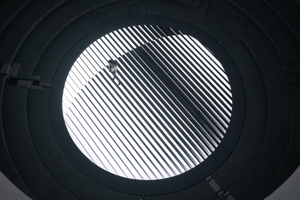
Your work revolves around making visible, moving objects, forms, large-scale AV installations and spatialized sound. For instance with Parallels at STRP Biennale, you have used the whole space as a canvas for light which must also be quite difficult technically. That must result in a lot of experimentations and research behind each piece. Could you both tell us a bit more about that process?
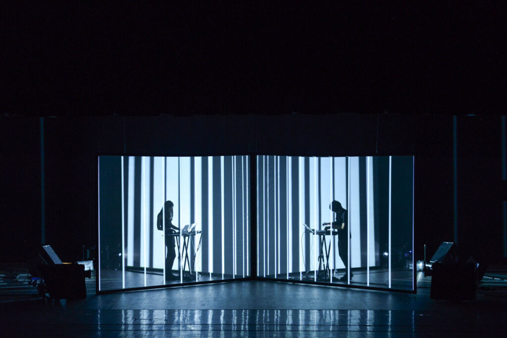
NS: At the beginning of NONOTAK we were a lot exploring light through projections and semi-transparent screens.
The semi transparent screens allow us to catch the visuals but also letting passing through the light and create duplication of the same visuals into several layers. It was our way to materialise the light at this moment. We develop few installations and a performance using this concept and explore different set up to see how we can create illusions playing with the positions of the projectors etc.
When we get commissioned for STRP Biennale, the theme of the exhibition was “Outside the screen”. We were working on the concept of the piece we wanted to present and at some point of the night we just realise why not just take literally the theme of the exhibition and get outside of our screens. That’s how we develop a concept that would materialise the light through space itself by using haze and would only have the space as a limit of the installations.
The first time we were able to experiment on this new concept was during the few days we had to set it up before the opening of the exhbition. We had preparations and expectations in our mind before coming but the first day we were there we just realise the effect wasn’t working as planned. We had to change everything, move completely the position of the projectors inside the room and start from zero all the composition of the visuals at the last minute. It learns me how important it is to be in front of the piece when you program it and how dangerous it could be to work on something by simulation when it comes to something as sensitive than light.
TN: This is actually one of these projects that really drew a line on the approach and the personal relationship we have with the work we create.
We realized that imagining projects in small scale or simulating them was helpful to visualize projects but nothing felt more real than getting to our exhibition space, spend time with our new piece and work on the composition in relation to the space. Living within the project and make it an intense experience. That’s how we like to experience our installations, and we should never forget that the reason we started all of this was because of our love for materiality in light, and we do think this can’t be replicated virtually and we treat it as a material in itself.
Your 40 minute audio visual piece SHIRO was ranked by the New York Times as one of the top 15 performances at Sónar Electronic Music Festival in Barcelona in 2017. I could not find the whole performance online but watched various extracts from it. In contrast to your other works, you both are taking part on stage so to speak in the performance. How did that feel? Would you want to do more of those kind of perforrnances in which the public get to actually see you?
You have performed this piece in different places over the years, was there any in particular that you keep a fond memory of and if so, why?
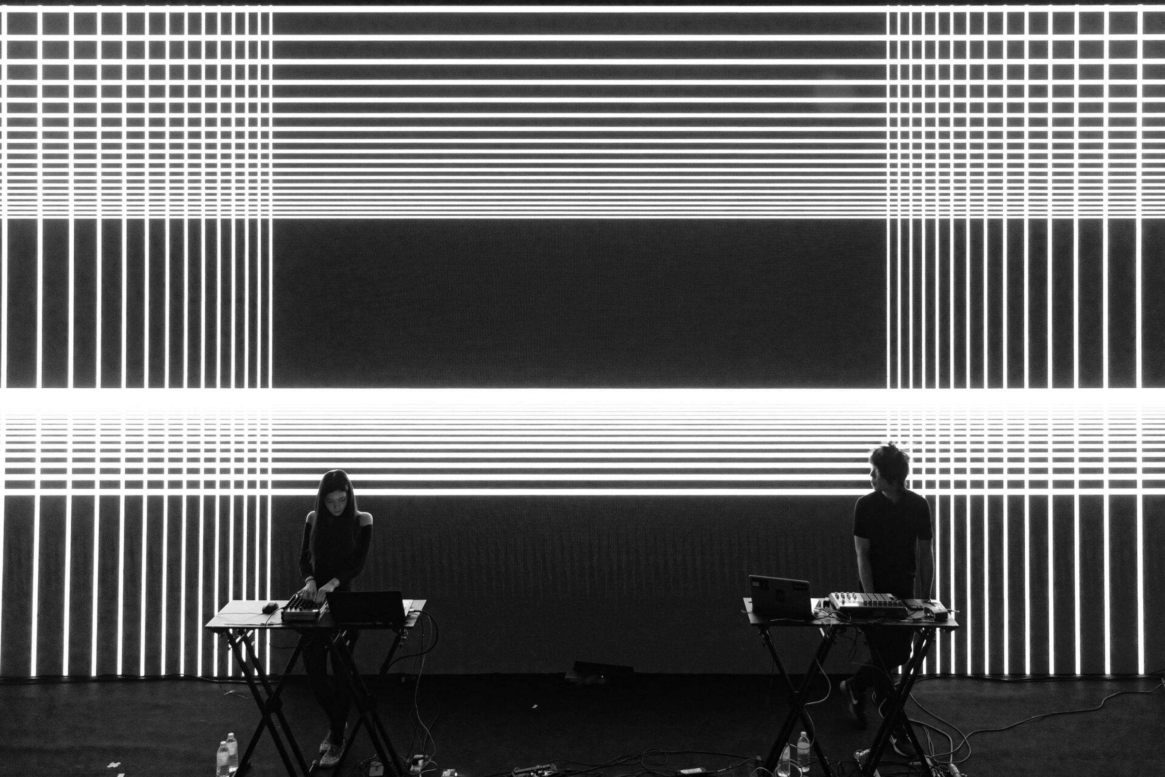
NS: When we were working on our installation we also realise it was cool to see people silhouette passing through it. The relationship with the human body scale and the installation was interesting. Tak as a musician was interested to extand his background in electronic music. That’s how in summer 2013 we worked on our first performance called LATE SPECULATION. The concept was us performing inside a translucent structure with 2 projectors and use our silhouettes as part as the visual effect. One projector was placed from the front and the other one in rear. By alternate which projector was on, we were making a visual illusion of us appearing or disappearing. SHIRO is our second performance in continuity with LATE SPECULATION.
Installations and performances are really different experiences. The first big difference is the fact that we are sharing the same moment with the audience and have a direct reaction from them. The dynamic is really different. It’s really powerful to hear the audience during the show.
TN: In addition to Noemi’s answer, I think we simply like the fact to not really limit ourselves to installation artists but also performances where music takes another dimension and also the way we directly interact with the audience and experience something in real time with them.
Stage is a special and unique place to express yourself and we enjoy switching from installation projects to live performance projects.
The 2019 pandemic in which we are still in, has obviously impacted quite harshly the arts and performances industry. The past year has definitely been difficult and for some more than others but I feel like we have all in some sort and in different capacities being able to plant the seeds for the present year. It feels as though there has been a lot of self-reflection and introspective work done at an individual level which will then enable growth, which is the theme of this issue. How do you both feel with this? How does Growth resonate with you?
NS: During 7 years we had the chance to be able to live for our art and been able to showcase it in so many extraordinary places. I would be for ever grateful for this. The rhythm of our travels, exhibitions, live shows was intense and we never really had breaks at all. When we had our first show cancelled and the first lockdown was announced I was a little bit puzzled but at the same time for the first time since years, I would have a break and time to step back about NONOTAK.
Now that it’s been a year we are in this situation and seeing how it evolves I’m more than sad and anxious about the future. With NONOTAK what drive us was the experience, the moment, to feel physically connected with a space, exchange emotions with an audience, share a stage with people. And when I see the art scene going more and more only online it deeply depress me.
TN: That “covid” crisis really affected the touring dynamic of our collaboration and it is pretty sad, but we know it is also reflecting in many other people’s lives. That crisis gave us the time to reflect on ourselves, the meaning of creating art especially in this type of context. But it also gave us the time to reflect on society and the power the government has over people’s lives and their freedom but more importantly, the way they are able to fragilise culture and normalize it out in the open.
Questioning the narrative became politically incorrect, aspiring for freedom makes you feel guilty and this is the society we allowed ourselves to live in. What kind of future does Art expression have in this “new normal” we are submitting to? I don’t really know about that. But it seems to me that being a sovereign individual is the starting point of any form of expression and we feel like we are totally losing the value of what it means to be free. It is pretty scary to me and I guess it is for many other people.
I think growth is still possible in this context. being adaptive is key to finding a path you feel comfortable with in terms of creating and growing. Since “covid” started we got ourselves in projects that required lot of learning and we at least feel like we took advantage of this a little bit. We don’t know when we would have stopped touring without any interruption if this did not happen as well.
We are doing this interview during the first few months of 2021 and the issue will be released this spring. Are there any projects you are looking forward to be taking on and that you could share with us?
NS: We are working on permanent installations that will take place in 2023. It’s a different challenge than working for events or temporary exhibitions but really exciting about the idea that the piece will last for ever.