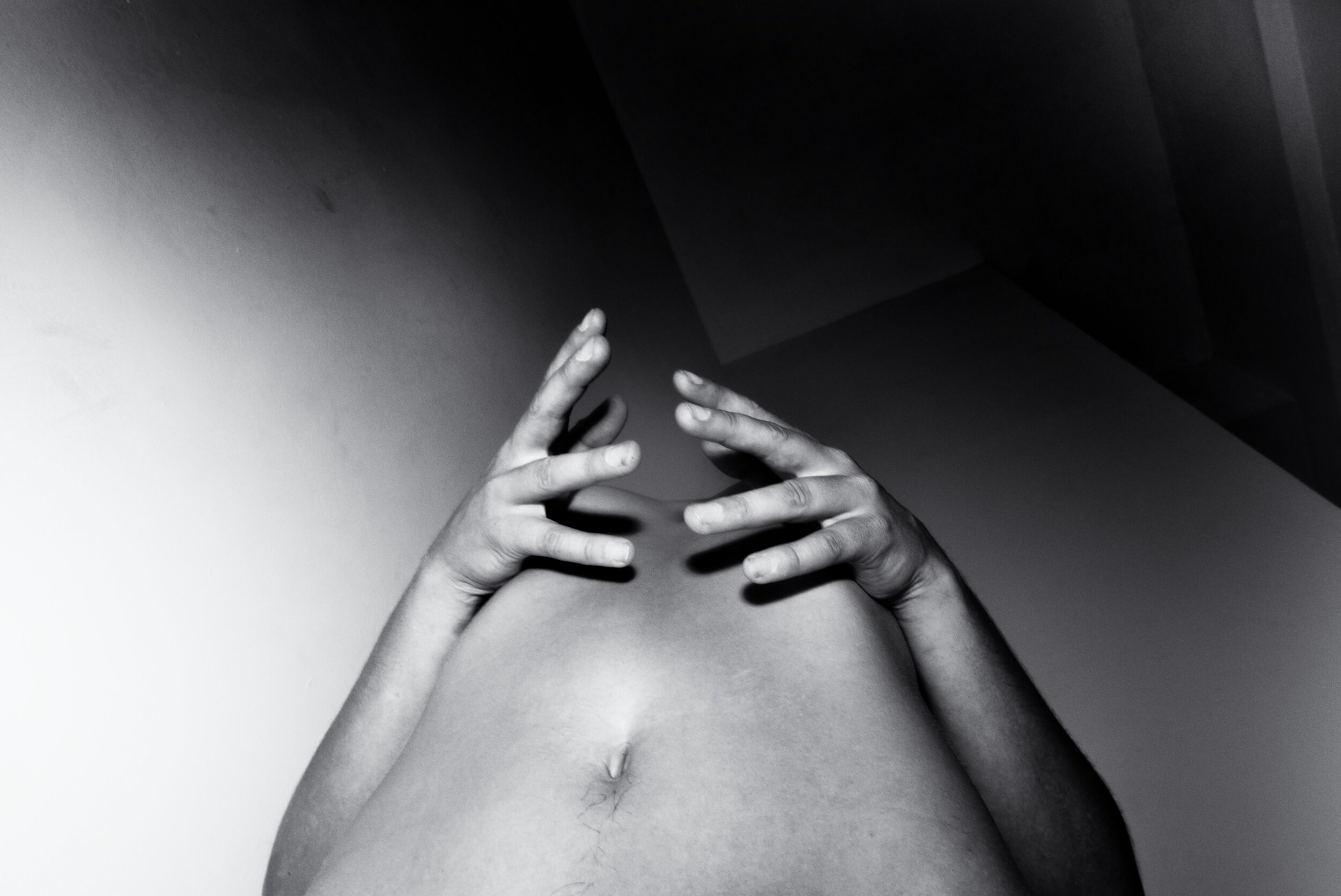
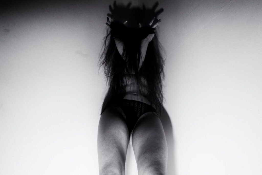
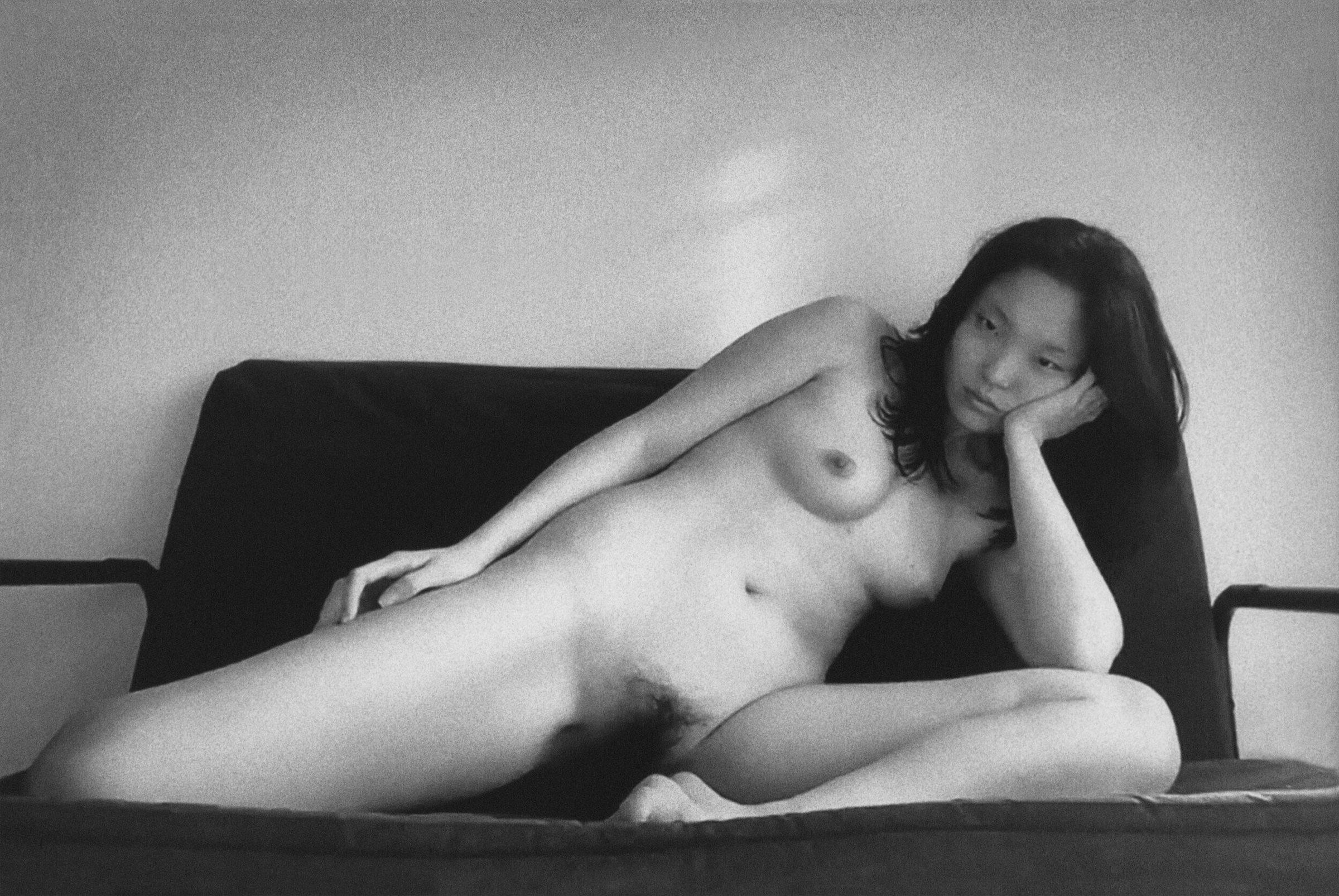
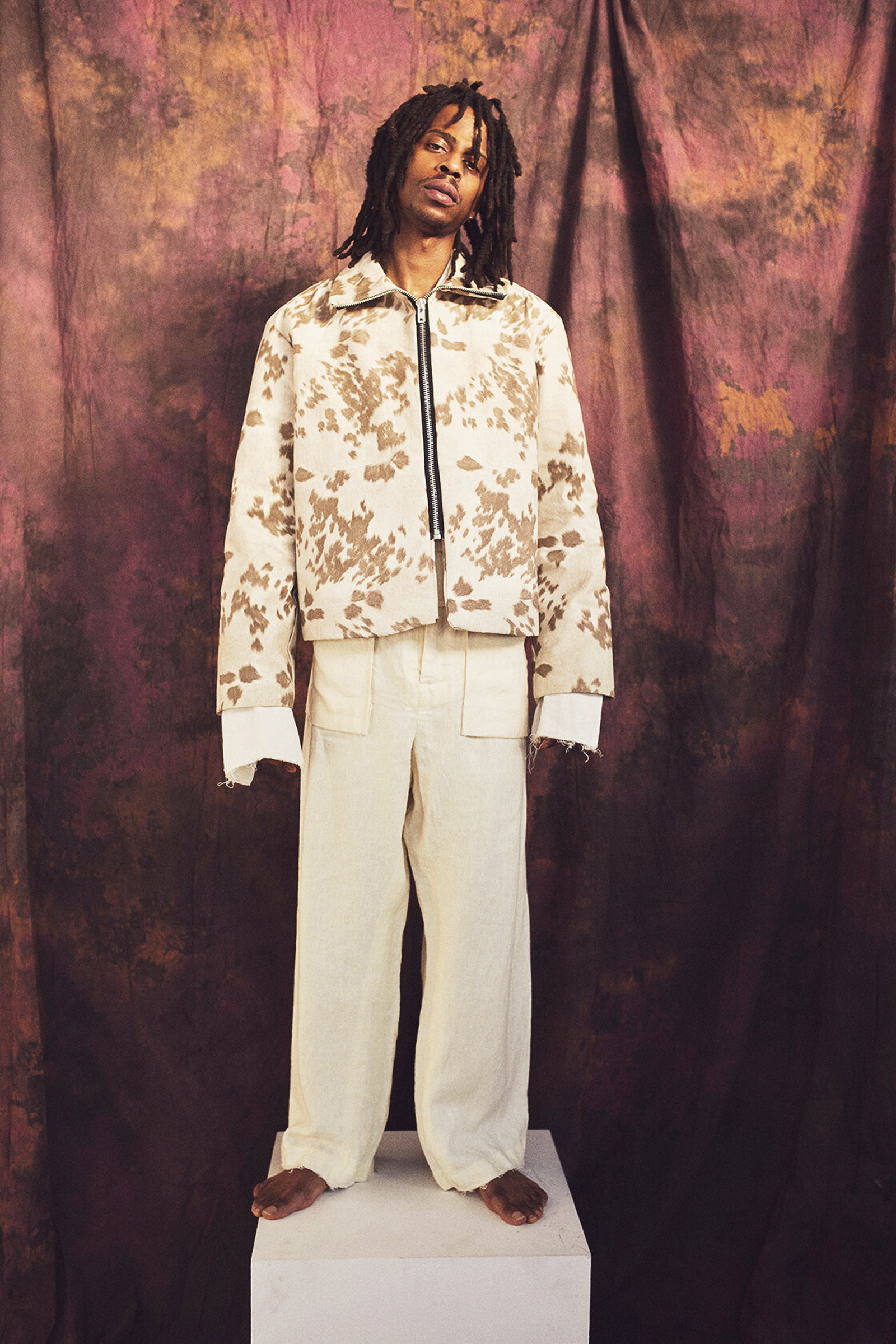
Spiders and Religious Mysticism

Credits
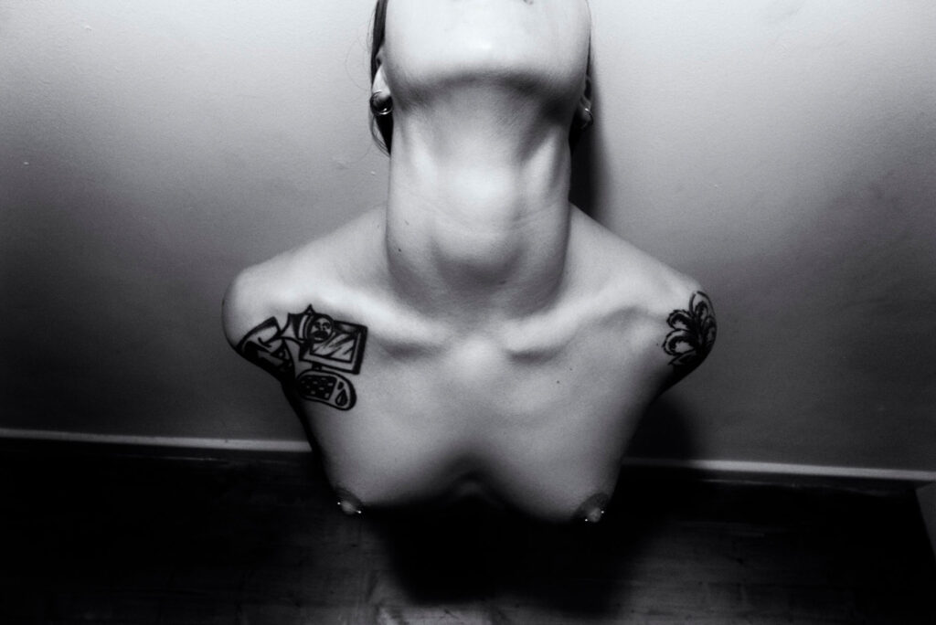
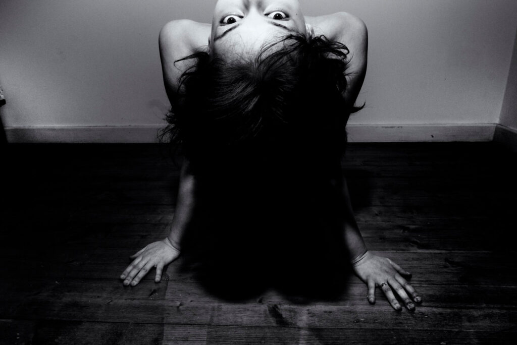
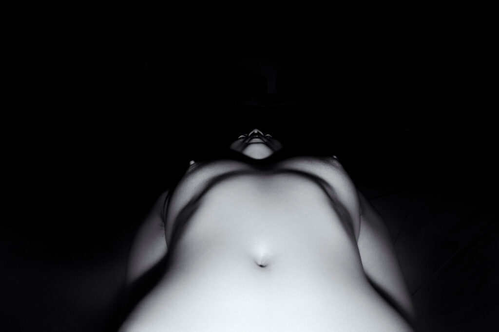
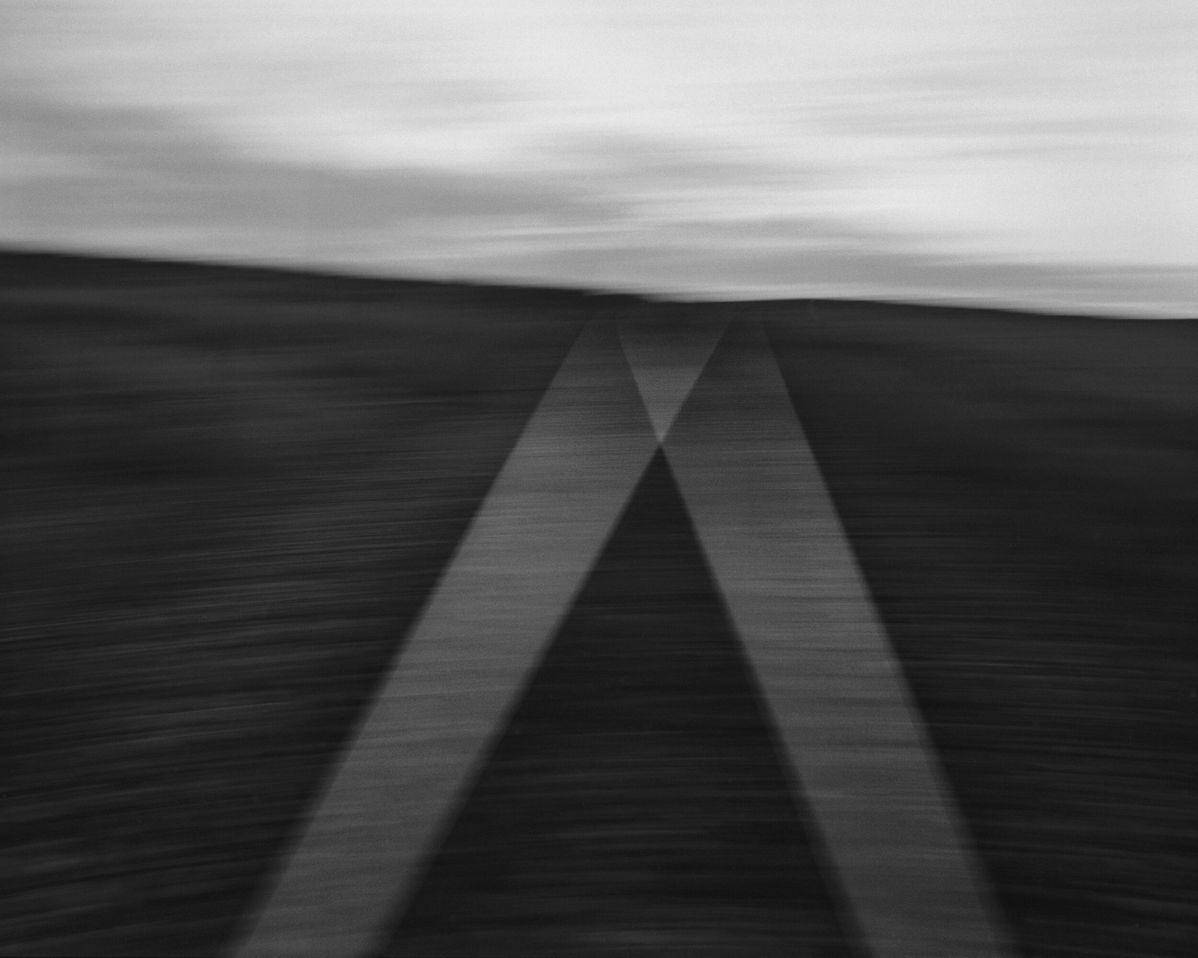
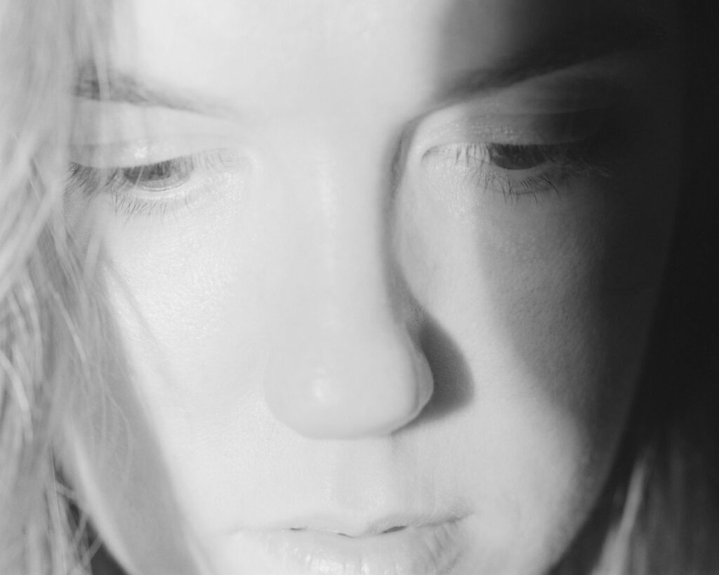
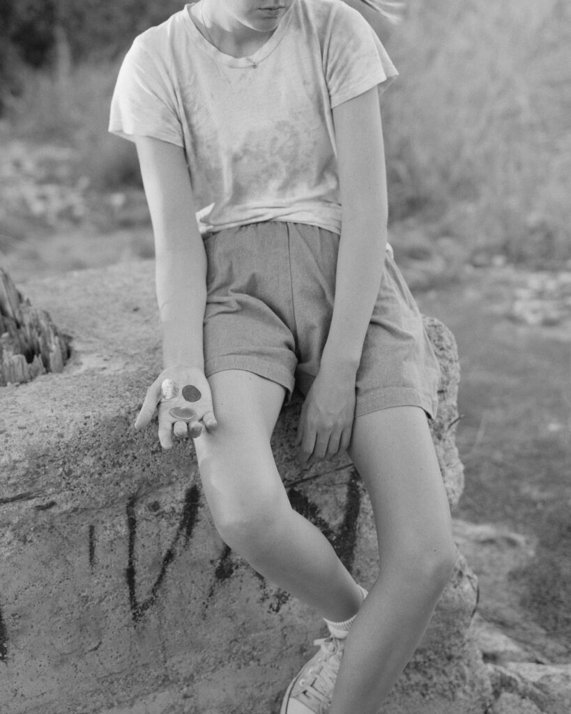
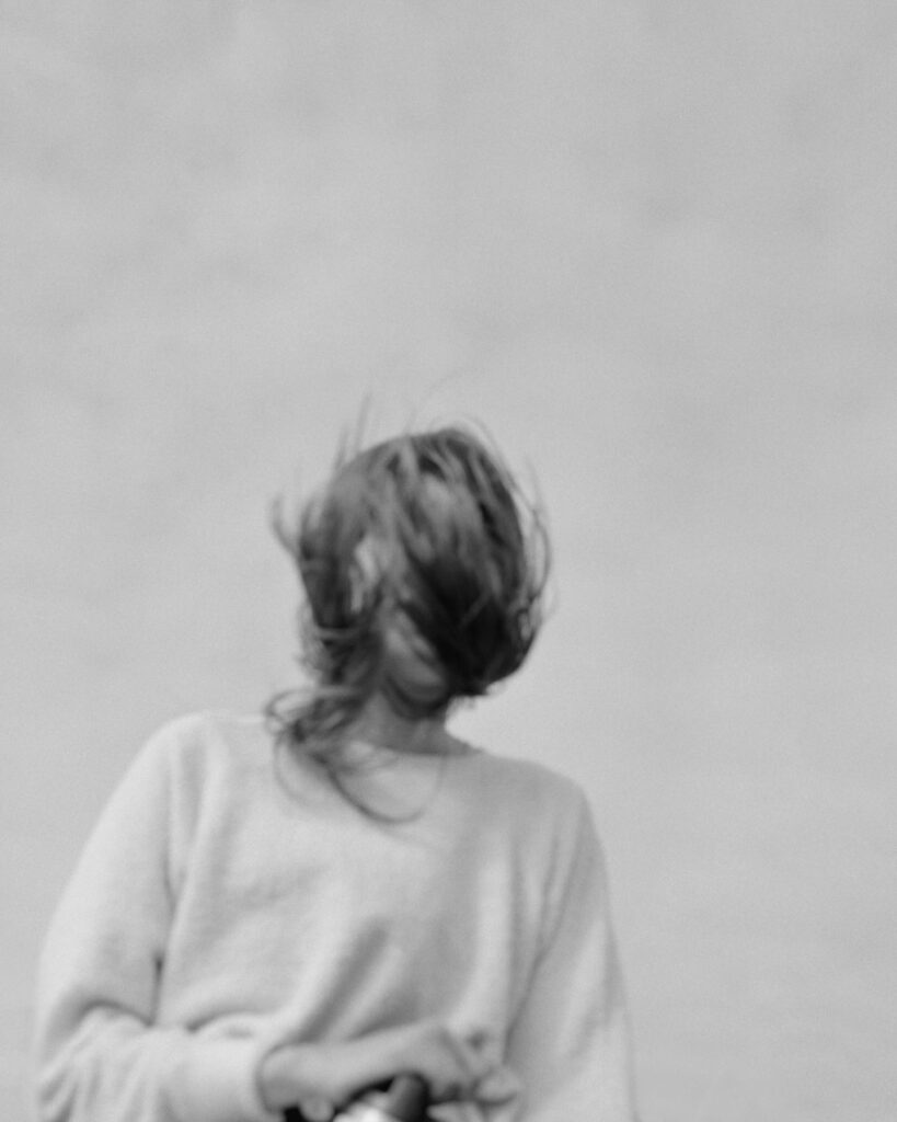
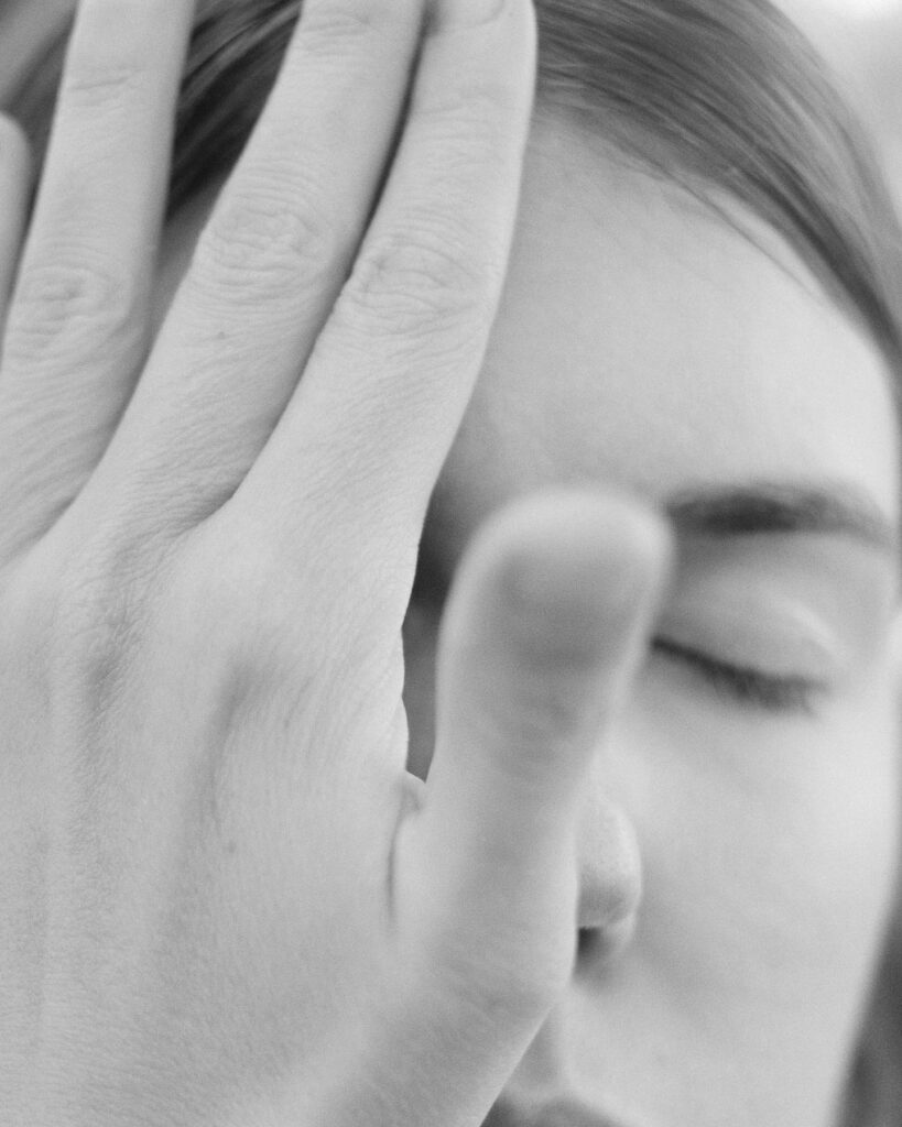
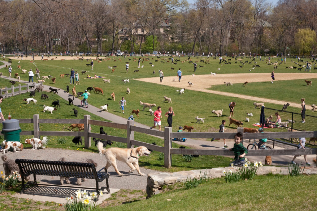
Photography · Yis Kid
https://yiskid.com/
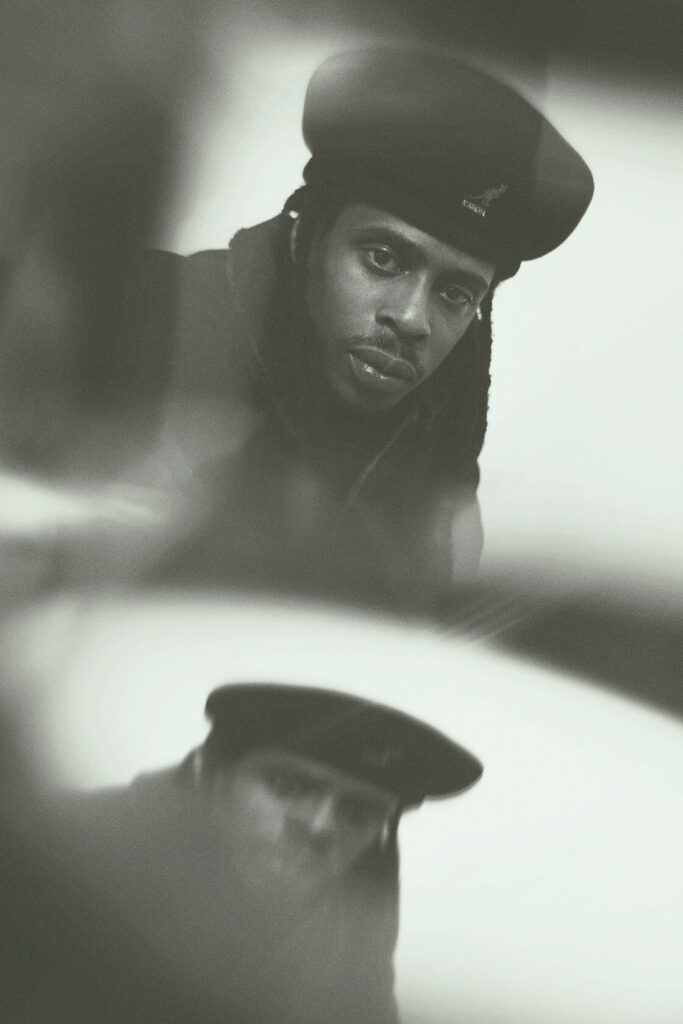
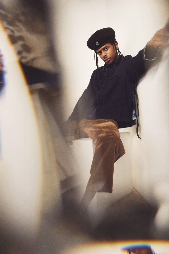
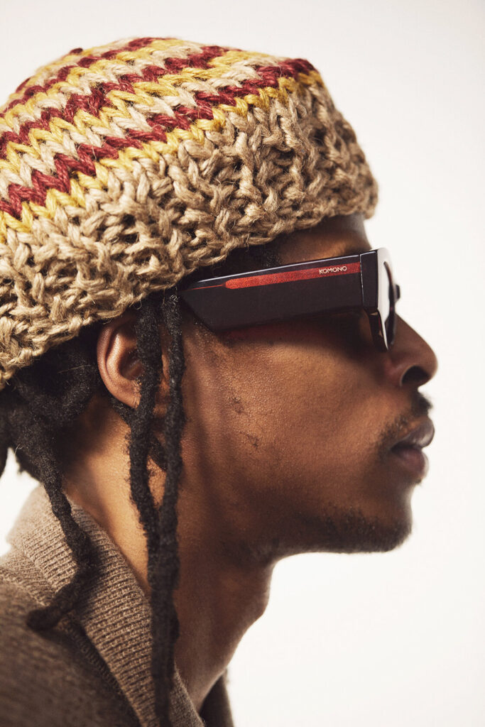
Credits
Photography · Yis Kid
https://yiskid.com/
When Sumayya Vally founded the Johannesburg-based architectural studio Counterspace in 2015, it was against the backdrop of a deeply entrenched narrative of western hegemony. As an architectural student in South Africa, at the University of Pretoria and then the University of the Witwatersrand, Sumayya found the curriculum pivoted around a western worldview. And as the name implies, Counterspace seeks to redefine such a narrative, to amplify the lived experiences of those who have, historically, been overlooked. Earlier this year, Sumayya’s efforts to incorporate marginalised and underrepresented architectural ideas into an existing lexicon were internationally recognised when she was included as one of the TIME100’s most influential people.
Sumayya’s architectural perspective is one shaped by her experience growing up in a place less openly inclusive, though equally diverse. Now 30, Sumayya’s early life was spent in the final years of Apartheid-era Pretoria. And as child, she experienced first-hand the impact that architecture and design can have on people’s lives. As South Africa nears 30 years since Apartheid’s end, it’s a country that remains deeply segregated by race, class and wealth. Architecture and city planning is not an innocent bystander here and have been used throughout history as tools for control, subordination, and exclusion. Sumayya’s exposure to this complicated reality informs the interdisciplinary, and often imaginative, work that Counterspace does.
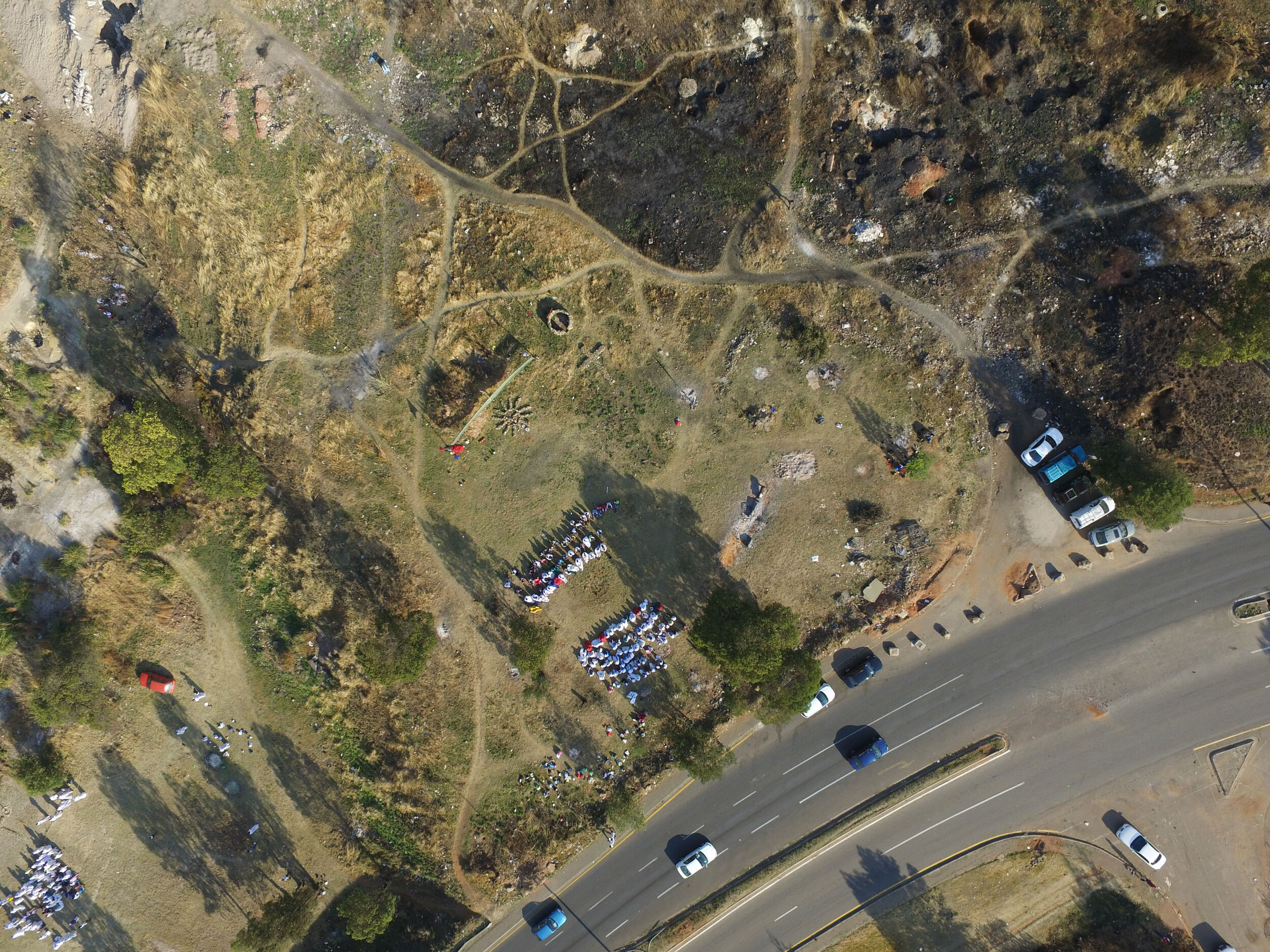
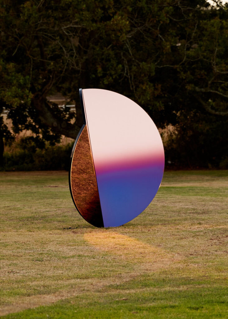
In 2019, the studio unveiled Folded Skies – a series of three sculptural structures made from interlocking tinted mirrors. The iridescent glow captured in the surfaces of the structures appears to represent the history of a city built on the vast gold deposits discovered in Johannesburg in the 1880s. While the legacy of this glittering past is reflected in the city’s colonial architecture, Folded Skies recalls instead the ecological aftermath of the gold rush. The city remains blighted by toxic pollution emanating from the equally vast number of waste dumps left behind from abandoned gold mines. The presence of these dumps is a reminder both of the aphorism that ‘everything that glitters is not gold’ and of the country’s history of segregation and suffering.
Johannesburg was a city divided right from the start, with mine-owners, wealthy from the gold rush, living separated, then segregated, lives from a black population who were eventually forced into townships in the city’s suburbs. The hangover of that gold discovery continues to wreak havoc. The large domineering heaps act as a physical barrier between rich and poor, black and white neighbourhoods; a reminder that segregation still exists. Toxic fumes from the dumps, which are themselves now being mined for the fragments of gold they may contain, are carried south by the wind, poisoning the black communities who live in their path – environmental racism in practise. Though human-made, the waste heaps demonstrate how materials can be used to control, to divide, to enslave people; as tools to construct a built environment, or as resources to build global trade.
By engaging with Johannesburg’s complicated history, Sumayya and Counterspace’s practice is as much social history as it is about designing for a better future. Uhmlaba, a film made in collaboration with the Guggenheim Museum, will explore South Africa’s history of segregation using soil (as land) as both its catalyst and focus. The studio often uses film and photography (archival and contemporary) to animate their ideas; visual evidence to demonstrate the fluidity of life and people in an urban environment. And if Johannesburg exemplifies how the architecture is used to control and segregate, the architect’s plan cannot always anticipate the unpredictability of the lived city experience. Counterspace celebrates, and designs, with small acts of subversion in mind. And so, as Sumayya explains in our conversation below, a new approach to architecture and the way we look and engage with urban spaces begins with interweaving unheard and overlooked histories into the fabric of our built environments.
Would you be able to share some insight into the upcoming film Umhlaba?
Umhlaba translates to land in Zulu. The land in South Africa, like many places in the majority world has been implicated in our histories of movement, dispossession and displacement, empire and extraction. The film considers the depths, scales and layers of connection (and violences) in our relations to land – through the narration of recipes, stories and ingredients that become part of our cultures and constructions of belonging – to the violence of breathing toxic dust and the zoomed out segregation and separation of bodies from land in Apartheid city planning. The film is a collage of these various scales and entities, and weaves together connections and links between what was assumed unconnected and innocent.
How did you develop the approach that Counterspace takes through research, practice and pedagogy?
Johannesburg has served as a source of immense inspiration for the practice. Because so much of the city exists below the surface, so many ritual, economic and other practices have developed incredible resistances and are able to surface and exist, despite being excluded by our city’s histories and infrastructures. There is so much that lives beyond the limits of traditional planning, design and beyond the tools of the architectural plan, section and elevation. These ways of being invite us to imagine different ways to draw – to find tools to learn, absorb, understand, listen to and interpret our conditions. Many of them are aural, oral, atmospheric – which has given rise to drawing through film, performance, choreography, the digital, sonic and atmospheric field notes, temperature, colour, etc., to develop an expanded lexicon and ways of reading and seeing Johannesburg.
What informs your approach as an architect to incorporate performance, the medium of video/film, cultural histories into the practice?
Rituals, ways of being and the lives of people in my city – and this intent to draw, make visible, amplify and sharpen aspects of our histories and cultures that cannot be included in the traditional tools and ways of archiving that the discipline and the profession of architecture has inherited.
Counterspace’s work delves into materials like sand, soil, everyday detritus, so I’d love to know what you see as the cultural importance of “material”?
I very much see materials as shifting earth and land; constantly being negotiated, reconstituted and reconfigured. Whether implicit or explicit, all projects stake a political claim in their approach to materials. I am very interested in the use of detritus, in traces and reconfigured leftovers, in how these give us a reading of our relationships to the earth. Materials are not neutral – everything, from cane and cotton, to concrete and gold – is a reading of our ties to each other and our histories (and consequential futures). I am also interested in blurring the binaries that we have drawn between ourselves and the world we are in, and a part of. Johannesburg has also given me an implicit desire to be resourceful and to piece together a lot with very little.
How do you navigate the kinds of architectural malpractices/Western authority that shaped the studio’s raison d’être?
I see my practice as an effort to realise design languages from places of difference – different ways of being and seeing, different histories and stories – and in that sense it has always existed tangentially to the dominant canon. I think things are changing now, but for a long time this meant that the work was quite invisible to the dominant canon. I very much see myself as part of a generation and a movement working to translate and embody our own positions of difference and bring a critical mass of them into the world. Any identity that is different to the dominant discourse is a lens with which to see the world from a different perspective – which is so needed, now more than ever.
It’s interesting to think of spaces where people gather as places that weren’t always envisioned as serving those very purposes. How did growing up around Johannesburg shape your understanding of this?
Our city, of course, has a history of clandestine meeting and organising – from pirate radio setups on kitchen tables to underground jazz during Apartheid. The city has such a divisive understanding of what public is and looks like. In many regards, we never had public spaces that are truly designed for everyone and that have truly drawn on our ways of being and our understandings and cultures of what ‘public’ is and looks like. But, in many other ways, the resilience of practices and gathering that exist outside of, and despite formal limitations, has been a revelation. Being able to see and read these, and learning from the atmospheres and spaces that are created by people and their practices of gathering and constructions of belonging – whether at a carwash, at a petrol station, for a lunchtime gathering, or church on a patch of leftover veld grass in the centre of the inner-city – has been deeply fundamental to my practice.
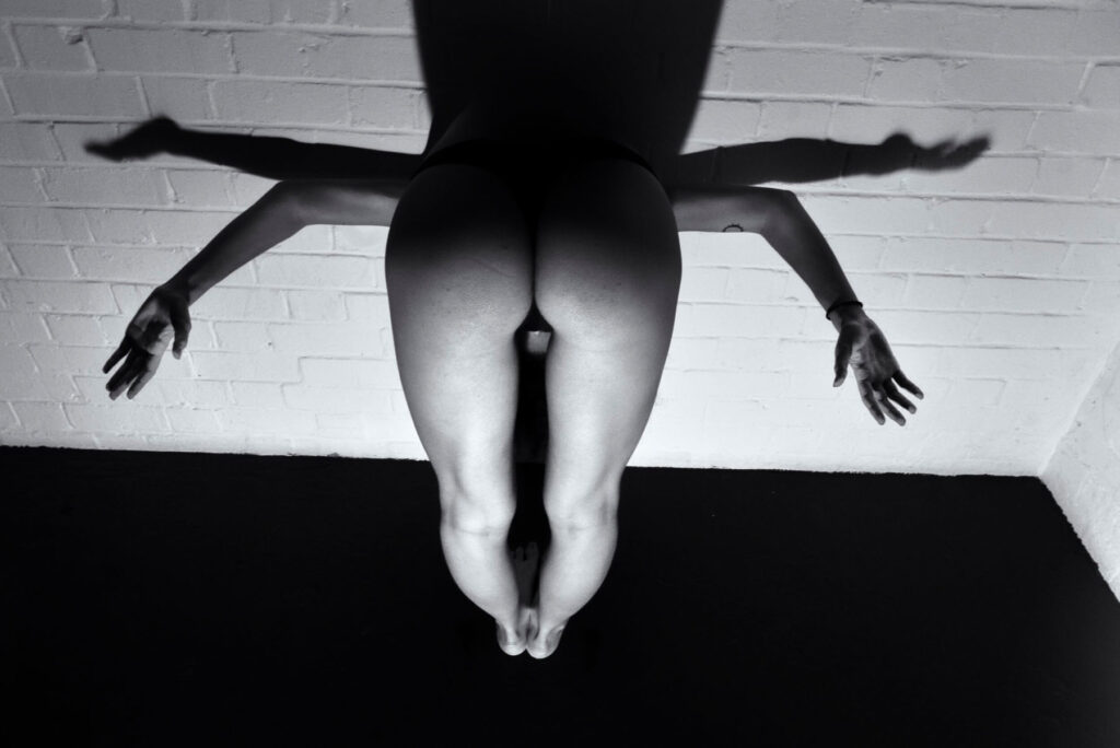
Mother of Dogs
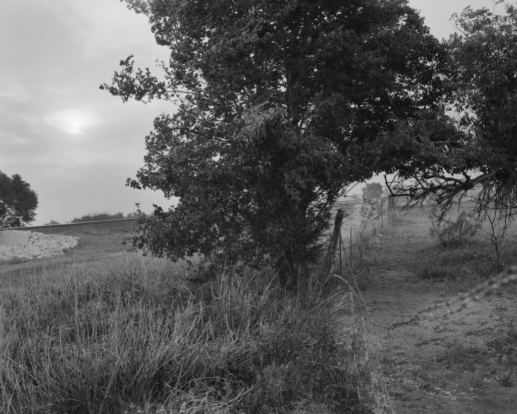
“Mother of Dogs is a project that I began and completed at the beginning and middle of quarantine. Life had been tossed in the air once the pandemic hit, so my partner and I began taking daily walks by the train tracks next to our house in order to introduce some stability. That project could be related to growth considering our development towards balance and steadiness.”

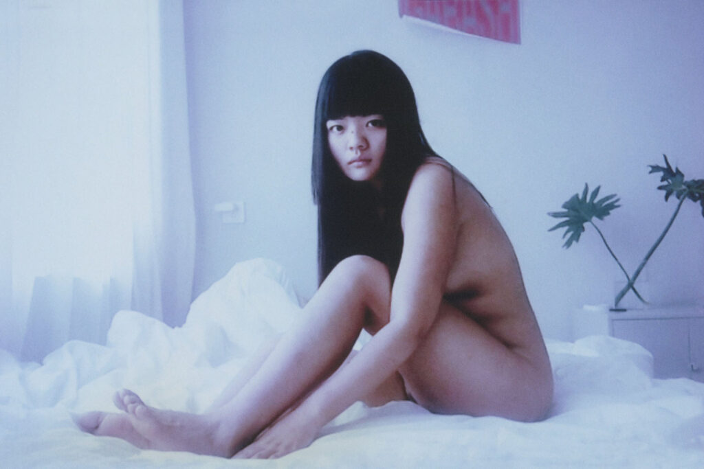
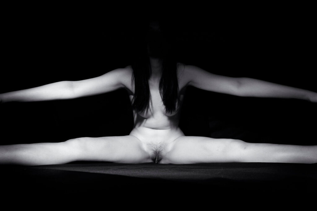
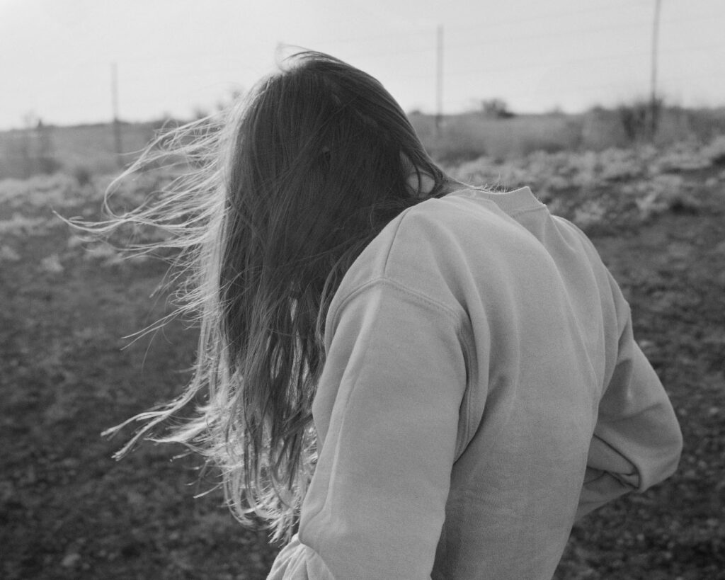
My body. My limbs. My hair. My nose. My skin. My heart. My lungs. My breath.
Much of what we are taught about ourselves as women is that our bodies are not ours. As if we are someone else’s to keep, to define, to use, take pleasure in, and to hurt.
Loving our bodies is not as simple as it sounds when we are still finding a home within us. When we’re alone in nothing but our skin.
While nudes have traditionally been used to display our bodies for the pleasure of the male viewer, these portraits of us are distinct in that they evoke the safety we feel when no one is looking. We do not produce images for the gaze of patriarchy or to compete with other women. We don’t seek to empower people — we know empowerment happens when we take control for ourselves.
Across many regions and cultures, though it doesn’t represent every kind of body and beauty out there, this project is us sending nudes to ourselves — not to be consumed but to be revered. Each woman has a unique, evolving relationship with her body. What we have in common is being alongside one another on the path to loving our bodies how we choose, despite the battles we may face.
So we dream along our journeys. We touch each hair, each fold, each wrinkle, and each scar, remembering that we belong to ourselves.

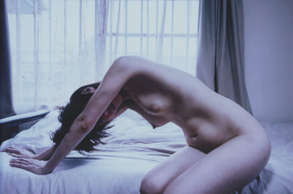
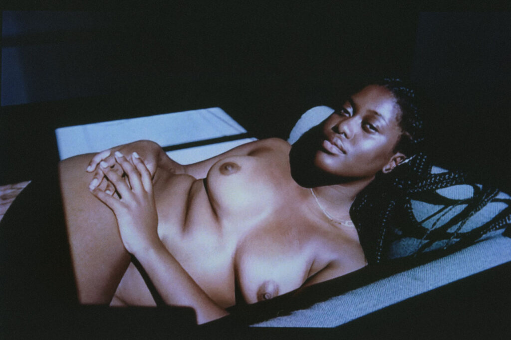
Credits
Words · Alexandra Leese and Xoài Pham
Me + Mine is available for purchase via antennebooks.com
Proceeds of Me + Mine will be donated to the organisations Black Trans Femmes in the Arts, Trans Law Centre and Rape and Sexual Abuse Support Centre.

New-York based photographer Alessandra Sanguinetti often explores through her work, changes, experiences and feelings in society. Sanguinetti’s photography is infused with a certain serenity and a beautiful melancholia showing a certain level of trust between her and her subjects.
Her decade long project The Adventures of Guille and Belinda captures two cousins growing up together in the rural province of Buenos Aires, in Argentina. It is a testimony of family, a study of love, tracing the girls’ lives between every day and imagination from the ages of 14 to 24 and their passage from girlhood to young womanhood. The series which began in 1998 is the subject of two booksThe Adventures of Guille and Belinda and the Enigmatic Meaning of Their Dreams (Nazraeli) and ten years later,The Adventures of Guille and Belinda and the Illusion of an Everlasting Summer(Mack).
Recently, Alessandra Sanguinetti shot a cover for Vogue Italia for their January 2021 Animal issue which aimed at bringing awareness to the urgency of the environmental problem.


When I was nine years old a book I began to get curious about the books on our living room coffee table. Amongst books about nature and old ‘masters’ (Caravaggio etc) there was a Lartigue, a Chim (David Seymour), Dorothea Lange book , and Wisconsin Death Trip, by Michael Lesy. It was the latter that made me beg for a camera. I had a gut reaction to that book – it was the first time I saw, or paid attention to, images of people long gone, and it was the first realization that I was going to die and disappear as well. I panicked and had immediately associated photography with death, life, and memory.
I did receive a camera for Christmas and set out to memorialize everything in my life.
That’s the way it’s been since.
As far as my practice, it was in my twenties that I consciously realized photography was a way to relate to the world and a way to make a living. I’d never thought of myself as an artist or anything in that neighborhood, until then.


Credits
Images · ALESSANDRA SANGUINETTI
https://www.instagram.com/alessandra_sanguinetti/
Designers


Credits
Images · PELLE CASS
https://pellecass.com/

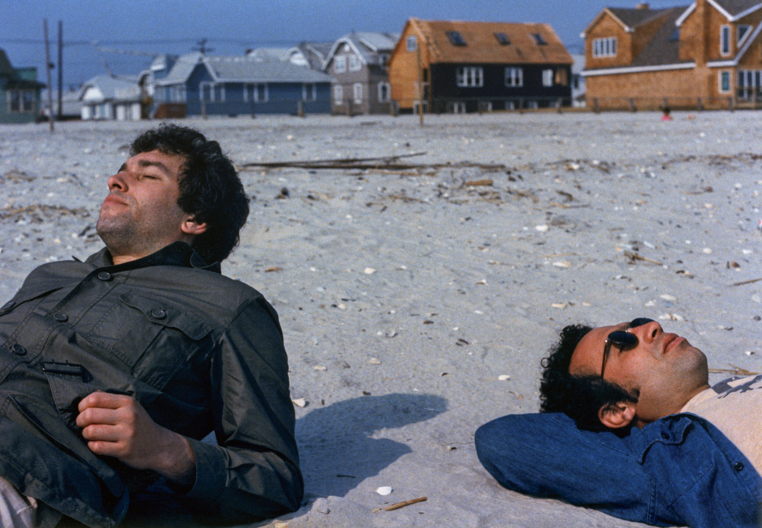
Rick Schatzberg grew up in a suburb of Long Island in the 1950s – a place constructed out of nothing but a post-war optimism for prosperity and abundance. A place that, by Rick’s own admission, was in reality, characterised by its monotony and it’s ‘nowhereness’. Surrounded by the comfort of middle class living, Rick and his friends discovered the world by hanging out in one another’s bedrooms, the local mall or a wooded area not far from their suburban enclave. As teenagers, the boys (as they came to be known amongst themselves) would experiment with alcohol and drugs, and hang out with girls; an upbringing unremarkable to anyone who wasn’t there at the time. As they grew older, the boys took on different careers. Rick moved to New York and became an entrepreneur, the others would become teachers, taxi drivers, salesmen, realtors and healthcare workers But they remained what Rick calls a ‘cohesive entity,’ eternally bound together by their childhood moniker.
The Boys, the second photobook by Rick Schatzberg, is the result of both his pivot into photography and the unexpected death of two of his friends in close succession. Confronted with the fragility of life, Rick began in earnest to take photographs of the remaining boys. Using a large format camera, the images of himself and his friends, now in their mid-60s, are a stark reminder of the passage of time. In and of themselves, Rick’s photographs are tender portraits capturing the toll of time and age on the human body. But in the book, these images are interspersed with snapshots and photographs from the boys’ youth. Aged bodies become youthful, smiling faces – hanging out, experimenting with weed. Though Rick is quick to outline that The Boys isn’t nostalgic, there’s something poignant in flicking through the book’s pages and recognising the quirks and characteristics of each of the boys as time passes by. Addressing the responses he’s had so far about the book, Rick sums this feeling up well in our interview below: ‘anemoia: nostalgia for a time or place you’ve never known’. Many of the old photographs included in the book are snapshots that had been forgotten about – forgotten in the almost immediate aftermath that they were taken. They raise questions of memory; can the boys even recall the time and place that the photograph puts them in?
Alongside the images, old and now, are twelve short texts. One is an email exchange between Rick and two of the boys trying to piece together the facts of a fight that happened at a wedding. Their recollections of what actually occurred differ; evidence of the unreliability of memory. To celebrate the release of the book, Rick spoke in conversation with the photography writer and curator, David Campany in early 2021. As well as discussing the subject matter of The Boys, something that came up as crucial to the book’s release is its design. As part of the book launch, Rick shared a video of himself going through the book to demonstrate that the large format photographs of his friends feature as fold out pages (something, he tells the audience via Zoom, his mentors and peers from his photography course advised against). But something that also stands out in the structure of the book is that the 12 texts Rick includes in The Boys read like snapshots themselves.
An accompanying essay to the book by the writer, Rick Moody, raises this point, writing about the ‘relationship between a still image and the kind of expressive power that we associate with narrative activity.’ In the context of The Boys, as a photobook, this takes on historical significance. Writing about the 1920s, a time of the proliferation of the photobook and the photo essay, the academic Andreas Huyssen describes how a new form of literature appeared.
The “modernist miniature”, popularised by novelists like Franz Kafka and critical thinkers like Walter Benjamin, sought to capture modern life with photographic precision through words. In that way, then, Rick’s book is much more than a selection of photographs of his peers – young and now old – it’s a reckoning with how we navigate time, memory and our existence through the lens of modern life.


How did your experience of studying photography influence The Boys?
My work on The Boys was influenced by my art school education in several ways. To begin with, the photography MFA program I was enrolled in at Hartford University, Connecticut, is heavily focused on photobooks, and I went knowing I’d be making one. I thought I already knew a fair amount about photobooks, but the breadth of what I was exposed to by teachers, guest artists, and student colleagues was eye-opening. I had to examine my motivations to make any work and to think about how I would make a book that wasn’t just a collection of interesting pictures, but something with substance and depth.
In grad school, one of the challenges of making work that you hope to eventually present to the world is interpreting and deciding what to do with the near constant feedback you receive. You go to art school to not be limited by your inclinations. But there’s also the danger of gearing your work for approval of teachers and fellow students. In the end, I had to absorb what was helpful and discard what wasn’t; making that distinction was sometimes a confusing struggle.
At the virtual launch, you emphasised that this book had to be universal, and not nostalgic. What feedback have you had from people about The Boys? Does it differ from the boys themselves, those who come from the same place/time, and those with no real connection to the American suburb?
For me, the work is not really nostalgic; I feel that the almost forensic nature of the large format portraits grounds the work in the present. But I may have overstated my case against nostalgia a bit. The feedback has been consistent in that the work evokes an emotional response, which I find very gratifying. But judging from what people have written or told me, the way into the work has really varied. For some, the immediate connection is nostalgia for their youth or that time or place. For others, typically younger readers and often European, it may be anemoia: nostalgia for a time or place you’ve never known. (Like films and novels, photography is good at evoking this.) I’ve heard from people for whom the portrayal of enduring friendship was the hook, and after reading the book they either felt the urge to reach out to friends they have not been so attentive to or lamented that they didn’t have friendships that lasted into adulthood.
Obviously, this work is radically specific: a very particular group of white guys of a particular generation, raised in a very particular American suburban community.
“From the outset though, my feeling was that if this work isn’t felt to be universal then it’s a failure. Mortality, after all, is the bedrock of our biology.”


You mentioned the importance of collaboration in making the book – did this collaboration extend to your friends? Or did they feature just as subjects? Why did you use a large format camera for the portraits?
I discussed the deeper underlying themes of the project – aging, loss, memory, mortality, friendship – with my friends during our photo sessions. Though my directions for posing were minimal, these conversations helped to create the atmosphere I needed to portray vulnerability. I also explained that I planned to use the work as the basis of my master’s thesis so they understood that there would be a critical audience for the work beyond our circle. Their attitudes went from gracious acceptance to genuine interest. It was as though they became partners with a stake in the outcome.
“It was clear that I would be making unheroic portraits that might not be flattering, and they understood there was good reason for doing so.”
The word that often came to mind in these photo sessions was ceremonial. Using a 4×5 film camera, with all its fussy rituals and storied traditions, felt performative and serious. The slow, cumbersome, and mysterious (to my subjects) process helped amplify the psychological intensity surrounding the project. In the face of our brothers’ deaths, together we were creating a formal certificate of presence (to use Roland Barthe’s expression), using traditional tools.
That said, it is was not a true collaboration because the power to select specific portraits for use in the book was mine alone. My friends did not even see the images I was choosing between, nor did they know how I would ultimately deploy the portraits in the book. They trusted me. It was important to assert my authorial voice, but without entirely drowning out the voices of my friends, which they asserted through the written word, their snapshots, and their gestures in the portraits.
We’re faced with the processes of ageing, time and mortality in The Boys – when returning to your childhood home and neighbourhood for the book, had the nowhere place you came from aged too?
In the winter, with the trees bare, the neighborhood looks very much like it did 50 years ago. In the warmer months the trees, mature and leafy, give the neighborhood a homier, more established feel. The automobiles in front of many of the homes are now more numerous and luxurious, probably more a sign of growing consumer credit and a shift in values than of greater wealth.
The short texts in The Boys read like snapshots, how and why did you choose the texts you include?
I was interested in constructing narratives to loosely link text and images that would stand as discrete memories – not stories as such but fragments that help tell the larger story. I chose to write short texts that could function in different ways: sometimes straight narrative; sometimes like vague, recovered memories; sometimes as meditations; and sometimes more as dream than narrative. The one outlier is the story about my father. I didn’t initially think to include this in the book. I was having a conversation with my editor and I related the story to her.
“She told me to write it down and as soon as I did, I knew it belonged in the book.”

In his essay, Rick Moody refers to a good photograph as one left in a drawer for 30 years. Did the archives of photographs of yourself and the Boys ever come to light in the intervening years leading up to the making of this book? If so, in what circumstances?
Several of the snapshots have been circulating for ten years or so on social media. Others, which I found loosely strewn in boxes stored away for years, may have been passed around shortly after they were taken but were mostly forgotten. Time conferred poignancy as Rick Moody describes, but curating enlarged full-bleed versions astride pictures of old men and stories of death, makes new meaning. Even the more familiar old snapshots felt like new discoveries.
Credits
Images · RICK SCHATZBERG
https://rickschatzberg.com/


Credits
Images · LYNDON FRENCH
https://lyndonfrench.com/
Born and raised in Brooklyn, rapper Goya Gumbani moved to London as a teenager. Landing a retail job at the London branch of Pharrell and Nigo’s streetwear label, Billionaire Boys Club, Goya joined a hub of fashion and music. The story goes that when the store closed, BBC would become a de facto studio – with industry heavyweights passing through its doors. Goya went on to pursue music, notably with the release of the 2018 EP, Morta & More Doves, but fashion has remained on his orbit. For one, he walked the Louis Vuitton AW presentation earlier this year – a far cry from ‘[modelling] in mad streetwear stores basements’ five years ago, as he shared on Twitter. Goya’s slick personal style is both an amalgamation of his inspirations (‘I like shit that looks 80s – pro Black, UK Reggae and Dub man from Brixton,’ he told BBC), and a visual embodiment of the London music scene that has come to influence his sound. Last year was a busy year for Goya, releasing five EPs with the likes of producer Oliver Palfreyman, on November’s six track EP Truth Be Sold, and with Bori on Steps Across the Pond from March (which got a limited edition vinyl pressing last month, a year after its release). Goya’s catalogue is consistent in its warmth. Often reflective and contemplative – and at times, existential – Goya’s vocals are perfectly matched to the soulful, hazy beats that are coming to define the artist’s sound.
How do you set the pace of making music, and when do you know if something makes the cut for release?
I do this every day – at this point it’s like breakfast or dinner. I wake up and think about something music related. The making the cut process really just depends on where I’m at sonically or visually.
“Being from Brooklyn, living in London” is something of a tagline attached to your name. In terms of your sound, style and influence though, how do these elements come together?
They are both two great cities, they have both taught me different things from different perspectives. Both cities are in my DNA at this point, so they make me – if that makes sense.
I’d love to know if working at Billionaire Boys Club opened up your experience of London in different ways. How much of working there influenced your transition into music?
Yeah BBC was like a hub, everybody from every crack of the world used to pass through. So I met a lot of people in all fields, but most of the people I worked with there, also made music. I use to think I would just meet people to meet ‘em. But soon after, I realised you meet everyone for a reason. It’s not only to talk sweet nothings, but to build an grow to some degree.
At what point did you feel ready to share your music with people around you?
Few years ago, I just had something I wanted to show, which kinda lead me to a place where I wasn’t fazed by my own self-doubt.
I really love the EP covers/videos, and how they’re all quite different – is there any relationship between the music and the visuals you use? (If so, to what effect?)
The artwork and visuals are a lot. I feel like that’s gonna speak to you before you even hear anything. So it’s chosen with the intent to grab and leave wonder… Everything relates though; it’s all one big canvas of imagery that can speak on its own if needs be.
Besides appearing in the Louis Vuitton AW21 presentation, what defines ‘style’ and your style?
Style is expression and personal touch to me. I worked in a couple menswear spots back in the day, so that gave me the knowledge into different eras and how style was a time stamp. But, my old boy Jack used to tell me: “if no one likes it, you going in the right direction”, Which I took as get dressed for yaself and you can’t go wrong. So that’s the motto.
What are you currently working on, and what can we expect from you this year?
I got a collab project coming out with [the producer] Subculture and a solo tape coming out this year I’m excited about. Few things with some familiar faces too… Oh and catch me on a few festival line ups!
Credits
Photography · DAVID REISS
Styling · SERGIO PEDRO
Creative Direction · NIMA HABIBZADEH AND JADE REMOVILLE
Interview · ELLIE BROWN
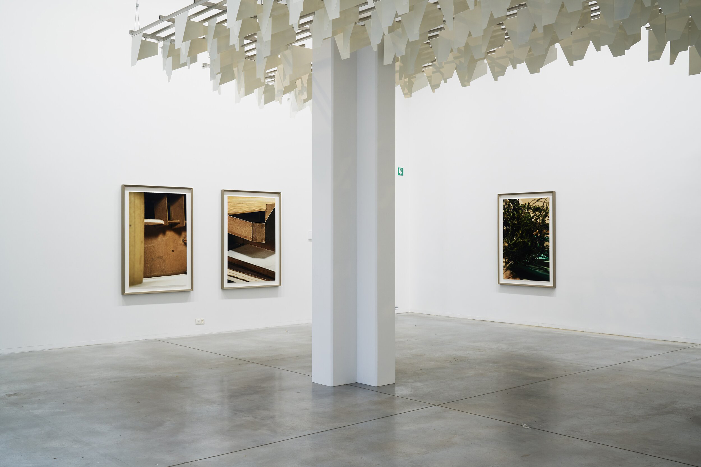
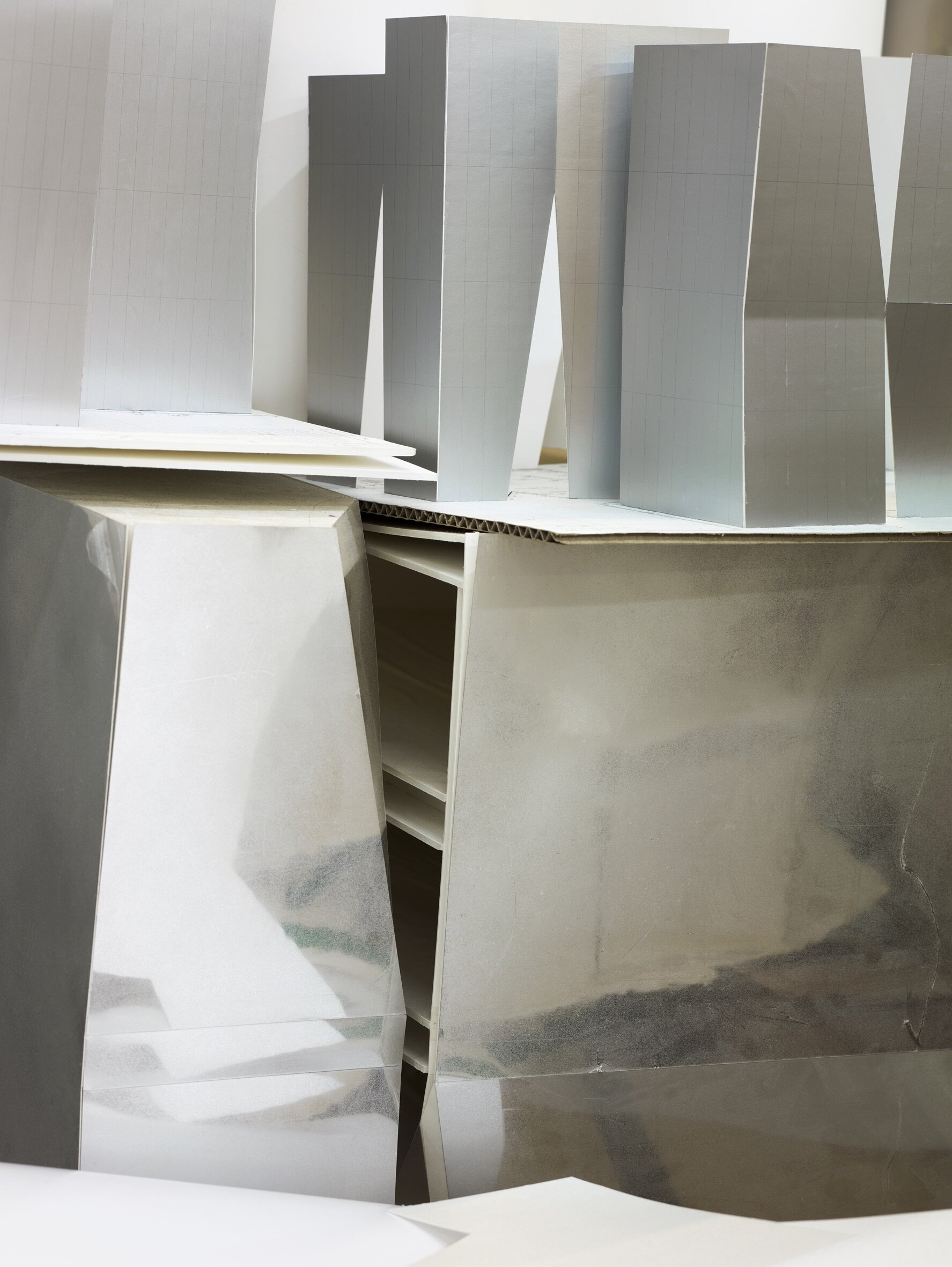
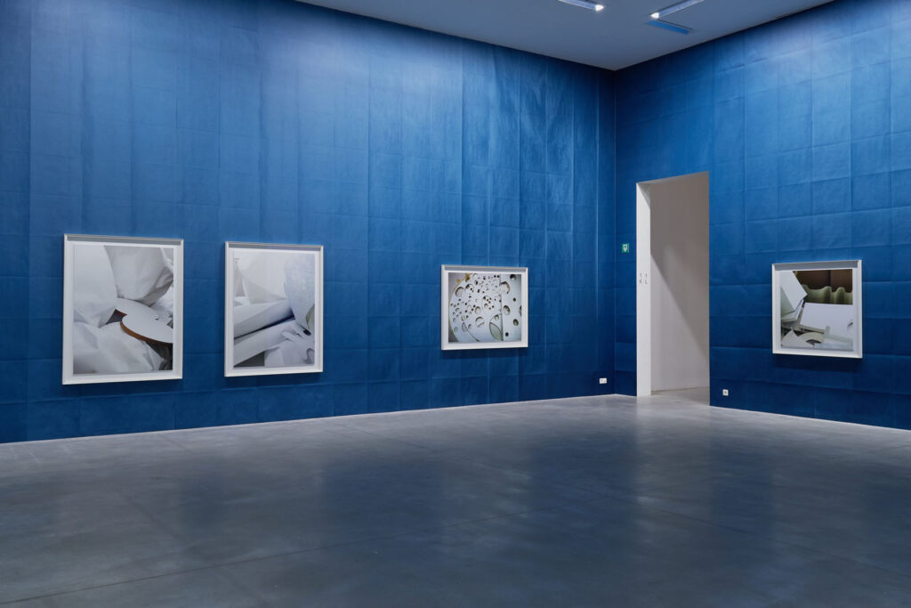
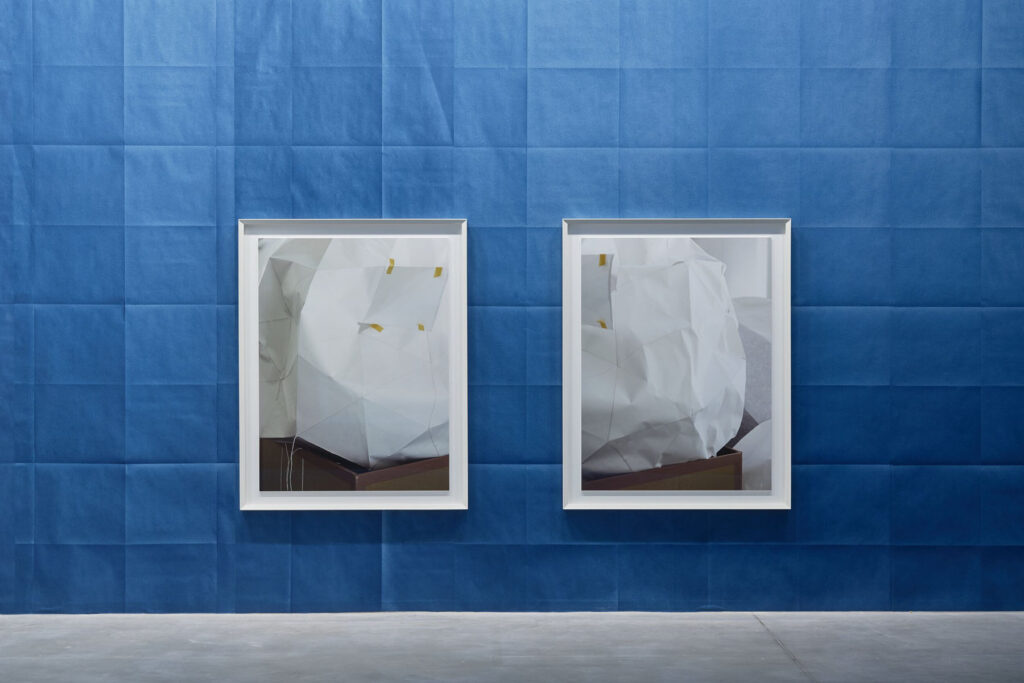
German sculptor Thomas Demand lives and works between Berlin and Los Angeles. One of the most innovative artists of his generation, Demand has specialized in handcrafting facsimiles of architectural spaces and natural environments. Through his use of paper and cardboard, Demand meticulously reconstructs images and scenes, embedding those in society’s collective memory with mural-scale photographs. The ephemeral and illusionistic characters of Demand’s work have pushed the medium of photography further than ever before and are part of his investigation of the livelihood of images.
NR looks into Thomas Demand’s development as an artist, from sculptor to photographer and how he found a balance between the two practices using excellent craftsmanship and imagination, blurring the line between reproduction and original whether it be in architecture or fashion.
Thomas Demand, it is such a pleasure to be interviewing you. How are you?
Very well, thank you.
You have had a fascinating career spanning across various fields such as sculpture, photography, art, film. As the theme of this issue is Growth, I thought it would be interesting to let you talk to us about how you found a balance between all those practices, using excellent craftsmanship and imagination.
You initially trained as a sculptor, how did you find yourself in the place where you are today and how did you initiate that merge between sculpture, photography and architecture?
I grew up in an environment which naturally connected these fields like family: my father and mother were painters, my uncle and grandfather architects, my grandmother a concert pianist (still working to find my way in that field) and my best friend at school was the son of one of the most important and visionary art collectors in Germany. So I have no Schwellenangst, even if I do have greatest respect for the disciplines and their differences.
You have studied in Düsseldorf, Munich, Amsterdam, Paris and London. You have been moving quite a lot. What are some of the places that have inspired you the most?
Japan, USA and northern Italy. But I also noted over the years that there are cities which are good for making art and some to look at art, but rarely is both the case.
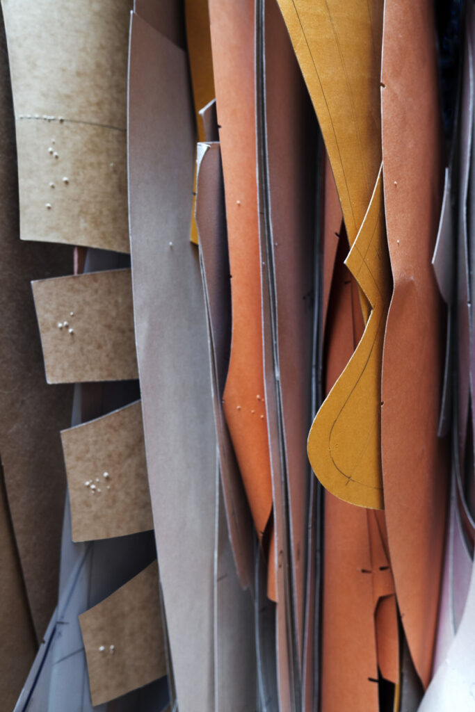
Your starting point is often photography as a “constructed reality” and from there, you design life-size paper models with colored paper and cardboard. You create inventive images of life- size architectural paper models that look exactly like the final product. Your constructions are ephemeral as you always discard them once you’ve photographed them. Why is that?
I don’t think it is exactly like the starting point, but even if, it would be a valid artistic concept, I believe. But my version is a version of reality which might have more relations to how we see the world, not how it might be. How we remember it, how we are manipulated, how our ideas influence what we recognize and so forth. Like a writer, he might write truthfully about the world, but it will not be taken as the reality itself. I consider this worth exploring in the medium of photography, where this distinction is easily obfuscated by the mechanistic understanding of documentation the apparatus delivers.
Your work often serves as testimonies for other artists’ thought processes and create a place in time for them. Where did that interest come from?
We all stand on someone else’s shoulders, and I find it an easy way not to isolate my vision in the ghetto of photography. Photography as a technique or discipline never interested me enough.
In an interview for the Louisiana Museum you say that “many things first become visible to us via the images we see of them.” and that we live in a world of models. Could you elaborate on that? Do you think you are creating a new version of reality or giving new perspectives or is this more about bridging the gap between what we see and what is represented and almost building a realm between fiction and reality?
I think the use of models is a highly influential and underexposed cultural technique, we can only absorb the complexity of the world around us by filtering end remodeling it. The ancient Greek philosophy was already fully aware of that and things didn’t get less complex since then. The weather forecast, retirement plans, demographics, elections, psychology ect, all is using models to find a direction through data. People often think of architects and children’s toys if they refer to models, but it is much more fundamental. It is amazing how little literature and research there is about that.
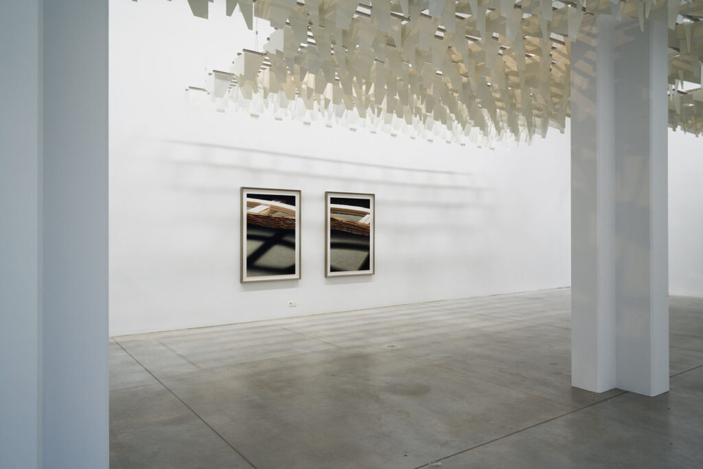
Your major solo exhibition ‘House of Card’ is on view until April 2021 at M Leuven museum in Belgium. It coincides with the release of your book House of Card with Mack, which focuses on your relationship to architecture and the collaborations you have done with architects. Your series Model Studies which also serves as an introductory point in House of Card, was honoring through photographs taken during your visit at the Getty Museum in Los Angeles, 13 unreleased projects and discarded structures made by well-known architect John Lautner. This was also the first time for you not to photograph models of your own.
HoC is the show and the book, which works as a standalone, but it is the book to the show.
Could you delve into your engagement with architecture over the last decade?
I noted over the years that architecture developed a specific interest and response towards my work, I heard of competitions which were won with my images as examples, architectural schools did seminars about it and architectural biennales invited me many times to contribute. I also worked since my first exhibitions with display features, exhibition architecture and embraced challenging spaces to show the work without compromising neither the architecture nor the pictures. All that established long-termed collaborations with a number of architects. I think that prepared the situation in which I started thinking about architecture as a promising claim for my thinking and obviously there are a number of approaches imaginable for me: looking at it, using it and now also doing it myself. That’s what the show is about, plus collaborative aspects which come along, as architecture is always a team effort.
How does your work resonate with architecture? In your opinion, how do abstraction and architecture correlate?
Architecture, not unlike photography are figurative. The process might be very abstract, but what is built is concrete. But there are stages in the design process which are open and not about doors, faucets and fire regulations, and those interest me, as they shadow a bit what I enjoy in my work, when ideas become form and forms become figures. I consider my Model Studies series as my most photographic work to date but also my most abstract. In the end the source is becoming irrelevant, you won’t recognize a Lautner building nor a dress by Alaïa on my images.
You have spent time recently in Tokyo in the offices of the architects Kazuyo Sejima and Ryue Nishizawa, also known as SANAA. Your 2015 show Latent Forms at Sprüth Magers in London displayed the close-up images you took of their paper and cardboard architectural models during your visits at SANAA offices. Those images part of Model Studies II, became abstracts and fragments of ideas of buildings that may not come to realization. Why were you interested in working with SANAA?
Besides the fact that they are amongst the most astonishing and original firms in the field of architecture, I was approached by them to contribute to their Venice architecture biennale exhibition in 2010. I visited them in Tokyo and found the most amazing and confusing office they worked in, which just fascinated me. So, when I moved to L.A. I decided to fly every few months over there to see how that place changes. Their design process is highly influenced by the use of very low-key simple paper models, which they make in a minute to communicate ideas. Once such idea is used or abandoned for one project it might have an afterlife in another project because it just sits there amongst what looked like a 1 million other models. So, it felt familiar for me as a studio situation, but also it was used for completely different purposes.
Could you tell us about Model Studies IV and the inspiration you had from the late fashion designer Azzedine Alaïa’s pieces?
I had the pleasure to have lunch with him once or twice in his atelier, and at the same time I had planned to work with the patterns which are used in clothes making for many years. Although I never found the right picture, I kept searching. It reminded me of the discarded leftovers on Matisse’s floor in his studio in Nice, where he did the cut outs in colored paper. Again, it felt familiar but wasn’t an artist’s studio. Important in all cases is for me also that these people think with their hands, which is really important in a time when the digitalization is taking over any aspect of our life.

Last year you realized your first collaboration with a fashion brand, for Prada and you’ve decided to create anonymously a series of images titled Hanami (meaning cherry blossoms, a symbol of youth and love) created for each window of every Prada stores across the world. This was also a first for Prada to officially collaborate with an artist. You have had a close relationship with Miuccia Prada and Fondazione Prada for the last decade. How did that collaboration unfold? Why also the desire for anonymity? Could you tell us more about the narrative behind the series and what was the inspiration behind it?
Over the last 15 years I did nine different projects in all different shapes and ambitions with the Fondazione Prada. I saw it developing into an amazing organization, which never used the art for marketing reasons, very unlike most other efforts in that field. The trust in the artist and the generosity when it comes to making things possible is the connection to the core of the company and in the end their idea of luxury. So when MP asked me if I would consider to give permission to use my work in a seasonal campaign worldwide – it was spring 2020 – I considered the cooperation with company a chance to try out my work on a global audience without making it a marketing move on my part. I mean every Prada shop in the world, all of them in prime locations, and most of the windows were designed specifically. What a roll out!
It seems that artists and fashion brands are collaborating more and more. You have mentioned before that fashion is time and identity related and I think we can find those elements in your work too. What are some other fashion houses that you would want to collaborate with?
I find it a relatively confusing message to have a shop window with handbags and then having an artist name on top of that, possibly even with a social mission. I think the handbag should convince in itself and the shop window should do the best to create attention and context, full stop. But as I said, contemporary art is a niche and fashion is an industry, I think there can be very interesting combinations, as long as they respect the autonomy and maybe auratic character of an artwork. Also, the series ‘Blossom’ was existing, we aligned and composed it anew for the purpose, but it was not a commission in the sense of the word. But I really admire what Prada has built over the years, that’s why I was open to the request, not because I wanted to combine my ‘brand’ with theirs or any other strategic consideration.
Coming back to architecture, your most recent project currently under construction, is very very exciting. It is a Pavilion at the Headquarters of design-innnovation leader Kvadrat, a contemporary textiles and textile related products for architects and designers, company in Denmark. Could you tell us about this collaboration?
Again, that grew over the years into a long ongoing and trustful relation. Anders Byriel, the CEO, is very interested in contemporary Art and approached me decades ago when I had a show in the Museum Louisiana, and was just trying find his way around in the arts. It wasn’t really about commercial interests on both sides. We became friends since, did a few projects which were all great fun and showed convincing results, and so when he decided to build some kind of meeting place next to the company headquarters, he asked me if I have ideas or if I want to do it. And I said yes, instantly. You need to understand, very rarely an artist has the chance to build an entire house or in this case three of them. And I am trying to make it in some kind of Gesamtkunstwerk, where I am doing everything you touch and consider everything in it’s visual appearance and all follows the logic of paper. As it is my first, of course I needed help and asked CarusoStJohn to facilitate my ideas, I have also done a number of projects with them in the past, so it is a constructive and sensitive dialogue.
Are there other projects that you are working on at the moment?
I am working on a film about which I can’t say much right now, we will open a show in London next week, I am developing a large show for Garage in Moscow, which will include a direct collaboration between me and SANAA, as well as a contribution by Alexander Kluge and a show at the Fundacion Botin in Santander, called Mundo del Papel, with a very ambitious exhibition architecture in their wonderful Renzo Piano Building. Let’s hope the world is back on track by autumn, when it all will be realized.