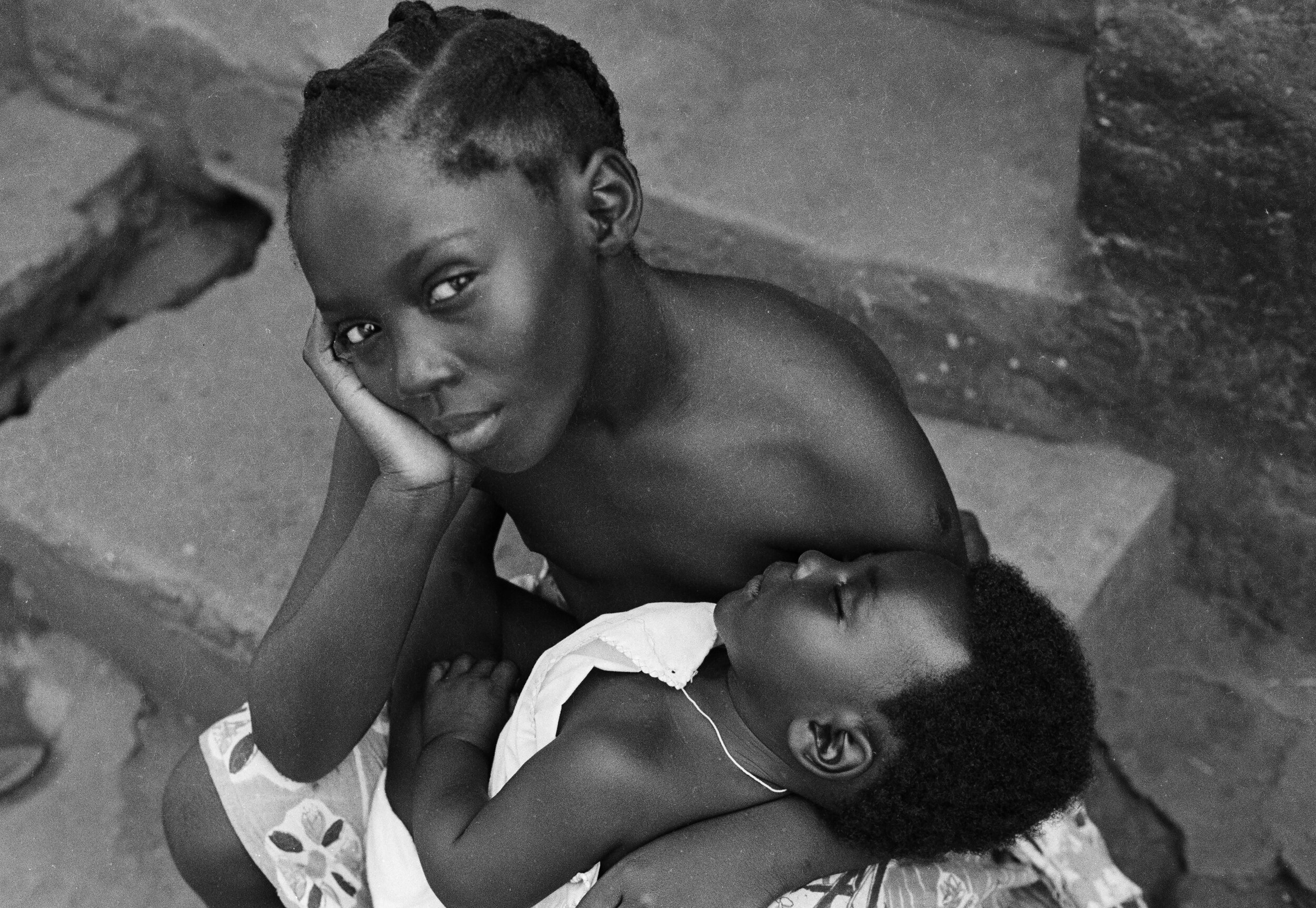
Milano. Fotografie 1956 – 1962
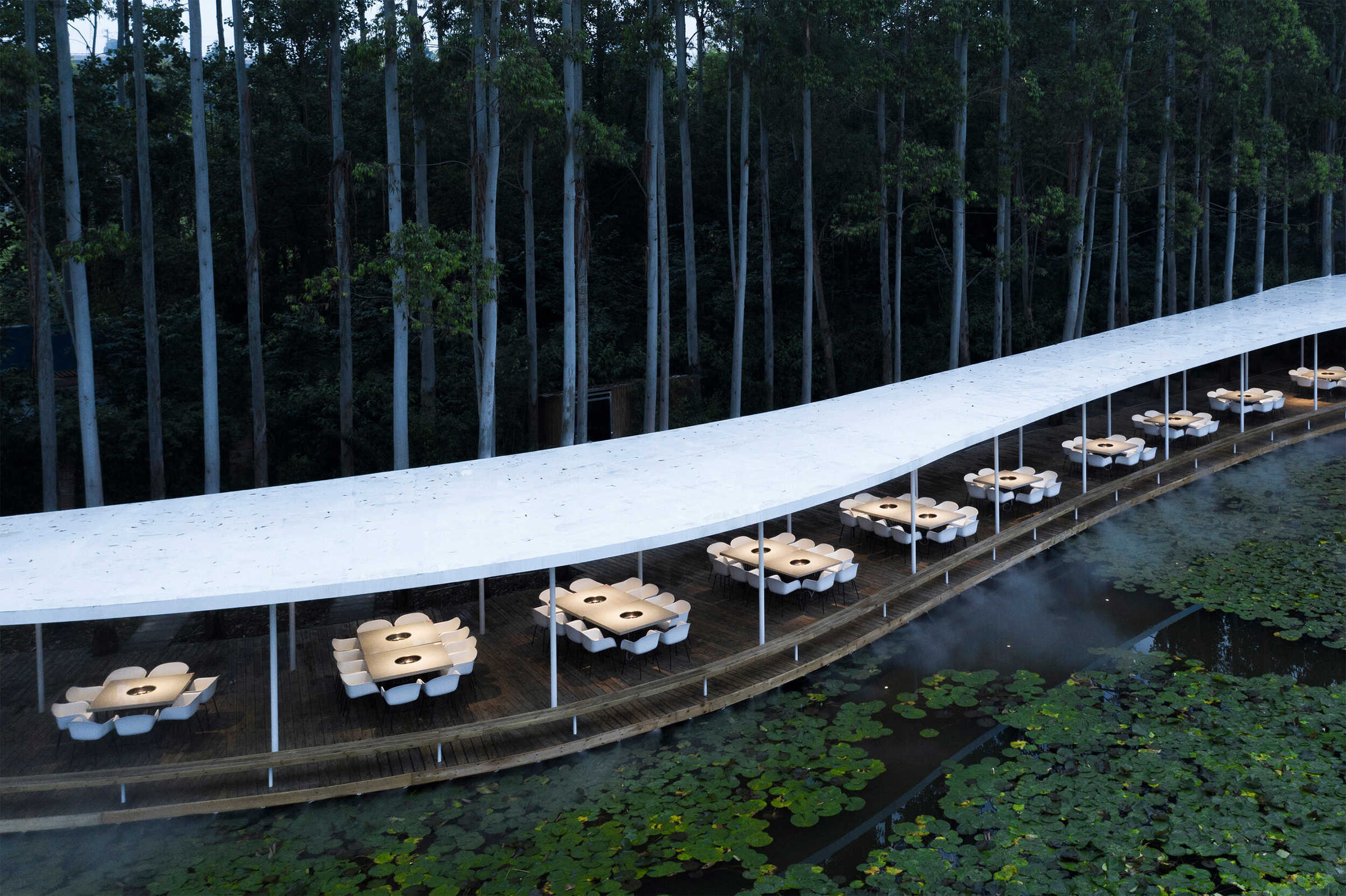
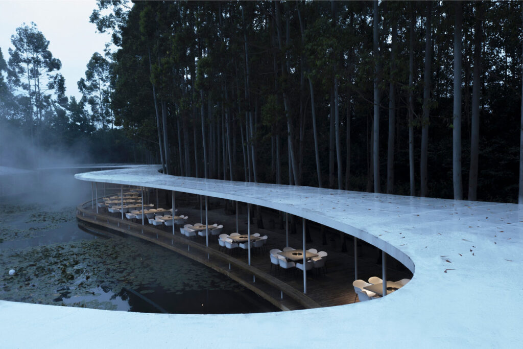
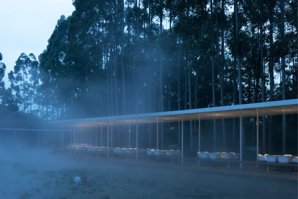
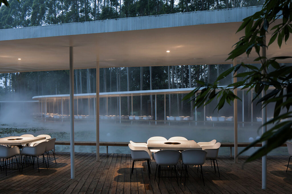
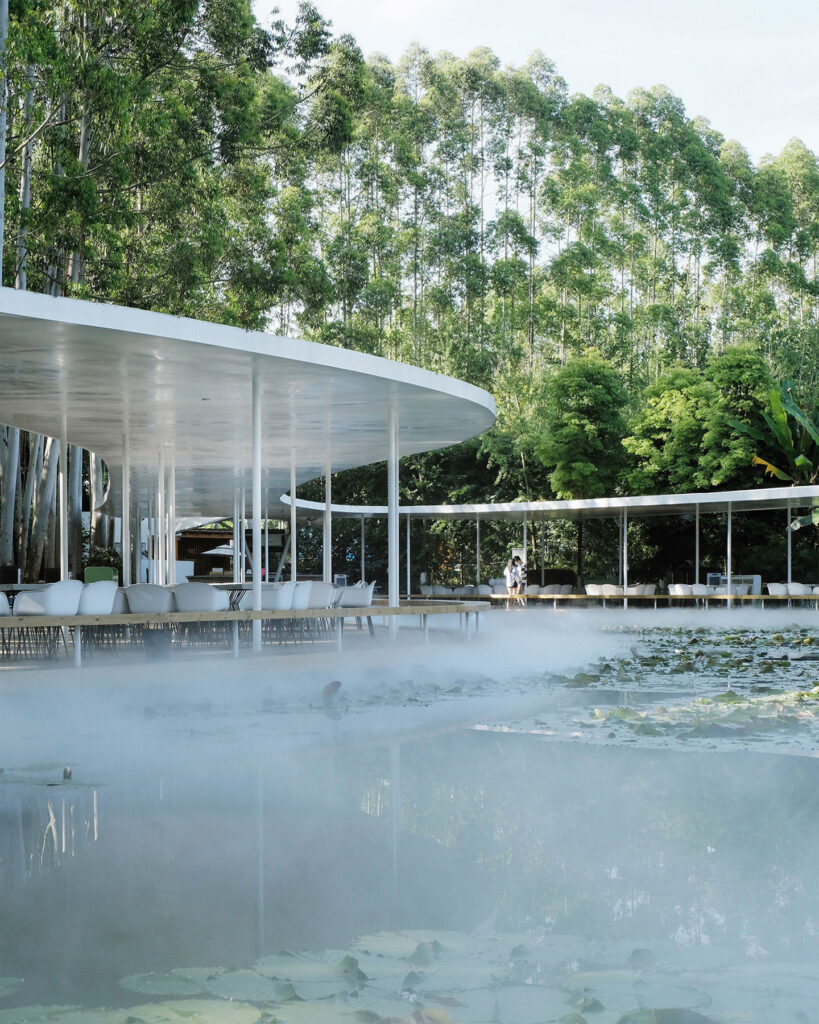
As I enter an entryway clothed in a mass of tendrils and leaves, a restaurant heralds the space with diners enclaved among the green shrubbery. I follow the walkway until I find myself at the footsteps of a staircase, leading towards the gallery. Fondazione Sozzani presents the exhibition Milano. Fotografie 1956 – 1962 of Paolo di Paolo, curated by Silvia di Paolo in collaboration with Bvlgari. The series of photographs displays di Paolo’s adoration and admiration to the city of Milan, which meant a sense of traveling to a foreign country for the photographer. The exhibit showcases di Paolo’s conception of Milan, an unprecedented and untouched look before globalization. Mist hovers, residents and pigeons flock the city center, and the romance of typography and companionship croons the metropolis: the photographs lull the visitors back into the ripening state of Milan.
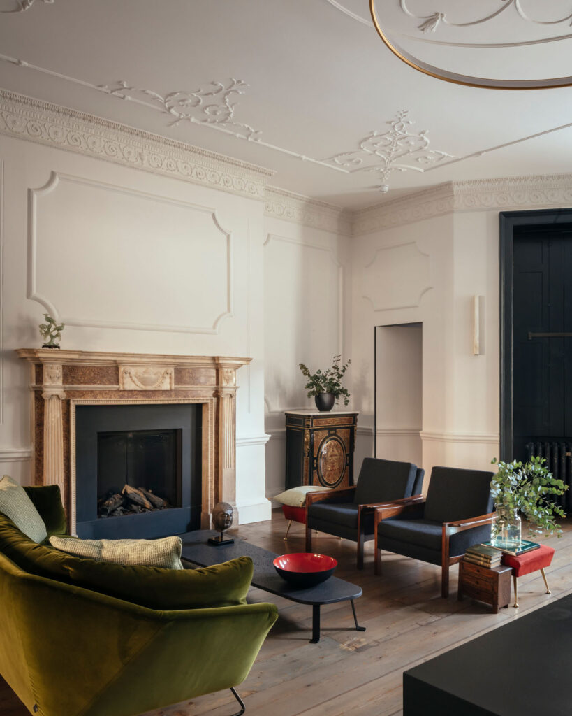
Humid air permeates the quaint space of the exhibit, stirring up warmth against the twenty-five-degree weather outside. The sliding door remains opened, stuck in its machinery, but whirs whenever a guest walks into the area. As I make my way inside, the glint of the seventeen overhead warm lamps, dangling over the square-shaped metal railing, reflects on the glossy purple floor. It adds illumination into the space as if the two closed windows on the left side are not enough to spill the sunlight inside. Positioned in the middle, a DNA-shaped metal seat waits for three tired guests, but there are only two visitors at the time, myself included.
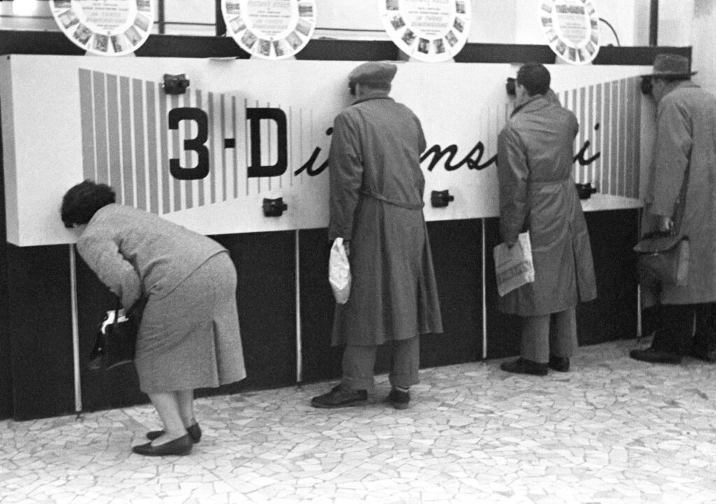
Strolling to the left side by the entrance, di Paolo’s reverence for Milan springs up. The photographer captures four open windows in an architecture for La natura resiste. From afar, a person holds onto the railing of a window as they dust off the beam they crouch on, but the attention suddenly diverts to the sawed trunk and branches attached to the remains of the tree with a rope. The classic human versus nature tale leaps off the frame, a lost narrative from the two images of Fiera di Milano that position beside it. In these two photographs, captured in 1962, a crowd inspects the thermal circuit breakers with its cresting gray thin wires inserted into an unwieldy-looking box where the name KLIXON remains embossed on the side. The business men’s observant and analytical gaze at the device outlasts their time so much that they have forgotten to notice the two nuns in their habit uniforms that observe with them, who are enthralled by how the device functions. As di Paolo walks further in the 1962 technology fair, he captures three men and a woman peeking through the viewfinders of the cameras nestled into the walls which promise 3D images during the decade.
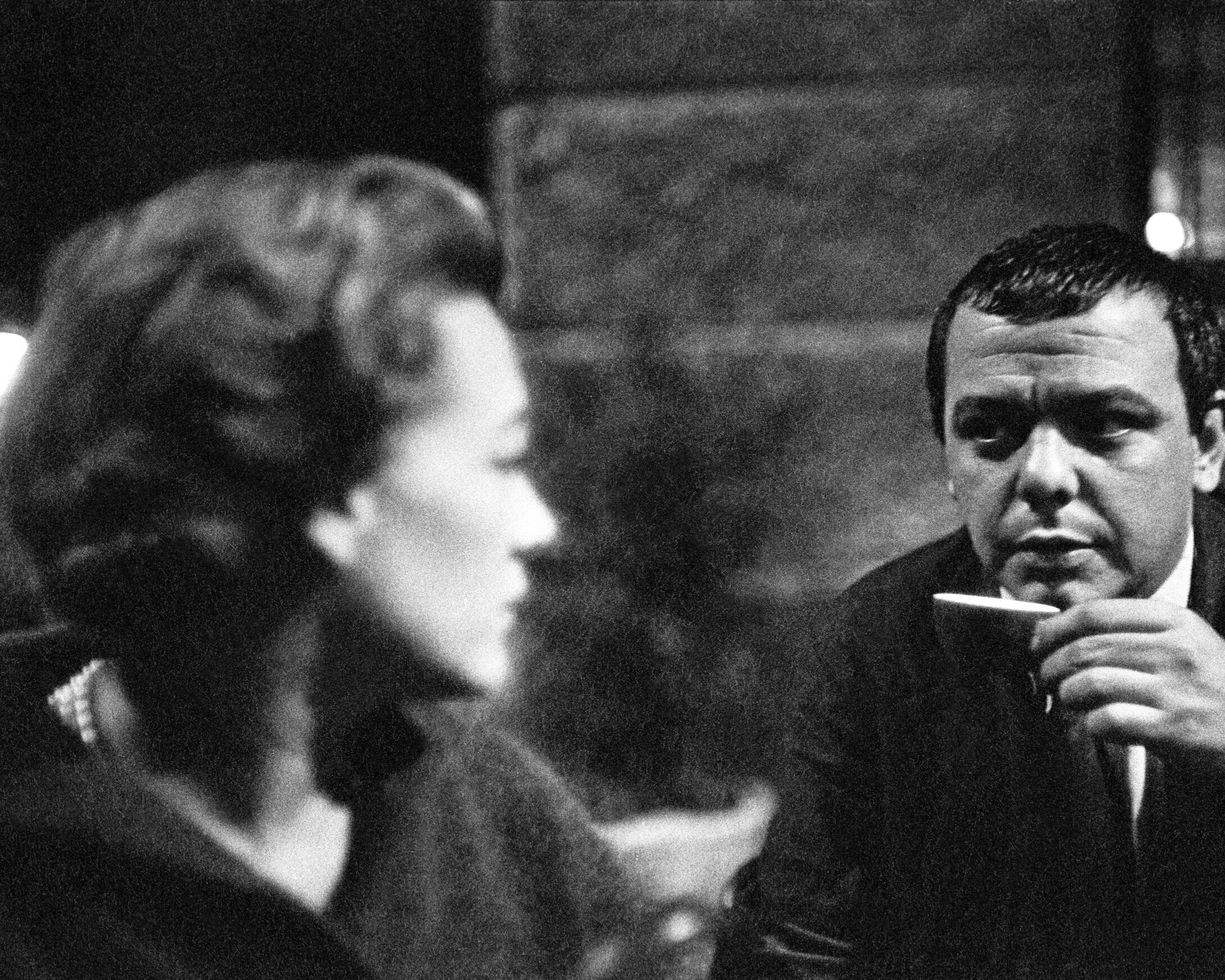
The year 1960, two years before the fiera, means di Paolo goes to Bar Jamaica and weaves through the bustle of Milan’s folks, photographing their humane interaction by giving each imagery his definition of grandeur in the city life. An orator raises his hands as he looks at the ceiling, swooned by his own declarations and dismissing the puzzled looks of the man behind him. A man sits beside a woman and courts her, bending his head sideways to usher humor into his punchlines, while she directs her eyes far from his presence. A woman looks behind her to find a man in his pensive expression as he raises his small cup, snugged between his forefinger and thumb, just below his lips. On the other side of the room, a group of men gambles in a room clothed with bathroom tiles. Here, the primary subject wears an unperturbed expression while a lit cigarette snuggles between his teeth, oblivious to the curious onlooker behind him who stands too close to the player and desires to offer advice on which card to throw on the table.
Magnolia on the radar, the celestial flow of luxury in the 1960s: di Paolo walks into the Aretusa Night Club, his camera in tow. Inside, an overhead lamp casts shadows across the space, illuminating romance and haze to wrap with the nostalgia of the evening. A man hooks his arm around a woman’s hips and tugs her to his body. They sway to the soft hum of the music and pay no attention to the patrons that surround them as they gaze into each other’s eyes, falling and ruminating. Such a sight differs in Sala da ballo as patrons dance to the sound of the live band, a mix of piano and guitar tunes over the saxophone lullabies.
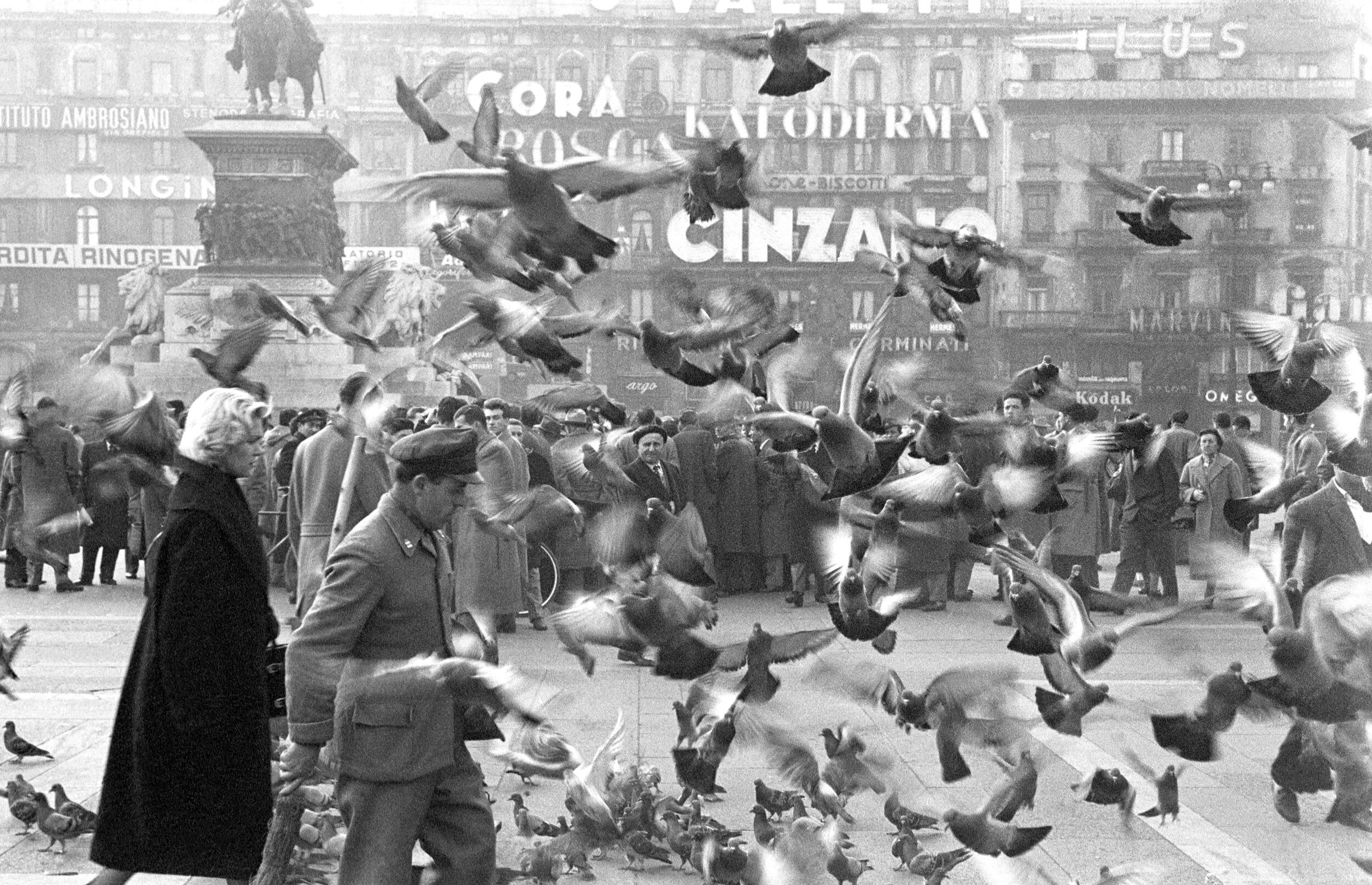
Di Paolo commands his camera to record the political discussion in Duomo, the heart of Milan, when the year pivots back to 1958. The frantic pigeons flap their wings aggressively as they flock the city center, masking over the photograph. As one sees beyond the birds, residents crowd beside the monument of Vittorio Emanuele II to participate in political exchanges in their heavy winter coats, handheld purses and attache cases, tipped hats, and cigarette stubs between the lips. In the background, the forgotten era of typography in a myriad of designs and styles pepper the antique and historic architecture of Milan, a slow ascent towards modernization and minimalism.
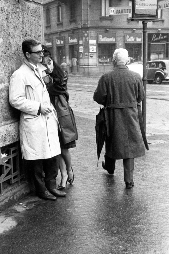
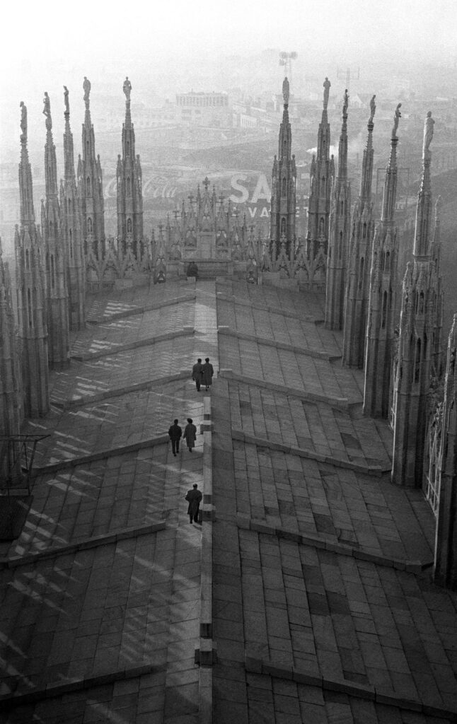
The photographer’s storytelling on Milan endures as he captures a lone man walking on the roof of the cathedral with his phone on his ear, his scrunched eyebrows signal distressed against the lush and resplendent of the church. In Sul tetto del Duomo, – on the roof of Duomo – di Paolo hovers his camera to carpet the shot with the cathedral’s poignance, a registered vaporous memory to last and test time. As di Paolo walks down the cathedral and into the streets of Milan, he bumps into a couple, innamorati a Milano, lazing in the angle of a street – the man in trench coat looks afar as contentment flashed across his face and lets the woman beside him rest her cheek and hands on his left shoulder. Milan serenades the couple in the shelter of its romantic arms, enshrining their affair with a state of zen and mirage for years to come.
Dusk turns into nighttime, and the city center glows with Christmas string lights and street lamps. Di Paolo shoots four photographs for le luci di Natale as the exhibit forwards in 1962 and demonstrates the solemn celebration far from the Western upbringing. A policeman wears his cap and stands alone in the corner of a street, watching the pedestrians cross as the rattle of the tram passes by. Cars honk as they jam the street and appear slower than the crowd who germinate the sidewalks on foot. A policeman – his back facing the lens – stands outside Galleria Vittorio Emanuele II in Duomo, watching the residents stoll around the space and away from the frenzy Milan encounters today. The last photograph, the one that sits on top of the three frames, shows street lamps decorated with sticks of light to emulate fireworks in a starless sky. Here, a sense of finale has dawned in defiance.
I step back from the four photographs of le luci di Natale and turn around to find myself alone in the room. The afternoon sun creeps into its peak, and the rays pass through the window panes and bounce on the floor, attempting to replicate the reminiscence of Milan between the 1950s and 1960s. The longer I remain in the four walls of Fondazione Sozzani in Via Corso Como, 10 with Milano. Fotografie 1956 – 1962 of Paolo di Paolo, the more I realize that the beauty, divinity, and fertility of the bygone years persist.
Credits
Images · FONDAZIONE SOZZANI
For more information visit
Fondazione Sozzani
Corso Como 10, 20154 Milano
tel. +39 02.653531
galleria@fondazionesozzani.org