Archive page:


Mark Steinmetz

Mark Steinmetz, Greater Atlanta, 1999 (1994-2009)

Inexplicable Rightness

“I think you want to show the ordinary world, but have it be fresh, and have it be charged, so that we’re not so complacent in our lives, and we notice every day.” A manifesto for his entire practice. Across four decades of work, from the streets of Los Angeles to the sidewalks of Chicago, from the deep South to Parisian metro entrances, Mark Steinmetz has built one of the most quietly radical bodies of photographic work in American culture.

Steinmetz has remained committed to something rare: attention. His black-and-white photographs hold space for uncertainty, for what Robert Adams once called “inexplicable rightness,” for the strange poetry that emerges when nothing is forced to perform. Children pausing between innocence and self-awareness, strangers crossing in a sliver of light, bodies waiting, resting, passing through.

In this interview for NR Magazine, Steinmetz reflects on the formative years that shaped his way of seeing – from a childhood darkroom and early obsessions with cinema and Nabokov, to wandering Los Angeles with Garry Winogrand, to decades of slow, committed observation across the American South and beyond. What emerges is not a theory of photography, but a philosophy of presence: a belief that meaning does not need to be manufactured, only attended to. Steinmetz remains faithful to a more difficult task: to look long enough for the world to reveal itself back.

You began photographing in your late teens, initially as a way to understand and engage with the world rather than as a defined artistic ambition. What did photography make possible for you at that stage, in terms of access, understanding, or a way of being in the world? At what point did it shift from interest to necessity?

I began photography earlier than my late teens. I was taking pictures as a kid, and I had a darkroom around the age of twelve or thirteen, so I was already photographing. I was always interested in photographs. My interest early on may have been more in special effects. It wasn’t until college, when I was about eighteen, and I saw a lot of movies by Michelangelo Antonioni, that I began to think more about the literary aspect of photography, more about the humanities side of it. There was always a component of it being a kind of game, trying to catch things. But as you get older, you start to want to make things more meaningful. 

You have spoken about early influences from cinema and literature. How did these non-photographic arts shape your sensitivity to narrative, rhythm, or atmosphere within a single image?

I read a lot of Nabokov. It was very clever and complex. In movies, I looked at Antonioni, but also a lot of film noir, and how gangster movies can operate on another level at the same time. The formal strategies of directors, especially in the thirties, forties, and fifties before color took over, were very architectural. You see a lot of constructed scenes.

After leaving the MFA program at Yale, you moved to Los Angeles and began making your first sustained body of work in public space, a period you have often described as formative and shaped in part by figures like Garry Winogrand. What did that moment—Los Angeles, the street, the encounter—teach you about photography that formal education could not? And as you were absorbing the work of photographers such as Walker Evans and Lee Friedlander, each working within very different social and historical contexts, how did those visual histories begin to inform, or resist, the development of your own way of seeing?

Los Angeles was a difficult time. I was twenty-two. I was restless. It seemed like a simple, superficial place, not a lot of the kind of artistry I was interested in. I was taking pictures, and I met Garry Winogrand a few times. We drove around together, and it meant a lot. I absorbed something from him, especially his manner of being. It showed that an adult could do this kind of work. There is no real career as an artist, but you can survive. There was a way to share it, and Winogrand was well known.

Are there any memories from Los Angeles, particularly with Winogrand…

The last time I really saw him we were photographing at the zoo. He made a body of work there called The Animals. We were there on a weekend, photographing separately, then we met. Toward the end of the day the light was fading, and on the way out Bernadette Peters was there. She was very famous then. She had been photographed by Gary years earlier for the film Annie, directed by John Huston, for which photographers like Stephen Shore and Eggleston were also invited.

She was there with her boyfriend. They had the same curly hair and matching leather jackets. Gary zoomed in and took a picture, and she threw her head back, just like the famous ice-cream photograph. We left. He sat in my car and said, ‘Boy, you don’t know how tired you are until you sit down.’ Later he became sick. He was photographing two months before he died.

The phrase showing us what we already know” is often used in relation to your work. What does that idea mean to you in the context of your photographic practice? What kinds of recognitions or quiet truths are you most drawn to through photography?

Maybe it’s more accurate to say that it shows what we think we already know. You want to show the ordinary world, but have it be fresh, and have it be charged, so that we’re not so complacent in our lives and we notice every day. 

From your earliest work onward, your photographs return to ordinary encounters, small gestures, and everyday situations. What is it, specifically, that you recognize in these moments as worth holding onto?

I’m drawn to moments of poignancy that transcend what we are accustomed to. There is a connoisseurship to photography. It isn’t people holding hands. It’s these people holding hands this way, in this light. Something very specific.

Your practice emphasizes intuition and chance, allowing situations to unfold rather than directing or staging photographic moments. How do intuition and restraint work together when deciding whether a moment becomes a photograph? You have spoken about resisting images that feel over-determined, where meaning is quickly resolved, in favor of photographs that leave space to dwell. How do you define restraint in a photograph, and what does that openness allow the viewer to experience?

I think you want to restrain yourself from being too obvious. You want to leave things open so that there is free will. Things can be implied in the pictures, but you can certainly over-imply them. Robert Adams uses the expression ‘inexplicable rightness’. So I think intuition begins when you don’t have that dialogue in your mind. You know, ‘Is this making sense? Is this not?’ It looks good, feels good to take the picture. With intuition too, there’s a lot of anticipation. You sense that something is brewing.

ATL Terminus and Greater Atlanta document the city through contrasting temporal conditions, the airport as a space of transit and the city and suburbs through long-term return. How do these two bodies of work speak to one another?

There are pictures of Atlanta taken from airplanes in ATL. To me, Atlanta is a modern city. It has some vestiges of the old South, but it is very corporate and very functional.

Greater Atlanta is about something else. It’s about fossil fuels, capitalism, and civilization. It’s about how things progress. There are pictures in Greater Atlanta that point toward prehistory, toward the land before development and before this modern system was put in place.

ATL is more about a state of limbo. It’s about traveling, about people moving between places. They have their suitcases. They’re passing through rather than being anchored. So the two projects are not completely yoked together. One looks at movement through the city, and the other looks at the deeper structures that shape what the city is.

Developed over nearly two decades, Summer Camp documents daily life through routine, social structure, play, and solitude. Did the project gradually become less about individual moments and more about observation itself, about how time moves through people and relationships?

Summer Camp was done over a decade from the first picture to the last, maybe twelve years, and it only takes place during a couple of months in the summer, which makes it hard to get into. For a long time in America, kids went to camps like this: you had a campfire, a lake, a dining hall, cabins with screen doors. I tried to capture how no time was really passing, a twentieth-century experience. It’s a little like Lord of the Flies at times.

Mark Steinmetz, Summer Camp, 1996 (1986-2003)

It connects to other bodies of work I’ve done. The Players was mostly boys, some girls, but it was about Little League baseball. That work, and Summer Camp, and even the carnival pictures, which are more teenagers, all share something: a strong setting. The baseball fields with chain-link fences, uniforms, gloves. The camp with its cabins and lake.

In all of them, the kids are more or less free of their parents. They have coaches or counselors, but they’re inside an intense activity. Baseball is about winning and losing. Camp isn’t about winning and losing, but it is about being together, about summer, about having a lot of time on your hands. In both cases I think I’m pretty much the same photographer. I’m different in something like the South Trilogy or ATL, but in these I feel very consistent.

Kids and Teens focuses on children and adolescents in public and semi-public spaces, often at moments of pause or self-awareness. What draws you to these in-between states, and what do they reveal to you about looking, being looked at, and the act of noticing itself?

Physically, kids are interesting. Teenagers, their faces, their heads, and their stories are interesting. They carry this sense of prospect, of becoming an adult.

I did a lot of kids and teenagers work earlier on, when I was in my twenties and thirties and childhood was closer to me. Cartier-Bresson and Helen Levitt did great work with kids early on too. You also had more permission photographing kids than adults then. They were less self-conscious.

Later I photographed younger people in their twenties. As I grew older, my subjects grew older too. Now I photograph anything. I have a daughter who’s eight, so I photograph her a lot.

I think I did a certain kind of work that belonged to a time before. That life isn’t the same now. There isn’t the same relationship to time. There was more boredom, more waiting. You had to rely on your own resources more than you do now, when you can just turn something on and be stimulated by someone else’s production. 

France 1987 presents photographs made in public spaces and revisited decades later. Looking at this work now, what does it reveal to you about changes in public life, physical presence, and social interaction?

It really seems like a timepiece. It seems connected more to the world that Cartier-Bresson and Doisneau and Atget photographed. It’s looking like a different time. That’s a big shock to me.

France preserved a more traditional way of dressing for longer. In America there were more gaudy T-shirts with sports teams, more sportswear. In France people kept wearing traditional clothes without insignia.

Now that’s changed. There’s more writing on people’s clothes, but it seems like an earlier time: End of a period when the present was still in touch with the twentieth century. That really gave way in the 1990s.

Your archives often sit for years before being edited or published. How does distance affect what you choose to keep, print, or release?

Time is interesting. I took the pictures then, but when I’m editing now, it feels like the work now. You have more detachment the longer you wait. You might have all these ideas in your head about what you’re doing, then years later you just look at how they work for you now. There’s this partnership between me and my present self and me and these former selves that don’t exist anymore.

You have worked almost exclusively with film and printed by hand. How does that process shape your way of seeing?

I first photographed a lot of six-by-nine centimetres. I still use 35mm as well. I was photographing this morning, actually, traffic and circulation, bicyclists and scooters, in fairly dark conditions. But in something like South Central, pretty much every picture is medium format, six-by-nine. Some are a mix, but most of them are.

Mark Steinmetz, South Trilogy, 1992

I like darkroom prints. I like silver on paper. I like the process of working. I’m in Paris now and I don’t have a darkroom here, and the weather is pretty lousy. It would be great to go in and print instead of trying to make pictures in bad light, although there’s something interesting about that too, because I’m used to working in nicer, warmer light.

I use digital sometimes, mainly for commercial or fashion work if they want color. But for me film is better at capturing atmosphere, especially backlighting. I love backlighting, and I love when there’s moisture in the air. Digital tends to remove what’s in the atmosphere. It becomes hyper-clean. It creates light where there isn’t any, and I don’t really see the point of that.

A lot of people photograph in low light digitally and the pictures come out, but it doesn’t look right to me. Digital embellishes things. I take a lot of iPhone pictures too, but I’m more moved by a new Robert Frank picture or a new Winogrand picture. If there’s a new Eggleston picture, that can hit me too

Across your career, photography appears as a sustained practice of attention. What keeps that practice alive for you now?

Everything is up in the air because of the situation in the world. I’m in Paris. I have French citizenship. My mother was French. My daughter has French citizenship. My wife doesn’t. Our house and darkroom are in the States, so it’s America, France, Paris, somewhere else, I don’t know.

I drop my daughter at school every morning, and there’s this area, Porte de Chambert, with a lot of traffic, a rush hour, bicyclists of all kinds, people on scooters, people pushing strollers, all these different kinds of vehicles colliding. I started photographing there, which I wouldn’t have thought of a couple of months ago.

The solstice light is very dim. There are headlights now, which weren’t there a few days ago. I’ve also been photographing at La Plastique, an area with a metro stop, a cinema, a big school, a few cafes, where all kinds of people meet. People smoke outside the metro before they go in. That’s a lot of the street photography I’ve been doing.

Mark Steinmetz, Paris in My Time (1985-2011)

I look at photographers like Robert Adams now, in his eighties, still putting out books from the past twenty years, and they feel very alive and very wise. Maybe they’re not for everyone, but I see a really interesting photographic mind at work, someone whose pictures are dense with a lifetime of experience.

I wonder if I’ll have that. I have an eight-year-old daughter, I feel fine, I still have good reflexes. I don’t know the future yet. 

Credits

All images courtesy of Mark Steinmetz.
Discover more on marksteinmetz.net

Corbin Shaw

Eurotrash

A national identity? in this economy? On the eve of his first large scale exhibition at Spazio Maiocchi in collaboration with Slam Jam, NR spoke with British artist Corbin Shaw (b. 1998) of new and old monuments, and taking, conceptually, the piss, diving deep in the global-local dichotomy and the meaning of nostalgia and complexity in the economy of a gen Z artist seeking sustainable form of expression. A conversation on Shaw’s practice framed through his new body of work developed exclusively for Eurotrash, an exploration of identity and contemporary stigmas, with the occasional detour on Mod’s “live clean in difficult circumstances” motto and a touch of Baudrillard mixed with Simon Reynolds subcultural commentary —best served cold at an airport.

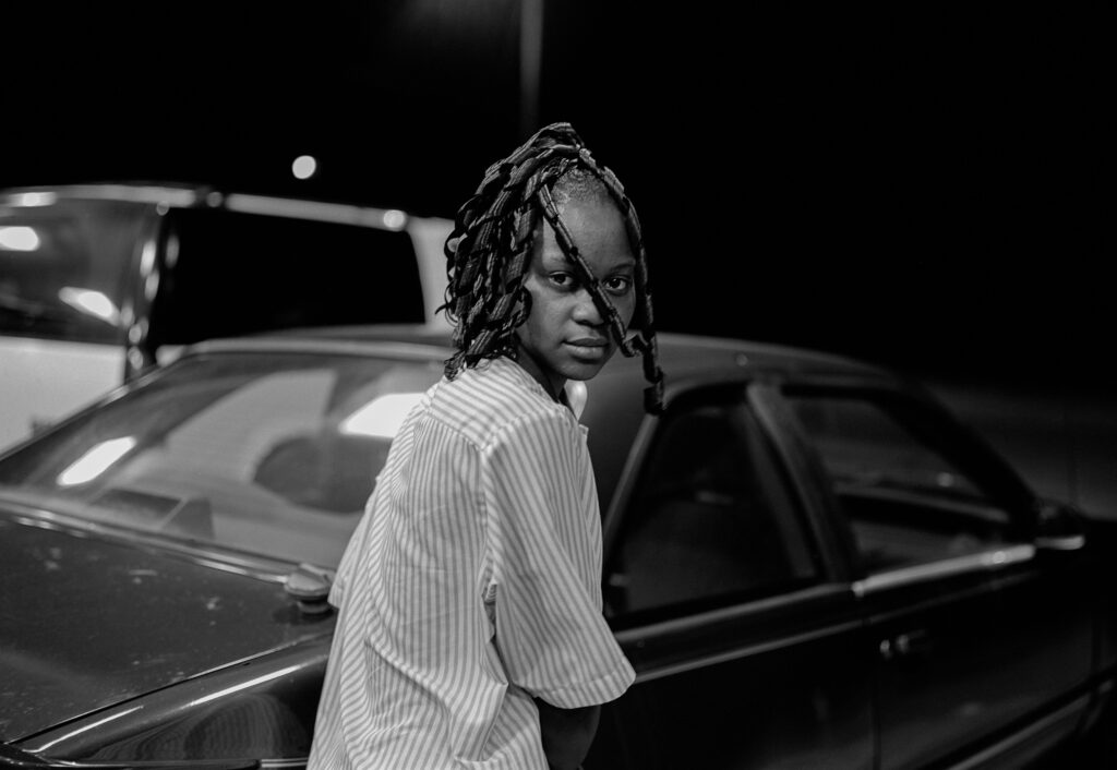
You mentioned that you’ve never worked in a place quite like this. How does it feel?

It’s surreal, honestly. I’ve never really been in a position like this before, where I feel trusted to take on something so significant. But yeah, I’m excited about it. It’s this strange experience to go from just sitting, sketching ideas, to suddenly seeing them materialize. To see my name on the window outside—it feels almost unbelievable when I think back to just four years at university, working alone as an artist. Things have evolved so quickly, from working in my bedroom, to having a studio, to shows, and now to something this large. It’s kind of a dream.

Is this your first exhibition of this size?

Yes, it is.The groundwork for this show started with another project back in April, which marked a big step in my practice. People from London started noticing it and sharing it. But yes, this is the largest thing I’ve done. It’s crazy. One minute you are a student at university, the next one you’re here. I’m really curious about how an Italian audience would react to my work. In Britain, there’s a certain cultural understanding, a legacy, around the themes I explore, but I wonder how that translates here. I’m also constantly trying to explore my identity as British, yet not cling to it too nostalgically. The works reflect modern Britain, not an idealized past, so I’m interested to hear how Italian viewers might respond to this contemporary vision. Growing up, I was surrounded by the clash between old and new. It’s like this constant layering of history. In London, for example, you see these guys on bikes, fully armored up, like modern-day knights riding electric-powered bikes instead of horses. It’s this strange mix of the past and the present, like jousting in the streets, but with a tech twist. Living in a city like London, it feels like you’re always immersed in it. You walk down a street and see a plaque that says, “This person lived here” or “Karl Marx wrote here,” and you’re reminded of the history all around you. It’s mental, really. You’re not just walking through space, you’re walking through time, learning about it, experiencing it, and being a part of it all. There’s this sense of living within layers of history. I’m fascinated by that.

How do these themes of history and identity find their way into your work?

When I moved to London, a lot of my work was focused on my hometown and the city I grew up in. I lived in a way that made it feel like my life had ended—everything was about the past, about my childhood. I was mourning that phase a bit, while also trying to move on. I was growing into adulthood and starting to consider myself a distinct person in the world, trying to figure out my place as an artist. But eventually, I realized I wasn’t paying attention to what was around me, to the contemporary culture. When I left university, I was really eager to learn more. At school, I was always more academic. I knew I was creative, but I never felt great in the academic setting. When I studied in London, I often felt like I was falling behind. So, when I graduated, I was determined to learn about the deeper things that fascinated me. I was drawn to places in London—whether they were galleries, museums, or institutions—that had a rich cultural history. Being in a city that has so many cultural sources, shaped by its colonial past, was a privilege. It’s similar to when I was in Athens and visited the Parthenon. That experience was huge for me. Of course, half of it is in the British Museum, and I was just so fascinated by that.

So, you’ve shifted from nostalgia to something more current, right?

Yes, absolutely. I grew up in a post-industrial suburb, a place surrounded by new developments and shopping centers, where my comfort was in these plastic, suburban spaces. Now, whenever I go back, I notice even more the rapid transformation—everything seems modeled after American culture. But I’m drawn to these “modern monuments,” and I’m trying to express that they are as valuable to me as a historic landmark might be. For example, the urinal in the square references Trafalgar Square fountain, but also the one outside Buckingham Palace and the one at Fauci Square. Each of these has become a space where, every time a football match is on, the fans gather. In football, especially, the celebration gets a bit wild—men often celebrate the game by being naked in the fountain. There’s something about that, almost biblical in a way, that makes me think about how people overlook the significance of these rituals in modern contexts. It’s like history repeating itself over and over again, in a different form. I’ve become increasingly interested in architecture, particularly in the last year or two, and how the materials used in buildings influence our perception of them. What does concrete say in comparison to limestone? What’s the history of limestone? How does the color of concrete, or something like plastic, influence our understanding of a place? In the UK, a lot of new buildings, even in the city, are made to look old. It’s as if there’s a desire to preserve history, but in a way that feels almost like a post-postmodern approach. We’ve had modernism, then postmodernism, and now this hybrid where every detail is meticulously recreated. I think in Britain, there’s a struggle with identity, especially with the impact of globalization and capitalism.

It’s funny you mention that, because one of the things I jotted down in my notes was exactly this apparent clash between the rampaging globalization happening right now and the closing of borders, which is especially evident on the political level—like with Brexit and, just a couple of days ago, Trump being reelected. It’s a bit unsettling, to say the least. But then, on the cultural and arts level, we see this amazing (though not always in a positive sense) amalgamation of everything. It’s as if everything is starting to feel the same. You can see it and feel it in cities, in the way things are constructed, but also in food, in people’s behavior, and in how they react to art. I think this ties into what you mentioned earlier about being curious to see how people will react and interact with your work here. What do you think about this? Do you consciously think about it when you’re working, or is it something that’s so ingrained in people of our age and generation that we just absorb this contradiction and live with it?

I think, for me, I realized that nostalgia had crept into my work so much that it started to feel like I was looking backward, not appreciating what was around me. I grew up in a suburban area in Sheffield, in the north of England, in a post-industrial village where much of the industry had been lost. I lived on a new-build estate, and my comfort was found in shopping centers, retail parks—new spaces that, in a way, reflected America. Every time I go home now, I notice how rapidly it’s all changing. Everyone drives around with huge Stanley Cups, buys doughnuts, grabs coffee, and goes to the movies—it’s surreal. But is that a bad thing? Can you actually love these things? I think you can, and that’s what I’m trying to explore with my work. I’m trying to find a balance, a kind of level ground, where something like a McDonald’s toy holds as much emotional significance for me as a historic monument or flag. I feel emotionally attached to it, so why not value it as a cultural object? In England, the class system is so deeply embedded that what’s considered valuable or not is tied to hierarchy. It’s a classic thing that runs through everything. But there’s something sad about it in Britain—especially in fashion—where working-class culture gets fetishized. It’s appropriated by middle- and upper-class people, and then, all of a sudden, it’s seen as valuable when before, it wasn’t.I’m really interested in that tension between the high and the low. Words like “kitsch” are so loaded.. It’s aggressive, almost. I try to work around this question: What does it mean to take objects that are deemed “unimportant” or “alien” and reframe them as valuable in a gallery setting? For example, in my work, I’ve taken an inflatable plastic sword, something that would usually deflate or fade, and I’ve cast it in stone. I like the idea of freezing time—preserving something that would typically be temporary, turning it into something that lasts, just like plastic itself does.

That’s fascinating—taking something “disposable” and making it timeless. It makes me think of monuments. Historically, they were grand symbols of a culture’s values, but today’s equivalents are different, like you said. They might be something as mundane as an iPhone or a McDonald’s toy. 

Yes, exactly. It’s about finding meaning in the “everyday monuments” of my time, which might be shop signs or commercial objects. I love Baudrillard’s idea that everything in our society has become a simulation—meaning is fluid, almost arbitrary, yet we find ourselves living in this “nightmare” where we can’t help but participate.

This reminds me of a larger conversation about culture in an era of globalization. Everything is blending, borders are dissolving, yet there’s a resurgence of nationalism. Do you find this paradox influencing your work?

Absolutely, it’s like we’re witnessing the collapse of any singular cultural identity. I think that’s what I’m questioning: What is British culture now? Is it the historic landmarks, or is it the commercial plasticity of modern life? As artists, we’re kind of forced to reckon with this fragmentation. It’s exhausting because things change so quickly, yet there’s a deep sense of nostalgia for what’s been lost, even if we didn’t live through it

This is a discussion I’ve been having with a lot of the people I work with. I think this is the most contemporary predicament we’re facing right now. Is a predominant culture even possible anymore? And if so, what would that mean today? In a way, this relates to the fact that there are no longer clear borders, but politically, the new right is trying to reintroduce them. I think it comes from a shared fear—the fear of dispersion, of complete fragmentation—and we all internalize it and express it differently. You as an artist might channel it in your work, while I try to write about it. But at its core, it’s the same fear: the fear of not being able to keep up, or even worse, not knowing what we’re trying to keep up with.

I think it’s strange. I feel like capitalism has hijacked creativity in a way that distorts what I believe creativity was originally meant to do. For me, art and artistry were about connecting with others—expressing myself through writing or physical objects is just a way of trying to relate to someone, or to describe a feeling, a setting, or anything happening in our lives. But now, everything is moving at such a fast pace that so much gets lost. We don’t spend enough time with what’s being presented to us. You could even say that about this exhibition—it’s only up for a few days, maybe four or five. In my head, it seems crazy. I can’t believe how much time and effort go into something so grand that ends so quickly. We live in an era of the “moment.” Everyone wants to be at the event when it’s happening, to get that photo and say, “I was there.” And it’s exhausting. Honestly, it makes me want to lock myself away in a house by the seaside, be completely alone, because I think that’s important for an artist. But at the same time, I want to be immersed in the culture, react to it, experience it all. It’s such a tough balance. You can’t do everything, right? It’s hard. I think this is the experience we’re all living now, especially as creatives trying to make work—it’s incredibly complicated. I don’t think anyone before us could have really understood it.

The levels of complexity are definitely different now. It’s also about the continuous pace of change and the sheer amount of information we now have access to. 

I don’t work in one specific way, and I actually find it almost backwards when I think about artists who limit themselves to one medium. I don’t know if that sounds like a bad thing, but I can’t see myself creating work in just one form. We have access to so many tools and opportunities—why couldn’t I be a weaver, an embroiderer, a sculptor, a video artist, a performer, all of it? I think a lot of young creatives in London feel the need to work in just one way because they believe that’s how they’ll sell. But I don’t feel that pressure. I love being an artist because I approach my work as a question or an exploration, and I’m always trying to find the right medium to best fit the concept or the idea.

The word “brief” itself says a lot about how we’ve become accustomed to balancing the art world with the commercial side. I think the most effective way to work within this framework is to make those two coexist. With younger artists, like those of our generation, there’s a growing awareness of how capitalism, or whatever system is in place, has infiltrated art—something that was once meant to be its antithesis. More and more, artists are internalizing that contradiction and starting to work with it, exploring how to express themselves within that tension.

At the end of the day, people need to make money to pay bills, rent, all of that. But I think the bigger issue is that it’s stifling creativity. So many interesting ideas are out there, but they’re just not being funded. Big companies, or filmmakers and funding bodies, would rather back the same formulas over and over again. They’d rather fund another blockbuster movie than take a risk on something new and experimental. There’s this fear, and I think fear is what’s strangling a lot of creativity right now.

Do you think new pockets of resistance are emerging in response to this?

Absolutely, there are always new pockets of resistance. I don’t think that creativity is dead or that interesting things aren’t happening—I know people who are doing amazing work. But I do feel like there’s a big difference between now and, say, the 90s. Back then, people just went for it. We did what we wanted, how we wanted, without worrying about how long we could keep it up. It was more spontaneous. Now, when I talk to people from that time, it feels like it’s not like that anymore. Everything has become more commercialized, and the spirit of creative freedom feels restricted.

Do you ever get frustrated by that?

Sometimes, yeah. I know it sounds a bit like a tantrum, but I think it’s justified. I just wish past generations understood that things aren’t the same anymore. I know they faced their own challenges, but it’s different now. It’s harder, really hard. But at the same time, great things are still happening. People are resilient, and there’s still faith in the creative process. I just wish more opportunities were available to more people.

It’s a big issue—sustainability in culture and expression. How do you see that changing? What do you think about new models for supporting culture and creativity?

Yeah, that’s a huge topic. It’s not just about environmental sustainability but also about creating a sustainable model for culture and artistic expression. We need new ways of supporting the creative community, and I think institutions need to start thinking outside the traditional structures. There are places like Sponsor Mayock, which operate at these intersections between art, commerce, and culture. They take money from one pocket and use it to support new platforms and give people a space to be heard. That’s what more people should be doing—providing space, providing opportunities.

Speaking of space, I’m really intrigued by the sound section of your show. Could you tell me more about that?

Sure! James Massiah is a poet, rapper, and musician. I first came across his work through the Baby Father album, which captured such a specific, vivid snapshot of life in London at that time. After hearing that, I dug deeper into his spoken word, and I ended up spending some time with him—though not personally, I followed his events in London and watched a lot of his talks and podcasts. I’ve always been drawn to artists, especially men, who manage to balance hyper-masculinity with vulnerability. They express themselves in ways that feel so raw and authentic, especially considering the environments they come from. When I heard James’s words, it really painted a picture of the London experience—of love, loss, and everything in between. I thought it would be interesting to showcase two different perspectives on life there, especially with the contrast between my background as a white northerner and his as a Black man from London. There’s an intriguing interplay in how our experiences overlap, and I think that contrast makes for a compelling conversation about identity and experience. I just really admire his work, and I felt it would be an interesting addition to the show.

Circling back to the questions about a different audience, would you think say an italian audience might get the same contrast? Or perhaps not? Are you also interested in the possibility that this contrast might fly over their head? 

Well, I chose to make work referencing an airport, which is such a sterile, liminal space—almost without any fixed identity. It’s hard to pin down to any one country. But, of course, there are elements in airports, like signs or symbols, that make it clear you’re in a specific place. I like that idea—there are subtle elements of me in there, but mostly, the space is so clean, almost like a white cube, that the addition of James’s words would really paint a different picture. His words would recontextualize everything in a new way, almost creating a suspension of the usual narrative. His work could shift the whole atmosphere in the space.

Exactly, it would create a new kind of suspension in the moment. Maybe his words, when played, would generate something different, a kind of re-contextualization happening in real time.

Yeah, definitely. And reconnecting to what you said about being so obsessed with the moment—being at an opening, being in that experience—it makes me think about how we engage with shows. There’s this element of site specificity that’s inherent in the medium itself, and how we experience things in museums. You go for the experience of the opening, and that specific moment—something that can only happen there, and then.

Right, it’s almost like the temporality of the show itself, being here for just a few days, really makes you reflect on how events like this are tied to a specific site and time. It’s a fleeting experience.

Yes, exactly. That temporality is key to the experience—it adds another layer of meaning. I think there’s something really interesting in that. i like the idea of doing something as grand as this outside of London. A lot of the time, I look at New York and think, everything’s happening there, and I wish I were there. I think the same probably happens in London—people look at the city and say, great things are happening here. But for me, I like the idea of moving my work outside of London, even outside the UK altogether. There’s something intriguing about stepping away from those established centers of culture. I’m just curious about how people react to it. I want to know how people from outside view it. Like, if an Italian were to look at a British person, how do they see that? It’s interesting how we boil down cultures into symbols—through history, football teams, political leaders, and so on. You know, Italians have their own stereotypes, and so do the British. It’s fascinating how these perceptions play out across different cultures.

Well, Britain has had a rich subcultural history, especially in London. My father, for example, was a modernist—he collected things related to that movement. He would always tell me that being a mod is more about an attitude than an aesthetic. He was big into Northern Soul and the Manchester club scene, so I grew up with that influence.

That’s really similar to me, actually. My father also had that mod influence, with skinhead culture and fashion. Britain was really defined by things like mod culture, skinhead culture, and even ska, fashion-wise, but also as a reflection of the working-class attitude—living clean under difficult circumstances. It was a real expression of resilience.

Yeah, exactly. That’s why Simon Reynolds’ essay on Mods really resonates with me. His exploration of how kids would save up for certain clothes, dress up—they were making a statement. It’s essentially where streetwear culture was born, just from a conceptual standpoint. This idea of attaching pride to what you wear, even when it means making sacrifices elsewhere—like, do you eat or do you dress? And they chose to dress. It was that important.

Exactly. It’s fascinating how that culture was built on wanting to be part of high culture, but doing it on a shoestring budget. Look at the mods in post-war Britain—they were watching the Italians, drinking cappuccinos, riding Vespas, listening to jazz from America and France. All of that was aspirational for the working class in Britain. They wanted to be part of that “cool” European vibe but in their own, more affordable way. They were looking at European and American culture and trying to recreate it with what they had, making it their own. What’s overlooked in the UK now, I think, is how deeply that ethos still lives on, in some form. That’s the beauty of culture, isn’t it? Things don’t belong to anyone, really. When something becomes a pure symbol—like the Vespa—it doesn’t matter where it came from anymore. It’s a symbol that represents something else entirely. It becomes something significant in its own right, without needing its original signifier. That’s where it gets interesting. Yes, there’s a lot of confusion, a lot of loss of meaning, but there’s also a lot of freedom in that.

That’s why you’re wearing a MoMA hoodie, right?

Absolutely. Even though me wearing a MoMa hoodie comes from a completely different place, if you’d like, culturally.

It says a lot about the state of things today. I think it’s time to rethink what culture even means now. I’ve been thinking a lot about the relationship between art, aesthetics, and politics, and whether there’s still a meaningful connection between them. Can art even be political today? That’s a tough question, one that’s kind of provocative. But, when you look around—especially with figures like Donald Trump or Berlusconi—it’s hard to make sense of it all. When politics feels so absurd, everything kind of seems to make sense at the same time.

It’s true. We live in a time where deep fakes and AI are making it harder to tell what’s true and what isn’t. It’s all very confusing. But somehow, we just carry on, don’t we?

Yeah, it’s a strange existence. And it reminds me of the Form Follows Fiction show at Castello di Rivoli in the early 2000s. 20+ years later, it feels like life is more and more similar to being in a movie sometimes—like when you look around, you feel like you’re playing a part. And that, oddly, becomes your reality.

Exactly. And we were kind of getting into this when talking about my show, but we got sidetracked a bit. The fountain concept in my work, though—it’s something I’ve thought about for a long time. I’ve always wanted to use a fountain because it’s such a sharp reference to art history, but I also wanted to play with that in a more subversive way. In a city like Milan, you have these beautiful, crafted fountains, right? But in places like Soho in London, you get these grotesque, plastic public urinals where people piss. I thought it would be interesting to transform something so raw, so hyper-masculine, into something beautiful and reflective—turn it into an art object. And I wanted to play with the idea of it “pissing backwards,” which felt pretty nice.

Is the fountain, conceptually, “taking the piss?”

Yes, exactly. But it’s more than that. There’s something about the space a fountain occupies in a city. At night, when you walk by one of those public urinals, it’s like the atmosphere shifts. Soho transforms from a daytime café and bar culture into a nighttime, more aggressive drinking culture. And as a woman, you’d probably feel some fear walking through that, right? But what I wanted to do was take this hyper-masculine, charged object—this four-way urinal—and turn it into a soft, inviting space. Something where people could reflect, sit, maybe throw a coin in, and make a wish.

That’s an interesting inversion of the object’s usual use.

Yeah, it’s about giving a sense of serenity back to a place that is typically more charged. In a way, it’s a nice contrast—a beautiful, calm fountain where you can wish for a better, more peaceful world. Even in all the bleakness, that’s the kind of hopeful gesture I want to end with. But then there’s also the billboard. The picture on it is from when I was driving down to Dover. Dover’s this big, white, chalky cliff area in the UK, and it’s where ferries to France or the Netherlands depart. What’s interesting about Dover is that when you’re there, your phone network changes to a French one. It’s like being so close to another country, but still so far. I’ve been working a lot with chalk recently, so I’ve been carving and playing with the white cliffs of Dover in my work. I took this picture driving down there, and it’s the first thing you’d see when you arrive by ferry into Britain. But it’s not exactly exciting—it’s actually quite bleak and boring. It’s real. And when you arrive, you see these road signs in different languages, like French and Spanish or maybe French and German, telling you what side of the road to drive on. It kind of looks like I’m driving on the wrong side, which I thought was interesting. I liked the idea that it could be a foreigner just arriving, confused about which side to drive on. It’s a simple but effective picture, and the font used on the signs also has a certain feel to it. It reminds me of a type used in Britain by organizations like the National Trust, which is responsible for preserving natural landmarks like the white cliffs of Dover. The National Trust protects these places from being built on or altered, allowing people to walk through and enjoy them as they are. In a way, it felt like an advertisement for Britain, especially with how some ads in Britain today try to promote domestic travel. They encourage people to leave London for the countryside, like Suffolk or the seaside, to escape the nine-to-five grind. It feels almost a bit surreal, but it’s true—people in London rarely leave London. There’s a disconnect between London and the rest of the country, just like the difference between cities here in Italy, like Milan and Naples or Rome.

Yeah, Milan is its own world, separate from the rest of Italy. It’s the same with London and the rest of Britain.

Exactly. There’s a huge divide between the North and the South of Britain, just like there is between the North and South of Italy. It’s a different reality in each region, and it’s something that’s really apparent when you travel outside the big cultural capitals. There’s this weird thing about regional pride, too. I was thinking about this when I was in New York this past August, working on ideas for this show. I came across a story about graffiti artists replacing white flags with star-spangled banners on the Brooklyn Bridge, and it got me thinking about the symbolism of white flags and surrender.

That’s really interesting. It’s almost like a stripping away of national identity.

Exactly. I thought about how, if the far right got their way in post-Brexit Britain and created a “white utopia,” they might try to erase all color—like bleaching everything white, almost as if to cleanse it. That’s what I liked about the idea of the white flag—it symbolizes surrender, but in a very daunting way. It felt like a metaphor for what was happening in Britain, especially with the way they want to hold onto the past, with all the imperial history and the constant pomp and circumstance. The actions don’t match the rhetoric.

Right, it’s like they want to hold onto this image of Britain that doesn’t exist anymore.

Yes, and the way things are now—the ceremonies, the national symbols like the poppy—have become detached from their original meanings. For example, the red poppy was meant to symbolize ceasefire and remembrance for fallen soldiers, but now it’s become more of a detached ritual. Last year, on Remembrance Day in London, people marched for the fallen in World War I and II, but there was also a Palestinian freedom march happening at the same time. There was conflict between the two groups, but both were essentially marching for the same thing—a desire for peace. Yet, it became this battle over meaning, and that’s where language, history, and symbolism get distorted.

So, the idea of the white flag in your work reflects that loss of meaning and identity?

Exactly. The flag, in its pure white simplicity, is a surrender—there’s a kind of haunting finality to it. But it’s also about the bleaching of something—removing all the color to create this sterile, empty ideal. It’s also about the way Britain tries to elevate itself by clinging to the past while ignoring the realities of the present. This all ties back to that idea of “peace, prosperity, and friendship” that was stamped on the commemorative coin made when Britain left the EU. It’s a joke because the reality is so far from that ideal.

It’s interesting how these symbols that once meant something have now become empty gestures.

Yes, and it’s like the ceremonies and parades continue as if nothing has changed. The poppy, for example, has become detached from its original meaning, much like the national identity itself. It’s a cycle of forgetting what something truly stood for and replacing it with a hollow version. We only start to realize the consequences of this once it escalates into something even larger, like a global conflict. History tends to repeat itself, but people often don’t recognize the patterns until it’s too late.

Credits

Photography  ·  Andrea Nicotra
All images courtesy of the artist and Spazio Maiocchi

Simone Bodmer-Turner – Emma Scully

The Fusion of Art and Design: A Discussion with Simone Bodmer-Turner and Emma Scully

Renowned American artist and designer Simone Bodmer-Turner, known primarily for her work in ceramics, has embarked on an innovative exploration into new mediums, showcasing collectible design objects crafted from bronze, wood, lacquer, and silk at the Emma Scully Gallery in New York. In a captivating discussion, Bodmer-Turner and Gallerist Emma Scully delve into the intricate interplay between design and art, reflecting on the evolving landscape of creativity. At the heart of their conversation lies the focal point of their recent collaboration—the exhibition “A Year Without a Kiln.” running until June 22, 2024.

Simone, Emma thanks for joining us. Simone, you recently moved from New York City to rural Massachusetts. What motivated this change, and how has it impacted your life and work?

SBT: Before I was able to do my work full time, I spent a period of time working at a food/farming-centred start up, then working in restaurants and farming to support my studio practice. Being close to food, growing it myself, and being very intertwined with nature has been something I’ve been trying to re-incorporate into my life, but I had to be patient through the initial years of solidifying my work becoming my business in New York before I could do that. It’s been freeing to be able to expand into the spaciousness of the countryside.

Your solo exhibition at Emma Scully Gallery, “A Year Without a Kiln,” features pieces created during this transitional period. Can you tell us more about this project and what inspired it?

SBT: The work in the show was created both in a moment of transition, but also in a moment when I didn’t yet have a studio or access to my usual materials and tools I had used to make my work up until this point. I had had the privilege of collaborative work before, but finding myself in this place with the invitation of a solo show, made collaboration key to the conceptualisation of the work. It was an opportunity to design in materials that I was not personally a master in – wood, bronze, iron, lacquer – but that resonated with me for their rootedness in traditional craftsmanship and the unadulterated materials of the natural world.

Emma Scully described this exhibition as a tactile encapsulation of your work and perspective. What do you hope viewers take away from “A Year Without a Kiln”?

SBT: I hope that viewers and clients begin to understand what work I do as diversely as I dream it up in my imagination – covering all manner of materials and ways of working. I want viewers to recognise my language of form and see it transposed onto unexpected and sometimes more traditional shapes. I want to remove preconceptions and categorisations – both in my work and in all these overlapping worlds of art/design/craft – of “high” vs “low”, “functional” vs “sculptural”, “craft” vs “art”. I want the work to serve as a small part of a movement towards a different way of designing and fabricating, with craftsmanship and human relationships at the center. Collectively we need to recover from the hangover we have from the 70s when the idea of craft erroneously came to equate to craftsy, rather than multi-generational, learned craftsmanship – an error that has birthed multiple generations who turn a blind eye, often unknowingly, to how the things we bring into our homes are made and by whom.

Where do you see your practice going from here?

SBT: I’ve dabbled in many materials and ways of working over the last few years, and plan to spend the next bit solidifying and clarifying the arms of the studio and our offerings. We’ll be growing our site-specific interior installations, continuing to partner with craftspeople to develop furniture and sculpture in other materials, and building out our new ceramic studio in the countryside to have a ceramic offering again.

What challenges have you faced in transitioning from ceramics to working with materials like wood, bronze, and lacquer?

SBT: Every material is so different. Wood requires precision whereas clay does not. It’s challenging to make progress with bronze in the summer when it’s too hot to have the furnace going. Bronze also brings weight into the equation as a potential issue, though luckily it has much more capacity to bear weight that clay does and there’s the ability to create finer, thinner areas within a piece, unlike clay. True urushi lacquer takes an immense amount of time (4 months per piece) and the right moisture conditions to cure, unlike any material I’ve encountered before.

Speaking of the Tadpole Bowl, its polished bronze silhouette reflects the titular creature. Can you tell us more about the inspiration behind this piece?

SBT: I had to come up with a name that quickly reframed for the viewer what they initially thought, might just possibly be a sperm. It was early springtime when I finished the model, and all the tadpoles were out in the ponds, and hence…

Calder and Giacometti are muses for you. How do their influences manifest in your new work?

SBT: Calder was the first creator of objects that I understood, as a child, to be “an artist”. My parents really loved the whimsy, balance, and lightness of his work and took me to his exhibitions when they came to town. A lot of the playfulness, interactivity, and tension I bring into my work stems from a lifetime looking at his. Diego Giacometti was a later discovery, only finding out about him from underneath the shadow of his brother when my work was moving more distinctly into the design realm. His adornment and twists on traditional structures of lighting, chairs and tables, has been influential in this most recent body of work.

Now, I’d like to shift our focus to Emma Scully Gallery, where your latest work is being showcased. Hi Emma, how did you approach curating this exhibition, and what was your vision for presenting Simone’s work?

ES: A solo show is a wonderful opportunity to show the world of the designer. Simone took the lead on the exhibition design of her show and thoughtfully created a space where her work could be presented in the context of her larger design ethos.

How do you choose the artists and designers you collaborate with for your gallery? And how do you envision the future of galleries in promoting hybrid forms of design and art?

ES: First and foremost, my responsibility to my clients is to show them the best of contemporary collectible design. Beyond this, a lot has to align to show an artist or designer at the gallery. It has to be the right time in someone’s career to be supporting their work, and we have to want to embark on this intensive journey of working together! One of the things I am most proud of in my work at the gallery is supporting the fabrication of work. What this means looks different for each artist and designer I work with. But I hope it is something other galleries continue to do – and find ways of supporting the work and the artists we work with beyond sales.

Emma, what advice would you give to emerging artists looking to find their unique voice?

ES: Experiment, work and look at a lot!

Credits

Photography ·  William Jess Laird
All images courtesy of Simone Bodmer-Turner and Emma Scully Gallery

Christopher Puttins – Arkadiusz Swieton

Team Credits

Photography · Christopher Puttins
Styling · Arkadiusz Swieton
Hair and Makeup · Mariana Colemenares
Model · Tory (Modelwerk)


Designers

  1. Tie and shirt SOJI SOLARIN and tights WOLFORD
  2. Shirt and shorts SOJI SOLARIN, tights FALKE and shoes Stylist’s archive
  3. Top DOMINIK BITTMANN, shorts MAISON MARGIELA and shoes Stylist’s archive
  4. Dress and bra SARA SPENNER, skirt COMME DES GARCONS and shoes Stylist’s archive
  5. Headpiece SARA SPENNER

Studio MK27

Brazilian Architecture: A Poetic Exploration with Marcio Kogan

Architect Marcio Kogan, a native of São Paulo, brings a fresh perspective to Brazilian modernist principles through his minimalist design approach. Established by Kogan in the early 80s, Studio MK27 has emerged as a prominent player in contemporary Brazilian architecture. Situated in the vibrant atmosphere of São Paulo, the studio seamlessly integrates traditional building techniques with innovative design concepts, providing refined and elegant solutions. Kogan’s remarkable achievements extend to his status as an honorary member of the AIA, his role as a professor at Escola da Cidade, and his recognition among Brazil’s top 100 influential individuals.

Marcio Kogan, your accolades are as impressive as they are extensive. From being an honorary member of the AIA to your contributions to esteemed institutions like Politecnico di Milano and MASP. Could you share shortly with us the journey of Studio MK27 from its inception to its current stature?

It’s been practically a lifetime dedicated to architecture and a body of work built slowly and consistently, with the help of an excellent team.

The studio was founded in the early 80s, right after my graduation, and turned into a collaborative practice in the beginning of the 2000s and today is composed of 60 collaborators internally. Since 2010, Studio MK27 has constantly grown and globalised its activities, creating a larger and more diverse group of consultants and partners around the globe. The team members are great admirers of the Brazilian modernism generation and seek to fulfil the task of rethinking and giving continuity to this iconic architectural movement.

I like to think that Studio MK27’s architecture represents attention to detail – we give the same importance to a master plan as we do to a doorknob – and the effort to create a flawless architecture. This quest for perfection fascinates me.

If you had to describe Brazilian architecture with a poem, what would it be?

Instead of a poem about Brazilian architecture, I will choose a phrase from a Brazilian architect, Oscar Niemeyer, which is my motto: life is more important than architecture.

Speaking of poetry, we were fascinated by Casa Azul. What were the main challenges in designing the house amidst the lush and protected nature of Serra do Guararu?

Because Serra do Guaruru is an environmentally protected area, there was a tight delimitation of where the house could be deployed. This demand led the architecture to raise the house on pilotis, generating a 12-meter span and with 3 meters cantilever.

The newly configured terrace became the main social and leisure area of the house. Also, by raising the house, the living area could linger amidst the treetops and enjoy the sea view. I visited this house last week, and I was happy to confirm that it’s still one of my favorites.

Could you provide further insights into the Casa Na Mata project, which appears to be another compelling case study? Looking forward, how do you envision the relationship between architecture and nature evolving in future projects, considering the success of this organic integration in the current design?

The Jungle House clients, a couple with four kids, wanted a house to be used on weekends and holidays, as the plot is located on Sao Paulo state’s coast. They also wanted a nice social space to gather friends and family. The site is in a rainforest region and has a mountainous topography with dense vegetation, the idea was to insert the house into the landscape as unobtrusive as possible while maintaining the connection to the existing vegetation surrounding it and allowing for the sea view.

The placement of the house, in between trees and in such topography was a great challenge, but what at first appeared to be a limitation, actually, prompted us to seek a bolder and more creative architectural solution. In that sense, nature never limits us, it always drives us. We always seek to give maximum importance to the site. How to get the maximum feeling from the space? How to extremely integrate the landscape? How to be delicate with which surrounds us? These are constant concerns of our team.

What makes C+C House unique, and what motivated the choice to integrate revolving windows into the facade design as a significant feature? 

The C+C house is one of our urban houses, and as São Paulo is a very dense city, the plots are mostly narrow, so we need to get creative when developing the architecture. No matter the size of the plot, there is a constant search for enlargement of spaces.

In this house, the upper volume appears to float, supported by a linear wall that extends throughout the plot, connecting all living areas. A white-painted mashrabiya makes up the freestanding façade system, with pivoting windows that are totally imperceptible when closed. It also works as a light filter, allowing for a controlled transparency. These camouflaged openings balance the notions of empty and full. The entire project revolves around this dilution of limits between the interior and exterior, creating an intense and spatial dynamic.

What aspects of working on private homes have fascinated you the most? 

When I graduated I wanted to work with social housing, which was challenging, because they are mostly governmental projects, and here in Brazil everything was poorly made, with no desire to do better. I ended up migrating by coincidence to the opposite side, extremely luxurious houses, which gave me the possibility of doing something that I really like, deep detailed, and the possibility of doing everything with perfection, from the architecture to the interiors, from the large to the small scale, and sometimes, even contributing to the house’s soundtrack.

Marcio Kogan, your contributions extend beyond design practice to academia, where you inspire future generations of architects. How do you see this mentorship aspect influencing the studio’s legacy? 

For me it is very clear that teaching is a two-way street. Every time I go to workshops in Mantova, Italy, the mission is to teach, but end up learning just as much.

What are the challenges and opportunities faced by young architects in Brazil today, and how do socio-political factors influence their work? 

São Paulo is currently undergoing a huge transformation due to an enormous  boom in civil construction, and this unrestrained onrush upon the city profoundly disturbs me. The restaurant where we used to have lunch near Studio MK27 was demolished so that a building could be raised. And so was the bakery, the café and the florist’s, which means the destruction of what I hold dearest in my neighbourhood. Everything is disappearing. On the one hand, we have a lot of work ahead of us, but on the other, the city’s history is fading.

The ethos of Studio MK27 is deeply rooted in formal simplicity and meticulous attention to detail. How do these principles translate into your approach towards sustainability and environmental consciousness in architectural design?

We are always pursuing sustainability goals. For us, sustainability reflects a cultural deepening, an improvement of values and an understanding of our performance in space – the environment itself.

In order of appearance

  1. Blue House (Casa Azul), Guarujá, São Paulo, Brazil. 2015-2020. Architecture Studio MK27. Architect Marcio Kogan. Co-Architect Samanta Cafardo. Interior Design Diana Radomysler. Photography by André Scarpa. Courtesy of Studio MK27.
  2. Jungle House (Casa Na Mata), Guarujá, São Paulo, Brazil. 2009-2015. Architecture Studio MK27. Architect Marcio Kogan. Co-Architect Samanta Cafardo. Interior Design Diana Radomysler. Project team Carlos Costa, Eline Ostyn, Laura Guedes, Oswaldo Pessano,  Fernanda Neiva, Mariana Simas and Ricardo Ariza. Photography by Fernando Guerra. Courtesy of Studio MK27.
  3. C+C House (Casa C+C), São Paulo, Brazil. 2011-2015. Architecture Studio MK27. Architect Marcio Kogan. Co-Architect Samanta Cafardo. Interior Design Diana Radomysler. Project team Carlos Costa, Eline Ostyn, Laura Guedes, Mariana Simas and Ricardo Ariza. Photography by Fernando Guerra. Courtesy of Studio MK27.
  4. Hotel Fasano Itaim, São Paulo, Brazil. 2018-2023. Architecture and interiors Studio MK27. Architects Marcio Kogan and Diana Radomysler. Co-architect Luciana Antunes. Project team André Sumida, Carolina Klocker, Giovanni Meirelles, Gustavo Ramos, Letícia Lacerda, Luísa Vicentini, Oswaldo Pessano, Regiane Leão, Renato Périgo and Ricardo Ariza. Photography by Fran Parente. Courtesy of Studio MK27.

Tobias Spichtig

Born 1982 in Lucerne, Switzerland, Tobias Spichtig lives and works in Berlin. Spichtig draws inspiration from the world of fashion, theater and music, and works in a variety of media including painting, sculpture, installation and photography.  His practice reflects upon the role of the icon in contemporary society, the idea of idolatry, as well as the gaze. Using everyday items such as sunglasses or depicting popular figures from the fashion world, Spichtig explores the intersection between the private and the public, the intimate and the glamorous,  inquiring how society and the individual engage with the idea of seeing – and being seen. His works have been exhibited internationally at the Kunsthalle Basel, Basel; Lafayette Anticipations, Paris; the KW Institute for Contemporary Art, Berlin; the KINDL – Centre for Contemporary Art, Berlin; the Swiss Institute, New York; the Boros Foundation, Berghain, Berlin; the Kaleidoscope, Spazio Maiocchi, Milan; the Centre d’art contemporain – la synagogue de Delme, Delme; the SALTS, Basel; the Museum Folkwang, Essen; the Dortmunder Kunstverein; the Malta Contemporary Art, Valetta; the Museum of Contemporary Art in Belgrade, Belgrade; the Hammer Museum, Los Angeles; the Kunsthalle Wien, Vienna; the Ludlow 38 (Goethe Institute), New York; the Ursula Blickle Foundation, Karlsruhe and the Witte de With Center for Contemporary Art, Rotterdam.

Looking through the different exhibitions you held across time your body of work seems very rich, in both media and style.  Recently it looks like you are focusing mostly on painting as a medium and how it intertwines with installation in the same space.

Yes, I’m mainly painting.  I guess it’s about moods, feelings and what not. Drawing and photography is part of it. It’s the material I work with. It’s quite simple in terms of media. Painting and sculpture. I like to sing. That ends up to be a performance sometimes. I write once in while. I like to think that my material is everything important to me, both in immaterial material and physical material. But in the end it might be simply about some kind of beauty. I usually dream about works and then a show. 

I daydream a lot. 

Looking at past shows, ’hi Is just another word for hello’ for instance, compared to your most recent one ‘everything no one ever wanted’, the difference in both style and artistic choices is very striking. I wonder, do you conceive your practice as a progression? 

I think it’s pretty much the same. These artworks were combining photographic prints with painting.

What I see as a fil rouge in all your different shows is the idea of the Icon. It’s a very interesting element to analyse. The icon is vastly explored in early Christianity, I think for example of the Coptic images of figures with staring eyes, but also beyond it, large part of Christian or religious imagery is dedicated to the icon and its symbolic value. Transposed onto contemporary society, we could think of public personae as sorts of icons. You often depict famous figures of the fashion world, for example. Is this something you think about? Do you see them as contemporary holders of iconic status? 

I think certain people are iconic. and I think all my friends and people I admire are that. And then situations, moods and other things can be iconic. I’m not interested in the general Christianity or coptic images. Quite the opposite. They don’t speak to me at all. But I believe that anything that is made with great admiration and passion has the character of an icon.  Andy Warhol is my favourite and was the first Artist I fell in love with.  And I grew up catholic.

This aspect of the icon is strictly related to two other things that are recurrent in your practice. The portrait, as a pictorial genre, and the idea of the gaze. Can you tell me more about these two pivotal topics?

I guess the gaze and the glance is where it all happens.

Also interesting about your work is the employment of everyday items. They can be seen as vestiges of everyday life, often reminiscent of specific trends or times. In this sense your work reflects a lot about contemporary society and its customs. 

I work with the material that surrounds me. And I love beautiful things. So it’s simply the material I work with.

Coming back to the use of everyday objects, sunglasses are a recurrent theme in your work. This connects back to the idea of the gaze and the icon, previously explored. I am curious to know your idea about it. 

I think that’s true. Yes.

Last question I have for you concerns the idea of scenography, which I find particularly suitable for your practice because of the way you play with the space you inhabit, and also the versatility of environments you have worked in, like the Balenciaga store for example. Is theatre a source of inspiration to you?

I love theater and opera. But more because of the story and the drama. And the music of course. But that’s what every exhibition has or does. Everything has a scenography. But I’m not into sets or stage decoration. My work is about beauty, love and passion, life and death and other so called big or small things.

In order of appearance

  1. Tobias Spichtig, Sam (Reclining Nude), 2023 Oil on canvas, 210 x 260 cm. Courtesy the artist; Contemporary Fine Arts, Berlin / Basel; Jan Kaps, Cologne; and Meredith Rosen Gallery, New York. Photography by Philipp Hänger.
  2. Tobias Spichtig, Izzy Spears, 2023
    Oil on canvas, 120 x 80 cm. Courtesy the artist; Contemporary Fine Arts, Berlin / Basel; Jan Kaps, Cologne; and Meredith Rosen Gallery, New York. Photography by Philipp Hänger.
  3. Tobias Spichtig, Sorat, 2023.
    Oil on canvas, 120 x 80 cm. Courtesy the artist; Contemporary Fine Arts, Berlin / Basel; Jan Kaps, Cologne; and Meredith Rosen Gallery, New York. Photography by Philipp Hänger.
  4. Tobias Spichtig, Pretty and Ugly, 2023
    Oil on canvas, 210 x 140 cm. Courtesy the artist; Contemporary Fine Arts, Berlin / Basel; Jan Kaps, Cologne; and Meredith Rosen Gallery, New York. Photography by Philipp Hänger.
  5. Tobias Spichtig, Model Sitting, 2023
    Oil on canvas, 200 x 125 cm. Courtesy the artist; Contemporary Fine Arts, Berlin / Basel; Jan Kaps, Cologne; and Meredith Rosen Gallery, New York. Photography by Philipp Hänger.

studioutte

Exploring the roots of studioutte: a conversation with founders Guglielmo Giagnotti and Patrizio Gola

In the heart of Milan’s Central Station area, the modern charm of rationalist architecture is experiencing a renaissance under the touch of studioutte. Led by the dynamic duo of Guglielmo Giagnotti and Patrizio Gola, who established the studio in 2020, studioutte is not just about architecture—it’s a multifaceted practice that delves into interior design, decoration, and the creation of collectible designs.

Deriving its name from ‘hütte’, a term that evokes images of huts, cabins, and shelters, studioutte’s ethos is rooted in a blend of distinct Italian tradition and harmonious, integrated design principles. The studio’s approach is informed by a deep engagement with vernacular architecture and varied regional influences, striving for a design language that eschews redundancy and extremity for clarity and expressiveness.

Guglielmo and Patrizio, nice to meet you. It’s exciting to learn more about studioutte, which you established in 2020. To start, could you tell us what inspired the founding of your Milan-based practice?

We were led by the idea of restoring a certain cultured and gentle minimalism that have always been present in the Italian history but recently disappeared in favour of an eclectic ultra – decorative approach. 

If I asked you to show me a place uniquely Milanese, where would you take me?

We are truly fascinated by the powerful presence of the Angelicum by Giovanni Muzio in Piazza Sant Angelo.

The name “studioutte” is quite unique. Can you explain the meaning behind it and how it reflects your approach to design?

Hütte means hut, shelter. We are always linking the idea of architectural composition to a sense of protection and retreat.


Your work emphasizes a hybrid design of architecture research and influences from various regional practices. How do you incorporate these diverse elements into a cohesive design language?

It is a kind of spontaneous digestion of an infinite accumulation of images, observations, travel experiences that naturally flow towards the final object. Always guided by a precise research of proportions and materials.

What does the idea of a “waiting room” evoke for you?

A sense of suspension and tension towards something assertive and definitive, that for us means timeless Architecture.

I understand that studioutte aims for a design aesthetic that reaches beyond simple forms to express a primitive essence. Could you expand on what this means in your creative process?

It is an instinctive path towards simplicity  and mute forms of a space or an object. It is taking a lot of energy and time while aiming to reach a balance of shapes and material that leads to a sense of metaphysical anonymity.


Lastly, how do you envision Milan’s evolution over the next decade as a cultural hub for designers and artists?

Milan is a great hub, the challenge will be being more and more open to different cultures and paths intersection without loosing its own rational introvert dark and magnificent identity 

In order of appearance

  1. Milan Design Week 2023, studioutte x district eight. Photography by Vito Salamone. Courtesy of studioutte.
  2. Bedroom, Viale Brianza Apartment, Milan, studioutte. Photography by Paolo Abate. Courtesy of studioutte.
  3. Entrance, Viale Brianza Apartment, Milan, studioutte. Photography by Paolo Abate. Courtesy of studioutte.
  4. Rootine Wellness Club, Munich, studioutte, , Photography by Romain Laprade. Courtesy of studioutte.
  5. Master Bedroom, Antwerp House, studioutte. Courtesy of studioutte.
  6. Stair View, Moncucco House, studioutte. Courtesy of studioutte.
  7. Steel Lamp, Milan Design Week 2024, studioutte. Photography by Romain Laprade. Courtesy of studioutte.
  8. Milan Design Week 2024, studioutte. Photography by Romain Laprade. Courtesy of studioutte.
  9. Bathroom, Via Volturno Apartment, Milan, studioutte. Photography by Vito Salamone. Courtesy of studioutte.
  10. Entrance, Via Volturno Apartment, Milan, studioutte. Photography by Vito Salamone. Courtesy of studioutte.

Studio HAOS

Through the Lens: From Photography to Design with Studio HAOS

Sophie Gelinet and Cédric Gepner didn’t have formal training in furniture design, but they shared a passion that led them to create their first lamp. That lamp became the foundation for a collection, and in 2017, Studio HAOS was born.

They believe in keeping things simple, using materials like oak plywood and sheet metal to create thoughtful furniture and lighting. They focus on clarity and proportions, avoiding unnecessary complexity. Now based in Lisbon, their work is recognised worldwide, and they’re represented by galleries in major cities like Paris, New York, and London.

Sophie and Cédric, thanks for being here with me. Could you narrate the journey of Studio HAOS, from its inception with the creation of your first lamp to evolving into a fully-fledged design studio?

We had the desire to work on something together, on the side of our regular jobs. We had a shared interest in photography, and that led us to a few personal projects in France and in the north of India. At some point I wanted to try something new and started working on the prototype of a first lamp, and Cedric soon joined me. It was just something we were doing for fun on the side of our regular jobs. From what was initially a single lamp we made a small series, we then reached out to the press, got some publications, started getting some orders, etc. It started like that, quite randomly. We created the studio in 2017, and a couple of years later reached the point where we could both work full time on HAOS. 

How did your previous exploration in photography inform or shape your approach to design?

Looking back at it I think it helped in three ways. The first one was learning how to collaborate on a creative endeavour, which is not simple especially when you are also partners in life. The second was that it helped us develop our understanding of what makes a good picture: just as much as in photography, design is about arranging shapes, finding harmony, playing with light, shadows, shades, textures… The third and maybe most important is that it’s usually fruitful to be exposed to as many fields as possible. It’s often at the intersection of seemingly unrelated interests that cross pollination or creativity happen. Trying to understand and replicate the appeal of pictures by Stephen Shore, Joel Sternfeld or Alec Soth, to name a few, that must have permeated into our practice of design in many positive ways that we don’t necessarily understand.

Your design ethos revolves around elevating humble materials such as plywood and sheet metal. What attracts you to these materials, and how do you integrate them into your designs?

One key feature of photography is that the most vernacular subject matter can be transformed into singular, poetic images. And this kind of transmutation can be achieved with the most basic equipment. All that is required is an understanding of colour, form, and composition. We believe design should work in the same way. Very intricate and time-consuming savoir-faire applied to opulent materials, that’s where craftsmen can shine. In our view the focus of designers should be on shape and form. The more accessible the materials and techniques, the better, as it is the thinking process that then takes center stage. If a piece is thought-out, it doesn’t need to be loud to catch attention. On the contrary, we believe there is a particular form of elegance that lies in the ability to express or evoke emotions with restraint and with purposely limited means. It’s not exactly a new idea, it has been exemplified by many designers and artists for more than a century, just think of Gerrit Rietveld and his crate chair, Achille Castiglioni’s floor lamp based on a car headlight, or the works of minimalists such as Donald Judd or Charlotte Posenenske. But this conversation is not over and it’s especially relevant today.

What does the concept of “slow design” signify for you, and how does it manifest in your creative process and final products?

Actually our practice tends to go in the opposite direction. We are now trying to experiment faster, because the more experiments we undertake (with new processes, new materials, etc.) the more chances we have to stumble upon something worthwhile.

How has the environment and atmosphere of Lisbon influenced your creative process and the direction of your designs?

Lisbon happened by accident. The initial plan was to relocate to Tangier in Morocco, but as the pandemy picked up again late 2021, we decided to make a stopover in Lisbon until things settled. It’s a city that’s hard not to like, and the stopover turned into a long-term installation. Being here enabled us to open a large-scale workshop, where design, prototyping and production can happen side-by-side. We can go from an idea to a finished piece in a matter of weeks instead of having to wait months for a first prototype. And we now have a lot more freedom to play with materials, processes and finishes. 

Studio HAOS is known for embracing simplicity while eschewing unnecessary complexity in design. How do you navigate the delicate balance between minimalism and functionality in your creations?

It can be tempting to free oneself from the “functionality” constraint, and make pieces that have more value as a work of art than as a functional object, and some do it very well. As for our way of practicing design, we feel it’s important to keep it because ultimately constraints are essential to the process of creation. Paradoxically the more constraints you have and the more creative you have to be, and besides functionality, we don’t have that many of them. We indeed have to balance this with quite a minimalistic approach, but they are not necessarily opposites. Minimalism for us is not about stripping everything out, it’s about achieving the desired effect with restraint, trying to be subtle rather than loud, leaning away from frivolous complication. In that sense ornament can be necessary, and functionality is not a cross to carry.

Reflecting on your journey so far, what advice would you offer to yourselves when you were first embarking on this path?

We were quite self conscious when we started, not having a product design background, and we would spend way too much time on each object. It usually doesn’t make them better, quite the opposite in fact. Looking back I would tell myself to be more confident, build more pieces, because with each new piece we make mistakes, learn, and get better at what we do. In other words, “it’s not about the destination, it’s about the journey”.

As Studio HAOS continues to evolve, what are your aspirations and goals for the future of the studio?

I hope we’ll always have the curiosity to experiment with new ways of doing things, and that we will keep doing so surrounded by a team of talented and fun people. And above all, I hope that we always get to keep the immense privilege of being allowed to spend our days making beautiful things, and be paid for it. 

In order of appearance

  1. ANTIMATIÈRE Exhibition, 2024, Paris. Photography by Depasquale and Maffini. Courtesy of CONTRIBUTIONS Design
  2. Aluminium Side Table. Photography by Inês Silva Sá. Courtesy of Studio HAOS.
  3. Aluminium Dining Table. Photography by Inês Silva Sá. Courtesy of Studio HAOS.
  4. Grid Chair. Photography by Inês Silva Sá. Courtesy of Studio HAOS.
  5. Leather Chair. Photography by Inês Silva Sá. Courtesy of Studio HAOS.
  6. Aluminium Lounge Chair. Photography by Inês Silva Sá. Courtesy of Studio HAOS.
  7. Aluminium Arm Chair. Photography by Inês Silva Sá. Courtesy of Studio HAOS.
  8. Aluminium Bench. Photography by Inês Silva Sá. Courtesy of Studio HAOS.
  9. Steel Lamp 3. Photography by Inês Silva Sá. Courtesy of Studio HAOS.
  10. Steel Lamp 1. Photography by Inês Silva Sá. Courtesy of Studio HAOS.

Nicolas Schuybroek

Minimalism With Soul: A Dialogue With Architect Nicolas Schuybroek

In 2011, Nicolas Schuybroek started his own practice in Brussels, Belgium. His goal was simple: to design spaces and objects with great care, skill, and a warm feeling. Nicolas focuses on timeless minimalism and simplicity, using natural materials to bring his designs to life. His work is elegant and understated, appealing to those who appreciate subtle beauty.

Today, we have the pleasure of sitting down with Nicolas Schuybroek, the architect and designer behind the eponymous studio based in Brussels. Nicolas, thank you for joining us. What inspired you to start your own practice in Brussels in 2011?

The purpose was well defined: create and produce architecture, interiors and objects characterised by an acute sense of detail, craftsmanship and intuition, while retaining a feeling of warmth. The search for timeless minimalism and apparent simplicity have always been central in our work, as well as the love of unassuming, tactile, and raw materials. There’s no straining for effect, just a muted elegance. The essence is to conceive serene and pure, yet warm, comfortable, and authentic spaces. 

What is your perspective on the relationship between the socio-cultural system and design/architectural initiatives in Brussels? Could you share also a particular location in Brussels that holds a special significance for you?

Overall, Belgian architecture over the past few years has been enjoying a creative renaissance, thanks to a generation of talents who excel at blending earthy palettes, natural materials, and curated interiors. This philosophy has helped establish a contemporary Belgian architectural identity, which is more and more celebrated abroad.

Brussels is a city you need to discover, preferably with locals, due to the many gems hidden in a complex urban grid. Personally, I do enjoy most of the contemporary art galleries and love an early morning stroll through the royal galleries of St-Hubert in the city centre.

Your multicultural background and extensive travel seem to play a significant role in shaping your design perspective. How do these experiences inform your work?

International projects and the relationships which comes with it, deeply nourishes our work: it broadens our perspective in terms of cultural differences, languages, religion, local habits, craftsmanship etc. to name a few. Belgian remains a fairly mall country, and we feel lucky and humbled to be able to work on so many projects around the globe.

Could you discuss the inspiration and creative journey behind the Aesop Salone del Mobile project in Milan for this year?

The scenography is inspired by the Minimal Art movement from the 1960’s and 1970’s, including artists like Donald Judd, Carl Andre and Richard Nonas, whose works are reduced to the essential minimum. This movement has served as an inspiration for many years now and and shaped the base for this scenographic project for Aesop, known for its uniform and minimal packaging’s, accentuating the content of the bottles, rather than the bottles itself. The inspiration of Superstudio’s 1970s iconic grid structures is a hint to timeless Italian design. To emphasise the minimal character of the installation, we conceptualised a grid shaped screen wrapping the perimeter of the shop, only interrupted when needed for circulation.

Entirely built up with Aesop soap bars – used within a vertical brick pattern– the screen creates a soft, matte, and reflective installation. A strong serenity exhales from the design by limiting the walls to monochromatic materials and textures. The restricted use of using something simple as a soap bar – “a daily functional household item” – resonates yet to another art movement, the Arte Povera, which fits perfectly in this context. Within the screen, small rectangular cavities are shaped by removing soap bars, to generate viewing portals to small, intimate hidden boxes showcasing Aesop’s products at the centre of the installation sits a large silicon block, wrapped in a matte silicon envelope. The central island stands out without taking away attention of the soap wall and will be the centre stage to skincare performances and massages where spectators can gather around.

The structure takes its form from the regimented rows of Aesop products, following the formulation-first logic central to the brand’s philosophy. Within the assembly, small rectangular cavities are created by removing soap bars, generating portals through which to enter—via film—the sensorial world of Aesop’s products. This way of working is a good match between Aesop and my office. In our office we always kick-off with concept, context, and research before digging into designing. In that way we develop a clear formulation before creating. I think this is important to avoid losing yourself in later stages of design. Of course, this formulation can change during the process, which is another important stage. But for us formulation works as a compass during a project. 

What does “muted elegance” mean to you in the context of your work?

The essence of our work is to conceive serene and pure, yet warm and authentic spaces. Muted elegance is in my perspective the true definition of luxury today.

Few years ago premiered a Signature Kitchen for Obumex at Salone del Mobile. Can you tell us more about this project and your collaboration with Obumex?

In this first collaboration with Obumex, we designed a unique Kitchen which exhales a sense of profound serenity and yet, feels warm and authentic due the singular material used throughout the concept. It is also the first contemporary kitchen design finished with tin.

As a starting point for this design, we rethought the block-like typology of a kitchen island and transformed it into a dynamic shape, resulting in carefully proportioned shifts between the sculptural blocks. The design has been conceived as derivative of our studio’s architectural typologies and grants different views and perspectives around all four elevations, reinforcing the concept of a kitchen island as a functional sculpture.

The tin cladding, wrapping the entire volume, offers a high level of tactility paired with softness, which contrasts beautifully with the minimal geometry of the island. As tin gains a unique patina, the aesthetics of the kitchen will beautifully evolve over the course of time, resulting in every kitchen to be unique.

MM House in Mexico City, completed between 2014 and 2017, caught my eye with its intriguing design. Could you delve into the details of this project and share what inspired its creation?

While the main brutalist concrete structure was kept, we transformed it by adding new layers to the house: we came up with the idea of an interior patio with a small reflecting pool and a minimal spout to add a sense of calm to the space.

The sound of the water feature echoes throughout the house, linking the floors and rooms together, as is customary in many Mediterranean countries. We tried to create a very cozy and warm scale in a house for one and relied on the lessons of the potential found in augmenting a sense of balance through proportions. The placement of artworks, such as Terence Gower’s black-and-red steel sculpture The Couple that appears to float on a reflecting pool, provided a sense of drama that conceptually and materially resonated with other elements of the house, such the exposed raw steel staircase that created a similar juxtaposition of weight with a perceived sense of weightlessness. 

Through a great transnational collaborative process, we were able to transform the house from a closed-off heavy bunker into a home where air and inspiration could freely circulate. One way we achieved this was by leaving the ground floor partly open. Alberto had the brilliant idea to extend the concrete slab that was on top of the old entrance to create a garage and a suspended garden on the second floor, allowing us to close off the house from the street and create a small, secret, and secluded landscape within. The effect was similar to what we love in Belgium, where the exterior of a building can bely, the magic found within it. Alberto also added thoughtful landscaping to ground our project to the land of Mexico with a design scheme based entirely on native plants. A restrained material palette spanning the entire house, from polished concrete floors to cement finishes on walls and ceilings, Arabescatto marble for the kitchen and bathrooms, and locally sourced Parota wood for the millwork creates a sense of timelessness to frame a contemporary art collection that celebrates ruptures with tradition.

What are some upcoming projects or collaborations that you’re particularly excited about?

We are handing over three exciting projects right now, a private house/museum for an art collecting couple outside of Antwerp, a concrete “tropical” bunker on the west shore of Bali, Indonesia as well as an extensive townhouse renovation in NY (Larry Gagosian’s former house).

Finally, what advice would you give to emerging architects and designers?

Your education in architecture has hardly begun: work, stay curious, humble and most importantly by persistent and tenacious in all your endeavours.

In order of appearance

  1. NM House, Mexico City, Mexico, 2014-2017. Nicolas Schuybroek Architects. Photography by Nicolas Schuybroek Architects.
  2. Aesop, Lyon France, 2023. Nicolas Schuybroek Architects. Photography by Romain Laprade. Courtesy of Aesop.
  3. Aesop Salone del Mobile, Milan, 2024. Nicolas Schuybroek Architects. Photography by Romain Laprade. Courtesy of Aesop.
  4. Obumex Signature Kitchen, Milan, 2022. Nicolas Schuybroek Architects. Photography by Eric Petschek.
  5. NM House, Mexico City, Mexico, 2014-2017. Nicolas Schuybroek Architects. Photography by Nicolas Schuybroek Architects.
  6. NWJ House, Antwerp, Belgium, 2015-2018. Photography by Nicolas Schuybroek Architects.

    All images courtesy of Nicolas Schuybroek otherwise stated.

Snow Strippers

Like for Andy on The Merv Griffin Show in 1965, silence is sexy for Snow Strippers. NR explores the US band’s universe, one made of sound, images, and few words.

You just got back from your very first European tour, and have ahead of you the NA one.. Are you currently recharging the batteries or went straight back into work mode?

We’re always working cause we love what we do.

During the last couple of months you had an incredibly upward trajectory: Media coverage, web exposure, some pretty big collaborations, and the tours and dates are bringing your music to a wider-than-usual audience. How are you handling it?

Doesn’t feel that much different honestly we are grateful though.

You always describe your ethos as free styling. Now you are quickly moving away from the underbrushes and more towards the spotlight: are you planning on keeping things “DIY” or are you thinking of scaling? I’ve read that you were thinking of releasing clothes, which you started doing by now, curating other artists’ images and artistic direction, and dropping films via your Label, Nice Bass Bro.

Everything we do will always be our own vision and yes we said we were going to and we did.

You seem to have a very dedicated fanbase! I did a reddit check: it was impressive, and very informative –Loads of very interesting threads deep-diving on the Snow Stripper lore. It is almost as if your fanbase aliments your myth, how’s your relationship with them? Do you think of it in terms of image-construction?

We love talking to our listeners cause we like our music too and they changed our life and we are forever grateful.

Speaking of reddit: I quote “It’s just banger after banger after banger… never knew anything like it ..Is it just me that feels that this band has more hits than any other artist ?” Which is very true, your sound is very consistent and your production very cohesive, even though you’ve been around from relatively little..You drop a lot of music, but it always stays fresh and coherent. What are your plans moving forward? Keeping the recipe as it is or thinking of experimenting in new sonic territories?

I think we’ll always experiment or try fresh shit that just kinda comes naturally why wouldn’t we wanna try and make some new shit.

Since we mentioned hits: what defines a hit, today, for you, in the midst of infinitely available content?
A song a lotta people can fuck with or even a few people fuck with it a lot idk.

I am curious to hear your take on sped up Tik Tok songs, remixes and mash-ups. There’s a parallel between the controlled-chaotic nature of your sound and how the platform allows users to sample and repack aesthetics and sounds. It is by now, becoming almost industry-defining, with some mainstream powerhouses adapting to it. Thoughts?
I love the sped up and slowed down tik tok songs

You have experimented with different stylistic coordinates and made them yours, to the point where one cannot subtract your aesthetic stances from your sound..what comes first? Music or Visuals?
We like both !


Fave style icons?
Tati

Credits

Photography · Marc Souvenir
Creative Direction · Aina Marcó, Marc Souvenir
Art Direction · Marc Souvenir, Rita de Rivera
Hair and Makeup · Venus Hermitant
Special thanks to Good Machine PR

Subscribe to our
Newsletter