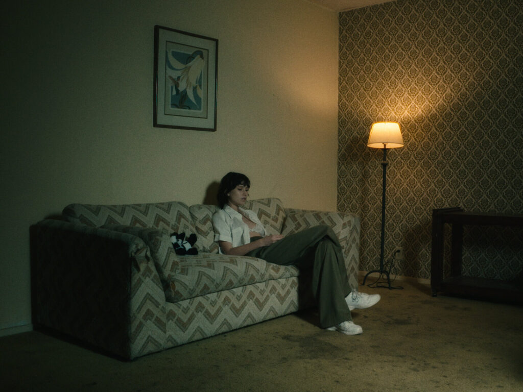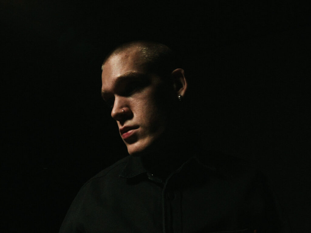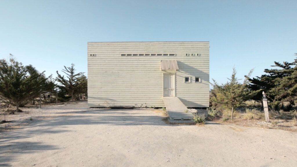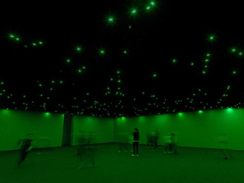
“I need to know the mood of a space before I can start to imagine who occupies it”
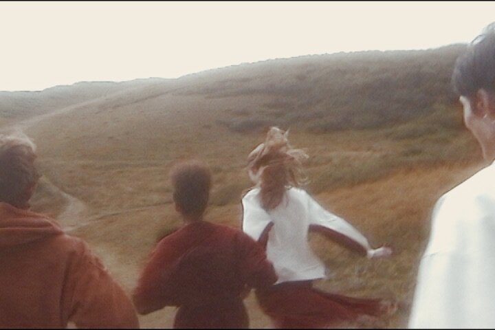
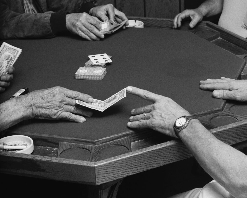
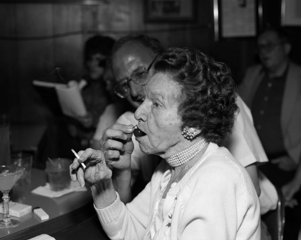
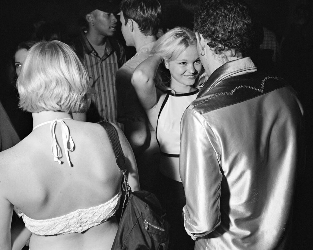
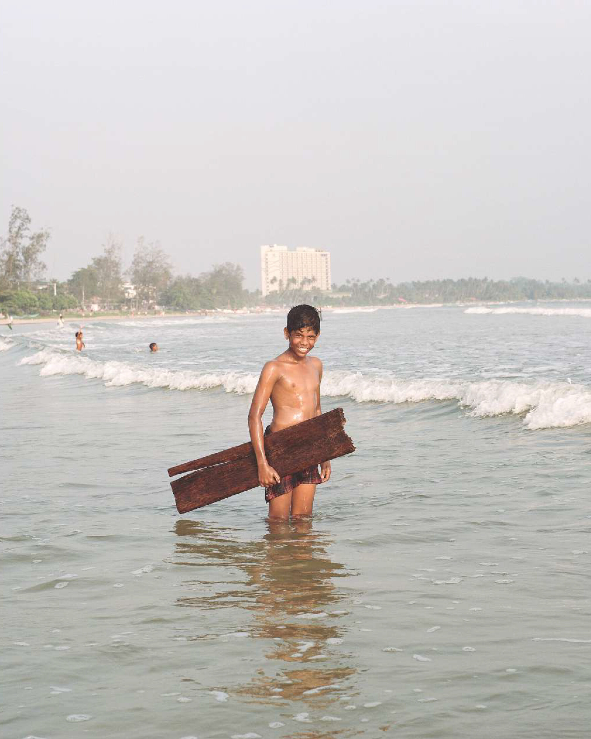
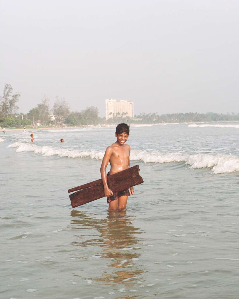
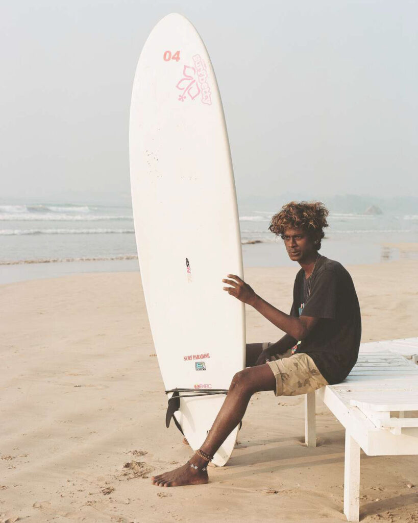
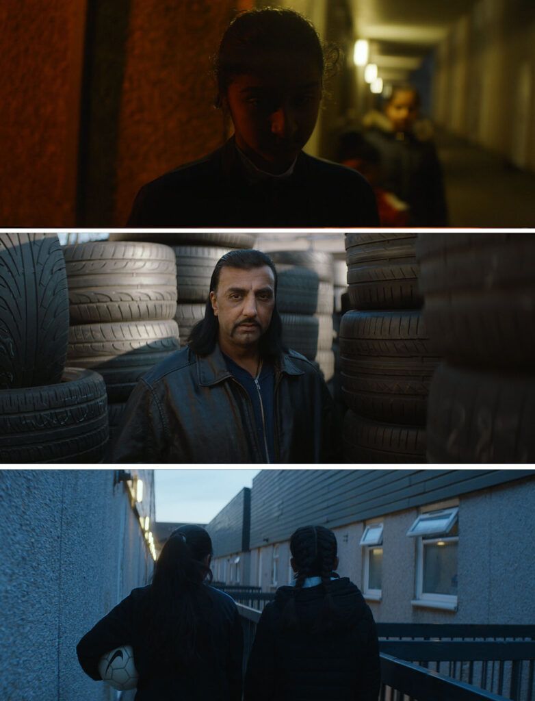
In the yellowy November gloom, a young Londoner tries to scrape together enough money to take his crush on a date. Money Up, named after the schoolyard game, is a film that captures the “spirit, grit, and resilience of young Londoners in a lighthearted and poetic tone.” The film has been garnering attention for Dhillon Shukla, whose previous works range from photographing young Sri Lankans who have adopted Californian surfer culture to collaborating with music artists such as Jessie Ware, Disclosure and Gorillaz. NR Magazine joined Shukla in conversation.
As both a filmmaker and a photographer how do you think your previous experience with photography projects informs your filmmaking process.
I think it’s changed over time. When I started taking pictures I was a teenager, I used to walk around and shoot locations I thought would be interesting to set a film in. I had this massive archive and I used to look through it and try to imagine a story. Then a couple of years later I started to work with musicians who were quite established, a lot of them had really creative personalities and sometimes our visions wouldn’t aline so I had to learn how to navigate that. After a few of those experiences, it began to feel natural to work with talent and for sure that’s fed into directing and working with actors.
You have stated that you predominantly worked with music and documentary. Do you find that you include those elements in your fictional works and if so how?
I take a lot of influence from music when starting a film, for me, it’s one of the best ways to find an emotion or feeling and put yourself in the headspace of a character. Then recently I completed a documentary which was shot over 4 year period and in a really observational style when I started it I only planned to shoot for 3 months, I had quite a rigid idea of what it would be but then there were a lot of surprises and the story told me it wanted to be something else. I had to listen to that. Looking back that was probably one of the best projects I could have done as it taught me to really think about an edit while shooting, I was always reacting to a moment and simultaneously trying to capture it whilst thinking of questions to ask and how I would build that into an edit. Creatively I became a lot sharper and able to generate ideas a lot quicker than I used to which helps with fiction work and to not be too attached to the script as it’s always evolving.
What was the most exciting filmmaking project you worked on?
I’d probably say Run Outs – the short film I’m making with the BFI at the moment. Like Money Up, it’s set in London but it’s darker, more ambitious and also quite impressionistic. I’m excited by how it’s developing, it feels quite fresh and more in line with the direction I want to go in.
You stated that you wanted to show the lighter side of London in your film Money Up. Do you find that people tend to have a negative stereotyped view of London and do you think your film works to change those perspectives?
I just felt that a lot of youth-orientated stories in London revolved around drugs and violence and while that’s obviously a reality for some people they’re also a lot of peoples experience that doesn’t reflect that. The intention of the film was to reframe that for sure and also show multicultural London kids in an innocent way.
You mentioned you are working on a script for a large scale work set in the future. Can you tell me more about this project?
Not really at the moment, just that it’s finished and the plan is to make it my first feature film.
What filmmakers and directors do you draw inspiration from and how do you apply that inspiration to your work?
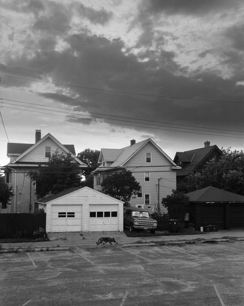
I think when I’m writing I’m more inspired by music or locations. I need to know the mood of a space before I can start to imagine who occupies it. That’s where most ideas come from for me. They’re not many films I would say are perfect but the ones below are and I find it hard to not think about them from time to time.
Chungking Express
A Prophet
The Tree of Life
Barry Lyndon
Apocalypse Now
You shot Money Up on a small budget. What was the process you had to go through to see the film to fruition?
I wrote the script for an open call for the BBC and got selected. My exec producer connected me with an amazing casting director. They’d worked with people like Nicholas Winding Refn, Lars Von Trier and Gaspar Noe but they’d also cast all the seasons of Top Boy which made me feel they’d be perfect for the film. They were great and found all the actors in about 3 or 4 weeks. We shot in November during a lockdown so it complicated things a bit, we weren’t able to rehearse or even meet each other before we shot it. Then for all of the post-production, we had to work via Zoom as well. It was quite a different way to work but I think in the end everyone who was in it and worked on it was pretty happy with the result.
How do you think Covid will affect the indie film scene in the future?
I’m not sure but it’s been a shame all the film festivals have moved online because they’re really important for indie filmmakers to connect with people and continue to keep making work so I hope they’ll come back soon.
What advice do you have for young creatives looking to work with film and documentaries?
Start by making something independently where you can have creative control. It’ll allow you to develop your style and attract the right collaborators for you.
What are your plans for the future?
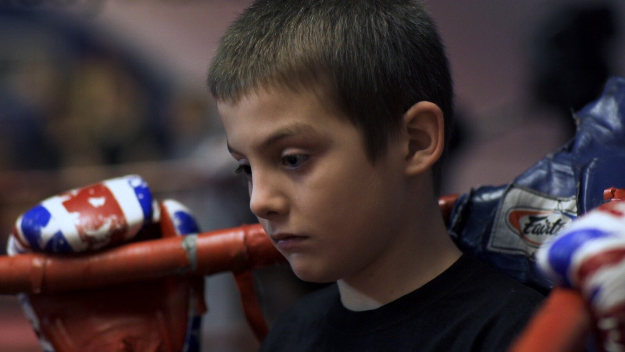
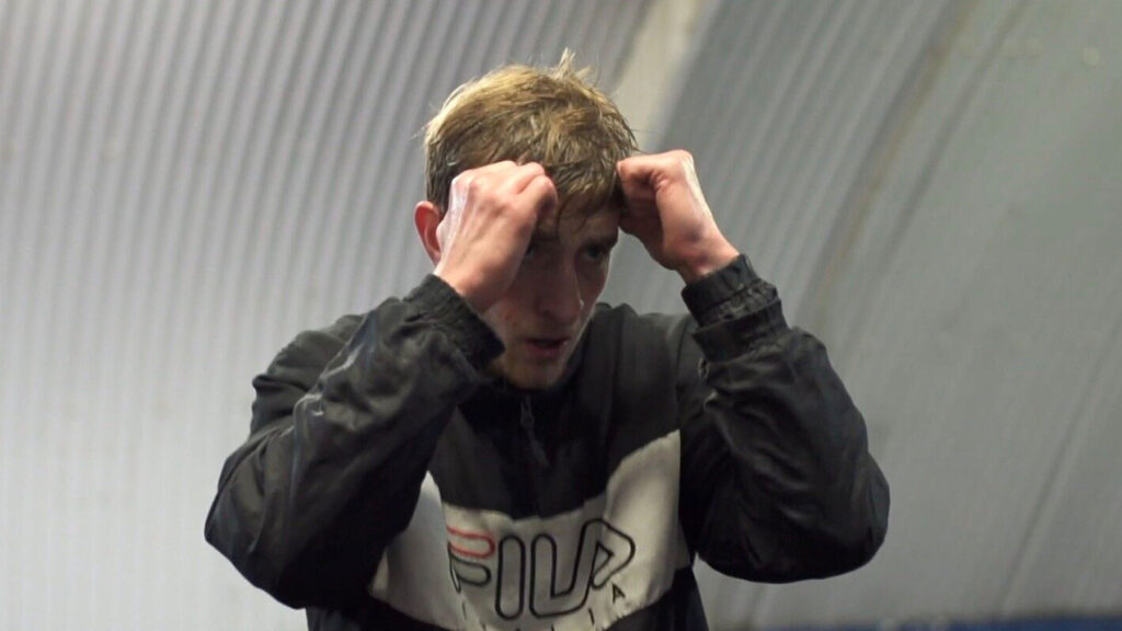
As I mentioned before I’ve recently completed a 40-minute documentary called The Prodigy which follows 23-year-old Muay Thai world champion Greg Wootton and his 9-year-old prodigy Jimmy Clarke, they both fight out of the KO Gym in Bethnal Green which has produced over 25 world champions. It’s about two young Londoners’ pursuit for greatness in the sport which leads them to find a deeper meaning in their lives. It’s been quite an epic project so I’m really excited about releasing that later this year and also completing Run Outs. Then beyond that, I’ve got another short I’m going to make before doing my feature film.
Credits
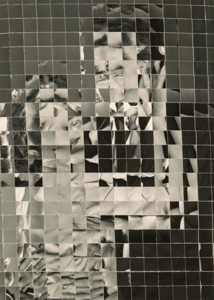
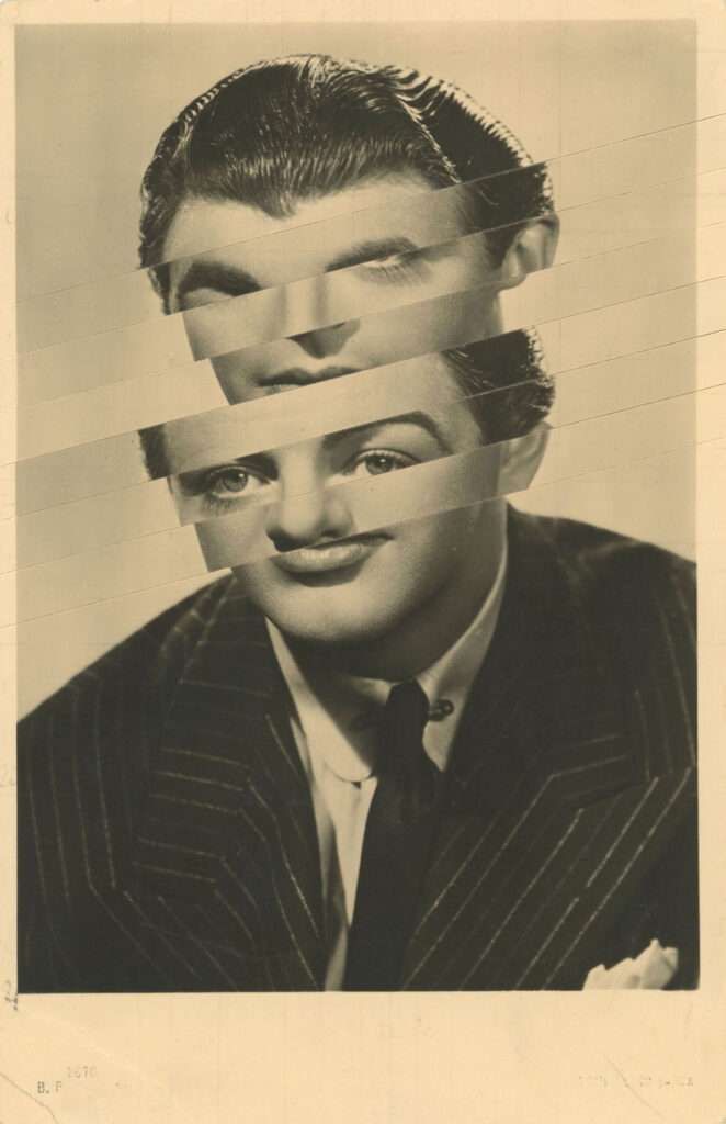
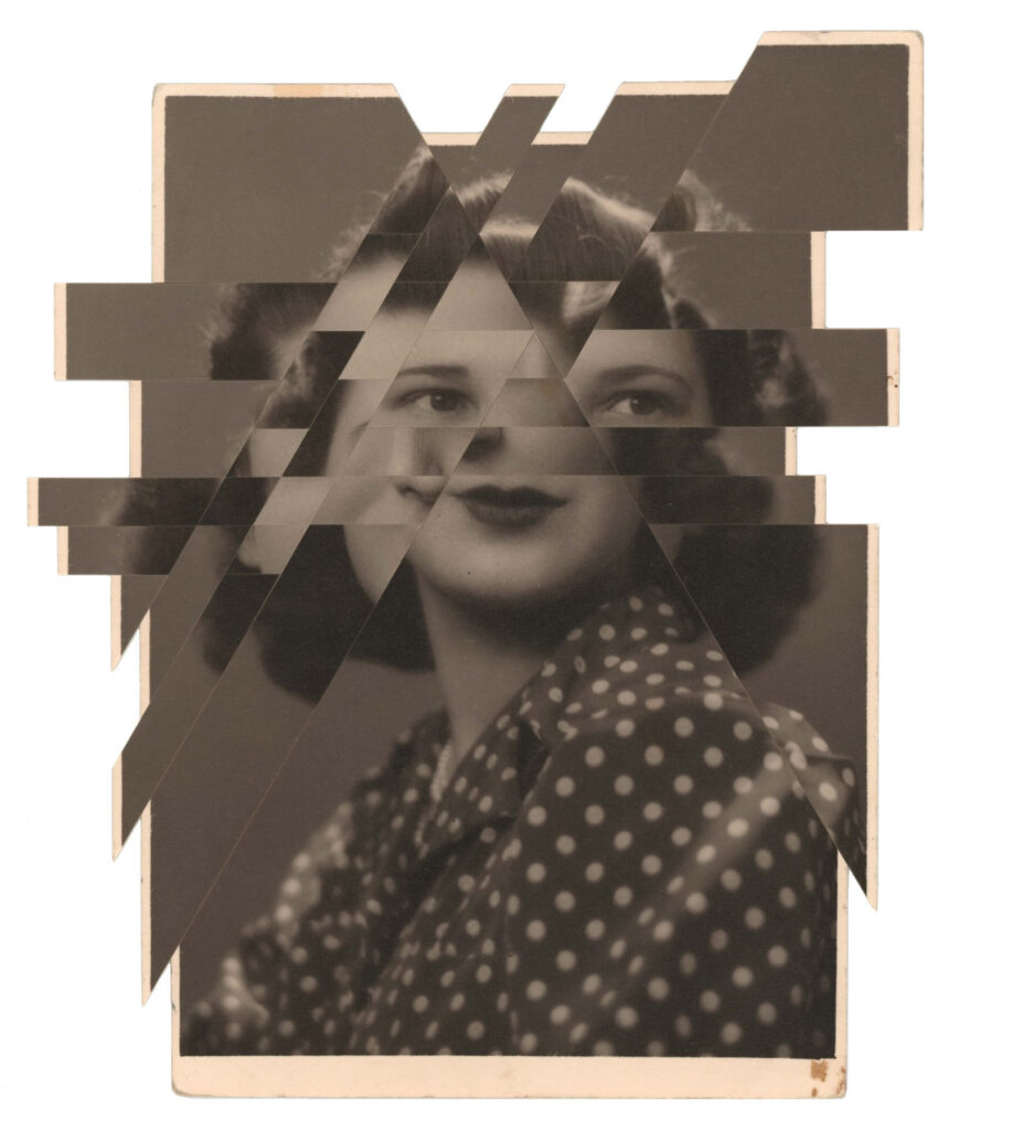
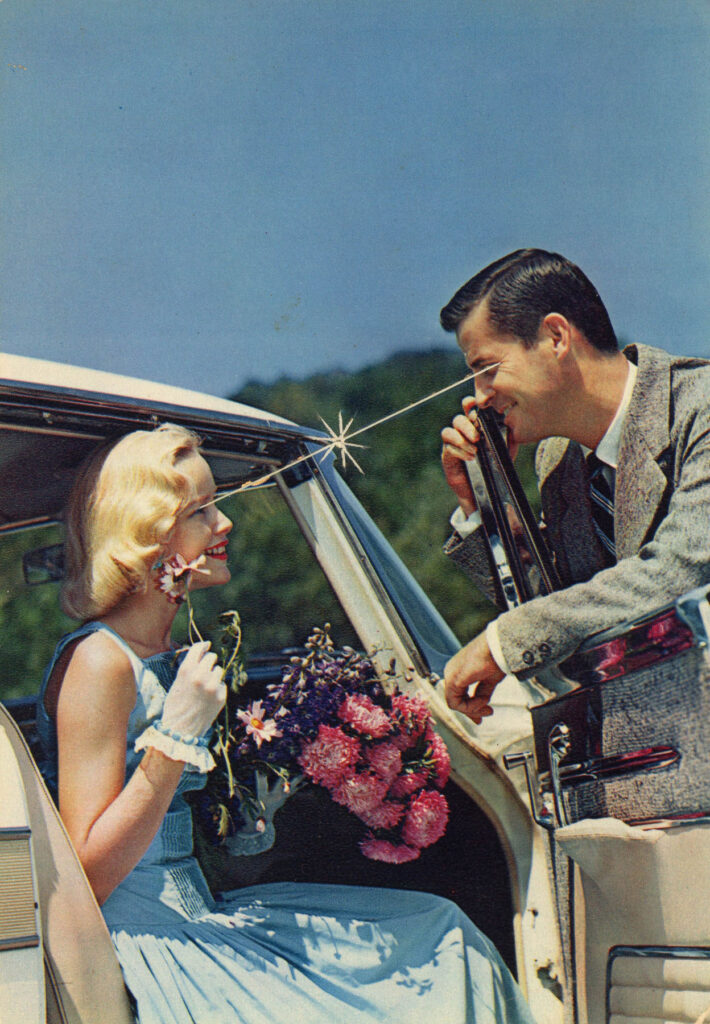
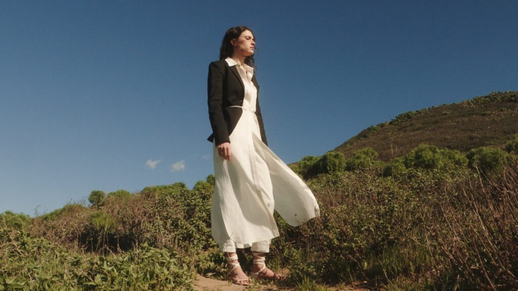
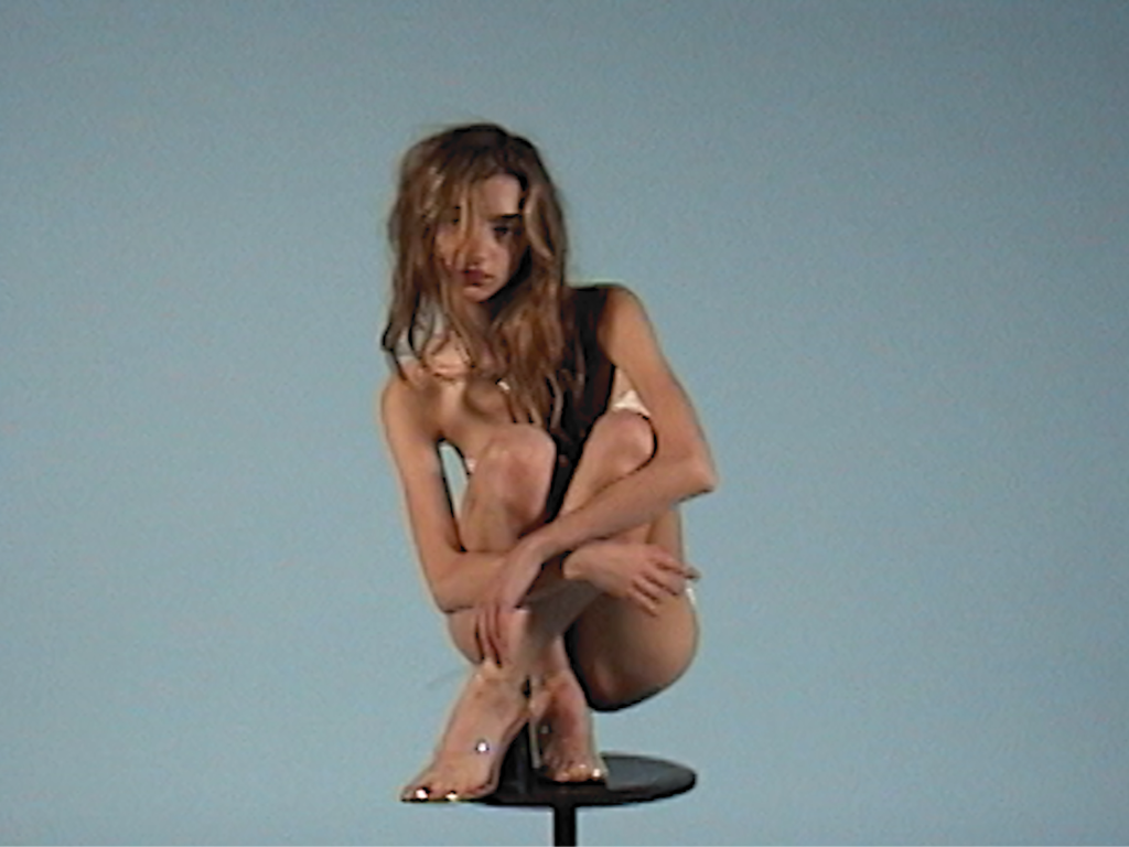
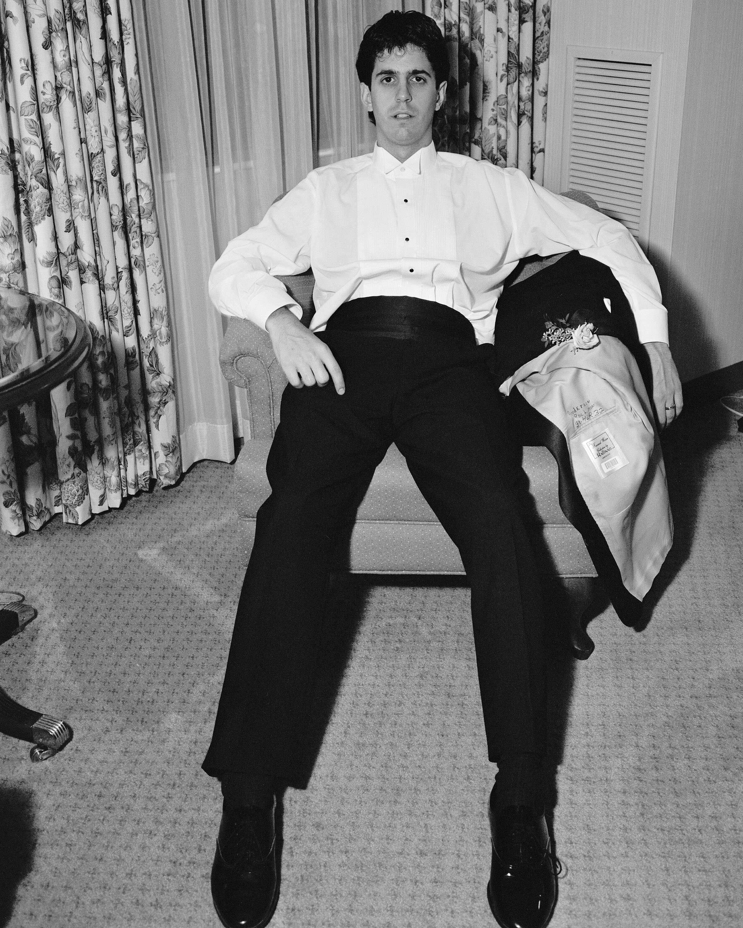
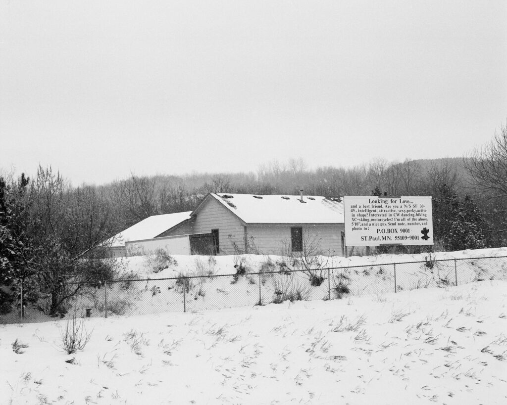
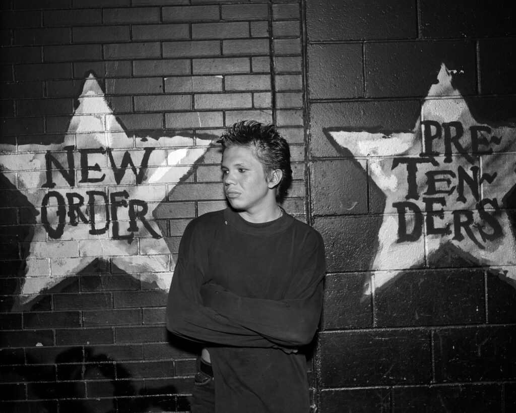
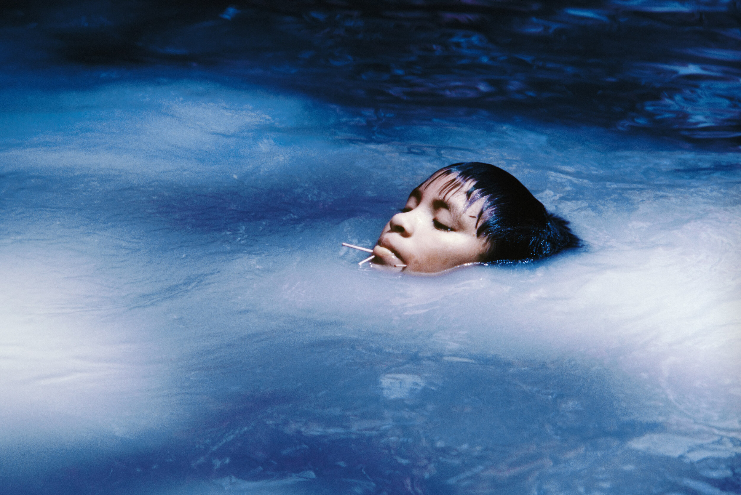
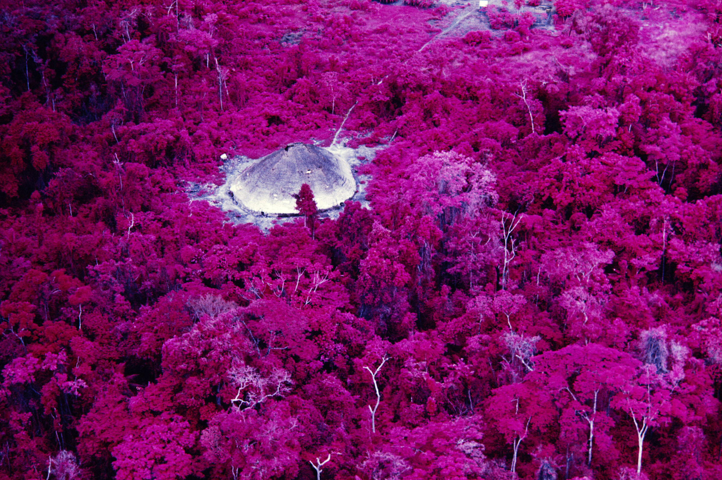
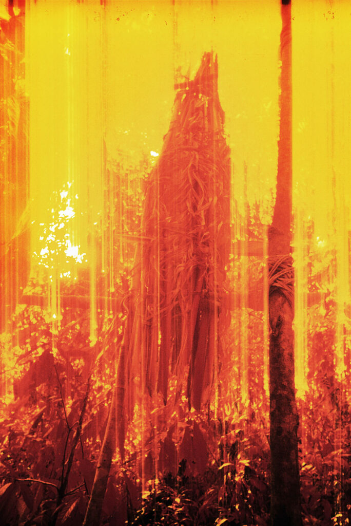
Images · DHILLON SHUKLA
https://www.dhillonshukla.com/#1