Archive page:


(AB)NORMAL

Architecture as a living process: world-building beyond the normal

Founded in 2018 by a group of collaborators, Mattia Inselvini, Davide Masserini and Luigi Savio, driven by a fascination with obsolete technologies, gaming culture, and ephemeral atmospheres, (AB)NORMAL studio began as a shared diary of colorful renderings and narrative experiments rather than a conventional architecture firm. Over time, these graphic explorations evolved into three-dimensional environments, from temporary installations and exhibition spaces to commissioned architecture, where the virtual and the tangible, the personal and the collective, converge. NR spoke with the architectural studio to trace the origins of its practice, its interdisciplinary approach, and the evolving philosophy that positions architecture as a living, inhabitable process.

I would love to begin at the origin of your practice. When we met, you showed me your early rendering drawings, where you used color gradings to create imaginative words and utopy spaces. Your website also presents sections of sketches, graphic novels, and research projects across diverse formats. How did these explorations evolve into the construction of three-dimensional, inhabitable space, and how do you conceive interdisciplinarity within your practice, particularly the relationship between image, narrative, research, and built form?

(AB)NORMAL began in 2018 as a shared diary rather than a studio in the conventional sense. We were collecting formal obsessions and reflections on contemporary life—together with a fascination for obsolete technology, gaming culture, and a certain kind of spirituality. Producing images was almost a form of collective therapy: a way to exorcize the fantasies that tend to cling to the creative process.

Those early renderings, with their gradients and artificial atmospheres, were not meant to represent architecture. They were small world-building devices. Plants, statues, iPods, headphones, joysticks, fragments of architecture, and 3D graphic elements became protagonists of collages that were trying to capture emotions, historical moments, and personal reflections. We often used architectural representation tools inefficiently on purpose – because for us the “error,” the glitch, the excess, was part of the thinking.

Over time, what was initially graphic started to reveal a spatial potential. We realized that the narrative quality embedded in the images could become operational in three dimensions. That’s how we moved into ephemeral environments, exhibitions, fashion shows, and temporary installations: spaces conceived as portals where the boundary between the virtual and the tangible becomes softer, and where digital culture can be experienced collectively, in public space, rather than privately on a screen.

Interdisciplinarity, in our practice, is not about blending disciplines as a stylistic choice. It’s a natural condition – an open system where formats constantly translate into each other. Image generates atmospheres and iconographies; narrative gives time, causality, and social behavior; research adds friction, specificity, and a reading of contemporary cultural phenomena; and built form is where everything becomes measurable, negotiated with gravity, budgets, regulations, and bodies.

We don’t see a separation between thinking and construction, between theory and space. Architecture is not a final object for us, but a living process: a way to transform research into concrete experience, and to make the complexity of the present spatial, inhabitable, and shared.

Your work conveys an approach to architecture as the shaping of time, space, and human experience rather than the mere production of aesthetic environments. It evokes, for me, a sensibility reminiscent of Bachelard’s phenomenology, attentive to how spaces are experienced and how time is woven into them. In developing a project, do you start by asking who the space is meant for, or what it needs to feel like? Beyond these immediate considerations, do social, political, or theoretical reflections on inhabitation and identity play a role in how you conceive and compose your spaces?

I’m glad you mention Bachelard, because that attention to lived experience resonates with how we work, although we rarely start from a theoretical framework in a direct way. We begin from a more immediate question: what kind of atmosphere should this space produce, and what kinds of behaviours should it enable?

In many projects we don’t separate “who the space is for” from “what it needs to feel like.” We start by mapping a set of bodies, rhythms, and expectations,  the clients, the visitors, the workers, the public, and at the same time we try to define an atmosphere, an emotional disposition. For us, architecture is not only a form, but a temporal condition: a sequence of thresholds, pauses, intensities, and moments of orientation or disorientation. Especially in ephemeral environments, what matters is not the object, but the experience of moving through it and the way people recognize themselves inside it.

The composition of space, then, becomes a way to organize time collectively: light, sound, images, materials, and interfaces are not decorative layers, but tools to construct a shared situation. This is also where the virtual and the tangible matter to us – not as a celebration of technology, but as a way to compress distances and create a feeling of proximity between people, even when they come from different worlds.

Social and cultural reflections are always present, because we constantly observe contemporary phenomena – from gaming to streaming, from entertainment to the aesthetics of technology – and we try to translate those into spatial experiences. We are careful not to use our work as a platform for explicit political statements, but inhabitation is never neutral. Choices about openness, accessibility, visibility, and flexibility always imply a position.

So rather than starting from an ideology, we start from the reality of the present, and we try to build spaces where contemporary identities and forms of coexistence can be rehearsed, not just represented.

Looking at some of your past projects, such as your graphic-novel explorations, there seems to be a consistent interest in the interplay between narrative, spatial sequences, and materiality. How do these non-commissioned or experimental works inform your approach to commissioned architecture? Would you say these projects operate as laboratories for concepts, atmospheres, and techniques that later manifest in built spaces ? 

Narrative is central in these experiments because it forces space to unfold in time. A graphic novel, for instance, is already a spatial tool: it’s made of sequences, thresholds, cuts, pauses, and intensities, which are exactly the ingredients of architectural experience. Through these formats we can prototype how a space might be inhabited, how a body moves, what kind of attention or distraction it produces, and what kind of collective situation it enables.

Materiality also enters early, even when the work is virtual. We use digital tools not to “illustrate” a final design, but as an operational environment where we simulate light, textures, reflections, and spatial compression. In that sense, the rendering becomes a critical device — a way of thinking through material behavior before it becomes construction.

When we move into commissioned work, those experiments don’t simply provide a catalogue of aesthetics to apply. They provide a vocabulary of techniques and questions: how to build a Stimmung, how to design a space as a flexible infrastructure, how to combine physical elements with image, sound, and interfaces, how to accept the productive role of error, and how to make the experience collective rather than purely visual.

So yes, they function as laboratories, and simultaneously, as a constant training ground. They keep the practice open, and they prevent architecture from becoming a fixed style or a formula.

Materials appear as active agents in your practice, with intrinsic behaviours, textures, and narrative potential. To what extent does material research guide your design process, and in what ways is matter treated as a conceptual partner, as a vessel of memory, or as a means to articulate spatial and sensory qualities?

Material research entered our work progressively, growing in importance as our projects became more spatial and inhabitable. At first, materials were part of an image vocabulary, linked to atmosphere and iconography. Over time, we began to treat matter as an active agent within the design process. Materials carry behaviors, react to light, define acoustic conditions, age, reflect, and absorb, producing an immediate emotional and cultural reading.

Because our practice moves between the virtual and the physical, we test material atmospheres early through digital simulations. Rendering becomes an operational environment where texture, reflectivity, depth, and spatial compression can be explored through iteration and error. This allows materiality to guide decisions long before construction.

Matter also acts as a vessel of memory. Certain surfaces evoke domestic familiarity, industrial systems, or obsolete technologies, triggering recognition and affect. In this way, materials become conceptual partners in composing an atmosphere. Ultimately, material choices articulate sensory qualities such as warmth, opacity, intimacy, and exposure, shaping how time is experienced in space and how people inhabit it.

Your practice also extends to the design of objects, such as tables or other design elements. When approaching these smaller-scale pieces, how does your method differ from designing larger spatial environments? To what extent do considerations of the surrounding space, function, and human interaction inform these objects, and how does your approach engage with notions of decoration or ornament within the broader logic of the project?

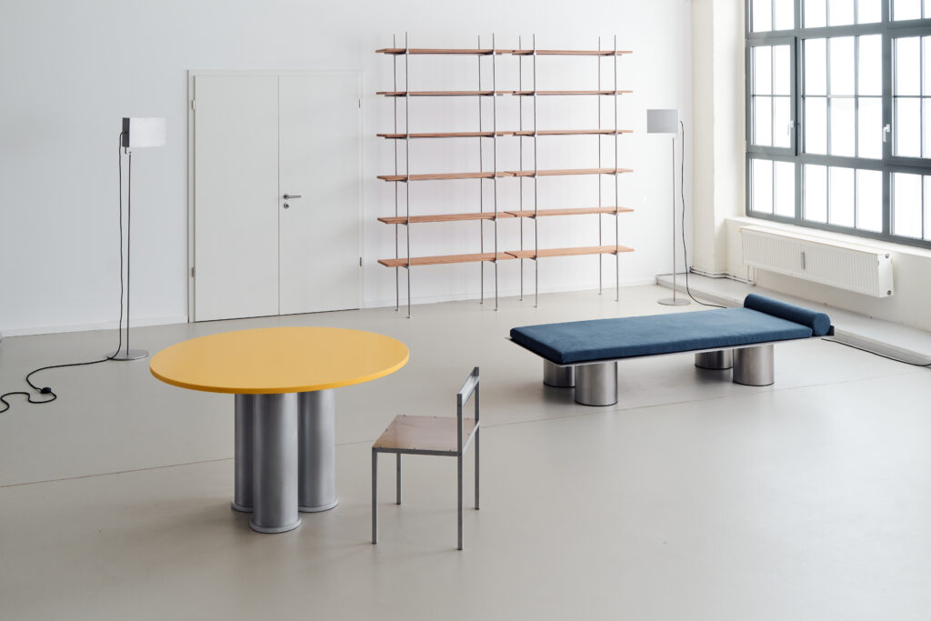
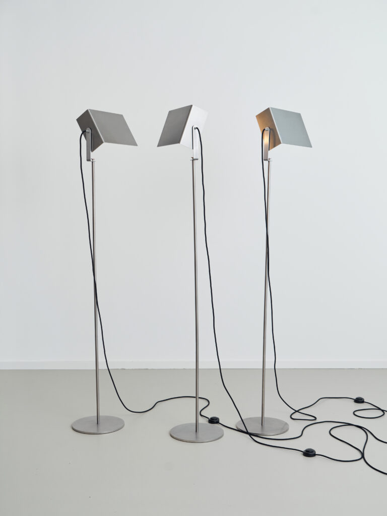
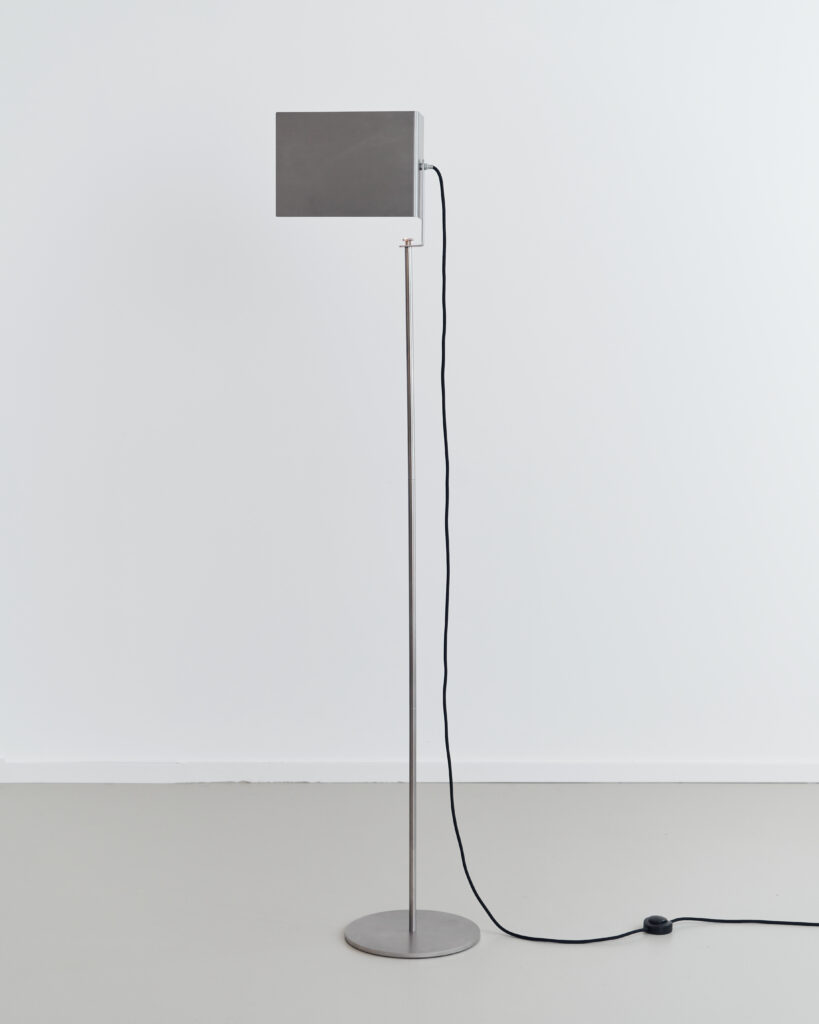
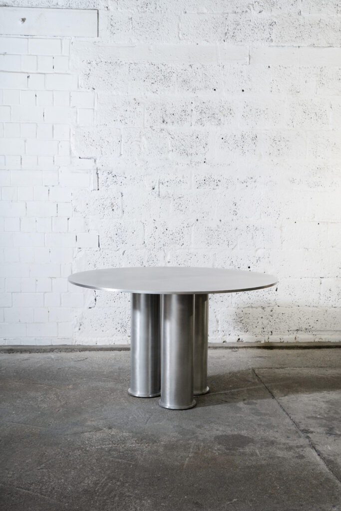
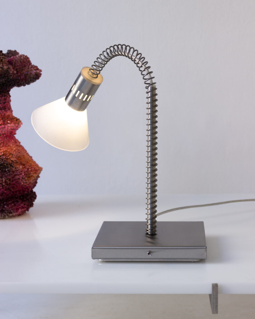
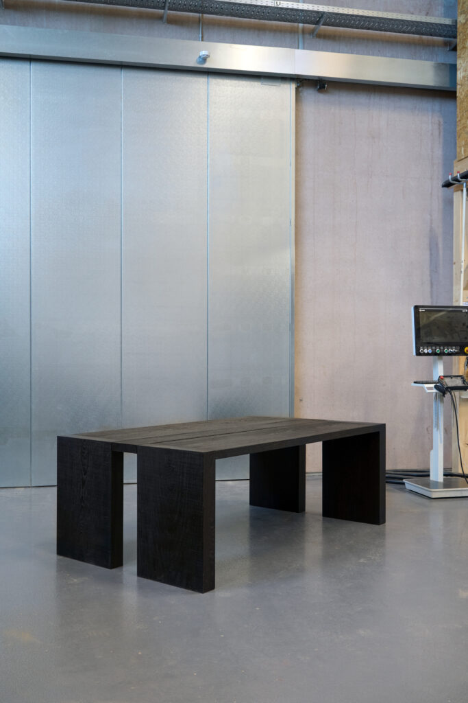
We approach objects almost the same way we approach architecture. Even at a smaller scale, we design them as spatial devices rather than accessories. A table, a lamp, or a custom element is treated as a unique piece with its own presence, geometry, and narrative potential, like a small building inhabited through use.

The main difference is intimacy. Objects are experienced at close range and through contact, so function and human interaction become immediate. We think about posture, touch, weight, and how bodies gather around an object. We also consider the surrounding space. We rarely design standalone pieces. We imagine objects as part of an ecosystem for the whole space, shaping how a room is used, how circulation works, and how attention is directed.

Decoration and ornament are never applied superficially. What might appear ornamental is often structural or performative. Detail, texture, and material behavior reinforce the project logic and intensify atmosphere. An object can become a threshold, a marker, a focal point, or a small ritual.

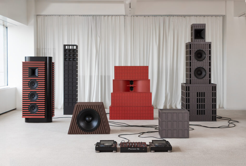
I would like to discuss your most recent project, which stands out in the portfolio of works made so far: the creation of a custom sound system for WSA NYC. How did this commission come about? Considering WSA is described as a spatial platform blending architecture, design, exhibitions, and brand-driven environments, what was the initial brief or cultural ambition behind this collaboration? Did it originate as a product-design assignment, an installation, or an attempt to rethink what a space for music, art, and social gathering could be in New York? 

The request wasn’t simply to “deliver a product,” but to develop a custom sound system that could act as an identity element and a piece of architecture in its own right. From the beginning, we understood it as a project about atmosphere, behavior, and gathering, as much as acoustics.

Rather than starting from a conventional hi-fi object, we worked as we would on an architectural commission. We considered the surrounding space, how people move, where they pause, how they socialize, and how music performs within that context. The goal was to create a system that supports different modes of inhabitation, from focused listening to informal conversation, without turning sound into background decoration.

So the project sits somewhere between product design and installation. It is a unique object, but it also reorganizes the room and amplifies the cultural ambition of WSA: to rethink the space of music, art, and social life in New York as a shared environment, where technology becomes part of the spatial narrative.

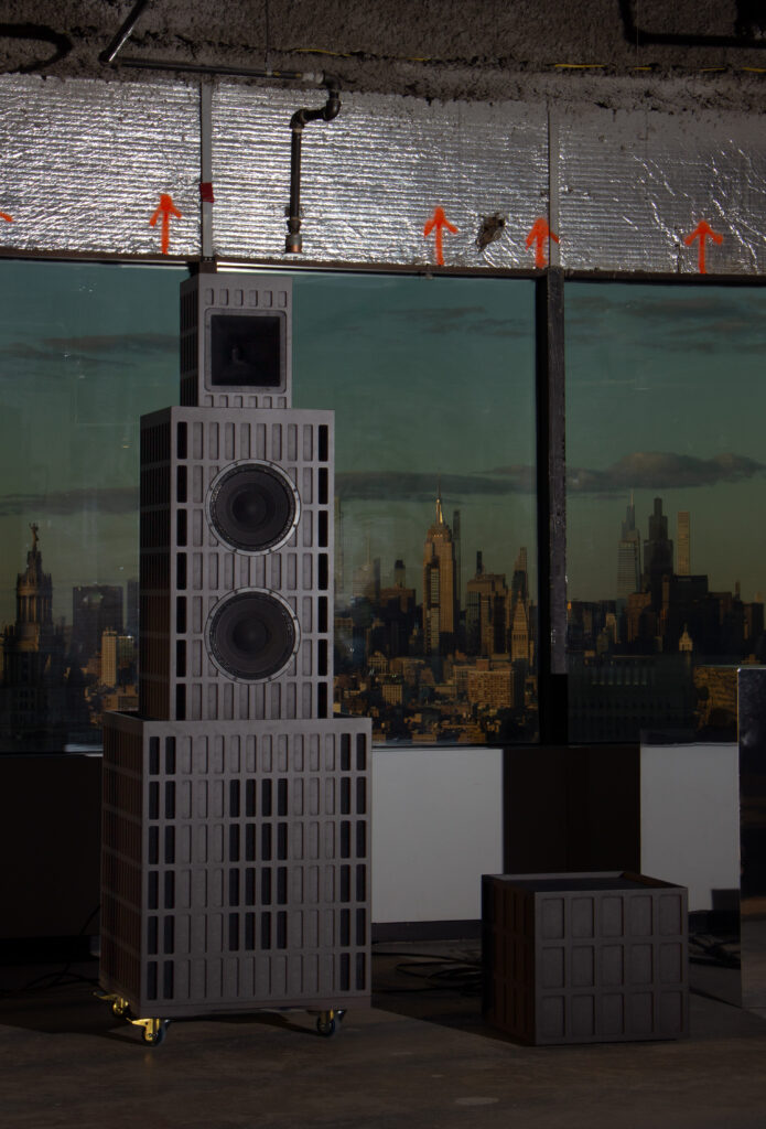
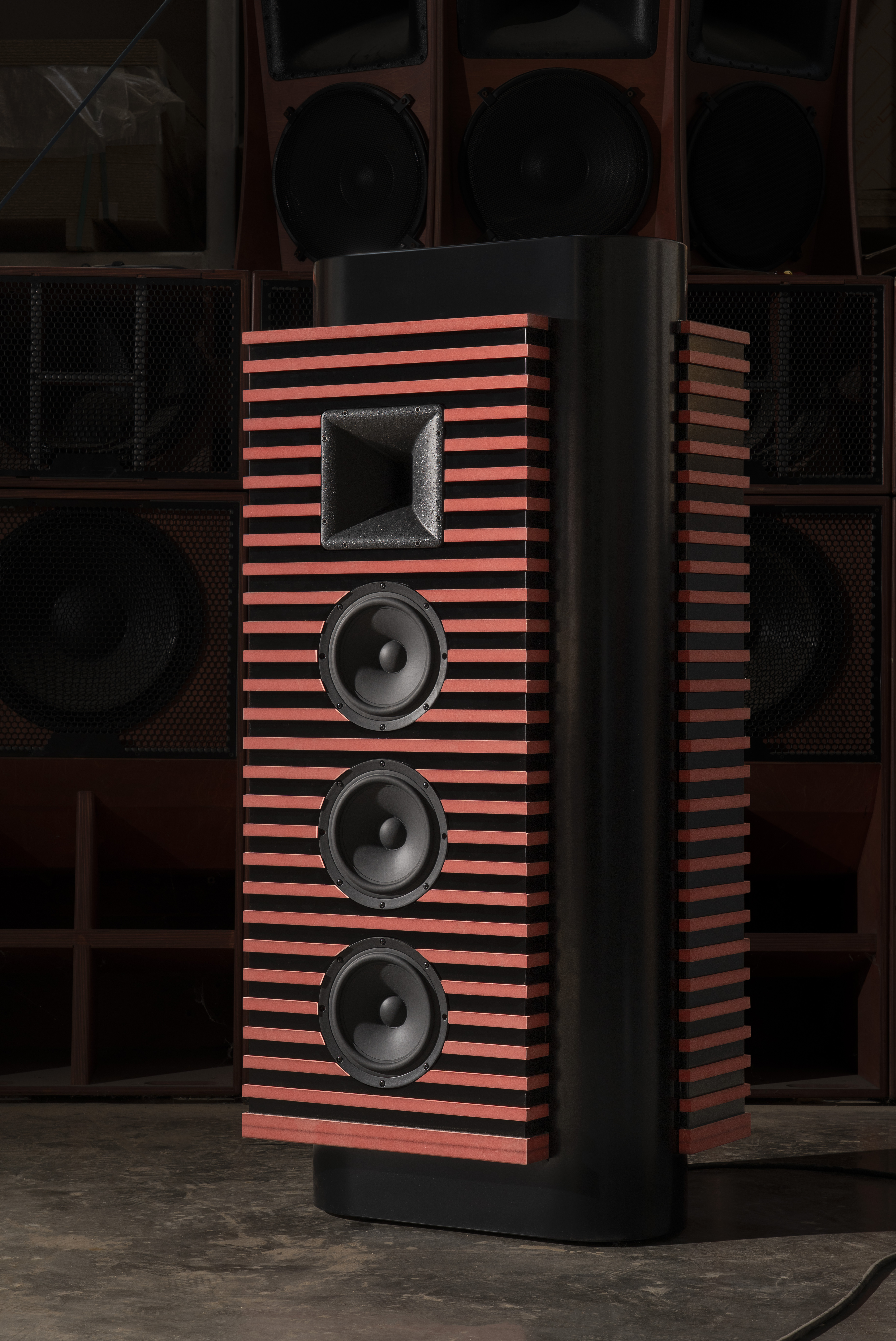
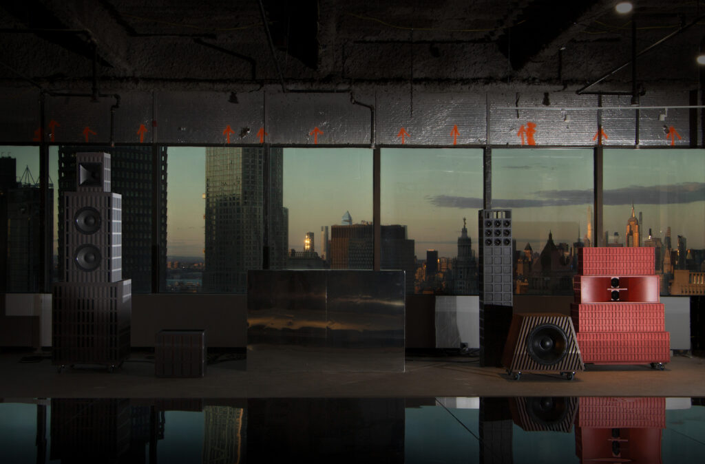
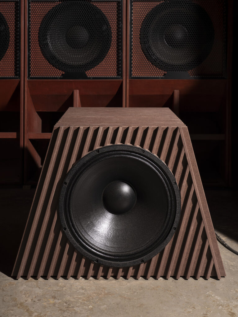
The WSA Sound system is presented not as a mere sound setup but as a sculptural constellation of speaker-towers whose modular design echoes rigid geometry and corporate aesthetics. In designing this, how did you negotiate between its identity as a functional sound system and as an architectural-sculptural installation? Explaining myself clearly: looking at it, it reads almost as a miniature city in itself, with its own carefully drafted colors and shapes. Could you use this project as an example to discuss how aesthetics, function, and conceptual intention intersect in your work? How do these dimensions inform each other in the design process?

Yes, the WSA system is a good example of how function, aesthetics, and conceptual intention intersect in our work, because we designed it as an architectural landscape rather than as audio equipment. We began from performance and presence. The system had to work acoustically, but it also had to occupy the room and become readable as a spatial structure.In our practice we manipulate the scale of objects to create spatial tension. When a speaker tower becomes as tall as a person, or when a subwoofer becomes a block, the object stops behaving like a device and starts behaving like architecture. It produces orientation, distances, and thresholds. It changes how you enter, where you stand, how you gather, and how you look. In the image, the constellation reads almost like a miniature city because the pieces have the logic of buildings. They create a skyline, bases, voids, and a rhythm of volumes distributed across the room.

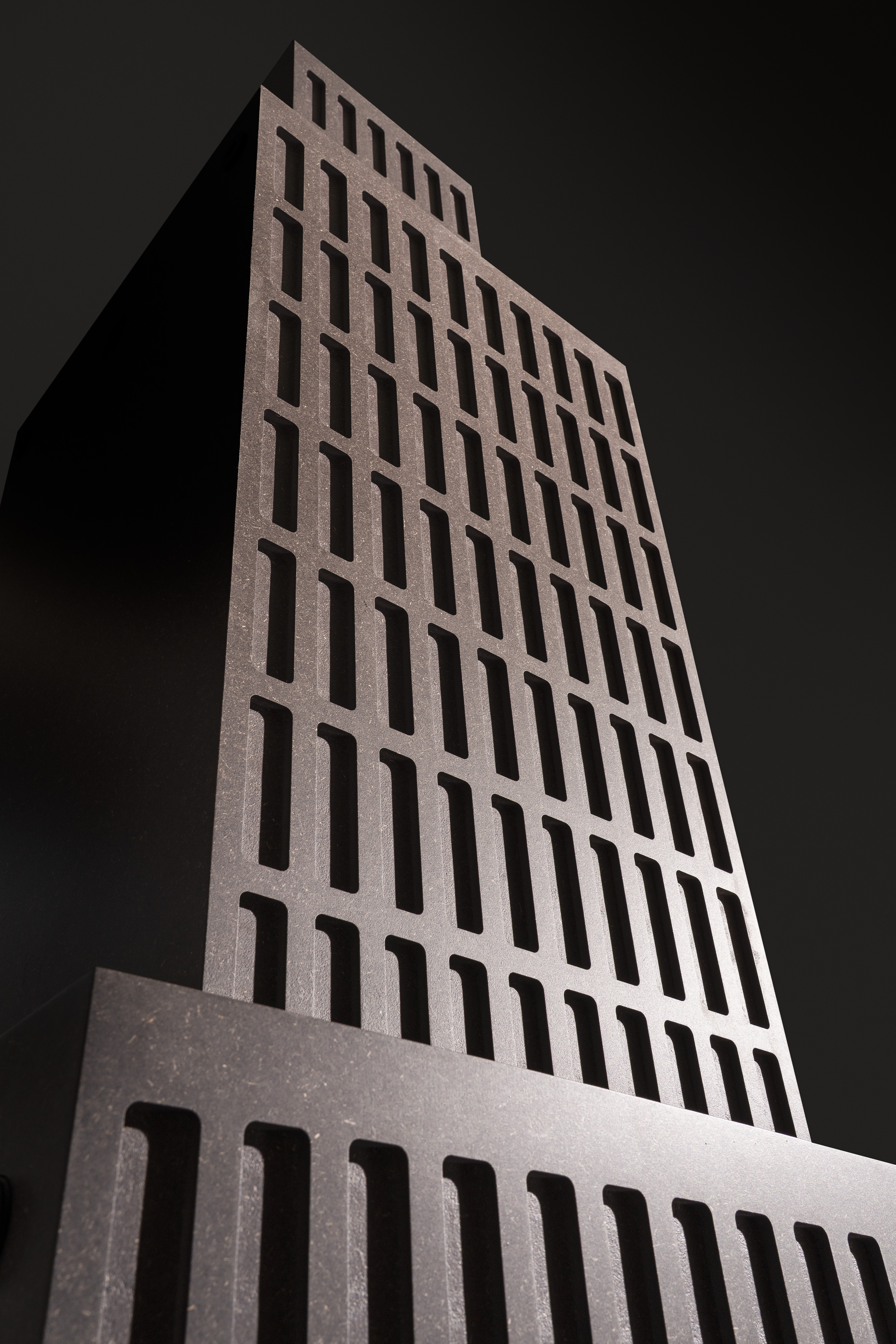
This sensibility comes from our early work and from narrative formats such as the graphic novel. Working with sequences trained us to think in terms of framing and perceptual displacement. Exaggerating scale creates that displacement. It makes the familiar slightly uncanny, shifting the experience from pure utility toward something closer to an artistic encounter.

The rigid geometries and calibrated colors reinforce that dual identity. They give the system an infrastructural, corporate aura, while allowing it to function as a sculptural installation that organizes both sound and space.

Considering the diversity and conceptual depth of your work, what open territories remain for future investigation and experimentation?

We honestly don’t know, and we prefer it that way. We try not to define future territories too precisely, because the most valuable directions often arrive as surprises. What keeps the practice alive is lateral thinking: the ability to move sideways across disciplines, scales, and formats, following unexpected connections. New collaborators, new technologies, or new cultural phenomena can suddenly open territories we couldn’t have planned. Staying open to that uncertainty is what generates enthusiasm and keeps our work from becoming a fixed style or a predictable agenda.

I would like to conclude our conversation by returning to the very origin of your practice: the choice of your name. Naming a studio is never a neutral act; it often contains the initial spark that motivates its existence. After everything we’ve discussed, I am curious to hear how this origin resonates throughout your work. Why Abnormal?

Abnormal has a very literal origin, and a broader meaning that has stayed with us. The studio began as a graphic reflection on architectural representation. We were working with 3D tools and we became fascinated by the gradient of a normal map, the image that encodes surface orientation through RGB colors to simulate depth and light. That technical vocabulary, and that strange artificial “skin” of digital representation, became part of our identity. It marked the moment when our practice was more about generating worlds through images than producing buildings.

Over time, the name also became a statement about attitude. Many of the projects we do try to go beyond what is considered normal within architecture and design. We look for iconicity and uniqueness, for forms and atmospheres that feel slightly displaced, excessive, or unexpected. In that sense, “abnormal” is not about being strange for its own sake. It is about refusing a standard formula, keeping the practice open, and allowing each project to find its own language, even when it pushes beyond familiar categories.

Credits

All images courtesy of (AB)NORMAL.
Discover more on abnormalstory.com

Mesura

Mesura and architecture that returns to genius loci 

Heritage is the guiding force behind Mesura’s work. Inspired by the Roman concept of genius loci, the Barcelona-based architecture studio is drawn to places rich with history—UNESCO heritage sites, towering castles, or even the discarded stones of Gaudí’s Sagrada Família. Working within the spaces history has left to modernity, Mesura brings together fragments of the past with contemporary techniques, creating projects that span the globe.

The studio emerged during a turbulent time in Spain’s architectural landscape. In the early 2010s, amid the recession, a few university friends with a shared design philosophy began to work together in a small space in Barcelona. Their turning point arrived when they entered the EUROPAN 2011 competition, choosing the historic walls of Dubrovnik as their site. What started as an experiment soon became a defining moment—designing with history, rather than just around it.

That realisation shaped Mesura’s identity. Rather than following the traditional model of a singular architect at the helm, the studio’s co-founders— Benjamín Iborra, Carlos Dimas, Jaime Font Furest, Jordi Espinet, and Marcos Parera Blanch—built a space for collaboration, research, and a reimagined approach to design.

In conversation with NR, Mesura co-founder and partner Benjamín Iborra discusses some of the studio’s defining projects. 

Were you always called Mesura?

We just started doing stuff together, but then at some point we said, ‘okay, there’s a little money coming in. So, we need to have a name just to receive the money.’ So, we first used the name of the street that we were based on. It was just a number: a pre-name without any thought behind it. We were called 311 … something ridiculous like that. 

In 2015, the name Mesura was born. The word ‘mesura’ has a lot of meanings. For us, the first important thing was a name that could be understood in many languages. Next, it had to make sense in terms of being something specific to measurement: working in architecture is very technical. 

Nevertheless, what’s most important is what it means to work ‘with mesura’ in Spanish! It means to work with respect. It’s not about doing whatever comes to mind; it’s about taking the time to think things through—twice, three times, even four times. 

Your research is very visually oriented, almost like a pictorial collage of your thinking and the resources you encounter. Walk me through how you start this process: Where do you first go for references? Who are some of the people you interact with to immerse yourself in the environment?

We believe it’s much more interesting to see the process and not just the final result. We really enjoy it! We have this passion for using graphic design and narrative to explain process. At the beginning, we did it just for pleasure. In fact, it happens to be pretty unprofitable because it takes a lot of time. But eventually, we realized that when we spend to genuinely show what we do, the money comes back. 

We like to focus on our communication, but we actually do this in our daily life— we look to research, to investigate, to make models, to try things out.  It’s an atmosphere that we’re generating at Mesura. You’re not just seeing a result: you’re seeing research, trials, and a mix of things that go beyond architecture that are related to design and to culture.

The people that work in-house have great abilities and are very cultured.  We’re involved in universities and there’s always people coming in and out of the studio.  We do these things called ‘Tuesday Talks’ where we bring people that are not architects to the studio every Tuesday to talk about whatever they want. It’s ideas that are totally crazy that contribute to the culture of the people in Mesura. It gets us thinking beyond architecture and to have an open mind in all our research.

To create the Aesop Diagonal store in Barcelona, Mesura sourced KM0 (Kilometer Zero) stones, originally from the Montjuïc quarry.  You describe deploying a “pseudo-archaeological effort” when found the stones that eventually would make its way into the final design. What does “pseudo-archeological” mean and what did this process look like?

We ended up calling this process ‘creative anastylosis:’ I’m going to explain more later. And we’re not just using zero-kilometer stone, we’re reusing zero-kilometer stone. 

For Aesop, we started from [Barcelona’s] local identity. We learned that, whenever they create a stone for La Sagrada Familia that’s not perfect, they throw it back into the mountain. Our first idea was: let’s use these discarded stones to represent the identity of the city. But obviously, La Sagrada Familia, in the name of Gaudi, said, ‘no, this is not possible. You cannot use stones from Gaudi to do your shop.’ 

At first it was a pity, but it opened up another opportunity. La Sagrada Familia was initially done with stone from the Montjuïc quarry in Barcelona: here, a lot of stones were extracted to create buildings in the city. This quarry was closed 60 years ago because it wasn’t possible to extract more from the little mountain. La Sagrada Familia was originally started with these stones, but in the sixties they also stopped. 

We called a lot of people who worked with stone in Catalonia to ask if they had stones from Montjuïc. We ended up finding a family business that, for the past 30 years, had been gathering Montjuïc stones from all the buildings that have been demolished and gathering them in their quarry. 

They said, ‘come to our quarry and just see whatever we got!’ That was amazing. Here is the part about ‘creative anastylosis’. After a historical building has been demolished, anastylosis is the art of gathering those pieces and remaking it in the exact same way. For us, it’s a creative anastylosis, because what we’re placing the stones in a unique, creative way for new purpose. 

It was very interesting because I think we found about 100-200 stones in this quarry. We didn’t need that much so we decided to be more ambitious and use the ones that have memory.  Not just a square block, but one with a shape that you recognize because it has been in another building before. 

The pieces that had some “memory” of an architectural past was a striking choice. It’s interesting to hear that the first approach involved The Sagrada Familia. It has such a strong architectural language—it’s extremely recognizable and particular. 

You’re right. We saw the thrown-out Gaudi pieces, modelled them, and then arranged them for the store. In the end, we had a proposal for a concept. It was really powerful. It had a lot of shape, color, and character… maybe too much. But we’ll never know!

Regarding the Sundial House, given its unique location in the parks of AlUla in Saudi Arabia, what was the client’s motivation for building here? Has it been built?

Our first project in Saudi Arabia was done maybe more than 10 years ago. It was a retail shop in Riyadh. It was one of our very first projects. Since then, there have been many paths that have taken us back to Saudi Arabia. It’s a country that’s changing a lot and we want to be part of this change. They are developing projects in a good way while being respectful to the space. 

One of the projects Saudi Arabia proposed was to create 100 houses. This was a competition, where the result was 100 designs created by all different architects in different places within Alula. We won and received an amazing site: it was a mountain carved out from the inside. With it, we proposed a house that made the niche into a unique courtyard within nature while working with raw materials like the sand and the rock that surround the space. 

We hope that this is going to be done in the future, but we still don’t know. It’s in standby at the moment.

This house in Alula touches on how privacy and protection are two essential aspects of Saudi houses. How did these values end up in the architecture?

Our approach goes back to that initial project in Dubrovnik. Our first intuition was to create respectful design. This meant not competing with the space but observing it. Also, often working on tight budgets taught us to work with what’s available and appreciate vernacular architecture. In the north, buildings invite sunlight in; in the south, they protect against it. There’s some very basic and logical decisions that modern architecture has moved away from. In the end, these logical decisions can greatly reduce the energy that the building should consume. 

Protection from sand and heat often results in enclosed, private, inward-facing spaces, which then influence cultural norms. There’s a deep connection between architecture, environment, and lifestyle. We believe in the concept of genius loci—the Roman idea of a place’s protective spirit. Not every project needs to follow this path, especially in urban settings without a lot of historical context. But in places like Jeddah and Riyadh, where we work alongside heritage architecture, respect for the environment is essential.

Ultimately, we’re continuously learning from the past, seeking the right balance between contemporary design and vernacular traditions. That middle ground is where we find meaningful, sustainable architecture.

In terms of preservation, when describing the Peratallada Castle project, Mesura said: “While, like the artwork, architecture has aesthetic and cultural value (it makes us reflect concepts and see things differently), it can never escape its functionality.” I’m interested in a moment during this project where you felt this tension most—between historical preservation and modern utility.

I’m glad you asked about this project—it was one of our first. What was realized was the landscape project with the swimming pool. Although there were concepts made, we didn’t end up touching the castle itself which held the historical parts.

Functionality in this project started with material choices. “Peratallada” comes from piedra tallada—literally “carved stone.” The village was built from the very quarry where the castle’s stone originated. We went to a specialist to understand the castle’s history. From the outside, everything might look equally old and worth preserving. Nevertheless, the expert revealed some stones dated back to 200 BC, while others were just 50 years old. 

Our initial approach to the landscape project, considering the budget we had, was to work with local stone. We went to people in a nearby town that worked with the material. Like we discovered later on, they had a lot of leftover stones in their quarry from a previous project. 

In Casa Ter, located in Baix Empordà, you built a “Catalan vault.” Why did you choose this typology of structure? What were some of the technical challenges you encountered while working on it?

The site is incredibly beautiful, so we wanted the project to feel calm, grounded, and not aggressive. To do this, we created a single-story structure, with long, extending horizontal walls that connected to the landscape. But the client was set on having a second floor to capture views of the sea.

The Catalan vault became the perfect solution for two reasons. First, it allowed for a smooth transition between the ground and the next floor up—rather than a stark, boxy structure. Second, it honored the idea of genius loci, protecting the spirit of the place.

This project made us realize how important of a decision the vault was, not just in terms of its form, but also in its techniques. It’s the kind of thing that will be lost if architects stop pushing to have them used in their projects. When we saw an old, expert artisan executing this vault technique, and alongside him was a young kid learning the craft, we understood that by incorporating this method, we weren’t just building—we were helping this skill get passed from generation to generation.

Technically, the vaulting process is a highly specific local tradition, typically done by layering locally made ceramic pieces in a way that creates structural integrity. However, we pushed it further by using an atypical shape. Instead of the conventional vault, we created a half dome. It was creating something new while still rooted in tradition.

The materials were equally important. From the start, we committed to using local ceramic and stones from the nearby River Ter—hence the name, Casa Ter. The entire process was beautiful, balancing the old with the new in a way that felt both respectful and innovative.

Credits

  1. Mesura, Vasto Gallery. 2023. Photography by Salva López.
  2. Mesura, Aesop Diagonal. 2024. Photography by Maxime Delvaux.
  3. Mesura, Sundial House. Photography by Beauty & The Bit / Alba de la Fuente.
  4. Mesura, Peratallada. 2016. Photography by Salva López.
  5. Mesura, Casa Ter. 2019. Photography by Salva López.

All images courtesy of Mesura

Glenn Sestig

Home as an enduring space: Glenn Sestig and architecture as a cyclical practice

There is something prescient about Glenn Sestig’s eye. Consistent throughout his career, he sees a home, and decades later, its historic plans reappear on his desk, asking to be reanimated and given new life.

In his conversation with NR, Sestig admits to falling into the stereotype of architects, saying, “I can still be a bit stubborn with my own vision.” But on the contrary, he constantly strives to see from the point of view of both architects (past and present) and clients alike. In doing so, he brings into contemporary view the spaces underneath, besides, and between historic architecture.

Can you tell us about your early influences? Was there a specific moment or project that made you want to pursue architecture?

Around 12 years old, my grandmother wanted to redo her kitchen and asked me to design it. I did it together with a carpenter. I had to explain things with my hands and little drawn lines because, well, I didn’t know design or architecture yet. My grandmother was very happy with the kitchen, and she even said, “It’s your first project so I will pay you!”

My mother and my father also had a really modern spirit. We lived in a bungalow house, which was redone quite well in the ‘70s. It wasn’t a high budget project, but it was already very modern and minimal. When I was a kid, my mother and my father let me design my own room. I did the same thing as I had in my grandmother’s kitchen, working with the same carpenter. Afterwards, I also did their bathroom and kitchen. After all these little projects, my family and I felt that I should pursue architecture.

To be honest, I was in between fashion and architecture. I had some second thoughts about pursuing fashion, but at a certain point, my mother preferred I chose architecture because it’s more stable. Maybe back in those years, in her mind, it was a more stable career.

For your primary private residence, Pavilion Sestig (2019), you became your own client. What were some of your personal aspirations for the space?

Honestly, the easiest thing for me is to work for someone else—someone else with a strong vision, of course. When I start designing, the most important thing is, first, the plan and functionality, then second, the client’s style. At the beginning, clients never believe me when I say this! But I listen closely and absorb everything they share with me. That’s why each project ends up so different.

The most challenging part here was that Pavilion Sestig was both for me and for Bernard [Sestig’s partner]. Because I was working just for us, it was very nice to have Bernard to talk with. As an architect, I can still be a bit stubborn with my own vision, so it was great when he suggested something I wouldn’t have done.

For example, the house has this big roof. Bernard said to me, “I want to easily be on the roof because it’s full of trees over on the other side. Can you design me a beautiful staircase?” So then I designed it for him. In that moment, with the details we changed here and there, Bernard became a kind of client for me to talk with.

The original structure was created by architect Ivan Van Mossevelde. Can you talk us through how you made decisions to preserve versus renew the structure?

When I look at Van Mossevelde’s architectural plans from the ‘70s and ‘80s, they are already quite close to how I design. It was very easy for me to see what he did and to then bring it into the present, 50 years later, without completely breaking down the walls or changing the architecture. We brought the house into the future with the modern technical features available now. The windows are better, the electrical is changed inside, but the architecture for me is still the masterpiece that Van Mossevelde achieved. I wanted to preserve the house as much as possible. This is not a challenge for me – it’s routine. I work around the space, without touching the original structure, until it feels right. I must say, I’ve been in love with the house since I first saw it 30 years ago.

We also wanted to talk about Penthouse Mulier (2016).

About 35 years ago, an architecture professor of mine used it as a reference project and brought us to the Penthouse on Riverside Tower in Antwerp.

Years later, when Raf [Simons] was at Dior, I was with him in the car going back to Belgium when he said to me, “Peter [Mulier] bought the most beautiful penthouse. Even more beautiful than mine.”

I responded, “Okay, which one? Is it the one on the Riverside Tower?” and he looks at me as if to say, “How do you know that?” Well, it’s because I was actually there years ago! It was amazing to have the chance to see it when I was studying because it’s a private apartment. The past owners, Léon Stynen and Paul De Meyer, were famous Belgian architects and knew my professor since they were all in the same field.

This residence also features some built-in concrete furniture. With furniture design as part of your architectural practice, how do you go about creating pieces that are in conversation with the greater architecture of the space?

If you go into Penthouse Mulier, you won’t see what we added. There is concrete furniture and other new elements we designed, but I don’t want my furniture to pop out and be more important than the existing architecture. I engage in a conversation with the building when it has such a strong identity: my work then needs to be fluent with the existing space.

I must ask out of pure curiosity: I read that Mulier held an Alaïa catwalk in this house. When I saw the very long layout of the house in the floor plan (that looked a lot like a catwalk), I wondered is this the reason it was changed from a 6 bedroom to 1 bedroom residence?

Well, for Peter’s space, we really only wanted one bedroom. The six rooms that existed back in the day for family were removed for the master bedroom. In the end, there are actually two bedrooms with the guest room on the -1 floor. That’s why it’s so empty now.

But then it could be used as a catwalk, voilà! That Alaïa show was amazing.

Talking about your 2018 project, Wallace, there’s something really striking about how planar it is. There’s this cantilever detail and it’s almost as if the house moves into the landscape. It’s a beautiful ode to the original owner of the home, landscape painter Albert Saverys. I’m Interested in how you bring out the subject of the space in your architecture.

Originally, the client had called the office and said, “Is it possible to talk to Glenn? I have a project, but I know he won’t do it.”

The interior of the home was already done, and we normally don’t work around that. If we build a house for somebody, it has to be one cohesive project that includes interiors and exteriors. But because Wallace was so close to our offices, I told the client I would come and see the house regardless. When I arrived there and the outdoor environment was so amazing, I immediately told the client, “Hello. No problem. I will do it.”

We started with a beautiful home, but not something “wow” or particularly huge. The problem was that it was in a restricted area where we can no longer expand the building. But what was possible was terraces, pedestals, and cantilevers. With those, we made the house look double its size without making the internal architecture bigger.

With your consistent application of concrete and building on top of existing architecture, your works are often compared to those of Tadao Ando. I’m curious as to what you make of this comparison.

Ooh la! How chic! Are they now? Who is making this comparison? Well, I love the work of Tadao Ando—it’s impossible to say anything different as an architect. Of course, when you do a house in concrete, it’s easy to say, “it’s very Ando.” I’m very happy with this comparison, but I don’t know if I completely understand it.

My practice comes from a different place. It’s about the existing architecture and the client who brings it to me. This process is really about the space between us—it’s a conversation. I design something that matches the landscape, the existing building, and, of course, the client, who will live in it and need to be happy in it for many years. This is how I see my work in architecture.

What I will say, I do have a client who also has a house in Sri Lanka built by Tadao Ando. The father said to the mother, “I love you so much. What would you like to have?” And she responded, “Oh, a house by Tadao Ando.” At one point, they had the biggest private Tadao Ando home ever built. And now, I’ve done a few homes for them as well. One is Retreat Pringiers on the coastline of Belgium in Ostend. This house is completely concrete inside and out, so I can understand if people see this and say, “oh it’s a bit Ando.” But these clients are really in love with concrete.

On the note of concrete, do you find that there are certain materials or techniques you often find yourself gravitating towards on your projects?

We use a lot of natural stone. In Pavilion Sestig, marble had already been installed back in the ‘80s but we took it out. With the loud white color and the big nerves, it was too ‘80s. The original architect, Van Mossevelde, was very ahead of his time when he chose it, but for us, it was too indicative of the era. Instead, we used a sandstone that went well with the color of the concrete.

In a building with a concrete exterior, most of the time, it’s more beautiful to also have concrete flooring and concrete elements continue into the interior. Though if we are using stone, I love gray travertino, specifically, Travertino Titanium. It’s in Peter Mulier’s kitchen.

This gray Travertino is great because a lot of people initially think it’s concrete, but it adds another feeling. Living on and touching natural stone is just a different experience from concrete.

It’s interesting to see how so many of your projects build atop and renew the existing architecture in the space. If you were asked to renovate a project you worked on 10-15 years ago, what would you focus on?

When I take on a project, the materials and products should last as long as possible—that’s my ecological approach to architecture. Even though renovations often result in a lot of waste, when we bring in new architecture or interiors, the goal is to make them last for years to come.

I believe that’s the most ecological thing you can do with a building. It’s not really a building if, after 10 years, you have to throw it away and build a new one.

The buildings we work on are old buildings with strong architecture. That means you can renovate them, and they don’t need to be completely demolished. If I were asked to renovate a project, I’d focus on making functional improvements and expanding the space, rather than just updating it because it’s no longer good enough.

So yeah, voilà!

Credits

  1. Glenn Sestig Architects, Wallace, Astene Belgium, 2018. Photography by Jean-Pierre Gabriel
  2. Glenn Sestig Architects, Pavilion Sestig, Deurle, Belgium, 2019. Photography by Jean-Pierre Gabriel
  3. Glenn Sestig Architects, Wallace, Astene Belgium, 2018. Photography by Jean-Pierre Gabriel
  4. Glenn Sestig Architects, Molotov, Antwerp, 2004. Photography by Jean-Pierre Gabriel
  5. Glenn Sestig Architects, Pavilion Sestig, Deurle, Belgium, 2019. Photography by Jean-Pierre Gabriel
  6. Glenn Sestig Architects, La Réserve Knokke Belgium 2023. Photography by Jean-Pierre Gabriel

Simone Bodmer-Turner – Emma Scully

The Fusion of Art and Design: A Discussion with Simone Bodmer-Turner and Emma Scully

Renowned American artist and designer Simone Bodmer-Turner, known primarily for her work in ceramics, has embarked on an innovative exploration into new mediums, showcasing collectible design objects crafted from bronze, wood, lacquer, and silk at the Emma Scully Gallery in New York. In a captivating discussion, Bodmer-Turner and Gallerist Emma Scully delve into the intricate interplay between design and art, reflecting on the evolving landscape of creativity. At the heart of their conversation lies the focal point of their recent collaboration—the exhibition “A Year Without a Kiln.” running until June 22, 2024.

Simone, Emma thanks for joining us. Simone, you recently moved from New York City to rural Massachusetts. What motivated this change, and how has it impacted your life and work?

SBT: Before I was able to do my work full time, I spent a period of time working at a food/farming-centred start up, then working in restaurants and farming to support my studio practice. Being close to food, growing it myself, and being very intertwined with nature has been something I’ve been trying to re-incorporate into my life, but I had to be patient through the initial years of solidifying my work becoming my business in New York before I could do that. It’s been freeing to be able to expand into the spaciousness of the countryside.

Your solo exhibition at Emma Scully Gallery, “A Year Without a Kiln,” features pieces created during this transitional period. Can you tell us more about this project and what inspired it?

SBT: The work in the show was created both in a moment of transition, but also in a moment when I didn’t yet have a studio or access to my usual materials and tools I had used to make my work up until this point. I had had the privilege of collaborative work before, but finding myself in this place with the invitation of a solo show, made collaboration key to the conceptualisation of the work. It was an opportunity to design in materials that I was not personally a master in – wood, bronze, iron, lacquer – but that resonated with me for their rootedness in traditional craftsmanship and the unadulterated materials of the natural world.

Emma Scully described this exhibition as a tactile encapsulation of your work and perspective. What do you hope viewers take away from “A Year Without a Kiln”?

SBT: I hope that viewers and clients begin to understand what work I do as diversely as I dream it up in my imagination – covering all manner of materials and ways of working. I want viewers to recognise my language of form and see it transposed onto unexpected and sometimes more traditional shapes. I want to remove preconceptions and categorisations – both in my work and in all these overlapping worlds of art/design/craft – of “high” vs “low”, “functional” vs “sculptural”, “craft” vs “art”. I want the work to serve as a small part of a movement towards a different way of designing and fabricating, with craftsmanship and human relationships at the center. Collectively we need to recover from the hangover we have from the 70s when the idea of craft erroneously came to equate to craftsy, rather than multi-generational, learned craftsmanship – an error that has birthed multiple generations who turn a blind eye, often unknowingly, to how the things we bring into our homes are made and by whom.

Where do you see your practice going from here?

SBT: I’ve dabbled in many materials and ways of working over the last few years, and plan to spend the next bit solidifying and clarifying the arms of the studio and our offerings. We’ll be growing our site-specific interior installations, continuing to partner with craftspeople to develop furniture and sculpture in other materials, and building out our new ceramic studio in the countryside to have a ceramic offering again.

What challenges have you faced in transitioning from ceramics to working with materials like wood, bronze, and lacquer?

SBT: Every material is so different. Wood requires precision whereas clay does not. It’s challenging to make progress with bronze in the summer when it’s too hot to have the furnace going. Bronze also brings weight into the equation as a potential issue, though luckily it has much more capacity to bear weight that clay does and there’s the ability to create finer, thinner areas within a piece, unlike clay. True urushi lacquer takes an immense amount of time (4 months per piece) and the right moisture conditions to cure, unlike any material I’ve encountered before.

Speaking of the Tadpole Bowl, its polished bronze silhouette reflects the titular creature. Can you tell us more about the inspiration behind this piece?

SBT: I had to come up with a name that quickly reframed for the viewer what they initially thought, might just possibly be a sperm. It was early springtime when I finished the model, and all the tadpoles were out in the ponds, and hence…

Calder and Giacometti are muses for you. How do their influences manifest in your new work?

SBT: Calder was the first creator of objects that I understood, as a child, to be “an artist”. My parents really loved the whimsy, balance, and lightness of his work and took me to his exhibitions when they came to town. A lot of the playfulness, interactivity, and tension I bring into my work stems from a lifetime looking at his. Diego Giacometti was a later discovery, only finding out about him from underneath the shadow of his brother when my work was moving more distinctly into the design realm. His adornment and twists on traditional structures of lighting, chairs and tables, has been influential in this most recent body of work.

Now, I’d like to shift our focus to Emma Scully Gallery, where your latest work is being showcased. Hi Emma, how did you approach curating this exhibition, and what was your vision for presenting Simone’s work?

ES: A solo show is a wonderful opportunity to show the world of the designer. Simone took the lead on the exhibition design of her show and thoughtfully created a space where her work could be presented in the context of her larger design ethos.

How do you choose the artists and designers you collaborate with for your gallery? And how do you envision the future of galleries in promoting hybrid forms of design and art?

ES: First and foremost, my responsibility to my clients is to show them the best of contemporary collectible design. Beyond this, a lot has to align to show an artist or designer at the gallery. It has to be the right time in someone’s career to be supporting their work, and we have to want to embark on this intensive journey of working together! One of the things I am most proud of in my work at the gallery is supporting the fabrication of work. What this means looks different for each artist and designer I work with. But I hope it is something other galleries continue to do – and find ways of supporting the work and the artists we work with beyond sales.

Emma, what advice would you give to emerging artists looking to find their unique voice?

ES: Experiment, work and look at a lot!

Credits

Photography ·  William Jess Laird
All images courtesy of Simone Bodmer-Turner and Emma Scully Gallery

Yellow Nose Studio

From Architecture to Design: The Impact of Background on Yellow Nose Studio’s Approach

We recently met Hsin-Ying Ho and Kai-Ming Tung, the creative minds behind Yellow Nose Studio, a Berlin-based design venture founded in 2017. With backgrounds in architecture and a shared passion for handmade objects, this Taiwanese duo embarked on a journey to explore the intersection of space, materiality, and emotion. Inspired by a desire to infuse raw materials with new life, they craft organic forms from typically inorganic elements, guided by an intuitive logic rooted in emotional processes. Through their work, they seek to capture the essence of slow living, offering living tools that invite us to savour and appreciate the spaces we inhabit each day.

Hi Ying and Kai, it was really good to see you in the Milan scene during the last design week. Could you tell us about the journey that led to the founding of Yellow Nose Studio?

We were classmates when we were studying architecture in Taiwan. However, the idea to work together came only after we came to Berlin to study for our Master’s degrees. Ying studied Scenography, and Kai studied Product Design.

We wanted to do something that combined both of our professions but was also based on our backgrounds in architecture. That’s why we showed our first collection as a tryout then. We didn’t want to show them as products but as a holistic lifestyle vision.

Could you share the story behind the name “Yellow Nose” and what significance it holds for your studio?

After completing our architectural studies in Taiwan, we went to Berlin to pursue our master’s degrees in Product Design and Theater Design, respectively. Then we outlined our creative direction of “Surrounding Space and Objects” to establish Yellow Nose Studio. “Yellow” represents the color of light, which is the most important element in a space, while the “nose” reminds us that apart from vision, designers should be more sensitive to all senses. As an extension of this, the series of works on space starts with Y, and objects with N.

As a Taiwanese native, how does your cultural background influence your work and creative process?

In fact, Taiwan itself is a multicultural country, so the influence of multiple cultures creates how we constantly look at the same thing from different perspectives. It also creates a sense of collage that is unique to our design.

Your studio is known for its focus on finding balance within space through handmade objects. How do you approach this quest for balance, and what role do handmade objects play in achieving it?

We aim to create objects that have their own personality but can still fit into spaces with subtle emphasis.

Berlin serves as the backdrop for your studio. How does the city inspire and influence your creative process and the aesthetic of your designs?

Berlin is a really good place for us to be creative. It’s a big city, but not as busy as others. We both got highly inspired by it, which shows how we work. Sometimes, it’s a chair people left on the street to give away, and sometimes, it’s the texture of a tree that fascinates us. Also, the city has this gap (time and space) somehow in between the city that allows us to recharge.

Yellow Nose Studio has a distinctive approach to using raw materials in unforeseen ways. Can you share some insights into your creative process and how you transform these materials into unique pieces?

We define perfection by showing the character of the materials themselves. Our furniture is made of industrialized and simple forms. For our latest collection, INDERGARTEN, we picked up standard wood materials meant for architectural construction and played around with their original sizes and textures.

Still, with the ceramics, we wanted to emphasize the rawness of the clay, so we left the rough details instead of polishing them perfectly. It’s interesting to see how strong the contrast is between them, but it gives each piece its character when separated.

Your work often bridges the gap between organic and inorganic elements, displaying a logic rooted in emotional processes. Can you elaborate on this philosophy and how it manifests in your designs?

In life or in work, people try to pursue this ‘perfect circle.’ But it will never be a perfect circle naturally—if you do it by hand. This has become really symbolic in our work, so our logo is actually not perfectly round. This represents us.

In the same way that allowing for these imperfections opposes the uniform nature of mass production, we further imbue our pieces with individuality and warmth through the handmade nature of our process.

You emphasize the principle of embodying a slow life through living instruments. How does this concept resonate with you in today’s fast-paced modern world?

We really enjoy the process, no matter how long it takes. We try to stay as calm as possible and not be influenced by how fast the world goes. People can really see the connection from each object through our hands, even with a little finger mark on the clay or some imperfection from the wood. The slow process brings warmth to the home of the pieces.

Having transitioned from architecture to design, how does your background inform your approach, especially regarding spatial planning and user interaction?

The most important thing we learned from architecture was not the technical part. It’s how architecture naturally becomes the base of our lifestyle—how you look at things and how you focus on the details.

Architecture inspired us greatly during our studies in Taiwan. We were taught to be wild and to make mistakes. This really special education system definitely flipped both of our lives upside down. Architecture is no longer a simple academic topic that we need to learn but rather a lifelong philosophy that influences us daily.

So we don’t see ourselves looking away from architecture, but instead using it as a foundation to pursue our aesthetic. We keep trying to bring many different aspects into our projects and to accept the impact that our architectural studies have brought us.

Looking ahead, what are your aspirations for Yellow Nose Studio, and how do you envision the evolution of your craft in the years to come?

We are keen to expand into large-scale spatial design projects so we can combine our sculptural objects in a space.

Credits

All images courtesy of Yellow Nose Studio.
Photography · Daniel Farò

studioutte

Exploring the roots of studioutte: a conversation with founders Guglielmo Giagnotti and Patrizio Gola

In the heart of Milan’s Central Station area, the modern charm of rationalist architecture is experiencing a renaissance under the touch of studioutte. Led by the dynamic duo of Guglielmo Giagnotti and Patrizio Gola, who established the studio in 2020, studioutte is not just about architecture—it’s a multifaceted practice that delves into interior design, decoration, and the creation of collectible designs.

Deriving its name from ‘hütte’, a term that evokes images of huts, cabins, and shelters, studioutte’s ethos is rooted in a blend of distinct Italian tradition and harmonious, integrated design principles. The studio’s approach is informed by a deep engagement with vernacular architecture and varied regional influences, striving for a design language that eschews redundancy and extremity for clarity and expressiveness.

Guglielmo and Patrizio, nice to meet you. It’s exciting to learn more about studioutte, which you established in 2020. To start, could you tell us what inspired the founding of your Milan-based practice?

We were led by the idea of restoring a certain cultured and gentle minimalism that have always been present in the Italian history but recently disappeared in favour of an eclectic ultra – decorative approach. 

If I asked you to show me a place uniquely Milanese, where would you take me?

We are truly fascinated by the powerful presence of the Angelicum by Giovanni Muzio in Piazza Sant Angelo.

The name “studioutte” is quite unique. Can you explain the meaning behind it and how it reflects your approach to design?

Hütte means hut, shelter. We are always linking the idea of architectural composition to a sense of protection and retreat.


Your work emphasizes a hybrid design of architecture research and influences from various regional practices. How do you incorporate these diverse elements into a cohesive design language?

It is a kind of spontaneous digestion of an infinite accumulation of images, observations, travel experiences that naturally flow towards the final object. Always guided by a precise research of proportions and materials.

What does the idea of a “waiting room” evoke for you?

A sense of suspension and tension towards something assertive and definitive, that for us means timeless Architecture.

I understand that studioutte aims for a design aesthetic that reaches beyond simple forms to express a primitive essence. Could you expand on what this means in your creative process?

It is an instinctive path towards simplicity  and mute forms of a space or an object. It is taking a lot of energy and time while aiming to reach a balance of shapes and material that leads to a sense of metaphysical anonymity.


Lastly, how do you envision Milan’s evolution over the next decade as a cultural hub for designers and artists?

Milan is a great hub, the challenge will be being more and more open to different cultures and paths intersection without loosing its own rational introvert dark and magnificent identity 

In order of appearance

  1. Milan Design Week 2023, studioutte x district eight. Photography by Vito Salamone. Courtesy of studioutte.
  2. Bedroom, Viale Brianza Apartment, Milan, studioutte. Photography by Paolo Abate. Courtesy of studioutte.
  3. Entrance, Viale Brianza Apartment, Milan, studioutte. Photography by Paolo Abate. Courtesy of studioutte.
  4. Rootine Wellness Club, Munich, studioutte, , Photography by Romain Laprade. Courtesy of studioutte.
  5. Master Bedroom, Antwerp House, studioutte. Courtesy of studioutte.
  6. Stair View, Moncucco House, studioutte. Courtesy of studioutte.
  7. Steel Lamp, Milan Design Week 2024, studioutte. Photography by Romain Laprade. Courtesy of studioutte.
  8. Milan Design Week 2024, studioutte. Photography by Romain Laprade. Courtesy of studioutte.
  9. Bathroom, Via Volturno Apartment, Milan, studioutte. Photography by Vito Salamone. Courtesy of studioutte.
  10. Entrance, Via Volturno Apartment, Milan, studioutte. Photography by Vito Salamone. Courtesy of studioutte.

Studio HAOS

Through the Lens: From Photography to Design with Studio HAOS

Sophie Gelinet and Cédric Gepner didn’t have formal training in furniture design, but they shared a passion that led them to create their first lamp. That lamp became the foundation for a collection, and in 2017, Studio HAOS was born.

They believe in keeping things simple, using materials like oak plywood and sheet metal to create thoughtful furniture and lighting. They focus on clarity and proportions, avoiding unnecessary complexity. Now based in Lisbon, their work is recognised worldwide, and they’re represented by galleries in major cities like Paris, New York, and London.

Sophie and Cédric, thanks for being here with me. Could you narrate the journey of Studio HAOS, from its inception with the creation of your first lamp to evolving into a fully-fledged design studio?

We had the desire to work on something together, on the side of our regular jobs. We had a shared interest in photography, and that led us to a few personal projects in France and in the north of India. At some point I wanted to try something new and started working on the prototype of a first lamp, and Cedric soon joined me. It was just something we were doing for fun on the side of our regular jobs. From what was initially a single lamp we made a small series, we then reached out to the press, got some publications, started getting some orders, etc. It started like that, quite randomly. We created the studio in 2017, and a couple of years later reached the point where we could both work full time on HAOS. 

How did your previous exploration in photography inform or shape your approach to design?

Looking back at it I think it helped in three ways. The first one was learning how to collaborate on a creative endeavour, which is not simple especially when you are also partners in life. The second was that it helped us develop our understanding of what makes a good picture: just as much as in photography, design is about arranging shapes, finding harmony, playing with light, shadows, shades, textures… The third and maybe most important is that it’s usually fruitful to be exposed to as many fields as possible. It’s often at the intersection of seemingly unrelated interests that cross pollination or creativity happen. Trying to understand and replicate the appeal of pictures by Stephen Shore, Joel Sternfeld or Alec Soth, to name a few, that must have permeated into our practice of design in many positive ways that we don’t necessarily understand.

Your design ethos revolves around elevating humble materials such as plywood and sheet metal. What attracts you to these materials, and how do you integrate them into your designs?

One key feature of photography is that the most vernacular subject matter can be transformed into singular, poetic images. And this kind of transmutation can be achieved with the most basic equipment. All that is required is an understanding of colour, form, and composition. We believe design should work in the same way. Very intricate and time-consuming savoir-faire applied to opulent materials, that’s where craftsmen can shine. In our view the focus of designers should be on shape and form. The more accessible the materials and techniques, the better, as it is the thinking process that then takes center stage. If a piece is thought-out, it doesn’t need to be loud to catch attention. On the contrary, we believe there is a particular form of elegance that lies in the ability to express or evoke emotions with restraint and with purposely limited means. It’s not exactly a new idea, it has been exemplified by many designers and artists for more than a century, just think of Gerrit Rietveld and his crate chair, Achille Castiglioni’s floor lamp based on a car headlight, or the works of minimalists such as Donald Judd or Charlotte Posenenske. But this conversation is not over and it’s especially relevant today.

What does the concept of “slow design” signify for you, and how does it manifest in your creative process and final products?

Actually our practice tends to go in the opposite direction. We are now trying to experiment faster, because the more experiments we undertake (with new processes, new materials, etc.) the more chances we have to stumble upon something worthwhile.

How has the environment and atmosphere of Lisbon influenced your creative process and the direction of your designs?

Lisbon happened by accident. The initial plan was to relocate to Tangier in Morocco, but as the pandemy picked up again late 2021, we decided to make a stopover in Lisbon until things settled. It’s a city that’s hard not to like, and the stopover turned into a long-term installation. Being here enabled us to open a large-scale workshop, where design, prototyping and production can happen side-by-side. We can go from an idea to a finished piece in a matter of weeks instead of having to wait months for a first prototype. And we now have a lot more freedom to play with materials, processes and finishes. 

Studio HAOS is known for embracing simplicity while eschewing unnecessary complexity in design. How do you navigate the delicate balance between minimalism and functionality in your creations?

It can be tempting to free oneself from the “functionality” constraint, and make pieces that have more value as a work of art than as a functional object, and some do it very well. As for our way of practicing design, we feel it’s important to keep it because ultimately constraints are essential to the process of creation. Paradoxically the more constraints you have and the more creative you have to be, and besides functionality, we don’t have that many of them. We indeed have to balance this with quite a minimalistic approach, but they are not necessarily opposites. Minimalism for us is not about stripping everything out, it’s about achieving the desired effect with restraint, trying to be subtle rather than loud, leaning away from frivolous complication. In that sense ornament can be necessary, and functionality is not a cross to carry.

Reflecting on your journey so far, what advice would you offer to yourselves when you were first embarking on this path?

We were quite self conscious when we started, not having a product design background, and we would spend way too much time on each object. It usually doesn’t make them better, quite the opposite in fact. Looking back I would tell myself to be more confident, build more pieces, because with each new piece we make mistakes, learn, and get better at what we do. In other words, “it’s not about the destination, it’s about the journey”.

As Studio HAOS continues to evolve, what are your aspirations and goals for the future of the studio?

I hope we’ll always have the curiosity to experiment with new ways of doing things, and that we will keep doing so surrounded by a team of talented and fun people. And above all, I hope that we always get to keep the immense privilege of being allowed to spend our days making beautiful things, and be paid for it. 

In order of appearance

  1. ANTIMATIÈRE Exhibition, 2024, Paris. Photography by Depasquale and Maffini. Courtesy of CONTRIBUTIONS Design
  2. Aluminium Side Table. Photography by Inês Silva Sá. Courtesy of Studio HAOS.
  3. Aluminium Dining Table. Photography by Inês Silva Sá. Courtesy of Studio HAOS.
  4. Grid Chair. Photography by Inês Silva Sá. Courtesy of Studio HAOS.
  5. Leather Chair. Photography by Inês Silva Sá. Courtesy of Studio HAOS.
  6. Aluminium Lounge Chair. Photography by Inês Silva Sá. Courtesy of Studio HAOS.
  7. Aluminium Arm Chair. Photography by Inês Silva Sá. Courtesy of Studio HAOS.
  8. Aluminium Bench. Photography by Inês Silva Sá. Courtesy of Studio HAOS.
  9. Steel Lamp 3. Photography by Inês Silva Sá. Courtesy of Studio HAOS.
  10. Steel Lamp 1. Photography by Inês Silva Sá. Courtesy of Studio HAOS.

Frederik Fialin

From Denmark to Berlin: Frederik Fialin’s Unique Approach to Furniture Design

Today, we have the pleasure of sitting down with Frederik Fialin, a designer hailing from Denmark but based in Berlin, specialises in crafting bold yet whimsical minimalist furniture using durable, frequently recycled materials. He enjoys playing with contrasts, blending elements like sturdy construction steel with vibrant velour upholstery. Despite his traditional training as a cabinet maker, Fialin consistently challenges conventions and explores new possibilities in his work.

Frederik, your furniture pieces are characterized by their bold yet playful aesthetic. Can you tell us more about your creative process and what inspires your designs?

I’m usually content with my work when it makes me laugh and wonder at its oddness. I aim for it to be disproportionate or unexpectedly shaped, yet maintain a clear and simple structure. I find great beauty in simplicity and honesty, and I strive to infuse these qualities into my furniture. I often make only minor tweaks to the original concept, mainly to address functionality and overcome technical hurdles. I enjoy exploring extremes and using the full range of sizes available, whether from ready-mades or custom fabrications. Why stick with a 50mm pipe when you can use a 270mm one? It might be unnecessary, but it’s decorative and adds a touch of humour.

How does your background influence your approach to furniture design and craftsmanship?

Clearly, my background as a classically trained cabinetmaker must have some importance, but never in any directly noticeable way. If anything, not having a theoretical background has probably benefited me in some ways and has potentially given me a more naive approach, which I think is clear when you look at my furniture. Starting out not knowing design history, theory and the mere fundamentals has both been challenging and rewarding. I think not taking it all that seriously is probably the main one. After all, it’s just furniture, and theorising on a particular piece or subject is generally pointless. Either you like it or you don’t.

Your pieces often challenge the notion of industrial design. What other design categories or influences do you draw inspiration from?

Do they? I don’t see it like this at all. My furniture makes use of very well- known and often basic materials. I usually try to simplify as much as I can and remove all unnecessary elements. I don’t take inspiration from anyone or anything in particular and I work based almost solely on gut feeling, but almost always to make myself happy. I like the framework that using mainly common geometric shapes gives me though. For me, it’s about combining these well-known shapes and placing them in unusual ways, adding or decreasing thickness, changing the diameter, or something else that can turn a simple circle or cylinder into something interesting, aesthetically pleasing, and most importantly, a functional piece of furniture.

How has Berlin’s dynamic cultural scene influenced your creative process and the development of your designs?

I doubt that Berlin has had any particular influence on my work. It’s more a place I happened to be while maturing and realising how I want to spend my time professionally.

Could you tell us about any specific challenges you’ve encountered while experimenting with materials or pushing the boundaries of design?

As with everything; finding the balance between beauty, functionality, humour and self-interest.

What role does sustainability play in your work, particularly considering your use of recycled materials?

I haven’t used recycled materials in quite a while; instead, I try to make use of materials that are not transported thousands of kilometres and should they eventually be thrown out, it would probably be aluminium (which is infinitely recyclable) or wood. I don’t believe that what we do in my studio has any particular influence on the status of the world. We produce furniture in very small quantities, sometimes in exotic materials, sometimes not. It doesn’t matter in the greater scheme of things and is not something I worry about.

Looking ahead, what are your goals or aspirations for your furniture studio, and how do you envision the evolution of your designs in the future?

At the moment, we are planning the next year. There will be some shows and design festivals as well as further developments of already existing pieces and new ones. I simply hope to be able to continue doing what I do and have fun with it.

In order of appearance

  1. Flagpole Lamp, Elephant Tripod Table, AC01 Dining Chair, Spaghetti Shelf System, Monteverdi Daybed. Courtesy of Frederik Fialin.
  2. Flagpole Lamp, 2023. Courtesy of Frederik Fialin.
  3. Elephant Tripod Table, 2023. Courtesy of Frederik Fialin.
  4. Springloaded Light, 2024. Courtesy of Frederik Fialin.
  5. Hefty Table, 2024. Courtesy of Frederik Fialin.

MOCK Studio

The Art of Furniture: Insights from MOCK Studio

Upon encountering the products of MOCK Studio, a palpable aura of tranquility enveloped me. The seamless blend of wood and aluminium spoke volumes of the meticulous craftsmanship behind each piece. Specialising in bespoke furniture and interior installations, MOCK Studio boasts a diverse portfolio that spans from individual items to entire interior environments.

What sparked MOCK Studio’s foray into crafting furniture and interior installations?

We are architects who wanted to create a furniture line for our commissioned projects that follows our design ethos, we simply wanted to extend our design thinking into furniture that was rooted in simplicity, proportion and material selection. Once we started making our own pieces we received an overwhelming response and so we decided to launch a furniture brand. Our focus has always been on accessible and easy to manufacture furniture.

MOCK: each letter an adjective.

Modest, Obvious, Clean, Kind

Could you walk us through the process of ideating and crafting your pieces?

We tend to start with a material we like and think of ways that it can be manipulated with the least amount of effort, our process is very intuitive but we are always striving for effortlessness. We are constantly questioning our processes and how they can be simplified to achieve the most satisfying results with the least amount of physical effort. 

Given the shifts in the human-home dynamic observed during the recent Milan Design Week, how do you foresee the role of furniture and interior installations evolving over the next 5 years?

We feel like this is both overdue and inevitable as the design community struggles with notions of sustainability and resource scarcity. Where it will go in the next 5 years is anybody’s guess however we can only hope that it only continues to grow in prominence because it is an ethos that really resonates with us and the way we approach design. 

If you had the chance to gather three influential personalities for a dinner soirée, who would you extend the invitation to, and what draws you to them?

Donald Judd because we are so inspired by his work and how it was able to make such simple things be so iconic. Dieter Rams because of his commitment to intentional design thinking, functionality and reason. David Attenborough because of his ability to engage our curiosity about the natural world. 

Could you spotlight a project that serves as a prime example of MOCK Studio’s guiding principles and ethos?

There are moments that embody our ethos on a project called TBSP and some more in our 2023 NYC X Design installation but we are still evolving as a practice and there is still a lot left unexplored which we are very excited about.

Peering into the future of MOCK Studio as it strides into 2034, what visions do you behold?

We behold a strong vision of life in the Mediterranean, we mean that both metaphorically and literally, as we are starting to shift our focus towards Europe, specifically Greece, and we are continuously drawing inspiration in the way we design from aspects of life in that part of the world.

Credits

Photography · Sean Davidson
Courtesy of MOCK Studio

Nifemi Marcus-Bello

Crafting Contemporary African Design

Nifemi Marcus-Bello, a Nigerian designer based in Lagos, specializes in product, furniture, and experience design. Celebrated for his talent in crafting sustainable products that originate from local ecosystems while making waves in international projects, Nifemi is the creative force behind nmbello Studio. He is at the forefront of shaping Africa’s design landscape with his innovative and unconventional designs. His work seamlessly blends historical perspectives with contemporary influences, resulting in conceptual products that marry artistic expression with practical functionality. Nifemi Marcus-Bello’s approach to design aligns with the emerging trend that explores the intersection between producing individual pieces and small series. His creations are deeply rooted in culture and often serve as vessels for profound meanings.

Hi Nifemi, thank you for joining us for this conversation. Can you share more about your childhood experiences that sparked your interest in product design and manufacturing?

My story into design is a bit of a cliche to people who eventually chose a path of creativity. As a kid I was curious and got excited around dismantling any object I could, so at the age of 13 my mum introduced me to a welder who I would have an apprenticeship with for a few years after school. Even with all of this, I never thought of design as a career path, I gravitate more towards art and architecture because contextually, they were a lot more familiar at the time. After staying back home for a few years after high school, my mum eventually would be able to send me to school in the United Kingdom. Here I stumbled on to design as a practice and profession and it was love at first sight. 

Looking back, what advice would you give to your younger self as you embarked on your design journey?

I have been described to be a “cynic optimist”, a trait I had in my younger years and still have till now. For me I think all good designers possess an energy of optimism when creating any piece of work in the sense that you are presenting an idea into the world with the thought of changing what or how the world currently sees itself. So my advice to my younger self would be to remain optimistic and hopeful. 

In today’s society, what role do you believe design should play in addressing contemporary needs?

I think design is already playing a very important role in contemporary society and is helping to enhance experiences within technology and even the analogue world. I think it’s easy to forget that everything around us and that we use in our daily lives has to be designed by someone or people, from the chair you sit on, to the laptop you use, to the medical devices you use. So we as a people wouldn’t survive without design, it’s everything to us. I just hope that pushing forward design plays a role in the consideration of ethnography, where design solutions are culturally considerate to users and systems. 

In your view, how does the concept of “the society of fatigue,” as described by German-Korean philosopher Byung-Chul Han, manifest in contemporary design, where there’s a growing emphasis on hyper-productivity and efficiency?

I think that design as a practice is and will evolve within the coming years. I think a bigger shift (which is already happening) will see design and designers take greater consideration of systematic, ecological and human sustainability approaches to creating products and design solutions. A good example is a hyperlocal approach to manufacturing, scope of work and distribution. 

What initiatives or partnerships have you engaged in to promote African design globally?

I think the easiest thing to do is to be true to yourself and be as authentic as possible when it comes to your design approach and context. As the studio grows, with both a commercial and artistic approach and collaborations with brands in North America and across Europe. I sometimes have to educate clients that yes, the studio is based in Lagos and the work we do is contextual but we actually live in a global village, where everyone uses an iphone, practically see the same movies via Netflix so consumption of aesthetics and information has become global but with a hint of local context, for example, Kids love Stussy in Lagos, Nairobi, London and New York. 

What motivated the establishment of nmbello Studio, and how does it align with your vision for the future?

Before established nmbello Studio, I did my rounds as a junior and then lead designer for various companies, designing mobile phones, phone accessories, medical devices and furniture across the continent. I decided to start the studio for many reasons but the one that kept me curious was understanding and documenting material evolution and production availability of modern day Africa through a design practice. 

For me the future is in Africa, we have all the resources and with the youngest population in the world, we have the numbers so it is important for us to dictate our on futures and tell our own stories by creating our own products that will eventually dictate how we live and our future aesthetic.    

Can you provide an example of a manufacturing process or technology that has inspired your work?

As a lot of my work is contextual to availability I try not to have too much of an emotional attachment to one material. But one material and process that inspired my way of thinking approach to designing within my studio will have to be sheet metal and laser cutting. I know this might and usually comes as a shock for most designers but a great deal of this process is readily available in Lagos due to the production of electrical products such as generators, and they have become the norm in the streets of Lagos, a few indigenous manufacturers who need to produce casing for such items, popularised the process in the early 2000s.

Looking ahead, what aspects of your practice and the potential impact of your designs excite you the most?

I am very happy to be getting busier and being able to have work that resonates with a large audience. A great deal of the commercial work coming out of the studio sells on the continent and outside the continent as well. With this, I think there is untapped potential when it comes to strategic brand partnerships and special projects and a lot of discussion is being had around these possibilities.  With my artistic practice via the gallery shows getting a lot of museum acquisitions and discussions around the documentation of my work, I am deliberate in taking the right steps to communicate and archive my work effectively when it comes to the design process via mediums as film and photography, which has helped bring another layer into my design practice as a whole. 

In order of appearance

  1. Nifemi Marcus-Bello. Photography by Stephen Tayo
  2. Selah Lamp, nmbello Studio. Photography by Kadara Enyeasi.
  3. Friction Ridge, nmbello Studio. Photography by Kadara Enyeasi.
  4. Waf Kiosk, nmbello Studio.

All images courtesy of Nifemi Marcus-Bello

Subscribe to our
Newsletter