Archive page:


Brent Chua

Stem

Credits

Photography · BRENT CHUA
Fashion · JUNGLE LIN
Grooming · TAKANORI SHIMURA using MAC COSMETICS
Models · CANNON MICHAEL and LUKE LENSKI at IMG

Designers

  1. Full Look SAINT LAURENT with GUCCI Shoes
  2. Full Look BOTTEGA VENETA
  3. Full Look KYLE’ LYK
  4. Full Look GUCCI 
  5. Coat VERSACE Top ERMENEGILDO ZEGNA XXX
  6. Full Look LRS NYC with DRIES VAN NOTEN Shoes
  7. Bag ERMENEGILDO ZEGNA XXXTrousers and Shoes EMPORIO ARMANI
  8. Back Turtleneck GUCCI Trousers BOTTEGA VENETA Shoes LOUIS VUITTON   Front Trousers KYLE’ LYK
  9. Full Look LOUIS VUITTON
  10. Left Shirt DRIES VAN NOTEN Trousers ERMENEGILDO ZEGNA XXX Shoes EMPORIO ARMANIRight Shirt and Shorts VERSACE Shoes SAINT LAURENT

Jean Dubuffet

Chaotic yet vibrant visual tumult, mirroring the hectic pace of life in the last quarter of the century

Barbican Art gallery presents ‘Jean Dubuffet: Brutal Beauty’, the first major UK exhibition in over 50 years celebrating the career of Art Brut pioneer Jean Dubuffet. The exhibition explores Dubuffet’s rejection of conventional notions of beauty in favour of more subversive forms and presents the artist as a multifaceted innovator of the immediate post-war period, adept at translating his creative vision through a vast range of artistic mediums, creating works out of mud, glass and cement.

Walking through the exhibition, visitors can track the course of Dubuffet’s career, as his practice and inspiration evolves and progresses. Abundantly inventive and playful, Dubuffet’s oeuvre includes assemblies of butterfly wings, scrawled illustrations, viscous and visceral painted landscapes and female nudes – monstrous and captivating – that all come together as a chaotic yet vibrant visual tumult, mirroring the hectic pace of life in the last quarter of the century. 

A defining feature of the exhibition is Dubuffet’s variety of technique and materiality. His work prompts a unique kind of introspection and contemplation, as he captures the sombre essence of the post-war period. Dubuffet’s scenes and caricatures rail against traditional ideas of beauty and capture the beauty of the mundane and something in a gritty and poetic way.

The exhibition is on at the Barbican until the 22nd August.  For more information visit Barbican

Paolo di Paolo

Milano. Fotografie 1956 – 1962

As I enter an entryway clothed in a mass of tendrils and leaves, a restaurant heralds the space with diners enclaved among the green shrubbery. I follow the walkway until I find myself at the footsteps of a staircase, leading towards the gallery. Fondazione Sozzani presents the exhibition Milano. Fotografie 1956 – 1962 of Paolo di Paolo, curated by Silvia di Paolo in collaboration with Bvlgari. The series of photographs displays di Paolo’s adoration and admiration to the city of Milan, which meant a sense of traveling to a foreign country for the photographer. The exhibit showcases di Paolo’s conception of Milan, an unprecedented and untouched look before globalization. Mist hovers, residents and pigeons flock the city center, and the romance of typography and companionship croons the metropolis: the photographs lull the visitors back into the ripening state of Milan.

Humid air permeates the quaint space of the exhibit, stirring up warmth against the twenty-five-degree weather outside. The sliding door remains opened, stuck in its machinery, but whirs whenever a guest walks into the area. As I make my way inside, the glint of the seventeen overhead warm lamps, dangling over the square-shaped metal railing, reflects on the glossy purple floor. It adds illumination into the space as if the two closed windows on the left side are not enough to spill the sunlight inside. Positioned in the middle, a DNA-shaped metal seat waits for three tired guests, but there are only two visitors at the time, myself included.

Strolling to the left side by the entrance, di Paolo’s reverence for Milan springs up. The photographer captures four open windows in an architecture for La natura resiste. From afar, a person holds onto the railing of a window as they dust off the beam they crouch on, but the attention suddenly diverts to the sawed trunk and branches attached to the remains of the tree with a rope. The classic human versus nature tale leaps off the frame, a lost narrative from the two images of Fiera di Milano that position beside it. In these two photographs, captured in 1962, a crowd inspects the thermal circuit breakers with its cresting gray thin wires inserted into an unwieldy-looking box where the name KLIXON remains embossed on the side. The business men’s observant and analytical gaze at the device outlasts their time so much that they have forgotten to notice the two nuns in their habit uniforms that observe with them, who are enthralled by how the device functions. As di Paolo walks further in the 1962 technology fair, he captures three men and a woman peeking through the viewfinders of the cameras nestled into the walls which promise 3D images during the decade.

The year 1960, two years before the fiera, means di Paolo goes to Bar Jamaica and weaves through the bustle of Milan’s folks, photographing their humane interaction by giving each imagery his definition of grandeur in the city life. An orator raises his hands as he looks at the ceiling, swooned by his own declarations and dismissing the puzzled looks of the man behind him. A man sits beside a woman and courts her, bending his head sideways to usher humor into his punchlines, while she directs her eyes far from his presence. A woman looks behind her to find a man in his pensive expression as he raises his small cup, snugged between his forefinger and thumb, just below his lips. On the other side of the room, a group of men gambles in a room clothed with bathroom tiles. Here, the primary subject wears an unperturbed expression while a lit cigarette snuggles between his teeth, oblivious to the curious onlooker behind him who stands too close to the player and desires to offer advice on which card to throw on the table.

Magnolia on the radar, the celestial flow of luxury in the 1960s: di Paolo walks into the Aretusa Night Club, his camera in tow. Inside, an overhead lamp casts shadows across the space, illuminating romance and haze to wrap with the nostalgia of the evening. A man hooks his arm around a woman’s hips and tugs her to his body. They sway to the soft hum of the music and pay no attention to the patrons that surround them as they gaze into each other’s eyes, falling and ruminating. Such a sight differs in Sala da ballo as patrons dance to the sound of the live band, a mix of piano and guitar tunes over the saxophone lullabies.

Di Paolo commands his camera to record the political discussion in Duomo, the heart of Milan, when the year pivots back to 1958. The frantic pigeons flap their wings aggressively as they flock the city center, masking over the photograph. As one sees beyond the birds, residents crowd beside the monument of Vittorio Emanuele II to participate in political exchanges in their heavy winter coats, handheld purses and attache cases, tipped hats, and cigarette stubs between the lips. In the background, the forgotten era of typography in a myriad of designs and styles pepper the antique and historic architecture of Milan, a slow ascent towards modernization and minimalism.

The photographer’s storytelling on Milan endures as he captures a lone man walking on the roof of the cathedral with his phone on his ear, his scrunched eyebrows signal distressed against the lush and resplendent of the church. In Sul tetto del Duomo, – on the roof of Duomo – di Paolo hovers his camera to carpet the shot with the cathedral’s poignance, a registered vaporous memory to last and test time. As di Paolo walks down the cathedral and into the streets of Milan, he bumps into a couple, innamorati a Milano, lazing in the angle of a street – the man in trench coat looks afar as contentment flashed across his face and lets the woman beside him rest her cheek and hands on his left shoulder. Milan serenades the couple in the shelter of its romantic arms, enshrining their affair with a state of zen and mirage for years to come.

Dusk turns into nighttime, and the city center glows with Christmas string lights and street lamps. Di Paolo shoots four photographs for le luci di Natale as the exhibit forwards in 1962 and demonstrates the solemn celebration far from the Western upbringing. A policeman wears his cap and stands alone in the corner of a street, watching the pedestrians cross as the rattle of the tram passes by. Cars honk as they jam the street and appear slower than the crowd who germinate the sidewalks on foot. A policeman – his back facing the lens – stands outside Galleria Vittorio Emanuele II in Duomo, watching the residents stoll around the space and away from the frenzy Milan encounters today. The last photograph, the one that sits on top of the three frames, shows street lamps decorated with sticks of light to emulate fireworks in a starless sky. Here, a sense of finale has dawned in defiance.

I step back from the four photographs of le luci di Natale and turn around to find myself alone in the room. The afternoon sun creeps into its peak, and the rays pass through the window panes and bounce on the floor, attempting to replicate the reminiscence of Milan between the 1950s and 1960s. The longer I remain in the four walls of Fondazione Sozzani in Via Corso Como, 10 with Milano. Fotografie 1956 – 1962 of Paolo di Paolo, the more I realize that the beauty, divinity, and fertility of the bygone years persist.

Credits

Images · FONDAZIONE SOZZANI
For more information visit
Fondazione Sozzani
Corso Como 10, 20154 Milano
tel. +39 02.653531
galleria@fondazionesozzani.org

Auroboros

“Agender and body inclusive, the clothing line is establishing a community evolving around the limitless nature of digital”

What could questionably be the most important aspect of contemporary fashion, if not its attempt in shaping the light of tomorrow, or, as others would say, the future?

In light of the countless issues and social discrepancies, the role of fashion cannot detract itself from accountability any longer. Being the second most polluting industry worldwide, and probably one of the most disregarded powers in promoting cultural, political and ethical change, nowadays fashion has landed onto a battlefield that requires much more than it used to. Producing clothes, projecting a vision: time requires engagement, it expects creative voices to speak, and bring light to what more than ever should matter now, change. So here I am, hoping for a brighter tomorrow that I ask myself, what is the ethics of the future? Where should fashion be standing within such instances?

The correlation to luxury not only became to represent a myth, it has rather bonded itself to an idea of culture which cannot survive within time. What we are experiencing is a crisis of values, where the reward of luxury is nothing, but individualistic. Looking back at the etymology of luxury, it is clear that its original meaning of ‘abundance’ cannot fit within the contemporary scenario anymore. The act of consumption of the rarefied can no longer withstand, rather, one should question what it could eventually mean today. With the advent and unprecedented development of technology and digital platforms, how can luxury fit within the cyber realm and culture? Digital currency, digital art, the world of NFTs is slowly redefining the meaning of luxury. People are investing in it, they are questioning the principles of its value, making implications that could dismantle our preconception of worth.

Striking attention this spring is nonetheless the digital creator AUROBOROS. Member of The Sarabande Foundation by Lee Alexander Mcqueen, the uprising high-tech brand is deconstructing the boundaries of fashion, placing itself under the spotlight as the first-ever digital fashion house.

The founders Paula Sello and Alissa Aulbekova, respectively digital designer, and director of visual communication, have been merging forces in bringing to life the first brand blending physical haute couture to digital-only ready-to-wear design. With innovation at the core of their project, the designers are morphing their sci-fi and nature inspiration, to project the wearer into another world, into other realities: to take the physical experience onto unexplored territories.

Two are the lines the brand is currently covering: physical couture and digital RTW. The first, focused on innovative science, employs never-used-before materials in correlation to temporality. Designing pieces that grow over a longer period of time, the brand’s couture creations project patterns from nature onto the wearer’s bodies, transcending the evolution of the materials from the very first stages of their conception, to their growth and final disintegration. On the other hand, AUROBOROS’ RTW line is instead debuting on a full-digital basis: capping material wait to 0, and addressing luxury to a much wider audience. Agender and body inclusive, the clothing line is establishing a community evolving around the limitless nature of digital: a domain where body diversity and disabilities can be fully represented, bringing self-expression to an innovative brand new stage.

AUROBOROS allows the wearer to encapsulate the garment onto any visual source. it allows materials exchangeability, including fire, jellyfish, metal: in other words, a limitless asset of opportunities. Not only is RTW being deprived of its infamous idea of luxury, the brand is also actively opening it to a wider dialogue, demonstrating the power of technology in generating utopia rather than dystopia.

As pointed out by the designers, digital fashion should not dictate, it should rather push us to explore identity, and reconnect to nature. Imagine a world where anything could be worn: with creativity being the only limit, it is within such instances that luxury is pushed to an idea of experiencing something that you would have never thought of before.

With this in mind, how could consumerism accept the digitalisation of fashion to become the ultimate luxury?

Dropping their debut collection this June during London Fashion Week in official tech partnership with the Institute of Digital Fashion, the brand’s hopes fall within the understanding of their creative process as an effort in creating a new world, rather than a mere digitalisation of a tangible experience. What this seems to be all about, is to suit fashion to the customer, erasing its impersonal contemporary status. AUROBOROS has successfully demonstrated the necessity for accessibility, but, most importantly, has opened up a discussion that has been required for a long time. How we engage with technology is what will define our future.

Credits

Images · AUTOBOROS

Di Petsa

“There is a  censorship of our bodily waters: the fact that we are wet, the fact that we come from water is something to be hidden.”

When thinking of contemporary design and consumerism, the idea of social engagement is probably one of the most important factors in distinguishing the greatness of a creative mind. Dimitra Petsa, Athens based designer, and founder of the namesake brand DI PETSA, is a clear example of it.

Following her graduation from MA Fashion Womenswear at Central Saint Martins, the designer set back to her city of origin to establish her own label, a creative platform that pursues cultural support to women. “My long term aim is to be able to provide jobs for these women, to facilitate the training of younger people, in order to preserve crafts in the future.” admits the designer.

This past week, Dimitra Petsa sat down with NR magazine to look back at her roots, inspiration and ideals. Advocating against cultural taboos of wetness, the designer explained her intent and ambitions for her label: community based projects, performances, workshops and a publication too. Blending together performance art, writing and ancient design techniques, the brand is fighting against shame, promoting an empowering vision of femininity and WETNESS. 

For those who may still not know you, would you like to tell us a bit more about the brand and how you started your career as a fashion designer?

I grew up in Greece, around my grandmother who ran her own tailoring school, and this is where I learnt to sew and construct a dress from a very young age. I think this experience has influenced the way I see fashion in general, from the point of view as a seamstress who works with her personal clients, rather than its normative context. I admired her deep connection with her clients. While the fabric was pinned to the body there were secrets, tears, laughter… I craved this deep intimacy between the designer and wearer, which I first got to experience while developing my final collection at Central Saint Martins. My models would run around the studio naked, share personal stories, and discuss philosophy to help with the design development. One moment we were laughing, the next one crying: I fell in love with that process of design, an exercise based on personal experience and interaction.

How has your brand developed since your graduation at Central Saint Martins back in 2018?

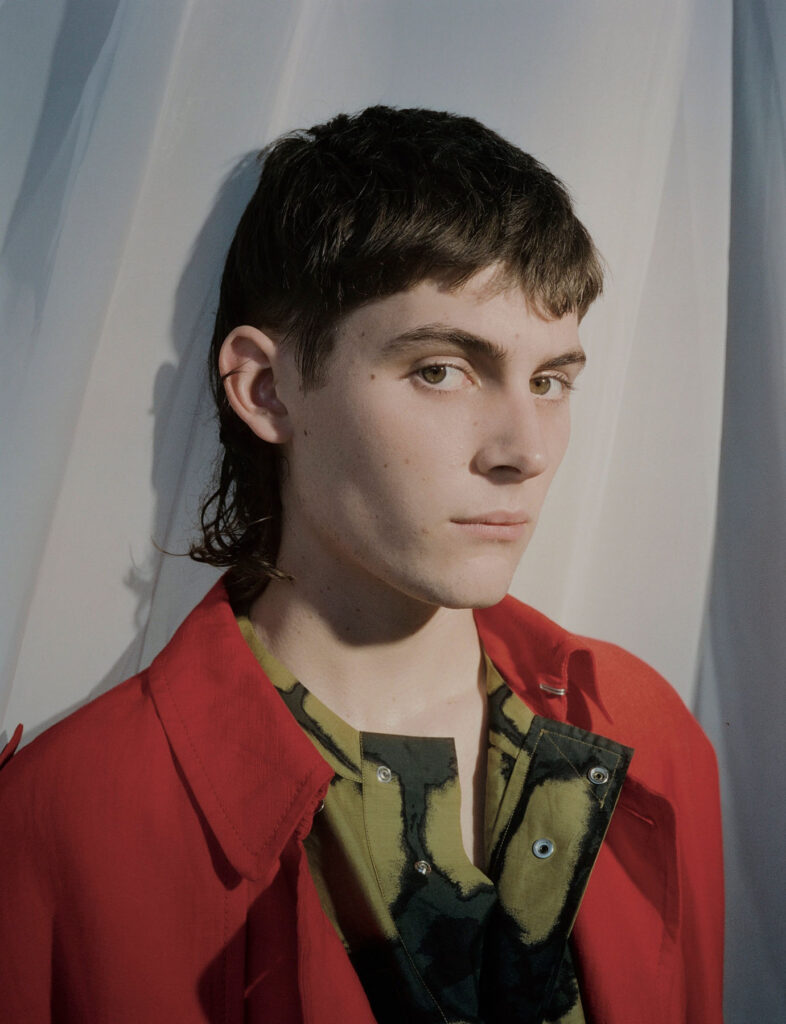
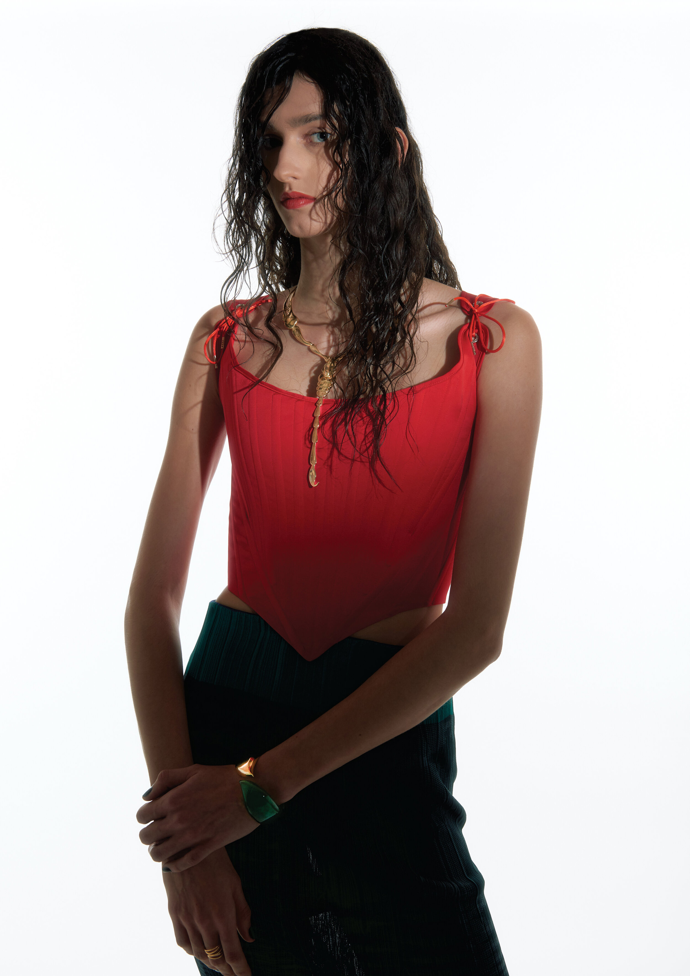
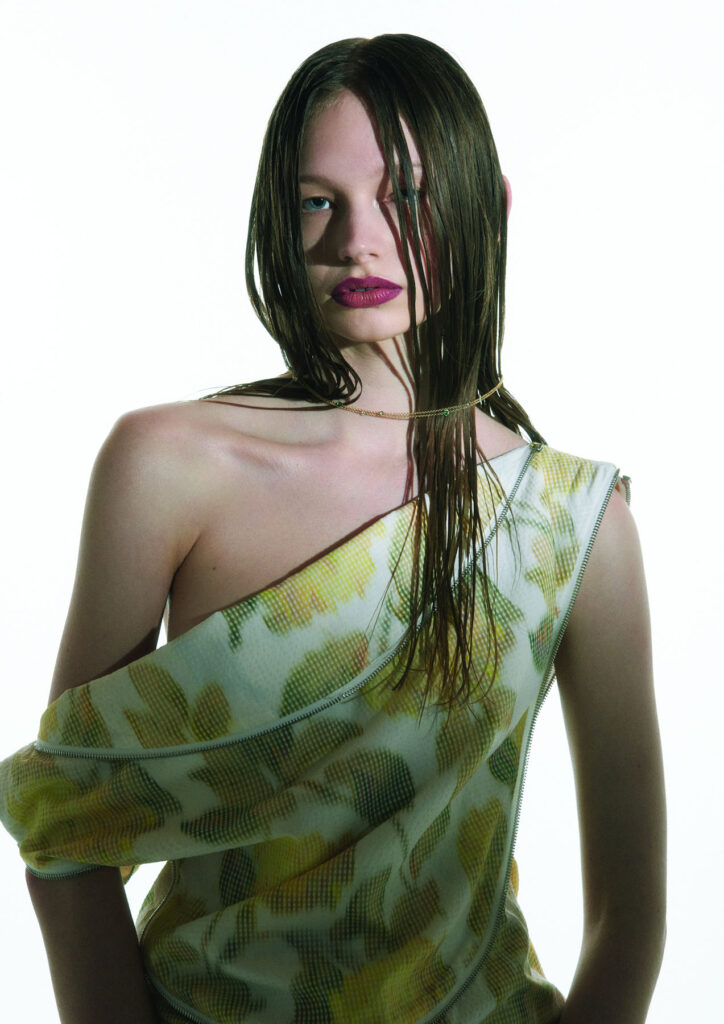
The ethos of our brand is centred around the ‘Wetness Theory’. It has remained the same, and continues to be a focal point of our design inspiration. Each collection explores this through new viewpoints: looking at the evolution of the journey of a woman, her relationship with water, and how she is becoming more accepting of her bodily waters.

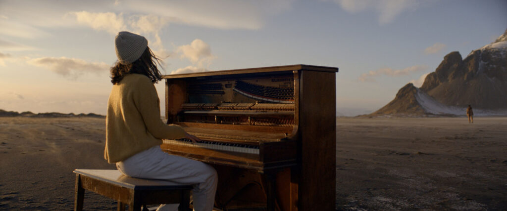
For the SS21 collection, titled Self-Birth, water is examined as a vital force of life, and re-birth, that allows introspection, and ultimately self-reconnaissance. With a focus on Maternal waters, and the journey to self-healing, the film displays the vision of a woman floating on water, representing the act of transcending – an ecstatic self-birth.

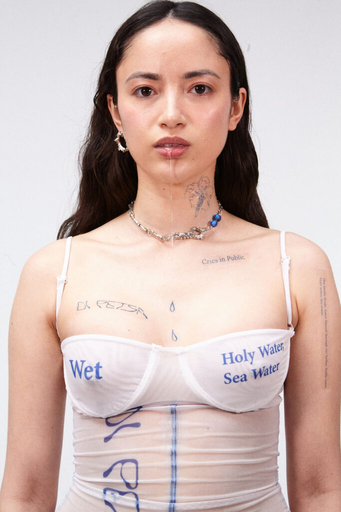
Our AW21 collection, titled “I am my own Mother”, is inspired by the devotion of self-mothering. To love one-self unconditionally, embracing the strength that comes with self-acceptance of our Bodily Fluids: Water filtered through our bodies, Bodily Water. Holy Water, Sea Water. After last season’s collection centered on ecstatic birth, we now look to a transformative future, harnessing the power of self-love for unashamed self-expression, with the aim of strengthening the connection to our physical and immaterial self, water.

How do your origins inform your work?

To me, the sea has played an essential role in growing up. My hometown in Greece is next to a harbor, meaning I could always hear boats leaving the docks from my bedroom. I find sea healing: to me it feels like home, it has played a big part in my research and creative practice with the DI PETSA brand.

In terms of cultural influence, I am very interested in exploring antiquity, how it coexists in contemporary culture, and how we communicate our relationship with the past in general. Greek mythology and practice inform my designs. For SS21, we developed a golden prayer corset that’s entirely hand-embroidered with materials traditionally used in Greek orthodox priest-wear.

Lastly, craftsmanship, sustainability and textile innovation are very important to me. I am very moved by the dying art of traditional greek craftsmanship. I would love to find a way to preserve it, to interact with it in my designs. For our latest AW21 Collection we have been working with a local group of women in Athens – the Lyceum Club of Greek Women, an organisation founded in 1911 – who work towards preserving traditional arts, including embroidery and lace making. For our latest season, we created our first collaboration together. My long term aim is to be able to provide jobs for these women, to facilitate the training of younger people, in order to preserve such crafts in the future.

I see Di Petsa, I think WET DRESS. Can you tell us about the inspiration behind it?

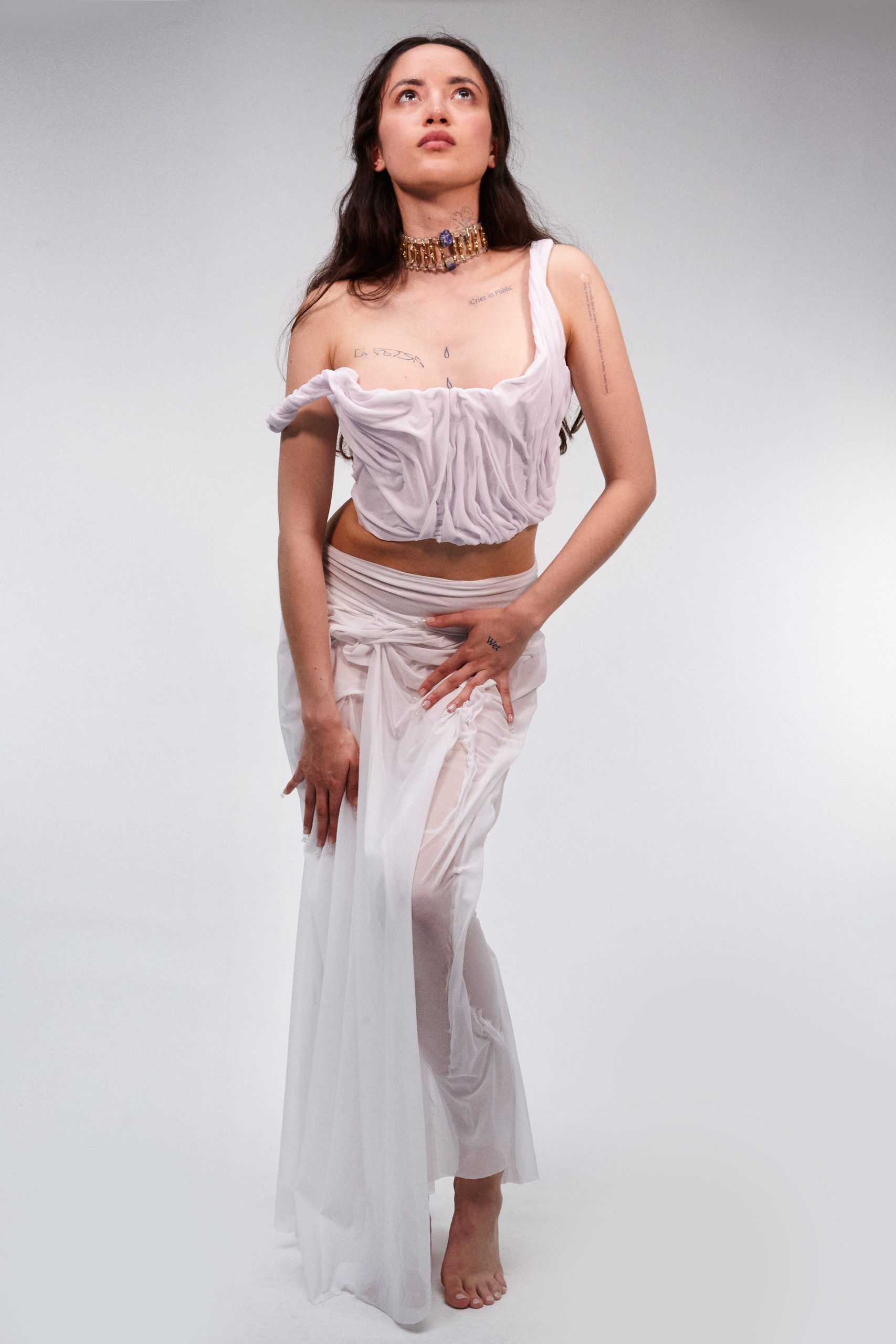
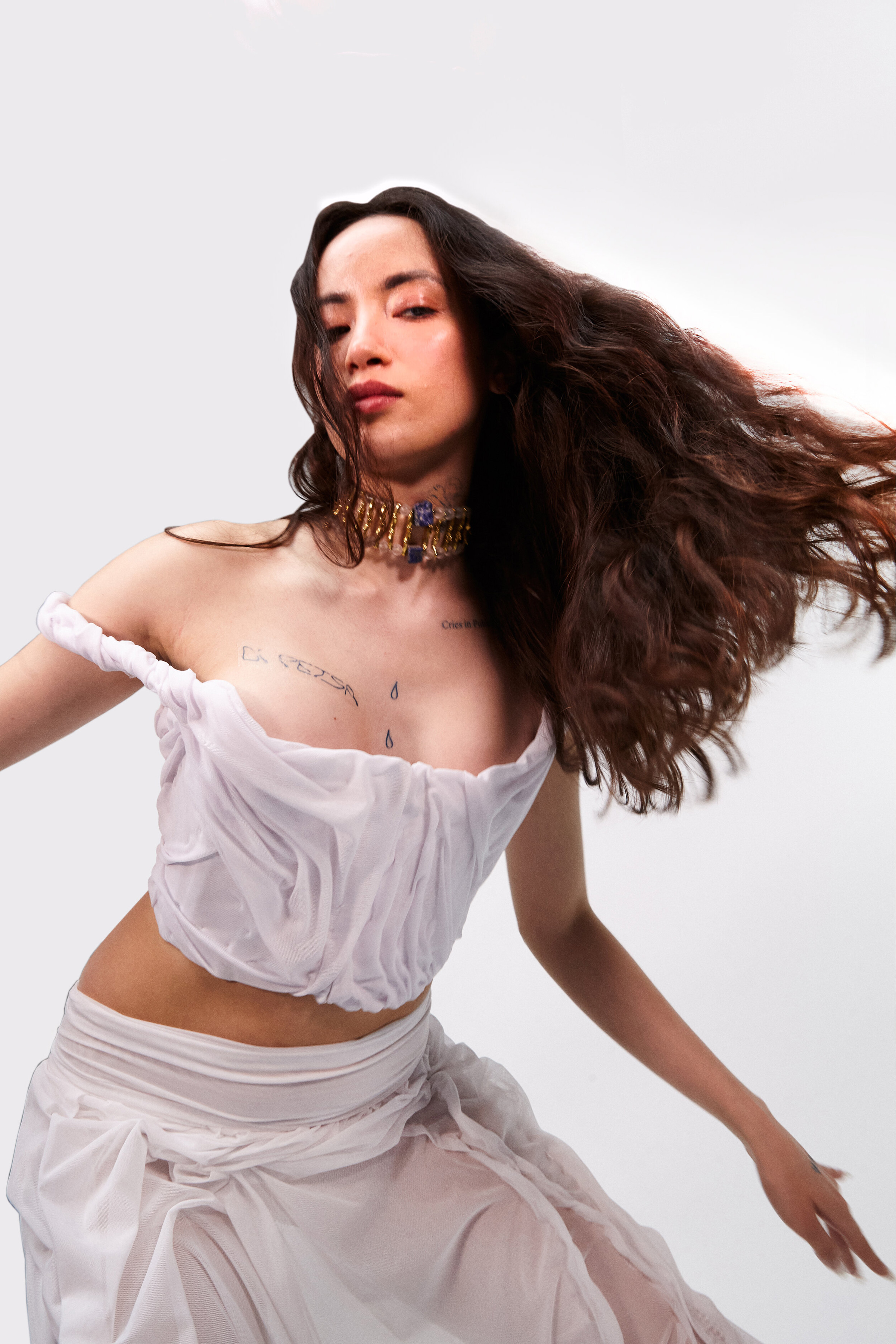
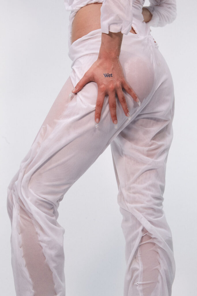
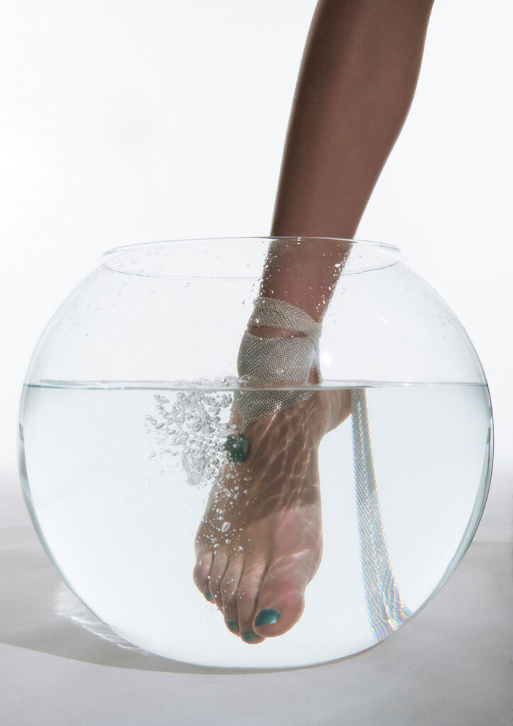
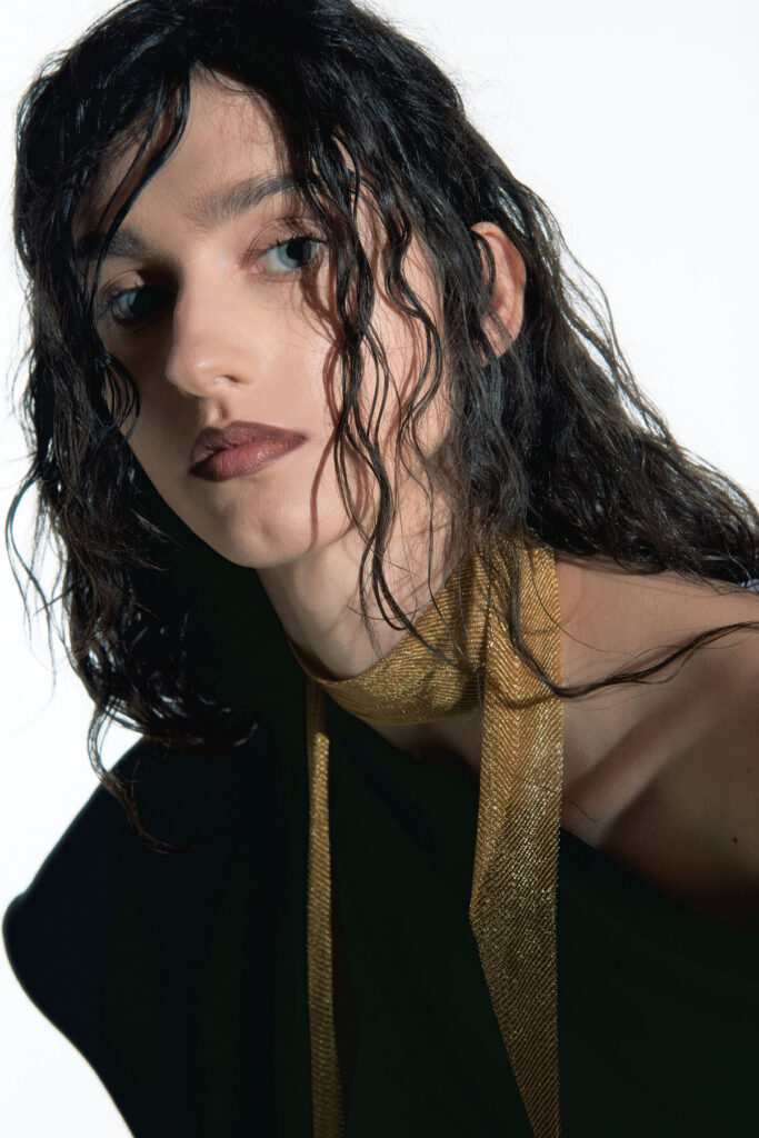
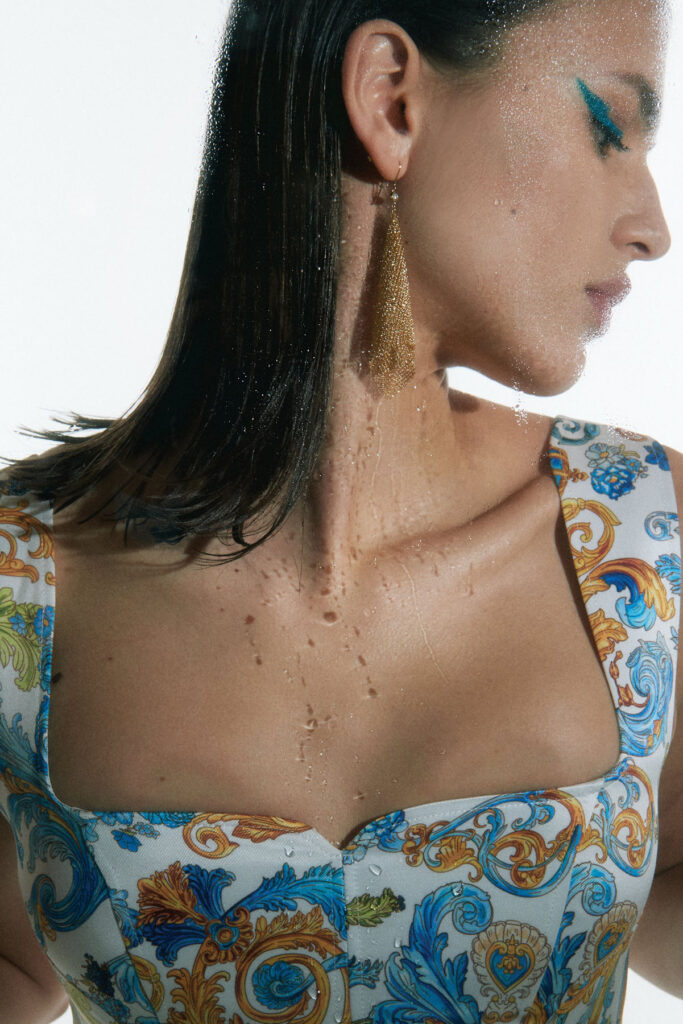
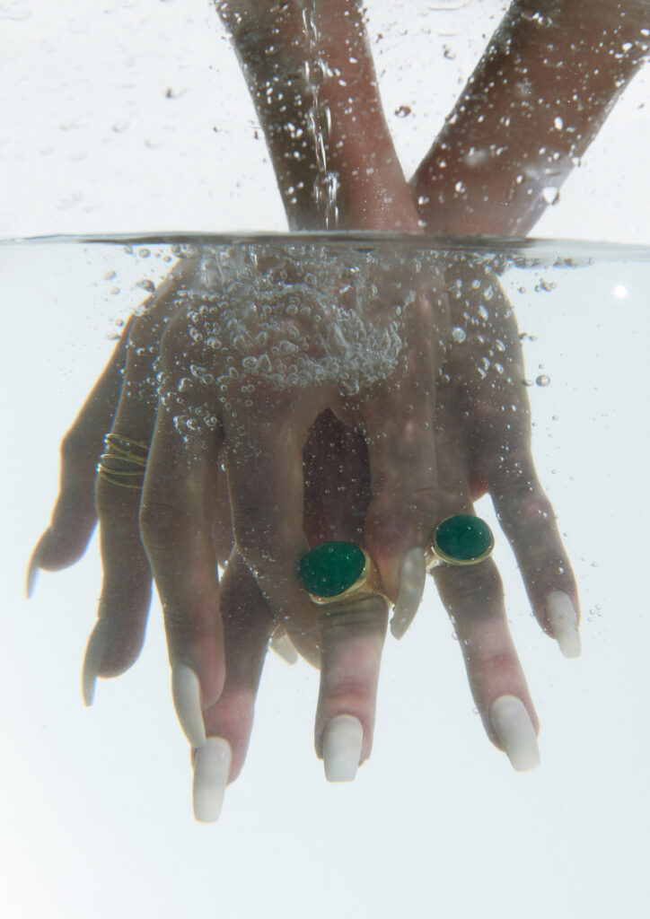
The Wetness theory behind the brand evolved during my time at CSM. I was conducting eco-feminist research, investigating the relationship between Women and water, Women and their bodily fluids. The idea was to create a vision of a totally wet woman, fully accepting she is coming from water, and of her wetness. Our goal in fashion is to allow people to be unashamedly wet. To create beautiful work that can inspire others to consider nature as something of our own. Our bodily fluids. Water filtered through our bodies, bodily Water, holy Water.

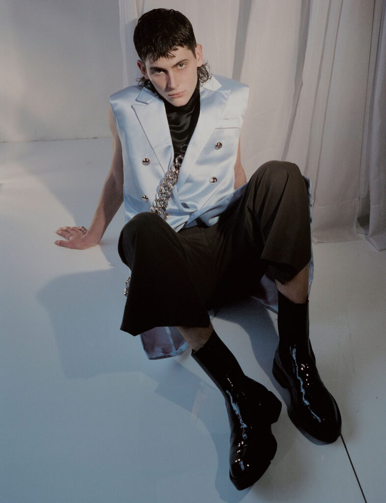
The Wetlook comes after an original technique that took 6 months to develop during my master’s years at Central Saint Martins. Its conceptualization started from a series of performances I was doing for my BA years studying performance, design and practice. I had a woman dressed in water walk across Athens and that was the idea I wanted to crystallize: somebody wearing their own Wetlook could be part of this water performance without actually having to be wet.

Where does your work stand in relation to Feminism? 

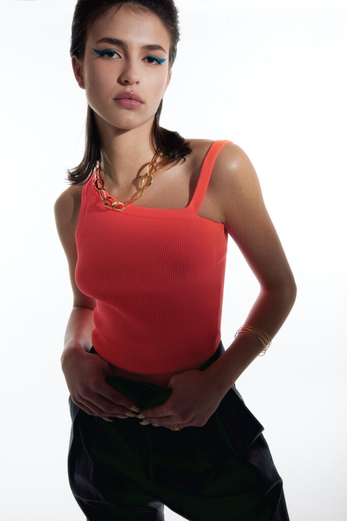
The brands Wetness theory seeks to subvert the idea of shame of natural bodily fluids. By re-narrating their physical and philosophical context – a notion that is unapologetically on display through our Wet Script Mesh collections, with poetic scripts, such as “Cries in Public”, “Holy Water, Sea Water”, “Wetness”, digitally printed onto the surface of the mesh garments – our mission aims to inspire the wearer and act as subtle reminders in the performance of their everyday life to embrace their wet self.

Through our work we aim to create a new narrative around bodily fluids and the female body, a subject that often remains taboo in mainstream media. We want to make women feel comfortable and empowered in their natural self, something which we are conditioned and told through the media to change and mould into what society views as the “ideal” vision of a woman. It feels very sanitized and stirpped back, “if you cry in public, you must hide it, if you breastfeed in public, you must hide it”.. There is a  censorship of our bodily waters: the fact that we are wet, the fact that we come from water is something to be hidden. Shame is a self-inflicting punishment. This research, which has resonated with a lot of other people, is to this day a personal healing journey.

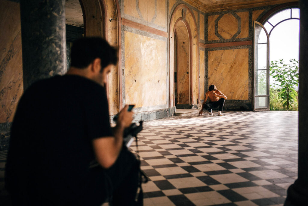
Your work also penetrates the realm of performance, how does such practice enable you to spread your voice?

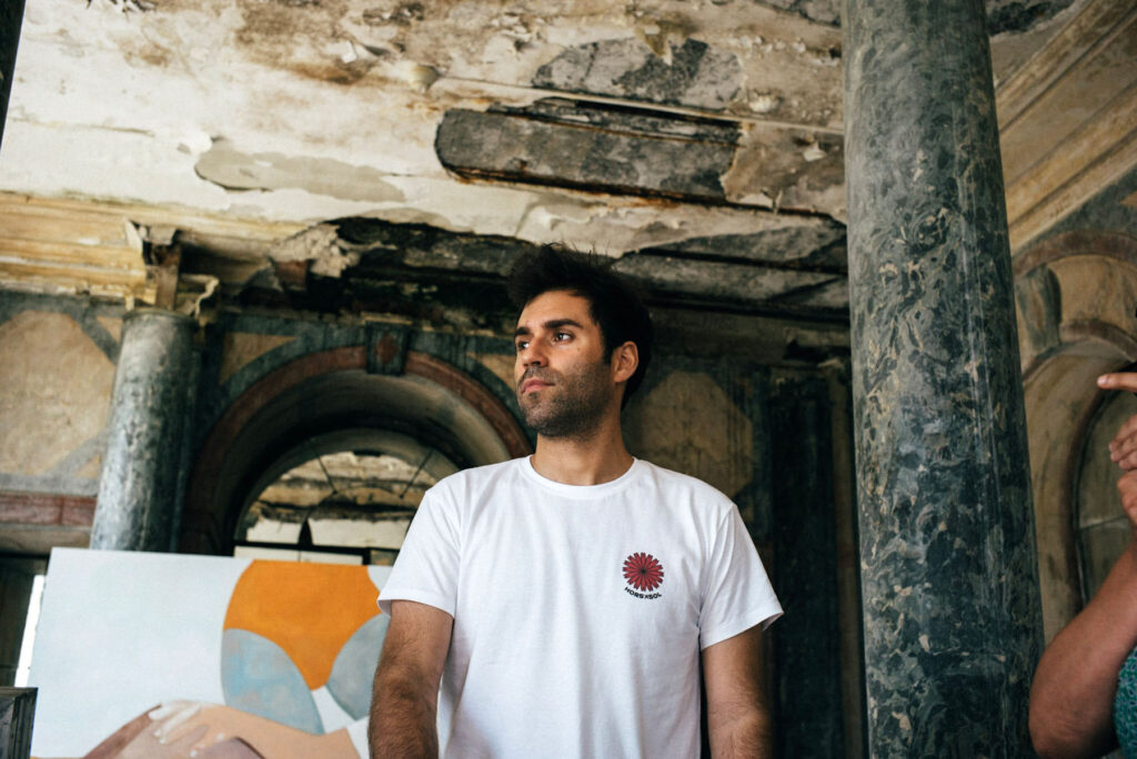
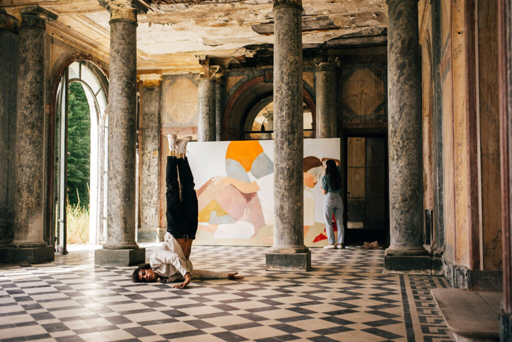
I knew I loved fashion, but I was also very interested in performance art, theater and film, and I wanted to acquire skilIs that would develop my artistic practice and bring new viewpoints and inspiration to my fashion education. I did my first degree in Performance Design and Practice at Central Saint Martins. When I graduated I continued onto the Masters in Fashion Design Womenswear, and that was where I really combined all my skills and interests into one practice: couture fashion practices, textile development with performance, sustainability and film.

Both performance and art are so important to my work and creative practice. I am very involved in my work: it is something very personal to me. The relationship between model, designer and viewer is very interconnected, that’s why I always take part amongst the performers in my shows, exploring my vulnerability and body expression, alongside their exploration. Through these intimate moments, and the overcoming of shame, I can really tap into my creative side, and create work that comes from a deeper place. Work that is authentic to me and my experience. For us, a garment worn with intention and connection to a deeper emotional message, is one that will resonate and last with the consumer.

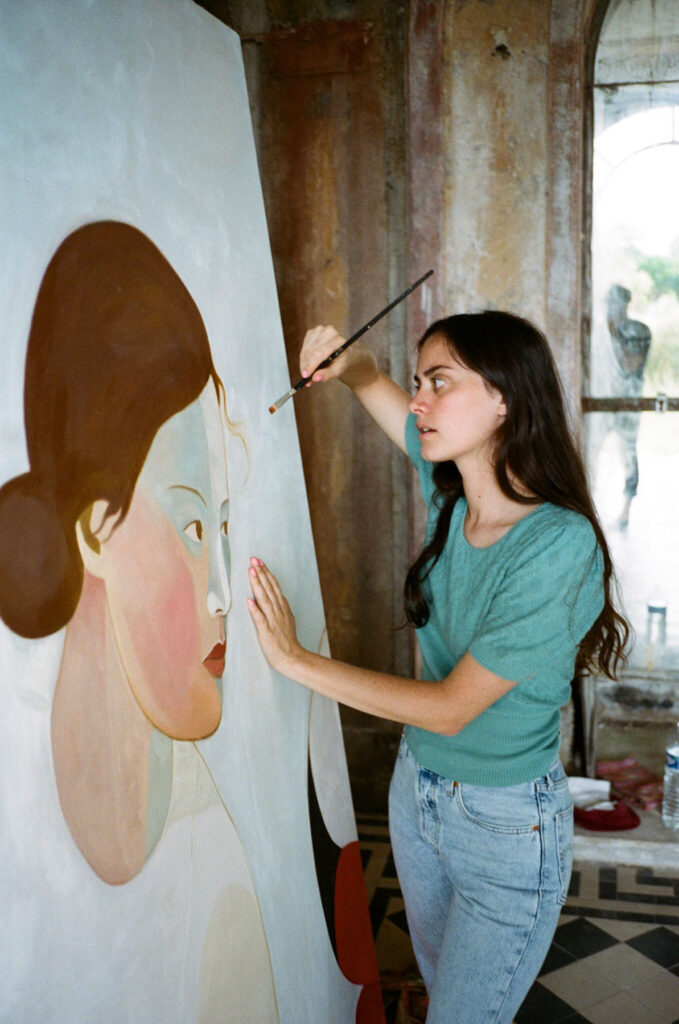
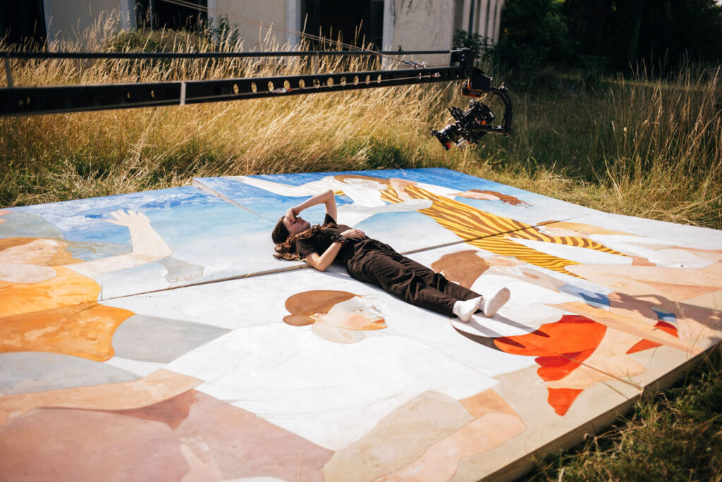
At DI PETSA, we are working on many different creative projects aside from the RTW collections. We recently launched a book, titled WETNESS: A Script of bodily Fluids, which I wrote and also illustrated. The book consists of 7 chapters exploring 7 bodily fluids: Saliva, Tears, Breast Milk, Vaginal Fluids and Semen, Sweat, Blood, and Urine. The writing is a merge of scripts for a filmed performance and poetic text which aims to create an alternative narrative for bodily fluids.The book includes direction notes, rehearsal exercises, diary logs, and fashion illustrations offering a behind the scenes eye to the Wetness concept and the performance work at DI PETSA.

We also run monthly Wetness Workshops that allow our audience to deepen their connection to water at large, and the connection to our bodily waters.

What is the highlight of your SS21 Collection?

The highlight piece from the DI PETSA SS21 collection for me was the Gold Embroidered Breastfeeding Corset and Wrap Skirt. The embroidery technique was inspired by an ancient greek ritual dress often used to decorate Greek Orthodox Priest wear – traditionally worn by males – but created, and passed through the hands of women. I liked the idea of subverting this by applying the technique to a womenswear garment.

What do you hope your audience to perceive from your work?

I hope the work at DI PETSA inspires our audience to embrace their Wet Self. To find intimacy in becoming comfortable with their natural self and their fluid expressions of wetness. The Wet Script garments are a very useful performance tool for when you get out of centre, or when you want to dedicate your day to Wetness and to coming back to the home self – the sea. It can be very beautiful to just look down your chest, and read excerpts of a script that re-aligns you to your own self. It puts you back into the performance you choose to create, and not be so affected by what is around you. A wearer-performer, that’s the way that I perceive it. Someone who puts an intention forward when they wear a Wet Script garment, and chooses to connect with it on a deeper level.

What are the next steps you would like your brand to follow?

Craftsmanship and sustainable design is important to our brand, and something we want to continue to evolve within our design process in the future. We have recently started to work with a local group of Women in Athens for a special Ancient Greek embroideries series. We want to continue investing in community driven projects like this. As the scale of our production grows, we hope to employ more women. In the future, we would like to run teaching classes within our studio, to ensure the embroidery skills continue to be passed down to younger generations. We want to develop collections that are consciously designed, with investment in sustainable materials and innovative ways of designing, looking at methods of upcycling and repurposing

James Barnor

Exploring the nuances and societal transitions in the 1950s and 1960s, as London was blossoming into a multicultural capital

London’s Serpentine Gallery presents an overview of the career of British-Ghanaian photographer James Barnor. Working over two continents and over six decades as a studio portraitist, photojournalist and Black lifestyle photographer, Barnor’s career covers a multitude of photographic genres and offers a wider social commentary, documenting major socio-political changes in London and Accra.

On the cusp of Ghana’s Independence in the early 1950s, Barnor set up his famous Ever Young studio in Accra. Arriving in London towards the end of the decade, he began working with the South African magazine Drum, capturing the experiences of the African diaspora and the style and creative spirit of the period. Barnor returned to Ghana in the 1970s, where he continued his work with portraiture, established himself in the music scene and created the country’s first colour processing lab.

Barnor’s street photography explores the nuances and societal transitions in the 1950s and 1960s, as London was blossoming into a multicultural capital. Returning to the city 1994, Barnor’s work focussed on documenting the Black communities that had settled in London – something that had previously been documented by mostly white, European photographers. His portraits of the African diaspora in London focus on the members of the Black Power Movement, while also capturing different fashion trends present in Britain’s Black community during the 1960s.

Barnor’s body of work spans six decades and possesses a clarity of vision and a sense of community and sensitivity that he both extends towards and brings out in his subjects. The Serpentine’s exhibition displays Barnor’s work from 1950-80 and draws from his archive of around 32,000 images, all mapping the flourishing cultures of two cities and reflecting Barnor’s ceaseless uplifting and creative energy.

‘James Barnor: Accra/London’ runs until 22nd October at the Serpentine North Gallery.

Neels Castillon

Film director and photographer Neels Castillon on cinematic visuals

For Neels Castillon, authenticity is integral to his role as a film director and photographer, especially, as he explains on the phone from Paris, in an age of fake news. The dissemination of falsified and fabricated news reportage may not have a direct connection to Castillon, whose clients include Lacoste, Hermès and the French singer, Angèle, but his contention lies with the prevalence of artifice. He sees his role as navigating a balance between capturing the feeling that cinematic visuals can provoke, whilst simultaneously resisting the artificiality those same visuals can carry. There is perhaps no better example of how Castillon meets this feat than in his production company, Motion Palace’s, advertising campaign for kitchen manufacturer, Schmidt. The premise of the advertisement was to have one of Schmidt’s kitchens appearing on a cliff face, demonstrating the brand’s functionality and adaptability. On seeing that the brief was to shoot in a studio with a green screen, Castillon responded that it should be shot for real in the Alps. The ensuing advertisement, and supplementary documentary about the process, are jaw-dropping to watch, as mountaineer Kenton Cool makes himself breakfast in a fully-working kitchen, 6500ft above ground. Castillon refers to the experience as a ‘cool adventure’; the team involved stayed in tents for fifteen days, hiking their way up to the cliffside, and creating an entirely new structure to support the camera from above.

It is through commercial work, like the advertisement for Schmidt, that Motion Palace is able to pursue its more artistic endeavours; ‘It’s in the DNA of my company to produce art stuff with the money we make,’ Castillon explains. As a result, Castillon was able to realise the F Major music video for the neo-classical pianist, Hania Rani, in Iceland earlier this year. 

Filmed in a remote location, Hania is seen playing an open-front upright piano – an approach which visually encapsulates the artist’s fascination with the mechanical, organic possibilities that the instrument affords. For the video, Castillon worked with the choreographer, Fanny Sage, and the dancers Mellina Boubetra and Janina Sarantšina, whose interpretations of Hania’s ethereal performance is captured in a single sequence shot. The camera work signals Castillon’s commitment to striving for authenticity; ‘The concept was, how can we translate music that never stops, and keep up this pace?’ So, the camera doesn’t stop either. It was important, too, to translate the sensation of freedom that comes both with Hania’s music and the dancers’ movements – something that the film’s location allowed for. ‘I want to celebrate nature,’ Castillon explains, adding that he strives to capture how a landscape can be inspirational, whilst resisting the urge to just create picture postcards of the scenery. The backdrop of mountains and black sand in F Major have the potential to be just that; awe-inspiring and spectacular in itself. But, as the chilling wind that entraps Hania and the dancers in the video confirms, the logistics of F Major were anything but straightforward. ‘As you can see, there was an ice storm,’ Castillon points out; ‘It was very cold, like minus seven degrees. We rehearsed a lot before but, on set on the beach we only had three takes because of the light and the weather.’ Not only was the filming testament to Castillon’s approach to taking on a challenge, but also his dedication to fully realising the potential of the performers he works with. 

Castillon discovered Hania Rani through her record label, Gondwana Records: ‘I like pretty much all the artists they have in their roster, so when I listened to her first album (2019’s Esja) I was totally in love.’ At the time Castillon reached out to Hania, she was writing her second album, Home, but she had seen Castillon’s 2017 film, Isola with the dancer Léo Walk, and wanted to work together. Their collaboration was postponed to allow time for Castillon to raise money and for Hania to complete the album. This time also gave Castillon the chance to work out the concept for their work; ‘I listened to [F Major] maybe 200 times before coming up with the idea.’ He was also keen to ensure he attended every rehearsal and discuss the concept with the dancers; the process is ‘almost a co-creation,’ Castillon explains, like ‘ping-pong.’ It’s a constructive and collaborative process of back-and-forths to find a way that Castillon can capture the performance in the best possible way. His work with Hania may have been a while in the making, but that seems to be the case with a lot of Castillon’s collaborations. 

Stills from Hania Rani’s F Major music video

There is a sense, talking to Castillon, that he uses his films to capture the creative endeavours of those he knows and admires – and in turn, to introduce them to one another in the name of collaboration. That was the case for last year’s short film, Parce Que, featuring the painter, Inès Longevial, and Léo Walk. Inès, like Hania after her, had seen Isola and was keen to work with Léo who, similarly, loved the painter’s work. Castillon had known Inès for a number of years previously and was waiting for the perfect opportunity to work together, which Parce Que would be – but it took ‘almost a year to find a time when [Léo and Inès] were both available.’ The idea was to combine painting and dance together, but Castillon was wary of avoiding the pitfalls of an ‘arty cliché’. With Serge Gainsbourg’s song Parce Que as the film’s soundtrack, the dangers of doing something cliché could be high, but Castillon managed to pull it off. That success is demonstrative of the director’s integrity when it comes to understanding the performers he works with. It was important that the location choice for Parce Que would be able to accommodate Léo’s dancing, which, as he explains in reference to Isola, requires a smooth enough surface to allow for some of the breakdancing moves. As the film, which tells the story of love and, eventually heartbreak, progresses, Léo dances on a six by four metre painting that Inès is depicted as working on; Castillon’s way of combining the creative skill of both collaborators, and avoiding the cliché of something ‘that has already been seen before’. 

Léo Walk on the set of Parce Que

Inès Longevial on the set of Parce Que

As with the Schimdt advertisement and the F Major video, Parce Que shows that Castillon is a master at pulling of impressive operations. ‘It’s what I love,’ he enthuses, ‘sometimes you have a crazy idea like, “What if Léo dances on a big painting?” And one year later, you are shooting it. Like, okay – it’s worth it.’ A special frame was made for Inès’s painting, which was kept in four parts in a friend’s shop in Paris because, as Castillon explains, ‘the apartments are very tiny’, before being transported to a secret location in the South of France for filming. A delipidated castle near Biarritz was chosen in part because the location reminded Inès of her childhood and also because Castillon liked its uniqueness. It had been designed by a woman at the turn of the twentieth century, who had taken inspiration from far and wide including, amongst other references, Versailles. Castillon is careful not to disclose the exact location of the castle because of the fragile state that the building is now in; the team spent two days clearing the site of detritus before filming and filmed quickly to cause as little damage as possible. There is, then, a sense of nostalgia that infuses Parce Que – a longing for lost love, a reminder of childhood and memory of times gone by. 

Personal connections prove important to Castillon, perhaps another explanation for how he avoids clichés. During the location scouts for Isola, it occurred to Castillon that he knew exactly the place to film. Castillon grew up in Sardinia; he remembers a deserted building near a beach he used to frequent with his grandmother, which would become the ‘perfect place’ to film. He describes the place as surreal, the light there reminding him of an Edward Hopper painting. The experience of watching Isola feels similar to viewing a painting by Edward Hopper, too. To see Léo perform, at first refracting the haze of the summer sun and, later, his movements lit up by the warm glow of sundown, it is possible to feel connected to him in his solitude. Isola grants the opportunity to be close to Léo precisely because Castillon is conscientiously aware of the viewer. One of the director’s earlier videos, La République du Skateboard, came from the desire to capture a scene close to Castillon’s heart. As a skateboarder from the age of ten, Castillon started making skate videos using filming techniques common to the scene, ‘fisheyes, long lens – pretty dirty stuff.’ But, he decided to make a film that was more cinematic, taking influence from the classic movies that helped him learn the filming techniques he employs today. The film, about skateboarding and, skateboarding in Paris in particular, was envisioned as something that anyone could watch. The result is an ode to the scene and the city, beautifully shot, as would be expected from Castillon’s work, and accessible too. ‘I didn’t want to make something that only speaks to experts,’ the director explains. ‘I wanted to translate it in a way that is universal so that everyone can watch and understand why it’s beautiful.’ That same philosophy is applied to dance; ‘I’m not interested in making dance videos that only a few people can understand’, Castillon says of his approach. Rather, he wants to ‘find a perfect balance between the popular and the artistic.’  

At its core, Castillon’s role as a director could be understood as transforming his fascination for performers into nuanced films that combine a highly cinematic approach with a deep respect for artistic craft. He says that he is fascinated by artists like Léo Walk and Fanny Sage, and this fascination inspires him to tell their stories. It’s somewhat telling that Castillon describes himself as someone who ‘cannot create a whole universe from nothing’. Rather, he thrives on the collaborative process that comes with the way he instinctively works. Just as he brings up fakes news as the anthesis of his search for authenticity, Castillon describes a ‘kind of boredom’ that comes with the saturation of content on platforms like Instagram and Netflix. He is resolutely not interested in making films that have been done before. That said, Castillon’s upcoming release sees the director return to Iceland with Fanny Sage for a second film; the music is by the French artist, Awir Leon, who, not surprisingly, Castillon claims to love. He describes the short film, called 間 (Ma), as ‘mind-blowing’ – and it’s a project that he seems immensely proud of. When it premieres on June 29th on Nowness, it’s more than likely worth watching.  

Muda Architects

“preserving and staying respectful to the natural environment”

Garden Hotpot Restaurant designed by MUDA Architects is located in the Sansheng Township in the suburb of Chengdu, China. Surrounded by a lotus pond and nestled in the midst of a eucalyptus forest, the building’s unique design reflects the beauty of the natural landscape and pays homage to the established traditions of hotpot culture – the area’s traditional cuisine where a simmering pot is served at the table.

Originally founded in Boston in 2015, MUDA Architects have set up offices in both Beijing and Chengdu. The studio’s aim for the Garden Hotpot Restaurant was to gently integrate the site with the surrounding environment, creating a leisurely and peaceful dining experience. The suburb’s warm climate makes its location ideal for visitors, and Chengdu’s unique natural features made it the perfect setting for the architects to generate an interactive space.

With no external or internal walls, MUDA decided to construct the restaurant out of a series of pillars and boards to blend the building in with the surrounding woodlands, allowing it to gently integrate with the site. The building’s canopy skirts the body of water, curving organically and seemingly in response to the landscape, replicating the shape of steam and smoke of hotpots diffusing into the air, further blurring the boundary between the building and nature.

The overall aim of the design was to minimise human intervention and enhance the interaction between the guests and nature. NR speaks with the architecture studio to learn more about their approach to sustainability and design.

The restaurant is located in the Sansheng Township – what were the advantages of working in such a suburban area?

The natural environment of the suburb is incredibly beautiful and peaceful. Its also very close to the city, so visitors can reach it easily.

How did you decide to integrate hotpot culture into the design of the restaurant?

“Hotpot” is the best representation of the leisurely spirit of life in Chengdu; so we thought it best for the design concept of the restaurant to echo this culture. We drew inspiration from the dense smoke rising from the boiling soup of the hot pot to create the free-flowing curves of the building.

How do you feel the project reflects and respects its surrounding environment?

When I first visited the site, I was deeply impressed by the breathtaking natural environment, with its tall eucalyptus trees and silhouettes of egrets skimming through the forest. To preserve the eucalyptus trees on the site, we mapped their locations so the building could curve to avoid the plants, preserving and staying respectful to the natural environment.

Did any other elements of the natural landscape inform or inspire the building’s design?

Inspired the trunks of the eucalyptus trees, we used white columns to support the roof, allowing the columns to integrate with the trees.

What was the process like when working with the natural environment – was it important for you to conserve some of the landscape?

Preserving the natural environment was a focus of ours. During the construction process, we shared with the contractor about the measures we were willing to take to help protect the natural environment of the site. We avoided large construction equipment and instead used manual operations.

Was bringing people closer to nature an important part of the project?

Absolutely. With the idea of paying the greatest respect to the natural environment, we decided to blur the architectural scale, leave out walls, and only use pillars and boards in order to let the building gently integrate with the site and to delineate the shape of the lake in a gentle way, so that visitors could experience the natural landscape close-up.

The features of your other project, the Xinglong Lake CITIC Bookstore, also interprets cultural traditions – is this something that you try to maintain within each of your designs?

The design concept of the Xinglong Lake CITIC Bookstore originates from the idea of “a book falling from the sky”, and the curved roof refers to the local traditional single-pitch roof. We aim to tap into each project’s locality and culture, and to incorporate that in a contemporary way into our design strategy.

What are some of the projects MUDA is currently working on?

The projects that are under construction right now are the M50 Art Hotel, Haikou Visitor Center and the TCM Museum of Pengzhou.

Credits

Images · MUDA ARCHITECTS
www.muda-architects.com

Elsa Peretti

Elsa Peretti
x
Tiffany & Co

The designer behind some of Tiffany’s most iconic pieces, Elsa Peretti, died at the age of 80 on 18th March 2021. Somewhat unintentionally, this editorial becomes a tribute in her honour.

Born in Italy, Peretti moved to New York in the late 1960s, finding work as a fashion model (a job that gave her financial freedom, having previously been cut off from her eye- wateringly wealthy, but inwards-looking family in Florence). In New York, she became a regular at Studio 54, accompanied by a posse including Warhol, Liza Minelli and the designer, Roy Halston Frowick. It was the through the latter that Peretti’s career blossomed; she designed jewellery for Halston’s eponymous line, and it was him who introduced her to Walter Hoving, CEO of Tiffany & Co. in 1974. By Peretti’s own telling, she was “hired on the spot,” and so began a collaboration that would last until her death. A few years ago, when Peretti threatened to quit the partnership, the company were quick to renegotiate a contract for a further 20 years – which would have lasted until what would have been her 92nd birthday.

With only a few years off celebrating half century of Peretti’s designs for Tiffany, her pieces are icons for a by-gone era. The mesh scarf necklace, for example, which debuted on the runway of Halston’s fall collection in 1975, is evocative of the disco age. But Peretti’s designs remain unequivocally timeless. Peretti reintroduced silver as jewellery to a world in which it was confined to use for accessories and homeware.

Her appointment at Tiffany came as the brand was looking to reach a broader audience – a woman who couldn’t afford to buy herself gold or diamonds, and a woman who wouldn’t necessarily rely on a man to do so for her. The necklace, Diamonds by the Yard (its name coined by Halston), made diamonds affordable by spacing small stones out along the chain. Peretti designed for the modern woman, and was herself, a modern woman. Tall, intimidating (by all accounts) and famously short-fused, Peretti retained the rights to her designs and name. Designs like the Open Heart, Bean and Bone capture the fluidity of form that defined Peretti’s designs.

Her work coalesced organic forms with sophistication and elegance. In the 1980s, the designer escaped the chaos and debauchery of New York to Sant Martí Vell, a small village in Catalan – where, since her early modelling days, she had gradually been buying up the abandoned houses there. She would spent most of the rest of her life there, working with artisans around the region, restoring her own private village, and continuing to design for Tiffany. Like her work for Tiffany, Peretti herself has remained something of a lasting icon. Photos of the designer at work in her New York apartment from the 1970s capture the essence of what makes Peretti’s designs so alluring. The ease with she fuses the natural world with luxury are demonstrative of a designer’s natural instinct for shape, composition and the beautiful things in life.


Team

Photography Teresa Ciocia
Fashion Oana Cilibiu
Make-Up Manuela Renée Balducci
Nails Roberta Rodi  
Casting Isadora Banaudi
Models ADELE aldighieri and VIKA yakimova at Fabbrica Milano and Margot hubac at THE LAB Photo Assistant Jacopo Contarini
Fashion Assistant Mathilde ProiettI
Production Thirteenth
Production
Words Ellie Brown
Discover more on tiffany.com


Designers

  1. Corset ALICE PONS Skirt MISSONI Necklace ELSA PERETTI® SCORPION NECKLACE in 18K yellow goldBracelet ELSA PERETTI® FEATHER GREEN JADE CUFF in 18K yellow goldRing ELSA PERETTI® WAVE ring in 18K yellow gold
  2. Top ROBERTO CAVALLI Skirt PAULA CANOVAS DEL VASRing ELSA PERETTI® DIAMOND HOOP RING in 18K yellow gold with diamonds Carat total weight .10Bracelet ELSA PERETTI® FACETED CUFF in 18K yellow goldRing ELSA PERETTI® WAVE RING in 18K yellow gold
  3. Dress KENZO Necklace ELSA PERETTI® COLOR BY THE YARD in 18K yellow gold with emeralds and diamonds
  4. Necklace ELSA PERETTI® MESH SCARF in Sterling Silver with Keshi Pearl
  5. Dress THE ATTICONecklace ELSA PERETTI® MESH SCARF NECKLACE in 18K yellow gold 38 inch
  6. Top SPORTMAX Trousers JIL SANDER Necklace ELSA PERETTI® AEGEAN TOGGLE NECKLACE in 18K yellow gold 20 inch Bracelet ELSA PERETTI® WAVE FIVE ROW BANGLE in 18K yellow gold Ring ELSA PERETTI® WAVE RING in 18K yellow gold
  7. Dress VERSACE Necklace ELSA PERETTI® MESH EARRINGS in 18K yellow gold with round brilliant diamonds Carat total weight .14
  8. Ring ELSA PERETTI® CABOCHON RING  in 18K yellow gold with green jade, 19 mm wideRing ELSA PERETTI® CABOCHON RING in 18K yellow gold with green jade, 15 mm wideRing ELSA PERETTI® WAVE RING in 18K yellow gold

Motoi Yamamoto

“Our lives, that we live here now, it is always wrapped up in ephemerality”

Soft white piles of salt weave across the floor in delicate and intricate patterns that fill entire rooms. These transient installations are the result of hours of painstaking work from artist Motoi Yamamoto, for whom these creations are a way to remember his sister, who he lost in 1994 to a brain tumour, and his wife, who passed away in 2016 due to breast cancer.

Yamamoto states that he “keeps creating so that I will not forget memories of my family.” He considers the long hours he spends on each artwork as a way to help him to retain those memories. “I look for a convincing form of acceptance to come to terms with the parting of ways.”

On the last day of each exhibition, Yamamoto invites the public to help him destroy the artwork, gather up the piles of salt, and then return them to the sea. The cyclical nature of this act is inherently spiritual and references the cultural use of salt in Japanese traditions such as funerals. NR Magazine spoke to the artist about his practice.

I’ve noticed that you use a fine white seas salt to create your works, have you ever considered using other types of salt like pink rock salt which typically has larger crystals? 

I’ve only used it once in the past. In 2011, I used pink Himalayan rock salt in a large-scale solo exhibition in a museum. It was a work that looks like a Japanese rock garden. But one of the major reasons I use salt is its transparent whiteness and beauty as a crystal, so I think I will continue to use salt that looks white in the future.

Do you consider the process behind your work as a form of therapy that can help you work through and deal with the trauma of personal loss? 

The reason why I make art is to realise the farewell to the precious persons in a convincing way. I keep making art so that I don’t forget memories of those precious people.

“I see my work as ‘a mechanism to fight against the self-defence instinct of oblivion’.”

Salt has a particularly traditional and spiritual significance in Japanese culture, but also in many other cultures and practices around the world. What do you think it is about salt that makes it a globally significant and spiritual substance? 

Salt is a food necessary to support people’s lives. It is familiar but takes a considerable amount of time and effort to collect, which makes it both rare and essential. Another major advantage of salt is that food can be preserved and stored for a long time by salting. These are important functions of salt that support our life.

You have spoken about how you spend much of your time raising your daughter and that you want your work to look to the future. Do you involve your daughter in your art practice and does her view of the world offer you inspiration for your work? 

Basically, making art is a means to solve my own problems. But as she grew up, I sort of adopted changes in her will and mind and opened up opportunities to think about my work together with her. For example, one of the major reasons why I use blue as the underlying part of my work comes from the words my wife spoke before she died, but I asked my daughter about how bright and vivid the blue colour should be, and I decided to use the colour she chose for the work I am going to show this fall.

Both the process you use to create your works and then the returning of the salt to the sea when the installation is over, have an element of ritual to them. Do you think these acts could be considered a form of performance art? 

Certainly, there are performance elements in “public production” and “project to return to the sea”. However, it only looks like a performance as a result if you try to categorise it. It’s not my intention to establish it as a performance.

The patterns that make up your work are very organic in their form, is there a particular reason behind this? How do you plan out the designs?

The labyrinth-like complex shape was originally triggered by the winding form of the brain as my sister died of a brain tumour. And labyrinths have a meaning of rebirth. I began to draw the swirling works “Floating Garden” because the form of a vortex has a similar meaning to that of a labyrinth, mainly in East Asia.

What was the most challenging installation you worked on and why? How did you overcome these challenges? 

One of the most difficult works was a solo exhibition at a church in Cologne in 2010 in cooperation with MIKO SATO GALLERY. From 5:00 a.m. to 9:00 p.m., I worked more than 14 hours a day. Because I decided that the area originally planned was not enough to face the majestic space, it was necessary to take far more time than initially planned. With the help of the gallerist, the director, and many others, I managed to create a very satisfying work. The time I spent in Cologne is my treasure.

There is an ephemeral nature to both your completed artworks and the medium you use to create them. Do you think that nature is something that originally drew you to creating art in this way?

Since my sister and wife passed away at a young age, I always spend a finite time, permanently conscious of death. Even while I’m answering your question I am using my limited lifetime. There is no doubt that it is a very precious and limited time. Our lives, that we live here now, it is always wrapped up in ephemerality.

What advice would you give young creatives who want to create installations but perhaps don’t have the space or the resources to do so? 

After my wife died, I cancelled all my work to rebuild my life with my daughter. And I printed out hundreds of photos of my memories with my wife and put them on the wall of my room. That’s when I became suddenly aware that creating an installation and putting photos on the wall are equivalent to me.

My aim is to remember people who are precious to me, and I want to make sure that I never lose sight of the fact that creating installations with salt is just a means to get closer to that aim.

What projects are you working on at the moment and what plans do you have for the future? 

This year I am working on a new project. The Oku-Noto International Art Festival is a big challenge. Create huge installations in what was once a nursery. It is a plan to combine an area that uses a large amount of salt with an area drawn with paint. I’ll paint the walls, ceilings and floors of the nursery with the light blue colour that my daughter chose.

From next year onwards, I would like to realise exhibitions overseas again, for example in Germany, France and other countries.

Subscribe to our
Newsletter