“Our identity is the fuel behind the best design and architecture”
Architectural studio The Ranch Mine draw inspiration from the rich history of the pioneers who settled in their local state of Arizona in search of a better life. “We chose our name to honour those that have come before us, the humble ranchers and miners, who have paved the way for our opportunities for prosperity today, and to serve as inspiration to design spaces that afford us the opportunity to imagine what’s beyond what we see in the present so we can strive for new experiences.”
In 2018 The Ranch Mine was approached by a family who owned a large plot of land in Phoenix, Arizona to create a home “in which their family could grow and create.” One member of the family is a ceramic artist and The Ranch Mine drew inspiration from the ancient art of pottery when designing the property. The name Foo House is derived from the Chinese character ‘Fu’, which means good fortune and luck, as a nod to the client’s Chinese heritage.
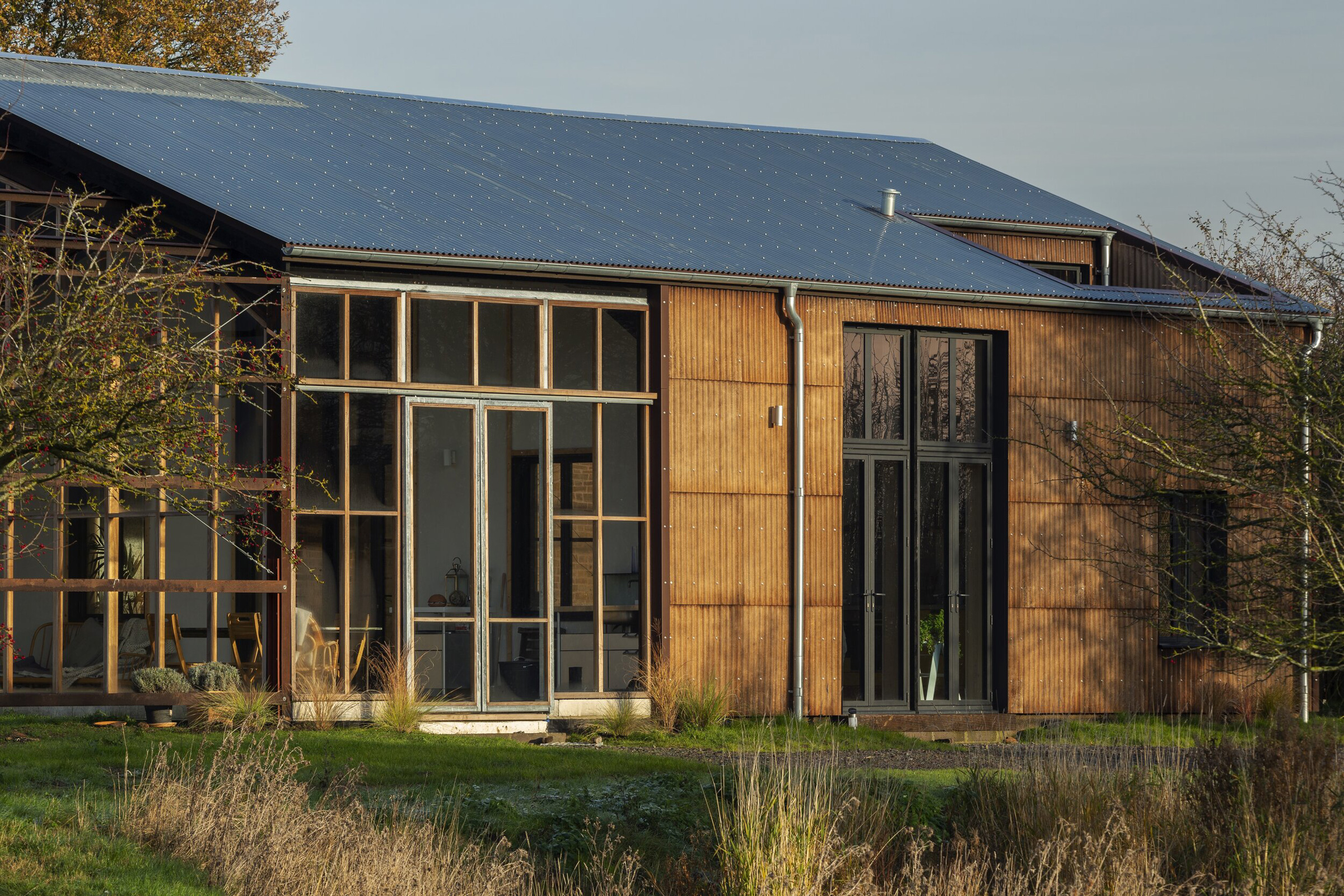
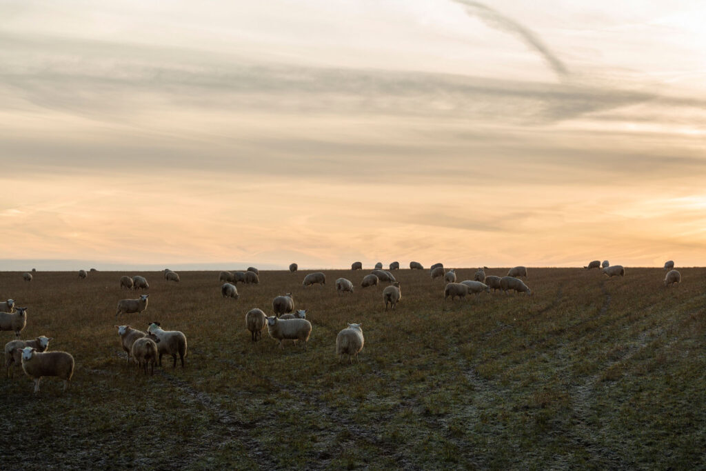
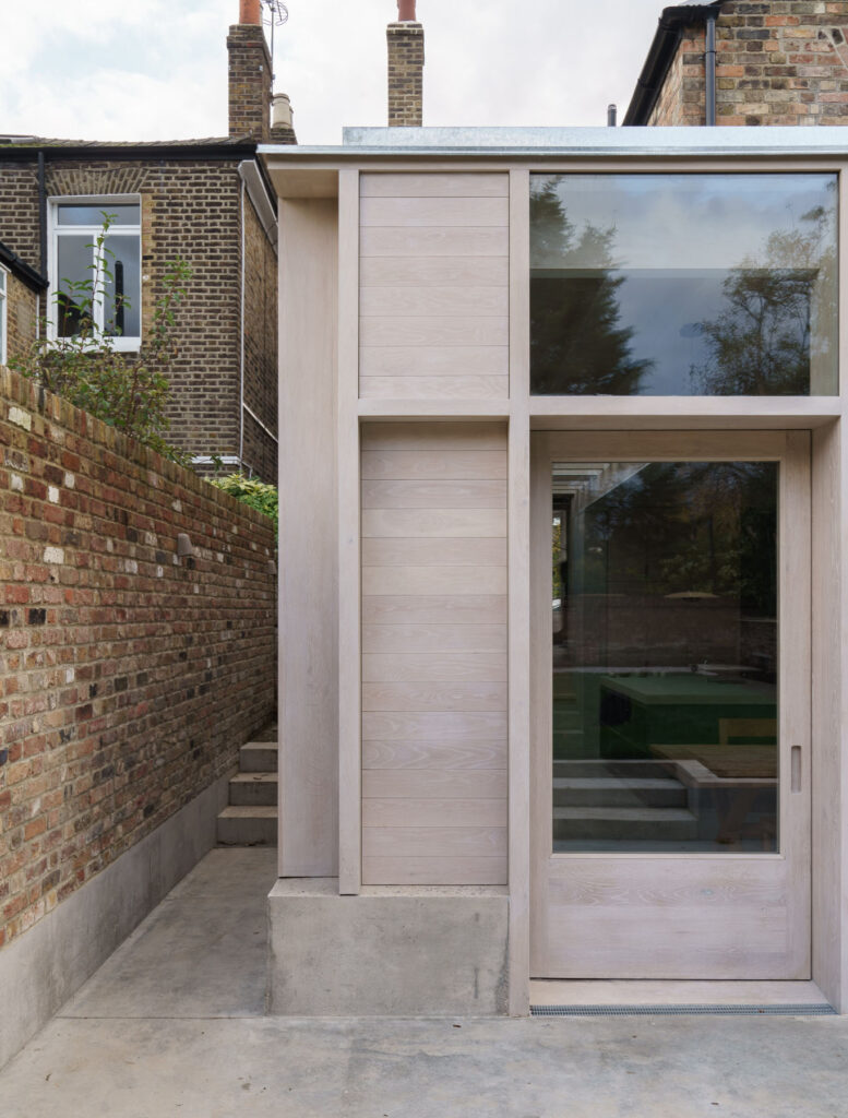
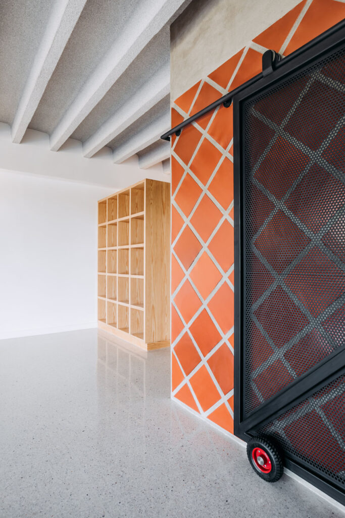
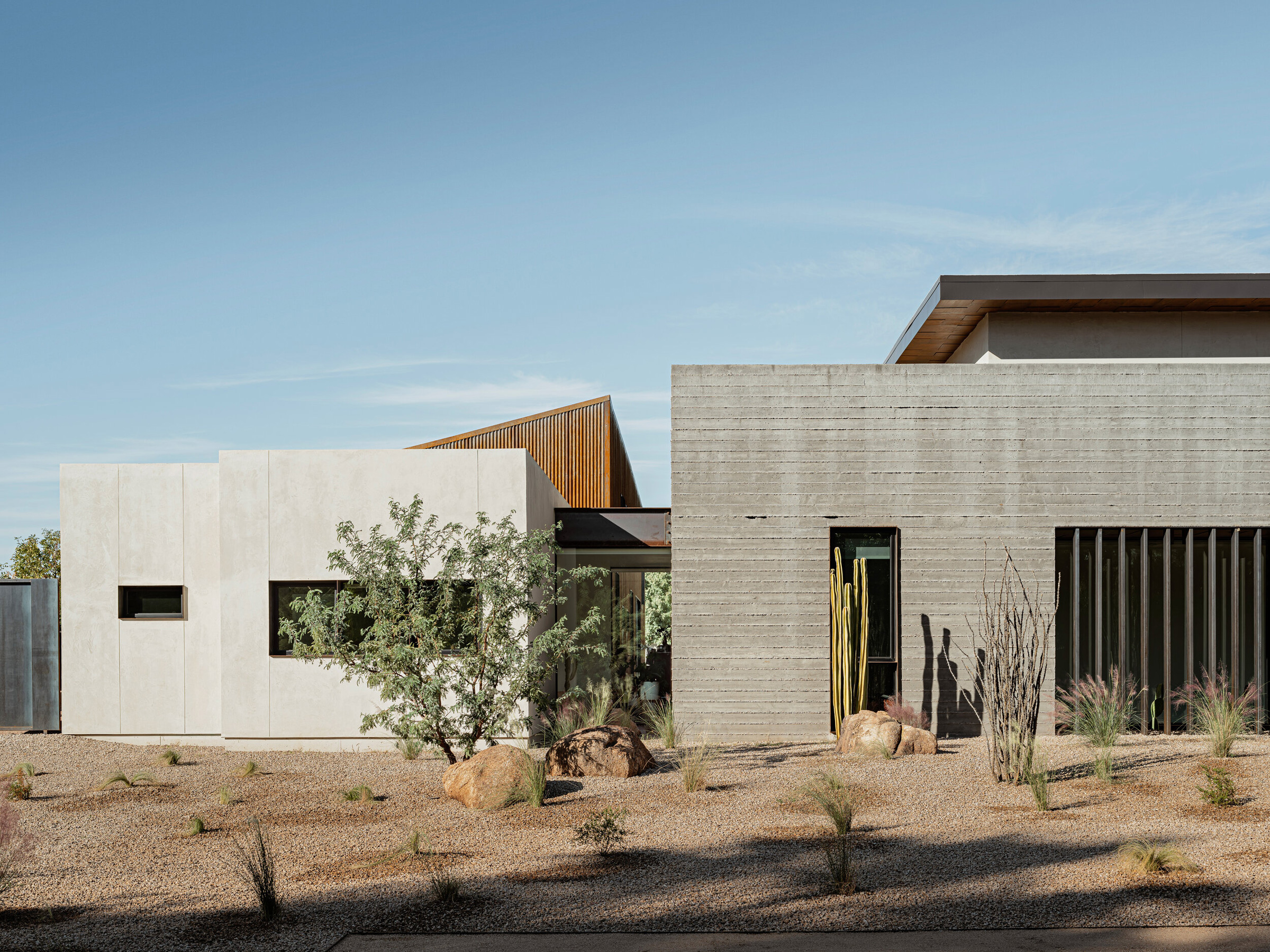
Phoenix is located in the northeastern reaches of the Sonoran desert and is known as The Valley of the Sun. With dusty-grey board marked concrete, orange weathering steel, and shades of olive and cream Foo House embodies the spirit of the desert with a sprawling and airy design. NR Magazine joins The Ranch Mine in conversation.
How do you think identity informs design and architecture?
We believe that identity is both the reason for design and architecture and the result of design and architecture. Our identity is the fuel behind the best design and architecture. Architecture is a reflection of who we are, our time, our place, and our culture. Who we are and how we live shapes the form and function of the spaces we create. What is really fascinating to us is that who we are is inextricable from where we have been and where we are. We shape the built environment, and it, in turn, shapes us. This is why it is critical to continue to infuse the identity of people into spaces, and design for opportunities to grow beyond who we are and what we see today.
Foo House is influenced by the ancient art of pottery. How did this factor into the design specifically?
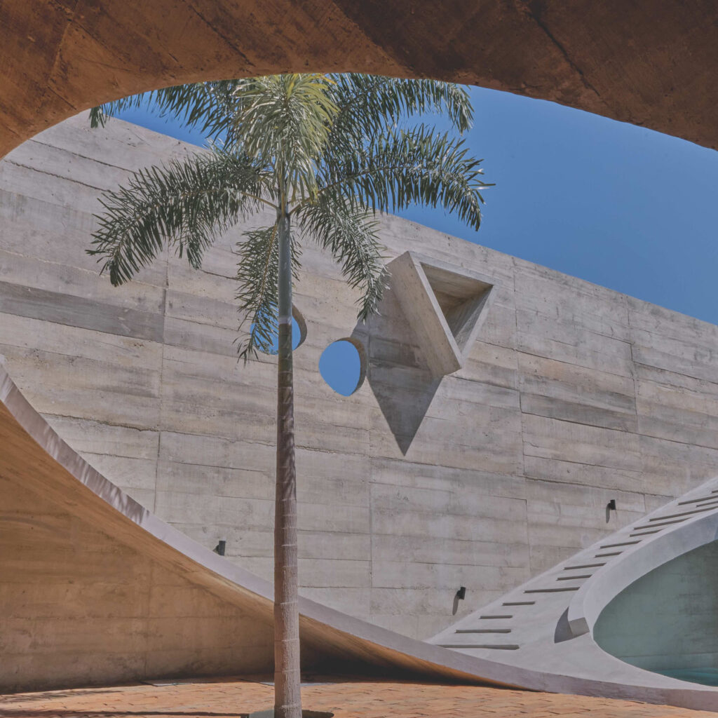
We are fascinated with history and love how pottery has played a critical role in most societies in human history as well as our modern-day understanding of those societies. So we broke down what makes pottery interesting to us, and how could we take those principles to inform a new piece of architecture. The design emerged as a home that is rigid in structure while malleable in use, precise in form while imperfect in texture, and varied in volume while limited in materials.
Are there any new technologies in architecture that you are particularly excited about?
One of the most exciting things about architecture is the development of building science, and how we can use new materials to improve tried and true ancient ways of living. The newest technology that we are excited about is a company based here in Phoenix called Source that has created a hydropanel that is the first renewable drinking water system. It creates drinking water from the air through the use of solar energy. Living in a desert where water is a precious resource, this is very exciting to us.
Given the issues of rising temperatures around the globe and the location of Foo House was this something you had to consider when conceptualising the architectural design of the property?
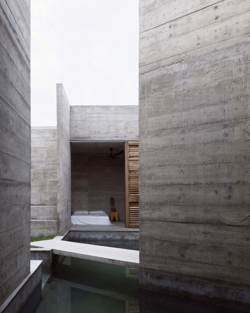
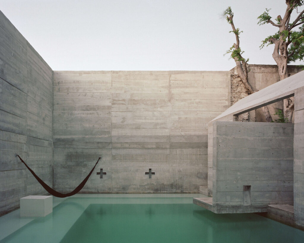
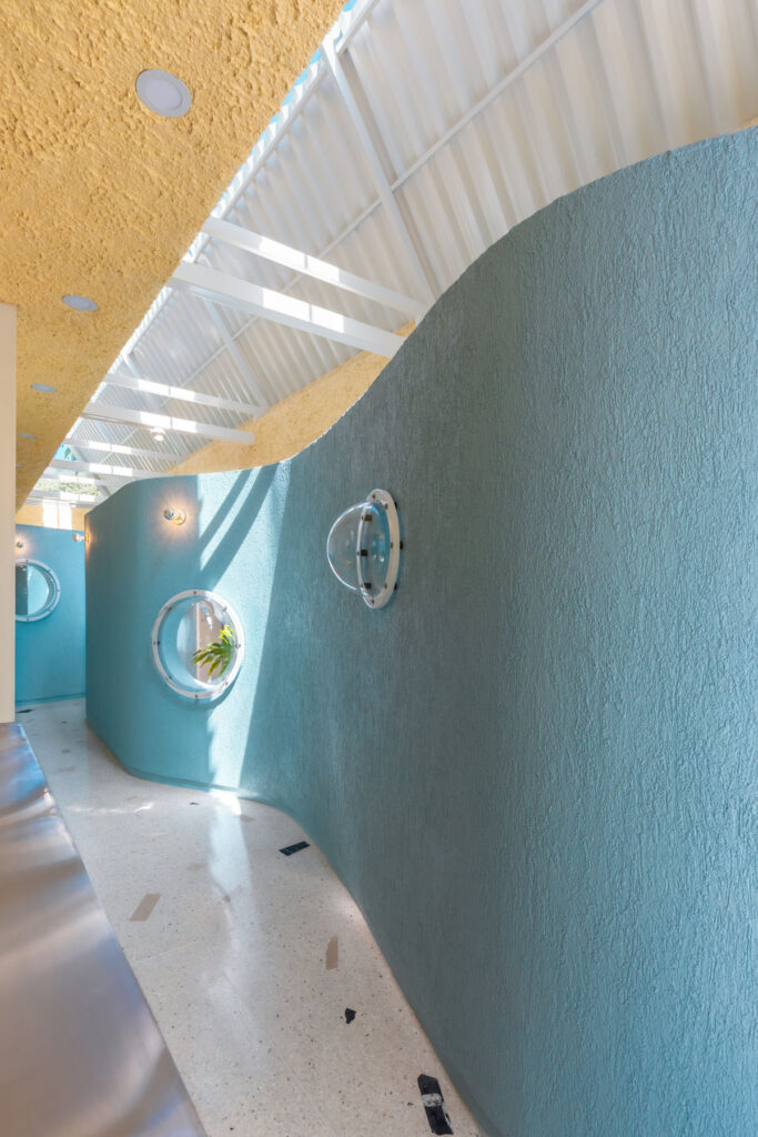
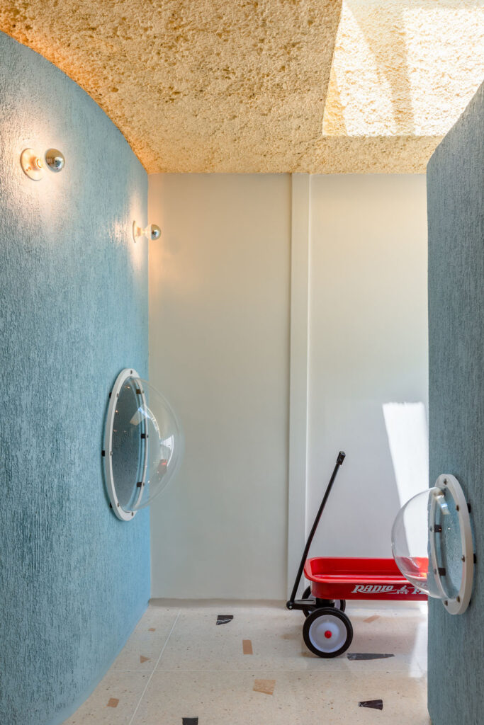
Phoenix is definitely at the forefront of dealing with extremely high temperatures and has been for a while. Studying the sun, the most powerful element here is where all our designs begin. Foo was designed as a large courtyard house that follows the sun’s day arc, shielding the interior from times of extreme heat. Courtyard houses have been effective ways of living in the desert dating back 5000 years to Kahun in Egypt and possibly earlier. They are self-shading, providing a space to either embrace or escape the sun at all times of day throughout the year.
Other than the ancient art of pottery were there was there any other influences or inspirations that you drew on when working on this project?
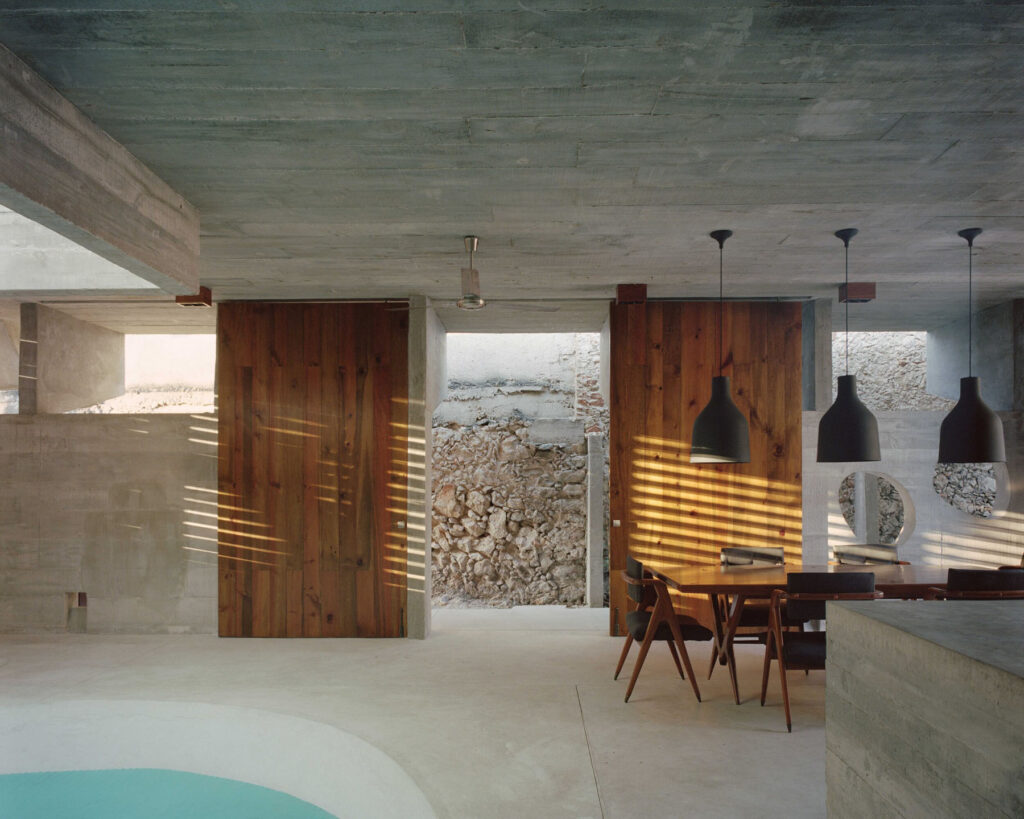
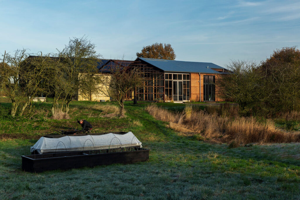
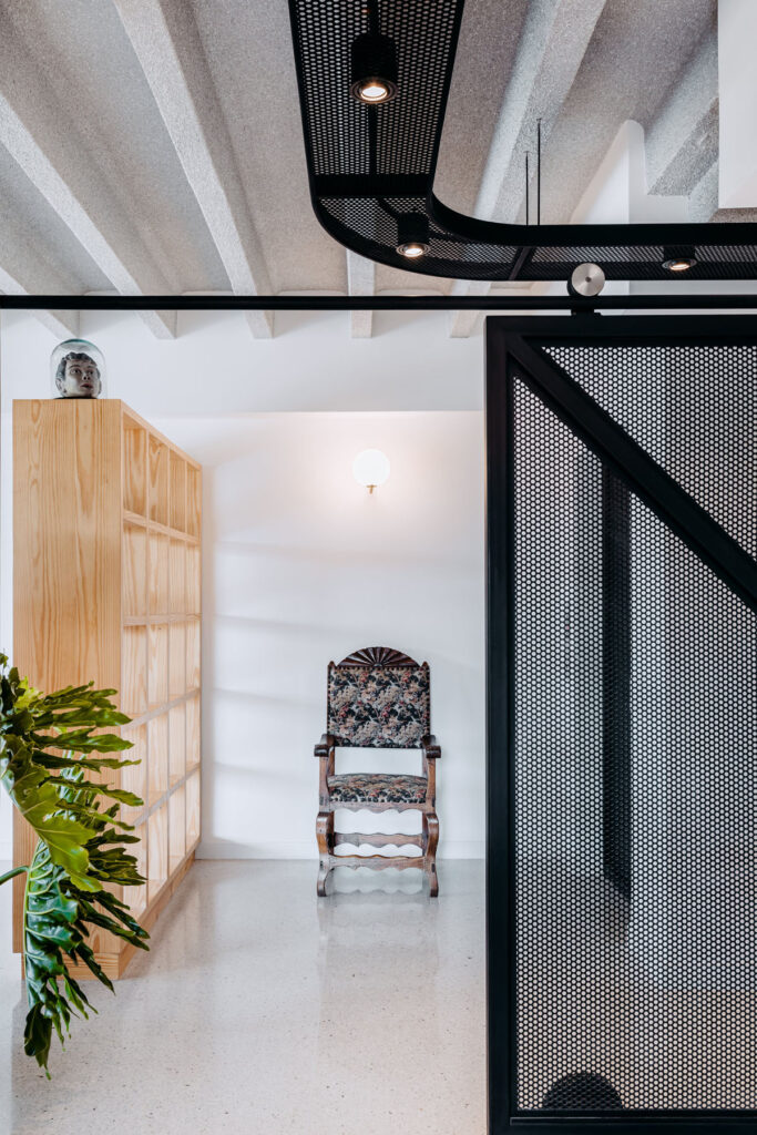
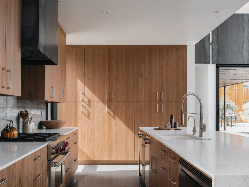
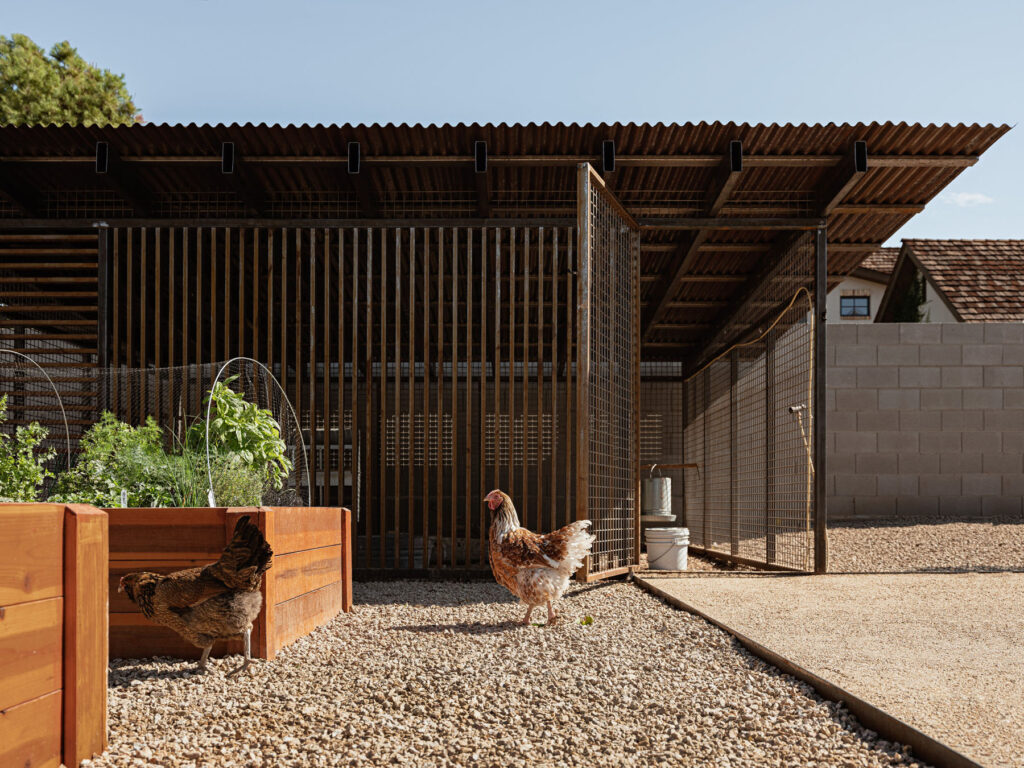
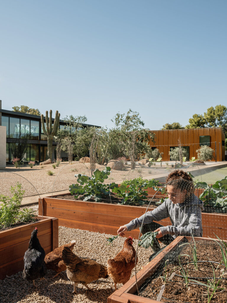
We always draw inspiration from our clients, who in this case were a very “hands-on” family, starting with their professions but leading to their kids playing musical instruments, gardening and raising chickens, and making robots. We wanted to go beyond just making a pottery studio and maker space to satisfy the “what” of the scope. We wanted to build on the essence of these items and make an entire home that reflected their family values. So the design uses a combination of the hand made and materials meant to patina and change over time, in an aesthetic some might consider wabi-sabi, that embraces the journey, the imperfections of hand made, and the transitory nature of our world. The other major inspiration in every project is the site, and its location in this world. We are fortunate to have incredible weather for the majority of the year in Phoenix. While the headlines talk about the high heat which can be intense, about 7-8 months a year you can basically live outside.
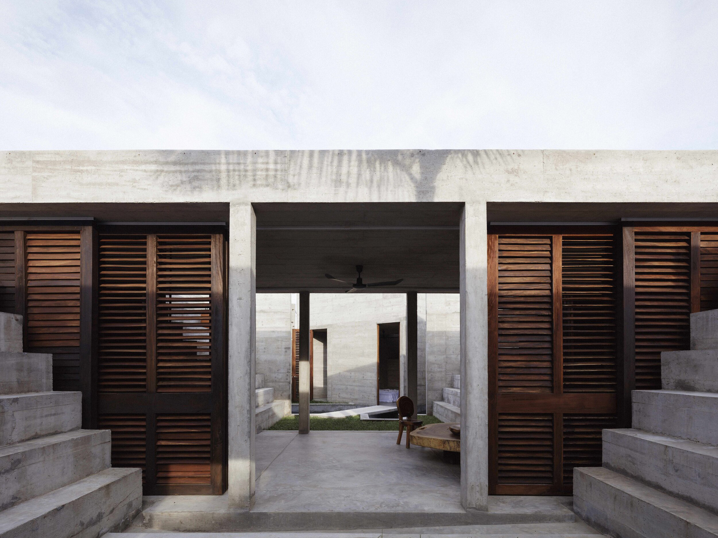
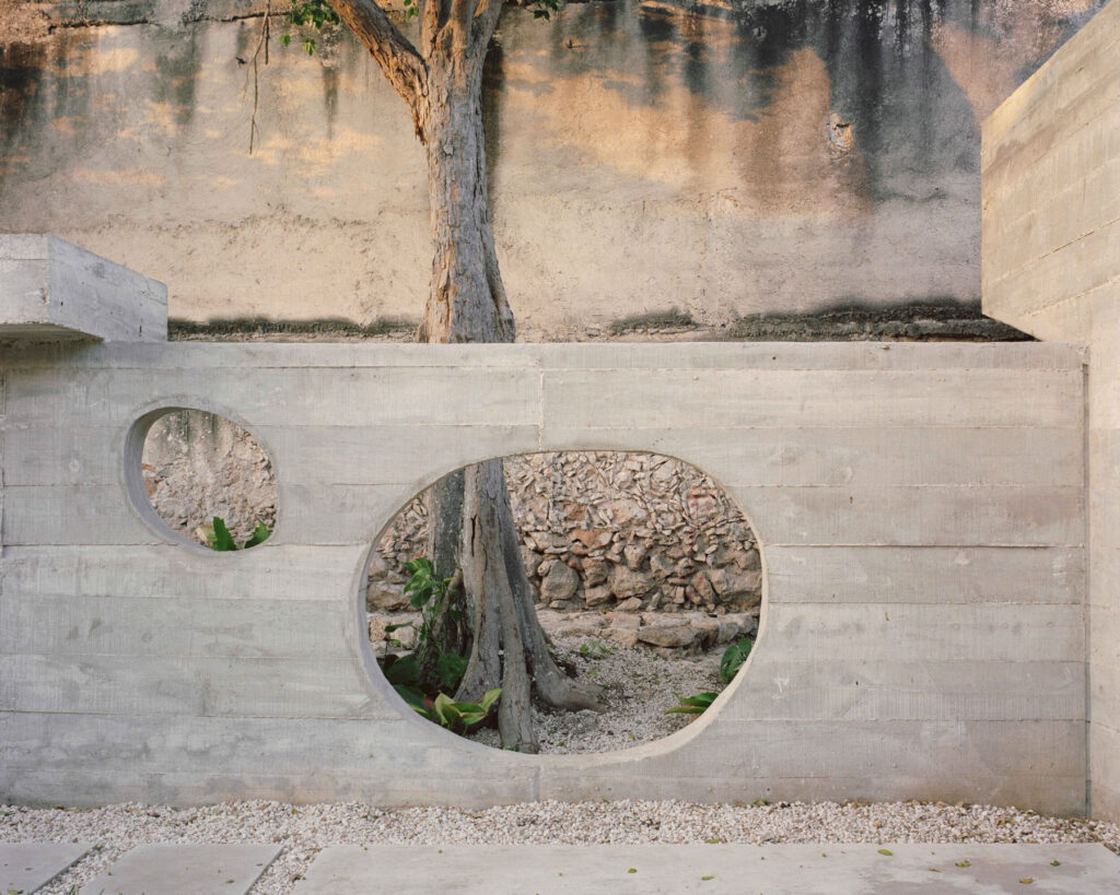
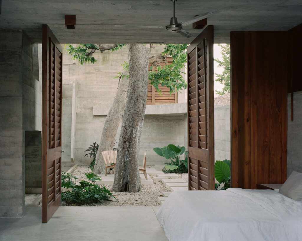
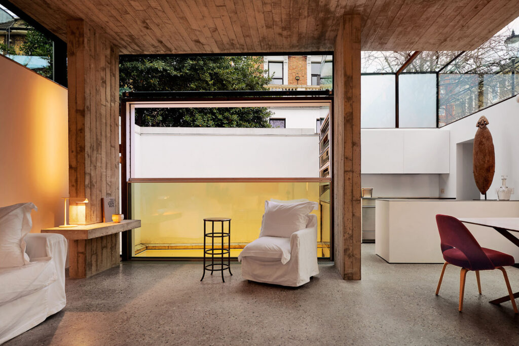
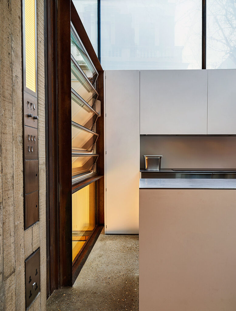
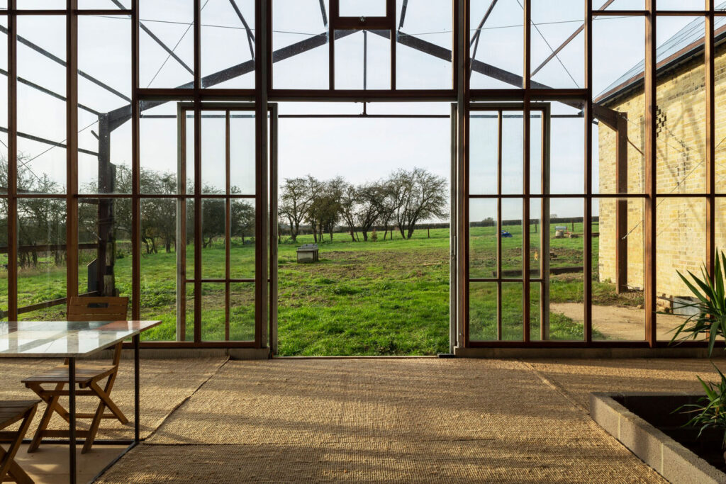
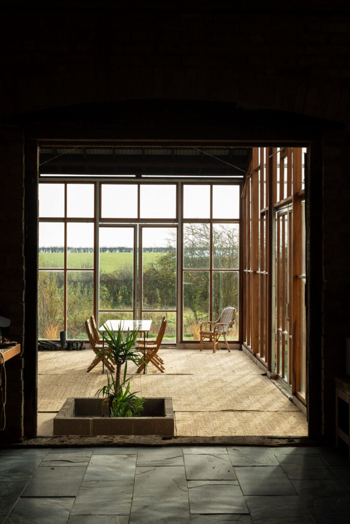
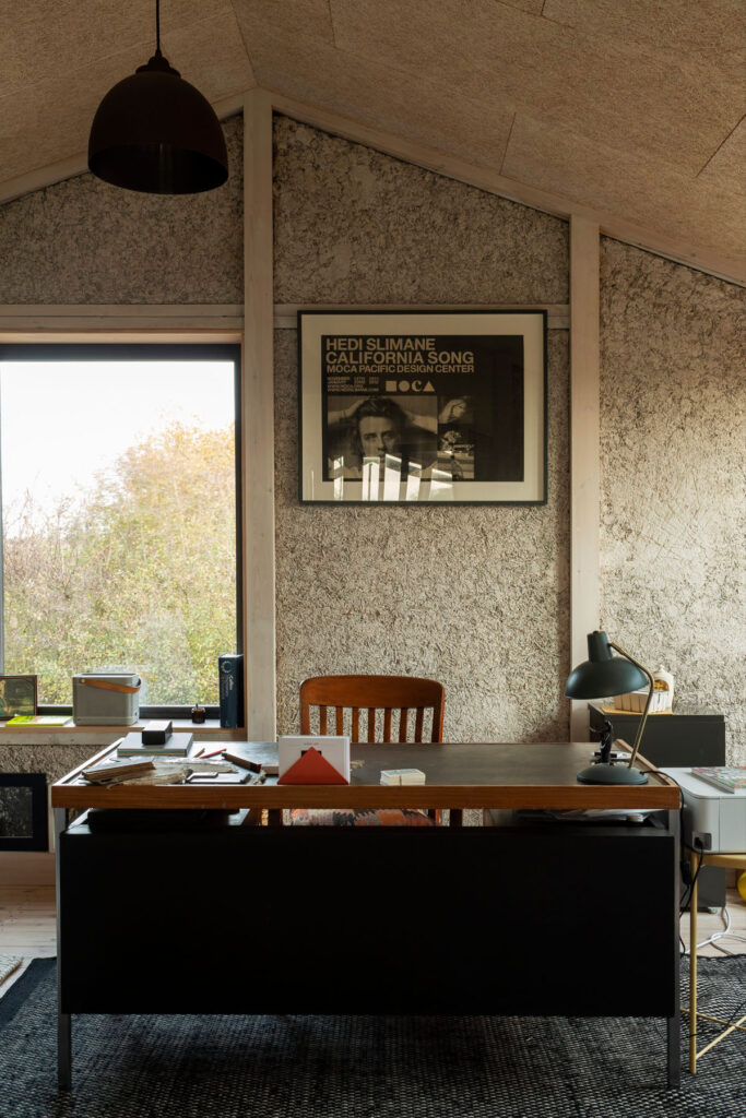
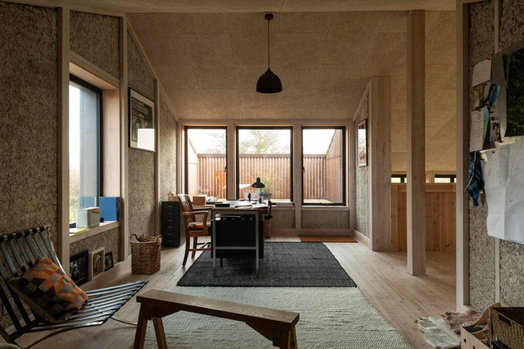
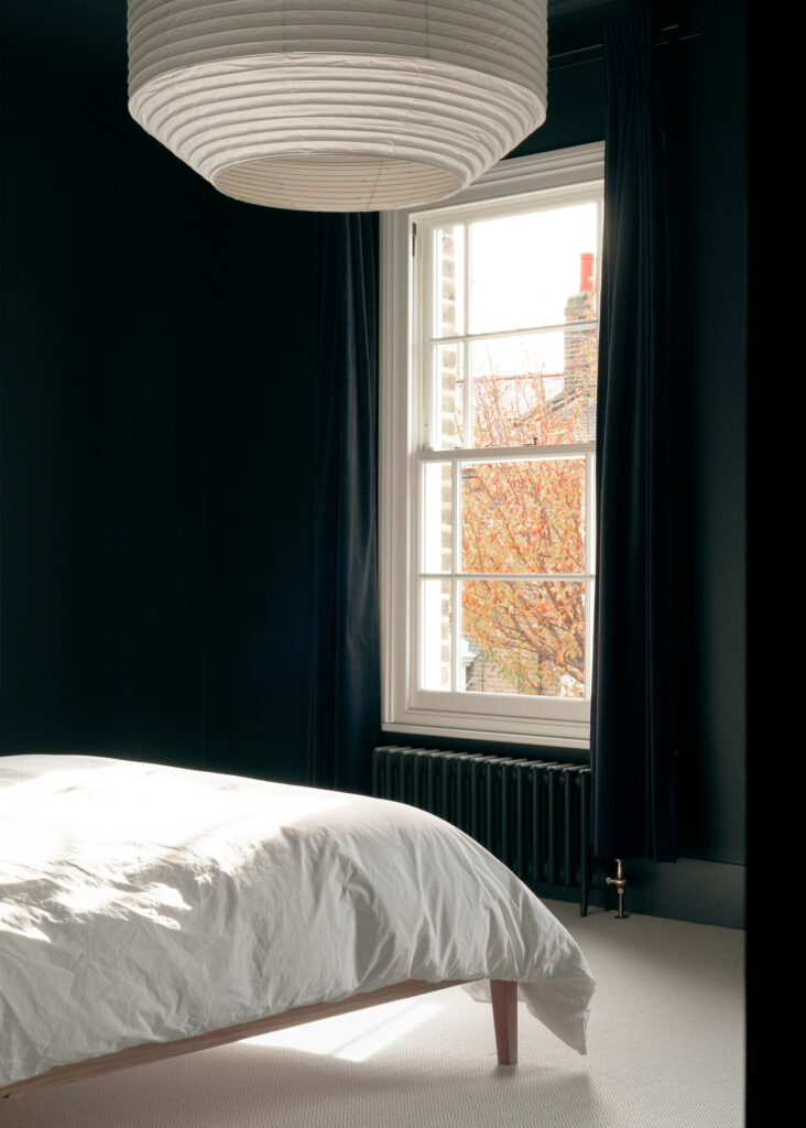
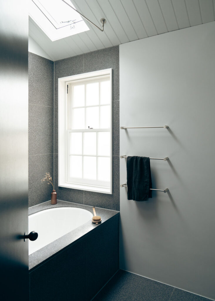
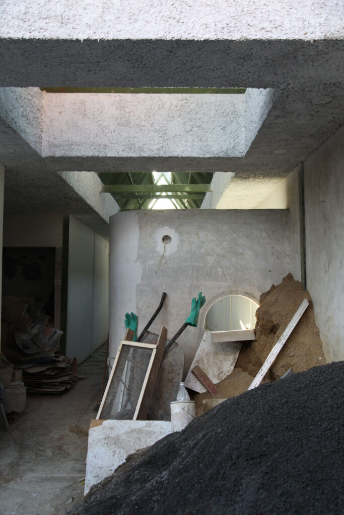
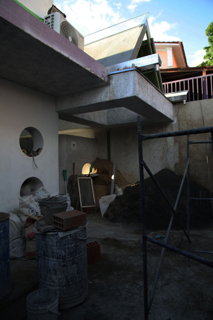
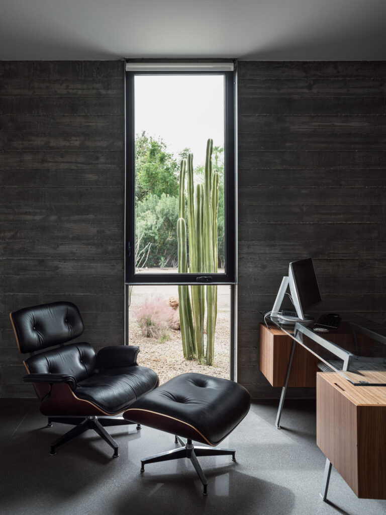
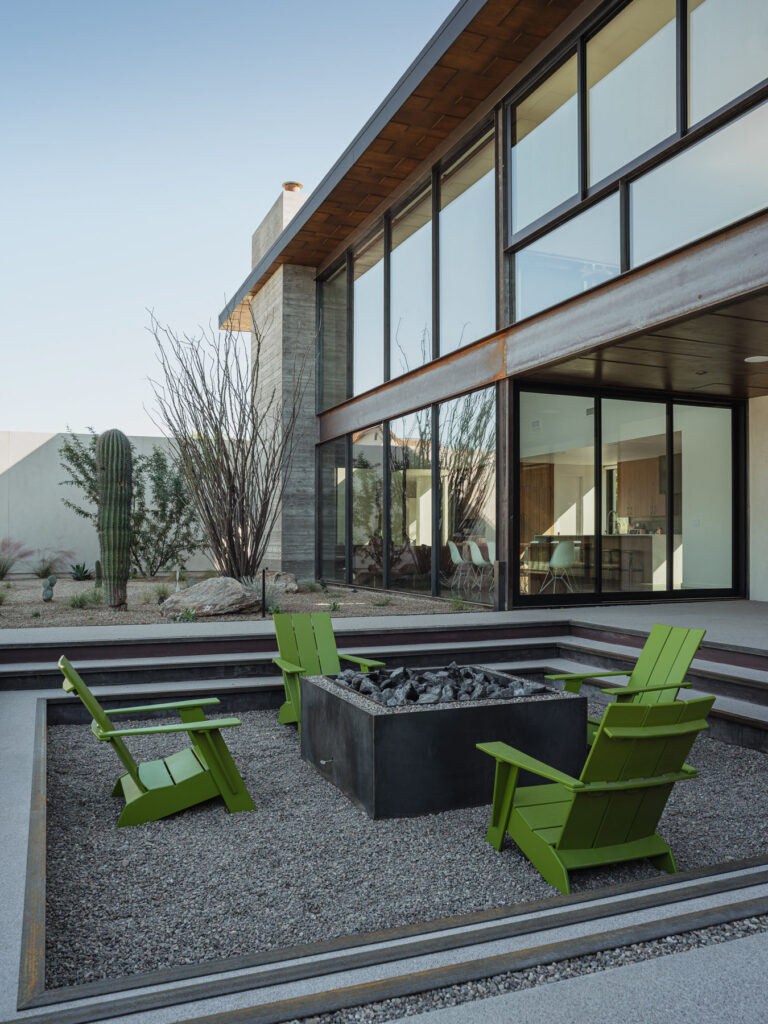
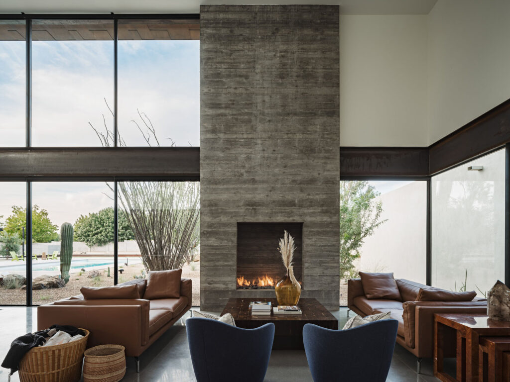
We wanted to create a home that everywhere you are in the house has a direct relationship with the exterior, and we wanted to create a lot of different types of connections, not just one big opening. The main living space has double-height glazing that faces north towards the courtyard. It has sliding glass doors that open it out onto the covered patio towards the outdoor kitchen, fire pit, and pool beyond. It also has a lofted area that provides skyline views to the south and views of the Phoenix mountain preserve to the north. It provides a different perspective of the landscape. We also created glass connectors between the volumes of the house, so the landscape sort of tucks in around the house, and you are constantly aware of it as you walk from one area of the house to the next. The bedroom wing has smaller openings that frame the olive grove or high windows that look towards the sky. Using exposed aggregate concrete blurred the transition as you step outside and areas where the glass is fixed, the new desert landscape comes right up to it.
What were some of the challenges you faced when working on Foo House and how did you overcome them?
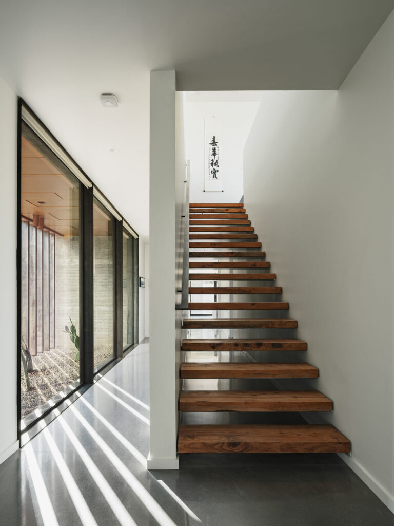
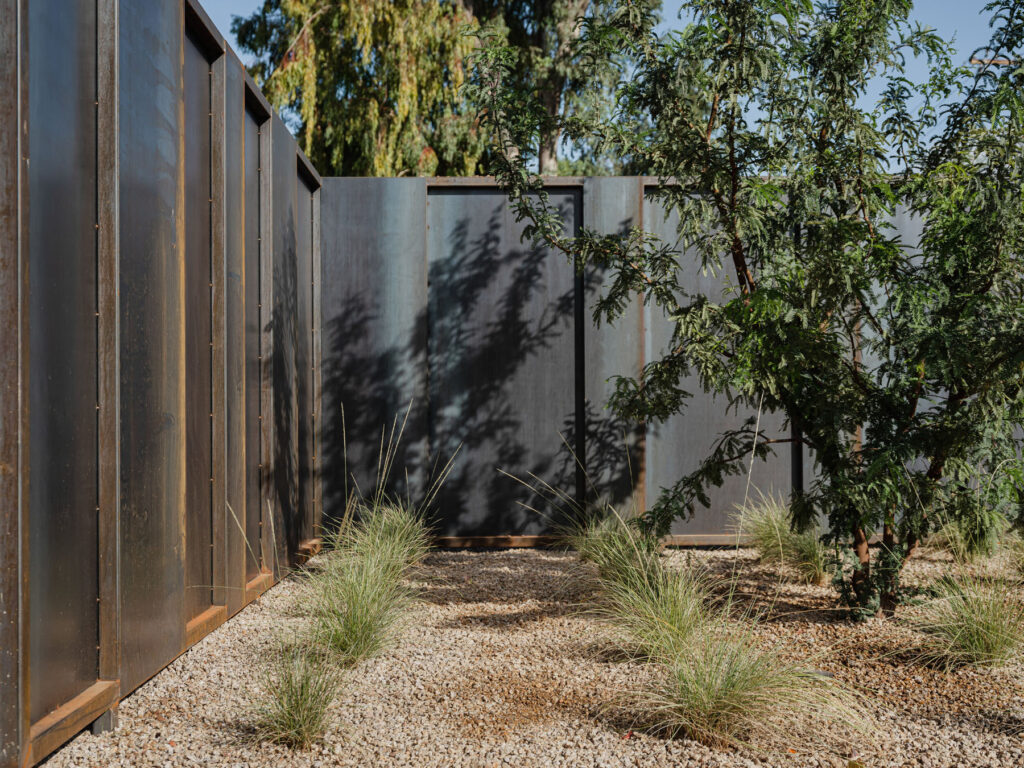
The first challenge is that the house is located in a pretty busy urban area, less than a half-mile from 10+ story towers. To create an oasis-like refuge, we shaped the building to create a large central courtyard, using the building to shield the areas that faced the busy part of the city. The second challenge was overcoming the fact that buildings are generally by their nature static. We wanted to find a way to activate the house to meet the dynamism of the family and their passions. Our approach to doing this was two-pronged. The first was to design the building to be noticeably affected by time. We did this by using materials that would patina like the rusting siding or soften the board-formed concrete joints as well as using vertical floor to ceiling windows that face due south that act like sundials throughout the day. This is most noticeable where we shifted the hallway around the stairwell and added a steel brise soleil to highlight the solar pattern in the hallway. The second way we did this was by creating a campus-like plan, where you walk through communal spaces, outside and inside to get to more specific places. This creates casual exchanges.
When creating a family home like Foo House what are some important aspects to bear in mind?
When creating a family home, the first thing people often think of designing for is durability. While this is of course important, it is not the main driving factor for us. When designing family homes we focus on flexibility over time, spaces that inspire creativity, and a variety of spaces in which you can connect with each other, with extended family and with friends, as well as opportunities to disconnect.
The site contains a chicken coop, a citrus grove, a stone fruit grove, and raised planting beds for growing herbs and vegetables. Are there any other methods of sustainability used on the property?
The house is designed to primarily use stack ventilation in the bedrooms and main living area to use the diurnal temperature swings to help passively cool the house. The house opens up primarily to the north for indirect natural light and uses the height of the volumes to shade exterior spaces for outdoor living. The U-shaped form of the house creates a large courtyard, creating a bit of a microclimate. The roofing is a combination of white-coloured foam or corrugated metal to reflect the radiant heat from the sun. The property used to be almost entirely grass and we changed it to primarily desert and native vegetation on drip irrigation, heavily reducing the water consumption on the property in combination with low flow water fixtures throughout.
What advice do you have for young creatives looking to work in architecture?
Find out who you are first. Then put that out into the world. Once you do it will attract people you want to work with. You are uniquely you. Your identity is your gift to the world, it is the one thing you do better than everyone else. Share it.
Are you working on any projects at the moment and what are your plans for the future?
We have about 30 residential projects in the works currently. We are excited that about 1/3 of those projects have taken us into new climates, new states, and outside of the country. Each new location continues to hone our research practices and understanding of place.
Our plans for the future are focused on continuing to grow our residential practice, designing homes that expand people’s creative potential and liberate them from the confines of convention. We look forward to more projects locally as well as projects that take us to new places, new people, and introduce new challenges.